10,000 search results
(0.04 seconds)
- Fagelyne by Krafted,
$10.00 Looking for a modern and extravagant font that is easily memorable? In the sea of similar designs, something unconventional but tasteful will certainly put your brand on the map. Introducing Fagelyne - A Modern Elegant Font. Use this font for promotional material, ads, web pages, apps, clothing, printed material, and anything else you need to make your brand shine. What you’ll get: Multilingual & Ligature Support Full sets of Punctuation and Numerals Compatible with: Adobe Suite Microsoft Office KeyNote Pages Software Requirements: The fonts that you’ll receive in the pack are widely supported by most software. In order to get the full functionality of the selection of standard ligatures (custom created letters) in the script font, any software that can read OpenType fonts will work. We hope you enjoy this font and that it makes your branding sparkle! Feel free to reach out to us if you’d like more information or if you have any concerns.
 - Luxyna by Krafted,
$10.00 Wish to add a touch of luxury to your design? A deluxe font will transform the way people see your brand. Introducing Luxyna - a Luxury Serif Font. A perfect blend of luxury and modern spirit, Luxyna will appeal to all audiences, young and old. Best of all, it works great on both the web and in print. Give it a go and see how the right font choice improves your image. What you’ll get: Multilingual & Ligature Support Full sets of Punctuation and Numerals Compatible with: Adobe Suite Microsoft Office Keynote Pages Software Requirements: The fonts that you’ll receive in the pack are widely supported by most software. In order to get the full functionality of the selection of standard ligatures (custom-created letters) in the script font, any software that can read OpenType fonts will work. We hope you enjoy this font and that it makes your branding sparkle! Feel free to reach out to us if you’d like more information or if you have any concerns.
 - Sedid World by Fontuma,
$28.00 Sedid, “solidity; It is an Arabic term meaning “righteousness”. In particular, the correctness and soundness of a word is indicated by this word. The fact that I gave this name to the writing family is to point out its accuracy and robustness. This typeface, which is sans serif, consists of three families: ▪ Sedid: Font family containing Latin letters ▪ Sedid Pro: Font family including Latin, Arabic and Hebrew alphabets ▪ Sedid World: A family of typefaces including Latin, Cyrillic, Greek, Arabic and Hebrew alphabets Do you want a difference in your work? Then meet the Sedid World font family. This font will meet all your expectations in terms of the languages it supports and the variety of glyphs it contains. You can easily use the Sedid World font family in every project. Because this font has beautiful and soft lines. The font family includes open type features, as well as a large number of ligatures, small caps, modifiers, and currency symbols of many countries.
 - Colotus by Ditatype,
$29.00 Colotus is a striking sans-serif display font that immediately captures the eye. The characters in Colotus is made in bold and solid square forms, imparting a sense of reliability and authority. However, what truly sets Colotus apart is its subtle brush detail that adds a touch of handcrafted charm. This brush detail infuses the font with a sense of artistry, creating a captivating blend of contemporary design and organic creativity. In addition, you can also enjoy the features here. Features: Alternates Ligatures Multilingual Supports PUA Encoded Numerals and Punctuations Colotus fits in headlines, logos, posters, flyers, branding materials, print media, editorial layouts, and many more designs. Find out more ways to use this font by taking a look at the font preview. Thanks for purchasing our fonts. Hopefully, you have a great time using our font. Feel free to contact us anytime for further information or when you have trouble with the font. Thanks a lot and happy designing.
 - Lemony by Din Studio,
$29.00 Lemony is a serif font family in 8 different volume options expressing formality and elegance in your designs. Its family character is that it has small lines in horizontal or vertical forms on the letter body, easing readers to read the letter as the lines guide readers’ attention to the reading directions. As a result, you may use this font on any text sizes. In addition to the font weight variations, you will have freedom of how and where you should use the font. Enjoy the available features here. Features: Ligatures Multilingual Supports PUA Encoded Numerals and Punctuations Lemony fits for various design projects, such as posters, banners, logos, magazine covers, quotes, invitations, greeting cards, merchandise social media, etc. Find out more ways to use this font by taking a look at the font preview. Hopefully, you have a great experience using our font. Feel free to contact us if you require more information when you are dealing with a problem. Thank you. Happy designing.
 - Hardbones by Krntype Studio,
$16.00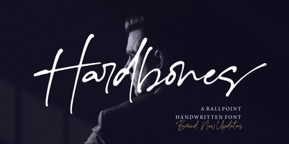 Hardbones is a stunning ballpoint signature font. font with unique natural flow and feminine style, made using a unique gel ballpoint ink. Each letter is deliberately imperfect to make it look more natural and charming. Hardbones comes with multilingual support, ligature, and ending swash from a-z.
 - Lettre by Latinotype,
$19.00 Lettre is a geometric serif font designed by Pablo Sinn. Thanks to its imperfections, this font looks like it is hand-lettered. Lettre brings back nostalgic feelings of mechanical typewriter characters and recovers the essence of the rustic and natural, what makes it a very modern typeface.
 - Ahra by Magpie Paper Works,
$58.00 Ahra from Magpie Paper Works is an upright, hand-lettered script full of fun calligraphy. This Opentype font was created with a pointed pen & ink, and features a host of special features. Within Ahra are three sets of capital letters, ranging from simple to quirky to traditional, as well as single-word characters for common titles (Mr., Miss, Dr., etc.) prepositions (to, the, for, etc.) and envelope addressing (blvd., st., etc.). You'll also find simple & automatic end-of-word swashes, old-style numerals and special double-letter ligatures for a true hand-drawn look. Ahra Hand features decorative word art, all lovingly drawn in a swirling traditional calligraphy style. There are 88 unique greetings, prompts, and phrases, plus an ornate set of numerals 0-9. Ahra Swash includes over fifty unique hand-inked flourishes, borders, corners, swashes and curls. Mix and match for a truly custom look! All were designed to coordniate with the Ahra alphabet, but can be used to enhance other faux-calligraphy fonts.
 - Ice Creamery by FontMesa,
$29.00Ice Creamery is a new variation of our Saloon Girl font family complete with italics and fill fonts which may be used to layer different colors into the open parts of each glyph. We don’t recommend using the fill fonts for Ice Creamery as stand alone solid fonts, Ice Creamery Chocolate was designed as a the stand alone solid font for this font family. Fill fonts go back to the 1850's where they would design matched sets of printing blocks and the layering of colors took place on the printing press, they would print a page in black then on a second printing they would print a solid letter in red or blue over the letters with open spaces to fill them in. Most of the time the second printing didn't line up exactly to the open faced font and it created a misprinted look. With the fill fonts in Ice Creamery and other FontMesa fonts you have the option to perfectly align the fill fonts with the open faced fonts or shift it a little to create a misprinted look which looks pretty cool in some projects such as t-shirt designs. I have some ice cream making history in my family, my Grandfather Fred Hagemann was the manager of the ice cream plant for thirty years at Cock Robin Ice Cream and Burgers in Naperville IL. In the images above I've included an old 1960's photo of the Cock Robin Naperville location, the ice cream plant was behind the restaurant as seen by the chimney stack which was part of the plant. If you were to travel 2000 feet directly behind the Cock Robin sign in the photo, that's where I started the FontMesa type foundry at my home in Naperville. My favorite ice cream flavor was their green pistachio ice cream with black cherries, they called it Spumoni even though it wasn't a true Spumoni recipe. Their butter pecan ice cream was also incredibly good, the pecans were super fresh, their Tin Roof Sundae ice cream was chocolate fudge, caramel and peanuts swirled into vanilla ice cream. One unique thing about Cock Robin and Prince Castle was they used a square ice cream scoop for their sundaes. - Finest Romance by Din Studio,
$25.00 Be a trendsetter and get prominent with the best style from the Finest Romance. Finest Romance is a duo font from mixtures of serif and script fonts. This harmonic duo font work hand in hand to produce marvelous designs because it expresses modernity, elegance and a little romance. Additionally, the geometric serif font’s letters are simple and consistent for a great legibility purpose. On the other hand, the script font’s letters are designed to be similar to a handwriting by adding more variations to the letters with curves and final swinging wipes. You can use this font together or separately based on your necessity. With this font’s amazing features, you can enhance your design products. Features: Stylistic Sets Ligatures Multilingual Supports PUA Encoded Numerals and Punctuations Finest Romance fits for various design projects, such as posters, banners, logos, magazine covers, quotes, name cards, invitations, headings, printed products, merchandise, social media, etc. Find out more ways to use this font by taking a look at the font preview. Hopefully, you have a great experience using our font. Feel free to contact us if you require more information when you are dealing with a problem. Thank you. Happy designing.
 - Plata by 4RM Font,
$12.00 Plata font is a humanist display font with unique authentic value. available with 4 weights will add value to the authenticity of this font. generally suitable for use in logo design, packaging.
 - Nindia by Phoenix Group,
$13.00 Nindia font is a font that was created based on the idea of beauty and elegance, with a modern and millimistic form, making Nindia font suitable for use in feminine design types.
 - Eragu by Twinletter,
$15.00 ERAGU is a display typeface that is unlike any other, both in terms of shape and the impression it gives when used in words or sentences. It also has a new and unusual appearance that makes it truly unique and quirky. All of your projects will be unique in the market if you use this font; it will pique the interest of everyone who sees it, and it will be simple to remember every message you will convey to the audience because, in just a few seconds, everyone will be interested in the appearance of your project if you use this font. Logotypes, food banners, branding, brochure, posters, movie titles, book titles, quotes, and more may all benefit from this font. Of course, using this font in your various design projects will make them excellent and outstanding; many viewers are drawn to the striking and unusual graphic display. Start utilizing this typeface in your projects to make them stand out.
 - Size by SD Fonts,
$34.00 Retro style is hip, so are early 20th century poster fonts. Size is based on these extra condensed letter forms. In the 19th century the need to communicate commercial messages on limited poster space brought up extremely condensed fonts creating a new typographical look. Since not really legible in small sizes these fonts nearly disappeared with the change in the commercial communication in the 20th century. For a couple of years now, these extra condensed fonts have a revival copying the exact historical appearance of its predecessors. Size, though also seeking the inspiration in the historical draft, furthermore aims to interpret this compressed look in a more vivid way by not closing in on the open counters of the round letters, but having its stroke endings slightly curved. Since other characters are defined by straight strokes, Size displays a look more vital and candid, but still distinct, compared to its historical predecessors.
 - Cumbre by Antipixel,
$22.00 Cumbre is a slanted display type with unorthodox anatomy, a dynamic rhythmic structure, movement expression, and intense visual language. An eccentric rebel with ribbon-like moves, a balanced extrovert that makes meticulous use of ink traps. Both the name and design got inspiration from mountain peaks. "Cumbre" in Spanish means summit, and that's the motive for the spiked design and the angular serrated structure. Cumbre is built by balancing sharp angles and venturous curves. The stems are spiky, and they vary in width. Cumbre is slanted and unicase. It has condensed proportions, moderate weight contrast, spacious counters, pointy terminals, and square ink traps. Cumbre is meant for large display settings to make the most out of the precise outlines and the clean intersections. The font styles: 'Sharp' has straight paths and precise intersections. 'Round' has the same outlines but with round corners. 'Stamp' has irregular wavy contours and heavy swelling at intersections.
 - Metal Cry by Fabulous Rice,
$25.00 Metal Cry is a font family that was inspired by countless hours spent playing video games, watching old movies or reading comic books. And even more hours closely analysing the design of all these things. The art of creating beautiful letters has slowly declined with the rise of the digital age and its solid-colour, 2D fonts. And most of the time, the care given to typography in cultural products just isn't what it used to be anymore. This was the inspiration for Metal Cry, a family of 4 layerable fonts that can bring a feeling of depth to its letters, and offers endless possible combinations. Metal Cry Outlands is the basic shape of all the characters, it can be used as the bright side of the bevel. Metal Cry Front is the inline border font that can be used as the front side of the bevel. Metal Cry Shadow can be used as the dark side of the bevel. Metal Cry Depth can be used to flash out the inside shape of the letter. But of course, any font can be combined with any other font(s) to obtain various results. The planets in the above visuals are courtesy of 3D artist Thomas Veyrat / veyratom.com
 - Morning Edition JNL by Jeff Levine,
$29.00 The front page headline of the April 6, 1917 edition of the Bemidji Pioneer [from Bemidji, Minnesota] says in extrabold letters: “State of War is Declared”. The subtext underneath reads: “President Signs Resolution 1:13 P.M., Passed by House 3 O’Clock this Morning”. Thus, the United States formally entered into World War I. However… that subtext was set in a sans serif type face which was a perfect addition to the numerous newspaper-inspired type revivals offered by Jeff Levine Fonts. Morning Edition JNL is available in both regular and oblique versions.
 - Lansbury - 100% free

- Inabitavel Typewriter by Intellecta Design,
$25.00 The Inabitavel Typewriter is a unique typewriter font design, great for mimicking the effect of typewriting older machines. Has an erased and much-inked style, good for exquisite designs.
 - Cul De Sac by Hanoded,
$25.00 Cul De Sac is a beautiful cartoon-like font. It was hand drawn, using an old fashioned pen and India ink. Use it for your ads, posters and websites.
 - King15 by Typo5,
$5.95King15 is a beautiful script font based on signatures dated back from hundreds of years. Its asymmetry and ink imperfections give it a strong and a truly unique character. - TT Ricordi by TypeType,
$49.00 TT Ricordi useful links: Specimen | Graphic presentation | Customization options The TT Ricordi font family is a collection of three display heading serifs designed to significantly diversify the traditional font palette. Each font from the TT Ricordi family was drawn by a separate designer and has its own story. With that, all three fonts are close in thickness and similar in their character compositions and are featured in the uppercase set and the small capitals set, which replaces lowercase characters. The fonts have the broad support of Latin languages and support basic Cyrillic. The project originates from the pre-coronavirus tourist trips to Italy, during which our art director Yulia Gonina has accumulated many photographs of historical inscriptions and tablets. Many of these inscriptions had interesting character or unusual character shapes. We wanted to work with them, to try to reinterpret them, and, if possible, make them ultramodern and accessible to the modern font user. The fonts from the TT Ricordi typeface turned out to be quite display and contemporary, but at the same time, they retained subtle references to historic inscriptions. The fonts fit perfectly both on the covers of book classics and in glossy magazine layouts. They can also be used in posters and packaging, or as the main expressive element of company branding. In addition, all three serifs from the TT Ricordi font family go well with functional sans-serifs such as TT Norms Pro or TT Commons. TT Ricordi Nobili is a display serif with a rich Roman ancestry and contemporary world views. It stands out from the crowd with its subtlety and elegance. The font was drawn by Anna Tikhonova and was inspired by an inscription carved into the stone floor of a cathedral in Florence. Because people walked over the inscription, some of the letters got thinner and worn out over time. It is this feeling of disappearing or flickering elements that we wanted to capture and implement in the project. The TT Ricordi Nobili has high contrast, even though the font itself is quite thin. The serifs in the font are not massive at all, but at the same time, they are display serifs. There is a certain tension in TT Ricordi Nobili, and the viewer perceives this tension. We can say that behind the external classic facade lies a rather modern plot. The font has a large set of discrete ligatures which allow to create interesting combinations and expand the capabilities of the font. There are 709 glyphs in the TT Ricordi Nobili font, and a whole set of useful features, such as: aalt, ccmp, locl, numr, ordn, tnum, pnum, case, dlig, ss01, ss02, ss06, ss07, ss08, ss09, ss10, calt. TT Ricordi Todi is a wide serif with a classic base and a contemporary nature. The font turned out to be refined yet sharp, and in places even pushy and aggressive. The font was drawn by Yulia Gonina, and the project was based on plaques with engraved street names from the small Italian town of Todi. The main challenge was to decipher the characteristic features of the signs and emphasize them in a modern way. In addition, it was necessary to draw a Cyrillic alphabet that would not be inferior to the Latin alphabet in its expressiveness. The TT Ricordi Todi has fairly wide character proportions, and there is practically no contrast in them. The main feature of the font is the combination of smooth round shapes with deliberately squared shapes. In addition, the font is characterized by crisp and sharp character details, exaggerated ascenders and descenders, and muted contrast. Among the interesting font peculiarities, you can choose between the characteristic long descenders and ascenders and their more tempered versions, you can find a stylistic set with triangular dots, alternative versions of the EF characters and two letter ? shapes, round and squared. There are 876 glyphs in the TT Ricordi Todi font, and a whole set of useful features, such as: aalt, ccmp, locl, numr, ordn, tnum, pnum, case, dlig, salt, ss01, ss02, ss03, ss04, ss05, ss06, ss07, ss08, ss09, ss10, calt. TT Ricordi Fulmini is a fashionable contemporary serif firmly holding on to its historic roots. The font turned out to be like a thistle flower: bright and catchy, but still subtle and delicate. TT Ricordi Fulmini was drawn by Marina Khodak, and the initial inspiration for the project was the inscription on the altar from the National Gallery of Umbria in Perugia. As the font was pulled into “contemporaneity”, it was completely transformed and revealed its new side. The main catchy detail in the TT Ricordi Fulmini is the aggressive and rather sharp diagonal serifs. In addition, in the process of working on the font, several graphic solutions emerged, for example, the mono-serifs and the very calligraphic connections of diagonal strokes with their historic spirit. We wanted to keep them, and thus 4 thematic stylistic sets appeared in the font, thanks to which we can greatly change the perception of TT Ricordi Fulmini. In addition, the font has a set of interesting discrete ligatures. There are 793 glyphs in the TT Ricordi Fulmini font, and a whole set of useful features, such as: aalt, ccmp, locl, numr, ordn, tnum, pnum, case, dlig, ss01, ss02, ss03, ss04, ss05, ss06, ss07, ss08, ss09, ss10, calt. TT Ricordi supports more than 180+ languages, such as: Acehnese, Afar, Albanian+, Aleut (lat), Alsatian, Aragonese, Arumanian+, Asu, Aymara, Azerbaijani +, Banjar, Basque +, Belarusian (lat), Bemba, Bena, Betawi, Bislama+, Boholano+, Chamorro+, Chichewa, Chiga, Colognian+, Cornish, Corsican +, Cree, Croatian, Czech+, Danish, Dutch+, Embu, English+, Esperanto, Estonian+, Faroese+, Fijian, Filipino+, Finnish, French, Frisian, Friulian+, Gaelic, Gagauz (lat), Galician+, Ganda, German+, Gusii, Haitianm, Creole, Hawaiian, Hiri Motu, Hungarian+, Icelandic+, Ilocano, Indonesian+, Innu-aimun, Interlingua, Irish, Italian+, Javanese, Jola-Fonyi, Judaeo-Spanish, Kabuverdianu, Kalenjin, Karachay-Balkar (lat), Karaim (lat), Karakalpak (lat), Karelian, Kashubian, Kazakh (lat), Khasi, Kinyarwanda, Kirundi, Kongo, Kurdish (lat), Ladin, Latvian, Leonese, Lithuanian, Livvi-Karelian, Luba-Kasai, Ludic, Luganda+, Luo, Luxembourgish+, Luyia, Machame, Makhuwa-Meetto, Makonde, Malagasy, Malay+, Maltese, Manx, Maori, Marshallese, Mauritian Creole, Minangkabau+, Moldavian (lat), Montenegrin (lat), Morisyen, Nahuatl, Nauruan, Ndebele, Nias, Norwegian, Nyankole, Occitan, Oromo, Palauan, Polish+, Portuguese+, Quechua+, Rheto-Romance, Rohingya, Romanian +, Romansh+, Rombo, Rundi, Rwa, Salar, Samburu, Samoan, Sango, Sangu, Sasak, Scots, Sena, Serbian (lat)+, Seychellois Creole, Shambala, Shona, Silesian, Slovak+, Slovenian+, Soga, Somali, Sorbian, Sotho+, Spanish+, Sundanese, Swahili, Swazi, Swedish+, Swiss German +, Tagalog+, Tahitian, Taita, Talysh (lat), Tatar+, Teso, Tetum, Tok Pisin, Tongan+, Tsakhur (Azerbaijan), Tsonga, Tswana +, Turkish+, Turkmen (lat), Uyghur, Valencian+, Vastese, Vepsian, Volapük, Võro, Vunjo, Walloon, Welsh+, Wolof, Xhosa, Zaza, Zulu+, Belarusian (cyr), Bosnian (cyr), Bulgarian (cyr), Erzya, Karachay-Balkar (cyr), Khvarshi, Kumyk, Macedonian+, Montenegrin (cyr), Mordvin-moksha, Nogai, Russian+, Rusyn, Serbian (cyr)+, Ukrainian.
 - Lovers Clouds by Anastasia Kuznetsova,
$18.00 Say Hello to Lovers Clouds! A set of three delightfully bold and sensual cloud-style fonts! Perfect for in-game quotes, packaging, branding, invitations, greeting cards and more. Super easy to use! Font Features: A-Z; a-z character set; 1 language (English); numbers and punctuation marks, symbols. Fonts can be opened and used in any software that can read standard fonts, even in MS Word. No special software is required to get started. It is recommended to use it in Adobe Illustrator or Adobe Photoshop. Made with love and magic ♡ Thank you for reading it, and do not hesitate to send me a message if you have any questions! ~ Anastasia
 - Btoxina by FSdesign-Salmina,
$39.00 Btoxina is a free interpretation of the theme pixel font. With its technological feeling, it reflects the spirit of our age. By designing the font Filippo Salmina, the author, has been inspired by the signage used in starships. Btoxina is grid-based but it differs from classical screen fonts by the use of diagonal lines. It is characterized by the renouncement of the use of capital letters in favor of using negative letters and by the automatic generation of ligatures. The typeface is available in two different styles: Atoxina (regular) and Btoxina (italic). Btoxina is especially suited for headlines in cool or experimental typography; be careful though, this font is toxic, we deny any responsibility for its use!
 - Sassoon Joined ENGLISH by Sassoon-Williams,
$66.00 These fonts will join-as-you-type in your OpenType application as shown in the posters above. Choose Use Contextual Alternates option in your app to get basic recommended baseline joins for teaching. Additionally, use can choose from 7 Stylistic Sets of alternative letterforms that are so important for Teachers. Create ‘pen lifts’ anytime too! Fonts display unjoined by default on this website and are delivered that way - joining is controlled by your application. Free to download resources Stylistic Sets and how to access the alternative letters feature in these OpenType fonts Purchasers of this font package may use their Order Number to receive a free Copybook PDF by Rosemary Sassoon recommended for effective teaching
 - Halis Rounded by Ahmet Altun,
$19.00 The Halis Rounded Font Family from Ahmet Altun comes in eight weights. In addition, all weights have small caps for romans. Halis Rounded is the smoother version of the Halis Grotesque family. With rounded corners, this new font seems much softer and eye-pleasing even though it still has geometric and straight borders. Halis Rounded is legible from very small size to very large ones and also suitable for letterpress. Thanks to small caps accommodation, this font family makes their use in web typography even easier. As with the small caps, all fonts can be used to create great works on the web as logos, texts, presentations etc. and in prints as posters, t-shirts, magazines, and notices.
 - Rahmalia Script by Shape Studio,
$12.00 Rahmalia calligraphy is a new modern script calligraphy font with an irregular baseline. Trendy and feminine style. Rahmalia Script looks lovely on wedding invitations, thank you cards, quotes, greeting cards, logos, business cards and more. Perfect for using in ink or watercolour. Including initial and terminal letters, alternates, ligatures and multiple language support.Files included: OTF To enable the OpenType Stylistic alternates, you need a program that supports OpenType features such as Adobe Illustrator CS, Adobe Indesign & CorelDraw X6-X7, Microsoft Word 2010 or later versions. There are additional ways to access alternates/swashes, using Character Map (Windows), Nexus Font (Windows), Font Book (Mac) or a software program such as PopChar (for Windows and Mac).Thanks so much for looking and please let me know if you have any questions
 - Highland Morning by Nathatype,
$29.00 Highland Morning is a thick weight serif font in slight watercolor or ink textures with fun retro nuance and complex styles. Its main characters are the addition of small lines/hooks on the top or bottom of the letter and the curvy ending wipes on some of the letters’ edges. With a number of alternative symbols, Highland Morning provides your designs with unique edges and has other interesting features you can utilize. Features: Stylistic Sets Ligatures Swashes Multilingual Supports PUA Encoded Numerals and Punctuations Highland Morning fits for any design projects, such as posters, banners, logos, book covers, album covers, invitations, quotes, greeting cards, name cards, headings, printed products, social media, etc. Find out more ways to use this font by taking a look at the font preview. Thank you and happy designing.)
 - Loyalty Script by Shape Studio,
$12.00 Loyalty Script is a new modern, trendy calligraphy font with an irregular baseline and a feminine style. Loyalty Script looks lovely on wedding invitations, thank you cards, quotes, greeting cards, logos, business cards and more. Perfect for using in ink or watercolor. Loyalty Script includes initial and terminal letters, alternates, ligatures and multiple language support. To enable the OpenType Stylistic alternates, you need a program that supports OpenType features such as Adobe Illustrator CS, Adobe Indesign & CorelDraw X6-X7, Microsoft Word 2010 or later versions. There are additional ways to access alternates/swashes, using Character Map (Windows), Nexus Font (Windows), Font Book (Mac) or a software program such as PopChar (for Windows and Mac). Thanks so much for looking and please let me know if you have any questions.
 - Leaden Skies by Kitchen Table Type Foundry,
$16.00 A ‘Leaden Sky’ is a dark grey sky without clouds. We don’t see too many of them here in Holland, as we usually have lots of clouds. Yesterday, however, the sky turned a sinister greyish green and it spewed out an an enormous amount of hailstones the size of walnuts. Leaden Skies is a handmade, all caps display font. I made it with a brush and Chinese ink. It comes with extensive language support and a set of alternates for the lower case glyphs.
 - Guerrilla Handshake by Hanoded,
$15.00 Shaking hands is quite a complicated process: do it too lightly and you appear weak, grab too hard and you’re too eager. There are also those with a ‘Guerrilla Handshake’ - grabbing your hand unexpectedly, shaking it vigorously and yanking it toward them. Guerrilla Handshake font was actually made by hand, using Chinese ink and a brush. I did use the brush vigorously, but I made sure not to shake or yank it too much! Guerrilla Handshake comes in a slightly backslanted ‘regular’ version and an italic version.
 - Florentina by Namistudio,
$15.00 If you ever dream about light vibe, playful, easy going, cute, has some nature touch in it and still has a good read-ability font: it's time to wake up. Florentina is here. The "ink bleed", irregular line, it looks like you write it by yourself. Not mentioning that dreamy hand-drawn bonus... LOTS OF THEM. And it is support 22 languages as well. I hope it support yours. Happy designing! BONUS vector can be downloaded from https://www.dropbox.com/sh/fwgkzcecjy8tqsu/AADi06i-Hf0R49mtT8_DPMw8a?dl=0
 - Insigne Splats! by insigne,
$14.99 Insigne Splats! is a series of vectorized ink splatters that can be quickly and easily used in your artwork. There are 64 unique and useful ink splatters. These individual splats can be combined, decomposed and organized to accent your designs. Splats! works well in conjunction with some of insigne's grungier faces such as Valfieris Aged, Arendahl, Majidah or Blue Goblet. Please see the printable sample .pdf for a full preview of all the splats available and the keys they map to.
 - PR8 London Ads - Unknown license

- Putrey by Alit Design,
$11.00 Introducing PUTREY Typeface PUTREY font is designed with a modern concept that is simple and dynamic. The sans serif style adopted by the PUTRAY font is a 2022 style font, has a unique swash alternative, has a large selection of ligatures. In addition. Sans Serif typefaces such as “PUTREY typeface” are very easy to apply to any design, especially those with an elegant and smooth concept, besides that this font is very easy to use both in design and non-design programs because everything changes and glyphs are supported by Unicode (PUA). The PUTREY typeface contains 837 glyphs with many unique and interesting alternative options. Plus, there's a cool sans serif font family for header and description text from light to black. In the poster preview all the letters are in the PUTREY typeface.
 - Cumhuriyet World by Fontuma,
$34.00 Cumhuriyet means “the form of government in which the nation holds the sovereignty and uses it through deputies elected for certain periods”. The reason why I gave this name to the font is that 2023 is the centennial anniversary of the Republic of Turkey, which was founded by Atatürk. This typeface, which is sans serif, consists of three families: ▪ Cumhuriyet: Font family with Latin letters ▪ Cumhuriyet Pro: Font family including Latin, Arabic and Hebrew alphabets ▪ Cumhuriyet World: Font family including Latin, Cyrillic, Greek, Arabic and Hebrew alphabets Cumhuriyet World is a family of multi-purpose typefaces designed in a geometric style. This font is suitable for use in printed products, media and digital media, as well as in every field that is the subject of writing.
 - Brocades by Edignwn Type,
$16.00 The font collection is called "Brocades", it is a crafted display with vintage themes. These collections contain monoline script, sans serif stencil and serif stencil. Every font comes with 4 style typefaces (regular, rounded, rough and stamp). Brocades give more extras 2 pack illustrations (animals and motorcycle). This script font includes 3 sets alternates and swashes. The Brocades matches apply in some designs such as the logotype, poster, label, badge, packaging, apparel, branding, and more custom design. Brocades features : 4 style typefaces (regular, rounded, rough and stamp) Uppercase, lowercase, numeral, symbol, punctuation, alternate and swash in monoline script All-caps, numeral, symbol and punctuation in sans serif and serif font Multilingual PUA Encoded Brocades includes : 14 fonts (script, sans serif, serif and dingbat) 52 illustrations in dingbat Thank you for your support and choosing us.
 - Mollyn by Alit Design,
$11.00 Introducing Mollyn Typeface Mollyn font is designed with a modern concept that is simple and dynamic. The sans serif style adopted by the Mollyn font is a 2022 style font, has a unique swash alternative, has a large selection of ligatures. In addition. Sans Serif typefaces such as “Mollyn typeface” are very easy to apply to any design, especially those with an elegant and smooth concept, besides that this font is very easy to use both in design and non-design programs because everything changes and glyphs are supported by Unicode (PUA). The Mollyn typeface contains 556 glyphs with many unique and interesting alternative options. Plus, there's a cool sans serif font family for header and description text from thin to heavy. In the poster preview all the letters are in the Mollyn typeface.
 - Tractatus by Kaer,
$24.00 These initials set I collected from “Tractatus sacerdotalis de sacramentis”, published in the city of Lugrun, printed by Arnaldum Guillermum de Brocario in 1503. Tractatus font family has Regular and Colored styles. It's all you need to precisely imitate medieval style text. Use this font as a decorative element at the beginning of a paragraph or section, other part of the paragraph should be in regular black letter font. You’ll get Drop Caps & Numbers set. --- *You can use color fonts in PS CC 2017+, AI CC 2018+, ID CC 2019+, macOS 10.14 Mojave+ * *Please note that the Canva & Corel & Affinity doesn't support color fonts!* *Please download this test file with only A letter ( https://www.dropbox.com/s/1lr7fify0n520ms/Tractatus-Test.otf?dl=0 ) to check your app & system.* --- Best, Roman. Thank you!
 - Mathery by Alit Design,
$14.00 Introducing Mathery Typeface Mathery font is designed with a modern concept that is simple and dynamic. The serif style adopted by the Mathery font is a 2022 style font, has a unique swash alternative, has a large selection of ligatures. In addition. Serif typefaces such as “Mathery typeface” are very easy to apply to any design, especially those with an elegant and playful concept, besides that this font is very easy to use both in design and non-design programs because everything changes and glyphs are supported by Unicode (PUA). The Mathery typeface contains 806 glyphs with many unique and interesting alternative options. Plus, there's a cool serif font family for header and description text from thin to heavy. In the poster preview all the letters are in the Mathery typeface.

