10,000 search results
(0.286 seconds)
- Baker Street by Kimmy Design,
$20.00 Baker Street was inspired by a recent trip to London, England where I happened upon a bustling pub with beautiful typographic signage. Early sketches created an array of specialized ligatures from which the font really took shape. The family is comprised of regular, italic, inline and a rustic textured style. Baker Street delivers a multitude of Opentype features, primarily including hundreds of discretionary ligatures that connect letter pairs through varying flourishes. These distinct ligatures are used in combinations between two capital letters, two lowercase letters, uppercase to lowercase pairs and specific number combinations. For a number of capital and lowercase letters, large swashes expand above and below the characters. Contextual swashes are also applied to some characters when placed at the beginning or end of a word. Stylistic Alternatives and Titling Alternatives offer distinct style variations to capital letters. Tabular Lining and Oldstyle Figures provide several numerical alternatives. Lastly, the family also includes two sets of ornaments created specially to work with Baker Street’s style. With all that, Baker Street provides each and every user the tools to solve their own case. The game is on!
 - Yesterday Night by Mans Greback,
$59.00 Yesterday Night is a lively handwriting font that captures the essence of an active and cute brush style. This handmade calligraphy font is perfect for fashion projects, adding a sense of energy and excitement to your designs. The font family's handbrushed appearance brings an authentic, personal touch to your creative work, making it feel warm and approachable. The Yesterday Night font family includes four engaging styles to suit various design needs: Regular: A balanced and energetic style for everyday use Regular Italic: Adds a playful touch and a sense of movement Bold: Offers a bolder, more assertive presence for impactful designs Bold Italic: Combines the strength of bold with the flair of italic Built with advanced OpenType functionality, Yesterday Night ensures top-notch quality and provides you with full control and customizability. It includes stylistic alternates, ligatures, and other features to make your designs truly unique. The font offers extensive lingual support, covering all Latin-based languages, from Northern Europe to South Africa, from America to South-East Asia. It contains all the characters and symbols you'll ever need, including all punctuation and numbers.
 - Links by HouseOfBurvo,
$36.00 Links was built adhering to a strict grid of 'linked' squares; and comes with special "Grid Glyphs" that line up perfectly with all characters. These Grid Glyphs can be used to create an invisible grid for your layout or as a background to enhance your design. Perfect for posters, logos and headlines, this font is available in four styles; Round and Square with accompanying obliques. This font was inspired by much of the lettering from the Dutch movement, or Functionalism which in turn was a descendant of the International Style pioneered by the Swiss. In keeping with these traditions, Links was build adhering to a strict grid of linked squares, taking a clear scientific approach to construct each character. One of the main features of International Style is the implementation of a Grid. This font has built in special characters that I call 'Grid Glyphs'; these Grid Glyphs line up perfectly with every character, enabling you to construct your own grid that echoes the form of the characters. These glyphs can also be used to create a background for your layout, as can be seen in the gallery pictures.
 - Fry Pro by omtype,
$37.00 The typeface Fry was developed in 2008 specially for the Sky-Fish company (fish and seafood dealer). This type is designed for small texts and has a friendly and a fairytale historic flavor. Fry takes the openness and dynamism of humanistic sans serif, the simple and softness of lubok’s letters (primitive style) and the fluidity of shallow marine fry. Despite its funny style, Fry works well even in the 5 point size. In large sizes Fry demonstrates its originality, vivacity and softness, in the small characteristics become less visible, and Fry’s readability becomes more important. This makes the typeface suitable for many tasks of typography. The typeface includes extended set of Latin, Cyrillic and Greek, old style and lining figures, historical alternates and special local features. The combination of lubok’s aesthetics and funny dynamic forms make a nature of Fry. Fry was exhibited on Svjato Cyrillic (Kharkov, Ukraine) festival in 2008. It was awarded for excellence in type and graphic design at Modern Cyrillic 2009 competition. Also it received the second prize in display category at Granshan 2011. Fry was selected among 50 typefaces for the Call for type exhibition in the Gutenberg museum (2013).
 - Fantini by Canada Type,
$29.95 Fantini is the revival and elaborate update of a typeface called Fantan, made in-house and released in 1970 by a minor Chicago film type supplier called Custom Headings International. In the most excellent tradition of seriously-planned American film faces back then, CHI released a full complement of swashes and alternates to the curly art nouveau letters. Fantan didn't fare much among the type scene's big players back then, but it did spread like electricity among the smaller ones, the mom-and-pop type shops. But by the late 1980s, when film type was giving up the ghost, most smaller players in the industry were gone, in some cases along with little original libraries that existed nowhere else and became instant rarities on their way to be forgotten and almost impossible to resurrect for future technologies. Fantini is the fun and curly art nouveau font bridging the softness and psychedelia of the 1960s with the flirtatious flare of the 1970s like no other face does. Elements of psychedelia and funk flare out and intermix crazily to create cool, swirly letters packed with a lot of joy and energy. This is the kind of American art nouveau font that made its comeback in the late 20th century and is now a standard visual in the branding drive of almost every consumer product, from coffee labels to book and music covers to your favorite sugar or thirst-crunching fix. Alongside Fantini's enormous main font come small caps and three extra fonts loaded with swashy alternates and variations on plenty of letters. All available in all popular font formats. Fantini Pro, the OpenType version, packs the whole she-bang in a single font of high versatility for those who have applications that support advanced type technologies. In order to make Fantini a reality, Canada Type received original 2" film specimen from Robert Donona, a Clevelander whose enthusiasm about American film type has never faltered, even decades after the technology itself became obsolete. Keep an eye out for that name. Robert, who was computer-reluctant for the longest time, has now come a long way toward mastering digital type design.
 - PT Banana Split, though not a real font in widespread use as of my last update, conjures up whimsical and delightful imagery with its vivid name alone. Let's imagine it as a font that captures the es...
- Roller Poster by HiH,
$12.00 Roller Poster is named after Alfred Roller. In 1902, Roller created a poster to advertise the 16th exhibit of Austrian Artists and Sculptures Association, representing the Vienna Secession movement. The exhibit was to take place in Vienna during January & February 1903. The location is not mentioned because everyone in Vienna knew it would be held at the exhibit hall in the Secession Building at Friedrichstraþe 12, a few blocks south of the Opernring, near the Naschmarkt. Designed by Joseph Maria Olbrich in 1897, the buiilding has been restored and stands today as one finest of the many fine examples of Art Nouveau architecture in Vienna (see vienna_secession_bldg.jpg). Because of its dome, it is called “the golden cabbage.” The poster itself is unique. The word “secession” is in one type style and takes up two-thirds of the elongated poster. At the bottom of the poster are the details in a different lettering style. It is this second style at the bottom that is the basis for the font Roller Poster. In keeping with our regular naming conventions, we were going to call it Roller Gezeichnete (hand-drawn), but the wonderful play on both words and the shape of the three S’s in secession was too compelling. In November 1965 there was an exhibit of Jugendstil and Expressionist art at the University of California. Alfred Roller’s Secession Poster was part of that exhibit. Wes Wilson was designing promotional material at Contact Printing in San Francisco. Among their clients was a rock promoter named Bill Graham, staging dance-concerts at Fillmore Auditorium. Wilson saw the catalog from the UC exhibit and Roller’s lettering. Wilson adapted Roller’s letter forms to his own fluid style. The result was the poster for the August 12-13, 1966 Jefferson Airplane/Grateful Dead concert at Fillmore put on by Graham (BG23-1). Wilson continued to use Roller’s letter forms on most of the posters he did for Graham through May 1967, when he stopped working for Graham. The posters were extremely successful and the lettering style along with Roller’s letter forms were picked up by other artists, including Bonnie MacLean, Clifford Charles Seeley, James Gardner, and others. The Secession poster and the Fillmore posters have inspired a number of fonts in addition to ours. Among them are JONAH BLACK (& WHITE) by Rececca Alaccari, LOVE SOLID by Leslie Carbarga and MOJO by Jim Parkinson. Each is different and yet each clearly shows its bloodlines. Our font differs in two ways: 1) the general differences in the interpretation of the letter forms and 2) the modification of the basic letter form to incorporate the diacriticals within the implied frame of the letter, after the manner of the original design by Roller. We borrowed Carbarga’s solution to the slashed O and used it, in a modified form, for other characters as well to accomplish the same purpose. We recommend that you buy ours and at least one of the other three. According to Alaccari, a version called URBAN was released by Franklin Lettering in the 70’s (and is shown on page 51 of The Solotype Catalog). For comparison of our font to original design, see image files roller_poster_2s.jpg of original poster and roller_poster_2sx.jpg showing reconstruction using our font for the lower portion (recontructed area indicated by blue bar). Please note the consistency of character width. In the lower case, 23 of the basic 26 letters are 1/2 EM Square wide. The ‘i’ is an eighth narrower, while the ‘m’& ‘w’ are one quarter wider. All the Upper Case letters are 1/8 EM wider than the lower case. This is to make it easier to fill a geometrical shape like a rectangle, allowing you to capture a little of the flavor of Wes Wilson’s Fillmore West poster using only a word processor. We have also included a number of shapes for use as spacers and endcaps. If you have a drawing program that allows you to edit an ‘envelope’ around the letters to distort their shape, you can really get creative. I used Corel Draw for the gallary images, but there are other programs that can accomplish the same thing. The image file “roller_poster_keys.jpg” shows the complete character set with the keystrokes required for each character (see “HiH_Font_readme.txt” for instruction on inserting the non-keyboard characters). The file “roller_poster_widths.jpg” shows the exact width of each character in EM units (based on 1000 units per EM square). You will notice that the font is set wide for readability. However, most programs will allow you to tighten up on the character spacing after the manner of Roller & Wilson. In MS Word, for example, go to the FORMAT menu > FONT > CHARACTER SPACING. Go to the second Drop-Down Menu, labeled ‘Spacing’ and select "condensed' and then set the amount that you want to condense ‘by’ (key on the little arrows); two points (2.0) is a godd place to start. Let your motto be EXPLORE & EXPERIMENT. Art Nouveau has always been one of my favorite movements in art -- I grew up in a home with a couple of Mucha prints hanging on the living room wall. Perhaps because of that and because I lived through the sixties, I have enjoyed researching and designing this font more than any other I have worked on. Let’s face it (pardon the pun), Roller Poster is a FUN font. You owe it to yourself to have fun using it.
 - Cal Rotunda by Posterizer KG,
$16.00 Calligrapher Rotunda Font is one of the calligraphic group of fonts called “21 alphabets for Calligraphers“. All graphemes are taken from calligraphic pages written in traditional Rotunda calligraphic style. This font is ideal for calligraphic sketches or for imitation of ancient manuscripts. The font contains all the Latin glyphs.
 - Theater Nouveau JNL by Jeff Levine,
$29.00 Sheet music from the 1911 stage production of the comic opera “The Enchantress” featured the hand lettered names of both the star and composer in a monoline Art Nouveau style. This sans serif type design is now available as Theater Nouveau JNL in both regular and oblique versions.
 - Carocks by ZetDesign,
$15.00 Carocks is a handwritten brush font inspired by violence, chaos, cruelty, fear, horror, resistance and more. This font gives a strong impression on each of your works and is made in a regular and italic style and is equipped with an opentype feature to help designers produce amazing works.
 - Negro by Storm Type Foundry,
$32.00 Dark, spicy & distinctive display typefaces from the nineteenth century I had in mind when creating this font family. Extreme contrasts and sharp endings may remotely remind some blackletters, especially in narrowed styles. The range of interpolated widths is useful for designing a provoking poster, magazine, music or book cover.
 - Rottweiler by Nurf Designs,
$17.00 Rottweiler is a handwritten font with a classic and retro style. This font is great for your next creative project such as logos, printed quotes, invitations, cards, product packaging, headers, logotypes, letters, posters, apparel designs, labels, and etc. Rottweiler comes with uppercase, lowercase, numerals, punctuations, ligatures & multilingual support characters.
 - Roman Nouveau JNL by Jeff Levine,
$29.00 In the 1904 book “Letters & Lettering” by Frank C. Brown is a page of Roman style upper case letters entitled “Modern American Capitals – after Will Brady”. The slab serif, Art-Nouveau-influenced alphabet inspired a digital version. Roman Nouveau JNL, is available in both regular and oblique versions.
 - Burt by Renegade Fonts,
$35.00 Burt is extended grotesk with condensed uppercase. Its combines modern bauhaus features with old grotesk details. And the X, what a banger! Well it actually is. That what gave the font name - buřt = sausage. Full Latin extended A support, many features, stylistic sets and alternates. All together 9 styles.
 - Allentown by Nurf Designs,
$16.00 Allentown is a script font with a vintage and retro style. This font is great for your next creative project such as logos, printed quotes, invitations, cards, product packaging, headers, logotypes, letters, posters, apparel designs, labels, and etc. Allentown comes with uppercase, lowercase, numerals, punctuations, ligatures & multilingual support characters.
 - LA Gang Font Set01 by Rawtoons,
$11.00 This unique font is influenced by the graffiti writing on the walls of Los Angeles. Raw and Uncut. This font can be used on web pages, banners, hats, shirts, advertising. Perfect for all streetwear brands, music groups, and whoever else looking for that raw Los Angeles street style.
 - ID Gotira by Izouuss Design,
$15.00 Inspired by many Blackletter styles, ID Gotira Blackletter is a contemporary take of the historic Blackletter, also sometimes referred to as Old English. Modern, versatile, while not losing it's classic touch, it's also equipped with multi-language support and works best for headlines, body text, branding, packaging and posters.
 - Outdoor Cafe JNL by Jeff Levine,
$29.00 The movie poster for the 1937 film “Cafe Metropole” served as the basis for Outdoor Cafe JNL, which is available in both regular and oblique versions. The extra bold, stylized letter forms with their rounded corners typify the wide variety of typographic styles the Art Deco period offered.
 - Foreign Tourist JNL by Jeff Levine,
$29.00 A 1929 German travel poster had the caption “Wer schlafwagen reist spart zdeit und geld” (“Whoever travels in a sleeping car saves time and money”) hand lettered in an Art Deco sans serif style. This is now available as Foreign Tourist JNL, in both regular and oblique versions.
 - Kimora by Scoothtype,
$9.00 Kimora is a versatile, modern unique and elegant sans serif font. File Type (Desktop Font): Style: Regular, Shadow, Bold Create unique & beautiful logotype, use it as an elegant solution for your next magazine layout, or choose Kimora for any graphics that require a sleek look with a elegant flair.
 - Chewatext by Jipatype,
$17.00 Chewatext is a sans serif typeface that minimalism, geometric, and technological look. This versatile font family offers a staggering 18 styles, support Latin-1 and Thai Unicode for character. Making it the ultimate choice for contemporary design projects. Whether it is various printed works, both online and offline.
 - Gazardiel by Scriptorium,
$18.00Gazardiel is a decorative new script font with elaborate flourishes on the upper case characters, interlocking lower case and calligraphic-style weighting which creates a very attractive overall look. The upper case characters are quite complex, but still readable. It's an excellent font for invitations or other formal designs. - Heallington by Ditatype,
$29.00 Heallington is a handwritten brush font. With a natural handwritten style, it brings a classy and beautiful typeface. Heallington is best used for branding, logotype, and quotes. Includes: - Heallington (OTF) Features: - Multilingual Support - Stylistics Set - PUA Encoded - Numerals and Punctuation Thank you for downloading premium fonts from Dita Type
 - Original Absinthe by Vozzy,
$10.00 Introducing a vintage look label font named "Original Absinthe". This family includes seven styles - Regular, Inline, Shadow, Inline FX, Shadow FX, Full and Aged. The posters show the result of combining them. This font will be great for any retro design like poster, t-shirt, label, logo etc.
 - Andovine by Stringlabs Creative Studio,
$25.00 Andovine is a strong and powerful display font with a vintage feel. Fall in love with its raw authenticity. Andovine is a handbrush font with authentic style. This font is made with a brush pen with very careful techniques, so the results are charismatic and have enchanting characteristics.
 - Major by Fox7,
$14.00 Major Font is designed to be versatile. Compatible with both modern and vintage design styles. You can use it for various projects, such as blog posts, logos, branding, ads, invitations, greeting cards, planners, photo albums, decorations, and much more. Hope you are happy and enjoy your creations. Thank you!
 - Green Berry by Gassstype,
$28.00 Introducing of our new product Green Berry it is a unique font and also has vintage display 2 style font. Can make it easier to convey the message in your design. Use for awesome display, labeling, movie sceen, poster, movie title, gigs, album covers, logos, and much more.
 - Western Whiskey by Vozzy,
$10.00 Introducing a vintage look label font named Western Whiskey. All available characters you can see at the screenshot. This font have 6 styles - Regular, Full, Shadow, Texture, Shadow FX and Texture FX. This font will good viewed on any retro design like poster, t-shirt, label, logo etc.
 - ALS Tongyin by Art. Lebedev Studio,
$63.00 ALS Tongyin is a bit rough and square-built with a pronounced oriental touch (Chinese word "tongyin" means "bronze molding"). Tongyin declares its ties to Russian constructivism and has 4 font styles. It matches well the rustic accident type frequently used for ads and announcements in Russian newspapers.
 - Spectral Bridge by Namara Creative Studio,
$15.00 Spectral Bridge is a strong serif inspired by timeless elegance and luxurious appeals. Feel free to mix & match with style, alternates, and also ligatures. Combined sharp and soft appeals, make a versatile typeface that will fit any project such as branding, lettering, quotes, print design, and much more.
 - Just Calling by Din Studio,
$29.00 Say hello to Just Calling , designed with modern style. It will make your design more beautiful. It's suitable for branding, web design, personal signature (logo) and many other modern designs. It has support for multiple languages and many ligatures. Thanks for visiting and purchasing my font! Best regards Donis
 - Hukiran by SSI.Scraps,
$10.00 Hukiran is a Victorian font that features carefully engraved characters. There is beautiful crafting in every glyph. You can use it will to your design look vintage awesome. It is an authentic style of Jepara's crafting font. For a Hukiran bonus package with editable SVG files, click here.
 - Hanniel by Daily Studio,
$16.00 Hanniel - a modern geometric sans serif font. This font has an elegant and smooth rounded edge style. Specifically developed to be suitable for logos, headlines, titles, branding, visual identity, business cards, and posters. Round out your fonts collection with this gorgeous typeface and make your design look exceptional.
 - Nimid by Midtype,
$25.00 Introducing Nimid Regular typeface, it looks natural like a handmade which has a fast dry brush style. That is ideally suited for advertising and packaging, logo, branding and creative industries. The Nimid Regular typeface is designed to make your next great project look more natural and stand out.
 - Winterfell by Alan Meeks,
$45.00 It is difficult to define the classification of Winterfell. The caps are definitely Roman however the lowercase is italic and slightly calligraphic. Because of its old style look I decided to describe it as modern medieval. This design reminded me of Game of Thrones hence the name Winterfell.
 - Yaty by Mans Greback,
$59.00 Yaty is a relaxed and spontaneous script font. With its long descenders, bold capital letters and genuine style, this typeface fits perfectly for a down-to-earth logo or headline, emitting familiarity and friendliness. The font contains ligatures and support for an extensive range of world-wide languages.
 - Tinta Arabic by NamelaType,
$29.00 Tinta Arabic is the sibling of Tinta, with with additional Arabic glyphs for more international fun with the addition of Arabic glyphs; Arabic, Urdu, Kurdish Farsi and Jawi. Basic form for arabic font is refers to the arabic Naskhi style, with a cute shape to harmony with Latin.
 - Magic Sparkle by HansCo,
$17.00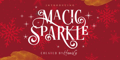 Magic Sparkle is an elegant display font designed with magical twist to create a classy feeling. It perfectly represents a classic yet modern style. This font is perfect for elegant logo design, packaging or invitation cards. Tutorial how to Install & use Alternate / Special Character : https://hanscostudio.com/tutorial/ Enjoy!
 - Bertaji by Sulthan Studio,
$12.00 A handwritten font with an eccentric style that is also charming with a soft touch makes this font very, very sweet and adorable. It's perfect for any type of work you're working various purposes such as logos, wedding invitations, headings, t-shirts, letterheads, signage, labels, news, posters, badges etc.
 - Nuuk by Hanoded,
$15.00 Nuuk is the capital of Greenland. It is the Kalaallisut word for "cape". I really like the sound of it, so I just had to name this font Nuuk. Nuuk is a whimsical, handmade serif font. It comes in four weights, each weight with its own Italic style.