10,000 search results
(0.032 seconds)
- Anahita Extra Bold by Naghi Naghachian,
$95.00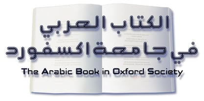 Anahita ExtraBold is designed by Naghi Naghashian. This Headline Font is developed on the basis of specific research and analysis on Arabic characters and definition of their structure. This innovation is a contribution to modernisation of Arabic typography, gives the font design of Arabic letters real typographic arrangement and provides more typographic flexibility. This step was necessary after more than two hundred years of relative stagnation in Arabic font design. Anahita supports Arabic, Persian, and Urdu. It also includes proportional and tabular numerals for the supported languages. Anahita Font is available in ExtraBold. This font is designed to be used as advertising and newspaper headlines. Anahita design fulfills the following needs: A Explicitly crafted for use in electronic media fulfills the demands of electronic communication. Anahita is not based on any pre-digital typefaces. It is not a revival. Rather, its forms were created with today's technology in mind. B Suitability for multiple applications. Gives the widest potential acceptability. C Extreme legibility not only in small sizes, but also when the type is filtered or skewed, e.g., in Photoshop or Illustrator. Anahita's simplified forms may be artificial obliqued in InDesign or Illustrator, without any loss in quality for the effected text. D An attractive typographic image. Anahita was developed for multiple languages and writing conventions. E The highest degree of geometric clarity and the necessary amount of calligraphic references. This typeface offers a fine balance between calligraphic tradition and the contemporary sans serif aesthetic now common in Latin typography.
 - Bamdad by Naghi Naghachian,
$95.00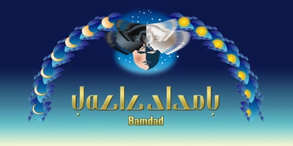 Bamdad Extra Bold Condensed is designed by Naghi Naghashian. This Headline Font is developed on the basis of specific research and analysis on Arabic characters and definition of their structure. This innovation is a contribution to modernisation of Arabic typography, gives the font design of Arabic letters real typographic arrangement and provides more typographic flexibility. This step was necessary after more than two hundred years of relative stagnation in Arabic font design. Bamdad supports Arabic, Persian, and Urdu. It also includes proportional and tabular numerals for the supported languages. Bamdad Font is available in Extra Bold Condensed. This font is designed to be used as advertising and newspaper headlines. Bamdad design fulfills the following needs: A Explicitly crafted for use in electronic media fulfills the demands of electronic communication. Bamdad is not based on any pre-digital typefaces. It is not a revival. Rather, its forms were created with today’s technology in mind. B Suitability for multiple applications. Gives the widest potential acceptability. C Extreme legibility not only in small sizes, but also when the type is filtered or skewed, e.g., in Photoshop or Illustrator. Bamdad's simplified forms may be artificial 'obliqued' in InDesign or Illustrator, without any loss in quality for the effected text. D An attractive typographic image. Bamdad was developed for multiple languages and writing conventions. E The highest degree of geometric clarity and the necessary amount of calligraphic references. This typeface offers a fine balance between calligraphic tradition and the contemporary sans serif aesthetic now common in Latin typography.
 - Parto by Naghi Naghachian,
$78.00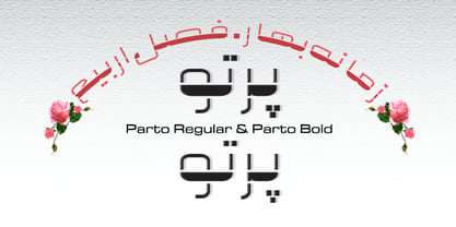 Parto Font family is designed by Naghi Naghashian. This Font is developed on the basis of specific research and analysis on Arabic characters and definition of their structure. This innovation is a contribution to modernization of Arabic typography, giving the font design of Arabic letters real typographic arrangement and providing more typographic flexibility. It enables, moreover, the use of this typeface for decorative headlines. This step was necessary after more than two hundred years of relative stagnation in Arabic font design. Parto supports Arabic, Persian, and Urdu. It also includes proportional and tabular numerals for the supported languages. Parto Font is available in Regular and Bold. Parto design fulfills the following needs: A Explicitly crafted for use in electronic media fulfills the demands of electronic communication. Parto is not based on any pre-digital typefaces. It is not a revival. Rather, its forms were created with today’s technology in mind. B Suitability for multiple applications. Gives the widest potential acceptability. C Extreme legibility not only in small sizes, but also when the type is filtered or skewed, e.g., in Photoshop or Illustrator. Parto's simplified forms may be artificial obliqued in InDesign or Illustrator, without any loss in quality for the effected text. D An attractive typographic image. Parto was developed for multiple languages and writing conventions. E The highest degree of geometric clarity and the necessary amount of calligraphic references. This typeface offers a fine balance between calligraphic tradition and the contemporary sans serif aesthetic now common in Latin typography.
 - Aban by Naghi Naghachian,
$95.00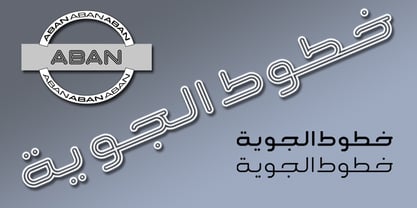 The Aban font family was designed by Naghi Naghashian. It is developed on the basis of specific research and analysis on Arabic characters and definition of their structure. This innovation is a contribution to modernization of Arabic typography, gives the font design of Arabic letters real typographic arrangement and provides more typographic flexibility. This step was necessary after more than two hundred years of relative stagnation in Arabic font design. Aban supports Arabic, Persian, and Urdu. It also includes proportional and tabular numerals for the supported languages. Aban Font Family is available in three weights: Regular, Bold and ExtraBold, a three stings outline font. The Aban design fulfills the following needs: A Explicitly crafted for use in electronic media fulfills the demands of electronic communication. Aban is not based on any pre-digital typefaces. It is not a revival. Rather, its forms were created with today’s technology in mind. B Suitability for multiple applications. Gives the widest potential acceptability. C Extreme legibility not only in small sizes, but also when the type is filtered or skewed, e.g., in Photoshop or Illustrator. Aban’s simplified forms may be artificial obliqued in InDesign or Illustrator, without any loss in quality for the effected text. D An attractive typographic image. Aban was developed for multiple languages and writing conventions. E The highest degree of geometric clarity and the necessary amount of calligraphic references. This typeface offers a fine balance between calligraphic tradition and the contemporary sans serif aesthetic now common in Latin typography.
 - Avesta Extra Bold by Naghi Naghachian,
$95.00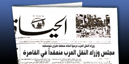 Avesta ExtraBoldCondensed is designed by Naghi Naghashian. This Headline Font is developed on the basis of specific research and analysis on Arabic characters and definition of their structure. This innovation is a contribution to modernisation of Arabic typography, gives the font design of Arabic letters real typographic arrangement and provides more typographic flexibility. This step was necessary after more than two hundred years of relative stagnation in Arabic font design. Avesta supports Arabic, Persian, and Urdu. It also includes proportional and tabular numerals for the supported languages. Avesta Font is available in ExtraBoldCondensed. This font is designed to be used as advertising and newspaper headlines. Avesta design fulfills the following needs: A Explicitly crafted for use in electronic media fulfills the demands of electronic communication. Avesta is not based on any pre-digital typefaces. It is not a revival. Rather, its forms were created with today’s technology in mind. B Suitability for multiple applications. Gives the widest potential acceptability. C Extreme legibility not only in small sizes, but also when the type is filtered or skewed, e.g., in Photoshop or Illustrator. Avesta's simplified forms may be artificial obliqued in InDesign or Illustrator, without any loss in quality for the effected text. D An attractive typographic image. Avesta was developed for multiple languages and writing conventions. E The highest degree of geometric clarity and the necessary amount of calligraphic references. This typeface offers a fine balance between calligraphic tradition and the contemporary sans serif aesthetic now common in Latin typography.
 - Bi Bi by Naghi Naghachian,
$78.00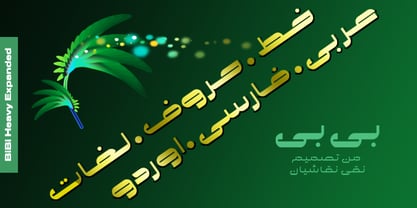 BiBi font family is designed by Naghi Naghashian. This font family is developed on the basis of specific research and analysis on Arabic characters and definition of their structure. This innovation is a contribution to modernisation of Arabic typography, gives the font design of Arabic letters real typographic arrangement and provides more typographic flexibility. This step was necessary after more than two hundred years of relative stagnation in Arabic font design. BiBi supports Arabic, Persian, and Urdu. It also includes proportional and tabular numerals for the supported languages. BiBi Font family is available in five weights: Light, Regular, Demi, Bold and Heavy; each of them in two diferent styles including normal and extended. BiBi designs fulfill the following needs: A Explicitly crafted for use in electronic media fulfils the demands of electronic communication. BiBi is not based on any pre-digital typefaces. It is not a revival. Rather, its forms were created with today’s technology in mind. B Suitability for multiple applications. Gives the widest potential acceptability. C Extreme legibility not only in small sizes, but also when the type is filtered or skewed, e.g., in Photoshop or Illustrator. BiBi's simplified forms may be artificial obliqued in InDesign or Illustrator, without any loss in quality for the effected text. D An attractive typographic image. BiBi was developed for multiple languages and writing conventions. E The highest degree of geometric clarity and the necessary amount of calligraphic references. This typeface offers a fine balance between calligraphic tradition and the contemporary sans serif aesthetic now common in Latin typography.
 - Fashion Experiment by PeachCreme,
$21.00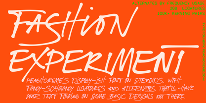 "Fashion Experiment" is an all-caps handwritten display font featuring a funky and expressive gel pen-style that is perfect for creating impactful header text, poster designs, album covers, product designs, and merchandise. The font's unique and playful appearance is crafted to maintain an authentic look, with alternative letters and ligatures adding to its creative potential. The font includes alternative letters and ligatures coded for uppercase letters. The font also features more than 100k kerning pairs, ensuring optimal precision and readability. To maintain the authentic appearance of ligatures, this font was crafted from the handwritten text. However, as ligatures that complement one combination of letters may not work for another, it is essential to have the option of switching to alternate letters or avoiding the use of ligatures altogether. The frequency of use for certain letters varies, resulting in some letters having more alternates than others. For example, letters such as A, E, L, M, S, and T are more commonly used than letters like X, Z, and Q, which explains the difference in alternate options. We recommend using programs that support OpenType features to fully access the font's features. This will allow you to access glyphs directly on the same panel without copying/pasting each glyph. Additionally, the OpenType panel allows you to turn on standard ligatures, which can automatically change letters for available ligatures. Even if you are using a program that does not support OpenType, you can still access the alternates and ligatures of this font through Fontbook or Character Map, as the glyphs are PUA-encoded. However, please note that you will have to copy and paste each ligature or alternate individually, which can be time-consuming and require extra effort. Happy designing, Gulya
 - Sharp End by Asritype,
$18.00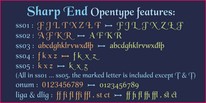 Sharp End fonts support Latin Based Languages only (see Tech Specs). Sharp End's creation is inspired by Gothic sharpness shape but only applied to the ends of normal letters. Make the font look beautiful and elegant, look as semi-serif, as calligraphic touch or others. The base of the Capital Characters is set a little bit lower than the small cases/lowercases. On small/normal size typing, the difference is less visible (obscure), but will be more visible/more clear as the typing set larger. Thus, Sharp End fonts will work well for both text and display. The fonts has also character variants. The character variations (in PUA) set in 5 stylistic sets ss01 ... ss05 (see Sharp End opentype features poster). So, these character variations will be easier accessible in more common application such as MS Words, Text Edit or the others. The glyphs may also be accessed via Character Map, Character viewer, insert character, insert symbol or other similar tools. You can use Sharp End for most of typing and design means such as: greeting, invitation, wedding and other cards; books, magazines, news, banners, logos, Pamphlets, advertising etc., for printing or digital/web display. As addition, with 3 weight variants, the regular will fit for longer text for normal use, while the bold and semi-bold is more suited for the covers, impressions, titling, Logos, design or other usage. With its smoothness curve and sharp ends, Sharp End will pairs well to most fonts of various kinds: Sans Serif, Serif, Handwritten, Scripts and others. As the example in one poster, Sharp End is paired with Astonice and Apresia Script (ornamented script font, one of the richest letter variations and ornaments). Thank you for visiting. Again, thank you very much for downloading this awesome fonts.
 - Fan Script by Sudtipos,
$99.00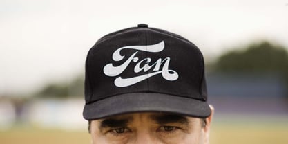 A friend of mine says that sports are the ultimate popular drug. One of his favorite things to say is, “The sun’s always shining on a game somewhere.” It’s hard to argue with that. But that perspective is now the privilege of a society where technology is so high and mighty that it all but shapes such perspectives. These days I can, if I so choose, subscribe to nothing but sports on over a hundred TV channels and a thousand browser bookmarks. But it wasn't always like that. When I was growing up, long before the super-commercialization of the sport, I and other kids spent more than every spare minute of our time memorizing the names and positions of players, collecting team shirts and paraphernalia, making up game scenarios, and just being our generation’s entirely devoted fans. Argentina is one of the nations most obsessed with sports, especially "fútbol" (or soccer to North Americans). The running American joke was that we're all born with a football. When the national team is playing a game, stores actually close their doors, and Buenos Aires looks like a ghost town. Even on the local level, River Plate, my favorite team where I grew up, didn't normally have to worry about empty seats in its home stadium, even though attendance is charged at a high premium. There are things our senses absorb when we are children, yet we don't notice them until much later on in life. A sport’s collage of aesthetics is one of those things. When I was a kid I loved the teams and players that I loved, but I never really stopped to think what solidified them in my memory and made them instantly recognizable to me. Now, thirty-some years later, and after having had the fortune to experience many cultures other than my own, I can safely deduce that a sport’s aesthetic depends on the local or national culture as much as it depends on the sport itself. And the way all that gets molded in a single team’s identity becomes so intricate it is difficult to see where each part comes from to shape the whole. Although “futbol” is still in my blood as an Argentinean, I'm old enough to afford a little cynicism about how extremely corporate most popular sports are. Of course, nothing can now take away the joy I got from football in my childhood and early teens. But over the past few years I've been trying to perceive the sport itself in a global context, even alongside other popular sports in different areas of the world. Being a type designer, I naturally focus in my comparisons on the alphabets used in designing different sports experiences. And from that I've come to a few conclusions about my own taste in sports aesthetic, some of which surprised me. I think I like the baseball and basketball aesthetic better than football, hockey, volleyball, tennis, golf, cricket, rugby, and other sports. This of course is a biased opinion. I'm a lettering guy, and hand lettering is seen much more in baseball and basketball. But there’s a bit more to it than that. Even though all sports can be reduced to a bare-bones series of purposes and goals to reach, the rules and arrangements of baseball and basketball, in spite of their obvious tempo differences, are more suited for overall artistic motion than other sports. So when an application of swashed handlettering is used as part of a team’s identity in baseball or basketball, it becomes a natural fit. The swashes can almost be visual representation of a basketball curving in the air on its way to the hoop, or a baseball on its way out of the park. This expression is invariably backed by and connected to bold, sleak lettering, representing the driving force and precision (arms, bat) behind the artistic motion. It’s a simple and natural connective analysis to a designer, but the normal naked eye still marvels inexplicably at the beauty of such logos and wordmarks. That analytical simplicity was the divining rod behind Fan Script. My own ambitious brief was to build a readable yet very artistic sports script that can be a perfect fit for baseball or basketball identities, but which can also be implemented for other sports. The result turned out to be quite beautiful to my eyes, and I hope you find it satisfactory in your own work. Sports scripts like this one are rooted in showcard lettering models from the late 19th and early 20th century, like Detroit’s lettering teacher C. Strong’s — the same models that continue to influence book designers and sign painters for more than a century now. So as you can see, American turn-of-the-century calligraphy and its long-term influences still remain a subject of fascination to me. This fascination has been the engine of most of my work, and it shows clearly in Fan Script. Fan Script is a lively heavy brush face suitable for sports identities. It includes a variety of swashes of different shapes, both connective and non-connective, and contains a whole range of letter alternates. Users of this font will find a lot of casual freedom in playing with different combinations - a freedom backed by a solid technological undercurrent, where OpenType features provide immediate and logical solutions to problems common to this kind of script. One final thing bears mentioning: After the font design and production were completed, it was surprisingly delightful for me to notice, in the testing stage, that my background as a packaging designer seems to have left a mark on the way the font works overall. The modern improvements I applied to the letter forms have managed to induce a somewhat retro packaging appearance to the totality of the typeface. So I expect Fan Script will be just as useful in packaging as it would be in sports identity, logotype and merchandizing. Ale Paul
 - Cardo - Personal use only

- NAKED - Personal use only

- Constant by Underscore,
$32.00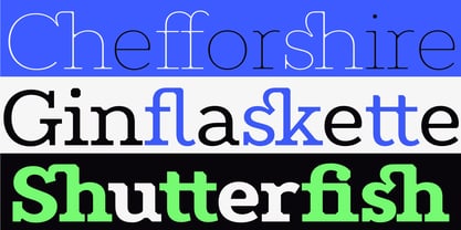 Constant is a meticulously constructed slab serif display typeface of a sturdy lineage. The strong horizontal and vertical rhythm and calculated angles dominate its appearance, yet sweeping broad shapes infuse the design with an overall warm undertone. Constant is best suited for setting short headlines, word marks, posters and other visual communication ephemera. Particular when set in all uppercase the typeface’s squarish and resolute nature commands attention and projects authority. Despite the prominent slab serifs and their angular corner details, these fonts work well also for shorter text passages, especially in the lighter to medium weights. When typesetting Constant in paragraphs spanning several lines the face requires a fair amount of leading to not appear vertically compressed. As customary for Underscore’s catalog the fonts have very extensive support for languages in the Latin script, reaching from Afrikaans to Vietnamese and Zulu. The fonts are carefully spaced, kerned and hinted, and include a variety of typographic glyphs and OpenType features like various ligatures, number features and case alternatives. Constant has been developed and released in 2018 as the proud forth release from the Underscore label. This design by Johannes Neumeier is available from the Underscore webshop as well as selected retailers.
 - Neuarc by CozyFonts,
$25.00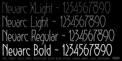 Neuarc Font Family This is the 20th font family of CozyFonts Foundry, established 10 years ago in 2012 with the release of Aladdin Bold. Neuarc is based loosely on arcs and curves, hence it’s naming. As shown in one of the font posters that serves to showcase this font, a collage of rough sketches is displayed as the poster’s background. These hand drawn pencil drawings were worked and reworked and The final drawings were scanned and built in Adobe Illustrator and transferred to glyph windows, glyph by glyph, in Fontlab 8. The 5 styles, so far, are reminisscent of The Art Deco Era of Design between the 1030s and 1950s. Neuarc also has it’s own footprint with several characters that stand out, eg. A, 8, &, B, ?, $, 5, w, x, a, c, e, etc. giving the reason for the ’Neu’ in the naming. These letterforms & Numbers work extremely well in monograms. Each styles has it’s own personality. From the ultra chic Light style to the dominant cool Bold style, this family maintains a uniform legibility at small to large sizes. Meant primarily for display uses, Neuarc works well for posters, logos, headlines, packaging, branding, signage for a myriad of applications. The Neuarc Deco style font will work well in titles and numbers of any application.
 - Lapoya by Cuchi, qué tipo,
$9.95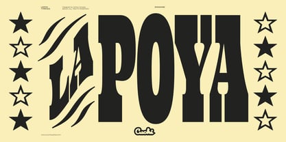 “LAPOYA” (meaning in english “the coolest”) is a large slab serif typeface family, with a certain Italian inverted contrast touch. Specially designed for advertising big shows and commerces, Lapoya has 36 variables and four axes, including a text and decorative versions, where the drawing and width of its counterforms vary. It also has icons that remember the old aesthetics of wood types from the early 20th century, and more than 400 characters with a multitude of signs and ligatures, that make Lapoya ideal for up to 89 languages. It is clearly inspired by the large wood types designed for posters, advertisements and newspapers. Since they were introduced in the 19th century, slab serifs have become extremely popular. In fact, serifs are often enlarged, not so much to look like beautiful or balanced letters, but to be more graphic and visual powerful than others. Furthermore, in the case of this typeface, this idea has been applied not only to capital letters, but also to the lowercase, numbers and signs of all kinds. “That’s why this typeface is LAPOYA!” Designed by Carlos Campos in 2023. cuchi@cuchiquetipo.com OPENTYPE FONT 426 GLYPHS 388 CHARACTERS 4 AXES 36 INSTANCES 9 LAYOUT FEATURES 89 LANGUAGES
 - Mon Nicolette by Sudtipos,
$49.00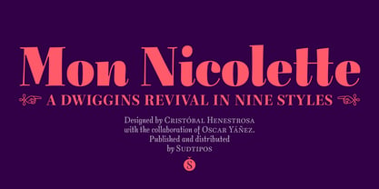 This is a digital revival by Cristóbal Henestrosa based on an experimental typeface named Charter, designed – yet never fully accomplished – by the prominent William Addison Dwiggins. It is an upright italic, unconnected script typeface, whose main features are a pronounced contrast, condensed forms and exaggerated ascenders. While Dwiggins worked on this project from 1937 to 1955, he only completed the lowercase and a few other characters. However, it was used to set a specimen in 1942 and a short novel in 1946. The sources that Cristóbal used for Mon Nicolette were the original sketches by WAD as well as printing trails kept at the Boston Public Library, and a copy of the 1946 edition of The Song-Story of Aucassin and Nicolette. This gorgeous typeface can be used successfully in headlines, subheads and short passages of text from 12 points onwards, in applications such as fashion magazines, soft news, advertising, poetry, albums, and book covers. This project started ten years ago, while Cristóbal was studying the Type@Cooper Extended Program at New York City. A previous version was selected to be part of the Biennial Tipos Latinos 2018, and now Mon Nicolette is finally ready for commercial distribution with Sudtipos… and we are very proud of it! Festina lente.
 - Momoiro by Underground,
$29.00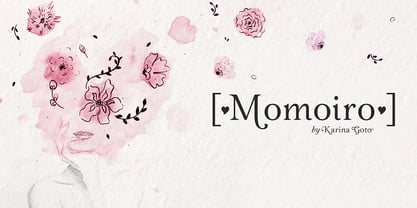 Momoiro is a feminine typeface family, designed for editorial use. "The first case in which appeared a fashion content in a magazine was in 1672 in the magazine Le Mercure Galant, which was a magazine of entertainment and varied content, including fashion. But the first illustrated and specialized magazine was Le Journal Des Dammes Et Des Modes, created in 1797. "(Fashion Trends, 2011). On the basis of this historical period, the creation of typography has characteristics of a Baroque type. "In this category we mainly include the types created in the Netherlands during the seventeenth century and whose protagonists are the punch makers Reinhard Voskens and Christoffel Van Dijck. Baroque typography stands out for its accentuated play of irregular axes and contrasts that permeate the text of great vividness. " Therefore it has contrast in the thick and thin strokes, Roman serifs, humanistic axis. With this typography, we are not looking for a re-reading of the baroque, but rather a current typeface with humanistic characteristics of the handwriting, with a brush as a differential. Momoiro comes in two weights plus italics to cover as much design needs as possible. It compliments from OpenType features such as ligatures, swashes, true fractions, old style numerals and stylistic sets.
 - Afical by Formatype Foundry,
$30.00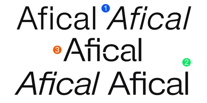 Afical update 2.0 version Afical Composed of 3 set families, consists of 35 fonts matching italic: Afical Std, Afical Neue, Afical Stencil. families all with distinctive qualities and features but share the same basic construction and proportions. Afical has been carefully crafted to focus on Text sizes and legibility with a high x-height, we developed it with Manual TrueType Hinting. Afical It's a perfect choice for publication, Packaging, logo, branding, Signage, wayfinding design systems, as well as web and screen design OpenType features: Alternate Characters SS.01, SS.02, SS.03, SS.04, SS.05, Denominators Case-Sensitive Forms, Tabular Lining, Fractions, Ordinal, Ligatures, Discretionary Ligatures, Subscript, Superscript, Language Support: 63+ (Latin based) languages Afrikaans, Albanian, Asu, Basque, Bemba-language, Bena, Danish, Dutch, English, Estonian, Faroese, Filipino, Finnish, French, Friulian, Gaelic (Irish, Scots), German, Gusii-language, Hungarian, Icelandic, Indonesian, Irish, Italian, Kabuverdianu, Kalenjin, Cornish, Luhya, Luo-Language, Machame, Madagascan, Makhuwa-Meetto, Makonde, Malayan, Manx, Morisyen, North-Ndebele-Language, Norwegian, Bokmål, Nynorsk, Nyankore, Oromo, Pare, Portuguese, Rombo, Rwandan, Rukiga, Rundi, Rwa, Samburu, Sango, Sangu, Swedish, Swiss German, Sena, Shambala, Shona, Soga, Somali, Spanish, Swahili, Taita, Teso, Vunjo, Zulu Behance Looking for custom Afical? Please send us an email at hello@formatypefoundry.com Designed 2017 Published 2021 2021 Copyright © Formatype Foundry All rights reserved
 - TT Supermolot by TypeType,
$29.00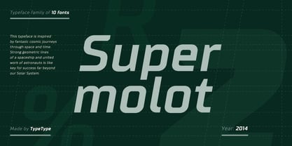 You are on the page of the old display version of the TT Supermolot font. In 2019, we released an entirely new, completely redesigned and significantly expanded version of the typeface called TT Supermolot Neue. In addition to 54 styles, TT Supermolot Neue has stylistic alternates, ligatures, old-style figures and many other useful OpenType features. Before you buy the old display version of the font, we suggest that you pay attention to the new superfamily TT Supermolot Neue and study it in more detail. - TT Supermolot Condensed is the narrow version of the TT Supermolot font family. Thanks to its open forms, TT Supermolot Condensed fits perfectly into any contemporary technological design and navigation systems. We've already seen this font family in the sports theme (as the main font for hockey teams branding), we've seen TT Supermolot as the main font inside the gameplay of a popular 3D-shooter. Information transfer in the high-tech areas is the ideal environment for this font family, also TT Supermolot Condensed fits well into army, space, and innovation themes. We've tried to create a maximum number of convenient weights (Thin, Light, Regular, Bold, Black) for you to be able to use this family anywhere, from mobile apps and web pages to big state fairs branding.
 - Targa Pro by Zetafonts,
$39.00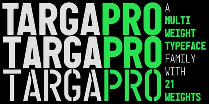 For many years license plates in Italy have been using a quite peculiar sans serif monospace typeface with slightly rounded corners and a geometric, condensed skeleton. These letterforms have been used by Cosimo Lorenzo Pancini as an inspiration for Targa, published as the first-ever Zetafonts typeface in 2003. Almost twenty years later, Francesco Canovaro has brought the project under scrutiny for a complete redesign, keeping its inventions, solving its issues, and making it into a versatile multi-weight typeface. The original type family has been developed in two subfamilies: Targa Pro Mono (which keeps the original monospace widths) and Targa Pro Roman (with proportional widths), both in five weights plus italics. The original family also included the handmade version Targa Hand which has been paired with a new Targa Pro Stencil to allow for more versatility and choice for display use. All weights of Targa Pro feature an extended latin character set covering over 200 languages, as well as a full set of Open Type features including positional numbers, alternates and stylistic sets. Halfway between postmodern appropriation of utilitarian design and rationalist design, Targa Pro sits comfortably at the crossroads between artificial nostalgia and modernist functionality, ready to surprise the user with its versatility and quirky Italian flavour.
 - Slantblaze Pro by Campotype,
$25.00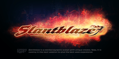 We Redesigned this Slantblaze-Pro. Slantblaze Pro is an exteme slanted display script with characteristics: Simple, Thick, Contrast, and Dynamic. First launched in 2011, and now we present it again in a new version to provide the best user experience. As italics (default), Slantblaze Pro has aloof challenge as a display font. It was designed as an alternative for headline, title in any purpose such as header, brands, packaging, identity, automotive logo, etc. What’s new and changed: This version 2.02 comes in a True Type OT-flavor version. The outline were designed to be smoother than before. Redesign of ‘C’, ‘E’, ‘F’, ‘G’, ‘T’, and some changes to all other smallcases Removed: question.sc, questiondown.sc, exclam.sc and exclamdown.sc assuming they will never be used Rewrite the features structure and adding some new related to all changes New swashed glyphs: A-Z The writing system of numbers is completed with the old-style version and each tabular and proportional method New contextual (calt) to an alternative look of “A" when combined with all lowercase. Also in this feature we have another way to access Ornaments is more interactive by combining dlig and calt features. Another new glyph may be access only in feature (salt)
 - Ladoga by ParaType,
$30.00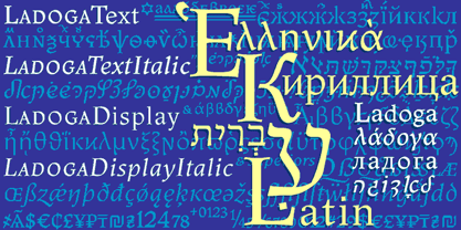 Ladoga — one of the most beautiful Russian designs from the soviet period. The type family was developed in Polygraphmash in 1968 by Anatoly Shchukin on the base of his own lettering for book covers and titles. It was one of the first attempts in Cyrillic typography to create text face in a style of renaissance antiqua. Stylization to broad pen calligraphy resembles early forms of Latin types that were based on handwritten humanistic minuscule. Unique in its character set digital version of Ladoga was designed by Viktor Kharik on the base of artworks of Shchukin for ParaType. The family consists of roman and italic styles in text and display versions. Character set includes characters of original shapes as well as more modern alternatives. Besides there are a set of additional characters, old style figures and small caps. The fonts cover all modern languages based on Latin and Cyrillic scripts, Greek alphabet (including polytonic extension), Hebrew and historical Cyrillic letters. Ladoga is gorgeous in display sizes and pretty readable in texts. It’s well suitable for fiction literature, historical books, art criticism, religious and philologist works. It will be extreme helpful for multilingual issues and for inclusions into body text historical passages in original orthography. The family was released in 2010.
 - Senlot Didone by insigne,
$35.00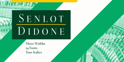 Senlot Didone enchants with this fresh and cutting-edge sequel. It’s a modern interpretation of Senlot that says glamor and seduction. The typeface adds to the original high contrast sans serif with it’s modern high contrast shape, and features a new beauty with the distinctive sinuosity of contrasting forms. Senlot Didone is the sleek, serifed, high contrast follow-up to Senlot, and it's low contrast sequel, Senlot Sans. A serif typeface suitable for text and display work joined in 2019. Senlot Didone includes a wide range of OpenType features, including titling capitals, superscripts and subscripts, and oldstyle figures. Senlot Didone is composed of 3 widths: Condensed, Normal, and Extended, with 9 weights and their italics for a total of 54 fonts with more than 800 glyphs. Senlot Didone is a great display typeface for logos, branding, packaging, and advertising. With its broad palate of options, the font covers over 72 Latin-based languages. Dress your text in any of nine separate styles from Thin to Bold. With Senlot Didone, there's no need to compromise on another font with fewer features. Simple, elegant, and versatile, Senlot Didone now makes perfect more possible. Take the show by storm with this high contrast serif. The seductive figure of Senlot Didone is here to entice your viewer.
 - Hybi5 by Hybi-Types,
$12.50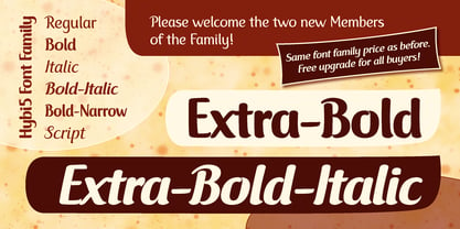 The Hybi5 font family can be described as a “crossover” between Antiqua, Grotesque and Brushscript with characteristics from all of this genres. My aim was to design friendly and versatile fonts, which can be used for headlines or slogans as well as for some longer texts. To make the fonts useful for as many languages as possible, I added a lot of exotic accents. All styles contain the whole “Adobe Latin 3 (CE)” character set plus a few letters from “Adobe Latin 4”. A lot of ligatures prettify the look of the fonts. Alternate uppercase letters in the script style might do the same. If you are a professional designer, you will surely appreciate the thousands of kerning pairs within each style, which will make your work easier. I recommend to set Kerning to “metric” and spacing to “zero” in your layout app. Back in 2015 I worked on the first sketches of “Hybi5” using Adobe Illustrator. “Fontself Maker”, an extension for Illustrator, was used to convert the drawings into font-files. This tool can only create “OTF” font files. For this reason there are no “TTF” versions. It’s not the first font I have ever made, but the first to be distributed commercially.
 - Bodrum Stencil by Bülent Yüksel,
$19.00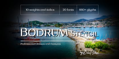 Bodrum Collection: 1- Bodrum Sans 2- Bodrum Sweet 3- Bodrum Stencil 4- Bodrum Slab 5- Bodrum Styte 6- Bodrum Soft Bodrum Stencil is a stencil serif type family. Designed by Bülent Yüksel in 2018/19. The font, influenced by style serifs, popular in the 1920s and 30s, is based on optically corrected geometric forms for better readability. Bodrum Stencil is not purely geometric; it has vertical strokes that are thicker than the horizontals, an “o” that is not a perfect circle, and shortened ascenders. These nuances aid in legibility and give "Bodrum Stencil" a harmonious and sensible appearance for both texts and headlines. Bodrum Stencil provides advanced typographical support for Latin-based languages. An extended character set, supporting Central, Western and Eastern European languages, rounds up the family. The designation “Bodrum Stencil 14 Regular” forms the central point. "Bodrum Stencil" is available in 10 weights (Hair, Thin, Extra-Light, Light, Regular, Meduim, Bold, Extra-Bold, Heavy and Black) and 10 matching italics. The family contains a set of 650+ characters. Case-Sensitive Forms, Classes and Features, Small Caps from Letter Cases, Fractions, Superior, Inferior, Denominator, Numerator, Old Style Figures just one touch easy In all graphic programs. Bodrum Stencil is the perfect font for web use.
 - 1812 by Apostrof,
$40.00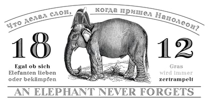 '1812' type family is a revival and further development of the typeface '1812' by Lehmann Type Foundry (St. Petersburg). It was created for the centenary of the French invasion of Russia, known in Russia as the Patriotic War of 1812 along the lines of decorative engraved inscriptions and ornamented typefaces of that time, presumably by the artist Alexandre Benois. It was used mainly for the decoration of luxurious elegant publications. Later, in 1917, this typeface was used on the Russian Provisional Government banknotes. In the Soviet period of time '1812' appeared to be one of the few typefaces included in the first Soviet type standard OST 1337. It was produced for manual typesetting until the early 1990s. This typeface could be seen on Soviet letterheads, forms, posters and even air tickets. The digital version development was launched in 2010. The original version was supplemented with lowercase letters and alternative symbols, the extended Latin and Cyrillic alphabets were fully supported. The font was evolved into a family of 14 decorative styles which can refine any design giving it a festive and elegant but at the same time strict and nostalgic look. Despite its decorative nature, '1812' is perfectly readable in small emphasized text blocks due to its classic shape and careful spacing.
 - Hangulatin EN by URW Type Foundry,
$99.99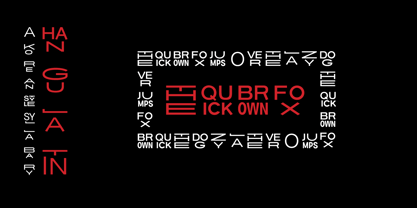 To obtain maximum pleasure in working with Hangulatin, please use the typeface as follows: 1 Open an OpenType-savvy program 2 Select the "Hangulatin“ typeface. 3 Copy the following test text into your document: HEL LO WORLD ! THE QUICK BROWN FOX JUMPS O VER THE LA ZY DOG . If this fails to bring about the desired result, please make sure that you are using an OpenType-savvy program and that usage of the OpenType features is activated in that program. Standard graphic programs are suited to that purpose. The same applies to Microsoft Word starting from the 2010 version upwards.To have fun and success with your new typeface, please write all words in the format shown in the sample text, i.e. all syllables need to be written in capital letters and separated from one another using spacecharacters (for single letters leave 2 spaces). If, however, a desired syllable is not to be substituted, proceed as follows: Please check + to see whether it is a word from the English language; + whether the word has been spelled correctly; + whether the word has been subdivided into syllables correctly; + whether the syllable has been terminated with a space character (allow 2 spaces for single letters).
 - Duepuntozero Pro by Zetafonts,
$39.00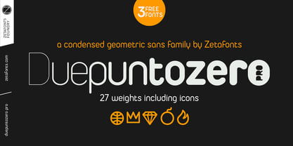 Created as a logo typeface in 2004 by Francesco Canovaro, Duepuntozero is one of Zetafonts classic typefaces. A monolinear sans serif typeface with rounded corners and condensed proportions, strictly based on modular geometric design, it was at first designed in five weights to be used as a condensed companion typeface to the rounded display family Arista. In 2019 the family was completely redesigned by the Zetafonts Team, expanding the original character set to include cyrillic and greek glyphs and adding four extra weights and italics to the original weight range. This restored and revamped version, named Duepuntozero Pro, also includes full Open Type features for positional figures, fractions and Small Caps. With his rounded, minimal aesthetic, Duepuntozero embodies the desire for simplicity and playfulness of contemporary mobile applications, making it a perfect choice for gaming and app interface design. Its compact design allow for maximum space saving on mobile screens when used as a text typeface, while the strictly geometric design and the extreme range of weights (including thin and black) make it excel in display, logo and editorial use. A complementary set of free icons in the same range of weights of the font is provided to help designers build consistent branding through pictograms in infographics, interfaces and editorial products.
 - Change Serif by Borutta Group,
$39.00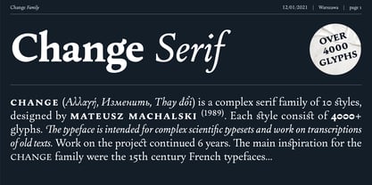 Change Serif is a typeface family designed as a part of Mateusz Machalski's PhD project, carried out in 2015-2021. The main goal was to create a typeface allowing for the typesetting of complex humanistic texts, containing many historical letterforms. The starting point was the preparation of most of the glyphs provided in unicode for Latin, Cyrillic and Greek. From the formal point of view, the Change family is based on Renaissance proportions with contemporary details. Classic upright version is paired with expressive and calligraphic italics, inspired by the works of Robert Granjon. Each of the styles contains about 4,000 characters, allowing for a broad range of typesetting capabilities – multiscript publications, historical translations, and texts transcription. The crucial aspect was to treat all scripts equally. All OpenType features, such as swashes, final forms, decorative ligatures, can be found in Latin, Cyrillic and also Greek. The name of the typeface refers to the design process in which there are constant changes and corrections. On the other hand, it means to convey how this project influenced my perception of typography and allowed me to embrace it as a medium of artistic expression. Due to its similar proportions, Change works perfectly with the Gaultier typeface.
 - TT Supermolot Condensed by TypeType,
$29.00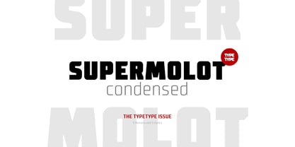 You are on the page of the old display version of the TT Supermolot Condensed font. In 2019, we released an entirely new, completely redesigned, and significantly expanded version of the typeface called TT Supermolot Neue. In addition to 54 styles, TT Supermolot Neue has stylistic alternates, ligatures, old-style figures and many other useful OpenType features. Before you buy the old display version of the font, we suggest that you pay attention to the new superfamily TT Supermolot Neue and study it in more detail. - TT Supermolot Condensed is the narrow version of the TT Supermolot font family. Thanks to its open forms, TT Supermolot Condensed fits perfectly into any contemporary technological design and navigation systems. We've already seen this font family in the sports theme (as the main font for hockey teams branding), we've seen TT Supermolot as the main font inside the gameplay of a popular 3D-shooter. Information transfer in the high-tech areas is the ideal environment for this font family, also TT Supermolot Condensed fits well into army, space, and innovation themes. We've tried to create a maximum number of convenient weights (Thin, Light, Regular, Bold, Black) for you to be able to use this family anywhere, from mobile apps and web pages to big state fairs branding.
 - Retrio by Luxfont,
$18.00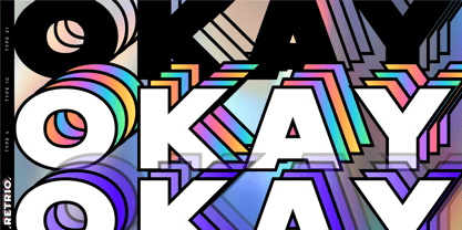 Introducing Retrio. Original glyphs with echoed behind. As if the letters were moved, but the kinetic trail remained. Colored, gradient, with transparency or solid - many options in one family for any task and for every taste. The font will emphasize the style of the 20th century in illustration. Discos, electro music, records, nostalgia - these are the associations that this font family evokes, which is very important in design. At the same time, the Retrio font is not outdated, it was created taking into account modern trends in retro themes. A unique family in which there are both color and classic monochrome versions. Great versatility in use is provided by the many fonts in the set. Great for ad designs, posters, headlines and covers. Check the quality before purchasing and try the FREE DEMO version of the font to make sure your software supports color fonts. P.s. Have suggestions for color combinations? Write me an email with the subject "Retrio Color" on: ld.luxfont@gmail.com Features: - Free Demo font to check it works. - Uppercase and lowercase the same size. - With transparency and without. - Mega high-quality gradients in letters. - Kerning. IMPORTANT: - Multicolor version of this font will show up only in apps that are compatible with color fonts, like Adobe Photoshop CC 2017.0.1 and above, Illustrator CC 2018. Learn more about color fonts & their support in third-party apps on www.colorfonts.wtf -Don't worry about what you can't see the preview of the font in the tab "Individual Styles" - all fonts are working and have passed technical inspection, but not displayed, they just because the website MyFonts is not yet able to show a preview of colored fonts. Then if you have software with support colored fonts - you can be sure that after installing fonts into the system you will be able to use them like every other classic font. Question/answer: How to install a font? The procedure for installing the font in the system has not changed. Install the font as you would install the classic fonts. How can I change the font color to my color? · Adobe Illustrator: Convert text to outline and easily change color to your taste as if you were repainting a simple vector shape. · Adobe Photoshop: You can easily repaint text layer with Layer effects and color overlay. ld.luxfont@gmail.com
 - Anaglyph by Luxfont,
$18.00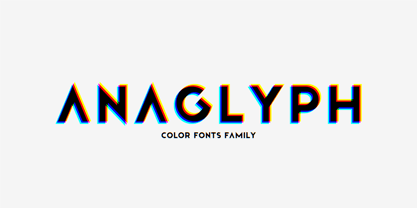 Introducing incredible COLOR ANAGLYPH font. Unique font family with anaglyph stereo effect - a novelty in the field of color fonts. Inspired by global trends in contemporary design with a touch of retro 90s, electric music and minimalistic purity of glyphs. Truly a reflection of modern POP culture. Font is ideal in entertainment design. Night club poster design, fashionable business card, website title, magazine illustration - there are countless options for using it. Font family has two thicknesses - bold & regular, 3 types of stereo effect, 2 font colors with stereo effect (black and white). Font consists of letters of the same height without division into uppercase and lowercase glyphs. This font family is based on the Regular & Bold fonts Boldini - which means that if necessary you can combine these two families and they will be absolutely stylistically identical and complement each other. Check the quality before purchasing and try the FREE DEMO version of the font to make sure your software supports color fonts. Features: Free Demo font to check it works. 36 OTF SVG fonts in the family 2 thicknesses: Bold, Regular 3 types of stereo anaglyph effect 6 font colors with stereo effect Kerning IMPORTANT: - OTF SVG fonts contain vector letters with gradients and transparency. - Multicolor OTF version of this font will show up only in apps that are compatible with color fonts, like Adobe Photoshop CC 2017.0.1 and above, Illustrator CC 2018. Learn more about color fonts & their support in third-party apps on www.colorfonts.wtf - Don't worry about what you see all fonts in black and not in multicolor in the tab “Individual Styles” - all fonts are working and have passed technical inspection, but not displayed in multicolor they, just because the website MyFonts is not yet able to show a preview of colored fonts. Then if you have software with support colored fonts - you can be sure that after installing fonts into the system you will be able to use them like every other classic font. Question/answer: How to install a font? The procedure for installing the font in the system has not changed. Install the font as you would install the classic OTF | TTF fonts. How can I change the font color to my color? · Adobe Illustrator: Convert text to outline and easily change color to your taste as if you were repainting a simple vector shape. · Adobe Photoshop: You can easily repaint text layer with Layer effects and color overlay. ld.luxfont@gmail.com
 - Rocking the Kasbah NF by Nick's Fonts,
$10.00This lively script is based on a handlettered offering from The Hunt Brothers, which they called simply "Ornamental Italic". Ornamental, yes, but there’s also a lot of action and attitude in this typeface. Please note that, due to the extreme slant of the characters, spacing in the font has been optimized for upper- and lowercase use. Both versions of this font contain complete Unicode 1252 (Latin) and Unicode 1250 (Central European) character sets, with localization for Romanian and Moldovan. - Oval Scalloped MNG by MonogramBros,
$12.00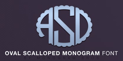 Oval Scalloped Monogram is a perfect shaped monogram font consisting of 78 letters and 1 basic frame. With just a single font file you will be able to create beautiful monograms in just a matter of minutes after the purchase! Oval Scalloped Monogram Font comes with font file in OTF format. It features all the modern advanced font features such as Contextual Alternates, effectively eliminating the need to use multiple separate font files for left, center and right letters.
 - Starlight Ballroom NF by Nick's Fonts,
$10.00Cross the irrepressible Samuel Welo with a bit of found matchbook art and voilà! You have this retro charmer, proudly found on the kind of neon signs that offered an invitation to dine and dance. To continue the baseline treatment between words—or to extend it on either side—use the _Underscore character. Both versions of the font include complete Latin 1252, Central European 1250 and Turkish 1524 character sets, with localization for Moldovan, Romanian and Turkish. - Alonida by Kartiny Type,
$12.00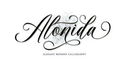 Alonida is an Elegant script font that comes with very beautiful character changes, a classic copper decorative script type with a modern touch, designed with high detail to present an elegant style. I also offer a number of decent stylistic alternatives for some of the letters. Classic style is very suitable to be applied in various formal forms such as invitations and others If you need help or have questions, let me know. I'm happy to help.
 - SK Yok Deve by Salih Kizilkaya,
$9.00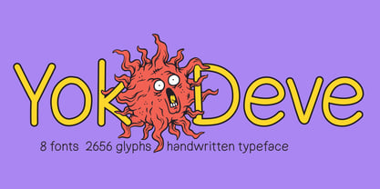 SK Yok Deve is a handwritten font. It is designed for use in cartoons, comics or illustrations. Special kerning settings have been made for easy reading in small areas such as speech bubbles. It offers full support for the Latin alphabet and contains many typographic elements. In this way, you can easily use it in your designs. This font family includes 8 fonts and 2656 glyphs. In this way, it contains many typographic materials you will need.
 - Another Monday by Hanoded,
$15.00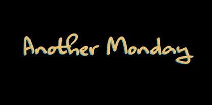 I started this font on a Monday and I finished it the Monday after, so I guess the name is right! Another Monday started off as a bit of doodling (with a Sharpie pen) on a piece of paper. Before I knew it, I had a complete glyph set and it looked nice. Another Monday is a bit messy, uneven and maybe even a little weird, but it will look good on postcards, packaging and labels.
 - Ye Olde Block NF by Nick's Fonts,
$10.00Lewis F. Day, in his book Alphabets Old and New, offered this typeface as an example from sixteenth-century England of lettering incised in wood. The font is essentially monocase, but there several lowercase letters are alternate letterforms. Please note that, due to the ornate nature of the letterforms, this font does not contain math operators, fractions or superior numbers. Both versions of the font include 1252 Latin and 1250 CE (with localization for Romanian and Moldovan) character sets. - Logisco by Ideabuk,
$16.00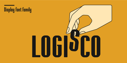 Introducing Logisco - a sleek and versatile display font family that combines modern geometry with a retro-cool vibe. This six-font collection boasts soft, rounded corners that add a dash of playfulness to any project. Logisco Light, Regular, and Bold offer a range of weights to fit any typographic need, while the Stencil variations add a unique edge to your designs. Whether you're creating sleek logos or funky posters, Logisco has you covered with its stylish and versatile letterforms.
 - Sasmitha Script by Cooldesignlab,
$13.00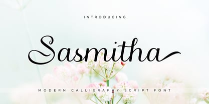 Sasmitha is a Modern Script font that comes with a very beautiful character change, a classic copper decorative script font with a modern touch, designed with great detail to present an elegant style. Sasmitha is interesting because the typeface is pleasing to the eye, clean, feminine, sensual, glamorous, simple and very easy to read, because of the many luxurious letter connections.I also offer a number of decent stylistic alternatives for some of the letters. Thank You

