10,000 search results
(0.031 seconds)
- PT Lightning by ParaType,
$25.00Lightning font was developed for the series of handwriting fonts based on the writing samples of real people. The font delivers natural sincere touch and can magically convert any stupid advertising text into intimate advice of your good friend. Cyrillic version was developed by Gennady Fridman in 2009. - Jaquizaca by Lamatas un Slazdi,
$19.00 Jaquizaca is hand drawn type to go well with vector illustrations. Jaquizaca was created in 2001 to make inter-titles for a TV-programme. After twelve years it was revised and updated with ligatures, contextual alternates and other OpenType features. It supports all the European languages using Latin alphabet.
 - Scriptonah by Jonahfonts,
$39.95 A script font family which include 4 variations, Light, Regular, DemiBold and Bold. An easily-legible font useful for notes, invitations and announcements, also for the package designer Read John Downers' article in Typographica®: ‘Our Favorite Typefaces of 2007’ https://typographica.org/typeface-reviews/scriptonah-and-casual-brush/
 - HiH Firmin Didot by HiH,
$10.00 Before Bodoni, there was Didot. With the publication by Francois Ambroise Didot of Paris in 1784 of his prospectus for Tasso’s La Gerusalemme Liberata, the rococo typographical style of Fournier de Jeune was replaced with a spartan, neo-classical style that John Baskerville pioneered. The typeface Didot used for this work was of Didot’s own creation and is considered by both G. Dowding and P. Meggs to be the first modern face. Three years later, Bodoni of Parma is using a very similar face. Just as Bodoni’s typeface evolved over time, so did that of the Didot family. The eldest son of Francois Ambroise Didot, Pierre, ran the printing office; and Firmin ran the typefoundry. Pierre used the flattened, wove paper, again pioneered by Baskerville, to permit a more accurate impression and allow the use of more delicate letterforms. Firmin took full advantage of the improved paper by further refining the typeface introduced by his father. The printing of Racine’s Oeuvres in 1801 (seen in our gallery image #2) shows the symbiotic results of their efforts, especially in the marked increase in the sharpness of the serifs when compared to their owns works of only six years earlier. It has been suggested that one reason Bodoni achieved greater popularity than Didot is the thinner hairlines of Didot were more fragile when cast in metal type and thus more expensive for printers to use than Bodoni. This ceased to be a problem with the advent of phototypesetting, opening the door for a renewed interest in the work of the Didot family and especially that of Firmin Didot. Although further refinements in the Didot typeface were to come (notably the lower case ‘g’ shown in 1819), we have chosen 1801 as the nominal basis for our presentation of HiH Firmin Didot. We like the thick-thin circumflex that replaced the evenly-stroked version of 1795, possible only with the flatter wove paper. We like the unusual coat-hanger cedilla. We like the organic, leaf-like tail of the ‘Q.’ We like the strange, little number ‘2’ and the wonderfully assertive ‘4.’ And we like the distinctive and delightful awkwardness of the double-v (w). Please note that we have provided alternative versions of the upper and lower case w that are slightly more conventional than the original designs. Personally, I find the moderns (often called Didones) hard on the eyes in extended blocks of text. That does not stop me from enjoying their cold, crisp clarity. They represent the Age of Reason and the power of man’s intellect, while reflecting also its limitations. In the title pages set by Bodoni, Bulmer and Didot, I see the spare beauty of a winter landscape. That appeals to a New Englander like myself. Another aspect that appeals to me is setting a page in HiH Firmin Didot and watching people try to figure out what typeface it is. It looks a lot like Bodoni, but it isn't!
 - LT Sweet Nothings - Personal use only

- PROG.BOT - 100% free

- Kis Antiqua Now TB Pro by Elsner+Flake,
$99.00 In the course of the re-vitalization of its Typoart typeface inventory, Elsner+Flake decided in 2006 to offer the “Kis Antiqua” by Hildegard Korger, in a re-worked form and with an extended sortiment, as an OpenType Pro-version. After consultation with Hildegard Korger, Elsner+Flake tasked the Leipzig type designer Erhard Kaiser with the execution of the re-design and expansion of the sortiment. Detlef Schäfer writes in “Fotosatzschriften Type-Design+Schrifthersteller”, VEB Fachbuchverlag Leipzig, 1989: No other printing type has ever generated as far-reaching a controversy as this typeface which Jan Tschichold called the most beautiful of all the old Antiqua types. For a long time, it was thought to have been designed by Anton Janson. In 1720 a large number of the original types were displayed in the catalog of the „Ehrhardische Gycery“ (Ehrhardt Typefoundry) in Leipzig. Recently, thanks to the research performed by Beatrice Warde and especially György Haimann, it has been proven unambiguously that the originator of this typeface was Miklós (Nicholas) Tótfalusi Kis (pronounced „Kisch“) who was born in 1650 in the Hungarian town of Tótfal. His calvinistic church had sent him to the Netherlands to oversee the printing of a Hungarian language bible. He studied printing and punch cutting and earned special recognition for his Armenian and Hebrew types. Upon his return to Hungary, an emergency situation forced him to sell several of his matrice sets to the Ehrhardt Typefoundry in Leipzig. In Hungary he printed from his own typefaces, but religious tensions arose between him and one of his church elders. He died at an early age in 1702. The significant characteristics of the “Dutch Antiqua” by Kis are the larger body size, relatively small lower case letters and strong upper case letters, which show clearly defined contrasts in the stroke widths. The “Kis Antiqua” is less elegant than the Garamond, rather somewhat austere in a calvinistic way, but its expression is unique and full of tension. The upper and lower case serifs are only slightly concave, and the upper case O as well as the lower case o have, for the first time, a vertical axis. In the replica, sensitively and respectfully (responsibly) drawn by Hildegard Korger, these characteristics of this pleasantly readable and beautiful face have been well met. For Typoart it was clear that this typeface has to appear under its only true name “Kis Antiqua.” It will be used primarily in book design. Elsner+Flake added two headline weights, which are available as a separate font family Kis Antiqua Now TH Pro Designer: Miklós (Nicholas) Tótfalusi Kis, 1686 Hildegard Korger, 1986-1988 Erhard Kaiser, 2008
 - Erpos by Baqoos,
$18.00 Erpos is a dynamic soften integral tech sans= apt for headline, editorial, branding, packaging, printed materials and typographic applications. 200+ glyphs with ligatures and fractions provided in opentype .otf and .woff format.
 - Jolgoria in Town - Personal use only

- Anno by Linotype,
$29.99The impulse behind André Maaßen’s design of the Anno typeface was the design of a New Year’s card for the year 2000 (Anno 2000). His desire to create the perfect printed image developed into a family with four styles: Anno 1, Anno 1 Italic, Anno 2, and Anno 2 Italic. Anno 1 and its Italic are semi-classicist typefaces, with a high degree of stroke contrast, while Anno 2 and its Italic are semi-grotesks, with less stroke contrast. Both Anno 1 and Anno 2 are sans serifs typefaces, but they each offer a new interpretation of the genre. The Anno typeface may be used in a number of applications and sizes. And it is naturally suitable for New Year’s greetings and other cards, of course! - Mitigate by Typodermic,
$11.95 In the fast-paced world of journalism, time is always of the essence. That’s why we need tools that work as quickly as we do. And in the world of typography, Mitigate is the answer. Mitigate is the condensed slab-serif typeface that every designer needs in their arsenal. You see, in a world of broad and regular typewriter fonts, Mitigate stands out with its compact design that makes it perfect for fitting in more text in less space. But that’s not all. Mitigate also features two distressed styles, giving your text that authentic typewriter effect that readers love. And if you’re using OpenType-aware apps, you’ll appreciate the custom ligature combinations that make your text even more unique. So, don’t let your message get lost in a sea of words. Choose Mitigate and make your words stand out. Most Latin-based European writing systems are supported, including the following languages. Afaan Oromo, Afar, Afrikaans, Albanian, Alsatian, Aromanian, Aymara, Bashkir (Latin), Basque, Belarusian (Latin), Bemba, Bikol, Bosnian, Breton, Cape Verdean, Creole, Catalan, Cebuano, Chamorro, Chavacano, Chichewa, Crimean Tatar (Latin), Croatian, Czech, Danish, Dawan, Dholuo, Dutch, English, Estonian, Faroese, Fijian, Filipino, Finnish, French, Frisian, Friulian, Gagauz (Latin), Galician, Ganda, Genoese, German, Greenlandic, Guadeloupean Creole, Haitian Creole, Hawaiian, Hiligaynon, Hungarian, Icelandic, Ilocano, Indonesian, Irish, Italian, Jamaican, Kaqchikel, Karakalpak (Latin), Kashubian, Kikongo, Kinyarwanda, Kirundi, Kurdish (Latin), Latvian, Lithuanian, Lombard, Low Saxon, Luxembourgish, Maasai, Makhuwa, Malay, Maltese, Māori, Moldovan, Montenegrin, Ndebele, Neapolitan, Norwegian, Novial, Occitan, Ossetian (Latin), Papiamento, Piedmontese, Polish, Portuguese, Quechua, Rarotongan, Romanian, Romansh, Sami, Sango, Saramaccan, Sardinian, Scottish Gaelic, Serbian (Latin), Shona, Sicilian, Silesian, Slovak, Slovenian, Somali, Sorbian, Sotho, Spanish, Swahili, Swazi, Swedish, Tagalog, Tahitian, Tetum, Tongan, Tshiluba, Tsonga, Tswana, Tumbuka, Turkish, Turkmen (Latin), Tuvaluan, Uzbek (Latin), Venetian, Vepsian, Võro, Walloon, Waray-Waray, Wayuu, Welsh, Wolof, Xhosa, Yapese, Zapotec Zulu and Zuni.
 - Diamond Braille by Echopraxium,
$5.00 Here is a "Decorative Braille font". The initial design was indeed drawn on a K.I.S.S digital sketchpad, the Windows default drawing tool (Microsoft Paint, classic version). A. Glyph Concept The Braille 2x3 dot matrix is weaved around a diamond-shape. a.1. Each "dot" is represented by a "right-angle isocel triangle". a.2. Braille dots in Diamond Braille a.2.I. "Dots" are outside the diamond for first Braille row (Braille dots 1, 4) and third Braille row (Braille dots 3, 6). a.2.II. "Dots" are inside the diamond for second Braillle row (Braille dots 2, 5). a.3. Diamond lattice Glyphs are connected horizontally (to/bottom diamond's corners) and vertically (left/right corners) to each other (see poster 5). a.4. Special Glyphs - Space: its is either empty ("Empty cell") or a "non Braille shape" { _, ° } depending on your display needs (as explained in b.3.II) - 6 dots: { £, =, û } - 6 empty dots: { ç, ¥ } B. Font user guide b.1. Lowercase glyphs { A..Z } In these glyphs the "dots" are represented as a white right-angle isocel triangle filled with a smaller black triangle. b.2. Uppercase glyphs { a..z } In these glyphs, the "dots" are represented as an empty triangle (this is an "empty dot"). b.3. 'Space' vs 'Empty Cell' b.3.I. 'Space' - 'Space' glyph is an empty shape - '¶' glyph (at the end of each line in Microsoft Word) is also an empty shape b.3.II. 'Empty cell' glyphs: _ (underscore), ° (degree). In these glyphs there are 2 "empty dots" at top and bottom corners of the diamond, which differentiates them from regular Braille glyphs (which dont have a "dot in the middle"). b.4. Diamond Lattice To display text as a 'diamond lattice', replace each 'Space' by an 'Empty cell' (as explained in b.3.II, see poster 5) b.5. Connectors The connector glyphs allow the creation of "circuit like" designs (see poster 1). Here are the connector glyphs: { µ, à, â, ä, ã, è, é, ê, ë, î, ï } b.6. Domino feature Some Glyphs represent numbers 1..6 in a way which is similar than on dominos (see poster 6) C. Posters Poster 1: the "Font Logo", it displays "Diamond Braille" text together with the Connectors feature. Poster 2: a pangram which is published on pangra.me ( "Adept quick jog over frozen blue whisky mix" ). Poster 3: an illustration of the Domino feature. Poster 4: a DiamondBraille version of the Periodic table. Poster 5: illustration of the Diamond lattice using only 6 dots ( û ) and 6 empty dots ( ç ) glyphs.
 - Paneuropa 1931 by ROHH,
$19.00 Paneuropa 1931™ is a faithful recreation of XX-century Polish classic, made by Idzikowski foundry in Warsaw, 1931. Original Paneuropa was a renowned and highly popular typeface in XX-century Poland, and was widely used in all kinds of design, editorial use and printed materials for decades. Paneuropa is a geometric, clean and versatile font family inspired by Paul Renner's famous Futura - it is a bit narrower, with different proportions and details in drawing, completely different figures and punctuation shapes than Futura. It is an interesting and refreshing alternative to Futura with its own distinct personality and a subtle authentic vintage flavour. Paneuropa 1931 contains separate styles for display and large sizes as well as styles for small text sizes - differing in spacing and the softness of letterforms. The family features an original Paneuropa Double font - a beautiful inline style for headlines and display use. The whole family is completed with added missing inbetween styles as well as italics. The original subfamily set is available for purchase and it contains solely the original Paneuropa styles (Thin, Regular, Bold, Text Regular, Text Italic, Double). Paneuropa 1931 characteristics: letter shapes and proportions are very faithful to the original, keeping its idiosycrasies and inconsistencies spacing and kerning are carefully adjusted in order to achieve the colour of the original fonts, keeping maximum possible consistency - a compromise between authentic vintage feel and legible consistent text colour (for hardcore users: just turn off the kerning) weights precisely matching the original (Thin, Regular, Bold, Text Regular, Text Italic, Double), inbetween weights were added (Light, Demi Bold, as well as missing italic styles) italic angle faithful to the original (8 degrees) softened corners help achieving the character of old imprecise printed display styles for big sizes are sharper and have tight spacing, text styles have softer shapes (recreating small print imperfect print) and broader spacing for use in paragraph text (spacing in both display and text styles matches the original as well) original style names in Polish for devices with Polish set as their primary language The family is very versatile. The Inline style as well as bold and thin weights are perfect for headlines and display use, other styles works wonderfully as paragraph text. Paneuropa 1931 consists of 18 fonts - 5 display weights with corresponding italics + 3 text weights with corresponding italics + 2 inline styles (for big and small print sizes). It has extended support for latin languages, as well as broad number of OpenType features, such as case sensitive forms, fractions, superscript and subscript, ordinals, currencies and symbols.
 - Cocogoose Pro by Zetafonts,
$39.00 Discover Cocogoose Pro Narrow Weights! Designed by Cosimo Lorenzo Pancini in 2013, Cocogoose was first expanded in 2015 with the help of Francesco Canovaro who co-designed the decorative display weights and Andrea Tartarelli who developed the condensed widths. In 2020 a full redesign of the typeface has been published: Cocogoose Pro now includes new widths, weights, open type features and characters, thanks to the help of Mario De Libero. Influenced by vernacular sign-painting and modernist ideals, Cocogoose is drawn on a classic geometric sans skeleton, softened by rounded corners and slight visual corrections. Its very low contrast, dark color and tall x-height make it a solid choice for all designers looking for a powerful display typeface for logos, headings and vintage-inspired branding. The tall x-height makes texts set in Cocogoose very readable even at small sizes, while the bold regular weight allows for maximum impact when used as a branding, signage or decorative typeface. Cocogoose Pro was designed as a highly reliable tool for design problem solving, and given all the features a graphic designer needs, starting from its wide range of widths and weights. Its 2000+ latin, cyrillic and greek characters make sure it covers over 200 languages worldwide, while its comprehensive set of open type features allows faultless typesetting thanks to small capitals, positional numbers & case sensitive forms. A wide range of alternate letterforms, developed along nine different stylistic sets, gives you an extra level of design fine-tuning. The layerable and color-ready display variants include inline, outline, shadow and a letterpress version that can simulate the effect of old print, also thanks to programmed randomization of its letters. Cocogoose Pro has been completely re-engineered in 2020 to include extra features and technologies. A variable font version allows you to fine tune precisely the appearance of the text while minimizing download size on the web. A darkmode weight range has been added to the whole family, to keep consistency of effect when the typeface is used in reverse on the web and in dark mode interfaces. Also, a new text subfamily has been developed for body text usage, to keep the look and feel of Cocogoose while maximizing readability on screen and on the printed page.
 - Mandalika by Sarid Ezra,
$17.00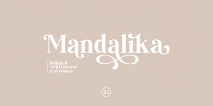 Mandalika is a bold and elegant serif with a bunch of ligatures and alternates that will make your presentation or logo even more stunning and stand out! Mandalika also contains multi-lingual support and PUA encoding. Features: Uppercase & Lowercase Numbers & Symbols Multi-Lingual Support Ligatures Alternates for each characters PUA Encoded Don't hesitate to send me an email at saridezra@gmail.com
 - Moonthyu by Skiiller Studio,
$20.00 Moonthy is a beautiful type of script font, There are more than 150 alternate encoded PUAs suitable for graphic design and other needs What's include: Ligature Stylistic set for lowercase Stylistic set for Ending\ PUA Encoded Characters - Fully accessible without additional design software. Basic Latin Language Support (AÀÁÂÃÄÅCÇDÐEÈÉÊËIÌÍÎÏÑOØÒÓÔÕÖUÙÜÚÛWYÝŸÆß ) How to access alternate glyphs? you can see it on this link ( http://goo.gl/1vy2fv )
 - Rachetty by Balevgraph Studio,
$12.00 Rachetty is a stylish and delicate script font. It has a clean, thin and smooth vibe and it will be a hit for any design that you want to add it to. This font is PUA encoded which means you can access all of the glyphs with ease! What's Included? Uppercase & Lowercase Numbers & Punctuation Ligature, Alternate & Swashes Multilingual Support PUA Encoded
 - Betrand by Balevgraph Studio,
$12.00 Betrand is a thin lettered and graceful script font. Fall for its ravishing style and use it to create gorgeous wedding invitations, beautiful stationary art, eye-catching social media posts, and much more! This font is PUA encoded which means you can access all of the glyphs with ease! What's Included? Uppercase & Lowercase Numbers & Punctuation Ligature, Alternate & Swashes Multilingual Support PUA Encoded
 - Strike Brush by Rockboys Studio,
$29.00 Strike Brush is a new modern brush font, incredibly adaptable to all sorts of designs. It is suitable for any branding, product packaging, invitation, quote, t-shirt, label, poster, logo that you wish to create. PUA encoded = Accessible in the Adobe Illustrator, Adobe Photoshop, Adobe InDesign, even work on Microsoft Word. PUA Encoded Characters - Fully accessible without additional design software.
 - Brushtter by Rockboys Studio,
$15.00 Brushtter is a modern brushed display font, incredibly adaptable to all sorts of urban or street related designs. It is suitable for any branding, product packaging, invitation, quote, label, poster, logo that you wish to create. PUA encoded = Accessible in the Adobe Illustrator, Adobe Photoshop, Adobe InDesign, even work on Microsoft Word. PUA Encoded Characters - Fully accessible without additional design software.
 - The Tiresome by Create Big Supply,
$15.00 The Tiresome is a sans serif brush font that has bold, strong, bold characters. This will add a very unique and powerful touch to your design. This font is PUA encoded which means you can access all the glyphs and sweeps easily Features: All Uppercase Numbers and punctuation Multilingual Ligatures Alternates PUA Encoding Full Character Set !"#$%&()*+,-./0123456789?@ABCDEFGHIJKLMNOPQRSTUVWXYZ[]^_abcdefghijklmnopqrstuvwxyz{}~ ¡¢£¤¥§©«®°±»¿ÀÁÂÃÄÅÆÇÈÉÊËÌÍÎÏÑÒÓÔÕÖØÙÚÛÜÝÞßàáâãäåæçèéêëìíîïñòóôõö÷øùúûüýþÿıŒœŠšŸŽž–—‘’‚“”„†‹›€−
 - AccruedInterest by Ingrimayne Type,
$9.00 AccruedInterest is an all caps font with hollow letters, the outlines of which were roughly drawn with a calligraphic pen. The serifs are large and round. In a revision in 2019, the insides of the letters were separated out to allow easy bi-colored lettering when using layers. This inside style can also be used alone if one needs very sloppy and loosely-spaced text.
 - Just Square by Linotype,
$29.99Zoran Kostik began designing the Just Square font family in 1999, based on a logo that his son, an art student, had designed. The design project grew until Kostic had designed eight weights, for both the Latin and the Cyrillic writing systems. Just Square is a very geometric and constricted face best used in experimental designs (i.e., logos, web sites, flyers, and expressive headlines). - Cloudbuster by K-Type,
$20.00 Cloudbuster is K-Type’s take on the mid twentieth century style of extra condensed slabs/moderns inspired by Imre Reiner’s Corvinus Skyline of 1934. Unusually, Cloudbuster has a printed-look softness, courtesy of very slightly rounded corners throughout, so it looks a little less harsh than similar typefaces. The font is an imposing display face with elegant, unfussy letterforms and a generous x-height.
 - Maker by Wilton Foundry,
$29.00 Maker, the font, pays homage to the Maker constructivist culture. Especially the sparked community interaction, and exchange of ideas through social meetings in shared spaces. With Maker you have hints of a Gothic minuscule heritage and pixel components that is carefully constructed into a discreet stencil font. The result is a fresh, contemporary and well grounded font that will shine in any technology, or arts related environment.
 - Soda Jerk NF by Nick's Fonts,
$10.00Lettering by an uncredited designer on a French travel poster from 1929 provided the inspiration for this ultrabold headline typeface, a curious blend of symmetry and asymmetry. The font’s small descender height allows tight line spacing while maintaining legibility, even in relatively small sizes. Both versions of this font include the complete Latin 1252 and CE 1250 character sets, with localization for Romanian and Moldovan. - Mukadua by Letterhend,
$10.00 Mukadua consists of two fonts: serif and script. Mukadua means "two-face", and so it can be used in a happy and fun concept, but still looks great in dark, horror, or scary concepts! The main font is a serif font type with unique bouncing baseline, includes upper and lowercase characters, punctuation, numerals, and multilingual support. It also has OpenType features like stylistic alternates and ligatures.
 - Are You Shaw NF by Nick's Fonts,
$10.00This decorative delight is based on a typeface discovered within the pages of "Schriftatlas: Alphabete von A bis Z," and originally named Pygmalion. The swash caps and plain caps in the lowercase positions allow for wide-ranging creativity in the composition of dramatic headlines. Both versions include the complete Latin 1252, Central European 1250 and Turkish 1254 character sets, as well as localization for Moldovan and Romanian. - Futurette by Jvne77 Studio,
$11.00 Futurette is a large weight family, covering all your needs for futuristic or sport projects, logos and others. Each style comes with 409 glyphes and can be used for Display titling, but in text also well. It was inspired by a bunch of 70's and 80's types like Handel Gothic or the ITC Bolt, and more recent faces like Typodermic's Conthrax and Good Times...
 - Museo Slab Rounded by exljbris,
$16.50 One of the most friendly Slab Serifs just got even more friendly. Museo Slab Rounded is the latest addition to the Museo font family. It has updated letterforms, spacing and kerning. It can perfectly be combined with Museo Sans Rounded. It comes in six weights with italics, that are not just slanted regulars. Key characters have been changed to give the italics more flow.
 - Monotype Clarendon by Monotype,
$40.99The first Clarendon was introduced in 1845 by R. Besley & Co, The Fan Street Foundry, as a general purpose bold for use in conjunction with other faces in works such as dictionaries. In some respects, Clarendon can be regarded as a refined version of the Egyptian style and as such can be used for text settings, although headline and display work is more usual. - Life by URW Type Foundry,
$35.99 Life is an elegant roman face, designed by W. Bilz and developed by Francesco Simoncini at Ludwig & Mayer in 1964. It is a contemporary design based on the Transitional designs of the eighteenth century. The Life font can be used for almost any kind of copy. Life is especially suitable for newspapers, both in editorial and advertising due to its high degree of legibility.
 - Relampago NF by Nick's Fonts,
$10.00This distinctive titling face is based on Elegant Lichte, designed by Hans Möhring for D. Stempel in 1928, with the helpful addition of a lowercase not found in the original. It functions equally well as either a period piece or a contemporary masterpiece. Both versions include the complete Latin 1252, Central European 1250 and Turkish 1254 character sets, as wellas localization for Moldovan and Romanian. - Aegipti 7 by 2D Typo,
$28.00 Aegypti 7 is a digital revival of Font No.7 or Egyptian Narrow - a Soviet display face cast for hand composition. I settled on the 12pt version as a basis for my digital version, as larger sizes added too much contrast to an otherwise quite orderly slab serif. The Soviet Font No.7 itself was based on an older Semi-Egyptian narrow cut before the revolution.
 - MS Mincho by Microsoft,
$39.00MS Mincho™ Japanese font features serifs at the end of its strokes, and can be used for a variety of uses from screen display to publications. This font file is 5.3 MB in size. MS Mincho Japanese font is a trademark of Microsoft Corporation. MS Mincho font Character Set: Latin-1, Japanese (code page 932). MS Mincho is available in both TrueType and OpenType font formats. - Antique Unique JNL by Jeff Levine,
$29.00 A page from an 1880s type specimen book presented a unique "Barnum"-like design with top horizontal lines much thinner than the bottom ones. Titled "Ten Line Antique Compressed No. 7", the design transcends the years; for it's not only an antique wood type font, but is also reminiscent of the 1960s hippie counterculture movement. Antique Unique JNL is available in both regular and oblique versions.
 - P22 Parrish by P22 Type Foundry,
$24.95 Maxfield Parrish (1870-1966), whose career spanned nearly ninety years, holds a unique place in American art and culture. He was enormously accomplished and successful in both fine art and commercial endeavors. Parrish's hand-drawn letters were a significant part of his works, which bridged the familiar with a startling otherworldliness. P22 has created the Parrish font set in cooperation with the National Museum of American Illustration.
 - Abdo Line by Abdo Fonts,
$49.50 Abdo Line is a simple Naskh font for books and magazines. Accurate design and clarity of reading and writing space-saving, it comes in sixth weights: Thin, Light, Regular, Bold, Heavy and Black. This is an OpenType Font supporting Arabic, Persian, Urdu Languages and compatible with the various operation systems and modern software. This font also contains many of Stylistic Sets, Ligatures and Justification Alternatives.
 - Yardbird Numerals by Coniglio Type,
$9.95Yardbird, insinuating prison numerals, was lifted from a wooden block print poster press, that would have indeed besides providing dates for the local carnival would have just as easily ink-chucked them over the backs of those denim blues. Part of Market LTD, a collection of limited faces, mostly alpha-numeric and some just plain numeric, used primarily in retail and display situations and titling. - Killer Ants by Cool Fonts,
$24.00 There are two versions of Killer Ants, regular and bold. Regular is a very cool cracked up looking font that will be great for all kinds of stuff. Bold is on of the most distressed fonts I've ever seen - there's crap everywhere - adjust your leading (line spacing) so the grunge overlaps and you have one awesome effect. Yes, those dots are actually smashed ants. Killer!


