10,000 search results
(0.025 seconds)
- Touvlo by Monotype,
$49.99 New from the Monotype Studio’s Creative Type Director, Emilios Theofanous, Touvlo – meaning brick in Greek – is an homage to London and the view from his studio window. A zestful, modern interpretation of a classic genre, Touvlo skillfully captures the spirit of early British grotesque typefaces through playful terminals and lively curves. Touvlo offers an array of styles, from clean uprights to characterful Italics, and exuberant Backslants. Its regular upright weights are optimized for long text, with prominent and visible vertical contrast, creating rhythm and texture for comfortable reading. The Italics are designed to be visibly distinct, with narrower proportions and calligraphic shapes, offering brightness and emphasis wherever needed. The Backslants are an unexpected and energetic addition, providing an element of surprise while following similar design choices as the Italics, packing a particular punch. With a total of 24 weights in 3 styles across 3 variable fonts, Touvlo’s variety adds flavor in any use case, and can withstand complex typographic layouts or unexpected and peculiar settings. Touvlo’s weights range from Thin to Black, giving it an expressive edge for headlines. Its lyrical Drop caps are the finishing touch, featuring exquisite birds and creatures inspired from ornaments found in type specimen books. Touvlo’s spirit is radiant; becoming more than a voice; a reimagining of a classic genre and a must have for every designer's typographic palette.
 - Touvlo Variable by Monotype,
$229.99 New from the Monotype Studio’s Creative Type Director, Emilios Theofanous, Touvlo – meaning brick in Greek – is an homage to London and the view from his studio window. A zestful, modern interpretation of a classic genre, Touvlo skillfully captures the spirit of early British grotesque typefaces through playful terminals and lively curves. Touvlo offers an array of styles, from clean uprights to characterful Italics, and exuberant Backslants. Its regular upright weights are optimized for long text, with prominent and visible vertical contrast, creating rhythm and texture for comfortable reading. The Italics are designed to be visibly distinct, with narrower proportions and calligraphic shapes, offering brightness and emphasis wherever needed. The Backslants are an unexpected and energetic addition, providing an element of surprise while following similar design choices as the Italics, packing a particular punch. With a total of 24 weights in 3 styles across 3 variable fonts, Touvlo’s variety adds flavor in any use case, and can withstand complex typographic layouts or unexpected and peculiar settings. Touvlo’s weights range from Thin to Black, giving it an expressive edge for headlines. Its lyrical Drop caps are the finishing touch, featuring exquisite birds and creatures inspired from ornaments found in type specimen books. Touvlo’s spirit is radiant; becoming more than a voice; a reimagining of a classic genre and a must have for every designer's typographic palette.
 - Jannon Pro by Storm Type Foundry,
$55.00 The engraver Jean Jannon ranks among the significant representatives of French typography of the first half of the 17th century. From 1610 he worked in the printing office of the Calvinist Academy in Sedan, where he was awarded the title "Imprimeur de son Excellence et de l'Academie Sédanoise". He began working on his own alphabet in 1615, so that he would not have to order type for his printing office from Paris, Holland and Germany, which at that time was rather difficult. The other reason was that not only the existing type faces, but also the respective punches were rapidly wearing out. Their restoration was extremely painstaking, not to mention the fact that the result would have been just a poor shadow of the original elegance. Thus a new type face came into existence, standing on a traditional basis, but with a life-giving sparkle from its creator. In 1621 Jannon published a Roman type face and italics, derived from the shapes of Garamond's type faces. As late as the start of the 20th century Jannon's type face was mistakenly called Garamond, because it looked like that type face at first sight. Jannon's Early Baroque Roman type face, however, differs from Garamond in contrast and in having grander forms. Jannon's italics rank among the most successful italics of all time – they are brilliantly cut and elegant.
 - Slowglass by Adam Jagosz,
$29.00 Slowglass is a geometric semi-serif accompanied by geohumanist italics. Softly rounded edges lend it a friendly tone. The typeface includes two categories of stylistic alternates, available as font features as well as complementary font subfamilies. Text forms for increased legibility (Slowglass Text) and uncial-inspired unicase variants (Slowglass Alt). At over 1500 glyphs per weight, the fonts support 80+ Latin-based languages (incl. Vietnamese), 14 Cyrillic-based languages and polytonic Greek. OpenType features: Six sets of figures: proportional / tabular × oldstyle / lining / petite (ss20) Superscript and subscript figures Fractions, numerators, denominators Optional slashed zero Case-sensitive forms Glyph composition/decomposition (support for Navajo and Greek) Localization (Dutch, Marshallese, Bulgarian) Stylistic Sets: ss01 Roman: Two-story a, loopy α / Italic: Loopy α ss02 Roman: Simple g / Italic: Simple k ss03 Unicase r ss04 Alt f t г п т γ ss05 Descending η χ ss06 Unicase β ζ θ ξ ss07 Alt в г д ж з к п т ю ss08 Latinized ς, cursive и й ss09 Round Δ Λ Д д Л л Љ љ ss10 Full-stem a q ss11 Seriffed I ss12 Unicase A ss13 Unicase E Ω ss14 Descending F T Г П ss15 Descending G P Q Y ss16 Unicase M N И H Y ss17 Extending Φ Ψ ss20 Petite figures
 - Essay Text by TypeTogether,
$49.00 Essay is an elegant serif typeface intended for setting books, with many stylistic alternates and other typographic goodies, designed by Stefan Ellmer. It is a highly legible text face with a natural flow of reading. This is enhanced by a slight slant of the roman, the combination of open and closed apertures and the amalgamation of organic strokes and counters with a static, fully straight baseline. Essay Text Regular looks back to the spirit of the french Renaissance, when the roman typographic letterforms came to full emancipation. Departing from that historical reference, Essay Text gets rid of all sentimental antiquity and becomes a contemporary interpretation of the “archetypes” of that period. Essay Text Italic refers to that more vaguely, resulting in a formalised look with fairly upright and open shapes and little cursiveness. As in the Renaissance, before the mating of roman and italic, Essay Text Italic works as a separate text face and a perfect secondary type. The name Essay derives from the literary meaning of the word, attempt or trial. Therefore, the typeface Essay can be seen as an attempt to express an opinion about reading, the omnipresence of history, the importance of calligraphy and the importance to deviate from that calligraphic source; as well as an attempt to crystallise lettershapes in balance between convention and the designer’s personal idiom.
 - AW Conqueror Std Sans by Typofonderie,
$59.00 AW Conqueror Sans was born out of this desire to fuse geometric and humanistic sans. It remains a typeface fundamentally influenced by both Bauhaus spirit — with its simplified geometric forms — and Jan Tschichold’s attempts to link this modular spirit to Eric Gill’s humanist sans serif. AW Conqueror Sans is a claimed French synthesis of Germanic Modernism and English classical tradition. Spheres of influence The core set of capitals are based on the proportions of the Roman capitals like Futura, Erbar, Nobel, Johnston, Gill Sans. During the 1930s, the Futura was a true success. Since then, Monotype offered a geometric version of the Gill Sans, and Linotype added Futura-like variants to WA Dwiggins’ Metro. AW Conqueror Sans is kind of a “fusion” of this approach. The lower case “b, d, p, q” are also directly influenced by Eric Gill’s, while the “y” is influenced by some of Jan Tschichold’s alphabets. In italics, drawn narrower, AW Conqueror Sans reinterprets Gill’s idea: a rigorous italic like a roman but which sometimes reveals some aspects of a Renaissance italic. AW Conqueror Sans and its extensions AW Conqueror Sans is the initial reference point for an extended family, including AW Conqueror Inline, Slab, Carved, Didot. The potential of these mixed families is powerful. Because AW Conqueror typefaces are based on an identical structure, and compatible proportions.
 - Apolline Std by Typofonderie,
$59.00 A Venetian serif in 6 styles The Apolline typeface family was created by Jean François Porchez as a means to study the transition from Renaissance writing into the first printing types. Rather than sticking to the method commonly used these days for the creation of revivals of Jenson or Bembo types, it seemed more interesting to try and get in the same mindset as those exceptional designers during this pivotal period in the history of typography. Thus Apolline is an exploration of the design methods used by people like Nicolas Jenson and his contemporaries for adapting handwriting with its multiple occurrences (a, a, a, b, b, b…) into single, unique signs (a, b…). Initially Jean François made drawings modelled after his own calligraphy. They were done at a very small size on tracing paper (2 cm high for the capitals) to preserve the irregularity of human handwriting. Besides emphasising the horizontal parts of the letter forms, the serifs were designed asymmetrically to reinforce the rhythm of the writing. The final drawings were produced at a large size (10 cm high for the capitals) to allow for subtle optimisation of specific details. The very narrow and fluid Apolline italic Influenced by various concepts for an ideal italic by Van Krimpen, Gill, etc. Apolline italic was designed at 8° degrees. Although the structure of the letterforms were informed by chancery scripts, the italic has full serifs like the roman. Very narrow and fluid, its unique design creates a good contrast when used in combination with its upright counterparts. Thanks to the presence of the serifs similar to roman typefaces it sets very neatly in large sizes. The next step was digitising the drawings with Ikarus (the pre-Bézier-curves era) to create the final roman and italic fonts. Two years later, when the family was expanded to six series the same method was used, this time with Fontographer. This was necessary for correcting a few problems caused by the conversion to Bézier outlines, and to add intermediate weights. Before the advent of feature-rich OpenType, quality type families consisted of several separate fonts for each weight to provide users with various sets of numerals, an extended ligature set and alternates, ornaments, and so on. Introducing Apolline Morisawa Awards 1993
 - Flaminia by Andinistas,
$39.95 Flaminia is a typeface family of 4 members designed by Carlos Fabián Camargo G. The central idea started as Dingbats and titles labeled with fine-tipped brushes and flat tip for graphic design related restaurant menus, instructions, packaging, food containers and labels. Thus began the process of drawings and letters integrated by shapes and counterblocks that seem inaccurate yet but at the same time clean and attractive. For this reason each variable suggests fresh brushstrokes that combine ideas from Roman and italic calligraphy. Flaminia members work separately or together by solving needs in different scenarios. This will enhance its properties in order to control and diagram titles, subtitles and short paragraphs with an effusive and manuscript character. Flaminia is useful for generating a flavor of "hand lettered by skilled artists lettering." In conclusion, Flaminia Regular and Italic are used to write short paragraphs. His ascending and downs are lower that the X height. Its width is imperceptibly condensed to save horizontal space. Its smooth lines and finishes simulating a crescent moon have been made with fine-tipped brush. The contrast between thick and thin has medium intensity. Its complement is an ideal italic to emphasize words and phrases. Its conceptual characteristics are similar with foundation's handwriting, except for his companion who takes ideas from the ornamental italic calligraphy. Flaminia Black is compact and ideal for ranking information such as words and titles. Its personality is based on ornamental penmanship italics mixed with humanistic ideas outlined with contrast-type, flat-tipped brush thickness. Its overall width is slightly condensed, rising and falling are short compared to an exaggerated X height. Its smooth lines and terminations as in a crescent moon simulate the path of a broad brush. Its amount of contrast between strokes have average intensity. In brief, push to the limit parameters such as the type and amount of contrast, size, backward, forward, overall width, etc. And finally, Flaminia Dingbats offers three sets of different illustrations, a total of almost 90 drawings useful in communications related to: Food, Clothes and Sketchy. Each carefully wrought through research, testing, analytical design, visual strategy and high-definition of Bezier paths, optimizing time and work to their users. And in conclusion, I have plans to continue expanding the family with more complete versions in the future.
 - Mantika Sans Paneuropean by Linotype,
$67.99With its well-defined characters that are readily legible even in the small font sizes, Mantika Sans by Jürgen Weltin is ideal for typesetting. The elaborately designed and highly individual set of italics enhances the attractiveness of the font.Jürgen Weltin developed the Mantika™ Sans sans serif font using older designs for an serif font as his inspiration. Nothing more than the merest suggestion of the original serifs has survived. Bevelled line endings and the slight variation in thickness of verticals, in particular, provide Mantika Sans with a very dynamic character that evokes manuscript. Short ascenders and descenders give the font a compact appearance that is also underscored by its condensed proportions. Weltin has achieved his aim of producing a typeface with excellent legibility even in small sizes not just by means of the x-height, which is tall in comparison with the capital letters, but also by using clearly defined and well differentiated designs for critical letters, such as i", "I" and "l". Lower case "i", for example, has a serif while the "l" has a curved base.In addition to uppercase numerals, Mantika Sans also has lowercase or old style numerals that have been designed so that they can be used in both tabular and proportional settings. The uppercase numerals are slightly shorter than the uppercase letters, ensuring that the latter can be sympathetically incorporated within continuous text.The Mantika Sans italics are very unusual. They are inclined at only 4.5° (the usual angle for italics is 10 - 12°) and so appear to be almost upright. In addition, they also have quite distinctive forms. The overall effect calls attention to their curvilinear, manuscript character, enhances contrasts and further emphasizes the terminals. Weltin explains: "Within the variety of forms of the italics there are many contrasting terminal elements that create dynamism. The result is a diversity of interaction between the rounded and angular forms". Mantika Sans Italic thus has all the features of a display typeface, but can also be happily used on its own to set longer text passages. Mantika Sans is available in two weights; Regular and Bold, both of which have corresponding italics sets. Mantika Sans has been designed so that the widths of the four related cuts are identical, meaning that a change of font within a single layout will have no effect on justification. In addition, the members of the Mantika Informal font family, designed by Jürgen Weltin in 2010, also have the same thickness. Other font families having weights with equal thickness can be found in the "Linotype Office Alliance series".The Mantika Sans character sets are paneuropean. There are characters for setting texts in Eastern European languages, Greek and Cyrillic. There is also a range of special symbols, including right-angled brackets, subscript and superscript lower case letters, together with numerals, arrows and many different bullet points.As a vibrant and highly legible text font, Mantika Sans has a broad spectrum of potential applications. Its unusual italics are not just perfect for use in display text. The fact that it has only four cuts means that Mantika Sans is particularly suitable for office use or for the setting of business reports. Its excellent legibility even in the small font sizes also makes it ideal as a text for electronic reading devices; this also applies to Mantika Informal.At the 3rd International Eastern Type Design Competition Granshan 2010, Mantika Sans was awarded in the category Greek text typefaces." - Mantika Sans by Linotype,
$50.99 With its well-defined characters that are readily legible even in the small font sizes, Mantika Sans by Jürgen Weltin is ideal for typesetting. The elaborately designed and highly individual set of italics enhances the attractiveness of the font.Jürgen Weltin developed the Mantika™ Sans sans serif font using older designs for an serif font as his inspiration. Nothing more than the merest suggestion of the original serifs has survived. Bevelled line endings and the slight variation in thickness of verticals, in particular, provide Mantika Sans with a very dynamic character that evokes manuscript. Short ascenders and descenders give the font a compact appearance that is also underscored by its condensed proportions. Weltin has achieved his aim of producing a typeface with excellent legibility even in small sizes not just by means of the x-height, which is tall in comparison with the capital letters, but also by using clearly defined and well differentiated designs for critical letters, such as i", "I" and "l". Lower case "i", for example, has a serif while the "l" has a curved base.In addition to uppercase numerals, Mantika Sans also has lowercase or old style numerals that have been designed so that they can be used in both tabular and proportional settings. The uppercase numerals are slightly shorter than the uppercase letters, ensuring that the latter can be sympathetically incorporated within continuous text.The Mantika Sans italics are very unusual. They are inclined at only 4.5° (the usual angle for italics is 10 - 12°) and so appear to be almost upright. In addition, they also have quite distinctive forms. The overall effect calls attention to their curvilinear, manuscript character, enhances contrasts and further emphasizes the terminals. Weltin explains: "Within the variety of forms of the italics there are many contrasting terminal elements that create dynamism. The result is a diversity of interaction between the rounded and angular forms". Mantika Sans Italic thus has all the features of a display typeface, but can also be happily used on its own to set longer text passages. Mantika Sans is available in two weights; Regular and Bold, both of which have corresponding italics sets. Mantika Sans has been designed so that the widths of the four related cuts are identical, meaning that a change of font within a single layout will have no effect on justification. In addition, the members of the Mantika Informal font family, designed by Jürgen Weltin in 2010, also have the same thickness. Other font families having weights with equal thickness can be found in the "Linotype Office Alliance series".The Mantika Sans character sets are paneuropean. There are characters for setting texts in Eastern European languages, Greek and Cyrillic. There is also a range of special symbols, including right-angled brackets, subscript and superscript lower case letters, together with numerals, arrows and many different bullet points.As a vibrant and highly legible text font, Mantika Sans has a broad spectrum of potential applications. Its unusual italics are not just perfect for use in display text. The fact that it has only four cuts means that Mantika Sans is particularly suitable for office use or for the setting of business reports. Its excellent legibility even in the small font sizes also makes it ideal as a text for electronic reading devices; this also applies to Mantika Informal.At the 3rd International Eastern Type Design Competition Granshan 2010, Mantika Sans was awarded in the category Greek text typefaces."
 - Psiphoon BB - Personal use only

- Wolf's Bane Expanded Italic by Iconian Fonts is not just a font; it's a voyage into the realm of the extraordinary and the distinctive, a perfect blend of the menacing and the elegant. As suggested b...
- Alothea by Stefani Letter,
$14.00 Alothea is a friendly and modern script font with a quirky style. Masterfully designed to become a true favorite. Beautiful and versatile, this font will become your top choice for a wide spectrum of creative ideas in no time! This font is PUA encoded which means you can access all of the glyphs.
 - Weatsyam by Sealoung,
$25.00 Weatsyam is a unique and elegant handwritten font. It looks beautiful on a variety of designs requiring a personalized style, such as wedding invitations, thank you cards, weddings, greeting cards, logos and so on. Weatsyam is PUA encoded which means you can access all of the amazing glyphs and ligatures with ease!
 - The Sansta by Beary,
$15.00 The Sansta is a fun font with a cute decorative theme. Masterfully designed to become a true favorite, this font has the potential to bring each of your creative ideas to the highest level!. This font is PUA encoded, which means you can access all of the glyphs and swashes with ease!
 - Osmane by Skiiller Studio,
$20.00 Osmane is a beautiful script type script designed with a neat concept, , even businesses, companies, clothing, and much more What's include: Stylistic alternate for lowercase PUA Encoded Characters - Fully accessible without additional design software. Basic Latin Language Support How to access alternate glyphs? you can see it on this link ( http://goo.gl/1vy2fv )
 - Angela Love Script by Fargun Studio,
$14.00 Introducing Angela Love Script Angela Love Script is modern script that is perfect for photography, branding, signature. It is beautiful and classy for all your projects. This font has given PUA code (specially coded fonts) so that all the alternate characters can easily be accessed in full by a craftsman or designer.
 - Blaze Stanley by Ditatype,
$29.00 Blaze Stanley is a casual, fun handwritten font, created by using a brush pen. Clean and a little bit quirky, this font is the perfect fit for all of your logos, branding, social media, and crafty DIY projects. Featured : Accents (Multilingual characters) PUA encoded Numerals and Punctuation (OpenType Standard) Full Support Dita Type
 - Baby Chipmunk by Stefani Letter,
$14.00 Baby Chipmunk is a cute and sweet handwritten font with an incredibly friendly feel. Get inspired by its playful feel! This font is PUA encoded which means you can access all of the cute glyphs and swashes with ease! It also features a wealth of special features including alternate glyphs and ligatures.
 - Dino Smile by Reyrey Blue Std,
$16.00 Dino Smile is a playful handwritten typeface. It is perfect for headings, logotypes, book covers, printed quotes, apparel designs, flyers, greeting cards, etc. It comes with multilingual support also. This unique font will make your project shine, super sweet, and lovely. Features : · All Uppercase and Lowercase · Number & Symbol · Supported Languages · Ligatures · PUA Encoded
 - Reinkey by Sign Studio,
$15.00 Reinkey is a neat and clean brushed display font. It has alternate characters, which will give you convenience when choosing a character for each design project. It is suitable for logotypes, banners, brochures, branding and more. It is PUA encoding which means you can access all of the glyphs and swashes with ease.
 - Diallome by MJB Letters,
$16.00 Diallome is a stylish signature font that has an elegant flow, this font will look very luxurious on wedding invitations, fashion logos, brand logos, thank you cards, business cards, watermarks, and any other design that wants to have a handwritten touch. Diallome Features - Uppercase and Lowercase - Numerical and Punctuation - PUA Encoded - Multilingual Language
 - Qairen by Letterena Studios,
$10.00 Qairen is a classic typeface with a unique style and modern look. It is perfect for elegant and luxury logos, book or movie title design, fashion brands, magazines, clothes, lettering, quotes, and so much more. This font is PUA encoded, which means you can access all of the glyphs and swashes with ease!
 - Kaithryn by Din Studio,
$29.00 Kaithryn is a modern calligraphy font. It brings a beautiful and attractive typeface. Made for any professional project branding. It is the best for logos, branding, wedding and quotes. Includes: Kaithryn (OTF) Features: Stylistic Set Beautiful Ligatures Multilingual Support PUA Encoded Numerals and Punctuation Thank you for downloading premium fonts from Din Studio
 - Aiolos by Nantia.co,
$16.00 This font is a hand-made typeface with Greek Character support. With cute doodles icons in PUA encoding, this typeface can be a mighty companion to your next graphic design project. From “hand-written” quotes to product packaging, merchandise, and branding projects, this font is so versatile that it can cover them all.
 - Saintecy by Ditatype,
$29.00 Saintecy is an equally relaxed and timeless handwritten font. It features an incredibly classic style, while still keeping a friendly feel. Saintecy is the perfect font for making original and outstanding designs, whether for formal or informal projects. Featured : Accents (Multilingual characters) PUA encoded Numerals and Punctuation (OpenType Standard) Full Support Dita Type
 - Rostave by Din Studio,
$29.00 Introducing Rostave Font. Rostave Font is created from our talented font designer. The design of typeface will make your project more powerful and inspiring. This font will suitable for any project that needs futuristic touch. Features : Accents (Multilingual characters) PUA encoded Numerals and Punctuation (OpenType Standard) Thanks for visiting and purchasing my font!
 - Salsa Billa by Sulthan Studio,
$12.00 Salsa Billa is new, fresh, funny, interesting, cute calligraphy font. It includes hearts and cute cords as alternatives. It is suitable for greeting cards, branding materials, business cards, quotes, posters, and more! Salsa Billa is coded with Unicode PUA, which provides full access to all additional characters without having special design software.
 - Careista by AEN Creative Studio,
$12.00 Careista is a sweet and flowing handwritten font. It is PUA encoded which means you can access all of the glyphs and swashes with ease! It maintains its classy calligraphic influences while feeling contemporary and fresh. Fall in love with its incredibly distinct and timeless style and use it to create spectacular designs!
 - Alvardo by Tigade Std,
$15.00 Alvardo is a retro and vintage bold script font. This font is PUA encoded which means you can access all of the glyphs and stylistic alternates with ease! It is looking great on product, headlines, magazines, logos, poster, branding and many more!. Use this font to bring your design back to the oldies!
 - Blacker Gothic by Letterara,
$25.00 Discover the allure of Blacker Gothic, an entrancing blackletter font that seamlessly blends bold elegance with distinctive character forms. Perfect for enhancing a variety of design projects, from product packaging to branding, its PUA encoding grants easy access to a wealth of unique glyphs and swashes, ensuring extraordinary results for your creative endeavors
 - Bolyvina by Almarkha Type,
$33.00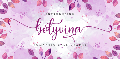 Bolyvina is a beautiful script that feels classy, elegant, and modern. It is perfectly suited for a wide variety of projects! This font is PUA encoded which means you can access all of the magical glyphs and swashes with ease! It also features a wealth of special features including alternate glyphs and ligatures.
 - Angellove by Nissa Nana,
$24.00 Angellove is a beautiful and elegant script font. Its modern and classy look makes it the perfect font for creating outstanding DIY projects! This font is PUA encoded which means you can access all of the glyphs and swashes with ease! It features a varying baseline, smooth lines, gorgeous glyphs and stunning alternates.
 - Silenter by Bluestudio,
$15.00 Silenter is suitable for all your design project needs such as: logo design, branding, covers, posters, magazines, wedding invitations, greeting cards, quotes and more. Silenter includes Titling, swash characters, and Stylistic Alternates Multilingual support - spread your message globally AÀÁÂÃÄÅCÇDÐEÈÉÌÍÎÏIÌÍÎÏNÑOØÒÓÔÕÖUÙÜÚÛWYÝŸÆßÞþ Encoded PUA Characters Fonts are fully accessible without additional design software. Happy designing...! Thanks.
 - Alberth by Atom,
$5.00 Alberth is an amazing family of unique and elegant fonts. with 119 elegant ligatures, giving your design a luxurious and classy touch. It's perfect for logos, invitations, wedding cards, watermarks, covers, quotes, business cards, and more! - Multilingual support AÀÁÂÃÄÅCÇDÐEÈÉÌÍÎÏIÌÍÎÏNÑOØÒÓÔÕÖUÙÜÚÛWYÝŸÆßÞþ - Encoded PUA Characters - Fonts are fully accessible without additional design software. Thanks Eko Kurniawan
 - Merry Script by Letterara,
$14.00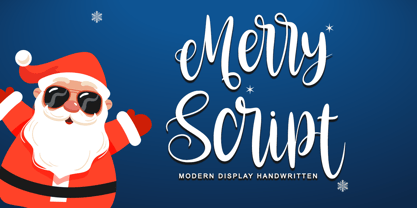 Merry script font that is simple and unique looking. Its beautiful charm makes it appear wonderfully down-to-earth, readable, and, ultimately, incredibly versatile. This will add a fun and friendly touch to any of your projects! This font is PUA encoded which means you can access all glyphs and sweeps easily.
 - Glandian by TM Type,
$12.00 Glandian is a romantic and sweet calligraphy typeface with characters that dance along the baseline. It has casual yet elegant features. It is perfect for wedding invitations, logo designs, social media, wedding greetings, etc. This font is PUA encoded, which means you can access all of the glyphs and swashes with ease.
 - Roseville Script by Letterhend,
$16.00 Introducing Roseville, a lovely modern script that bring luxury feel. The natural hand writing script is suitable for who needs a typeface for headline, logotype, apparel, invitation, branding, packaging, advertising etc. This typeface comes in uppercase, lowercase, with punctuations, symbols & numerals, stylistic set alternate, ligatures, multilingual support and is already PUA encoded.
 - Esthetik Letter by Nissa Nana,
$23.00 Beauty Flower is a delicate and elegant handwritten font. Its distinct and well rounded letters make this font a masterpiece. Fall in love with its incredibly versatile style and use it to create spectacular designs! This font is PUA encoded which means you can access all of the glyphs and swashes with ease!
 - Easter Sweet by AEN Creative Studio,
$15.00 Easter Sweet is a fun, quirky, and sweet serif font. No matter the topic, this font will be an incredible asset to your fonts’ library, as it has the potential to elevate any creation. This font is PUA encoded, which means you can access all of the glyphs and swashes with ease!
