10,000 search results
(0.05 seconds)
- Alige by Unforma Club,
$20.00 Alige is a humanist sans serif typefaces made for body text and display. Carried classic roman proportion in higher letterform for better reading experence. Inspired by Optima Nova which designed by Hermann Zaph in early 50's, alige contains 28 cuts which 14 style in text and 14 in display. Kindly visit Alige Playground for more detail presentation.
 - Palatino Arabic by Linotype,
$187.99 Palatino Arabic is a collaboration between Lebanese designer Nadine Chahine and Prof. Hermann Zapf. The design is based on the Al-Ahram typeface designed by Zapf in 1956 but reworked and modified to fit the Palatino nova family. The design is Naskh in style but with a strong influence of the Thuluth style as well. This is evident in the swash-like finials and the wide proportions of the letterforms. It is designed for use in print in both large and small sizes. The counters are wide open to allow for better readability in small sizes as well as to maintain an open and friendly appearance. The font has 1091 glyphs and includes a large number of extra ligatures and stylistic alternates as well as the basic Latin part of Palatino nova and support for Arabic, Persian, and Urdu. It also includes proportional and tabular numerals for the supported languages. Palatino Arabic wins Type Directors Club award. Each year, the New York-based Type Directors Club judges typeface designs from all over the world in their TDC2 contest. Linotype is pleased to announce that a very new typeface of its own is among 2008’s winners: Palatino Arabic. A collaboration between Nadine Chahine and Prof. Hermann Zapf, this face is an extension of Zapf’s Al-Ahram Arabic type from 1956 recreated to join the Palatino nova family.
 - HWT Konop by Hamilton Wood Type Collection,
$24.95 HWT Konop is a monospaced (fixed-width) typeface that is also square! Designed by Mark Simonson (Proxima Nova) as square characters that can be arranged vertically or horizontally and in any orientation. To a traditional letterpress job printer, a font like this wouldn’t make much sense. But to a modern letterpress printer it is an unusual and creative design toolkit. The bold gothic style is reminiscent of gothic wood types but more geometric. Since the characters are meant to be used in any orientation, the usual optical adjustments, such as making verticals thicker than horizontals and making tops smaller than bottoms are set aside. This results in a quirky but charming design. To provide more design options, Simonson came up with a modular system consisting of three sizes: 12-line, 8-line, and 6-line. These three sizes can be used together like Lego® bricks, with endless arrangements possible. And the sidebearing match so that characters always align when different sizes are used together. The digital version of Konop replicates the wood type version as much as possible, including the three different size designs. It includes OpenType stylistic sets that allow most characters to be rotated in place, 90° left, 90° right, or 180°, just like the wood type version. Extra characters not available in the wood type version are included with the digital fonts. The set of 3 is priced just $5 more than one single font, so order via "Package Options" HWT Konop is named for Don Konop, a retired Hamilton Manufacturing employee, who worked from 1959 to 2003. In addition to serving on the Two Rivers Historical Society Board from 2004 to present-day, he was also instrumental as a volunteer in helping with the museum’s move to its current home in 2013.
 - Corazon - 100% free

- Brasileiro by CastleType,
$19.00 Brasileiro, a CastleType Original, is a new art deco design inspired by the seven letters used for the masthead of the Brazilian magazine 'Para Todos' from the 1920s. Described as "great fun" and "nova e exuberante", Brasileiro captures the playful and joyful spirit of Brazil. Contains some alternates in the lowercase position, extensive language support for Latin and Cyrillic languages, and much more.
 - Zepto by d[esign],
$- Zepto is about as small as you can get with pixel fonts without sub-pixel rendering. Featured on Make: A tiny screen font you can actually download and use, free. For optimal use, please turn font anti-aliasing off and set at a size of 8px with image resolution set to 72ppi.
 - Manualito-Flo - Personal use only

- Sachiko - Personal use only

- Qirof - Unknown license

- Vixene - Unknown license

- ArmadaPirata - 100% free

- Gravity by Philatype,
$24.00 The Gravity family is a unique series of heavy square slab serifs intended mainly for display usage. Gravity Normal exhibits impact with legibility. Gravity Nova is fine-tuned to showcase brawn and beauty. Gravity Supernova, the most audacious of the family, commands attention with its extremely dense, mechanical design. Each weight includes diacritics for Western and Central European languages and is tightly spaced for maximum impact.
 - Summer Midnight by Jos Gandos,
$15.00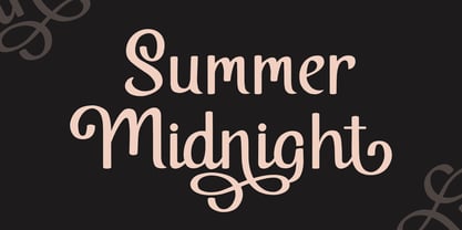 Summer Midnight is beautiful and elegant script font. Each glyph has its own uniqueness and when meeting with others will provide dynamic and pleasing proximity. Summer Midnight also comes with alternate style to make its style more unique and elegant. Summer Midnight will be perfect for your projects such as quotes, poster design, personal branding, promotional materials, logotype, product packaging and more.
 - Sassoon Montessori by Sassoon-Williams,
$48.00 Typefaces following Montessori Institute guidelines for reading and handwriting. With these fonts, the crucial stages of letter formation are made easier for parents and teachers to produce consistent worksheets. Children should then progress towards an efficient and mature joined-up handwriting. Free to download resources: How to access Stylistic Sets of alternative letters in these fonts
 - LightUnciale - 100% free

- Lemondrop - Personal use only

- Resist Sans by Groteskly Yours,
$25.00 Resist Sans is a free-spirited neo-grotesque that embodies both the innate desire for revolt and a tendency towards uniformity. While Resist Sans preserves the neat, minimalist look which is associated with neo-grotesques, it also accentuates the tentativeness of each letter form. The name, too, hints at the rebellious character of the typeface. Resist Sans comes in 28 styles (14 uprights and matching obliques). Text vs Display Resist Sans comes in two versions: Display and Text, which serve different purposes but remain interchangeable and even complementary in some cases. Resist Text is equipped with deep ink traps and optical compensators, which really come into play at smaller sizes. The Display version is smoother and more consistent, so better for use in larger sizes and headlines. Styles/Weights Each of the two versions of Resist Sans comes in 7 weights (Thin to Black) and is equipped with matching Obliques, which brings the total number of styles to 28. Two trial styles (Text Light and Display Medium Oblique) can be downloaded free of charge. Each style contains 900+ glyphs, awesome OpenType features, and around 1500 kerning pairs. Language Support Resist Sans is truly multilingual. It supports most European and Latin-languages and features Extended Cyrillic, which gives access to such languages as Ukrainian, Bulgarian, Serbian, Russian, Macedonian and many more. Free Styles Two styles of Resist Sans can be downloaded for free on MyFonts. Type Specimen Resist Sans PDF Type Specimen can be downloaded here: Resist Sans PDF Type Specimen
 - Linearmente - Personal use only

- Nonserif - Unknown license

- PiratsSymbolsArtefacts - Unknown license

- Tabaiba wild ffp - Personal use only

- Sometype Mono by Dharma Type,
$- Sometype Mono is a free monospaced font family for coding and tabular layout which can be used for commercial purpose for free. So far, Sometype Mono consists of 6 style. Regular, Italic, Medium, Medium Italic, Bold and Bold Italic.
 - Nova SOLID is a distinctive font crafted by the talented typeface designer Billy Argel, known for his expertise in creating unique, eye-catching fonts that often carry a personal touch and a creative...
- Zt Shago by Khaiuns,
$26.00 Zt Shago is a font family of 3 eye-catching display forms, each style has its own character, from very strong and soft angles. When you're looking for a font with a fun message, you can find it in the zt Shago family. Zt Shago is the most extensive font family I've ever created, with 33 styles and 16 free font styles. The default and round styles come in regular & Italic. But for the free one I only have one on myfont, for other styles you can download at Gumroad. While extra rounded only has one weight, namely extra bold. Zt Shago also has several unique alternatives to the letters a, h, k, m, n, v, w, & z, thus enhancing your design style. I hope you have fun using zt shago Thanks for using this font ~ Khaiuns X zelowtype
 - Destra by Isaco Type,
$26.00 Destra is a contemporary, narrow serif family, suitable to save space and legible at small sizes. Its shapes are the result of a mix of styles. "Destra" is the Portuguese word for "right hand". The font has several OT features - fractions, old style-, lining-, tabular numbers, superiors/inferiors, alternative glyphs, dozens of ligatures (standard + discretionary) and an exclusive feature to convert Arabic to Roman numerals up to 1000 (download the “OT Features Guide” pdf). Moreover, Destra has an impeccable technical finish, with a systematic review of nodes, curves, spacing and internal data, eliminating the possibility of errors when using it. The family consists of 8 styles, 4 weights - Regular, Medium, Bold and Black, plus their respective italic versions. The fonts are available in OpenType PS/TT and have extended character set to support CE, Baltic, Turkish as well as Western European languages. You can test Destra downloading the free trial font in Medium version (TT only). This trial file supports only Western languages.
 - Downtown Elegance - Personal use only

- Sassoon Patterns by Sassoon-Williams,
$48.00 Many children start school with their hands not ready and trained to produce the precise strokes required for forming letters and starting to write. Pattern is essential preparation. It is fun for children, building their confidence as well as training their muscles for the task. Each font has normal letters and pattern characters. Free to download resources: How to access Stylistic Sets of alternative letters in these fonts Purchasers of this font package may use their Order Number to receive a free Copybook PDF by Rosemary Sassoon recommended for effective teaching
 - Geometrico Sans by FSdesign-Salmina,
$39.00 Are you looking for a modern typeface? Geometrico. Round without Compromises. Now 12 Italic Styles added. Even more futuristic than the classical Bauhaus typeface Futura, “Geometrico” is a geometric typeface based on round shapes as suggested by its name. Designed without compromises, neither in form nor in function: Geometrico is ideal for logotypes, headlines and other modern typographic purposes. Would Paul Renner be delighted? Or would he turn around in the grave? Make your own opinion. Try Geometrico for free. Download a free trial version of Geometrico with a reduced character set. Check it out!
 - Savant by Characters Font Foundry,
$25.00 I proudly present Savant, a friendly headline typeface with an attitude. It’s got a slab serif touch and is packed with lots of nice typo-gems. The italic is a perfect companion for the regular. But beside that, it's powerful enough to stand its own ground. Savant is a good mixture of the playful and the classic. You can use it for fashion, food, magazines, packaging, corporate design- and other projects with an attitude. So show me what you’ve got! Savant Regular only is completely free in 2012, so download your free copy today!
 - CoolFatCat - Unknown license

- FerretFootPrints - Unknown license

- Berling by Linotype,
$29.99The productivity of the Berlingska Stilgjuteriet was made possible by the development of modern typeface art in Sweden in the 1950s. The typeface Berling was designed by Karl-Erik Forsberg for the Berlingska Stilgjuteriet in Lund. It belongs to the modern text typefaces and like most of these markedly shows the influece of the Neorenaissance. Berling Antiqua appeared in 1951 with a matching italic and by 1959, it was expanded to include five weights. Linotype offers Berling in four of them, roman and bold with their respective italics. In 2004 the Swedish publisher Verbum commissioned a complete redesign of Berling for the 21st century. Linotype assisted the designers of this new typeface, which came to be called Berling Nova. - Zapanese by Nocturnal Workspace,
$15.00 The first version of the Zapanese font has been published since 2019 under the name Zapan Script, and can be downloaded for free on the dafont website. At first this font was just a learning project from the 3rd type font and because we saw the enthusiasm of the downloaders, we developed it into a duo font with extra japanese elements. 2 versions Support Glyphs Basic Hiragana & Basic Katakana PUA Encode Characters, fully accessible without additional design software. Includes a range of multilingual characters. Zapanese is suitable typeface for various purposes like logotype, signage, label, poster, dropcap, titles, letterhead, book cover and etc. Thank you!
 - As of my last update in April 2023, Lindau is not widely recognized as a mainstream or popular font, and it might not exist in prominent font libraries or collections. Given this, let's take a creati...
- Chemistry - Unknown license

- Renaissance - Unknown license

- Stellar by Monotype,
$29.99Robert Hunter Middleton drew the original design of Stellar for the Ludlow Typograph Company in Chicago. Work began in the late 1920s, when Middleton was asked to create a sans serif type family to compete with European imports of Futura and Kabel. Stellar was Middleton's attempt to raise the ante. Where Futura and Kabel were geometric in design and monotone in weight, Stellar was based on roman character proportions and stroke weighs were stressed. In the late 1990s, Dave Farey took on the task of reviving the Stellar design. While Ludlow cut Stellar in a full range of point sizes, the family was limited to just a roman and bold design. Farey's revival is twice as large a family. It ranges from a very light called Stellar Nova to a very bold called Zeta In between are Lyra and Epsilon. - Simplo by Durotype,
$49.00 Simplo: the ‘Italian Futura’. Simplo is a geometric sans serif typeface, built in sixteen styles. It is a tribute to the 1930s typeface Semplicità, designed by Nebiolo’s Alessandro Butti. Although many details of Simplo differ from Semplicità, it preserves the spirit of the original. Simplo is ideal for use in display sizes. It is also quite legible in text, and is well suited for graphic design and corporate identity design. Simplo has sixteen styles, extensive language support, eight different kinds of figures, sophisticated OpenType features — so it’s ready for advanced typographic projects. The most notable characteristics of this typeface are the ‘t’ and the ‘f’. The ‘t’ is the culmination of simplicity: a vertical line with just a simple right-side crossbar. The ‘f’ also has just a right-side crossbar, and is really tall: it reaches both the highest and lowest vertical position of the typeface. The top of the distinctive ‘s’, is much narrower than its bottom. The ‘a’, ‘b’, ‘d’, ‘g’, ‘p’, ‘q’, and ‘u’ are spurless, and show a family resemblance with Hans Reichel’s 1990s typeface Dax. However, these letters are rounder and more geometric than Dax’s counterparts, because of Dax’s higher x-height and narrower design. In Paul Shaw’s Imprint article about typefaces that have been overlooked and/or underappreciated, “Overlooked Typefaces”, he concluded his discussion of Semplicità as follows: “These idiosyncrasies suggest that Semplicità might find a warm reception today, given the current love affair with Gotham, Neutraface and Proxima—and the resurgence of ITC Avant-Garde Gothic.” Free demo font available. For more information about Simplo, download the PDF Specimen Manual.
 - EVOL - 100% free

- CRAMPS - 100% free


