8,260 search results
(0.025 seconds)
- Fondue by Latinotype,
$29.00 Fondue: an eclectic-flavoured contemporary typeface. Designed by Jorge Alberto Martínez and Latinotype Team. Fondue is a type family of eclectic shapes, inspired by Art Deco designs, in particular, the lettering used by the Mexican cartoonist Ernesto “El Chango” Cabral on almost the entire publication Revista de Revistas ("Magazine of Magazines"). Far from being a copy, Fondue expects to be an adaptation of the thinking of that time to be used in contemporary context. Fondue has a cursive ductus, wide horizontal proportion and large x-height. Its friendly consistent rhythm makes it ideal for medium-sized text, headlines, branding, and so on. The family comes in 6 weights, from Thin, which reminds of the cartoonist’s loose strokes, to Ultra Bold, the version with powerful and unique voice. Fondue has a set of 496 characters that support 207 different languages.. OpenType features include standard and discretionary ligatures as well as stylistic alternates.
 - Piel Script by Sudtipos,
$89.00 Over the past couple of years I received quite a number of unusual and surprising requests to modify my type designs to suit projects of personal nature, but none top the ones that asked me to typeset and modify tattoos using Burgues Script or Adios. At first the whole idea was amusing to me, kind of like an inside joke. I had worked in corporate branding for a few years before becoming a type designer, and suddenly I was being asked to get involved in personal branding, as literally “personal” and “branding” as the expression can get. After a few such requests I began pondering the whole thing from a professional perspective. It was typography, after all, no matter how unusual the method or medium. A very personal kind of typography, too. The messages being typeset were commemorating friends, family, births, deaths, loves, principles, and things that influenced people in a deep and direct way, so much so that they chose to etch that influence on their bodies and wear it forever. And when you decide to wear something forever, style is of the essence. After digging into the tattooing scene, I have a whole new respect for tattoo artists. Wielding that machine is not easy, and driving pigment into people’s skin is an enormous responsibility. Not to mention that they're some of the very few who still use a crafty, hands-on process that is all but obsolete in other ornamentation methods. Some artists go the extra mile and take the time to develop their own lettering for tattooing purposes, and some are inventive enough to create letters based on the tattoo’s concept. But they are not the norm. Generally speaking, most tattoo artists use generic type designs to typeset words. Even the popular blackletter designs have become quite generic over the past few decades. I still cringe when I see something like Bank Script embedded into people’s skin, turning them into breathing, walking shareholder invitations or government bonds. There’s been quite a few attempts at making fonts out of whatever original tattoo designer typefaces can be found out there - wavy pseudo-comical letters, or rough thick brush scripts, but as far as I could tell a stylish skin script was never attempted in the digital age. And that’s why I decided to design Piel Script. Piel is Spanish for skin. In a way, Piel Script is a removed cousin of Burgues Script. Although the initial sketches were infused with some 1930s showcard lettering ideas (particularly those of B. Boley, whose amazing work was shown in Sign of the Times magazine), most of the important decisions about letter shapes and connectivity were reached by observing whatever strengths and weaknesses can be seen in tattoos using Burgues. Tattoos using Adios also provided some minor input. In retrospect, I suppose Affair exercised some influence as well, albeit in a minor way. I guess what I'm trying to say is there is as much of me in Piel Script as there is in any of the other major scripts I designed, even though the driving vision for it is entirely different from anything else I have ever done. I hope you like Piel Script. If you decide it to use it on your skin, I'll be very flattered. If you decide to use it on your skateboard or book cover, I'll be just as happy. Scripts can't get any more personal than this. Piel Script received the Letter2 award, where they selected the best 53 typefaces of the last decade, organised by ATypI.
 - FS Kitty by Fontsmith,
$50.00 Cute FS Kitty is the type equivalent of Bagpuss: plump, cute, cuddly and not fond of exercise. So don’t go giving it a run-out on body copy; FS Kitty is an all-caps font made for showing off in posters and headlines, and on products, point-of sale and especially sweets. Blubber Kitty had been quietly curled up in Phil Garnham’s sketchbook for a year before he brought it out to be brushed up. “It was in the mix as a basic form when I started thinking about FS Lola. It was a twisted, bubbly beauty – quite squishable and huggable. The working file was called Blubber. “At that time it was a basic construction of strokes. I created the ‘A’ first, purely as a shape to play with, not as type. I flipped it for ‘V’, and copied that for a ‘W’. I flipped the ‘W’ for an ‘M’... I thought, ‘This looks a bit wacky, but I like it,’ and just carried on. The most tricky characters were the ‘B’ ‘P’ and ‘R’. I must have drawn about 20 kinds of B for this, just to get it to fit.” Variety “When the regular weight of Kitty had been designed,” says Jason Smith, “it just felt like a natural progression to go on and explore how far we could go with it: Light, Solid, Headline, Shadow.” Phil Garnham thinks there’s still more to come. “There are some really individual characters in this font that I think have yet to be exploited: the Greek Omega symbol, the strange face in the ampersand. Like Bagpuss, Kitty has kept a low profile so far. “We know people are using Kitty. In fact, it was the first of any of our fonts that we sold on the day it was released. But I still haven’t seen it out there in the wild. It’s going to be a exciting moment.”
 - Arrow Hero by Alit Design,
$21.00 Introducing "Arrow Hero" - A Typeface of Elegance and Adventure Unleash the power of elegance and adventure with our latest font creation, "Arrow Hero." This unique serif font seamlessly blends the mystique of archers, the allure of elves, and the boldness of superheroes. Crafted with precision, this font is more than just letters; it's a journey into a world where every curve and angle tells a story of heroic feats and enchanted realms. Key Features: Elegant Serif Design: The Arrow Hero font boasts a sophisticated serif style that adds a touch of refinement to your projects. Each letter is meticulously crafted to exude an aura of strength and grace, perfectly suited for a variety of design applications. Illustrated Elements: Dive into the fantastical with Arrow Hero's unique illustrations. Arrows gracefully adorn each character, symbolizing precision and direction. Delicate elf ears and majestic wings enhance the overall aesthetic, creating a harmonious balance between the worlds of archers, elves, and superheroes. Versatile Usage: Whether you're working on branding, book covers, invitations, or digital designs, Arrow Hero is a versatile font that adapts to various contexts. Elevate your projects with a touch of magic and heroism that this font effortlessly provides. Tailored for Storytelling: Arrow Hero is not just a font; it's a storyteller. Use it to bring narratives to life, creating visual experiences that resonate with the mythical and the extraordinary. Let the characters on your screen or page become heroes in their own right, guided by the elegance of Arrow Hero. Multiple Styles: The font comes in various styles and weights, allowing you to express different moods and atmospheres within your designs. Whether you're aiming for a bold statement or a subtle enchantment, Arrow Hero has the right style for you. Elevate your design projects to new heights with Arrow Hero, where the elegance of serif meets the magic of arrows, wings, and elf ears. Download this font today and embark on a design journey that transcends the ordinary, celebrating the hero within every letter.
 - FS Kitty Variable by Fontsmith,
$199.99Cute FS Kitty is the type equivalent of Bagpuss: plump, cute, cuddly and not fond of exercise. So don’t go giving it a run-out on body copy; FS Kitty is an all-caps font made for showing off in posters and headlines, and on products, point-of sale and especially sweets. Blubber Kitty had been quietly curled up in Phil Garnham’s sketchbook for a year before he brought it out to be brushed up. “It was in the mix as a basic form when I started thinking about FS Lola. It was a twisted, bubbly beauty – quite squishable and huggable. The working file was called Blubber. “At that time it was a basic construction of strokes. I created the ‘A’ first, purely as a shape to play with, not as type. I flipped it for ‘V’, and copied that for a ‘W’. I flipped the ‘W’ for an ‘M’... I thought, ‘This looks a bit wacky, but I like it,’ and just carried on. The most tricky characters were the ‘B’ ‘P’ and ‘R’. I must have drawn about 20 kinds of B for this, just to get it to fit.” Variety “When the regular weight of Kitty had been designed,” says Jason Smith, “it just felt like a natural progression to go on and explore how far we could go with it: Light, Solid, Headline, Shadow.” Phil Garnham thinks there’s still more to come. “There are some really individual characters in this font that I think have yet to be exploited: the Greek Omega symbol, the strange face in the ampersand. Like Bagpuss, Kitty has kept a low profile so far. “We know people are using Kitty. In fact, it was the first of any of our fonts that we sold on the day it was released. But I still haven’t seen it out there in the wild. It’s going to be a exciting moment.” - Caslon Graphique by ITC,
$29.99 The Englishman William Caslon punchcut many roman, italic, and non-Latin typefaces from 1720 until his death in 1766. At that time most types were being imported to England from Dutch sources, so Caslon was influenced by the characteristics of Dutch types. He did, however, achieve a level of craft that enabled his recognition as the first great English punchcutter. Caslon's roman became so popular that it was known as the script of kings, although on the other side of the political spectrum (and the ocean), the Americans used it for their Declaration of Independence in 1776. The original Caslon specimen sheets and punches have long provided a fertile source for the range of types bearing his name. Identifying characteristics of most Caslons include a cap A with a scooped-out apex; a cap C with two full serifs; and in the italic, a swashed lowercase v and w. Caslon's types have achieved legendary status among printers and typographers, and are considered safe, solid, and dependable. Caslon Antique was designed by Berne Nadall and brought out by the American type foundry Barnhart Bros & Spindler in 1896 to 1898. It doesn't bear any resemblance to Caslon, but has the quaint crudeness of what people imagine type looked like in the eighteenth century. Use Caslon Antique for that old-timey" effect in graphic designs. It looks best in large sizes for titles or initials. Caslon Black was designed by David Farey in the 1990s, and consists of one relatively narrow and very black weight. It is intended exclusively for titles or headlines. Caslon Black has a hint of the original Caslon lurking in the shadows of its shapes, but has taken on its own robust expression. Caslon Graphique was designed by Leslie Usherwood in the 1980s. The basic forms are close to the original Caslon, but this version has wide heavy forms with very high contrast between the hairline thin strokes and the fat main strokes. This precisely drawn and stylized Caslon has verve; it's ideal for headlines or initials in large sizes."
 - Signerica Fat - Personal use only

- Ornamental Versals - Personal use only

- Pea Kim - Unknown license

- Pea Martha - Unknown license

- Pea Mandy - Unknown license

- Grottel by Hashtag Type,
$29.00 Grottel is a modern grotesque sans serif font family that follows the philosophy of original grotesque typefaces with enhanced personality. Fine details and tuning, balance functionality and the beauty representative of the aesthetic movement in the 19th century. Details include 5 weights, manually edited kerning, ligatures and alternatives to allow users to add further personality to the font.
 - Fontazia Stiletto by Deniart Systems,
$20.00 The Fontazia Stiletto font was inspired by my personal obsession with shoes. This is a stylized version of some of the lovely footwear found in my personal closet as well as some of my equally obsessed friends. You'll find 52 assorted shoe illustrations ranging from sandals to boots, some a little strange, but all in good fun.
 - Tragicomic by Veil of Perception,
$20.00 Tragicomic is a handwritten font which was originally conceived as a style which could be used in word balloons in comics and graphic novels. Swash characters, alternative letter forms, and a dingbat font were added to make it usable for brochures, personal notes, invitations, holiday greetings and other more general applications requiring a style with a personal handwritten touch.
 - Stuckeez by Arendxstudio,
$14.00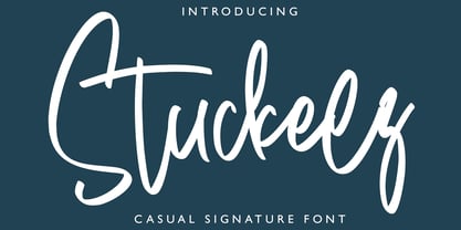 Stuckeez - Signature Font is a handwritten signature script with a natural & stylish flow. This collection of scripts is perfect for personal branding. this works well for many applications. Everything from personal branding & wedding invitations to advertising could benefit from this collection of signature fonts Features : • Character Set A-Z • Numerals & Punctuations (OpenType Standard) • Accents (Multilingual characters) • Ligature
 - Weatherglass by Arendxstudio,
$15.00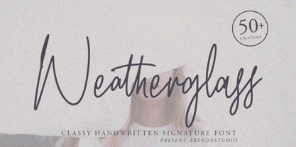 Weatherglass Signature is a handwritten signature script with a natural & stylish flow. This collection of scripts is perfect for personal branding. this works well for many applications. Everything from personal branding & wedding invitations to advertising could benefit from this collection of signature fonts Features : • Character Set A-Z • Numerals & Punctuations (OpenType Standard) • Accents (Multilingual characters) • Ligature
 - Ned by Linotype,
$29.99Ned Std. is part of a series of typographic experiments from the young Swiss designer Michael Parson. Using a wide, horizontal hexagonal grid, Parson created the system of letters that make up this font. Text set in Ned Regular takes on a modular, honeycomb-like appearance. For an interesting effect, try overlapping individual letters, or use a few letters together as elements in a logo. A great companion face to Ned Std. is Linotype's Hexatype Bold. Both Ned Std. and Hexatype Bold have been included in the Take Type 5 collection, along with eight further constructions from Parson." - Hexatype by Linotype,
$29.99Hexatype is part of a series of typographic experiments from the young Swiss designer Michael Parson. In this font, Parson has created an intriguing system of lines that form into letters, all based off of a hexagonal grid. Text set in Hexatype takes on an interesting honeycomb-like appearance. For a different effect, try overlapping individual letters, or use a few of Hexatype's letters together as elements in a logo. A good companion to Hexatype is Linotype's Ned Std. These two fonts, as well as eight more experimental designs by Parson, are included in the Take Type 5 collection." - MAWNS' Graffiti Filled - Personal use only

- KGMUSIC1 - Unknown license

- RMGator - Unknown license

- Covered By Your Grace by Kimberly Geswein,
$5.00 Authentic markered handwriting, neat enough to read but fun enough to inject some personality into your project.
 - Baystar Script by Mans Greback,
$59.00 Baystar Script is a high-quality script typeface. Drawn and created by Mans Greback in 2021, this calligraphic font has power, style and stamina. The type’s organic, handwritten lettering is well suited for a variety of applications: from happy, playful designs, to super sleek web graphics and vivid logotypes. It has velocity like a mustang, a brilliant look and–with its hundreds of alternates–is truly dynamic. It flows with quick turns, marking out brush strokes and connecting tails, like a genuine, hand-painted writing should. Write multiple underscores to make swashes of different lengths. Example: Corvette_______ Baystar Script is legible and professional while retaining the personality that is valued in handwriting. Drawn in accordance with the latest trends in design, but is inspired by retro logotype lettering such as Chevrolet Chevelle and Camaro. A modern calligraphy, fast as a sport race car or sharp as a stingray, the letters are characterized by thorny edges and tall ascenders. It comes in three weights; Light, Medium and Bold, making it useful in any size and context. The font is built with advanced OpenType auto-functionality and guaranteed top-notch quality, containing stylistic and contextual alternates, ligatures and more automatic and manual features; all to give you full control and customizability. It has extensive lingual support, covering all Latin-based languages, from North Europa to South Africa, from America to South-East Asia, as well as Cyrillic (Russian, Serbian, Bulgarian) and the Greek alphabet. It contains all characters and symbols you'll ever need, including all punctuation and numbers. Let this font help you to transform your professional work into an energetic piece of handmade art!
 - Planet Express by Estudio Calderon,
$29.99 Family type designed by Felipe Calderón. This type is a display with a modern style and a different and innovative concept. The development of this type was a challenge because it was set out from the begining as a script font with ornaments and complements, where the round shapes do not have prominence in the result. Planet Express is an interesting job from the aesthetic point of view, it works for big scale texts and contains little shadow-cuts in each character to give it more personality and stand out among other fonts from this gender. I hope this new project works to solve issues in design. Planet Express is composed of Regular & Italics, it has 250 intelligent ligatures to produce the best signs in big scale, it is perfect for branding and works very well with the geometric complements. It is designed with programming in opentype: Ligatures, Discretionary ligatures, Stylistic Alternates, Stylistic set 01, Stylistic set 02, Stylistic set 03, Stylistic set 04, Stylistic set 05, Stylistic set 06, Stylistic set 07, Stylistic set 08 & Stylistic set 09, multiple language support and a complete set of extras like arrows, catchwords, flags, emblems, hands, fleurons & crossed elements. Planet Express can be used in different ways, each character pretends to cover the needs in any circumstance where it is used. It is funny to write words and play with the complements. It also works with current concepts in graphic design like sports, cars, hip hop, music, social network, skateboarding and more. Everybody can use this font, it works with different languages like italian, french, portuguese, danish, german and so forth. See specimen and samples here. Enjoy it!
 - Verao by insigne,
$24.99 Remember clear summer days as a kid? Remember open fields that you explored? Sun shining? Simple breezes sweeping past your face as you ran far and free? The feeling was uncomplicated and enjoyable. It was natural. That’s Verao, the simple spirit of summer. Alive and vibrant, Verao takes a turn away from the cold structure of today’s rigid creations and embraces the movement back to the value of things handmade. This artisan creation represents the rare, soul-invested fusion of the craftsman’s tools, materials, and hand movements, which shapes the solid--but beautifully defined--parts, pieces that, when put together, breathe a measure of life into everyday paragraphs and other bodies of text. Verao’s hand-written brush script, with its characters’ imperfect elegance and handmade quality, keeps your work looking organic. Write a word in more than a hundred different ways thanks to the large number of extra letters it offers. Two sets of lowercase alternative letters without connectors are included as is a set of swashed endings. Verao contains stylistic substitutions and ligatures, too, that you can combine however you like. Whichever way you design, the elements continue to appear balanced and separate and will undoubtedly add more personality to your design. So stop switching out cogs in your rigid set of fonts. Take time again to play with a natural face that’s both easy and energetic. Verao’s great temperament makes it a joy to design with. Let this spirit of summer take you away from the mundane. There’s a good chance Verao will lead you where you need to go. Production assistance from Lucas Azevedo.
 - Zenzai Itacha - Personal use only

- PANHEAD - Personal use only

- PANHEAD - Personal use only

- Female and Male Symbols - Unknown license

- Just People by Outside the Line,
$19.00 36 men, women, children, babies, grandpas, grandmas, teens, this font has them all... and with lots of personality!
 - Feris Script by Pedro Teixeira,
$14.00 Feris Script is a cool typeface, unexpected and informal, good for logos or to add personality to designs.
 - KG Skinny Latte by Kimberly Geswein,
$5.00 This cute, slightly tall unicase handwriting has a slightly bubbly personality while still being completely legible and neat.
 - Champina by Forberas Club,
$16.00 Champina is handwritten font, Recommended uses for simple write, wall type, decoration, and poster. Free for personal use.
 - KG One Thing by Kimberly Geswein,
$5.00 This font is super bubbly and round. It is neat enough to be legible but still has personality.
 - Amazónica - Personal use only

- Pea Breathe Easy - Unknown license

- Linotype Gaius by Linotype,
$29.99Gaius is a beautiful script face with a nice relationship between the broad-edged pen and the proportions of the letterforms. It is very flexible and gives a personal touch due to its various alternate fonts with swash beginners, ending and ligature letterforms. Like Zapfino from Hermann Zapf, Gaius offers a great variety and makes the text more personal and readable. - Rahman by Kah Khiong Design,
$13.00 Rahman font is based on the idea of reflecting the personality of the first Prime Minister of Malaysia, Tunku Abdul Rahman in a typeface design. This sans serif font shows the founding father of Malaysia as a modern, simple, open-minded, uncomplicated and straightforward person. The font is suitable for posters, labels as well as book covers and paper printing.
 - Born Ready by Nicky Laatz,
$20.00 Get ready to make a statement with “Born Ready” - A dry marker handwritten font with textured lines and multiple personalities. Born Ready comes in various styles — Regular, Slanted and Upright — each with its own unique personality to suit the look you need. A handy set of alternate lowercase letters and ligatures allows you to get the perfect look you need for your design.
 - Candelivers by Armasen,
$12.00 Candelivers is a fun and display typeface, for better use in short sentences, or letterings and logo designs. It comes with a several features, like swashes, alternates and ligatures. It has a little not simmetry between the characters that gives a personality and handmade touch. A Glow version is also available to give more soft and fun personality. I hope you enjoy it!


