10,000 search results (0.044 seconds)
  1. Square Unique - Unknown license
  2. Rippen - Unknown license
  3. Speedlearn - Unknown license
  4. SnappyService - Unknown license
  5. AirCut - Unknown license
  6. regata - Unknown license
  7. Libeled Lady - Unknown license
  8. Pavadee - Unknown license
  9. Rx-OneZero - Unknown license
  10. Rx-FiveOne - Unknown license
  11. roundabout - Unknown license
  12. MigraineSans - Unknown license
  13. Silver Dollar - Unknown license
  14. Viper Squadron Solid - Unknown license
  15. SF Chrome Fenders - Unknown license
  16. Harrowprint - Unknown license
  17. Old Republic - Unknown license
  18. 1980 Portable - Unknown license
  19. W.J. Pearce 213 - Unknown license
  20. Electric Pickle - Unknown license
  21. voxBOX - Unknown license
  22. GauFontSpyLetter - Unknown license
  23. LT Streak - 100% free
  24. LT Speak - 100% free
  25. ho ho ho PERSONAL USE - Personal use only
  26. Nsai Regular - Personal use only
  27. LT Comical - 100% free
  28. LT Sonoma - 100% free
  29. LT Flode Neue News - 100% free
  30. Agelast - Personal use only
  31. Horyzen - Personal use only
  32. LT Streetway Neue - 100% free
  33. Deutschlander - Personal use only
  34. BONES - Unknown license
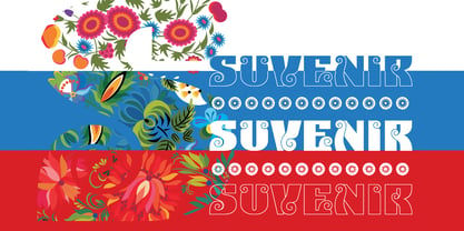
  35. Suvenir Rus by ParaType, $30.00
    The typeface was designed by Alexey Chekulaev inspired by artwork of Grigory Klikushin.
  36. Sampa by BRtype, $52.00
    The project aims to represent icons through the city of São Paulo. The image selection method prioritized elements of history culture and daily life. The claim is that the set of graphic symbols help disseminate one of the most important cities of Brazil and the southern hemisphere. See the sights of São Paulo: Edifício Copan, Avenida Paulista, Bairro da Liberdade, Mercado Municipal, Catedral da Sé, Estádio do Pacaembu, Sala São Paulo, Pátio do Colégio, Vale do Anhangabaú, Estação da Luz, Memorial da América Latina, Museu do Ipiranga, Teatro Municipal, Masp, Edifício Banespa, Monumento às Bandeiras, Obelisco do Ibirapuera, Auditório do Ibirapuera, Pinacoteca, Oca – Ibirapuera and Monumento Ayrton Senna.
  37. Preto Semi OT Std by DizajnDesign, $-
    Preto Semi is an experiment. It is an attempt to create a readable type for text point sizes (other than sans-serif and serif). Preto Semi is not a Sans with added serifs or Serif with serifs removed. The use of the serifs is redefined and used for other purpose(s). The serifs became the extension of the stroke, they help to solve the spacing problem of sans-serif types and they use the primary function of serifs – keeping the eye on the baseline and emphasize the horizontal rhythm of the lines of text. Preto Semi is intended for magazines and editorial design, as other members of Preto family. Preto is an extensive type family, which explores the function of serifs on readability and legibility. Preto consist of three subfamilies: Sans, Semi and Serif. Preto is designed for multilingual typesetting. All of the subfamilies have equal gray value but different texture which can be use to differentiate languages. Preto sub-families have two text weights and two bold styles (Regular -> Bold, Medium -> Black). Every weight has a companion Italic style as well.
  38. Preto Semi by DizajnDesign, $24.00
    Preto Semi is an experiment. It is an attempt to create a readable type for text point sizes (other than sans-serif and serif). Preto Semi is not a Sans with added serifs or Serif with serifs removed. The use of the serifs is redefined and used for other purpose(s). The serifs became the extension of the stroke, they help to solve the spacing problem of sans-serif types and they use the primary function of serifs – keeping the eye on the baseline and emphasize the horizontal rhythm of the lines of text. Preto Semi is intended for magazines and editorial design, as other members of Preto family. Preto is an extensive type family, which explores the function of serifs on readability and legibility. Preto consist of three subfamilies: Sans, Semi and Serif. Preto is designed for multilingual typesetting. All of the subfamilies have equal gray value but different texture which can be use to differentiate languages. Preto sub-families have two text weights and two bold styles (Regular -> Bold, Medium -> Black). Every weight has a companion Italic style as well.
  39. IRONGATE - Unknown license
  40. Demine by Craft Supply Co, $20.00
    Introducing Demine – Condensed Bold Sans Serif Font The Perfect Typeface for Large Displays Demine – Condensed Bold Sans Serif Font is an ideal choice for meeting your large display typography needs. With its distinct features, this font stands out in the world of design. Bold Impact for Attention Demine’s bold design unquestionably captures attention. Whether it’s billboards, posters, or signage, this font excels in conveying a powerful message that can’t be ignored. Furthermore, it ensures that your content immediately seizes the viewer’s gaze. Optimal Readability Even at Scale Despite its condensed form, Demine prioritizes readability. Each character is thoughtfully crafted to remain clear and legible, ensuring your message is effectively communicated, even at larger sizes. Consequently, it guarantees that your audience can easily comprehend the content. Versatile Design Applications Demine’s versatility shines through in various design applications. It’s not limited to headlines; it also excels in branding, packaging, and any project where making a bold statement is essential. As a result, it can adapt to a wide range of creative endeavors. In Conclusion Demine – Condensed Bold Sans Serif Font epitomizes typography that marries boldness with clarity. When you need your message to shine large and clear, Demine is your go-to choice. Elevate your designs with Demine’s impactful presence, and witness your message soar to new heights, leaving an indelible impression on your audience.
Looking for more fonts? Check out our New, Sans, Script, Handwriting fonts or Categories
abstract fontscontact usprivacy policyweb font generator
Processing