10,000 search results
(0.053 seconds)
- Mondera by Twinletter,
$17.00 Introducing MONDERA, our newest san serif font. We created this font by paying close attention to the harmony between each letter, resulting in a lovely blend of words when viewed or read. If you use this font for all of your projects, both official and informal, everything will look the same. of course, your various design projects will be perfect and extraordinary if you use this font because this font is equipped with a font family, both for titles and subtitles and sentence text, start using our fonts for your extraordinary projects.
 - Sassy by Just Bia,
$10.00 Introducing Sassy: a sans serif font! Sassy is a cute handwritten font. It maintains its classy calligraphic influences while feeling contemporary and fresh. This versatility will appeal to a wide range of crafty ideas, from letterheads and titles, to stationery. This font is perfect for: • greeting cards • packaging • social media and more! As the nature of the characters is hand-drawn some "wonky" lines might be found which helps to add another touch of organic in the font! Don't hesitate to reach out if you need any further information. Bia
 - Broadcast JNL by Jeff Levine,
$29.00 The vast resource of hand lettered vintage sheet music titles offers many interesting and unique variations on even the simplest styles of lettering. A simple thick-and-thin serif design circa the 1920s-1930s evokes a reminiscence of the Art Nouveau period combined with a touch of what was to come during the Art Deco era. Most charming is the fact this lettering is free of the formal rules and constraints of metal type, where designers are generally forced into conformity with uniform stroke widths, serif placements and character shapes.
 - Recording Artist JNL by Jeff Levine,
$29.00 When 45 RPM records were the norm for a teenager’s music collection in the 1950s and 1960s, many discs had their labels printed by letterpress. Some record companies utilized a bold, condensed typeface set in all caps for the song’s title and other pertinent information. The digital version of this font is called Recording Artist JNL, and is available in both regular and oblique versions. A companion font loosely based on this type design [but with more original characters and a slightly lighter weight] is Promotional Copy JNL.
 - Nazhdak by ParaType,
$30.00 Nazhdak is a handwriting sans serif of three styles sketched with a felted pen and digitized afterwards. Designed in 2001 under the impression of Erik van Blockland's FF Kosmik typeface. Nazhdak is searching and investigating boundaries between regular and irregular typefaces. In spite of ragged letterforms and general laxity the face is rather good for small sizes, and in large sizes it completely shows its crude fascination. The main destinations are small informal text compositions and display typography. Nazhdak was designed by Zakhar Yaschin and released by ParaType in 2009.
 - Sebastian Goen by Gian Studio,
$12.00 Sebastian Goen is my new elegant serif font that will give your projects a touch of luxury and style. It's perfect for logotypes, branding, monograms and wedding invitations, blog headlines, and more. Browse through all the previews and get as inspired as I was when creating this font. Important information: To access the alternatives, you must have access to an older version of Photoshop to copy/paste the glyphs from the included PSD, OR the Glyphs Panel, which can be found in Photoshop CC or any Version of Adobe Illustrator. Thanks.
 - Wild Fat Font by Softulka,
$10.00 Wild Fat Font - playful handwriting experimental display typeface inspired by classic old cartoons. Wild Fat Font is available in 3 styles: outline, outline distorted, and regular. The regular style imitates writing with a fat marker. The Wild Fat Font works perfectly for bold titles, Festival posters, a graphic element for bright T-shit or hoodies, designs for Kids, graffiti concepts, modern aesthetics, fashion, any visual design project, and even backgrounds! This bulging and chunky font likes an experiment with spacing and different deformation. Please, don't hold back on your bold modern ideas!
 - Swansea by Mysterylab,
$17.00 Swansea font is an ornate and elegant serif typeface providing both roman and italic variants. The old world strokes and flourish embellishments are fused with a modern uniformity that makes this type versatile and useful in many contexts. A collection of two character ligatures bring out additional possibilities (It's easy to override these ligatures in the Glyphs menu of most design software packages.) It's excellent for posh specialty branding applications, antique themes, fine art publications, fashion, and much more. This font also includes the complete Cyrillic character set for Russian, Belarusian, and Ukrainian.
 - Hello Amsterdam by Ake,
$18.00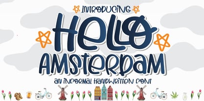 Hello Amsterdam Font is an informal, cute modern, fashionable, friendly, and trendy handwritten font. With its playful yet versatile style, Hello Amsterdam adds a delightful touch to any design project. Whether you're creating greeting cards, invitations, logos, social media posts, or anything in between, this font brings a casual and adept vibe to your work. Its handwritten charm and contemporary appeal make it a perfect choice for those seeking a touch of personality in their designs. Embrace the trendy vibes of Hello Amsterdam Font and let your creativity shine!
 - Broadletter JNL by Jeff Levine,
$29.00Modern digital typography pushes many designers to try and achieve visual perfection with their lettering. In the days of wooden type, the premise was more in creating a font that "sold" the message (possibly, in part due to the lack of advanced tooling to achieve uniformity). In many styles of wood type (such as the one used as a model for Broadletter JNL), there are vast differences within the character design, weight and symmetry from letter to letter. This is now looked upon as "old fashioned" and "charming" - part of the appeal of this typeface. - Brush Script Pro by SoftMaker,
$7.99 Robert E. Smith designed this typeface for American Type Founders in 1942. Brush Script is perfect for display work where an informal, handwritten style is desired, for example in signage and on posters. SoftMaker’s Brush Script Pro typeface comes with a huge character set that covers not only Western European languages, but also includes Central European, Baltic, Croatian, Slovene, Romanian, and Turkish characters. Case-sensitive punctuation signs for all-caps titles are included as well as many fractions, an extensive set of ligatures, and separate sets of tabular and proportional digits.
 - Kafenia by A.E.T.O.S,
$24.99 Kafenia is a geometric display typeface, consisting of capitals and small capitals only. Inspired by the combination of vintage and decorative aesthetics with squarish and compact look, Kafenia claims to be a classy and old stylish slab serif. With more than 1540 glyphs Kafenia is a great tool for your designing needs. Flexible, easily wrapped and reformed with plenty of open type features, Kafenia aims to provide versatility and lots of options for unique results in logos, posters, headlines and every design inspiration you dare bring to life.
 - Miguna by Twinletter,
$10.00 Miguna is a san serif family with relaxed, clean, and charming characteristics. its use is also very flexible, can be used for various design projects, both formal and informal, this font is really amazing. Miguna comes with alternatives from the thinnest to the thickest, helping you in creating titles and text. This font is perfect for packaging, special moment events, branding, banners, posters, movie titles, food and beverages, quotes, clothing, logotypes, and more. Of course, your various design projects will be perfect and amazing, start using our fonts for your amazing projects.
 - Leronda by Larin Type Co,
$16.00 Leronda is an awesome font that can look austere and classic or vintage and softer and more pliable thanks to alternatives. They will add charisma, diversity to your project and emphasize your brave decision. Also lowercase ligatures are included in this font, use them and it will also show your personality. This font is quite heavy weight and is perfect for creating logos, headlines, advertising, branding, book covers and magazines, and much more. Use it in headings and text to highlight important information. This font is easy to use and has OpenType features.
 - Contax by Type Innovations,
$39.00 In the advertising industry, I was often asked to supply the art directors with ideas for a san serif type design that was not the standard Helvetica or Univers. They wanted a fresh new approach, something with generous proportion, like Avant Garde perhaps, but not as uniform in proportions. A font that would lend itself well to wide and long columns of text with lots of leading. So, I rolled up my sleeves and designed a font that meet all their criteria. Contax is the new 'Univers' for the 21st century.
 - Solidus by Brown Type,
$40.00 Inspired by the heuristic typography of the Concrete Poetry movement, Solidus is a hardworking and unobtrusive sans in the Neo-grotesque style. Its simplified features, generous spacing and squarish curves imbue a sense of sobriety and allow the textual information to take centre stage, whether in body copy or at display sizes. Solidus is available in nine distinctive weights from wafer-thin Hairline to a hefty Black, each with accompanying italics. Typical of the Neo-grotesque style the italics are slanted in construction and have the same advance width as the uprights.
 - Moghel Display by Masa Type,
$18.00 Preview Text Moghel Display More information about this Font Moghel display is a modern serif font with a unique ligature style, a high contrast and light font perfect for feminine logo signs, fashion heads & editorial designs, branding projects, Clothing Branding, packaging, magazine headings, advertising, T-shirts, postcards and much more. Moghel display is also included full set of: Uppercase and lowercase letters Automatic ligatures Multilingual characters Numerals Punctuation What will you get? Moghel display Regular.otf Moghel display Italic.otf If you have any questions, don't hesitate to contact me. Thank you, Masa Type
 - Golden Grotesque by moriztype,
$10.00 Golden Grotesque - Designed by Moriztype. The whole family consists of 9 Golden Grotesque Uprights, 9 Golden Grotesque Italic, 19 fonts in all. The font is informal and friendly at first glance and perfect for any display setting, but the straight, upright Golden Grotesque architecture also makes it perfect for longer copies. Due to its large x-height, it even works well in very small sizes. Golden Grotesque - This contemporary type family is ideal for use in retail, cosmetic, food and hospitality applications and advertising. Golden Grotesque is equipped for complex and professional typography.
 - Heartwave by Shaltype Co,
$12.00 Heartwave is a handcraft display typeface that's inspired by old signs, 70's posters, and mixed with modern trend design. Build manually by hands, and reform into clean Typeface. Natural stroke from original hand-lettering. It can be used for just Title or even writing. In this font, you will get : Over 276 glyphs, 49 ligatures in 3 OpenType features, Support for 67 languages. Get HEARTWAVE now! It will best use for any design requirement, many fonts will come with a unique concept. Thank you! Best Regards, PUDJI PANGESTOE STUDIOS
 - Thwaites by Eyad Al-Samman,
$20.00 ‘Thwaites’ typeface is fully dedicated to one of my best Canadian friends who I do cherish and value highly. This great and industrious Canadian friend is ‘James Douglas Thwaites’ who lives along with his good-natured family in British Columbia, Canada. For me, James is like a source of inspiration and I do consider him as an ideal in my life. Our strong friendship has started since 1999 and I hope that it will endure just to the last moment of my life. Sometimes I see him as the writer and poet that I learn a lot from, sometimes I see him as a devoted religious minister that I try to understand more about his teachings, and other times I see him as the educator that I strive to imitate verbatim in my life. When I want to talk more about this Canadian friend, I will not be able to give him his due in full. Thus, I will instead mention some excerpts of his biography that he wrote himself saying that: “James D. Thwaites is a self-accomplished man. Having worked in various fields including restaurant management and cleaning, he has achieved his goals of being a full-time teacher, past-time writer, and volunteer religious minister for the Christian Congregation of Jehovah's Witnesses. His personal and academic pursuits have led him to be published in various magazines, newspapers, self-published books, and websites, including his now defunct ‘poetryofthemonth.com’ website. He continues to learn and augment the craft of writing while working primarily in early literacy and delayed literacy learners, teaching reading and literature to a wide age range of students. He views his religious endeavors as an extension of his academic ones. He teaches others both as a public speaker and in one-on-one situations, teaching about the benefits of submission to God and to His teachings. His future goals include expanding his ministry and continuing his writing.” The name ‘Thwaites’ itself comes from Great Britain and originated from the last Viking raids upon England, being an Anglicized version of a Scandinavian term meaning—depending on the source material—either "a place that is difficult to approach" or "a small thicket of trees." Another recitation mentions that ‘Thwaites’ can be described also as an English surname but one of pre 7th century Norse-Viking origins. It may be either topographical or locational, and is derived from the word "thveit", meaning a clearing or farm. As a locational surname it originates from any one of the various places called "Thwaite", found in several parts of Northern England and East Anglia to the south. The various modern spelling forms include Thwaite, Thwaites, Thwaytes, Thoytes, Twaite, Twatt, Twaites, Tweats and Twite. The name, although often appearing unique to outsiders, can often be found within other famous names like Braithwaite, Goldthwaites, or Misslethwaites. With various spellings, some families not including the ‘e’ or the ‘s’ at the end, Thwaites and its derivations—although not exceedingly common—is a name found worldwide. ‘Thwaites’ typeface is simply a sans-serif streamlined, stylish, and versatile font. It is designed using a combination of thick and thin strokes for its +585 characters. Its character set supports nearly most of the Central, Eastern, and Western European languages using Latin scripts including the Irish language. The typeface is appropriate for any type of typographic and graphic designs in web, print, and other media. It is also absolutely preferable to be used in the wide fields related to publication, press, services, and production industries. It can create a very impressive impact when used in headlines, posters, titles, products’ surfaces, logos, medical packages, product and corporate branding, and also signage. It has also both of lining and old-style numerals which makes it more suitable for any printing or designing purposes. ‘Thwaites’ typeface is really the cannot-miss choice for anyone who wants to possess unique artistic and modern designs produced using this streamlined typeface.
 - PharmaCare - Unknown license

- Spiderwort by Nathatype,
$29.00 Spiderwort is a lovely script font designed in a natural handwriting look. Like the other cursive fonts, the letters are interconnected to each other. This font type is perfectly applicable for texts that combine uppercases and lower cases in order for the writing to look flawlessly connected. Furthermore, it expresses soft and relaxing nuances to use in informal texts. The character of this font is the low contrasts in thin, unfirm lines. Nevertheless, it shows you unique, artistic displays on your designs particularly when you use it well and based on the desired theme. You can apply this font for any text sizes because it is greatly legible and also enjoy the available features here. Features: Ligatures Stylistic Sets Multilingual Supports PUA Encoded Numerals and Punctuations Spiderwort fits best for various design projects, such as brandings, invitations, greeting cards, name cards, quotes, printed products, merchandise, social media, etc. Find out more ways to use this font by taking a look at the font preview. Thanks for purchasing our fonts. Hopefully, you have a great time using our font. Feel free to contact us anytime for further information or when you have trouble with the font. Thanks a lot and happy designing.
 - Zapf Essentials by Linotype,
$29.99Linotype Zapf Essentials is the modernized version of Zapf Dingbats and was also designed by Hermann Zapf himself. Over 372 characters and symbols are included within six fonts and make life a little more communicative, a little more informative, and a lot more interesting. The fonts contain symbols for both professional and everyday uses. With their markers, ornaments and arrows they are informative as well as versatile, timeless and lively. An interesting note to the story of Zapf Essentials: in 1977, Hermann Zapf created about 1000 sketches of signs and symbols. ITC chose those which became known around the world as Zapf Dingbats. For a typesetter, dingbats are the characters in the corner of the type box which can be used for just about anything. The last decade has seen the appearance of new symbols for e-mail, fax, mobile phones and other developments. These are now part of Linotype Zapf Essentials, just as they are now a part of everyday life. For a quick overview of the different Linotype Essentials variations, see the keyboard layout PDF in the Gallery section. It shows the keyboard layout of each font. A helpful hint from Hermann Zapf: Linotype Zapf Essentials should be used sparingly so that the characters retain their emphasis. - FS Untitled Variable by Fontsmith,
$319.99Developer-friendly The studio has developed a wide array of weights for FS Untitled – 12 in all, in roman and italic – with the intention of meeting every on-screen need. All recognisably part of a family, each weight brings a different edge or personality to headline or body copy. There’s more. Type on screen has a tendency to fill in or blow so for each weight, there’s the choice of two marginally different versions, allowing designers and developers to go up or down a touch in weight. They’re free to use the font at any size on any background colour without fear of causing optical obstacles. And to make life even easier for developers, the 12 weight pairs have each been designated with a number from 100 (Thin) to 750 (Bold), corresponding to the system used to denote font weight in CSS code. Selecting a weight is always light work. Easy on the pixels ‘It’s a digital-first world,’ says Jason Smith, ‘and I wanted to make something that was really functional for digital brands’. FS Untitled was made for modern screens. Its shapes and proportions, x-height and cap height were modelled around the pixel grids of even low-resolution displays. So there are no angles in the A, V and W, just gently curving strokes that fit, not fight, with the pixels, and reduce the dependency on font hinting. Forms are simplified and modular – there are no spurs on the r or d, for example – and the space between the dot of the i and its stem is larger than usual. The result is a clearer, more legible typeface – functional but with bags of character. Screen beginnings FS Untitled got its start on the box. Its roots lie in Fontsmith’s creation of the typeface for Channel 4’s rebrand in 2005: the classic, quirky, edgy C4 headline font, with its rounded square shapes (inspired by the classic cartoon TV shape of a squidgy rectangle), and a toned-down version for use in text, captions and content graphics. The studio has built on the characteristics that made the original face so pixel-friendly: its blend of almost-flat horizontals and verticals with just enough openness and curve at the corners to keep the font looking friendly. The curves of the o, c and e are classic Fontsmith – typical of the dedication its designers puts into sculpting letterforms. Look out for… FS Untitled wouldn’t be a Fontsmith typeface if it didn’t have its quirks, some warranted, some wanton. There’s the rounded junction at the base of the E, for example, and the strong, solid contours of the punctuation marks and numerals. Notice, too, the distinctive, open shape of the A, V, W, X and Y, created by strokes that start off straight before curving into their diagonal path. Some would call the look bow-legged; we’d call it big-hearted. - FS Untitled by Fontsmith,
$80.00 Developer-friendly The studio has developed a wide array of weights for FS Untitled – 12 in all, in roman and italic – with the intention of meeting every on-screen need. All recognisably part of a family, each weight brings a different edge or personality to headline or body copy. There’s more. Type on screen has a tendency to fill in or blow so for each weight, there’s the choice of two marginally different versions, allowing designers and developers to go up or down a touch in weight. They’re free to use the font at any size on any background colour without fear of causing optical obstacles. And to make life even easier for developers, the 12 weight pairs have each been designated with a number from 100 (Thin) to 750 (Bold), corresponding to the system used to denote font weight in CSS code. Selecting a weight is always light work. Easy on the pixels ‘It’s a digital-first world,’ says Jason Smith, ‘and I wanted to make something that was really functional for digital brands’. FS Untitled was made for modern screens. Its shapes and proportions, x-height and cap height were modelled around the pixel grids of even low-resolution displays. So there are no angles in the A, V and W, just gently curving strokes that fit, not fight, with the pixels, and reduce the dependency on font hinting. Forms are simplified and modular – there are no spurs on the r or d, for example – and the space between the dot of the i and its stem is larger than usual. The result is a clearer, more legible typeface – functional but with bags of character. Screen beginnings FS Untitled got its start on the box. Its roots lie in Fontsmith’s creation of the typeface for Channel 4’s rebrand in 2005: the classic, quirky, edgy C4 headline font, with its rounded square shapes (inspired by the classic cartoon TV shape of a squidgy rectangle), and a toned-down version for use in text, captions and content graphics. The studio has built on the characteristics that made the original face so pixel-friendly: its blend of almost-flat horizontals and verticals with just enough openness and curve at the corners to keep the font looking friendly. The curves of the o, c and e are classic Fontsmith – typical of the dedication its designers puts into sculpting letterforms. Look out for… FS Untitled wouldn’t be a Fontsmith typeface if it didn’t have its quirks, some warranted, some wanton. There’s the rounded junction at the base of the E, for example, and the strong, solid contours of the punctuation marks and numerals. Notice, too, the distinctive, open shape of the A, V, W, X and Y, created by strokes that start off straight before curving into their diagonal path. Some would call the look bow-legged; we’d call it big-hearted.
 - etch a sketch - Personal use only

- Velvet by Reserves,
$39.99 Velvet is a heavy rounded block retro face inspired by the typeset album cover of the protopunk rock band The Velvet Underground’s debut. Stylistically, Velvet’s extreme angled terminals exude a sense of tension and irreverance, contrasting the smooth rounded block letter forms.
 - Railyard Stencil JNL by Jeff Levine,
$29.00Railyard Stencil JNL is a stencil variant of Decal JNL that was set aside for a long time in a forgotten work folder. It's broad strokes and sharp serifs emulate the vintage look of old railway cars and other earlier forms of transportation. - Alpha Juliet by Wiescher Design,
$39.50 Alpha Juliet is another font in my alpha-series, the experimental font series. It lends itself to modern designs in all forms. The font can be used together with Alpha Papa since it has the same origins. Your experimental designer, Gert Wiescher
 - North Bergen by Design is Culture,
$39.00 North Bergen is a dirty sans serif based on letterforms seen painted on a wall of a magazine store in North Bergen, New Jersey. Its unrefined, quirky forms reflect a typographic naivete and are meant to evoke a sense of hand painted signage.
 - Dada Sans Pro by Dada Studio,
$20.00 Dada Sans Pro is simple in form but elegant font with huge language support and OpenType features such as ligatures, stylistic alternates, ordinals, fractions, four variations of numerals and many more... It is suitable for large headlines in applications like magazines or newspapers.
 - M Young Hei HK by Monotype HK,
$523.99HK series fonts are in Unicode encoding and consists of BIG 5 character set and HKSCS characters. The character glyphs are based on the regular Traditional Chinese writing form and style. It is generally used in Taiwan ROC, Hong Kong and Macau. - Mokka by Ludwig Type,
$45.00 Mokka is a robust and crisp typeface with strong serifs and individual forms. Even in text and striking in display, it is suitable for a wide variety of uses. The style-linked family includes oldstyle and lining figures both tabular and proportional.
 - Song Folio JNL by Jeff Levine,
$29.00 A 1940s Australian song folio featuring tunes performed by singer-actress Deanna Durbin had her name hand lettered in an interesting Art Deco style sans. This became the basis for Song Folio JNL, capturing all the nuances of the original in digital form.
 - Ronsten by Fontron,
$35.00I know there are already quite a few Stencil type fonts but maybe this fills a niche. A very chunky serif stencil where the serifs are closely aligned and help form the the curves of the letters. An Italic is also available. - M Kai HK by Monotype HK,
$523.99HK series fonts are in Unicode encoding and consists of BIG 5 character set and HKSCS characters. The character glyphs are based on the regular Traditional Chinese writing form and style. It is generally used in Taiwan ROC, Hong Kong and Macau. - M HG Hagoromo T HK by Monotype HK,
$523.99HK series fonts are in Unicode encoding and consists of BIG 5 character set and HKSCS characters. The character glyphs are based on the regular Traditional Chinese writing form and style. It is generally used in Taiwan ROC, Hong Kong and Macau. - Upbeat by Jeff Levine,
$29.00 The free-form Art Nouveau hand lettering on the cover of the 1918 sheet music for “Smilin’ Through” (from the MGM motion picture of the same name starring Norma Shearer) is the model for Upbeat JNL; available in both regular and oblique versions.
 - P22 Vidro by IHOF,
$24.95 Vidro is a glass technique introduced by the Dutch in Japan in the 16th century. Vidro glassworks, such as decorations and children's toys, enrich the live of Japanese people. P22 Vidro is comprised of simple forms that express both irregularity and fluidity.
 - Uptown JNL by Jeff Levine,
$29.00 Uptown JNL was found amidst the pages of a 1944 edition of the vintage lettering design book entitled "Sixty Alphabets". This lovely Art Deco typeface has slight curvature to the straight lines of the letter forms and a wonderful hand-lettered look.

