9,769 search results
(0.027 seconds)
- Presa ANTIPIXEL.COM.AR - Personal use only

- green piloww - Personal use only

- Presse (Unregistered) - Unknown license

- Green Fuz - Unknown license

- Sybil Green - Unknown license

- Potato Press - Unknown license

- BM press - Unknown license

- Green Dinosaur - Unknown license

- Green Babe - Unknown license

- Green Fairy by Maria Montes,
$39.00 Green Fairy is a chromatic font family highly ornamented for display purposes. Green Fairy’s characters have been specifically designed to accommodate its loops and ornaments following a modern typeface structure. Green Fairy has four chromatic weights: 1. Green Fairy Outline 2. Green Fairy Dots 3. Green Fairy Stencil 4. Green Fairy Full The outline weight has been created as the base or structure for the other weights. You can combine these weights as well as add colours to obtain multiple effects and type styles. Green Fairy has also three combined weights (combos) to simplify your work flow, for these occasions when you only want to use one single colour in your font: 5. Green Fairy Dots Combo 6. Green Fairy Stencil Combo 7. Green Fairy Full Combo GREEN FAIRY ORIGINS The origin of this typeface is the lettering I designed in October 2015 as part of my illustrated cocktail artwork called “Absinthe. La Fée Verte (The Green Fairy)”. Originally, this lettering only featured eight letters “AB·SINTHE” vector drawn in Illustrator. Right after creating the full-colour artwork, I designed a fountain-letterpress print version of it, in collaboration with Ladies of Letters, A.K.A. Carla Hackett and Amy Constable from Saint Gertrude Fine Printing. At the beginning of 2016 –and thanks to the project @36daysoftype– I found the motivation, and most importantly the deadline, to draw the rest of the twenty-six letters of the uppercase alphabet using Illustrator. I started 2017 having my first two calligraphy courses sold out, so I took this amazing opportunity to devote myself to Green Fairy for a few months. In February 2017, I purchased the font software Glyphs and I started to re-draw all twenty-six letters of the uppercase alphabet again. PRODUCTION PROCESS Green Fairy started being one weight, but quickly turned into a layered/chromatic font. Things were going more or less fine till I arrived to the Dots weight: 1) I started drawing squares following a grid; 2) Then, the squares turned into diamonds following the same grid; 3) Then, the grid wasn’t working so well on the round letters so I tried randomising the position of the diamonds but it didn’t work; 4) So I went back to the grid, and this time scaled down the size of the diamonds creating a visual half-tone effect. I spent over four weeks working on the Dots weight and I felt like I was in the middle of a very long tunnel and I couldn’t see the light at the end. I encountered many other problems along the way but by June 2017, I felt I was back on track again. I kept working, tweaking, re-drawing and re-adjusting, and then the diacritics came on board… And then more re-drawing, re-tweaking, re-adjusting and then numbers… And then spacing, symbols, and currencies… And then more spacing, kerning, contextual kerning for triplets… In September 2017 I told myself “that’s it, I’m going to finish it now!” But guess what? More re-tweaking, testing, hinting, testing, rendering, testing… For those of you not familiarized with typeface design, it is extremely time consuming and it requires a lot of hard work, focus and determination. This project could not have been possible without the help of these generous professionals: Jose Manuel Urós, typeface designer based in Barcelona and my teacher twice in the past; Jamie Clarke, freelance letterer and typeface designer who has released a couple of chromatic fonts recently; Troy Leinster, Australian full-time typeface designer living and working in New York City; Noe Blanco, full-time typeface designer and hinting specialist based in Catalonia; And Nicole Phillips, typographer currently relocating from Australia to New Zealand. To all of you: THANK YOU VERY MUCH!
 - Lemon Press by Attype Studio,
$7.00 Lemon Press is display font of fresh lemon, come up with two font regular and display. It is suitable for any summer event! Lemon Press is perfect for branding, logo, invitation, stationery, social media post, product packaging, merchandise, blog design, game titles, cute style designs, Book/Cover Titles and more. Multilingual Support included for Afrikaans, Albanian, Catalan, Danish, Dutch, English, Estonian, Finnish, French, German, Icelandic, Italian, Norwegian, Portuguese, Spanish, Swedish, Zulu. Hope you enjoy with our font! Attype Studio
 - Green Berry by Gassstype,
$28.00 Introducing of our new product Green Berry it is a unique font and also has vintage display 2 style font. Can make it easier to convey the message in your design. Use for awesome display, labeling, movie sceen, poster, movie title, gigs, album covers, logos, and much more.
 - Prose Sans by Ayca Atalay,
$29.00 Prose Sans is a wide sans serif font family that comes in 8 weights. With its slightly tilted axis and relatively high contrast strokes, it is both elegant and strong. The standard and discretionary ligatures help achieve a more tailored look, excellent for branding, logo design, poster design etc.
 - Soft Press by Canada Type,
$24.95 This is the rounded, softer version of Canada Type's popular Press Gothic. Originally done in 2011 for a global publisher, this font has already seen plenty of magazine and book cover action, perhaps even more than the sharp condensed face that spawned it. And like Press Gothic, Soft Press comes with small caps and biform/unicase forms, in addition to the main upper/lowercase set. The extended language support covers a wide range, including Greek and Cyrillic, Turkish, Baltic, Central and Eastern European languages, Celtic/Welsh and Esperanto. The Pro version combines all three TrueType fonts into one OpenType-programmed font, taking advantage of class-based kerning, the small caps feature, and the stylistic alternates feature for the biform shapes.
 - Green Nature by ZetDesign,
$10.00 We're introducing our new product that we named Green Nature..... this font is inspired by leaves, so it gives a beautiful and natural impression. This font is very suitable for clothing, logos, magazines, banners, etc. With natural touch, this font is the best choice for your natural business. Files included: green nature.otf
 - Acid Green by The Flying Type,
$26.00 Acid Green has quite a psychedelic flair, but its origins are from long before the sixties psychedelia. Its roots date back to 1914, from an unnamed alphabet by J.M. Bergling, the amazing jewelry engraver and 'letterform inventor'—as he considered himself—whose books of art alphabets and lettering influenced countless artists, including, not surprisingly, those involved with the genesis of Art Nouveau and Art Deco movements. Perfect for multiple display uses, including retro designs and trippy letterings, Acid Green has an extensive character set, with multilingual support covering 208 languages. There are yet some handy stylistic alternatives for some extra grooviness. Acid Green is somewhat retro looking, for sure, but it can sound perfectly contemporary too. Tune in and enjoy a creative trip! [Pizza illustration on the first graphic by our neighbor @pedrocorrea84]
 - Green Peas by Four Lines Std,
$15.00 Crafted with meticulous attention to detail, Green Peas Font offers a harmonious balance between beauty and elegance of nature. Green Peas Font combines legibility adnd Readibility with a touch of whimsy, making it perfect for both digital and print mediums. Its versatility allows you to seamlessly incorporate it into various projects, from website headers, quotes, inspirational messages, posters, stickers, social media graphics, or personal journals, to book covers, ensuring a consistent and visually striking presence. Unlock the extraordinary power of Green Peas Font and witness the transformative effect it has on your designs.
 - Green Mexican by Vozzy,
$10.00 Introducing a vintage look label font named "Green Mexican". You can see all available characters in the posters. This font has 4 styles. This font will look good on any retro design like poster, t-shirt, label, logo etc.
 - Master Press by Fenotype,
$25.00 A stalwart vintage serif, Master Press displays rounded features and a resolute character in its design. Ideal for book covers, posters, labels, and any application requiring a sense of sturdiness and safety, Master Press delivers precisely that. Master Press boasts a generous x-height and slightly exaggerated proportions, situating it in the realm of "intellectual pizza" on the cultural spectrum. Enhanced with 46 Swash, Stylistic, and Titling Alternates, Master Press offers a versatile typographic toolkit.
 - Green Delight by Putracetol,
$22.00 Introducing “Green Delight,” a quirky vegetarian-themed font that embodies the essence of freshness, health, and the vibrant world of fruits and vegetables. This display font, with its rounded edges and unique design, is crafted for those who are passionate about nature, wellness, and creativity. Each letter is infused with elements inspired by various greens - from leafy vegetables to succulent fruits - making it a perfect choice for projects related to children, crafting, or any fun and playful themes.
 - Green Grove by True Story Letterworks,
$12.00 Green Grove is a display typeface with low contrast and compressed proportions. It works good in headlines for posters, key visuals, corporate identity and package design.
 - Greene Designs by Woodside Graphics,
$19.95This font consists of 26 design elements derived and adapated from various architectural works of Charles and Henry Greene who created hundreds of designs for houses, furniture and decorative arts in their own unique interpretation of the "Arts & Crafts" style in the early years of the 20th Century, mostly in Pasadena, California. Many of the picture elements are designed to form distinctive borders, and the variety of designs contained in this font encourages their use in many creative ways. - Green Brooks by Asenbayu,
$14.00 Green Brooks is a semi serif decorative display font. A mix of abstract and curves inspired by flowing rivers in nature, this font has beautiful flowing shapes. This font also has a modern feel with a sans serif outline. You can use this font in both modern and vintage designs. This font is suitable for attractive packaging label designs, unique desired logos, poster designs, fashion and many more. Green Brooks font features: standard glyph, kerning, stylistic alternates, stylistic ligatures, symbol, punctuation and multi languages supported.
 - Butter Press by Gassstype,
$22.00 Introducing Butter Press - Grungy cartoon font brush that written casually and quickly. Letters are made with brushes on Procreate. Then crafted carefully drawn into a vector format. That is why Butter Press has authentic and relaxed characteristics and a more natural look to your text with a more natural look. You can activate Ligature OpenType panel to make these two styles.ligatures that make your text and design more interesting. Butterpress is perfect for homeware designs, branding projects, Logo design, Quotes product packaging
 - Green Home by DLetters Studio,
$18.00 Hello, This GREEN HOME Sans Serif font, has a Skinny, Stylish, and elegant Shape is perfect for your design ideas with the theme of Home Decorating, Home Idea, and is also very suitable as a complementary font for any of your photography and creative works. What’s Included : – Web Fonts – Ligature – Works on Win, Mac – Simple installations – Accessible in Adobe Illustrator, Adobe Photoshop, Adobe InDesign, even work on Microsoft Word. – PUA Encoded Characters – Fully accessible without additional design software. Hope you enjoy it with GREEN HOME font! Contact me if you have questions
 - Oxford Press by Set Sail Studios,
$17.99 Recreate authentic letterpress typography with Oxford Press, a set of chunky uppercase Serif & Sans fonts designed using real vintage metal letterpress blocks sourced from old printing companies. The Serif & Sans fonts each have two variations, 'Clean' and 'Rough'—with the latter having real, highly detailed hand-made letterpress textures applied to each letter. Each letter of the 'Rough' fonts also has an alternate texture, which can be accessed simply by switching between upper and lowercase characters. The 'Rough' fonts can make a striking impact as bold header text for posters, adverts, prints and packaging, whereas the 'Clean' versions are more suited for smaller accompanying text, cleaner designs or for applying your own textures and styles. Language Support • English, French, Italian, Spanish, Portuguese, German, Swedish, Norwegian, Danish, Dutch, Finnish, Indonesian, Malay, Hungarian, Polish, Croatian, Turkish, Romanian, Czech, Latvian, Lithuanian, Slovak, Slovenian.
 - Green Leaves by Sakha Design,
$14.00 Green Leaves is a romantic and sweet handwritten font. It looks astonishing on love letters, greeting cards, logos, business cards, and every other design which needs a personalized touch. This font is PUA encoded which means you can access all of the glyphs and swashes with ease!
 - Press Grotesk by Studio Vachement,
$19.99 Press Grotesk is a handmade sans serif, condensed font that takes inspiration from old letterpress printing processes & handcrafting. The font's slightly imperfect, uneven appearance works perfectly for surfing, skating, motorcycling, coffee shops, health, wellness, adventure brands, and much more. Press Grotesk features 2 weights (fat and skinny), upper- and lowercase, many advanced characters and illustrations in order to achieve a truly hand painted look.
 - Bremer Presse by Schraube,
$29.00 As most successful German private press, «Bremer Presse» has strongly influenced German book art. It was founded 1911 in Bremen to print and produce books in perfection. The role model of the press’ typeface was the english Doves Press. Willy Wiegand drew three versions of the «Bremer Presse» antiqua font, starting with the regular weight in 16 pt and adding later the regular weights in 11 and 12 pt. The revival of this beautiful font is based on the 12 pt weight. During the design process, the focus was laid on finding the elegance and strength of original prints. As it was designed to print books, the typeface is optimally used for texts. And with the revival’s new weights «medium» and «bold» and OpenType features like ligatures or old style figures, you can design sophisticatedly typographical compositions.
 - Resonance Love by Andrey Font Design,
$10.00 Resonance Love is a romantic and natural handwritten font, featuring beautiful hearts as ornaments. It is ideal for valentine-themed greeting cards, weddings, and any crafting projects that require a warm touch. This font is PUA encoded which means you can access all of the glyphs and swashes with ease!
 - Easter Risen by Letterara,
$14.00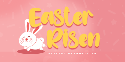 Easter Risen is a new, fresh, sweet, and unique handcrafted font. It's ideal for branding and decorate your projects. Easter Risen font has a classy and modern look that can be used for logos, branding, easter, invitations, posters, advertisements, stationery, animated films, social media posts, youtube channel, and much more! It is PUA coded which means you can access all the glyphs and sweeps easily!
 - Colonial Press by Simeon out West,
$25.00 Colonial Press is a font based on serif typefaces designed by William Caslon I (1692-1766) and various revivals thereof. Caslon is cited to be the first original typeface of English origin, but some type historians point out the close similarity of Caslon's design to the Dutch Fell types, presumed to be the work of Dutch punchcutter Dirck Voskens. Colonial Press harkens to the look and feel of newspapers in Colonial North America around the mid 1700s without the rough edges commonly associated with colonial printing and many reconstructions. The rough quality of the American typeface is believed to be the result of oxidation from the exposure to seawater during the long voyage from England to the Americas. Colonial Press is a heavy font that retains some of the handcut quality of these fonts while smoothing out the irregularities that make many of these fonts so visually distracting at larger point sizes. For the italic version of this font, I chose to emulate the more ornate letterforms that I have encountered, giving the italic characters a more ornamental feel. Colonial Press comes with full punctuation and a 362 glyph character set for most Western European-based Latin alphabet languages. It is a font that is designed both for normal typing and for larger, decorative display.
 - Fresh Press by Fenotype,
$30.00 Fresh Press is a pack of handmade goodness - a visual delight in the form of a beautiful and strong script family. Fress Press consists of Regular, Bold, Caps and Ornaments that all play smoothly together. If Fresh Press feels too clean, there’s a Printed version of the whole family with a rough outline and texture. Fresh Press is equipped with Standard Ligatures and Contextual Alternates that maintain a smooth text flow. If that isn’t enough, try Swash, Stylistic or Titling Alternates in any OpenType-savvy program, or manually look for alternates from character map. Fresh Press is a clear and strong choice for any display use from branding to packaging and online to print.
 - Spooky Green by Illushvara,
$13.00 Spooky Green is an incredibly unique and quirky display font. Its friendly feel makes this font incredibly versatile, fitting a wide range of contexts. Add it to your creative ideas and notice how it makes them stand out!
 - Beauty Green by BonjourType,
$13.00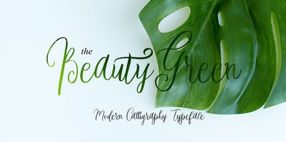 Proudly Present, BeautyGreen Font. BeautyGreen is a modern script font, masterfully designed to become a true favorite. It maintains its classy calligraphic influences while feeling contemporary and fresh. Fall in love with it and bring your projects to the highest levels! Fonts featured : Uppercase, Lowercase, Numbers, Symbols, Accents, Stylistic, Swash, and Ligatures. BeautyGreen also multilingual support
 - Resonant Chilliner by Lemonthe,
$9.00 Resonant Chilliner is a spectacular duo font (Serif and Script). Perfect for product packaging, branding project, magazine, social media, and much more. Add this font to your favorite creative ideas and notice how it makes them come alive! NOTE: Quick access beginning and ending swash with ligature, add (2-3)x underscore before or after lowercase a-z.
 - Peckham Press by EllenLuff,
$28.00 Peckham Press is a bold hand-pressed typefamily, with a raw aesthetic and solid industrial style. The font brings a spirit of street culture, with its defiant shapes, rough edges and unadulterated imperfections. It works best in strong design, and situations that require an authentic voice. This font is handmade and includes full original texture with density variants and original nicks and grit, with access options to suit different needs. The vector format allows the textured affect show up on any program, no additional software or updates required.Peckham Press supports a wide range of latin languages and paired with it's diverse flexibility allows it to handle projects of any size.
 - Mrs Green by Hipopotam Studio,
$2.00 Mrs Green is a great typeface for short texts, invitations, headlines, logotypes and advertising. We’ve started with a heavy capital G and A. At the beginning it was supposed to be just one fat style (still our favorite). But after a few months we’ve ended up with a family of 20 styles. It has contextual alternates, fractions, four types of figures (old style, lining, superior and inferior), ordinals and a case feature.
 - Press Gothic by Canada Type,
$24.95 Press Gothic is a revival of Aldo Novarese's Metropol typeface, released by Nebiolo in 1967 as a competitor to Stephenson Blake's Impact (designed by Goeffrey Lee). Though Metropol enjoyed a few short months of popularity and use in Italy, Germany and France, Impact won the technological outlasting battle by moving on to film type then to computer outlines bundled with mainstream software, while Metropol never made it past the metal state until now. Too bad really, since this is one of the few faces that could have played well with all the horrendous stretch'n'squeezing of the 1970s. Just like its inspiration, Press Gothic aims to be a fresh alternative to big economical poster fonts with clear sans serif forms and an urgent, strong, yet elegant design appeal. In the summer of 2008, Press Gothic underwent a major linguistic and aesthetic reworking for an international publishing company. The result of this on the retail side are new small capitals and biform/unicase additions to the main font, as well as expanded language support that includes Cyrillic, Greek, Turkish, Baltic, Central and Eastern European, Maltese, and Esperanto. Press Gothic Pro, the OpenType version, combines all three fonts into one, taking advantage of the small caps feature, and the stylistic alternate feature for the biform shapes.
 - Polar Press by Attype Studio,
$14.00 Polar Press is a vintage all caps font with 2 styles: clean and rough, and includes 22 ligatures. Polar Press is a strong font and is perfect for branding, logos, invitations, stationery, social media posts, product packaging, merchandise, blog design, game titles, retro style design, Book/Cover Titles and more.


