10,000 search results
(0.043 seconds)
- Lino Stamp - Unknown license

- Gunplay by Typodermic,
$11.95 Are you tired of weak, flimsy fonts that can’t handle the heat? Look no further than Gunplay—the tenacious stencil typeface that will make your message stand out from the pack. Inspired by the iconic 1972 film The Getaway, Gunplay exudes a gritty, rugged aesthetic that demands attention. With three different special effect styles, this font brings a bold and authoritative voice to your designs. Whether you’re looking to make a statement with a bold headline or add a touch of grit to your body text, Gunplay has got you covered. With its rugged design, this typeface can handle anything you throw its way. So if you’re ready to take your designs to the next level, give Gunplay a try. With its tough voice of authority, this font is sure to leave a lasting impression. Some Latin-based European writing systems are supported, including the following languages. Afaan Oromo, Afar, Afrikaans, Albanian, Alsatian, Aymara, Basque, Bemba, Bikol, Breton, Cape Verdean, Creole, Catalan, Cebuano, Chamorro, Chavacano, Danish, Dawan, Dholuo, Dutch, English, Estonian, Faroese, Fijian, Filipino, Finnish, French, Frisian, Friulian, Galician, Genoese, German, Guadeloupean Creole, Haitian Creole, Hiligaynon, Icelandic, Ilocano, Indonesian, Irish, Italian, Jamaican, Kaqchikel, Kikongo, Kinyarwanda, Kirundi, Lombard, Low Saxon, Luxembourgish, Makhuwa, Malay, Ndebele, Neapolitan, Norwegian, Novial, Occitan, Papiamento, Piedmontese, Portuguese, Quechua, Rarotongan, Romansh, Sango, Saramaccan, Sardinian, Scottish Gaelic, Shona, Sicilian, Silesian, Slovak, Slovenian, Somali, Sotho, Spanish, Swahili, Swazi, Swedish, Tagalog, Tetum, Tshiluba, Tsonga, Tswana, Tumbuka, Uzbek (Latin), Venetian, Võro, Walloon, Waray-Waray, Wayuu, Xhosa, Yapese, Zapotec Zulu and Zuni.
 - Air Superfamily by Positype,
$29.00 In B-movie awesomeness, Air began as Grotesk vs. Grotesque. I was trying to unify the prevailing traits of German and English Grotes(que/k)s in order to make something different but familiar. I am NOT trying to reinvent Helvetica (snore), so get that out of your system. From the onset, I intended this typeface to be a true workhorse that offers infinite options and flexibility for the user. At its core, it is the maturation of the Aaux Next skeleton I developed years ago. I worked out Aaux Next to settle my issues and love for Akzidenz. With Aaux Next, I strove to be mechanical, cold and unforgiving with it. I was single, young, cocky and it fit. Now I'm married, kids, dog and have found that I've turned into a big softy. When I look at Aaux Next (and have for the past few years) I see another typeface trying to eek out. I wanted it to avoid the trappings of robotic sans, quick tricks and compromises. The typeface’s DNA needed to be drawn and not just generated on a screen — so I set aside a year. I love type. I love working with type. I hate when my options for a slanted complement is only oblique or italic. I set out to produce both to balance usage — there are more than enough reasons to prepare both and I want the user to feel free to consciously choose (and have the option to choose) the appropriate typeface for print, web, etc. That flexibility was central to my decision-making process. The Oblique is immediate and aggressive. The Italic was redrawn at a less severe angle with far more movement and, as a result, is far more congenial when paired with the Uprights. Condensed and Compressed. Yep, why not? I know I would use them. There are nine weights currently available. The logical progression of weights and the intended flexibility demanded I explore a number of light weights and their potential uses — this has produced a number of ‘light without being too light’ options that really work based on the size. The result is a robust 81-font superfamily that is functional, professional, and highly legible without compromising its personality. Pair that with over 900 characters per font that includes ligatures, discretionary ligatures, stylistic alternates, fractions, proportional/tabular lining and proportional/tabular oldstyle figures, numerators, denominators, ordinals, superiors, inferiors, small caps, case-sensitive functionality and extensive language support and you have a versatile superfamily well-suited for any project.
 - Modern Neon by Ditatype,
$29.00 Modern Neon is an audacious display font that combines the allure of neon lights with an array of captivating lines. With its uppercase letterforms, this typeface commands attention, creating a visually stunning experience that leaves a lasting impression. The defining feature of Modern Neon lies in its bold and adventurous lines that adorn each letter. These radiant lines flow dynamically throughout the characters, adding an element of complexity and intrigue. The interplay of these luminous lines creates a visual spectacle, captivating the viewer's gaze and drawing them into a world of electrifying typography. Inspired by the vibrant glow of neon signs, Modern Neon exudes a futuristic energy. The font's luminosity casts a vivid hue, evoking a sense of innovation and modernity. Each letter pulsates with an otherworldly glow, creating a striking visual impact that cannot be ignored. Each letter of this font has been meticulously crafted to strike a balance between legibility and decorative intricacy. The interconnected lines add depth and movement to the characters, enhancing the overall composition without compromising readability. The result is a font that exudes creativity and boldness while ensuring your message remains clear and impactful. You can also enjoy the various features available in this font. Enjoy the various features available in this font. Features: Alternates Ligatures Multilingual Supports PUA Encoded Numerals and Punctuations The strong and bold strokes demand attention, making this font perfect for headlines, titles, and impactful statements. Whether you're creating posters, branding materials, digital artwork, or anything in between, this font will add a daring and captivating element. It particularly shines in applications related to technology, gaming, fashion, and futuristic themes. Find out more ways to use this font by taking a look at the font preview. Thanks for purchasing our fonts. Hopefully, you have a great time using our font. Feel free to contact us anytime for further information or when you have trouble with the font. Thanks a lot and happy designing.
 - Neon Backlight by Ditatype,
$29.00 Neon Backlight is a stunning display font that brings the mesmerizing beauty of neon lights to your typography. With its bold uppercase letterforms and a luminous backlight, this typeface demands attention, creating a captivating visual experience that leaves a lasting impression. The defining feature of Neon Backlight lies in its vibrant neon backlight effect. Each letter is imbued with a radiant glow that casts a captivating hue, evoking the nostalgic charm of neon signs illuminating the night. The luminous backlight adds depth and dimension, creating a sense of depth that draws the viewer in. Inspired by the enchanting allure of neon lights, Neon Glow exudes a futuristic energy. The font captures the vibrant spirit of urban nightlife and the excitement of bustling city streets. The neon glow infuses each letter with an electrifying aura, creating a striking visual impact that is both contemporary and timeless. Each letter of Neon Backlight is carefully crafted to balance the neon aesthetic with legibility. The uppercase characters are bold and easily recognizable, ensuring your message remains clear and impactful. The neon backlight enhances the overall composition, making the font truly come alive with an irresistible glow. Features: Ligatures Multilingual Supports PUA Encoded Numerals and Punctuations Neon Backlight thrives in designs that embrace a dynamic and vibrant style. Whether you're creating posters, signage, logos, or digital artwork, this font will add a dazzling element that sets your project apart. It particularly shines in applications related to nightlife, entertainment, fashion, and retro-themed designs. The bold strokes and clean lines exude confidence, making this font perfect for headlines, titles, and statements that demand attention. Find out more ways to use this font by taking a look at the font preview. Thanks for purchasing our fonts. Hopefully, you have a great time using our font. Feel free to contact us anytime for further information or when you have trouble with the font. Thanks a lot and happy designing.
 - De Rotterdam by Roland Hüse Design,
$20.00 This font is a clean, modern sans serif bold. Named after “De Rotterdam”* this huge and super cool building (read the story below). Great for headlines, Posters, Flyers but also well legible at small size in large texts. Contains All European language accents and characters. --- The Story --- *This complex is located in the Kop Van Zuid district of Rotterdam, on Wilhelminapier. I was lucky to see this building from the beginning (2009) growing up (2013) That time when I was working and living here. I was always amazed by the design and how huge it is every time I took a look at it while driving or walking on the Erasmus Bridge. When I was going to work or just hiking around the city. It has a special meaning and message for me: I started creating fonts in my free time in 2010 when I came to this city to work. I was factory worker, dishwasher etc. I grew together with this amazing construction from brick to brick, step by step. By the time its construction finished, I was able to quit my day job and become a full time freelance designer.
 - Darkness Awakening by Ditatype,
$29.00 Darkness Awakening is a chilling display font designed to send shivers down your spine. This uppercase font features eerie details that give it an air of horror and mystery, making it the perfect choice for spine-tingling design projects. Each letter in Darkness Awakening is meticulously crafted with the appearance of brush strokes, evoking a sense of handcrafted artistry. The brush details add a touch of unpredictability and chaos, giving the font a haunted and unsettling vibe. While the font is uppercase, it is not bold, allowing the horror theme and brush details to take center stage. For the best legibility you can use this font in the bigger text sizes. Enjoy the available features here. Features: Multilingual Supports PUA Encoded Numerals and Punctuations Darkness Awakening fits in headlines, logos, movie posters, flyers, invitations, branding materials, print media, editorial layouts, headers, and any horror-themed projects. Find out more ways to use this font by taking a look at the font preview. Thanks for purchasing our fonts. Hopefully, you have a great time using our font. Feel free to contact us anytime for further information or when you have trouble with the font. Thanks a lot and happy designing.
 - SchulVokalDotless - 100% free

- Aaux Next Wide by Positype,
$22.00 When the original Aaux was introduced in 2002, I intended to go back and expand the family to offer more versatility. Years went by before I was willing to pick it up again and invest the proper time into building a viable and useful recut. Just putting a new designation and tweaking a few glyphs here and there would not do the designer or the typeface justice; instead, I chose to redraw each glyph's skeleton from scratch for the four main subsets of the super family along with their italics. Each glyph across the super family is 'connected at the hip' with each style—each character carries the no frills, simple architecture that endeared so many users to it. The new recut expands the family to an enormous 72 typefaces! The original has spawned Compressed, Condensed and Wide subsets—all with corresponding weights—for complete flexibility. Additionally, all of the original weight variants have all been incorporated within the OpenType shell: Small Caps and Old Style Figures are there along with new tabular figures, numerators and denominators, expanded f-ligatures and a complete Central European character set.
 - Aaux Next by Positype,
$22.00 When the original Aaux was introduced in 2002, I intended to go back and expand the family to offer more versatility. Years went by before I was willing to pick it up again and invest the proper time into building a viable and useful recut. Just putting a new designation and tweaking a few glyphs here and there would not do the designer or the typeface justice; instead, I chose to redraw each glyph's skeleton from scratch for the four main subsets of the super family along with their italics. Each glyph across the super family is 'connected at the hip' with each style—each character carries the no frills, simple architecture that endeared so many users to it. The new recut expands the family to an enormous 72 typefaces! The original has spawned Compressed, Condensed and Wide subsets—all with corresponding weights—for complete flexibility. Additionally, all of the original weight variants have all been incorporated within the OpenType shell: Small Caps and Old Style Figures are there along with new tabular figures, numerators and denominators, expanded f-ligatures and a complete Central European character set.
 - Aaux Next Cond by Positype,
$22.00 When the original Aaux was introduced in 2002, I intended to go back and expand the family to offer more versatility. Years went by before I was willing to pick it up again and invest the proper time into building a viable and useful recut. Just putting a new designation and tweaking a few glyphs here and there would not do the designer or the typeface justice; instead, I chose to redraw each glyph's skeleton from scratch for the four main subsets of the super family along with their italics. Each glyph across the super family is 'connected at the hip' with each style—each character carries the no frills, simple architecture that endeared so many users to it. The new recut expands the family to an enormous 72 typefaces! The original has spawned Compressed, Condensed and Wide subsets—all with corresponding weights—for complete flexibility. Additionally, all of the original weight variants have all been incorporated within the OpenType shell: Small Caps and Old Style Figures are there along with new tabular figures, numerators and denominators, expanded f-ligatures and a complete Central European character set.
 - Aaux Next Comp by Positype,
$22.00 When the original Aaux was introduced in 2002, I intended to go back and expand the family to offer more versatility. Years went by before I was willing to pick it up again and invest the proper time into building a viable and useful recut. Just putting a new designation and tweaking a few glyphs here and there would not do the designer or the typeface justice; instead, I chose to redraw each glyph's skeleton from scratch for the four main subsets of the super family along with their italics. Each glyph across the super family is 'connected at the hip' with each style—each character carries the no frills, simple architecture that endeared so many users to it. The new recut expands the family to an enormous 72 typefaces! The original has spawned Compressed, Condensed and Wide subsets—all with corresponding weights—for complete flexibility. Additionally, all of the original weight variants have all been incorporated within the OpenType shell: Small Caps and Old Style Figures are there along with new tabular figures, numerators and denominators, expanded f-ligatures and a complete Central European character set.
 - Bredagh by Tony Fahy Font Foundry,
$25.00 Bredagh (pronounced Braid-ah) is a happy font! It can bring a smile to your face, yet is at one with science and mathematics and the Arts. The first presentation is in a Poetry book. Overall, it is a strong and capable font. The organic nature of the font Breadgh is in Nature itself, with the roundels as found in the cross-section of a tree, for example, both circular and rounded oblong shapes, influencing. Accordingly, some of the characters are of a condensed nature and some are not. The lower case does not have the condensed aspects but the numerals do. In the creation of Bredagh, it was the dynamic between all of these that was part of the challenge. And to make them all work together subtly to be in overall harmony—was the ultimate challenge.
 - Whiskey State by Mans Greback,
$59.00 Whiskey State strides onto the canvas like a cowboy entering a saloon: Tall, confident, and impossible to ignore. The font boasts an impressive height, stretching upwards with the same vigor as plumes of smoke rising from a smoldering campfire. Every letter stands upright and proud, imbued with the spirit of the Old West, yet exuding a contemporary coolness and innovativity. Its serifs aren't just appendages; they are expressions, giving the typeface its unique, assertive character.
 - Monotype Goudy by Monotype,
$40.99Over the course of 50 years, the charismatic and enterprising Frederic W. Goudy designed more than 100 typefaces; he was the American master of type design in the first half of the twentieth century. Goudy Old Style, designed for American Type Founders in 1915-1916, is the best known of his designs, and forms the basis for a large family of variants. Goudy said he was initially inspired by the cap lettering on a Renaissance painting, but most of the flavor of this design reflects Goudy's own individualistic style. Recognizable Goudy-isms include the upward pointing ear of the g, the diamond-shaped dots over the i and j, and the roundish upward swelling of the horizontal strokes at the base of the E and L. The italic was completed by Goudy in 1918, and is notable for its minimal slope. Goudy Bold (1916-1919) and Goudy Extra Bold (1927) were drawn not by Goudy, but by Morris Fuller Benton, who was ATF's skillful in-house designer. Goudy Catalogue was drawn by Benton in 1919-1921 and was meant to be a medium weight of Goudy Old Style. Goudy Heavyface was designed by Goudy for Monotype in 1925, and was intended to be a rival to the successful Cooper Black. Goudy Modern was designed by Goudy in 1918; its small x-height, tall ascenders and shorter caps impart a spacious and elegant feeling. Benton designed Goudy Handtooled, the shaded version that has just a hairline of white through its bold strokes. The Goudy faces, especially the bolder weights, have long been popular for display and advertising design. They continue to pop up all over the world, and still look reassuring to our modern eyes." - Goudy Ornate MT by Monotype,
$29.99Over the course of 50 years, the charismatic and enterprising Frederic W. Goudy designed more than 100 typefaces; he was the American master of type design in the first half of the twentieth century. Goudy Old Style, designed for American Type Founders in 1915-1916, is the best known of his designs, and forms the basis for a large family of variants. Goudy said he was initially inspired by the cap lettering on a Renaissance painting, but most of the flavor of this design reflects Goudy's own individualistic style. Recognizable Goudy-isms include the upward pointing ear of the g, the diamond-shaped dots over the i and j, and the roundish upward swelling of the horizontal strokes at the base of the E and L. The italic was completed by Goudy in 1918, and is notable for its minimal slope. Goudy Bold (1916-1919) and Goudy Extra Bold (1927) were drawn not by Goudy, but by Morris Fuller Benton, who was ATF's skillful in-house designer. Goudy Catalogue was drawn by Benton in 1919-1921 and was meant to be a medium weight of Goudy Old Style. Goudy Heavyface was designed by Goudy for Monotype in 1925, and was intended to be a rival to the successful Cooper Black. Goudy Modern was designed by Goudy in 1918; its small x-height, tall ascenders and shorter caps impart a spacious and elegant feeling. Benton designed Goudy Handtooled, the shaded version that has just a hairline of white through its bold strokes. The Goudy faces, especially the bolder weights, have long been popular for display and advertising design. They continue to pop up all over the world, and still look reassuring to our modern eyes." - Goudy Handtooled by Monotype,
$40.99Over the course of 50 years, the charismatic and enterprising Frederic W. Goudy designed more than 100 typefaces; he was the American master of type design in the first half of the twentieth century. Goudy Old Style, designed for American Type Founders in 1915-1916, is the best known of his designs, and forms the basis for a large family of variants. Goudy said he was initially inspired by the cap lettering on a Renaissance painting, but most of the flavor of this design reflects Goudy's own individualistic style. Recognizable Goudy-isms include the upward pointing ear of the g, the diamond-shaped dots over the i and j, and the roundish upward swelling of the horizontal strokes at the base of the E and L. The italic was completed by Goudy in 1918, and is notable for its minimal slope. Goudy Bold (1916-1919) and Goudy Extra Bold (1927) were drawn not by Goudy, but by Morris Fuller Benton, who was ATF's skillful in-house designer. Goudy Catalogue was drawn by Benton in 1919-1921 and was meant to be a medium weight of Goudy Old Style. Goudy Heavyface was designed by Goudy for Monotype in 1925, and was intended to be a rival to the successful Cooper Black. Goudy Modern was designed by Goudy in 1918; its small x-height, tall ascenders and shorter caps impart a spacious and elegant feeling. Benton designed Goudy Handtooled, the shaded version that has just a hairline of white through its bold strokes. The Goudy faces, especially the bolder weights, have long been popular for display and advertising design. They continue to pop up all over the world, and still look reassuring to our modern eyes." - Goudy by Linotype,
$39.00Over the course of 50 years, the charismatic and enterprising Frederic W. Goudy designed more than 100 typefaces; he was the American master of type design in the first half of the twentieth century. Goudy Old Style, designed for American Type Founders in 1915-1916, is the best known of his designs, and forms the basis for a large family of variants. Goudy said he was initially inspired by the cap lettering on a Renaissance painting, but most of the flavor of this design reflects Goudy's own individualistic style. Recognizable Goudy-isms include the upward pointing ear of the g, the diamond-shaped dots over the i and j, and the roundish upward swelling of the horizontal strokes at the base of the E and L. The italic was completed by Goudy in 1918, and is notable for its minimal slope. Goudy Bold (1916-1919) and Goudy Extra Bold (1927) were drawn not by Goudy, but by Morris Fuller Benton, who was ATF's skillful in-house designer. Goudy Catalogue was drawn by Benton in 1919-1921 and was meant to be a medium weight of Goudy Old Style. Goudy Heavyface was designed by Goudy for Monotype in 1925, and was intended to be a rival to the successful Cooper Black. Goudy Modern was designed by Goudy in 1918; its small x-height, tall ascenders and shorter caps impart a spacious and elegant feeling. Benton designed Goudy Handtooled, the shaded version that has just a hairline of white through its bold strokes. The Goudy faces, especially the bolder weights, have long been popular for display and advertising design. They continue to pop up all over the world, and still look reassuring to our modern eyes." - Gafta by Sensatype Studio,
$15.00 An Elegant Bold Serif font that we created special for elegant branding needs, with unique shape will be ready to add value of your brand. It so nice to leverage designer or product owner that need solutions to make their design look more stylish and modern. And specially for Gafta font, We prepared any characters to help you create unlimited variations for your creative needs. Gafta Elegant Bold Serif Font ready with: Ready with Alternate Characters Preview as a inspirations that you can do with Gafta font Ready with Lowercase and Uppercase characters Wish you enjoy our font. :)
 - Yuki by Thinkdust,
$10.00 Yuki is a full and rounded font that also manages to be compact, so when you need to make a big impact in a small space and still maintain a friendly feel, Yuki is here to do the job. In two different styles, each with bold alternatives, Yuki’s best function is to grab attention without taking up too much space. The lined form allows it to look even more streamlined in this performance, cutting shapes into more easily digestible pieces, while the bold forms create even more smoothness. Use Yuki for quick, impactful statements without being aggressive.
 - Delgado by Gaslight,
$30.00 Delgado is a narrow elegant serif font with drops. Delgado is a good choice for large journal titles and small amounts of text. This font was made for one of the independent magazine - but it all went wrong and Delgado was freed from the shackles and went to the free swimming. A large number of both Latin and Cyrillic ligatures makes Delgado playful and at the same time it remains faithful. Delgado received a citation for excellence in type design the in international competition "Modern cyrillic 2014".
 - Niblick by Prioritype,
$23.00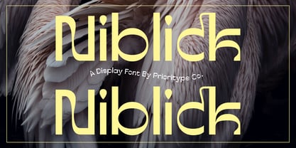 "Niblick" is a modern and classic styled display typeface. The unique touches on each character add to the visual impression that is more impressive. Useful if your project requires strong, memorable visuals. Great for branding designs, posters and logos. Features: Uppercase, Lowercase, Numeral, Punctuation, Multilingual, Ligatures & PUA Encoded. Thanks!
 - Boldiva by Graphicfresh,
$9.00 Looking for a way to add a touch of bold, retro charm to your designs that evoke the fun and creativity of the 70s, 80s, and 90s? Look no further than our collection of classic and modern fonts that are perfect for logos, posters, and all kinds of design projects, whether you're going for an old-school vibe or a fresh new twist on retro design. With our carefully curated selection of fonts, you'll have everything you need to create eye-catching and memorable designs that capture the essence of classic design from the past. Whether you're looking to add some vintage flair to a modern design, or you want to create a throwback look that's right at home in the 90s, our fonts are the perfect tool for the job. From bold, geometric designs that harken back to the 80s, to playful, colorful fonts that embody the fun-loving spirit of the 70s, our collection has something for everyone. And with our easy-to-use design tools and resources, you'll have everything you need to bring your creative vision to life in no time. So why wait? Start exploring our collection of classic and modern fonts today, and discover how easy it can be to create stunning logos, posters, and designs that are truly one-of-a-kind. Whether you're a seasoned designer or just starting out, our fonts are the perfect way to add a touch of old-school charm to any project.
 - Vintage Price Tags JNL by Jeff Levine,
$29.00 Vintage Price Tags JNL comprises three sets of numbers in both ribbon, circle and star patterns which, when combined will produce point-of-sale price elements. The designs were re-drawn from examples found in an old wood type catalog, and are now collected in digital format. Ribbon-style numbers are found on the upper case keys. A through J have the large numbers, K through T are the smaller, underlined numbers. The remaining upper case keys contain the dollar sign, cents sign and the phrases "each", "for", "dozen" and "pair". On the lower case, the circle set of combination numbers are on the following keystrokes: The keys a through j are the left side semi-circle numbers and the "k" key is a blank left side semi-circle. The l through u keys are the right side semicircle numbers and the "v" keystroke is a blank right side semi-circle. The star set is on the standard numbers keys for the left side of the star, with the right side characters on the corresponding shift keystrokes for the number keys. In following the original design examples, a cents sign follows the numbers on the right side of the circle or star sets. The lower case w through z contain a left side star blank, a left side star with $1, a right side star blank and a right side star with small double zeros (to comprise a star shaped price tag for $1.00).
 - Dez Squeeze by Dezcom,
$29.00 When you don't want to speak softly, Squeeze can shout above the crowd. Say it loudly and proudly, this face does not have a weight problem. The Dez Squeeze Pro Family is also now available from Dezcom in seven widths. http://www.myfonts.com/fonts/dezcom/dez-squeeze-pro/ Dez Squeeze has 483 glyphs with uppercase, lowercase, proportional lining figures, unicase, stylistic sets, alternates, ordinals, and case specific punctuation. It has a full range of diacritics and covers all European languages using the Latin script.
 - Blitz by Wiescher Design,
$20.00 A very glitzy Blitz! I always wanted to design a typeface that was top heavy, but I never knew how not to make it look like Antique Olive, until recently -- I had an idea. My new family is very readable despite it beeing top heavy, thin on the low end and thick on the upper end. The font gets a special shine because of this effect. And it stays readable despite its special design. Your designer of surprising typefaces, Gert Wiescher
 - OffBit by Power Type,
$15.00 OffBit is a font type derived from Bitmap with various variations from each box. The term bitmap comes from computer programming terminology, which means simply a bit map, a spatially mapped array of bits. Now, together with PowerType, it usually refers to a similar concept of an array of pixels that are mapped spatially and into various shapes such as dots and other models. This font matches the theme of computing, graphic design, posters or other media, all of which can be combined.
 - Instructor by Chank,
$59.00Introduced as the Chank Font of the Month for May 1998, Instructor was drawn Roger Lootine and fontified by Chank. Roger was an instructor at Art Instruction School. You know the "Draw Tippy the Turtle" ads? That's where Roger used to teach. He also draws a cool comic called Residue. "Roger's got the best handwriting I've ever seen, and you can download it today!" says Chank. "How lucky are you? Way lucky!" Now available in OpenType format for your Personal or Commercial Use. - Bologna by David Turner,
$35.00 Inspired by pointed pen calligraphy and modulated sans serif typefaces used for advertising in the 1920´s, Bologna is a high contrasted sans serif with a modern and fashionable look. Bologna comes in three weights: Regular, Bold and Black. The Regular and Bold weights are, despite of their high contrast, also build for body texts. Whereas Bologna Black, with a more expressive look and sharp angles, is specially designed for large and striking headlines, packaging or identities. Overview: 3 weights - Regular, Bold, Black Regular/Bold: 657 Glyphs Black: 871 Glyphs Lining, tabular and old style figures Ligatures: fl, fi, ff, ffi ffl, Unicase Letters: a, e, m, n, r Alternative Guillemets Case Sensitive Arrows Bologna Black: hairline accents and interpunctations Fractions Extended Language Support Stylistic Sets: ss01 = Alternative Guillemets / Alternative y ss02 = Unicase glyphs ss03 = Numerals in circle ss04 = Numerals in black circle ss05 = Hairline Accents and Interpunctations (Bologna Black)
 - Chase by Device,
$39.00 Type that preserves the over- and under-inked textures of true old-fashioned wood faces, now available without ink on your fingers straight from your keyboard. Based on samples taken from early and mid Nineteenth century Clarendons, the font carefully preserves all the battered idiosyncracies of vintage print shop type.
 - ABC Idea by Alphabets by Chileans (A.B.C.),
$18.00 ABC Idea is a contemporary geometric sans full of opentype features in Regular, Bold and very "fast" Italic. The design is an experimental fusion or mix between Humanist, Geometric and Grotesque models. The fine drawing in all letters and signs has precise ink traps to highlight contrast jus like lettering and calligraphy does, then ABC Idea re-creates this exquisite graphic details into the digital world. Designed by Miguel H. Montoya Fonts in Use Images by letargo.cl Magazine. Art Direction by studioprado.cl
 - Chenko by Studio K,
$45.00 Chenko is a nod to Alexander Rodchenko the Russian Constructivist artist and designer whose poster work is characterised by its stark, stripped down typography and bold, geometric graphics. It was truly revolutionary in its day, and continues to be influential in ours. Chenko is my own take on his deceptively simple letterforms, and designing a font without a curve or a diagonal (okay I cheated on a few details like the O-slash and A ring characters) presented some interesting design challenges!
 - Spy Stencil JNL by Jeff Levine,
$29.00 Dean Martin starred in four movies as Matt Helm, the titular character in a series of spy novels by Donald Hamilton. Martin’s version of the government counter-agent followed his TV persona – a fun-loving ladies man who (in this case) just happened to be a spy. The movie poster for 1966’s “The Silencers” has its title hand lettered in an extra bold sans serif stencil style. This is now available as Spy Stencil JNL in both regular and oblique versions.
 - When Suddenly by Comicraft,
$49.00 From completely OUT OF THE BLUE, here’s a font you'll need when, unexpectedly -- with a sense of immediate urgency -- your characters abruptly call out without warning and on the spur of the moment! When Suddenly ’s prompt! It’s abrupt! It responds in a flash! Now you can put all the words you need in your comic book in such a way that they'll come as a complete surprise to all your readers! When Suddenly is BOLD! It’s ITALIC! It’s anything but REGULAR!
 - Bozue by Lithographe,
$30.00 Bozue is an alternate between textual simplicity and display complexity. It is a Slab-Serif typeface meant for versatility and differentiation. It can be used as a title case it can be used as a text font. Its readability does not compromise its display ability. It's both bold enough to effect the tone of the message yet sensual enough to carry it through. The bi-linear efficiency of this tonal-mapping through visual comprehension make it a "must have" font for any designer.
 - Reksano by Just Font You,
$19.00 Reksano was inspired by retro vintage arcades, toys, and games back in the 90s era. Embracing the retro-futurism trend with the mindset from the past, predicting how the future will look from the human eye's perspective. The bold, and tall form of construction makes the Reksano a no-doubt game-changer for your graphic design visual journey. Perfectly fit for logo, branding, gaming, esport design, poster, music video, album artwork, cover, book, packaging, merchandise, apparel, fashion, and many more.
 - Carino Sans by Kaligra.co,
$29.00 Carino is a stunning classy modern bold all-caps sans serif that comes in three beautiful weights to complement every project you're working on. Use to create beautiful headings, gorgeous invitations, stunning logos, and so much more!! Perfect for displays, headers, invitations, save the dates, weddings, and so much more, Carino will become a playful staple in your font library! HOW TO ACCESS ALTERNATE CHARACTERS Open glyphs panel: In Adobe Photoshop go to Window - glyphs In Adobe Illustrator go to Type - glyphs
 - Zombie Drip by Adita Fonts,
$11.00 Zombie Drip is a hauntingly bold font that will send shivers down your spine. This spine-chilling typeface features a unique dripping effect on each letter, giving it an eerie and macabre appearance. With its thick and powerful strokes, Zombie Drip commands attention and creates an atmosphere of suspense and horror. Perfect for Halloween designs, horror-themed projects, or anything that needs a touch of creepy allure, Zombie Drip adds a bone-chilling twist to your typography. Let the letters drip with fear!
 - EB Humboldt by Fenotype,
$9.95 Humboldt is an ultra fat headline face. How bold can you go? Humboldt is an experiment to push the boundaries of character recognition: Its forms are extremely bloated yet highly distinctive. Open type savvy features provide an unexpected embellishment: small capitals, both lower case and upper case figures and several alternate glyphs are intrinsic in the design. Humboldt makes nice headlines and striking poster typography or logotypes. It can to some extent be used for setting even short phrases of text.
 - Hollow Mummy by Attype Studio,
$10.00 Hollow Mummy is a bold and authentic display font. Add this font to your creative and spooky ideas and notice how it will make them stand out! Hollow Mummy is perfect for branding, logo, invitation, stationery, social media post, product packaging, merchandise, blog design, game titles, cute style design, Book/Cover Title and more. What's Included : - hollow mummy (.otf) - hollow mummy display (.otf) - Multilingual Support (Afrikaans, Albanian, Catalan, Danish, Dutch, English, Estonian, Finnish, French, German, Icelandic, Italian, Norwegian, Portugese, Spanisch, Swedish, Zulu)

