10,000 search results
(0.036 seconds)
- PF Bodoni Script Pro by Parachute,
$79.00 Always intrigued by Bodoni's original work, I was set out—back in 2000—to examine his work and study Manuale Tipografico, one of the greatest specimen books ever printed. Issued in 1818 at Parma, Italy by Bodoni's widow, the two-volume work shows an impressive array of 142 roman alphabets and some foreign ones such as Greek and Cyrillic. After a careful examination of all characters, I decided to create a typeface based on the distinct script capitals presented in the book. Matching lowercase italics were later selected and designed to complete the series. Since my intention was not to create simply a digital version of Bodoni's work, this typeface was designed with connected characters and capitals with extra calligraphic elements. The result was released in 2002 and published in our award-winning catalog/book IDEA/Trendsetting Typography vol.1. Later in 2005 we revived a large number of ornaments and borders (credit goes to designer George Lygas). All this work was left behind till recently when it was revisited to create a complete 'Pro' family. Several new uppercase and lowercase glyphs were designed in order to create a distinct typeface, which is based on Bodoni but yet it stands out on its own. The new version also takes care of conflicts between neigbouring letters, something that was not included in the first version. Bodoni Script Pro is a 3-weight superfamily. It supports 10 special opentype features including 'contextual alternates' as well as support for both Latin and Greek. Each font comes with 725 glyphs including a large number of alternates as well as 144 ornaments. Furthermore, when you purchase the whole package you get a bonus font which contains 120 frame parts. These parts, when put together, create some truly amazing borders. -Panos Vassiliou
 - ÉconoSans Pro by Ingo,
$41.00 The most space-saving sans serif This font saves more space than any of its kind! Slim proportions, but not “condensed” Characters which nearly touch Sparse ascenders and descenders Distinct forms How close to each other can the characters of a font get? Theoretically, as close as you want. But obviously, the words should still be legible. And as any designer knows, body clearance of characters also depends on other parameters such as point size and line spacing. In practice, there are always situations in which as much information as possible has to be positioned in as little space as possible. The ingoFont ÉconoSans is made for exactly this purpose. Even the name of the font implies its function: French for the infinitive “to save” is “économiser.” Now if that doesn’t sound good… The shapes of the upper and lower case letters are completely matter-of-fact, the way a modern font has got to be. The letters c e, and s are wide open to their neighbors. An especially distinguished trait of this font is the design of the “triangular” characters v w y x k z and A V W Y Z K X M N. And the open form of B R and P is also not typical in a sans serif. The distance between letters is kept tight and often the characters nearly touch, but only nearly. With ÉconoSans you gain approximately 20% more text in a line than with »Tahoma«, and even still more than 10% compared to »Helvetica«. ÉconoSans also includes tabular figures as well as ligatures. Among the ligatures, the double mm is especially unusual and is hardly familiar, but can contribute greatly to saving space without catching the reader’s eye.
 - Rolling Pen by Sudtipos,
$79.00 After doing this for so many years, one would think my fascination with the old history of writing would have mellowed out by now. The truth is that alongside being a calligraphy history buff, I'm a pop technology freak. Maybe even keener on the tech thing, since I just can't seem to get enough new gadgets. And after working with type technologies for so many years, I'm starting to think that writing and design technologies as we now know them, being about 2.5 post-computer generations, keep becoming more and more detached from what the very old humanity arts/tasks they essentially want to facilitate. In a world where command-z is a frequently used key combination, it’s difficult to justify expecting a Morris-made book or a Zaner-drawn sentence, but accidental artistic “mutations” become welcome, marketable features. When fluid pens were introduced, their liquid saturation influenced type design to a great extent almost overnight an influence professional designers tend to play down. Now round stroke endings are a common sight, and the saturation is so clean and measured, unlike any liquid-paper relationship possible in reality. Some designers even illustrate their work by overlaying perfect circles at stroke ends, in order to illustrate how “geometric” their work was. Because if it’s measured with precise geometry, it’s got to be meaningful design. And once in a while, by a total freak accident, the now-cherished mutations prove to have existed long before the technology that caused them. Rolling Pen was cued by just such a thing: A rounded, circular, roll-flowing calligraphy from the late nineteenth century seemingly one of those experimental takes on what inspired Business Penmanship, another font of mine. Looking at it now it certainly seems to be friendlier, more legible, and maybe even more practical and easier to execute than the standard business penmanship of those days, but I guess friendliness and simplicity were at odds with the stiff manner business liked to present itself back then, so that kind of thing remained buried in the professional penman’s oddities drawer. It would be quite a few years before all this curviness and rounding were thought of as symbolic of graceful movement, which brought such a flow closer to the idea of fine art. Even though in this case the accidental mutation just happens to not be a mutation after all, the whole technology-transforms-application argument still applies here. I'm almost sure “business” will be the last thing on people’s minds when they use this font today. One extreme example of that level of disconnect between origin and current application is shown here, with the so-called business penmanship strutting around in gloss and neon. Rolling Pen is another cup of mine that runneth over with alternates, swashes, ligatures, and other techy perks. To explore its full potential, please use it in a program that supports OpenType features for advanced typography. Enjoy the new Rolling Pen designed by Ale Paul with Neon’s visual poetry by Tomás García.
 - FS Untitled Variable by Fontsmith,
$319.99Developer-friendly The studio has developed a wide array of weights for FS Untitled – 12 in all, in roman and italic – with the intention of meeting every on-screen need. All recognisably part of a family, each weight brings a different edge or personality to headline or body copy. There’s more. Type on screen has a tendency to fill in or blow so for each weight, there’s the choice of two marginally different versions, allowing designers and developers to go up or down a touch in weight. They’re free to use the font at any size on any background colour without fear of causing optical obstacles. And to make life even easier for developers, the 12 weight pairs have each been designated with a number from 100 (Thin) to 750 (Bold), corresponding to the system used to denote font weight in CSS code. Selecting a weight is always light work. Easy on the pixels ‘It’s a digital-first world,’ says Jason Smith, ‘and I wanted to make something that was really functional for digital brands’. FS Untitled was made for modern screens. Its shapes and proportions, x-height and cap height were modelled around the pixel grids of even low-resolution displays. So there are no angles in the A, V and W, just gently curving strokes that fit, not fight, with the pixels, and reduce the dependency on font hinting. Forms are simplified and modular – there are no spurs on the r or d, for example – and the space between the dot of the i and its stem is larger than usual. The result is a clearer, more legible typeface – functional but with bags of character. Screen beginnings FS Untitled got its start on the box. Its roots lie in Fontsmith’s creation of the typeface for Channel 4’s rebrand in 2005: the classic, quirky, edgy C4 headline font, with its rounded square shapes (inspired by the classic cartoon TV shape of a squidgy rectangle), and a toned-down version for use in text, captions and content graphics. The studio has built on the characteristics that made the original face so pixel-friendly: its blend of almost-flat horizontals and verticals with just enough openness and curve at the corners to keep the font looking friendly. The curves of the o, c and e are classic Fontsmith – typical of the dedication its designers puts into sculpting letterforms. Look out for… FS Untitled wouldn’t be a Fontsmith typeface if it didn’t have its quirks, some warranted, some wanton. There’s the rounded junction at the base of the E, for example, and the strong, solid contours of the punctuation marks and numerals. Notice, too, the distinctive, open shape of the A, V, W, X and Y, created by strokes that start off straight before curving into their diagonal path. Some would call the look bow-legged; we’d call it big-hearted. - FS Untitled by Fontsmith,
$80.00 Developer-friendly The studio has developed a wide array of weights for FS Untitled – 12 in all, in roman and italic – with the intention of meeting every on-screen need. All recognisably part of a family, each weight brings a different edge or personality to headline or body copy. There’s more. Type on screen has a tendency to fill in or blow so for each weight, there’s the choice of two marginally different versions, allowing designers and developers to go up or down a touch in weight. They’re free to use the font at any size on any background colour without fear of causing optical obstacles. And to make life even easier for developers, the 12 weight pairs have each been designated with a number from 100 (Thin) to 750 (Bold), corresponding to the system used to denote font weight in CSS code. Selecting a weight is always light work. Easy on the pixels ‘It’s a digital-first world,’ says Jason Smith, ‘and I wanted to make something that was really functional for digital brands’. FS Untitled was made for modern screens. Its shapes and proportions, x-height and cap height were modelled around the pixel grids of even low-resolution displays. So there are no angles in the A, V and W, just gently curving strokes that fit, not fight, with the pixels, and reduce the dependency on font hinting. Forms are simplified and modular – there are no spurs on the r or d, for example – and the space between the dot of the i and its stem is larger than usual. The result is a clearer, more legible typeface – functional but with bags of character. Screen beginnings FS Untitled got its start on the box. Its roots lie in Fontsmith’s creation of the typeface for Channel 4’s rebrand in 2005: the classic, quirky, edgy C4 headline font, with its rounded square shapes (inspired by the classic cartoon TV shape of a squidgy rectangle), and a toned-down version for use in text, captions and content graphics. The studio has built on the characteristics that made the original face so pixel-friendly: its blend of almost-flat horizontals and verticals with just enough openness and curve at the corners to keep the font looking friendly. The curves of the o, c and e are classic Fontsmith – typical of the dedication its designers puts into sculpting letterforms. Look out for… FS Untitled wouldn’t be a Fontsmith typeface if it didn’t have its quirks, some warranted, some wanton. There’s the rounded junction at the base of the E, for example, and the strong, solid contours of the punctuation marks and numerals. Notice, too, the distinctive, open shape of the A, V, W, X and Y, created by strokes that start off straight before curving into their diagonal path. Some would call the look bow-legged; we’d call it big-hearted.
 - Souttia - Personal Use - Personal use only

- Famous Cars - Personal use only

- Nose Bleed - Unknown license

- Milkmoustachio - 100% free

- ACED IT - Personal use only

- Ironworks™ - Unknown license

- Marmyadose™ - Unknown license

- Altenburg™ - Unknown license

- NudE - Unknown license

- KR Jigsaw Joey - Unknown license

- Magdeburg™ - Unknown license

- PerfectPixel - Unknown license

- Ridicule - Unknown license

- Rousseau™ - Unknown license

- BadAcid™ - Unknown license

- Double Quick by Hanoded,
$15.00 Double Quick is a fast, handwritten font with excellent legibility. It was designed to look like a quick grocery list, a hasty 'I Love You' note penned down on a Post-it or a home improvement to-do list. Comes with extensive language support.
 - Grufy by Stefani Letter,
$12.00 Grufy is an awesome bold and fun display font that will look stunning on any poster flyer or print. It will put a modern twist on any design project with its urban charm. Use this font for your designs and explore its endless possibilities.
 - Hedon by Tour De Force,
$25.00 Hedon is hedonistic & humanistic, but not an egoistic, sans serif family that comes in 4 weights and matching italics. It declares itself a neutral, versatile and legible partner for any kind of publication, with a tiny dose of impressionable characteristics that softens its base.
 - Lovely Orange by Almarkha Type,
$23.00 Lovely Orange – Fun Display Playful Sans full of charm . It will take any DIY-project to the next level! Lovely Orange is perfect for Craft , product packaging, product designs, label, branding projects, logo, wedding designs, social media posts, advertisements, watermark, invitation, stationery and any projects
 - Fantasie by Aestherica Studio,
$9.00 Fantasie is a handwritten script font with a natural & stylish flow, perfect for personal branding. Fantasie Script is perfect for branding projects, logos, wedding designs, social media posts, advertisements, product packaging, product designs, label, photography, watermark, invitation, stationery, and any projects that need handwriting taste.
 - Wishless by Good Java Studio,
$20.00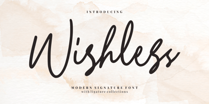 Wishless - Modern Signature Font Wishless - Modern Signature Font is a modern signature style. Perfect for logo, invitation, stationery, wedding designs, social media posts, advertisements, product packaging, product designs, label, photography, watermark, special events or anything. This font include : 30+ Ligatures, and also Multilingual support
 - Magis Authentic by Lemonthe,
$14.00 Magis Authentic is a signature style font, with a natural & stylish flow. Magis Authentic Font is perfect for many different project such as logos & branding, invitation, stationery, wedding designs, social media posts, advertisements, product packaging, product designs, label, photography, watermark, special events or anything.
 - MBF Kasa by Moonbandit,
$17.00 MBF Kasa is a modern and sleek monospace font. This versatile typeface can enhanced your projects that goes with a modern theme. Kasa have a geometric. futuristic, scifi feel but not overwhelming.This typeface is perfect for logo, text, display, headline, poster and many other
 - Only Wishing by FallenGraphic,
$19.00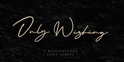 Only Wishing is perfect for many different projects such as logos & branding, invitation, stationery, wedding designs, social media posts, advertisements, product packaging, product designs, label, photography, watermark, special events, or anything. what’s inside : Accents (Multilingual Characters) PUA encoded Numerals and Punctuations (OpenType Standard) ligature
 - Great Banana by Aestherica Studio,
$5.00 This font duo with modern handwritten look design styles, available on regular and script typeface. Great Banana is perfect for branding projects, logos, wedding designs, social media posts, advertisements, product packaging, product designs, label, photography, watermark, invitation, stationery, and any projects that need handwriting taste.
 - Bealiva Vintage by Mevstory Studio,
$15.00 Bealiva is one of my fonts based on a hand lettering project in 2020. It was very inspired from the famous retro typography designs in late 60's until 70's. It includes the extrude look, so you will not have to add it later.
 - Bistro by Letterhead Studio-YG,
$29.00 Bistro and Hot Sauce have been prepared quickly. In Bistro you will find 10 fine traces from coffee cups, and in HotSauce 10 pleasant-for-eyes stains from sauce. Both fonts are created in the 1998. OpenType revision, with extended Latin characters, made in 2009.
 - Maravilla by madeDeduk,
$14.00 Maravilla is a vintage font, come with single weight, legible and expressive shapes. A lot of stylish alternates characters will makes this font suitable for your any project design. Feature Uppercase & Lowercase Number & Symbol International Glyphs Multilingual support Alternative Ligature Hope you enjoy it.
 - Tag by ITC,
$29.00Tag is the work of American designer David Sagorski and influenced by street art. It is an all caps typeface which includes a complete set of alternate capitals and amusing spot illustrations. The graffiti style of Tag is ideal for vivid, eye-catching headlines. - ITC Highlander by ITC,
$29.99ITC Highlander font is the work of Dave Farey and loosely based on the handwriting of the late American graphic artist and lettering master Oswald Cooper. ITC Highlander is a unique font family, but not so unusual that it is limited only to display applications. - Choco Chips by Fikryal,
$16.00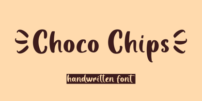 Choco Chips is a handwritten font perfect for crafting, branding, invitation, stationery, wedding designs, social media posts, advertisements, product packaging, product designs, label, photography, watermark, special events, or anything. Choco Chips comes with full set of uppercase and lowercase letters, multilingual symbols, numerals and punctuation.
 - Dunscans Mills by Deeezy,
$14.00 Trendy or modern style sans font for your fancy projects. Bold, elegant and retro style on Dunscans Mills font will be great for any branding project. Lot of alternates and ligatures will help you to create unique and original logo design or website header! Enjoy :)
 - Hubba by Green Type,
$19.00 Hubba is a modular geometric typeface. Its heavy weight is excellent for headlines and display. There is a plain, oblique, and opposite oblique styles. The variable version will give you the opportunity to be more free in design and not limited to standard styles.
 - Veronica by Miller Type Foundry,
$29.00 Veronica is a fun and playful script font with matching caps. Perfect for headlines, logos or display purposes; Veronica is sure to put a smile on the face of everyone who sees it. Veronica comes with opentype features like oldstyle figures, ligatures and stylistic alternates.
 - Cellosia by Bluestudio,
$20.00 Cellosia is made to resemble hand scratches, so it looks like a natural style like your own hand scratches. Cellosia offer beautiful typographic harmony for a variety of design projects, including watermark, logos, branding, wedding designs, social media posts, advertisements, product designs, magazines and others.


