10,000 search results
(0.025 seconds)
- Quitong by Arendxstudio,
$14.00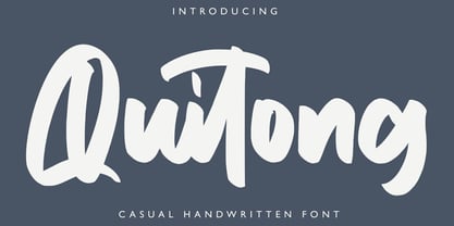 Quitong - Handwritten Font is a handwritten with a natural & stylish flow. This collection of scripts is perfect for personal branding. this works well for many applications. Everything from personal branding & wedding invitations to advertising could benefit from this collection of signature fonts Features : • Character Set A-Z • Numerals & Punctuations (OpenType Standard) • Accents (Multilingual characters) • Ligature
 - Cherkessk by Arendxstudio,
$15.00 Cherkessk - Handwritten Font is a handwritten with a natural & stylish flow. This collection of scripts is perfect for personal branding. this works well for many applications. Everything from personal branding & wedding invitations to advertising could benefit from this collection of signature fonts Features : • Character Set A-Z • Numerals & Punctuations (OpenType Standard) • Accents (Multilingual characters) • Ligature
 - Hurstville by Arendxstudio,
$15.00 Hurstville - Brush Signature Font with a natural & stylish flow. This collection of scripts is perfect for personal branding. this works well for many applications. Everything from personal branding & wedding invitations to advertising could benefit from this collection of signature fonts Features : • Character Set A-Z • Numerals & Punctuations (OpenType Standard) • Accents (Multilingual characters) • Ligature • Swash
 - Auberge Script by Sudtipos,
$79.00 It took me a long time, but I think I now understand why people of my generation and older feel the need to frame current events in an historical context or precedents, while most of the young couldn't care less about what happened ten years ago, let alone centuries back. After living for a few decades, you get to a point when time seems to be moving quite fast, and it’s humbling to see that your entire existence so far can be summed up in a paragraph or two which may or may not be useful to whoever ends up reading the stuff anyhow. I suppose one way to cope with the serenity of aging is trying to convince yourself that your life and work are really an extension of millenia of a species striving to accept, adapt to, and improve the human condition through advancing the many facets of civilization -- basically making things more understandable and comfortable for ourselves and each other while we go about doing whatever it is we are trying to do. And when you do finally convince yourself of that, history becomes a source of much solace and even a little premonition, so you end up spending more time there. Going far back into the history of what I do, one can easily see that for the most part it was ruled by the quill. Western civilization’s writing was done with quill pens for more than thirteen centuries and with newer instruments for about two. By the mid-18th century, the height of the quill experience, various calligraphy techniques could be discerned and writing styles were arranged in distinct categories. There are many old books that showcase the history of it all. I recommend looking at some whenever the urge comes calling and you have to get away from backlit worlds. Multiple sources usually help me get a better perspective on the range of a specific script genre, so many books served as reference to this quill font of mine. Late 17th century French and Spanish professional calligraphy guides were great aides in understanding the ornamental scope of what the scribes were doing back then. The French books, with their showings of the Ronde, Bâtarde and Coulée alphabets, were the ones I referenced the most. So I decided to name the font Auberge, a French word for hotel or inn, because I really felt like a guest in different French locales (and times) when I going through all that stuff. Because it is multi-sourced, Auberge does not strictly fit in a distinct quill pen category. Instead, it shows strong hints of both Bâtarde and Coulée alphabets. And like most of my fonts, it is an exercise in going overboard with alternates, swashes, and ornamental devices. Having worked with it for a while, I find it most suitable for display calligraphic setting in general, but it works especially well for things like wine labels and event invitations. It also shines in the original quill pen application purpose, which of course was stationery. Also, as it just occurred to me, if you find yourself in a situation where you have to describe your entire life in 50 words or less, you may as well make it look good and swashy, so Auberge would probably be a good fit there as well. This is one quill script that no large bird had to die for. A few technical notes The Auberge Script Pro version includes 1800 glyphs, everything is included there. Also latin language support. We recommend you to use the latest design application to have full access to alternates, swashes, small caps, ornaments, etc. The images from the gallery uses this version. For better results use the fonts with “liga” feature on. Awards During 2014 the early develop of Auberge Script was chosen to be part of Tipos Latinos, the most important type exhibition in South America.
 - Whistle by Arendxstudio,
$18.00 Introducing: Whistle - Signature casual handwritten font with personal charm. With an elegant sweep that is perfect for branding your product needs and brand name. PUA ENCODING SUPPORT Whistle contains upper & lower case letters, numbers and various complete marks while Whistle Alt has an alternative character set with lowercase letters that are completely new. Ligatures available for several lowercase letters (more natural double letters). This can only be accessed through software with different devices or machine panels, eg Photoshop / Illustrator. There he is! I really hope you enjoy it - comments & likes are always welcome and accepted. More importantly, don't hesitate to send a message if you have a problem or question. Now just read this, go there and make it happen. Come and say hello on Instagram! https://www.instagram.com/aseprendii.otf/?hl=en
 - Marguerite - Personal use only

- Quintus 'StainedCameo' - Unknown license

- RMPenquin - Unknown license

- RMBuggy - Unknown license

- RMFido - Unknown license

- RMMouthy - Unknown license

- RMChicky - Unknown license

- RMSignpost - Unknown license

- Scriptelle by Jonahfonts,
$39.95 A script that has a freedom-ring to it, inspired by my personal feeling of liberty.
 - Garaje 53 Unicase - 100% free

- Tabaquera - Personal use only

- Quadrus by ITC,
$29.99Quadrus is the work of New York graphic designer Peter Fahrni, a condensed open slab serif typeface. Fahrni was inspired by the lettering styles typical of baseball, basketball and American football sportswear. Quadrus is an all caps alphabet ideal for a variety of applications, particularly for those related to sports. - Alacant by Eurotypo,
$28.00 Alacant is a family of slab serif fonts composed of seven weights and their versions in italics. One of the most characteristic advantages of this font is its particularly square shape, very short descenders, open counter-forms and precise kerning that provides a very good visual impact and clear legibility.
 - P22 Frenzy by IHOF,
$24.95 Frenzy evolved from a logo for a Gen X product offered by a very staid company. It is a sythesis of Classic Roman Capitals and American Typewriter—with a bit of frenetic energy stirred in. It is dedicated to the designers son, who is the epitome of the font... contained chaos.
 - Semi Calligraphic JNL by Jeff Levine,
$29.00 A 1950 reissue of the 1934 tune “With My Eyes Wide Open I’m Dreaming” had the title of the sheet music hand lettered in a semi-calligraphic sans serif design. This became the model for the appropriately named Semi Calligraphic JNL, which is available in both regular and oblique versions.
 - Lonestar Western by FontMesa,
$25.00Lonestar Western is a revival of the old classic slab serif font named Hellenic which was very popular in the middle to late 1800s. While watching an old western movie the opening credits caught my attention, it was the Hellenic font with spurs added which gave it a more western look. - FF Bagel by FontFont,
$41.99 Danish type designer Per Jørgensen created this script FontFont in 2002. The font is ideally suited for advertising and packaging, festive occasions, film and tv as well as software and gaming. FF Bagel provides advanced typographical support with features such as ligatures and alternate characters. It comes with tabular oldstyle figures.
 - Cocktail Hour JNL by Jeff Levine,
$29.00 The opening title for the 1962 Blake Edwards film "Days of Wine and Roses" [starring Jack Lemmon and Lee Remick] was the inspiration for Cocktail Hour JNL. Adding to the playfulness of this font, the characters float above the baseline. Cocktail Hour JNL is available in both regular and oblique versions.
 - Gold Fever by FontMesa,
$25.00Gold Fever is a revival of the old classic Caxtonian font originaly designed in the mid to late 1800s. Along with the original engraved shadow version new styles have been created making this decorative font set more complete. The new styles include a solid black, open faced, condensed and fill versions. - Bla Bla by S6 Foundry,
$25.00 Bla Bla is a contemporary serif typeface inspired by brutalist forms, featuring large open counters, curved, round forms, creating a modern & elegant glyph set. The organic curves with gentle repetitions create powerful and harmonious forms. Designed to be a stylish modern family it is perfect for communication and branding projects.
 - Fille De Joie by Tension Type,
$10.00 Fille de Joie is a distressed typewriter font created from a vintage typewriter that a friend of mine bought in Paris. It’s pretty dirty and nasty. Included are open type ligatures for all of the double letters like “EE” “TT” “FF” etc. to give the font a more natural look.
 - Movie Arts JNL by Jeff Levine,
$29.00 In the June 18, 1929 issue of “The Film Daily”, the curvy and casual hand lettering found within the ad for the movie “Such Men are Dangerous” belies that this was actually a pre-code drama. Digitally redrawn as Movie Arts JNL, it is available in both regular and oblique versions.
 - Public Secret by Hanoded,
$15.00 A Public Secret (or Open Secret) is something that is widely known, although it is not supposed to be. Public Secret is a hand drawn font (I used a fineliner) that I made in between building a shower, a toilet and a laundry room… Yes, it’s all in a day’s work! ;-)
 - Sabrva by Nirmana Visual,
$7.00 Sabrva by Nirmana Visual is designed to work as perfect companions or simply as strong standalone typefaces. Give your typography design with a touch of Classic style with Sabrva. You can pick the alternate for substitution up to 7 variant per-letter. We really hope you enjoy it! Thank You!
 - Ratatam by alphabeet.at,
$40.00 Ratatam is a variable egyptian font face. There are eight weights from thin to black, but a lot more opportunities with the variable font, and a decor style with inner elements. Useful open type features, which are optional as well as contextual alternates and positions, are defined, all small caps integrated.
 - Redoura by Letterhend,
$16.00 Redoura Font is a script typeface inspired by 70's font style and Script Sports font style which is absolutely awesome for logotype / wordmark, especially for sports theme logos. Redoura Script font includes upper & lowercase characters, punctuation, numerals, and multilingual support. It also has many open type alternates and ligatures.
 - Stylized Deco JNL by Jeff Levine,
$29.00 In their book "Lettering of Today" by W. Ben and Ed C. Hunt, an Art Deco "thick and thin" alphabet with some stylized characters (which leaned a lot toward a calligraphic style) stood out from the rest. This is now available as Stylized Deco JNL, in both regular and oblique versions.
 - Glypha by Linotype,
$29.99 Glypha was designed by Adrian Frutiger and appeared with D. Stempel AG in 1977. The font consists of ten cuts and is formally based on its predecessor, Serifa, although its lower case letters are a bit larger. Like Serifa, Glypha is also based on the general scheme used to design Univers.
 - Grounds Crew Stencil JNL by Jeff Levine,
$29.00 The opening title from the 1943 Abbott and Costello comedy ”It Ain't Hay” shows a park bench with the words “Universal Presents” stenciled on it in a chamfered sans serif style. This served as the design model for Grounds Crew Stencil JNL, which is available in both regular and oblique versions.
 - Take Charge JNL by Jeff Levine,
$29.00 Take Charge JNL is based on the opening title card for the 1936 film "The Charge of the Light Brigade" starring Errol Flynn and Olivia de Havilland, Donald Crisp and David Niven. The typeface is a simple, bold titling font with the slight feel of Art Deco influence in its design.
 - Espectro by Corradine Fonts,
$24.95Espectro is a fabulous font full of swashes and alternates. Its free strokes give to your work a special feeling doing it very expressive and mysterious. Try the Open type version if you want to access to all its wonderful possibilities. Espectro has also a set of 26 related dingbats. - Bithead by Comicraft,
$19.00 INFO DUMP: Get jacked into cyberspace direct feed, no buffer with this hotwired font by John 'Son of a Glitch' Roshell. Initial upload to Ghost Rider 2099 was prematurely aborted, but not before the downramp pusbag Ozymandias pirated a jagged beta version and assaulted the Uncanny X-Men during 'Onslaught.'
 - Draughtsman Engraved by Greater Albion Typefounders,
$35.00 Draughtsman Engraved, inspired by hand drawn 19th century lettering, is an open shadowed display face, with an extensive range of OpenType features, including ligatures, stylistic alternates, petite and small capitals and old style numerals. Draughtsman Engraved is ideal for headings, initial capitals and anywhere a touch of distinction is needed.
 - Invertida by Vanarchiv,
$35.00 This display decorative slab-serif typeface, contain reverse contrast which remind the old western style, there are also stencil version available (Invertida St). Invertida font family contain Latin and Cyrillic encoding characters and italic versions are also available too. Open type features can provide more options (stylistic alternates, ligatures, swash, figures).
 - Rational TW by René Bieder,
$39.00 Rational TW is the typewriter addition to the Rational family. It is a monospaced font building on the same principles as its proportional, neogrotesque brother, such as maximum legibility and flexibility while combining Swiss and American gothic elements with a modern aesthetic. Due to the monospaced environment, some of its letter shapes like “r”, “m”,“f”, “i” and “w” have been slightly adapted but kept the same in appearance. Rational TW comes in two version: Rational TW Display and Rational TW Text. As indicated by its name, Rational TW Text is not limited to, but works best in small font sizes because it features distinctive letter shapes like a double storey “a” or “g” in order to help differentiate similar glyphs in small sizes. Rational TW Display, on the other hand, creates a geometric uniformity by implementing round shapes in “a” and “g”, giving it a subtle friendly and open character. Unlike many other monospaced fonts, Rational TW has a large amount of opentype features like small caps, alternative glyphs, case sensitive shapes, and many more making it the perfect choice for countless scenarios. With more than 700 glpyhs per font, it performs excellently in any project from print to digital.


