10,000 search results
(0.054 seconds)
- Tribeca Script by Pelavin Fonts,
$25.00 Script characters should fit together neatly and the connections mustn't look awkward. While this can be accomplished by using dozens of alternate glyphs and OpenType feature coding, there is still something worthy and eloquent about doing it with the simplest character set possible. Tribeca Script is a casual, mono-weight script first drawn as the headline for a Taste of Tribeca poster and later finessed into a font with no pretense of looking hand-rendered.
 - Phyton by Subqi Studio,
$21.99 Phyton is a beautiful font combination between script and serif. With alternative character in both serif and script style with over 380+ glyphs for the script and 320+ glyphs for the serif. Phyton will be great for your creative project such as wedding invitation, logo, header, card, packaging, label, badge, flyer and more. Phyton comes with uppercase, lowercase, numeral, punctuation and support western multilingual accent as well. With many additional alternative characters to play.
 - Umerica by Typotheticals,
$4.00 Umerica first made its appearance in 2007 as a series of characters in a pdf I posted to Typophile. It has taken a lot of time, and determination, for me to finally decide to complete it. I had the basic font completed in 2008, but put it aside as the creation of the italics it deserved were beyond me. That was then. Now the italic version has finally been added twelve years later.
 - Wave Path by Attype Studio,
$16.00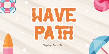 Wave Path inspired by Ocean Wave on summer. perfect Sans serif display font for summer business, summer flyer, summer sign & summer decor. Comes with Ligatures character, Perfect combination effect for typography that you creates. Wave Path is perfect for branding, logo, invitation, stationery, social media post, product packaging, merchandise, blog design, game titles, cute style design, Book/Cover Title and more. Features : - Wave Path.otf - Ligatures - Multilingual Support --- Hope you enjoy with our font! Attype Studio
 - Markingmate by Nathatype,
$29.00 Unveiling the exquisite charm of Markingmate, a script font meticulously crafted to emulate the fluidity of continuous handwriting while retaining a subtle contrast that adds depth and character to each letterform. The proportions of each letter are thoughtfully varied, resulting in an authentic handwritten quality. For the best legibility use this font in the bigger text sizes. This font fits in logos, posters, flyers, invitations, name cards, branding materials, and many more.
 - Baby Cakes NF by Nick's Fonts,
$10.00This robust, roly-poly typeface is patterned after a 1974 release from the Ludwig & Mayer foundry of Frankfurt am Main named Big Band, and designed by Karlgeorg Hoefer. The type color is even darker than the original, and the result is a delightful face that will definitely attract attention. The PC Postscript, Truetype and Opentype versions contain the complete Latin language character set (Unicode 1252) plus Central European (Unicode 1250) languages as well. - Modulair by Beware of the moose,
$17.99 Modulair is a dot matrix based font with nice typographic features. Various figures, complete punctuation and small caps in three weights makes the Modulair a very usable font for subtile typographic solutions or headlines. Since autumn 2023, the Modular has been expanded with italics in three weights. The first sketches were made in 1979 on my father's Olivetti typewriter. Forty years later I used these sketches as the basis for the Modular.
 - Mehighea by Youngtype,
$15.00 Mehighea Regular and Mehighea Clean are modern font sets featuring an organic, dynamic and energetic style. They can be used for a variety of purposes, such as titles, signatures, logos, correspondence, wedding invitations, letterheads, nameplates, labels, newsletters, posters, badges and much more. To enable the OpenType Stylistic alternative, you need a program that supports OpenType features such as Adobe Illustrator CS, Adobe Indesign & CorelDraw X6-X7, Microsoft Word 2010 or a later version. Thank You:)
 - Heyho Miguelo by Arterfak Project,
$17.00 Meet Heyho Miguelo! This distinctive handwriting font effortlessly captures the natural flow of handwriting with a playful design and a subtle rough touch on the letterforms, adding a unique and cheerful vibe to your typography. Versatile and perfect for posters, flyers, quotes, merchandise, decals, and more, Heyho Miguelo! ensures your designs stand out with charm and individuality. Elevate your creative projects with this font, designed to leave a lasting impression across various applications.
 - Ad Hoc by Linotype,
$29.99Ad Hoc is a fake. My intention was to design a typeface with the looks of the characters drawn on paper with a marker pen. But they are all drawn on a monitor, with no scanner ever involved. That's the reason why they look so regular. Ad Hoc is Latin and stands for, approximately, for this reason". The expression itself is often used for something unplanned, improvised. Ad Hoc was released in 1992. - Kontradix by Invasi Studio,
$19.00 A new collection of retro display fonts. Kontradix is a reverse contrast display font with a contemporary concept and modern styling. Ensuring carefully crafted styles result from the use of this font. The alternates and ligatures in this font can make your projects more interesting. The imperfections keep it casual while still providing legibility. It's ideal for headlines, flyers, posters, greeting cards, product packaging, book covers, logotypes, and album covers, among other things.
 - Horror Vibes by Gassstype,
$25.00 Introducing of our new product the name is Horror Vibes - Handmade horror Font and Multilanguage support.Introducing of designs look modern, unique and fun. It’s perfect for labels, quotes, posters, DIY projects, branding, packaging, greeting cards, websites, photos, photography overlays, signs, window art, scrapbooking, tags and so much more!our new product that inspired by Street Tagging, graffiti style with a fun theme very good for graffity poster, flyer, childrenbook, cartoon, comic etc
 - Scradl by Luxfont,
$35.00 Welcome to the world of Scradl - where fonts become the tool of the cutter and the artist at the same time. These letters, as if cut out of paper without preliminary drawings, are rough, angular and full of character. The main font is the canvas for your creativity. Additional variations add a stroke, shadow, or even a sticker effect, creating a harmonious visual interaction. Features: - Multilingual - Kerning - Ability to adapt letters to other languages
 - Pentaprism NF by Nick's Fonts,
$10.00In the Dynamic Seventies, "prismatic" typefaces were all the rage, and few were more popular than variants of Paul Renner's Futura and the Herbert Bayer-inspired Bauhaus. This family of fonts features Futura-like forms in the uppercase and Bauhaus-like forms in the lowercase, so you can mix or match to create just the perfect headline. As always, all versions contain the complete Latin 1252, Central European 1250 and Turkish 1254 character sets. - Grannys Greenhouse by Rocket Type,
$14.00 Granny's Greenhouse, a cute fun display font with tons of alternate characters. Granny's Greenhouse’s best uses are for headings, logotypes, quotes, apparel design, toy packaging, invites, flyers, posters, greeting cards, product packaging, book covers, printed quotes, cover albums, movies, etc. To access the alternate glyphs, you need a program that supports OpenType features such as Adobe Illustrator CS and Adobe Indesign. How to use OpenType features: https://helpx.adobe.com/illustrator/using/special-characters.html
 - Ayr Blufy by Aiyari,
$24.00 Introducing a new softest retro font family called Blufy. Heavy influence by Cooper black typeface by Oswald Bruce Cooper and ballon letters form from 60s - 70s era. Blufy Font Family contains 2 style regular and oblique. It comes with Stylistic Alternate, ligature, Stylistic Set 01-10, & swash. Ayr Blufy Font Family is best used for headings, logotype, quotes, apparel design, invitation, poster, flyers, greeting cards, packaging, book cover, printed quotes, cover album, movie, & etc
 - Good Friend by Senekaligrafika,
$12.00 “Good Friend” has hard strokes and signature style that speak to instant unique sensation. Take your creative projects to the highest level with this font. “Good Friend” will help you to create special and touching typographical design for your projects, for every day or the happiest day in life, greeting card, headings, flyer, product packaging, book cover, printed quotes, logos, and many more. It is really universal and modern font. The owner of endless possibilities!
 - Urban Brigade - Personal use only

- MB TyranT - Personal use only

- MCapitals - 100% free

- Dead Hardy - Personal use only

- LED BOARD REVERSED - Unknown license

- Miranda Wright by Din Studio,
$29.00 Miranda Wright is a captivating serif font designed in an exquisite and elegant style. Each letter is meticulously crafted with fine details, evoking a sense of sophistication and grace. What sets Miranda Wright apart are the last few letters, which feature graceful circular swings that add a touch of charm and uniqueness to the font.. The circular swings at the end of certain letters infuse this serif with a delightful flair. These subtle and graceful details add an air of playfulness and individuality to the font, setting it apart from conventional serif typefaces. The circular swings give the font a distinctive personality, making it ideal for creative projects that seek to stand out. Its legible and elegant letterforms make it suitable for both body text and headings, while the circular swings add a touch of character that enhances the overall visual appeal. Enjoy the available features here. Features: Stylistic Sets Ligatures Multilingual Supports PUA Encoded Numerals and Punctuations Miranda Wright fits in headlines, logos, posters, flyers, invitations, greeting cards, branding materials, print media, editorial layouts, website headers, and many more. Find out more ways to use this font by taking a look at the font preview. Thanks for purchasing our fonts. Hopefully, you have a great time using our font. Feel free to contact us anytime for further information or when you have trouble with the font. Thanks a lot and happy designing.
 - Lancelot Pro by Canada Type,
$39.95 When type historians look back on Jim Rimmer, they will consider him the last type designer who just couldn't let go of metal type, even though he was just as proficient in digital type. Lancelot is one definite case in point: A face designed and produced in digital as late in the game as 1999, only to spring onto the new millenium a couple of years later as a metal type cast in three sizes. That was Jim, a time traveler constantly reminding the craft of its origins. This particular time machine was originally designed as a simple set of attractive caps that emphasize the beauty of the variable conventional dialogue between the drawing tool and the intended final form, and the one exchanged within the totality of the forms themselves. Jim designed two weights, with contrast and counterspace being the main difference between them. In 2013, the Lancelot family was remastered and greatly expanded. Lancelot Pro is now a wonder of over 840 glyphs per font, including smaller versions of the caps in the minuscule slots, and alternates and ligatures that can transform the historic spirit of the original design into anything from half-uncial to outright gothic. Language support goes beyond the extended Latin stuff, to cover Cyrillic and Greek as well. 20% of the Lancelot Pro family's revenues will be donated to the Canada Type Scholarship Fund, supporting higher typography education in Canada.
 - Raimes by Craft Supply Co,
$20.00 Introducing Raimes – Script Typeface Charming and Playful Script Meet Raimes, the Script Typeface that effortlessly infuses charm and playfulness into your designs. Whimsical Elegance Raimes boasts a whimsical elegance that’s perfect for a wide range of creative projects, adding a delightful touch of fun to your content. Versatile for Creative Projects Raimes’ versatility shines through, making it an ideal choice for various creative endeavors, including branding, invitations, and more. A Script Typeface That Delights Raimes ensures that your content is not only visually pleasing but also engaging. It leaves a memorable and delightful impression on your audience. In Conclusion In summary, Raimes – Script Typeface is the font that will bring charm and playfulness to your design projects. Its versatility makes it a great choice for branding, invitations, and a variety of creative endeavors. Raimes captivates your audience, leaving them with a delightful and memorable experience, ensuring accessibility to a broad readership.
 - Fielding by AVP,
$25.00 Characterized by generous unstressed curves, subtley waisted stems and asymmetric serifs, Fielding is a great choice for sure-footed stylish text and elegant headlines. Its warm classical forms resolve into highly readable text at any size both on paper and on screen. Six weights and corresponding italics provide a choice of styles while small capitals, superscript, subscript, fractions, a range of ligatures and cameo capitals will add refinement to the most demanding of layouts. Default numerals are of uniform height, a little smaller than capitals and are proportional: not 'old style' in the traditional sense, they nevertheless sit comfortably in general text. Tabular numerals and lining numerals are also available. Italic styles are lighter in weight and freer in form, skipping alongside their upright counterparts to provide pleasing emphasis or variation. The comprehensive latin character set includes eastern European, Baltic and Turkish languages. First designed for a quarterly magazine, Fielding can be used wherever a modern interpretation of tradition is required including branding and packaging, websites, news media, books, general publicity and smart documentation.
 - Spectrum by Monotype,
$29.99Spectrum font is based on a design by Jan van Krimpen, who worked on his font from 1941 to 1943 for use in a Bible of the Spectrum publishing house in Utrecht. The bible project was later cancelled but the font was so beautifully formed and universal that the Monotype Corporation in London completed it. Distinctive are the reserved elegance and unmistakeable beauty of form. The italic was kept fine and is a wonderful complement to the other weights, making it perfect for emphasis in text. The form of the lower case italic g is reminiscent of van Krimpen's italic for Lutetia and Romanée. A similar font in form is the Perpetua from Eric Gill. It displays not only similar forms to those of Spectrum, both fonts also have uniquely designed old style figures. The 7 is particularly unusual with its slanted horizontal stroke and marked bend to the left in the lower third of the form. Spectrum is an extremely legible font even in smaller point sizes and is just as suitable for headlines as for long texts. - Precious Sans Two by G-Type,
$60.00 Precious Sans Two is a complete reworking of the 2002 design which was only ever available in PostScript format. Over a decade later G-Type’s Nick Cooke decided to re-appraise the typeface, scrutinise the old letterforms and overhaul the family. Make no mistake though, Precious Sans Two is no rudimentary re-release; nearly every character has been redrawn, re-proportioned, respaced and improved. Precious Sans Two is now in cross-platform compatible OpenType format with extended Latin language support for Western & Central Europe, the Baltics & Turkey. The original quirkier glyphs (f, g, I) have been retained as an OT style set feature and the typeface now contains small caps and an extensive set of discretionary ligatures as well as both proportional & tabular figures. The character set is further enhanced with the addition of 20 directional single and double arrows in each of the six weights which range from Thin through to Black, all with accompanying italics. Precious Sans Two is a distinctively modern typeface, well equipped for advanced typographic use in print, web and digital publishing environments.
 - Eurotypo BKL by Eurotypo,
$28.00 Eurotypo BKL is a family of fonts inspired in on one of the most beautiful British Typography ever done. This version of Baskerville tries to reflect the taste of his fine style, compatible with the bluntness of the digital present. As many other designers and foundries, our intention has been to represent the atmosphere of Baskerville's style, than simply relive the shapes of its letters. Actually, capitals fits almost to a square proportions, lowercases are more open, ascenders and descenders are shorter, offering more space for enlarge the "x" high. The beauty of his letterforms can enrich headlines; this font can also be used as body text for its good legibility and accurate kerning. John Baskerville (1706-1775) was born 1706 in Wolverley, England. He was a great typographer and printer who published a remarkable edition of Virgil in 1757. His typefaces were greatly admired by Benjamin Franklin; He also has improved and developed many innovations in printing, paper and ink production. Baskerville’s typefaces are regarded as transitional types that represents the link between Old Roman Style and Modern Roman typography.
 - Labyrindo by URW Type Foundry,
$39.99 Labyrindo is inspired on the classic Labyrinth. The oldest known labyrinth is 3200 years old and is to be found in Greece. The mythological king Minos held the monstrous son of his wife ‘Minotaurus’ prison in a labyrinth. Much later the labyrinth made his appearance in the medieval churches, this time as a pattern on the church floor. During the Italian renaissance the multiple gate labyrinth came in fashion. Paths led trough green hedges in beautiful palace gardens. These hedges where perfectly cut in rectangular shapes. Mainly meant as an aesthetic statement. Besides the origin of the physic labyrinth, it has always been a great source of story-telling and myths. I mention a few personal favourites (film) like, Pan’s Labyrinth (a journey to the underworld), Labyrinth (with David Bowie) and the Shining with Jack Nicholson (where a horrific scene takes place in a labyrinth). Not the most cheerful stories but fascinating and intriguing. A Labyrinth is mind boggling and mysterious but wonderful. I made graphic translation in this typeface.
 - Mestre by Tipotecture,
$19.99 Mestre is a German & Dutch inspired geometric sans-serif designed. Its solid and formal shapes are embedded with a discreet humanist flair resulting in a very versatile contemporary hybrid and a highly functional and flexible font for many of today’s branding & UX requirements. With its rational forms and its large x-height, Mestre is perfect for long texts in small sizes allowing a comfortable reading. Its open forms, moderate & balanced proportions, neutral appearance and solid structure grant a high legibility on paper and on screens. With its extensive 8 weights and corresponding true italics, more than 900 glyphs per font, extended character set to support Central and Eastern European as well as Western European languages and a wide OpenType features set (small caps, case-sensitive forms, lining, tabular & old-style figures, scientific superior/inferior figures, fractions, a set of arrows, etcetera) it is meant to build visual hierarchies of any detail and complexity in editorial design or deliver the best performance for branding purposes. Mestre is a great choice for modern, contemporary and professional typography.
 - Cry Wolf by Hanoded,
$20.00 When I was a kid, I loved the story of The Boy Who Cried Wolf. I thought it was pretty stupid of the boy to trick the villagers into believing wolves are attacking his flock of sheep. But I also thought it was a bit sad that the sheep are eaten by a wolf in the end. I didn’t really feel sorry for the boy (he really was stupid), nor the wolf (he just does what he is supposed to do in life), but I did feel sorry for those poor sheep. I guess this is what disinformation leads to in the end. Cry Wolf is a bit of a scary font: it was made with a really old and battered brush, using Chinese ink and some quality French paper. It has a slight tilt to the right and I added some inky splatter for dramatic effect. Use Cry Wolf for your book covers, product packaging and headlines; use if to spice up you invitations and your halloween posters. Comes in a slightly tilted Regular style and an outright Italic style.
 - VLNL Gindicate by VetteLetters,
$30.00 The alcoholic beverage Gin is drunk around the world, as far back as the 13th century. Originally distilled as a medicine, it draws its main flavour from juniper berries. Gin is colourless itself but – due to its smooth taste – a major ingredient in a long list of famous colourful cocktails. Gimlet, Singapore Sling, Negroni, Charlie Chaplin, French 75, Vesper, Tom Collins, White Lady, Aviation, Monkey Gland, Southside, Gin Gin Mule and New Orleans Fizz are but a few of them. That made us decide it simply cannot be missing from the Vette Letters font collection. Vette Letters designer Henning Brehm originally designed VLNL Gindicate for the 2015 action movie Hitman: Agent 47. It was specifically used for the logo and signage of the maverick ‘Syndicate International’ organisation in the film. It lay dormant in a folder for a while, when it was reworked into this flashy 5 weight family. VLNL Gindicate is a rounded modern sans serif family, suitable for a multitide of applications, corporate or otherwise. It has somewhat of a warm sci-fy feel, without being overtly techno-ish. In the family are 3 regular weights (Light - Regular - Bold), but also an Inline and Multiline weight for extra design possibilities. Company logos, brand identities, music flyers or posters, you name it. VLNL Gindicate will spice up any design. Bottom’s up!
 - Young Morin by Alit Design,
$23.00 Presenting the Young Morin typeface from alitdesign. Young Morin font is designed by combining elegant script font with a classic serif font style. The Young Morin font is inspired by a classic roman design that we apply modern elements according to current trends. This bold classic concept will create a design that is frightening but still looks modern and elegant. The Young Morin font is perfect for the design of young people who dare to be different and unique from the current trending design concept. Young Morin font is highly recommended to be a collection of fonts for current or future design creation. Young Morin is perfect for magazine cover designs, brochures, flyers. Instagram ads, Canva Design and so on with unique and modern and brave concepts. besides that this font is very easy to use both in design and non-design programs because everything changes and glyphs are supported by Unicode (PUA). The "Young Morin"contains 660 glyphs with many unique and interesting alternative options. Language Support : Latin, Basic, Western European, Central European, South European,Vietnamese. In order to use the beautiful swashes, you need a program that supports OpenType features such as Adobe Illustrator CS, Adobe Photoshop CC, Adobe Indesign and Corel Draw. but if your software doesn't have Glyphs panel, you can install additional swashes font files.
 - Dunver by Putracetol,
$24.00 Introducing Dunver - a display typeface font inspired by vintage albums and posters from 1960s music bands. The classic typeface, combined with fun and groovy impressions, make Dunver a unique and distinct font choice. This font is perfect for any kind of display purpose, including album covers, posters, labels, t-shirts, apparel, signage, quotes, logos, greeting cards, and logotypes. Dunver is especially well-suited for music and party events. With its retro feel and bold design, it can help you create designs that perfectly capture the energy and excitement of the event. Whether you're designing posters, flyers, or social media graphics for your next gig or music festival, Dunver can help you make an impact. The font comes with a range of features, including alternate characters divided into several OpenType features such as Swash, Stylistic Sets, Stylistic Alternates, Contextual Alternates, and Ligature. These OpenType features can be accessed using OpenType savvy programs such as Adobe Illustrator, Adobe InDesign, Adobe Photoshop CorelDRAW X version, and Microsoft Word. In the zip package, you will find Dunver in otf, ttf, and woff formats. It comes with uppercase and lowercase letters, opentype alternates and ligatures, numbers, punctuation, and symbols, as well as multilanguage support. Dunver is not just a font - it's a versatile tool that can help you bring your creative vision to life.
 - FS Albert by Fontsmith,
$80.00 The x factor How do you make a font like FS Albert unique, distinctive? “When designing a font I try to question every letter,” says Jason Smith, “but all you need is a few that have an x factor. With FS Albert, they’re the lowercase ‘a’ and ‘g’ and the uppercase ‘I’ and ‘J’. “I remember a friend saying, ‘Why on earth have you designed the ‘a’ like that? Isn’t it too friendly for this kind of font?’ And, in a way, that’s what I wanted – honesty and warmth, because a lot of big brands at the time really needed to show a more human side.” Range of weights and styles FS Albert is a charismatic type: a warm, friendly sans serif face with a big personality. Open, strong and amenable, and available in a wide range of weights and styles, FS Albert suits almost every task you put it to. Fontsmith has crafted five finely-tuned upright Roman weights and four italic weights, as well as a special Narrow version to provide the best coverage and give headlines and text an easy-going character. The chunky kid “FS Albert was inspired by – and named after – my son, who was a bit of a chunky kid,” says Jason Smith. “I designed an extra bold weight because I always felt that the really big font heavy weights had the most personality. “I recently told Albert this story. He laughed, and forgave me for thinking he was a fat baby. He liked the big personality bit, though.” 1000s of glyphs Not content with a character set that covered Europe and the whole of the Western world, the studio decided to go further afield. There are now FS Albert character sets that cover western and eastern European languages, including those of Russia, as well as Cyrillic, Arabic and Greek scripts. In fact, the font now covers more than 100 languages, making it ideal for bringing a consistent typographic style to the communications of global brands.
 - FS Albert Paneuropean by Fontsmith,
$90.00The x factor How do you make a font like FS Albert unique, distinctive? “When designing a font I try to question every letter,” says Jason Smith, “but all you need is a few that have an x factor. With FS Albert, they’re the lowercase ‘a’ and ‘g’ and the uppercase ‘I’ and ‘J’. “I remember a friend saying, ‘Why on earth have you designed the ‘a’ like that? Isn’t it too friendly for this kind of font?’ And, in a way, that’s what I wanted – honesty and warmth, because a lot of big brands at the time really needed to show a more human side.” Range of weights and styles FS Albert is a charismatic type: a warm, friendly sans serif face with a big personality. Open, strong and amenable, and available in a wide range of weights and styles, FS Albert suits almost every task you put it to. Fontsmith has crafted five finely-tuned upright Roman weights and four italic weights, as well as a special Narrow version to provide the best coverage and give headlines and text an easy-going character. The chunky kid “FS Albert was inspired by – and named after – my son, who was a bit of a chunky kid,” says Jason Smith. “I designed an extra bold weight because I always felt that the really big font heavy weights had the most personality. “I recently told Albert this story. He laughed, and forgave me for thinking he was a fat baby. He liked the big personality bit, though.” 1000s of glyphs Not content with a character set that covered Europe and the whole of the Western world, the studio decided to go further afield. There are now FS Albert character sets that cover western and eastern European languages, including those of Russia, as well as Cyrillic, Arabic and Greek scripts. In fact, the font now covers more than 100 languages, making it ideal for bringing a consistent typographic style to the communications of global brands. - Korge by Ferry Ardana Putra,
$19.00 Introducing "Korge", a captivating and versatile retro bold slab serif font that seamlessly marries vintage aesthetics with modern functionality. With its bold design, serif form, and a trio of regular, rounded, and extruded versions, Korge offers a wealth of creative possibilities for your design ventures. Korge is a font that transports your projects back to the golden eras of design. Its bold and distinct serifs evoke a sense of nostalgia, lending your creations a classic and enduring appeal. Korge provides not one, but three distinct styles to choose from. The regular version exudes a commanding presence, while the rounded variant softens the edges for a more approachable feel. The extruded version adds depth and dimension, giving your text a 3D, eye-catching quality. Korge is a font that speaks the language of design across borders. With its multi-language support and PUA encoding, it ensures your message resonates with audiences from diverse linguistic backgrounds. From logo design to branding, packaging, posters, and beyond, Korge adapts seamlessly to a wide array of design projects. Its bold slab serifs demand attention, making sure your message is delivered with both authority and style. Korge invites you to embark on a journey of creative exploration. Craft memorable headlines, iconic logos, or striking signage – this font is your canvas for pushing the boundaries of design. With Korge, the possibilities are limitless. Its vintage-inspired bold slab serif design, multi-language support, and versatile styles make it the ideal choice for designers seeking to infuse their projects with timeless charm and contemporary appeal. Get ready to bring your visions to life with Korge, where classic meets cutting-edge. ——— Korge features: A full set of Uppercase & Lowercase letters Numbers and punctuation Multilingual language support PUA Encoded Characters OpenType Features +237 Total Glyphs Rounded Style + Regular Style Extruded Style Korge Includes: Korge Regular Korge Regular Extruded Left Korge Regular Extruded Right Korge Regular Extruded Left Italic Korge Regular Extruded Right Italic Korge Rounded Korge Rounded Extruded Left Korge Rounded Extruded Right Italic Korge Rounded Extruded Left Korge Rounded Extruded Right Italic
 - Travelling by Ake,
$12.00 Travelling is a captivating display font designed to ignite wanderlust. Perfect for book covers, logos, and lettering, its bold and expressive design adds an enchanting touch to your creative projects. Embark on a typographic journey with "Travelling" and let your designs explore new horizons.
 - Bright Orchid by Balpirick,
$15.00 Bright Orchid is a Bold Handbrushed Font. Bright Orchid is perfect for product packaging, branding project, megazine, social media, wedding, or just used Bright Orchid has multilingual support. Enjoy the font, feel free to comment or feedback, send me PM or email. Thank you!


