7,739 search results
(0.02 seconds)
- Plakative Grotesk - 100% free

- Plans by Graphicxell,
$19.00 inspired by the famous minimalist logo perfect for the purposes of designing templates, brochures, videos, advertising branding, logos, invitation, layout design, elegant crafting, beauty design and other
 - Plan by Characters Font Foundry,
$17.50 Plan is a corporate typeface made for 'Plan A Ontwerp', a graphic design studio based in Eindhoven, The Netherlands. Based on the rough sketches of the founder of Plan A Ontwerp, Frank Vogt, Characters constructed, mastered and finetuned the complete Plan Family. Plan comes in three versions; Plan A, Plan B and Plan C. All versions can be mixed because they share the same metrics, spacing and kerning. Where Plan A is a strong display type, Plan B has more details and is therefore better suited for longer and smaller texts. Plan C is a decorative stencil version with an own personality and dynamic.
 - Grotesque - 100% free

- Grotesque by Wooden Type Fonts,
$15.00 Based on a revival of one of the popular type fonts of the 19th century, suitable for display, or text, bold.
 - Orgon Plan by Hoftype,
$49.00 Orgon Plan is the square-cut sister of the Orgon. It represents the crispy counterpart to the sucsessfull Orgon family and was published in 2020. Orgon Plan consists of 20 styles and is well equipped for advanced typography. It comes in OpenType format with extended language support. All weights contain small caps, ligatures, superior characters, proportional lining figures, tabular lining figures, proportional old style figures, lining old style figures, matching currency symbols, fraction- and scientific numerals and matching arrows.
 - Planks - Unknown license

- Plau by Plau,
$19.00 Futurist typeface from the programming era, Plau is a sans-serif with rounded corner personality and interestingly deliberate lettershapes. Comfortable in headlines, reads surprisingly well in longer passages of text. Includes the following OpenType features: OT All Small Caps, Small Caps, Fraction, Proportional/Tabular Oldstyle and lining figures, subscript and superscript numbers.
 - Plain by Sultan Fonts,
$19.99 Sultan Plain is an active contemporary variable font, complete with a flexible range of cases tailored to responsive layouts The font places itself at the boundary between two eras of contemporary typographic design, Between stillness and movement, between past exclusivity and present diversity, between the finite and the infinite. Although it is like many of the modern Naskh fonts, Sultan Plain has amazing unique energy Which is missing by many of the fonts that we designed since the beginning of the second millennium. The font is clear and legible in small sizes, suitable for printing for large texts, web pages, and other visual uses. The font includes a matching Latin design and support for Arabic, Persian, Kurdish, and Urdu.
 - Planc by Taner Ardali,
$39.00 Planc has emerged as an approach to reconsider the grotesque font anatomy in a contemporary way. It is a new grotesque family with its subtle touches of details. Its relaxed proportional structure differentiates Planc from the usual grotesque anatomy, meeting the grotesque font requirement that can keep up with today. In addition to the solid grid structure on the horizontal axis, with its smoothed curves, Planc provides a comfortable reading flow and avoids being dull with its details. Its minimalist approach comes from Planc's reduced dysfunctional details. As a clean design principle, it contains innovative letterforms. Planc font family consists of 10 weights including matching italics with extended Latin character set. It is a designer-friendly typeface with extra symbols, standard-old style,tabular-proportional numbers, arrow sets, and stylistic alternates.
 - Clans by T-26,
$19.00 - Plak by Linotype,
$40.99 Plak is a typeface originally created by famous German designer Paul Renner in 1930. Paul Renner is also the designer of the Futura typefaces. Like Futura, Plak is a sans serif design. But its unique qualities include its heaviness, and its un-geometric lowercase a.""
 - Plance by Hsan Fonts,
$16.00 Plance is a font for simplified logo design. The font is suitable for creating headlines, logos, text and advertising tags All alternate options for characters are included in each font. You can use the alternatives in most major photo editors.
 - Plants by Artisan Studio,
$15.00 Plants Clean & Rough is 2-style family. The brush script is beautiful and unique; it is a model of modern calligraphy typefaces, in combination with a calligraphy writing style. Can be used for various purposes.such as headings, logos, wedding invitation, t-shirt, letterhead, labels, news, posters, badges etc. This font's features are: - Contextual Alternates - Standard ligatures - Discretionary ligatures - Stylistic Alternates - Stylistic sets OpenType features can be accessed by using OpenType smart programs such as Adobe Illustrator and Adobe InDesign, Adobe Illustrator CS, CorelDraw X6-X7.
 - Plam by Plamen Atanasov,
$20.00 PLAM is a sans serif font in Geometric style, based on the new concept ofstructure and ratio between the elements of the letters. The proportions are subordinated to the decorative element present inall signs, which creates a sense of rhythm, dynamics and drive. The representation of PLAM in various designs reveals itsartistic touch - a symbiosis between the classical and decorative vision reveals various application options.
 - Plaq by 066.FONT,
$9.99 Plaq is a display font whose appearance draws inspiration from the distinctive large raster effect that can be achieved with a riso machine. Plaq retains its varied and extravagant style, while its crisp and bold letters add creativity and expression to projects. It is ideal for creative applications such as posters, invitations or branding materials, where a striking and distinctive text finish is sought that catches the eye with its unique raster. Remastered in 2023.
 - Aron Grotesque - Personal use only

- Grotesque BRK - Unknown license

- Voyager grotesque - Personal use only

- French Grotesque - Unknown license

- Lota Grotesque by Los Andes,
$29.00 Lota Grotesque was designed by Daniel Hernández with the collaboration of Rodrigo Fuenzalida and Latinotype Team in digital editing. The family comes in 7 weights with matching italics and includes alternative versions that provide high versatility and functionality. The whole font family is composed of 4 subfamilies that share exactly the same number of characters and styles but with differences in programming and default characters. Lota Grotesque contains a 760-character set that supports 219 languages and includes alternative characters, discretionary ligatures, small caps, and a variety of figures and fractions—a wide range of typographic tools to meet different design needs.
 - Quartz Grotesque by Hustle Supply Co,
$18.00 Quartz was originally published on the shop Font Forestry, but they are planning on closing - So now Quartz will live on Hustle Supply Co. Quartz is a minimalist All-Caps Sans Serif typeface that comes in 7 different weights. It's perfect for projects looking for that minimalist / clean aesthetic. Quartz includes regular, oblique, thin, bold & outlined versions. Western European Characters are included. Thanks!
 - Halis Grotesque by Ahmet Altun,
$19.00 The Halis Grotesque font family comes in eight weights of Normal and Italic. In addition, all weights contain small caps in both italic and normal. The name of the font means “pure, clean.” The Halis Grotesque Font Family has the new Turkish Lira Sign as well as an alternative ampersand created by Prof. Halis Biçer, renowned in Turkey for his expertise in typography, calligraphy, and graphic design. That’s why this font’s name is inscribed with a dedication to the venerable Halis Biçer. The spaces between characters are wide enough to be legible even at very small sizes. With the HALIS GROTESQUE FONT FAMILY, you can create beautiful works for the web, including logos, banners, body copy, and presentations. Halis Grotesque also works nicely in print formats such as posters, T-shirts, magazines, and affiches. Because of its eye-pleasing style, this font is both effective and versatile.
 - Murat Grotesque by Bülent Yüksel,
$69.00 "Murat Grotesque" is a sans serif font inspired by the "Impact" character. The corners were softened and many glyph forms were completely changed. It was transformed into a modern line, which is the result of the harmony of width and height, in particular to promote legibility in lowercase letters. You can enjoy using it...
 - MD Grotesque by Margarita Dyakovich,
$12.00 MD Grotesque is sans serif font family with a modern and minimalist feel with high readability. It’s extremely versatile and can be used for a big variety of design projects. Perfect for any simple text. It comes in 3 weights and its matching italics. Each style includes Latin and Cyrillic character set.
 - Galano Grotesque by René Bieder,
$30.00 Galano Grotesque is a geometric sans in the tradition of Futura, Avant Garde, Avenir and the like. It has a modern streak which is the result of a harmonization of width and height especially in the lowercase letters to support legibility. Galano Grotesque aims to be a universal weapon not only because it works great in headlines, short and long copies but also because of its subtle neutrality. It comes in 10 different weights with matching italics and is equipped with a set of powerful opentype features including alternative glyphs, fraction, arrows, ligatures and many more. An extended character set, supporting Central, Western and Eastern European languages, rounds up the family. During the design process of the alternative glyph shapes of Galano Grotesque, the interest of creating a standalone version emerged rapidly. This was the birth of Galano Grotesque Alt. Not only because of the legible and unique character created by the alternatives, but also because this could be the small copy embracing stylistic companion to Galano Grotesque. In addition to the alternative glyphs, the height of descender and ascender was increased, supporting structure and rhythm. When finishing Galano Grotesque Alt, it turned out to not only work great in small and long copies but also to be a great performer in headlines and short copies. I'm proud to introduce: Galano Grotesque and Galano Grotesque Alt.
 - Oblivian Grotesque by Jörg Schmitt,
$36.00 Oblivian Grotesque is a sans serif type family of ten weights. The typeface is based on geometric forms with bits and pieces of modern humanistic grotesque fonts. Due to the rounded edges it has a very soft / warm look and feel. It comes along with varius OpenType features such as table and old style figures. Oblivian Grotesque as an extended character set that support Central and Eastern European as well as Western European.
 - Neubau Grotesque by TipografiaRamis,
$29.00 Neubau Grotesque is an upright italics variation of Neubau Sans and is built in three weights. The main difference of this typeface is that it presents a softer and more human look (less techno), while retaining the condensed geometric structure of its counterpart. Neubau Grotesque is recommended for use as a display font, and has been generated in a single OpenType format with Western CP1252 character set..
 - Fox Grotesque by TipografiaRamis,
$29.00 Fox Grotesque is another member of the Fox Family and stylistically finds itself between Fox TRF (with some extreme curly lowercase letters), and Fox Sans (a cold geometric sans-serif). While the typeface is intended for use in display sizes, it is also quite legible in text and is well suited for editorials. Fox Grotesque is released in OpenType format with extended support for most Latin languages and includes some opentype features – proportional/tabular, lining/oldstyle figures, slashed zero, ligatures, fractions.
 - Mango Grotesque by Studio DC,
$20.00 A caps-only typeface with a modern twist. When the joy and corpulence of the mango fruit meet the gothic aesthetics, Mango Grotesque is born. In this territory, fun and creepy are mixed. Just like a tropical beach in an expressionist film. Cause it's a bittersweet symphony this life...
 - Botham Grotesque by Aiquitype,
$15.00 Introducing Botham Grotesque, a versatile typeface meticulously crafted to embody the essence of modernity and sophistication. This exquisite font, classified under the renowned Grotesque category, boasts four distinct styles that seamlessly blend form and function. Its clean lines and balanced proportions lend a professional, making it an ideal choice for a myriad of applications, from corporate branding to editorial design. What’s Include ? 1. Uppercase, Lowercase, Number and Punctutation 2. Ready 4 Style : Condensed, Semi Condensed, Reguler and Semi Ektended 3. Multilingual Support 4. Ligature and Alternate 5. Installed on Mac and Windows 6. PUA Encode Enjoy our Font.
 - Jam Grotesque by JAM Type Design,
$25.00 Inspired by the beautiful typefaces like Helvetica and Neue Haas Unica, this beautiful typeface looks fantastic in print as well as online.
 - Kin Grotesque by wearecolt,
$14.00 Introducing Kin Grotesque Kin Grotesque has been created to be your new go-to grotesque font that will work well for copy text and headline titles. With carefully crafted letterforms, ligatures and stylistic alternatives, Kin Grotesque is perfect for brand identity and logo design. With nine standard weights in standard and italic families. Features: 9 separate font weights + variable weight font for compatible software Standard and Italic Upper and lowercase Numerals Trial versions are available from www.wearecolt.com
 - Aurore Grotesque by Device,
$39.00 Aurore Grotesque is an elegant, robust geometric sans for both text and headline. It has a classic European heritage that references the posters of Cassandre and the modern sans of Paul Renner or Karl Gustav Möhring, but is entirely new and does not slavishly follow any historical reference. The low lower-case x-height gives it character and definition in running text, while the capitals-only Titling variant lends weight and punch to headlines. The full range of weights, each with matching italics, make it perfect for brochures, magazines, advertising, web, app and corporate uses. Includes lining, old-style and tabular numerals, arrows, stylised geometric alternates, and a full international character set.
 - Acherus Grotesque by Horizon Type,
$25.00 Acherus Grotesque is a rounded sans serif type family based on geometric forms. It comes in 20 styles, 10 uprights and matching italics. In this version standard greek and cyrillic scripts added plus all glyphs renewed. Each weight includes extended language support, ligatures and more. Acherus Grotesque is incredibly useful for nearly any creative design. Acherus Specimen Behance
 - Gorga Grotesque by Adam Fathony,
$15.00 Gorga is a modern sans serif with Grotesque touch. With 6 Fonts with 3 different weight and matching italic version of this fonts. Inspired by a Geometrical fonts and also Humanist Sans serif. This fonts are most try and error when I'm working on it for a better readiblity and legibility. Gorga comes with Opentype features that help some of the important areas. The Opentype features available on this fonts such as : Ligatures, Discretionary Ligatures, Contextual Alternates, Fraction Height Number Sensitive, Small Caps, Numerators, Denominators, Superscripts, Scientific Inferiors All of the Fonts are support for Multilanguage, Carefully Crafted. Even on the small caps there are available diacritics set.
 - Trooper Grotesque by DTrooper Foundry,
$30.00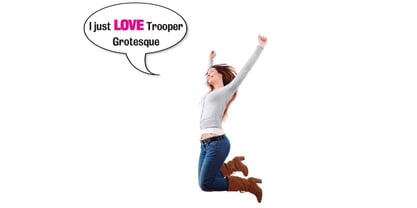
- Classic Grotesque by Monotype,
$40.99 Classic Grotesque by Rod McDonald: a traditional font with a modern face. The growing popularity of grotesque typefaces meant that many new sans serif analogues were published in the early 20th century. Setting machines were not compatible with each other but all foundries wanted to offer up-to-date fonts, and as a result numerous different typeface families appeared that seem almost identical at first glance and yet go their separate ways with regard to details. One of the first fonts created with automatic typesetting in mind was Monotype Grotesque®. Although this typeface that was designed and published by Frank Hinman Pierpont in 1926 has since been digitalised, it has never achieved the status of other grotesque fonts of this period. But Monotype Grotesque was always one of designer Rod McDonald’s favourites, and he was overjoyed when he finally got the go-ahead from Monotype in 2008 to update this “hidden treasure”. The design process lasted four years, with regular interruptions due to the need to complete projects for other clients. In retrospect, McDonald admits that he had no idea at the beginning of just how challenging and complex a task it would be to create Classic Grotesque™. It took him considerable time before he found the right approach. In his initial drafts, he tried to develop Monotype Grotesque only to find that the result was almost identical with Arial®, a typeface that is also derived in many respects from Monotype Grotesque. It was only when he went back a stage, and incorporated elements of Bauer Font’s Venus™ and Ideal Grotesk by the Julius Klinkhardt foundry into the design process, that he found the way forward. Both these typefaces had served as the original inspiration for Monotype Grotesque. The name says it all: Classic Grotesque has all the attributes of the early grotesque fonts of the 20th century: The slightly artificial nature gives the characters a formal appearance. There are very few and only minor variations in line width. The tittles of the ‘i’ and ‘j’, the umlaut diacritic and other diacritic marks are rectangular. Interestingly, it is among the uppercase letters that certain variations from the standard pattern can be found, and it is these that enliven the typeface. Hence the horizontal bars of the “E”, “F” and “L” have bevelled terminals. The chamfered terminal of the bow of the “J” has a particular flamboyance, while the slightly curved descender of the “Q” provides for additional dynamism. The character alternatives available through the OpenType option provide the designer with a wealth of opportunities. These include a closed “a”, a double-counter “g” and an “e” in which the transverse bar deviates slightly from the horizontal. The seven different weights also extend the scope of uses of Classic Grotesque. These range from the delicate Light to the super thick Extrabold. There are genuine italic versions of each weight; these are not only slightly narrower than their counterparts, but also have variant shapes. The “a” is closed, the “f” has a semi-descender while the “e” is rounded. Its neutral appearance and excellent features mean that Classic Grotesque is suitable for use in nearly all imaginable applications. Even during the design phase, McDonald used his new font to set books and in promotional projects. However, he would be pleased to learn of possible applications that he himself has not yet considered. Classic Grotesque, which has its own individual character despite its neutral and restrained appearance, is the ideal partner for your print and web project.
 - English Grotesque by Device,
$39.00 English Grotesque is based on the proportions of an early 20th century signwriter’s sans, emphasising the characteristic idiosyncrasies of type of the period. Sharing a similar Roman circle-and-square construction as Gill Sans or Johnston Railway, it has a wide T and W, a narrow S, and a long-tailed R. The Roman alphabet did not include a lower-case, and therefore early sans-serifs tended to base theirs on handwritten or cursive models, resulting in more even character widths. English Grotesque, by contrast, carries the more characterful proportions of the capitals through to the lower case. Available in six weights, with optional alternative versions for the Q, &, £ and J.
 - Nora Grotesque by vve.type,
$34.99 Nora Grotesque is a modern sans serif type family of five weights plus true matching obliques, all completely equipped with opentype features, fractions, lining numbers, old style figures, capsular numbers, superscript and inferiors. It has been designed parallel within the neogrotesque universe of typefaces and is inspired by humanist proportions and humanist-grotesk features in multiple languages, support Central and Eastern European as well as Western European languages. Working on Nora Grotesque type family, we've aimed to create a modern geometric grotesk with the widest implementation range, a reliable workhorse. Nora Grotesque is equipped for complex, professional typography with a high x-height for maximum legibility and a powerful personality then other alternates. We've been especially careful working on the uniq geometry of each glyph, both from the point of view of visual correctness and forms continuity.


Page 1 of 194Next page