10,000 search results
(0.028 seconds)
- Cesium by Hoefler & Co.,
$51.99 An inline adaptation of a distinctive slab serif, Cesium is an unusually responsive display face that maintains its high energy across a range of different moods. The Cesium typeface was designed by Jonathan Hoefler in 2020. An energetic inline adaptation of Hoefler’s broad-shouldered Vitesse Black typeface (2000), Cesium is named for the fifty-fifth member of the periodic table of the elements, a volatile liquid metal that presents as a scintillating quicksilver. From the desk of the designer, Jonathan Hoefler: I always felt that our Vitesse typeface, an unusual species of slab serif, would take well to an inline. Vitesse is based not on the circle or the ellipse, but on a less familiar shape that has no common name, a variation on the ‘stadium’ that has two opposing flat edges, and two gently rounded sides. In place of sharp corners, Vitesse uses a continuously flowing stroke to manage the transition between upright and diagonal lines, most apparent on letters like M and N. A year of making this gesture with my wrist, both when drawing letterforms and miming their intentions during design critiques, left me thinking about a reduced version of the typeface, in which letters would be defined not by inside and outside contours, but by a single, fluid raceway. Like most straightforward ideas, this one proved challenging to execute, but its puzzles were immensely satisfying to solve. Adding an inline to a typeface is the quickest way to reveal its secrets. All the furtive adjustments in weight and size that a type designer makes — relieving congestion by thinning the center arm of a bold E, or lightening the intersecting strokes of a W — are instantly exposed with the addition of a centerline. Adapting an existing alphabet to accommodate this inline called for renovating every single character (down to the capital I, the period, and even the space), in some cases making small adjustments to reallocate weight, at other times redesigning whole parts of the character set. The longer we worked on the typeface, the more we discovered opportunities to turn these constraints into advantages, solving stubbornly complex characters like € and § by redefining how an inline should behave, and using these new patterns to reshape the rest of the alphabet. The New Typeface The outcome is a typeface we’re calling Cesium. It shares many of Vitesse’s qualities, its heartbeat an energetic thrum of motorsports and industry, and it will doubtless be welcome in both hardware stores and Hollywood. But we’ve been surprised by Cesium’s more reflective moods, its ability to be alert and softspoken at the same time. Much in the way that vibrant colors can animate a typeface, we’ve found that Cesium’s sensitivity to spacing most effectively changes its voice. Tighter leading and tracking turns up the heat, heightening Cesium’s sporty, high-tech associations, but with the addition of letterspacing it achieves an almost literary repose. This range of voices recommends Cesium not only to logos, book covers, and title sequences, but to projects that regularly must adjust their volume, such as identities, packaging, and editorial design. Read more about how to use Cesium. About the Name Cesium is a chemical element, one of only five metals that’s liquid at room temperature. Resembling quicksilver, cesium is typically stored in a glass ampule, where the tension between a sturdy outer vessel and its volatile contents is scintillating. The Cesium typeface hopes to capture this quality, its bright and insistent inline restrained by a strong and sinuous container. Cesium is one of only three H&Co typefaces whose name comes from the periodic table, a distinction it shares with Mercury and Tungsten. At a time when I considered a more sci-fi name for the typeface, I learned that these three elements have an unusual connection: they’re used together in the propulsion system of nasa’s Deep Space 1, the first interplanetary spacecraft powered by an ion drive. I found the association compelling, and adopted the name at once, with the hope that designers might employ the typeface in the same spirit of discovery, optimism, and invention. —JH Featured in: Best Fonts for Logos
 - Reditum by Mans Greback,
$59.00
- Modicum by Elemeno,
$10.00 - Podium by Identikal Collection,
$23.00 - LT Festive Medium - 100% free

- Wiegel Latein Medium - 100% free

- Tt-Kp Medium - Unknown license

- COM4t Sans Medium - Unknown license

- SF Espionage Medium - Unknown license

- SF Arborcrest Medium - Unknown license

- Wiegel Kurrent Medium - 100% free

- SF Arborcrest Medium - Unknown license

- Abbey Medium Extended - Unknown license

- SF Espionage Medium - Unknown license

- Bill Corporate Medium by OGJ Type Design,
$35.00 Bill Corporate is a geometric typeface with generous capitals. A modern classic, based on Max Bill’s lettering work, its straightforward and uncompromising construction can be both edgy and sublime. With minimalist letterforms, pointy apexes instead of flat ones, and archetypal proportions, this font family doesn’t follow any trends but strives to achieve a timeless formal vocabulary. The skeleton of its letters is based heavily on the famous primary shapes of the Bauhaus: square, circle, and triangle. This makes for quite wide uppercase and much narrower lowercase letters. The contrast between uppercase and lowercase benefits inexperienced users, who will be able to get appealing results quickly. At the same time, it’s a powerful tool for seasoned designers, who can employ either case selectively to set the desired typographic course. Bill Corporate Medium’s 16 styles (including a set of eight lighter-than-light fonts from “Two” to “ExtraLight”) are an excellent choice for editorial design, branding, headlines, and even short to mid-length copy in a wide range of applications and industries. The uppercase letters in particular—with their varied widths and lavish dimensions—are suitable for cosmopolitan and stylish logotypes and wordmarks. Whenever a timeless, staid, and classy look is demanded, choose Bill Corporate.
 - Mementor Medium Regular by Wooden Type Fonts,
$15.00 Medium slab serif
 - Varial Rounded Medium by Cloud9 Type Dept,
$35.00
- Bernhard Gothic Medium by Wooden Type Fonts,
$15.00 A version of Bernhard Gothic Medium. Quite useful for advertising.
 - Martin Medium Regular by Wooden Type Fonts,
$15.00 Medium weight, sans serif.
 - Copperplate Classic Medium by Wiescher Design,
$49.50 Copperplate was the classic nineteenth century engravers typeface, consisting of capitals and small caps only. Among others (for example Deberny & Peignot) F. W. Goudy's cut for ATF around 1901 is probably the most widely known. Copperplate typefaces are traditionally used for business cards and all that "serious" stuff. My Copperplate Classic is a completely new design, based on some old samples. To make it look more up-to-date and elegant, I gave it some extra swings here and there. The old fonts were all designed with clogging corners or points that can break off in the minds of its designers. Today we do not have those problems any longer, so I could give my Copperplate Classic real sharp pointed serifs. To give you more choice I now added this medium cut in three variations, medium, sans and rounded! Enjoy! Gert Wiescher
 - LT Shortcake Medium - 100% free

- LT Bread Medium - 100% free

- LT Fillet Medium - 100% free

- LT Leap Medium - 100% free

- The Planeta by Aminmario Studio,
$20.00 Planeta Font, this font was created to look as close to a natural handwritten script as possible by including some alternates lowercase, ligature and underlines. Built in Opentype features, this script comes to life as if you were writing it yourself. Comes with regular and italic. Also support multilingual.Perfect for any awesome projects that need hand writing taste. It's highly recommended to use it in opentype capable software - there are plenty out there nowadays as technology catches up with design ... Other than Photoshop, Illustrator and Indesign, many standard simple programs now come with Opentype capabilities - even the most basic ones such as Apple's Text Edit, Pages, Keynote, iBooks Author, etc. Even Word has found ways to incorporate it. Thanks for checking out this font. I hope you enjoy it! AminMario
 - NT Plakaty by Novo Typo,
$26.00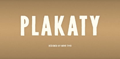
- Plakato Pro by Underware,
$50.00 Plakato, a stencil love affair Plakato is a family of display fonts, consisting of various eye-catching styles, each of them very bold. Plakato is an identity toolkit, a heavyweight building block in case you need a strong personality, a small stencil font family to cut out your best ideas and grab all the attention. But just as with many other creations, its outcome is as divers as its multiple origins. Plakato comes in 16 eye-catching styles. The default stencil style comes in Regular & Italic. They both have 2 variations: one version, named Plakato Stencil, automatically creates borders around the text, putting any text into a graphic stencil in this way. Another version, the extruded three-dimensional version, guarantees even more attention for your message. Next to this there is also the Inline version, which is an optical play with a lot of lines. Plakato Inline has a supportive background layer, a separate font in case you want to add a background in a different colour. Then there is Plakato Paper, a manually teared version of Plakato offering a more physical look. This small family of eye-catching display fonts also contains a Neon font, an independent design in Plakato style, which can actually be used for making neon signs due to its construction. Plakato Neon comes with its own Dingbat font for that extra flush-flush. Plakato has also been redrawn on a C64, and with all its accompanying limitations been ported back and turned into a font: Plakato Game. Also this font comes with its own Dingbat font, full of emoji’s and icons for oldskool pleasure. Last but not least there is Plakato Build, constructed out of blocks. As if that wasn’t enough, there are various dynamic versions in the Plakato Play package, which offer a whole new range of possibilities for typographic expression, with new animation and interaction opportunities.
 - Medio - 100% free

- Medin by Viaction Type.Co,
$25.00 Medin is a serif font with elegant characters. Medin is perfect for your elegant-themed work, suitable also for elegant vintage. This font is available multilingual & alternate characters, making it easy to do work on various design themes. Medin is equipped with multilingual accents. Get it now Medin fonts, to add to your collection and work solutions. Viaction Type Thanks.
 - Modum by The Northern Block,
$- A contemporary serif font family. The design takes influence from traditional serif forms to develop a precise, highly functional text face with a low contrast. Smooth radius details are blended with carefully drawn angles that give a crisp, distinctive aesthetic when used across body copy. Modum is a stylish modern day serif with great charm, harmony and practicality that is best suited for complex hierarchical projects, such as editorials, newspapers and text based books. Details include 8 weights and true italics, over 800 characters with alternative lowercase a, e, g and y. 7 variations of numerals, true small caps with accents, ligatures, manually edited kerning and Opentype features.
 - Meditative by UICreative,
$23.00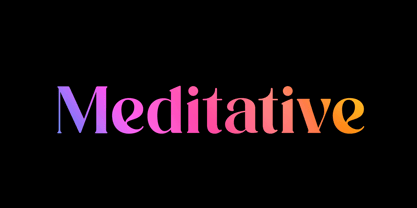 Introducing our new product the name Meditative Elegant Classic Serif Font. Modern Serif font that feels beautiful classy, elegant, and modern. This font is perfectly suited for a wide variety of projects, such as signature, stationery, logo, wedding, typography quotes, magazine or book covers, website headers, clothing, branding, packaging design, and more. Also for fashion-related branding or editorial design and displays both masculine and feminine qualities.
 - Rough Owl - Personal use only

- Charons Obol - Personal use only

- Barn Owl by astroluxtype,
$20.00 Vintage, country, distressed or just plain worn out. The Texas general store on the side of the highway that has been there since 1954 and they're still selling old fashion bottled soda. A renovation/excavation at a downtown urban construction site reveals the old ad on exterior brick. Barn Owl provides the headline in your project with the ultimate in aged retro visualization. It is a basic minimal font set which includes only uppercase letterforms. It is a headline font best used above 36 points in size. The first of our “Trifonictype” (Tin Sign is the 2nd) there are three components to the font, Barn Owl Outline, Barn Owl Fill and Barn Owl Shadow. These can be used in different combinations for different effects, copy and paste type then indicate a different font each time. Paste in the front or back in application to see effects in combination. Fill and Shadow could be used with irregular letter spacing for various effects. Outline could be used with just Shadow for a another effect. Use your photo manipulation program to overlay and change the transparency of your headline. There are a few extended glyphs and barn(ding)bats in the lowercase letter strokes indicated in a poster sample, these are found only in the Barn Owl Outline. Download PDF manual for complete showing.
 - OBO Regular by Wilton Foundry,
$29.00 OBO is a modern interpretation of the classical Italian letterforms with the readability of contemporary sans typefaces. OBO is ideally suited for creating identities for branding, posters, book covers, headlines, logotypes, restaurant menus, beer labels.
 - OBO Classic by Juri Zaech,
$19.00 OBO Classic is the second installment of the OBO series, a type collection based on a square. Every character is mapped on a 1x1 ratio which allows for horizontal and vertical settings alike. Or mixed, like crosswords. OBO Classic is a display interpretation of a traditional Old-style Serif. The “distortion” which maps each character to a square creates unusual proportions to what we are used to from classic serif typefaces. The result is a monospaced font. While each individual letter feels conventional on its own, when brought together in words the result feels contemporary. Thanks to the square base vertical and horizontal – and mixed – settings are possible and easy to apply. There are a few exceptions for certain punctuation and special characters that are half the width for better spacing; and the word space’s width can easily be adjusted through OpenType stylistic sets. Talking about spacing, for strictly horizontal typesetting there is the option to turn on kerning for a number of characters to create a cleaner texture across words and phrases. OBO Classic is best set in large sizes and is most comfortable in editorial and display settings. A series of icons complete the character set. A selection comes as pixel graphics which adds further contrast to the traditional legacy of the typeface.
 - Charons Obol by Hanoded,
$20.00 Charon's Obol is a scary, brushed typeface. It was created using cheap paint and stiff brushes - hence the rough texture of the glyphs. Using this font will ensure you a safe passage across the river styx - just don't pay the ferryman until he gets you to the other side…
 - Roble Alt by Latinotype,
$26.00 Roble Alt is a variation of Roble. It is a Slab Serif Font, from a mix between Andes and Sanchez, following an harmony with both fonts one sans and one serif with a fresh and dynamic result. Roble Alt is a family of 16 display fonts 8 weights plus italics.
 - DBL Cheque by Letterhead Studio-VG,
$15.00 This is an experimental type, something of retro-futurism and modern robotics in one package, with letters of unexpected proportions and forms. It was inspired by the glorious imagination of the past, but it holds in itself themes that are bound with the future. The DBL Cheque family consists of incredible 22 styles, filling every need for demanding designers.
 - OBO Star by Juri Zaech,
$19.00 OBO Star is a fat, subtly flared display typeface with a not so subtle groove factor. The letters are based on a square and do not have ascenders or descenders. This way the typeface can be used for horizontal and vertical settings, or mixed like crosswords. There are a few exceptions for certain punctuation and special characters that are half the width for better spacing; and the word space’s width can easily be adjusted through OpenType stylistic sets. Talking about spacing, for strictly horizontal typesetting there is the option to turn on kerning for a number of characters to create a more optimal texture across words and phrases. But that’s all just technical talk. The true character of OBO Star is the funky look, amplified by the wide 1x1 format that creates space for unconventional shapes, mostly pronounced in the letters R, K and G.


