2,895 search results
(0.025 seconds)
- Toms Finger by CozyFonts,
$20.00 Toms Finger Family fonts is a hand drawn sans serif series containing Regular weight (Toms Finger), Bold weight (Toms Thumb), and Light weight (Toms Pinky). Drawn entirely using his finger tip on a tablet Tom created this font to be user-friendly for Notes, Signs, Posters, Ads, Captions or anything where the writer wants to convey a casual, non invasive voice in the copy. Toms Finger Family is legible in a wide range of sizes in all weights.
 - Archaz Negras by Mans Greback,
$59.00 Archaz Negras strikes a chord with its rough rock band logo aesthetic. Its symmetric and captivating character makes it a fit for movie posters, Halloween invites, or a heavy metal t-shirt that demands attention. Dark, daring, and undeniably striking, Archaz Negras channels the raw energy of death metal and an eerie aura of horror. Designed with precision by Mans Greback, this destroyed font resonates with the rebellious spirit of punk and its haunting allure of the unknown.
 - Georgia Script by vuuuds,
$17.00 Georgia Script is modern script font, every single letters have been carefully crafted to make your text looks beautiful. With modern script style this font will perfect for many different project ex: photography, watermark, quotes, blog header, poster, wedding, branding, logo, fashion, apparel, letter, invitation, stationery, etc. This font including alternate glyph. You can access the alternate glyph via Font Book (Mac user) or Windows Character Map (Windows user), I've been put the link tutorial inside the zip file.
 - Mochalatte by Grontype,
$14.00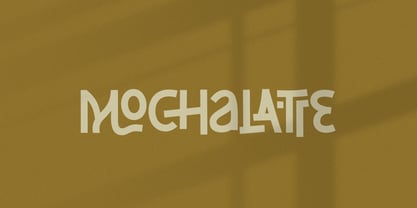 Mochalatte is an attractive and modern semi bold, elegant decorative font with a fun, dashing style look. This font equipped with extra ligatures and alternates, that will make your creative designs projects look impressive and stunning. Mochalatte is perfect for logotype, posters, t-shirt designs, packaging brand, or quotes, magazine header etc. Features: Basic Latin Glyphs Multilingual Numeral and Punctuation Standard Ligatures Stylistic Alternates Thankyou for picking up this font, hope you enjoy it. Regard. Grontype
 - LTC Goudy Extras by Lanston Type Co.,
$24.95 A set of over 50 ornaments, connecting borders, flourishes and decorative motifs originally designed by Frederic Goudy throughout his career. Many of these designs were used by Goudy at his Village Press and offered by his Village Foundry in the 1920s. The styles range from complex title page illustrations to simple linking borders, but all have the unique Goudy style. This set is completely different from the Goudy Ornaments found in the P22 Goudy Aries Set.
 - DEATHE MAACH by The Fontry,
$15.00 There's a war starting; you just didn't notice because you were too busy fighting to realize what was happening. Take your sides. Pick your battles. Choose a face that stands ready to defend, enforce and police. All who are ready to serve, please step forward. Deathe Maach is a six-font family of descending weights with the strength and stamina to face all comers in the approaching conflict. Armor on. Pistols out. Barrels forward. Enforce and serve.
 - Fido Pro by Canada Type,
$29.95Fido Pro is the official font of dog owners everywhere. Woof! When the original Fido font was published in 2009, it became an instant hit with cartoon channels, comic book artists, toy makers, cereal packagers and game developers. Now, more than a decade later, we decided to pick it up and give it the Pro treatment. This new version boasts more than 800 glyphs, including 117 interlocking ligatures, plenty of alternate glyphs, and and Pan-European language support. - Amterina by Aftertime Studio,
$19.00 Amterina Monoline Script Font The Amterina font is a simple font, comes with alternate font and some ligatures. We keep this font looks elegant, readable, stylish, and catchy. You can use this font for watermark on photography, signature or signature logo design, quotes, album cover, business card, and many other design project. The variations will make you smile and happy. Just pick the variation you like best. NO DOUBT ! The font has : Stylistic alternate Ligature, and Multilingual Support Thankyou..!!
 - Primaria by PeGGO Fonts,
$18.00 Primaria is a display font, inspired on the very first basic handwrite style teaching at primary school, designed in cursive and print styles in three weights each one: light, Regular and Bold, considering stylistic and typographic needs, it also contain OpenType initial lowercase alternative forms in order to get better links in those case where pairs of letters could be look better. Recommended playful and friendly design, teaching and learning stuff, children toys projects, food & drink and soft stuff.
 - Spookytooth by Comicraft,
$19.00 Sink your teeth into the World of Horror! SPOOKYTOOTH is sharp enough to penetrate even the most stubborn necks and has proven unnerving enough to make Ghost Rider, Deadpool, the Confessor and even ELEPHANTMEN’s Obadiah Horn sound both sinister and nefarious! Remastered Spookytooth includes a new Bold weight, automatic alternate letters, improved spacing & kerning, additional European, Vietnamese & Cyrillic language support, and Crossbar I Technology™ Script by Jeph Loeb & art by Ian Churchill with Liquid's Aron Lusen
 - Thurkle by Grontype,
$15.00 Thurkle is bold new serif font, look tough and playable. Comes with sharp edges, inspired by sword making dynasty in British History. This display typeface is semi condensed and included some extra unique ligatures. Thurkle is perfect for any project such as magazine header, flyer header, logotype, invitation card name, and some any other design. Features: All Caps and Small Caps Character Numbers and Punctuation Special Characters Ligatures. Multilingual Support Thankyou For Picking The Font, Enjoy. Grontype
 - Casiore by Grontype,
$12.00 Casiore is an elegant handwritten font with a fun brush style. It has a light modern calligraphy look making it perfect for branding and digital designs. Casiore equipped with alternative glyphs and ligatures. The font is suitable for any graphic design such as quotes, logos, social media, websites, blogs, intitation cards, and more! Casiore Features: light weight font Punctuation & Characters Ligatures and alternates Glyphs included superscript & Symbol Currencies Multilingual Thankyou for picking up this font. Happy creating! Regard, Grontype
 - Highills by Grontype,
$14.00 Highills is awesome bold decorative font. created in rounded corner that give this font a tough and calm feel. this font has s good looking as header and as text both. Highills is fit perfectly for branding projects, movies, logos, social media posts, posters, books, and many more. Features: Basic Latin Glyphs Bold Uppercase and Lowercase Letters Alternates & Ligatures Numeral and Punctuation Multilingual Support Thankyou for picking up this font, hope you enjoy it. Regard. Grontype
 - Altivo by Kostic,
$40.00 Altivo is a proper workhorse sans serif. Sixteen OpenType fonts in eight weights (with true Italics) range from Thin to Ultra. Meticulous care was taken to ensure high legibility in text sizes on the screen. The typeface is designed to have wide proportions, generous x-height, loose spacing, ink traps, large apertures and low stroke contrast. Altivo’s ink traps are not only a functional design feature, they also look interesting and lend character to the typeface in headlines. True Italics, small caps and multiple sets of figures, as well as a complete set of lowercase superscript were all included in the family to accommodate high typographic standards. If you need to pair it with a serif font, you can’t go wrong with Chiavettieri, since both typefaces were made with the same basic proportions, and their tabular figures are the same width.
 - CA Cula by Cape Arcona Type Foundry,
$40.00 CA Cula is standing in the tradition of cool tempered sans serif typefaces like DIN. But at a closer look it reveals a tendency towards rounder reading-friendly forms. The denaturalized ink traps give CA Cula a very special and individual look in display sizes, whereas in smaller sizes the positive aspects of huge ink traps show effect. The text looks clean and bright without black dots in the typographic image. This makes CA Cula suitable even for longer text, while the bold weight makes pretty cool headlines. The choice of weights aims at an easy straight forward use. A set of five well balanced weights ought to be enough to cover most needs without throwing the typographer into questions like: demibold or semibold? If you are looking for the extra kick, look out for CA Cula Superfat.
 - "Shipped Goods 1 (Personal Use)" is a captivating typeface from the creative mind of Måns Grebäck, a renowned designer known for his prolific output of visually striking and character-rich fonts. Thi...
- Love Script by Positype,
$55.00 Love Script came about as a way to finally answer the requests by individuals to take my brush pen/marker lettering styles and turn them into a typeface. Literally, everything lined up perfectly and there was a renewed impetus to push this genre, this style of lettering I have adapted over the years into what will become a series of brush pen/marker typefaces. The first I chose to complete was a high-contrast variant… I seem to be attracted to high contrast, high energy letters (think Lust, Lust Slim and Lust Script). As I was finalizing everything, I kept saying ‘I love this script’, which ultimately led the christening of the typeface as Love Script. For more fun, visit the Love Script Minisite Designer’s note: for this font to truly sing, be sure you have Contextual Alternates on in your OpenType settings. Hope you love it as much as I do.
 - Leidener by Talavera,
$40.00 This font family is inspired by printed work made by the Elzevir family back in the XVIIth century at Leiden (NL). They worked with material from several type designers, but further investigations sends us to the tracks of one in particular: Robert Granjon. Granjon italics were way ahead of his time, making some really beautiful signs like swashy ampersands and minuscule v letters. This font also contains old style figures in the same fashion as they were printed, like the flipped number 8 and open forms in 6 and 9. This is as much a revival as an original design, because of their weights bold and heavy (both with italics) that were inspired on some titles. In this font you can also find a lot of ligatures, small caps, diacritics and even a fleuron for each weight and variation. Leidener came up from two books: Constantini Imperiatoris (1611) and Exercitationum Mathematicarum (1657), printed by Louis and John Elzevir on their Leiden Workshop, back in the day.
 - Milescut by Tipos Pereira,
$14.00 Milescut is a display typeface inspired by some seminal covers the graphic designer and photographer Reid Miles created for the Blue Note Records between the 1950s and 1960s. Miles made almost 500 covers for Blue Note in this period, including some using the hand-cut technique that consists basically in doing vertical cuts in capital letters and numerals to create a unique style within the universe he created for Blue Note. Milescut is a tribute to this small “cut” 😬 in his trajectory within the greatest record label of all time. This idea came about while I was working on what will become soon a revival of a wood type that I fell in love with when flipping through a Specimen of the MACHINE CUT WOOD TYPE manufactured by The WM. H. Page Wood Type Co. Milescut has two extra sets of alternates that work cyclically when activated in your OpenType menu and lots of ligatures, pretty cool :)
 - Geographica Script by Three Islands Press,
$39.00 Time-tested elegance is what you’ll get with Geographica Script, a handwritten typeface steeped in 18th century sophistication. Source materials include the maps of Emanuel Bowen (circa 1694–1767), Geographer to King George II, as well as English and American trade cards from the middle 1700s, including the work of artist and printmaker William Hogarth (1697–1764). A kindred font to our Geographica serif family, Geographica Script is a painstaking replication of the elegant roundhand cursive seen in engravings of the period. Geographica Script has more than 1,100 glyphs, including scores of standard and contextual ligatures, three full uppercase alphabets, historical forms, decorative flourishes, and full Latin support. It’s also got fifty evocative ornaments inspired by map and trade card illustrations, e.g., lion rampant, unicorn rampant, crowns, anchors, sailing ships, whale, dolphin, sun, moon, and many others. Note: To prevent Microsoft Word from cutting off Geographica Script’s extra-long descenders, set line spacing (Format —> Paragraph —> Spacing) to 1.5 lines.
 - M Lady PRC by Monotype HK,
$523.99 M Lady is a design inspired by Agfa Waddy’s rather elegant design comes with narrow proportion. M Lady is a rare condensed design in world of Chinese typefaces. Entry and finial points of strokes are squarish, with a sharp but small symmetric serif. It has a medium contrast to improve character recognition. Its thin stems (豎) make it suitable for fine print with minimal conglutination. Dots (點) are straight, reversely curved or round. Downstrokes (撇、捺), ticks (剔) and hooks (勾) are highly regular and consistent. Dots (點), downstrokes (撇、捺) and ticks (剔) are long, smooth, monolinear and curved with small symmetric serif and sometimes angled entry and finial points of strokes to create subtle sharpness in the midst of its softness and elegance, which is better for larger text print. Its features and construction create subtle sharpness in the midst of softness and slim elegance. It is best suited for casual subheading or display, set upright (non-slanted), non-condensed (naturally condensed).
 - Hanley Pro by District 62 Studio,
$29.00 The origin story of HANLEY FONT COLLECTION all starts with the Script. We were designing logos and kept feeling like we needed a different kind of script, vintage feeling but not dated, and not too baseball-y or too formal. We couldn’t find exactly what we were looking for, so we decided to create it ourselves. After that we realized what we really wanted was good wood block looking lettering especially with small caps. And the collection just grew from there - a tall slim style, a monoline version of the script and of course a good sans. We topped off the group with a large selection of catchwords and extras with plenty of swirls, swashes and frames. Hanley has just enough irregularity to the edges to impart a human feel, but it’s still clean. Super versatile, all the styles work well together and can look authentically vintage or modern and hand-crafted.
 - 1863 Gettysburg by GLC,
$38.00 This script font was inspired by a lot of autographs, notes and drafts, written by President Abraham Lincoln, mainly the Gettysburg address, first draft and copies, but also the emancipation proclamation. It is an attempt to offer a typical manual script from this American period, not to propose the exact writing from A. Lincoln himself. This font is a little fat and monotone, maybe Abraham Lincoln used a smooth or rounded pen, but some letters I have consulted were written obviously with a sharp one, so, in the future, I will certainly produce a slim version of this font. It is used as variously as web-site titles, posters and fliers design or greeting cards, all various sorts of presentations, menus, certificates, letters. This font supports enlargement as well as small size, though the original size was about 18 to 24 pts. When printed, it remain perfectly legible from 10 to 12 pts.
 - Klint by Linotype,
$40.99 Type designer Hannes von Döhren created Klint. A sans serif typeface with a technical appearance and humanistic streak. The family includes five weights; each weight ships in three widths: condensed, regular, and extended. All of the 15 Klint variants have a companion Italic, rounding out family at 30 fonts. Klint's large x-height makes the design especially legible at small point sizes. In today's day and age, appliance manufacturers and/or companies in the mobile phone, computer hardware and software or Internet sectors are becoming ever more important. Klint fills the rising need for superfamilies with a technical feeling that are also legible in both text and display settings. Through conspicuous letters like R, K, k, or g, as well as the independent nature of its Italic, Klint exudes an ethos that separates it from the competition. Longer text passages in brochures, catalogs, or magazines would be well served by Klint's Light, Regular, and Medium weights. The heavier cuts are optimized for poster settings and headlines."
 - M Lady HK by Monotype HK,
$523.99 M Lady is a design inspired by Agfa Waddy’s rather elegant design comes with narrow proportion. M Lady is a rare condensed design in world of Chinese typefaces. Entry and finial points of strokes are squarish, with a sharp but small symmetric serif. It has a medium contrast to improve character recognition. Its thin stems (豎) make it suitable for fine print with minimal conglutination. Dots (點) are straight, reversely curved or round. Downstrokes (撇、捺), ticks (剔) and hooks (勾) are highly regular and consistent. Dots (點), downstrokes (撇、捺) and ticks (剔) are long, smooth, monolinear and curved with small symmetric serif and sometimes angled entry and finial points of strokes to create subtle sharpness in the midst of its softness and elegance, which is better for larger text print. Its features and construction create subtle sharpness in the midst of softness and slim elegance. It is best suited for casual subheading or display, set upright (non-slanted), non-condensed (naturally condensed).
 - Fairwater by Laura Worthington,
$29.00 Fairwater’s aesthetic derives from the cursive handwriting styles popularized in the early to mid-1900s, the simplified, forgiving letterforms of tattoo lettering – and the pictorial themes that informed early-to-mid 20th-century naval tattoos. The Fairwater family includes a script and sans face in three weights, four decorative serif faces and an ornamental font: DIY Lines. As with many of my fonts, I couldn’t resist adding a plethora of 465 swashes and alternates to the script version, that include ending forms on all letters, 34 beginning and isolated letters, an unconnected version and contextual alternates. Fairwater also includes a powerful decorative font entitled DIY Lines: 250 ornamental characters of ships, anchors, oars, knots, rope, botanicals, diamonds, arrows and more. With strokes and proportions that perfectly complement the type. See what’s included! http://bit.ly/2cJMUoe These fonts have been specially coded for access of all the swashes, alternates and ornaments without the need for professional design software! Info and instructions here: http://lauraworthingtontype.com/faqs/
 - Garduja by IbraCreative,
$17.00 Garduja, a stylish slim serif font, effortlessly blends sophistication with modern aesthetics, creating a typographic masterpiece that captivates the eye. Its slender and refined letterforms exude a timeless elegance, while subtle serifs add a touch of classic charm. Garduja strikes the perfect balance between readability and artistic flair, making it an ideal choice for projects that demand a polished and contemporary design. The font’s graceful curves and precise detailing contribute to its overall sleek appearance, ensuring a distinctive and memorable presence in both print and digital applications. With Garduja, every character embodies a harmonious fusion of tradition and innovation, offering a visually striking and versatile option for designers seeking a tastefully sleek serif typeface. Garduja is perfect for branding projects, logo, wedding designs, social media posts, advertisements, product packaging, product designs, label, photography, watermark, invitation, stationery, game, fashion and any projects. Fonts include multilingual support for; Afrikaans, Albanian, Czech, Danish, Dutch, English, Estonian, Finnish, French, German, Hungarian, Italian, Latvian, Lithuanian, Norwegian, Polish, Portuguese, Slovak, Slovenian, Spanish, Swedish.
 - SL Borges by Sudtipos,
$29.00A man purposes himself the task of drawing the world. Among the years, he populates a space with images of provinces, reigns, mountains, bays, ships, islands, fishes, rooms, instruments, heavenly bodies, horses and people. A while before he died, he discovers that patient labyrinth of lines traces the image of his own face. J. L. Borges. SL Borges is a homage to the genial Jorge Luis Borges, illustrious Argentinean writer who lived between 1899 and 1986. Sharply depicted by Augusto Costhanzo, SL Borges synthesizes to icons the big themes that obsessed him: the infinite, labyrinths, libraries, identity. But it although traces lines over the more human side of the writer, who loved cats, fervent politics and the taste of Tango. SL Borges abridges a sum of original iconographic illustrations in True Type format, which masterly synthesizes the most important themes of the grand genius of the literature. SL Borges takes part of the "Icons of Icons" Gallery, developed by SinergiaLab for Sudtipos - Newercastle by Chank,
$49.00 Newercastle is the new incarnation of a popular Chank font formerly known as "Newcastle". A consistent fan favorite since its initial release in 2005, the distressed blackletter font is new and improved. This sinister script is now bulked up with all-new capital letters, a bit of punctuation, and smattering of new crowns, griffins and other heraldic doodads. Designer Kevin Hayes opted for an assortment of gritty old icons instead of more traditional punctuation, because he felt that's just the way this type of font could perform best for you, the font enthusiast. "At-signs and percentile glyphs just aren't believable in fraktur-style fonts," says Kevin. You benefit by getting a bit of clip art with the new font instead of boring old punctuation. Use the new bats indiscriminately to add a regal air to even the most mundane newsletter. Or use layer upon layer to add a rustic richness to a poster project. Enjoy this wicked, textural type and use it with extreme force.
 - Marsden by J Foundry,
$25.00 Marsden is a bold, no-nonsense Grotesque. It was designed for display, branding, advertising, packaging or anywhere a strong voice is needed. Marsden is built on a geometric foundation, with just enough warmth to keep the style confident and lively. The family features 8 widths in 12 weights; from a Slim Hairline to an extremely bold Wide Super. The fonts flow from condensed to wide with design intent. The condensed forms feature flat sides and subtle curves, while the wider forms feature rounded sides and open curves. The character set is robust, covering extended latin. The default forms are contemporary with alternates including: single-story a, two-story g, curved terminal l, raised vertex M, rounded top A, fully rounded G, rounded leg R, straight tail Q and straight descender y, all separated into individual style sets for control and customization. Completing the family are the Text fonts where the weights, widths and spacing are adjusted for smaller use.
 - BackSplatter, created by the inventive Rev. Josh Wilhelm, is a distinctive font that embodies a raw, and somewhat rebellious, energy. Its design appears as if it were the product of ink or paint bein...
- The Slim Chef font by Juan Casco is a whimsical and charming typeface that exudes creativity and playfulness, tailor-made for those projects that require a dose of light-heartedness and a sprinkle of...
- Office Stamps JNL by Jeff Levine,
$29.00Office Stamps JNL is a collection of twenty-six images recreating the familiar 'stock' rubber stamps used in offices for decades before self-inking stamps and desktop printing made them relics of the past. Modeled from vintage sources, all of the images have been re-drawn by Jeff Levine to have a crisper look than simply utilizing scanned imprints of old marking devices. - Blackbarry NF by Nick's Fonts,
$10.00Deutsch Black, designed by Barry Deutsch for VGC in 1966, provided the inspiration for this extrabold exercise in heavy ink coverage. A number of variants, in lowercase slots, were added to offer flexibility to your headline designs. Both versions include the complete Latin 1252, Central European 1250 and Turkish 1254 character sets, as well as localization for Moldovan and Romanian. - Kwash Brush by me55enjah,
$14.00 Introducing Kwash Brush! A handmade brush typeface. Inspired by brush ink stroke character, Kwash Brush makes the messages you write have a more personal touch. This handwritten brush font containing upper & lowercase characters, numerals, and punctuation. Also, support multi-language (Latin simple). This brush font can be applied to any kind of purpose, from handwritten quotes, packaging merchandise, branding projects, etc.
 - Patrick Cleo by Ergibi Studio,
$19.00 Patrick Cleo is a sophisticated signature font in manuscript style and with an elegant ink flow. Patrick Cleo has swashes for the lowercase only, which makes it perfect for projects that need an elegant glow, like logos, wedding designs, branding, social media posts, advertisements, product packaging, product designs, labels, photography, watermarks, invitations, stationery and any project that requires a handwriting touch.
 - Docklan by Gustav & Brun,
$10.00 The display font Docklan arose from experiments of candle-grease and black ink. Book covers, music festivals, wedding invitations or just an essay in school – Docklan will allow you to make a statement in any setting! The lowercases are miniatures of the upper-ones and it comes with a set of basic English/Latin letters and some west European diacritics.
 - Mortal Coil by Hanoded,
$15.00 I was playing around with an old brush I found in our kitchen: it had fallen under the stove and it had probably been hiding there for quite some time! I dusted it off, got my Chinese ink and set to work. The result is a scary-ish font. Mortal Coil comes with discretionary ligatures for double lower case letter combinations.
 - Mignonette by Magpie Paper Works,
$46.00 Hand-drawn with calligraphy ink and an antique dip pen, Mignonette is ready for all uses charming and rustic. She's heavy on the bottom and hairline at the top, and includes all sorts of additional numerals, currency figures as well as multi-language support. Mignonette shines in both correspondence and display; she has a particular affinity for offbeat and heartfelt branding.
 - Seluas Handmade by Siwox Studios,
$10.00 Seluas Handmade is a bold and beautiful brush lettered font. It's perfect for using in ink or watercolour based designs or on its own as bold hand brushed lettering. Use it for websites, branding, weddings, social media, product design, stationery and advertising, etc. Seluas Handmade is versatile enough to add that natural nuance to any project where you need that to look real.