10,000 search results
(0.017 seconds)
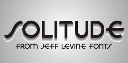
- Solitude JNL by Jeff Levine,
$29.00 - Uncial by Monotype,
$29.99Victor Hammer created many faces based on uncial handwriting of which American Uncial, released commercially by the Stempel foundry in 1952, is the source for this version. Uncial is an ideal choice for historical or church pieces, provided that the length of the copy is brief. - Pixeloza 01 by Fontsphere,
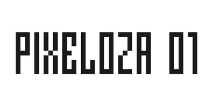
$12.00Pixeloza 01 is a pixel-style, grid-based, display typeface. Pixeloza 01 is available in two complementary options: Pixeloza 01 Regular and Pizeloza 01 Skewo Regular. It is distinguished by its simplicity and original form. It gives a lot of possibilities in creating unconventional, creative, unique projects. - Fragment by Ali Güzel,
$9.00 - Unboring by PintassilgoPrints,
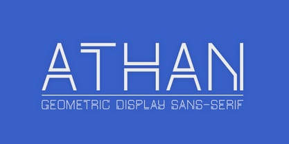
$20.00 - Athan by Thinkdust,
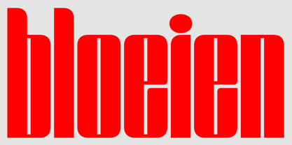
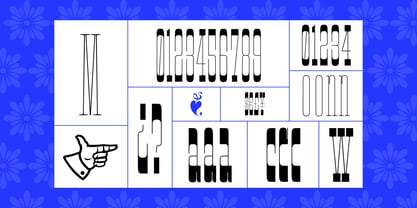
$10.00 - Bloeien by Aidan Cooke,
$112.00Bloeien is a super condensed variable typeface, consisting of 5 weights. With its subtle curves, consistently narrow counters and horizontal axis, this font is perfect to make a statement in editorial pieces, posters & headlines. Also, the variable feature allows complete flexibility and control when producing your designs. - Chromium One by ITC,
$29.99Chromium One is the work of British designer David Harris. With their rounded edges and shiny appearance, the characters seem to be made of smooth pieces of chrome joined seamlessly together. The unusual and distinctive Chromium One can be used for a variety of display applications. - Oversimplified JNL by Jeff Levine,
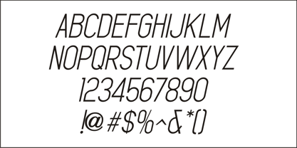
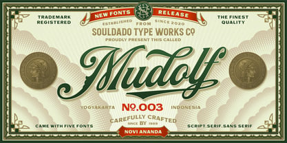
$29.00Oversimplified JNL is based on some examples of lettering silk screened onto plastic pieces for use on an interchangeable sign board. These thin, monoline letters are modular in nature and have the look of a ‘constructed’ alphabet. Oversimplified JNL is available in both regular and oblique versions. - NS Mudolf by Novi Souldado,
$35.00NS Mudolf is inspired by the lettering of vintage prints, signs and labels. It comes with five font styles and extra swashes, ligatures and stylistic alternates. It's ideal and perfect for creating a design piece such as letterheads, posters, signage, charters, labels, packaging, logotypes, and more. - Declaration - 100% free
- Le chant des Albatros - Personal use only
- Billion Dreams - Personal use only
- Angel Tears - Personal use only
- Cream Cake - Personal use only
- Wankstaberg Battles - Personal use only
- Berillia__s_Gaze - Unknown license
- Brandywine™ - Unknown license
- The Only Exception - Personal use only
- BPscript - Unknown license
- yodle - Unknown license
- Two Turtle Doves - 100% free
- Garton - Personal use only
- CoolHandLuke ttext - Unknown license
- Porcelain - 100% free
- Primot by Plau,
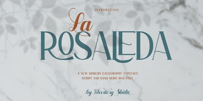
$49.00Primot is an upright script heavily influenced by italian gelaterias . After releasing 3 sans serifs , we were looking for an opportunity to design a display type with less constraints for legibility and expression. We started playing with brush lettering and looking into vintage scripts from different eras. Some cool things that made it into Primot were some unusual vertical connections and the sweet brush flairs in the letter endings. From that point on, we set out to create a beautiful looking vertical script – something we don’t see that often – in which each word set could would make a nice piece of graphic design (think logos, video game titles, shop windows etc.). We also made it smart by including hand-lettering inspired features such as initial and final forms for letters, contextual alternates and swashes. The result is a versatile 900+ glyphs display typeface, suitable for a wide range of applications. We hope you have as much fun with it as we had designing it! And while we’re here, you may like that it also pairs beautifully with our sturdy sans-serif family Motiva Sans . - La Rosaleda by Mevstory Studio,
$15.00La Rosaleda Font Duo is a ligature font pair with 30 amazing chic logo templates. With this open type font duo you can explore your creativity in unlimited way. To recreate your brand all you need is mix and match from the La Rosa font duo. This font duo is full of stylish ligatures, so that your writing with La Rosaleda can stand out. - Font Features: All fonts are OpenType fonts All fonts are fully vector designed Accurate kerning for all serif family Amazing ligatures to look natural in script font Alternative characters for script lowercase alphabets Multilingual Support for Both Scrip and Serif All OpenType fonts, Serif and Script. 30 Fully editable logos for Adobe Photoshop or Adobe Illustrator Font installing help file for PC and Mac Web-fonts for Script and Serif - Weekend Plans JNL by Jeff Levine,
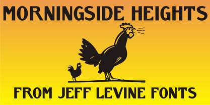
$29.00 - Morningside Heights JNL by Jeff Levine,
$29.00 - Extra C Variable by Tipastype,
$56.00 - Blacksmith JNL by Jeff Levine,
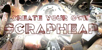
$29.00What started as an image of a single vintage brass stencil of the letter 'P' spotted in an online auction has turned into Blacksmith JNL. From that single letter Jeff Levine has created a complete Western stencil font, retaining the hand-made look of the original stencil piece. - RM Scrapheap by Ray Meadows,
$19.00 - Valjean by Solotype,
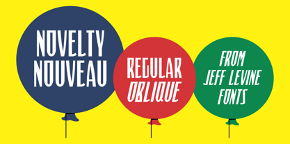
$19.95Here is a wood type from Tubbs & Co., about 1900. Its lack of decoration reflects the changes that were rapidly occurring in the design of printed pieces at the beginning of the 1900s. There were several similar types in metal in the first decade of the 20th century. - Novelty Nouveau JNL by Jeff Levine,
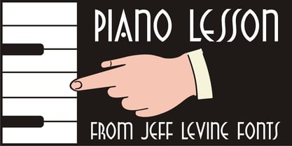
$29.00 - Piano Lesson JNL by Jeff Levine,
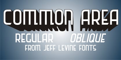
$29.00 - Common Area JNL by Jeff Levine,
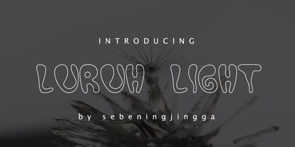
$29.00 - Luruh Light by Sebeningjingga,
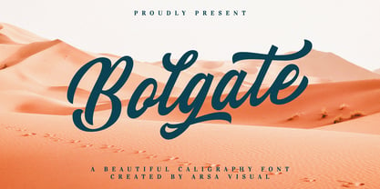
$5.00 - Bolgate by Arsa Visual,
$9.00Bolgate is a beautiful caligraphy font. This font works really well for Logos & Apparel Design. It's also great for creating Prints or Merchandise, as you can use the illustrative qualities of the shapes to create an art piece. Product includes: • Stylistic Alternates of Uppercase and Lowercase • Ligatures • Swash - Campcraft by Our House Graphics,
$-Remember those plastic Popsicle sticks that clicked together and you could make things from them with your sticky little fingers? Things like... camp crafts. Well, no� Of course you don't. You were too young. That�s why there is Campcraft. This is a fun loving dot-matrix font, or it would be a fun loving dot-matrix if the vertical and horizontal grid lines didn't pile up at the intersections. Then again, it wouldn't be any fun if they didn't pile up at the intersections, would it? Strictly a display type... Campcraft is excellent for what the name suggests. I goes well with Christmas sweaters, beaded jackets and purses and that time when we were all happy children with sticky little fingers. - Linotype Flamingo by Linotype,
$29.99Linotype Flamingo, from German designer Michael Leonhard, is part of the TakeType Library, chosen from the entries of the Linotype-sponsored International Digital Type Design Contest 1999 for inclusion on the TakeType 3 CD. The figures of this font have pieces missing, the curve of an a, the stroke of an n. The eye fills in the gaps, allowing the designer to present a unique font with reductionist forms which can still communicate written ideas to the reader. A small number of forms come together to create the alphabet and the 'missing pieces' make a light and airy overall impression. Linotype Flamingo should be used in point sizes of 18 and larger and because of reduced legibility should be used only for very short texts.
