10,000 search results
(0.036 seconds)
- Fun Play by FunFont,
$17.00 Fun Play is A Fun and Playful display typeface family with 5 wights variant; from Light to Bold. Comes with many features; Multilingual Support, Ligatures, Stylistic Alternate and more. Each character represents a child's joy. ‘Fun Play’ can be used for branding, packaging, headline and all styles of children-related design.
 - Scissorgirl by Type-Ø-Tones,
$40.00 Scissorgirl by Julia Friese and Clare Keogh OpenType, 1 style Scsissorgirl is the crafty work of Ms. Julia Friese and Clare Keogh with the unselfish help of Josema Urós. Following Cortada path, this is a new fresh cut-out typeface, made not with vectors but real scsissor strokes on cardboard.
 - Strap Monogram by MonogramBros,
$12.00 Strap Monogram Font is a perfect shaped monogram font consisting of 52 letters and 1 basic frame. Octagon Monogram Font comes with font files in OTF format. With just a single font file you will be able to create beautiful strap monograms in just a matter of minutes after the purchase!
 - Merlina by Prasetype,
$9.00 Merlina is an elegant, thin lettered sans serif font. This font is PUA encoded which means you can access all of the glyphs and swashes with ease! Add it confidently to your favorite creations and let yourself be amazed by the outcome generated. complete with ligatures regular kerning multilingual support
 - Fawazeernelly by MAKYN,
$20.00 FawazeerNelly is a Bilingual Display Typeface, the Arabic font is based on Kufi Maghribi script with high contrast strike thicknesses. And the Latin font is an italic high contrast font that compliments the Arabic. They work best for titles and Poster Designs. It is an Authentic Design with a modern flavor.
 - Priock by Holis.Mjd,
$10.00 Priock is an expressive display font with lots of ligatures as features in it which will produce a design that stands out and is unique. The Priock font is also available with a shadow style which will make it easier for you to design if you want to need it.
 - Kokomo by Hanoded,
$20.00 Kokomo is a beautiful handmade contoured font - which was drawn with an old-fashioned steel pen and Chinese ink. The open, shadowed letters are great for posters and ads. Kokomo comes with extensive language support and has an alternative lower case a, for those who don't like the one I used.
 - Schwager Sans by Latinotype,
$25.00 Schwager sans is the new version of Schwager. This time with a fresher taste, retaining the same principles of structure, geometry and modernist aesthetics in a contemporary reinterpretation. Designed especially for use in titles, reveals concepts associated with masculinity, technology or sports, perfect for application in cover design, logos, web.
 - FF Automatic by FontFont,
$41.99 Dutch type designer Donald Beekman created this display FontFont in 1999. The font is ideally suited for music and nightlife, poster and billboards as well as software and gaming. FF Automatic provides advanced typographical support with features such as ligatures and case-sensitive forms. It comes with proportional oldstyle figures.
 - FF Flava by FontFont,
$41.99 Dutch type designer Donald Beekman created this display FontFont in 2003. The family contains 4 weights and is ideally suited for advertising and packaging, music and nightlife as well as poster and billboards. FF Flava provides advanced typographical support with features such as ligatures. It comes with proportional lining figures.
 - Lexikos by ITC,
$29.00Lexikos was designed by Vince Whitlock and based on the design of the typeface Corinthian. It is a condensed sans serif typestyle with heavier horizontal weights as vertical. Lexikos is best used with close letter and word spacing and is an excellent choice for applications requiring a clean, contemporary look. - Chevalier LP by LetterPerfect,
$39.00 Chevalier LP is a revived decorative face with a European lineage. Its patterned and shaded 'fatface' letterforms exhibit the continent's 19th century fascination with elaborate engraving techniques, often used on currency as a deterrent against counterfeiting. It is not without reason that Chevalier conjures up images of bank notes and finance.
 - Kassi by Almarena,
$29.00 Kassi™ is a condensed typeface inspired by the scientific and mathematical world. It's available in 2 styles: The CLASSIC version, simple and readable with a touch of originality and the DISPLAY version, more elegant and contrasting. Kassi™ is compatible with 93 languages and contains +450 glyphs including several alternatives.
 - Arista 2.0 by Zetafonts,
$29.00 Arista is a soft round font, perfect for 2.0 logos and contemporary headlines. Arista 2.0 is the definitive release of Arista, with extra characters and corrected kerning. It includes a light version, a extrafilled version for 2.0 style fat borders, and an Alternate version with a lot of style changes.
 - CA Rusty Nail by Cape Arcona Type Foundry,
$19.00 Rusty Nail is a carefully hand-made uppercase only typeface with a full Central European character set which comes in two styles, Regular & Bold. It was created for a liquor company where hand-made letters were part of the corporate design. It’s perfect for labels or lettering with a "used look".
 - Addison by Kimmy Design,
$15.00 Addison is a typeface that brings together modern western styles with a rustic texture. Between Addison West, with thick block serifs, and Circus, a more decorative face, the two would bring an authentic and unique style to any artwork. The bold faces make a stand and standout for any design concept.
 - Moon Dream by Eotype,
$12.00 Moon Dream is a wide sans serif display font that has beautiful curves. Each end is made slightly rounded giving the impression of a comfortable and friendly. Moon dream provides a collection of glyphs with unique shapes. With alternative styles and ligature features, this font is perfect for complementing various projects.
 - Charlie Brocklin by Almarkha Type,
$35.00 Introducing Charlie Brocklin - Stylish Ligature Script is a Quality script that is written casually and quickly with 15 ligature. Letters are made with Sign on paper. Then scanned and carefully drawn into vector format. Charlie Brocklin is perfect for homeware designs,branding projects, Logo, design, Quotes, Product packaging, Photography, Watermark.
 - Golden Tale by Nissa Nana,
$25.00 Golden Tale is stunning handwritten font. It is PUA encoded which means you can access all of the glyphs and swashes with ease! It features a varying baseline, smooth lines, gorgeous glyphs and stunning alternates. Fall in love with its incredibly versatile style and use it to create spectacular designs!
 - Alchemia Decorative by Struvictory.art,
$19.00 ALCHEMIA is a modern sans serif font with mystical motives. The font is created in classic proportions and decorated with celestial and boho decor. ALCHEMIA is represented by sans serif lowercase and ornate uppercase. The font is suitable for the design on the theme of astrology, mysticism, spirituality, witchcraft, magic, esotericism.
 - Backover by Alit Design,
$19.00 Introducing “Backover Typeface” – Unleash the Power of Words with a Heroic Twist! 🔥 Immerse yourself in the epic realm of typography with our latest creation, the “Backover Typeface.” Inspired by the valor of superheroes and the chivalry of knights, this font is a visual journey into the heart of heroic tales. 🗡️ Strike with Power: Channel the strength of legendary warriors as each letter in “Backover Typeface” is meticulously crafted to embody the essence of a hero’s decisive strike. The sharp angles and bold lines evoke the precision of a superhero’s punch or a knight’s swordplay. 🛡️ Defend with Style: The font doesn’t just pack a punch; it defends with flair! Each curve and contour replicate the resilience of a shield, offering a typographic fortress that stands strong against the ordinary. Let your words be the armor that shields your message with distinction. 👤 Unleash Your Inner Hero: “Backover Typeface” isn’t just a font; it’s a transformation. Feel the power surge as you type words that resonate with the bravery of classic heroes. This font empowers your message to become a beacon of courage, ready to take on any adventure. ⚔️ Warrior’s Arsenal: Immerse your audience in the visual feast of classic warrior illustrations included with “Backover Typeface.” Swords clash, shields protect, and helmets gleam with the promise of valor. These meticulously designed elements seamlessly integrate into your typography, allowing you to create a visual narrative that echoes the grandeur of heroism. 🎮** Level Up Your Designs:** Whether you’re working on a superhero movie poster, a knight-themed game interface, or any project that demands a touch of legendary charm, “Backover Typeface” is your ultimate companion. Elevate your designs, captivate your audience, and let the font be the hero of your creative journey. 🌟 Key Features: Heroic Typography Superhero and Knight Theme Sword, Shield, and Helmet Illustrations Perfect for Movie Posters, Game Graphics, and more 🚀 Elevate your design game with “Backover Typeface” – where every word becomes a heroic adventure! Download now and embark on a typographic journey like never before. Unleash the hero within your words! ⚡️
 - Digital Sans Now by Elsner+Flake,
$59.00 Digital Sans Now combines and completes the many diverse requests and requirements by users of the past years. By now, 36 versions for over 70 Latin and Cyrillic languages have become available, including Small Caps. Digital Sans Now is also available as a webfont and reflects, with its simplified and geometric construction and its consciously maintained poster-like forms as well as with its ornamental character, the spirit of the decorative serif-less headline typefaces of the 1970s. The basic severity of other grotesque typefaces is here repressed by means of targeted rounds. Exactly these formal breaks allow the impression that it could be used in a variety of visual applications. Short texts, headlines and logos of all descriptions are its domain. It is because of this versatility that the typeface has become a desirable stylistic element, especially in such design provinces as technology, games and sports, and that, for many years now, it appears to be timeless. Additional weights designed on the basis of the original, from Thin to Ultra, the Italics, Small Caps and alternative characters allow for differentiated “looks and feels”, and, with deliberate usage, give the “Digital Sans Now” expanded possibilities for expression. The basis for the design of Digital Sans Now is a headline typeface created in 1973 by Marty Goldstein and the Digital Sans family which has been available from Elsner+Flake since the mid-1990s under a license agreement. The four weights designed by Marty Goldstein, Thin, Plain, Heavy and Fat, were originally sold by the American company Visual Graphics Corporation (VGC) under the name of “Sol”. Similarly, the company Fotostar International offered film fonts for 2” phototypesetting machines, these however under the name “Sun”. The first digital adaptation had already been ordered in the mid 1970s in Germany by Walter Brendel for the phototypesetting system Unitype used by the TypeShop Group, in three widths and under the name “Digital Part of the Serial Collection.” Based on the versions by VGC, Thin, Plain, Heavy and Fat, new versions were then created with appropriate stroke and width adaptations for data sets for the fonts Light, Medium and Bold as well as for the corresponding italics
 - happyloverstown.eu - accapo - 100% free

- Fortunaschwein - Unknown license

- WebType by TeGeType,
$29.00 The WebType family was designed to be used on screen with web design applications.
 - KG First Time In Forever by Kimberly Geswein,
$5.00 This handwritten font was designed with Ashley Sanderson at Flying High In First Grade.
 - Armageda by Graphite,
$10.00 A rugged angular display typeface, with variations in the upper and lower case characters.
 - Adore Mono by GarageFonts,
$39.00 Adore Mono is a monospaced font with a split personality. Playful, yet slightly ominous.
 - Letter Head by Gleb Guralnyk,
$15.00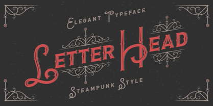 Introducing steampunk classic look typeface "Letter Head". It's a vintage font with decorative elements.
 - Ziclets by PintassilgoPrints,
$24.00 A fresh font for juicy designs and psychedelic minds, seasoned with yummy opentype features!
 - TheSans Typewriter by LucasFonts,
$19.00 A friendly monospaced typewriter font with slightly distorted outlines – not another “dirty typewriter font”!
 - Hacienda by Jonahfonts,
$18.00 A childlike freehand font amongst many others but with a more legible whimsical feel.
 - Egyptian ExtraBold Condensed by Wooden Type Fonts,
$15.00 One of the original Egyptian types. With a tall x-height, very short descenders.
 - Demented Avenger by Phat Phonts,
$20.00A splattery grunge font with ink blobs suitable for horror movies or Halloween use - Discorgasmique by Fonts of Chaos,
$10.00 Discorgasmique is a font take inspiration from the 1940' years with a futuristic mood.
 - Westkreep by Pedro Teixeira,
$25.00 Westkreep is based on wood type with characters extremely wide relative to their height.
 - Publio by Tour De Force,
$25.00 Publio is small unusual and unique font family, characterized with sharp, triangular semi-serifs.
 - The Crashed Fonts by Resistenza,
$39.00 We destroyed our fonts and create a new collection with our best-sellers types.
 - Set Fire To The Rain by Kimberly Geswein,
$5.00 This font was drawn with a round marker and is very bubbly and girly.
 - Bodoni Classic Fleurs by Wiescher Design,
$39.00 Bodoni Classic Fleurs is beautifully decorated with lots of alternate glyphs for many languages.

