455 search results
(0.013 seconds)
- Mirabel by Canada Type,
$24.95 Mirabel is based on the handwriting of Beverly Bouwsma (Philip's mother), which she developed in the 1930s in, as she puts it, an act of teenage rebellion. In the 1960s, Philip gave her a broad-edged Osmiroid fountain pen which she took to immediately and has used ever since, along with the computer fonts he made from her script. Since Beverly Bouwsma mixed loops and straight ascenders, two interchangeable fonts have emerged, a formal package that sacrifices some flamboyance for classical balance and legibility, but retains the quality of the writing and celebrates the personality of its creator. The Mirabel fonts are available in all popular font formats, and the character sets cover a wide range of codepages, including Central and Eastern European languages, Esperanto, Turkish, Baltic, Celtic/Welsh.
 - Englewood by Lipton Letter Design,
$19.00 Richard Lipton’s inspiration for Englewood came from the calligraphic hand of Philip Grushkin. Lipton has always admired his somewhat loose but disciplined hand and felt that it was worthy of keeping this style alive in a typeface that could be a somewhat accurate emulation of the warmth and life found in these letterforms. Spontaneity is a challenge to capture in a type treatment but with Englewood, Lipton hopes to honor Mr. Grushkin with a design that works especially well for an invitation, a menu, or in any display setting that calls for an informal calligraphic hand. This single weight display script includes small caps — somewhat of a rarity for a handwritten script — for flexible typesetting, along with 42 alternates that include 18 contextual ligatures to simulate the appearance of spontaneous writing.
 - LOL! - Personal use only

- Clashed Dinosaurs - 100% free

- Holly Journey by Letterhend,
$15.00 Holly Journey is a display handwritten font with many ligatures. The strokes make this font outstanding and looks great for title. A typeface with fun and playful looks that perfectly made to be applied especially in storybook children or child theme which is need a standout font, and the other various formal forms such as invitations, labels, logos, magazines, books, greeting / wedding cards, packaging, fashion, make up, stationery, novels, labels or any type of advertising purpose. Features : numbers and punctuation multilingual alternates / swashes and ligatures PUA encoded We highly recommend using a program that supports OpenType features and Glyphs panels like many of Adobe apps and Corel Draw, so you can see and access all Glyph variations.
 - New Journey by Letterhend,
$16.00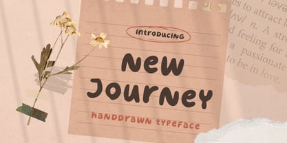 New Journey is a display font with fun and playful looks. This type of font perfectly made to be applied especially in storybook children or child theme which is need a standout font, and the other various formal forms such as invitations, labels, logos, magazines, books, greeting / wedding cards, packaging, fashion, make up, stationery, novels, labels or any type of advertising purpose. Features : uppercase and lowercase numbers and punctuation multilingual ligatures PUA encoded We highly recommend using a program that supports OpenType features and Glyphs panels like many of Adobe apps and Corel Draw, so you can see and access all Glyph variations. Email us to letterhend@gmail.com if you need something! Happy Designing!
 - Jumble by Laura Worthington,
$29.00 Jumble is friendly and cute treat for the eyes. Jumble draws you in with its thick, curvy strokes, jaunty counters, and a whimsical variety of counterforms with no two alike. For even more variety, Jumble includes 104 alternates for plus a handful of ligatures. Jumble conveys humor and warmth without being silly; its lack of straight lines and sharp edges makes it perfect for evoking tasty treats like frosted cakes or pies, or child-friendly toys and games. See what’s included! http://bit.ly/1RDnJjY This font has been specially coded for access of all the swashes, alternates and ornaments without the need for professional design software! Info and instructions here: http://lauraworthingtontype.com/faqs/
 - Crisis by SIAS,
$29.90 Crisis is a child of the dictatorship of economics. Since time is money the time budget of its production has been rigidly limited. Crisis was designed and generated completely on one single day. The target was to make a useful font while investing nothing more than absolutely indispensable. The component-based glyph construction scheme of another font has been utilized, further detailing work has been strictly limited. Due to those restrictions some letters have rather unusual shapes. This straightforward and contemporary sans (320 glyphs) is of compact proportions and very legible even when set in small sizes. In printing you get more text on one page and thus save up to 30% of paper.
 - Goose Creek JNL by Jeff Levine,
$29.00 The hand lettered credits from the 1942 British film comedy “The Goose Steps Out” became the model for Goose Creek JNL, a simple sans serif design available in both regular and oblique versions. According to the Internet Movie Database (imdb), “A bumbling teacher turns out to be the double of a German general. He is flown into Germany to impersonate the general and cause chaos and hilarity in a Hitler Youth college.” The title is a parody of the “goosestep” style of marching by German soldiers during World War II. As a variant on the movie’s title, the font was named for Goose Creek, South Carolina – a charming community just northeast of historic Charleston.
 - The PHILBATS font, crafted by the talented Phillip Andrade, is a unique and artistic typeface that stands out for its creative flair and distinctive style. Characterized by its playful yet somewhat g...
- Rosso by W Type Foundry,
$29.00 Rosso is a condensed geometric Sans with a retro style, inspired by various typographic styles. It features the Roslyn Gothic structure, which was popularly used for the covers of Philip K. Dick's books in the 1970s. Rosso has 10 variants from Ultra Light to Black with their respective Italics. In addition, it is divided into two Subfamilies, Normal and Alt. The normal one remains faithful to the proportions of Roslyn Gothic and classic geometric fonts, while the Alternative version expands its round shapes, generating a striking and unique rhythm and contrast, classic of Art Deco fonts. In addition, it has alternative glyphs and discretionary ligatures inspired by the work of Herb Lubalin, which add greater possibilities to face any design project. All this makes Rosso a font full of personality, striking and recognizable. Ideal for the construction of logos, eye-catching headlines, movie posters, volumetric posters, etc.
 - Luminari by Canada Type,
$29.95 Philip Bouwsma returns with yet another great manifestation of historical calligraphy. Luminari is an amalgam of High Middle Ages writing, a blend that combines the ornate Church hands with the simple Carolingian from the ninth to the fifteenth centuries. Its majuscules are particularly influenced by the versals found in the famous Monmouth psalters, as well as those done by the Ramsey Abbey abbots in the twelfth century. The minuscules also exhibit some influence from the book hand of prolific humanist Poggio Bracciolini from the early fifteenth century. Italian and essentially romanesque in style, Luminari exercises a slight tension between the round forms and the angular “gothic” styling. Luminari was updated with plenty of alternates and expanded language support in 2012. It now supports a very wide range of codepages, including Cyrillic, Greek, Central and Eastern European, Turkish, Baltic, Vietnamese, and of course Celtic/Welsh.
 - Formular by Brownfox,
$44.99 If you were a grotesque in mid-20th-century Switzerland, you were expected to be serious and proper, if a little dull. Unlike its dogmatic Modernist predecessors, Formular is a hip Swiss sans serif of the new generation. Inspired by the utilitarian 19th-century grotesques, its precision and and versatility are combined with a slightly eccentric character. A child of its time, it scoffs at the ideology of ‟ideal” forms, yet it is every bit as functional for all its idiosyncrasies, as any self-respecting Swiss sans. Formular comes in five weights with corresponding italics and a monospace companion to the regular weight. Each weight includes special extra-light punctuation, lining tabular and old style figures, case-sensitive punctuation, and stylistic alternates.
 - Beebzz Rounded by Popskraft,
$19.00 Everybody loves black colour, strict stylish and elegant shapes. We strive to be perfect. Right? But... Do not you think that we have lost something? Maybe child's spontaneity? The Beebzz Rounded font brings you back to those perfect times, when there was no need to be serious, when the whole world was not so serious. Beebzz Rounded is an original font family designed for headlines, titles and subtitles. It has his own unique style in expressive, perfectly condensed forms, inspired by child calligraphy and strong geometric typefaces. Beebzz Rounded is a font family that is ideal for display, text, print, branding, signage, and also for user interfaces, mobile devices, especially web design creation, with a set of optimal characters for your design in any layout.
 - Pickle Sans by Dear Alison,
$24.00Discover why Pickle Sans is the font the makers of Comic Sans don't want you to know about! Why not convey a casual professionalism that is a step above the competition? Pickle Sans is a bold, fun, attention getter of a font that is a cleanly readable brush script with a slightly imperfect hand. It speaks to children, retro enthusiasts, and too many others to list. If you've ever had anyone talk to you like a child, you'll understand how the right message can come out wrong. Avoid giving off that message to your audience and approach them in a casual, mature, yet fun manner. Respect your audience, whether younger or older, and convey your message in Pickle Sans. Try it and buy it today! - Xants by Adobe,
$29.00In 1932, Xanti Schawinsky (1904?1979) designed an alphabet that combines two styles: a neo-classic stroke contrast paired with characteristics of stencil lettering. This mix is a child of its time and seems to reflect the Swiss and Italian biography of Schawinski. Luca Pellegrini took on the modern look and re-drew the letterforms, interrupted by subtle spaces where thick and thin strokes meet. Although Schawinsky had already designed a complete alphabet and figures in the early 1930s, Pellegrini took the character set to another level, adding currency signs, mathematical symbols and all kinds of punctuation ? anything needed to set more than just headlines. Xants is a blend of Swiss elegance and exclusiveness with Italian charm and imperfection, a combination that never gets old. - Farmer's Marker by Citrus Branding,
$3.99 Farmer's Marker is an ode to the hobby-farmer and their honest and hardworking (but not too serious) lifestyle. The font reflects a vision of a farmer who quickly scrawls down her produce (72 Eggs + 20L of Milk + 2kg Honey) before she heads off to the market to do her best to sell what she has farmed. It is a casual, freehand, marker script that doesn't take itself too seriously. It is hand drawn by me, then meticulously perfected in Illustrator while leaving in just enough small imperfections that the font retains it's humanistic, hand-drawn and personal feel. The font will lend itself perfectly to rustic restaurant menu's, organic branding and packaging, social media content, child-centric design, travel posters, humanitarian organisations and much more.
 - Growlies by Letterhend,
$19.00 Growslies is a cute script font with playful looks. This type of font perfectly made to be applied especially in storybook children or child theme which is need a standout font, and the other various formal forms such as invitations, labels, logos, magazines, books, greeting / wedding cards, packaging, fashion, make up, stationery, novels, labels or any type of advertising purpose. Features : Uppercase and lowercase numbers and punctuation multilingual ligatures PUA encoded We highly recommend using a program that supports OpenType features and Glyphs panels like many of Adobe apps and Corel Draw, so you can see and access all Glyph variations. How to access opentype feature : letterhend.com/tutorials/using-opentype-feature-in-any-software/ Email us to letterhend@gmail.com if you need something! Happy Designing!
 - Lokacore by Letterhend,
$19.00 Lokacore is a ligature display font with fun and playful looks. This type of font perfectly made to be applied especially in storybook children or child theme which is need a standout font, and the other various formal forms such as invitations, labels, logos, magazines, books, greeting / wedding cards, packaging, fashion, make up, stationery, novels, labels or any type of advertising purpose. Features : Solid version and svg version Doodle dingbats numbers and punctuation multilingual ligatures PUA encoded We highly recommend using a program that supports OpenType features and Glyphs panels like many of Adobe apps and Corel Draw, so you can see and access all Glyph variations. How to access opentype feature : letterhend.com/tutorials/using-opentype-feature-in-any-software/
 - Weroth by Twinletter,
$15.00 Weroth is a lovely, eye-catching display typeface that will keep onlookers looking at your work. This font is a lot of fun; you can use it for informal or formal occasions, and it’s still adaptable. This font is still great for perfecting any creative project, whether it’s a child, teenager, or adult theme. Don’t wait, start utilizing this font immediately. This font is perfect for games, sporting events, branding, banners, posters, movie titles, book titles, quotes, logotypes, and more. of course, your various design projects will be perfect and extraordinary if you use this font because this font is equipped with a complimentary font family, both for titles and subtitles and sentence text, start using our fonts for your amazing projects.
 - Beebzz by Popskraft,
$19.00 Everybody loves black colour, strict stylish and elegant shapes. We strive to be perfect. Right? But... Do not you think that we have lost something? Maybe child's spontaneity? The Beebzz font brings you back to those perfect times, when there was no need to be serious, when the whole world was not so serious. Beebzz is an original font family designed for headlines, titles and subtitles. It has his own unique style in expressive, perfectly condensed forms, inspired by freehand child calligraphy and strong geometric typefaces. Beebzz is a font family that is ideal for display, text, print, branding, signage, and also for user interfaces, mobile devices, especially web design creation, with a set of optimal characters for your design in any layout.
 - Western Americana by Celebrity Fontz,
$24.99Western Americana is a unique collection of signatures of 72 famous American frontiersmen, gunslingers, Wild West personalities, outlaws, and Indians in a high-quality font. A must-have for autograph collectors, desktop publishers, lovers of history, or anyone who has ever dreamed of sending a letter, card, or e-mail "signed" as if by one of these famous Western celebrities. This font includes signatures from the following American West personalities: William Frederick Cody ("Buffalo Bill"), George Armstrong Custer, Meriwether Lewis, William Clark, Kit Carson, Joseph Brant, David Crockett, Wyatt Earp, Geronimo, James Bowie, Daniel Boone, Sam Houston, Calamity Jane, Sitting Bull, William H. Bonney ("Billy the Kid"), Cole Younger, Bob Younger, Jim Younger, Pat Floyd Garrett, James Butler "Wild Bill" Hickok, Squire Boone, Samuel Colt, Gordon William Lillie ("Pawnee Bill"), Annie Oakley, William Barret Travis, Allan Pinkerton, Jose de Galvez, George Rogers Clark, George Crook, John Charles Fremont, George Croghan, Simon Kenton, Maj. Frederick Benteen, James Wilkinson, Nelson Appleton Miles, Philip Kearny, Chief G.H.M. Johnson, William George Fargo, William Barclay "Bat" Masterson, King Philip, Frank James, Eleazer Williams, Henry Wells, Junipero Serra, John Sevier, John Ross, Joseph Virgo, Chief Joseph, Red Jacket, Manuel Lisa, Julian Dubuque, John Augustus Sutter, Manuel Lisa, Jesse James, Jesse James alias Thomas Howard, Manasseh Cutler, Robert Newton Ford, Emmett Dalton, Henry McCarty alias Greenville Mellen Dodge, Edward Zane Carroll Judson ("Ned Buntline"), Rain-in-the-Face, James Robertson, Zebulon Pike, Chief Two Guns White Calf, Pierre Chouteau Jr., Frank Butler, Isaac Shelby, Moses Austin, Moses Cleveland, Rufus Putnam, Pierre Chouteau Sr., Father Pierre Jean De Smet, and Auguste Chouteau. This font behaves exactly like any other font. Each signature is mapped to a regular character on your keyboard. Open any Windows application, select the installed font, and type a letter, and the signature will appear at that point on the page. Painstaking craftsmanship and an incredible collection of hard-to-find signatures go into this one-of-a-kind font. Comes with a character map. - Circoex / ANTIPIXEL.com.ar - Personal use only

- FS Alvar by Fontsmith,
$80.00 The classic modernist FS Alvar grew out of a library of pure modular shapes gathered by Fontsmith’s master of the abstract starting point, Mr Phil Garnham. “It was a collection that just had to be explored and brought to life in a typographic voice. “We debated long and hard about this. It was big decision to make a shift away from the typefaces that people knew us for. And we didn’t want to compromise our reputation of well crafted typographic quality”. Modular forms A headline font that’s both graphic and functional, in the modernist tradition, FS Alvar focused Fontsmith’s eyes on the bigger issue of what makes a font show its age. “Looking at those fonts from the 1980s that were supposed to represent the ‘future’,” says Phil, “they looked so dated now. With Alvar, we weren’t concerned with creating future-thinking typography but with exploring form for form’s sake, and how that can evolve to create letterforms. Modular forms with a typographic eye.” Stencilled The concept for Alvar first materialised back in 2001 with some sketches Phil made while still at Middlesex University. Eight years later, something made him dig them out again. “There was something really nice about the proportions of that first design. Working on it again, I thought about it properly, but it still needed something to give it that edge. “Jason stood up in the studio and supplied the missing link: ‘Why don’t we make it stencilled?’ He didn’t mean in an obvious way, but by building a kind of architectural stencil into the form. It worked and the idea of using an architect’s name (Alvar Aalto) to describe the font felt perfect.” Featured in... The three weights of FS Alvar are made for standout headlines in advertising campaigns and magazines. Alvar has had a starring role in campaigns for brands from Nike to Amnesty International, as well as on CD covers, record labels and packaging.
 - ITC Cinderella by ITC,
$29.99Some typefaces are staid, somber design tools. Then again, there's ITC Cinderella from Patricia Lillie: a typeface that's light-footed as a ballerina and joyful as a child at play. “There is a group of display faces that I simply love. Type that just seems to dance, type that makes me smile, designs that, when I see them, I say, "Boy, do I wish that was one of mine" says Lillie. “Although I never wanted to imitate these designs, when Cinderella started to emerge, I felt like it was the closest I've come to that quality.” ITC Cinderella projects gaiety and freedom. Capitals harmonize with a lowercase that bounces along with a lively, carefree attitude. Stroke weight stress is, well, all over the place. Curlicues abound. This delightful design is just that: brimming with delight. - Explore Magic by Letterhend,
$17.00 Explore Magic is a typeface with fun and playful looks. Available in two types, solid version and transparent version with doodle dingbats as extra! This type of font perfectly made to be applied especially in storybook children or child theme which is need a standout font, and the other various formal forms such as invitations, labels, logos, magazines, books, greeting / wedding cards, packaging, fashion, make up, stationery, novels, labels or any type of advertising purpose. Features : Solid version Doodle dingbats numbers and punctuation multilingual ligatures PUA encoded We highly recommend using a program that supports OpenType features and Glyphs panels like many of Adobe apps and Corel Draw, so you can see and access all Glyph variations. How to access opentype feature : letterhend.com/tutorials/using-opentype-feature-in-any-software/
 - Graham Cracker JF by Jukebox Collection,
$36.99 Graham Cracker is a fun, cartoony and child-like font that can't help but fill you with happiness! The font was inspired by hand-drawn lettering on an old 1960s movie poster, and contains over 175 interlocking ligatures that add a hand-lettered feel. Stylistic substitutions like this are where the OpenType technology really shines, allowing computer fonts to more closely mimic the variations of hand drawn lettering. The ligatures can be found under the Discretionary Ligatures OT feature, or applied from the glyph palette. Jukebox fonts are available in OpenType format and downloadable packages contain both .otf and .ttf versions of the font. They are compatible on both Mac and Windows. All fonts contain basic OpenType features as well as support for Latin-based and most Eastern European languages.
 - Revla Round by Eclectotype,
$40.00 Squeezing yet more life out of the Revla skeleton! This is Revla Round, a child-friendly version of Revla Sans, completely overhauled so there's no chance of cutting yourself on any corners. Every rounded terminal and corner has been painstakingly drawn, rather than using a round-corners filter. OpenType contextual alternates make for text that is lively and bouncy, without the monotony of obviously repeating letterforms. It's shamelessly fun, but pretty serious at the same time. The range of weights can be used to maintain an even colour across different sizes - use lighter weights for bigger sizes and vice versa. OpenType features include automatic fractions, ordinals, contextual alternates, standard and discretionary ligatures, and case-sensitve forms. Obviously, in sharing a common skeleton, it will work well with other members of the ever-growing Revla Superfamily.
 - Shopping Guide by Jeff Levine,
$29.00 While watching the 1947 holiday classic “Miracle on 34th Street”, one scene in particular presented a chance to develop a retro type design. ‘Kris Kringle’ suggests to a mother visiting with her child in the Macy’s toy department to try Gimbel’s for a toy she couldn’t find at the store. The news of this behavior reaches Mr. Macy himself, who embraces the practice as a brilliant marketing strategy. A number of departments are then presented with reference books containing competitor ads, and the visual of the cover stating “R.H. Macy & Co. Shopping Guide for the Convenience of Our Customers” shows on screen. The thin, Art Deco sans serif monoline with a few serif-like hooks added onto some characters became the basis for Shopping Guide JNL, which is available in both regular and oblique versions.
 - Ganley by Craft Supply Co,
$20.00 Introducing Ganley Cute Font Ganley cute font is a contemporary display font that radiates fun and playfulness, making it perfect for children’s themes and light-hearted designs. Playful Design Ganley’s design is characterized by whimsical and cheerful letterforms. Its cute and quirky appearance instantly adds a touch of joy to any project. The font embodies a sense of innocence and laughter. Child-Friendly Readability This font maintains readability while embracing a delightful style. The letter spacing and proportions are thoughtfully crafted for easy comprehension, ensuring that children can enjoy reading and interacting with it. Versatility in Design Ganley isn’t limited to just one application. It’s a versatile font that suits various creative endeavors, from children’s books and posters to party invitations and websites. Its adaptability knows no bounds.
 - Banco by Linotype,
$40.99 Designed for Linotype Library GMBH and the International Typeface Corporation in 1997 by Phil Grimshaw. Based on bold script Banco designed by French graphic and poster designer Roger Excoffon and released in 1952 by the Fonderie Olive. Originally Banco was an all-caps bold typeface, and the lower case and the corresponding light weight were created for ITC. The tapering slightly slanted strokes of Banco made by sharp-edged flat brush. The face has the effect of being quickly sketched by a powerful hand. For use in advertising and display typography. Cyrillic version developed for ParaType in 2000 by Tagir Safayev.
 - Treefrog by Three Islands Press,
$39.00 A one-time co-worker of mine sometimes used a fanciful inkpen-style script in display-lettering situations. I liked it a lot. "Phil," I says, "why not do the whole alphabet, maybe a few little dingbats, and I'll make a font." Well, one day he presented me with a stack of posterboard; he'd done some letters, all right -- hundreds of 'em. I managed to boil these down into a typeface called Treefrog, a name that seems to match its organic jumble, its tall x-height, its left- and right-leaning stems, its thick and thin strokes. Full release has many dingbats.
 - Doobie by Canada Type,
$24.95One would think the whole hippy thing would have died out after the knighting of Mick Jagger and the selling out of the The Who. Not at Canada Type. We still occasionally read Burroughs and Ginsberg, listen to Dylan and Hendrix, and use the backyard to pretend (um, like run barefoot with the dog). And we're always happy to make another psychedelic font. This one is based on an early 1970s film type that went by the names Hoopla and Scorpio. Doobie is a typical hippy font that uses the simplest elements of the art nouveau genre. Bubbly and wavy, Doobie exudes an almost child-like innocence, the ever laid back, optimistic simplicity of flower power. It is right at home alongside the many other psychedelic fonts that make Canada Type the definite home of the groovy alphabet. Far out! - Screener by Canada Type,
$25.00Game over. Insert coin to continue. 1 coin, 1 play. Credits 00. Screener is the latest child of arcade alphabets. Not too trendy, not too retro, not too stand-out, yet clear and fresh. Although it boasts plenty of the traits of its origins (early screen technologies), it manages to maintain a balance between the elements of its 1980s origins and the mechanical yet transparent late 20th century techno/pop design. Precise and geometric, solid and strong, Screener looks great on screen as well as in print, in tracked small sizes as well as in teaser headlines. Screener comes in two widths and weights, with italics, and extra sets of symbols and numerals (enclosed, fractions, superiors, inferiors, etc.), as well as two weights of small caps. Screener is available in separate packages, or in a value package that contains all twelve fonts. - Gready by Mans Greback,
$59.00 Gready is a swirly brush typeface. With happy swashes and funny curves, this comic lettering has a flowing and soft character and a greedy, optimistic personality. Use it for a fresh, tasty ice cream or food store logo, a cartoon headline or any playful context speaking to the child within us. Drawn and created by Mans Greback, this modern paintbrush font family comes in four styles: Thin, Regular, Bold and the crazy Outline variety. Gready is built with advanced OpenType functionality and has a guaranteed top-notch quality, containing stylistic and contextual alternates, ligatures and more features; all to give you full control and customizability. It has extensive lingual support, covering all Latin-based languages, from North Europe to South Africa, from America to South-East Asia. It contains all characters and symbols you'll ever need, including all punctuation and numbers.
 - Toy Decals JNL by Jeff Levine,
$29.00 For decades, cereal companies have included premiums [promotional gifts] inside their packages, printed on the cartons or to send for with a special coupon and redemption instructions. During the 1940s, Pep cereal [a long-discontinued Kellogg's brand] offered a series of water-applied decals within its boxes. Most likely made by the Meyercord Company (one of America's largest transfer decal manufacturers at the time), one decal in particular had an alphabet in gold letters with black outlines. (One can only presume the marketing strategy was to have kids bug their parents to buy more Pep cereal if the child needed more than one letter of the alphabet for his or her initials!) Those decal letters have inspired a digital version as the outline character font Toy Decals JNL, which is available in regular oblique, solid and solid oblique styles.
 - Calzone by Studio 85 Design,
$12.99 The Calzone Family is display typeface inspired by the many neighborhood pizza and local eateries with hand painted menus. The font is cozy and fun, like your favorite comfort food. All of the typefaces include standard ligatures, currencies, ampersands and footnotes consistent with the design. Calzone regular includes upper and lower case type, great for body copy. Calzone Caps is a heavy, stylized uppercase. Calzone Lower is a light, stylized lowercase. Included with Calzone Caps and Calzone Lower are a full set of alternate letters for variation to enhance your design and give it an informal feel. The Calzone Family is well suited for an informal look and feel. Alternate characters offer many opportunities to be creative with your designs. The Calzone Family is great is for menus (of course), apps, games, video, animation, packaging, child oriented design, presentations and anything fun.
 - Symposium Pro by Canada Type,
$49.95 Philip Bouwsma's Symposium Pro is a wide Carolingian script that can be set simply or with a wide range of flourishes. It takes its inspiration from the scriptoria of the twelfth century, particularly in Spain, where Christians, Muslims and Jews lived harmoniously in a brilliant culture for two centuries. As manuscripts were translated and copied to meet the Western demand for classical texts, calligraphic elements from Arabic and Hebrew spread throughout Europe, sparking a proliferation of new styles that brought the simple book hand to a higher level. Symposium Pro spans a broad range of time and space, from the court of Charlemagne to the Arabian nights and Renaissance Florence. Symposium Pro comes in four weights, ranging from Light to Bold, with each font containing over 1200 glyphs. Variations on every letter form, from swashes to subtle alterations, are plenty, with some even having up to 40 alternates. Also plenty are the embedded ornaments and flourishes, over a hundred of them. Keep that glyph palette handy for many pleasant surprises and easy setting solutions.
 - FS Aldrin by Fontsmith,
$80.00 Elegant and round Having harboured a desire for a rounded font within the Fontsmith library for some time, Phil Garnham recognised that FS Emeric offered the perfect skeleton around which to design it. Most new rounded fonts rely on scripts or other in-app automation to form their characters. For all their warmth and approachability, they too often conjure images of jelly sweets and sausages. Not so FS Aldrin, where every curve and transition has been crafted by hand, giving a distinctive look and elegant feel. Design highlights FS Aldrin enjoys wide-open ‘lunar’ counters and soft, tube-like terminals. These improve legibility, especially on backlit signage and screens. The open proportions and circular strokes are juxtaposed against a more serious technical aspect that exists within each counter shape. The lighter weights feel precise and efficient, perfect for notes on blueprints or technical drawings. The heavy weights are equally crafted but more playful by their rotund nature, and are perfect for strong headlines or packaging projects. UI icons A suite of 268 icons complement the typeface beautifully and extend the design language in all directions. They cover a range of commonly used applications and themes ranging from ecommerce to weather, and also serve as a solid starting point for a bespoke brand icon set or UI. In addition, born of FS Aldrin’s astronomical theme and playful nature is a special collection of space-themed icons, including rockets, shuttles and lunar modules (hint: if you type the word BUZZ with ligatures enabled, an astronaut appears). Earth to Buzz Buzz Aldrin was the pilot of Apollo 11’s lunar module, the one that put man on The Moon for the very first time. Early on in the project’s life, FS Aldrin emerged as the ideal hook on which to hang the font’s space helmet (hardly surprising given Phil’s fascination with space travel and astronomy). An approach was made to Buzz’s management to see if he would sanction the association. Not only was the great man himself happy to see his name on a typeface, he also asked to use it in his upcoming keynote talks, book launches and online projects.
 - Troubled PB by Pink Broccoli,
$16.00 Loaded with various auto-ligatures (primarily for ALL-CAPS typesettings), Troubled has all of the rebellious custom lettered attitude of a vintage pulp paperback. Troubled PB began as a digitization of a film typeface known as Toronado by LetterGraphics, perfect for typesetting early children books, candy packaging, toy packaging, birthday invitations, or any other playful design need. It's lowercase typesetting is straightforward and casual, with a light animated feel, while the all-caps typesetting goes wild with auto-ligatures galore to create wonderful and interesting interwoven letterform combinations. This typestyle has such an offbeat appeal to it that it just draws your attention. Great for headlines (especially in all caps settings), but also great for small bodies of text in mixed case setting. So whether child-friendly design pursuits, or reminiscing of vintage pulp paperbacks novels, Troubled PB has a little something for everyone.


