10,000 search results
(0.015 seconds)
- Tepeyacac by Ixipcalli,
$35.00 Typography inspired from original text of Nican Mopohua form Antonio Valeriano.
 - Tasman by Re-Type,
$30.00 Originally published by OurType, Dan Milne’s Tasman has found a new home at Retype. Milne first conceived Tasman as a typeface for newspapers. This influenced the proportions and look of the face considerably: the goal was to keep the personality as warm and playful as possible without losing the credible tone required to deliver all kinds of news. A sturdy, warm type family that is neither mechanical nor fragile. It borrows its name from Abel Janszoon Tasman (1603–1659), a Dutch seafarer, explorer, and merchant who mapped parts of Australia in 1642, including Van Diemen’s Land (now known as Tasmania). Tasman’s primary purpose is an unbiased presentation of information; it strives for neutrality over elegance. Its characters are sturdy and unambiguous, sporting strong serifs, punctuation, and diacritics, as well as generously sized small caps and hybrid figures. Rationalized letterforms give the face enough robustness to withstand the stress of screen applications and laser printing. The figures’ three-quarter x-height makes them considerably larger than traditional oldstyle numerals, yet they still integrate with the lowercase much better than lining figures do. Although initially intended for newspapers, Tasman’s somewhat corporate, objective appearance also makes it an excellent candidate for digital and print magazines, websites, annual reports, and corporate identities. Tasman is a suite of feature-rich OpenType fonts fully equipped to tackle complex, professional typography. The character set includes small caps, fractions, case-sensitive forms, bullets, arrows, special quotes, and nine sets of numerals. Besides standard Latin, its extensive character set supports Central European, Baltic, and Turkish languages.
 - Colotus by Ditatype,
$29.00 Colotus is a striking sans-serif display font that immediately captures the eye. The characters in Colotus is made in bold and solid square forms, imparting a sense of reliability and authority. However, what truly sets Colotus apart is its subtle brush detail that adds a touch of handcrafted charm. This brush detail infuses the font with a sense of artistry, creating a captivating blend of contemporary design and organic creativity. In addition, you can also enjoy the features here. Features: Alternates Ligatures Multilingual Supports PUA Encoded Numerals and Punctuations Colotus fits in headlines, logos, posters, flyers, branding materials, print media, editorial layouts, and many more designs. Find out more ways to use this font by taking a look at the font preview. Thanks for purchasing our fonts. Hopefully, you have a great time using our font. Feel free to contact us anytime for further information or when you have trouble with the font. Thanks a lot and happy designing.
 - Predy by Eurotypo,
$55.00 In the era of digital types, the round handmade cursive continues to intrigue many type designers, probably by their beautiful and graceful calligraphic origins. However, what is certainly true, is that all good traditional pen-formed script may be suitable for a wide range of fine graphic works. The Predy typeface is based on the famous style of the 19th Century: The English handwriting made by pen. It is a connected cursive in the tradition of the “ronde”. This typeface is constructed upon their vigorous ascenders with loops, two times the lengths of the descenders with an extremely short x-high. The uppercase is a classical modern roman typeface (Didona) that are accompanying with a set of accurate flourished capitals as alternates of the calligraphic style. Predy font comes with a set of decorative glyphs including old style figures, terminal letters, ligatures, alternates and swashes. This font will lend elegance and sophistication to a wide variety of design projects like wedding, invitations cards, logotypes, packaging and posters.
 - Due Giorni by Eurotypo,
$80.00 “Due Giorni”, two days in italian language, express a measurement of time, it can be little or a lot, depending on who or what it is used for. “Due Giorni” is a script font very expressive, fresh, agile and dynamic, hand-drawn with connected forms on slanted angle of 23º This font contain 542 glyphs with plenty OpenType features: Standard and discretionary ligatures, stylistic alternates, swashes, Old style figures, small caps, case sensitives and ornaments. It come also, with three kind of capitals: Roman Capitals, Small Caps (different proportions) and Swashes. Roman Capitals are inspired on the beautiful inscription found in the Augustorium’s house in Ercolano, Naples.those letters have been carefully drawn and sculpted. Swashed Cursive Capitals are similar to 18th century penmanship. “Due Giorni” is a versatile font that may give you the chance to create original logos and headlines, specially by many stylistic sets, ligatures and alternates that can be combined with them.
 - Vuelta by Dora Typefoundry,
$19.00 Vuelta display is a modern random style font that combines serifs and sans in one font file. With serif as uppercase and sans as lowercase. You can use both uppercase and lowercase in the same word which will make your text more distinct too plus some alternatives so this font really stands out. This font is perfectly made to be applied especially in logos, and other various formal forms such as display, header, headline, poster, logos, etc on a big typography. **Features:** - All Caps Font with different uppercase and lowercase - Number & Symbol - Supported Languages - Alternates and Ligatures - PUA Encoded **What is included:** - Vuelta Display Regular We highly recommend using a program that supports OpenType features and Glyphs panels like Adobe apps and Corel Draw, so you can see and access all Glyph variations. This type of family has become the work of true love, making it as easy and fun as possible.I really hope you enjoy it! Thank you Enjoy the font and go get creative :)
 - Halogen Slab by Positype,
$29.00 When I released Halogen, I asked ‘Who doesn't want or need an expansive contemporary extended sans that has a sense of style and swagger… what if it had a lowercase, small caps and various numeral options… how could you say no?’ Go, click on the Halogen link and read on, if you're interested. Halogen was well-received, so I decided to take it further with Halogen Slab (the name kinda tips you off as to what kind of typeface it is, don't ya think?). As always, I prefer not to take short cuts and provide an anemic offering of glyphs — a modern typeface offered today must provide more than just the basics and this one does — lowercase, smallcaps, old style numerals, tabular forms, stylistic and titling alternates, fractions, case-sensitive features, and even an alternate uppercase ordinal set is included. Now go make cool print and digital things with it, and share them with me.
 - LDJ Billy Bob by Illustration Ink,
$3.00Add character to your paper crafts. Download this cool Billy Bob font to create lettering with a scratched, slightly messy look. Design titles, captions, journaling and more for farm or redneck themes, or simply give your publication an off-beat, handwritten appeal. It's more than just chicken scratch! - Cayuse by Pacific Standard Type,
$36.00 Cayuse is a super-slab, all-caps titling face that tips its hat to the classic French and Italian “fat face” serifs of the nineteenth century. Structurally, Cayuse utilizes a reverse-stress stroke configuration—with thick, meaty slab serifs and sinuous, spiked connecting strokes. This crackling contrast gives Cayuse a very black, dense texture, and the ability to combine and contrast well with other typefaces. Arm yourself with Cayuse to create richly-textured, high-impact typography for packaging, editorial, brand identity, posters, signage, and many other applications. What's more, Cayuse also features an array of “word logos”, providing you even more options for creating dynamic typography.
 - Roman Pride by Letterhend,
$15.00 Introducing Roman Pride, a fresh and stylish font duo that features an elegant serif font and a charming script font. The combination of the two fonts creates a perfect harmony that is both classic and modern. Whether you're working on a wedding invitation and the other various formal forms such as labels, logos, magazines, books, packaging, fashion, make up, stationery, novels, labels or any type of branding project purpose, Roman Pride is a versatile font that will elevate your designs to the next level. Features : Uppercase & lowercase Numbers and punctuation Alternates & Ligatures Multilingual PUA encoded We highly recommend using a program that supports OpenType features and Glyphs panels like many of Adobe apps and Corel Draw, so you can see and access all Glyph variations.
 - OT Replica by OzType.,
$35.00 Replica seamlessly blends organic and geometric elements to create a captivating geometric grotesque font that draws its creative essence from the principles and design philosophy of organic architecture. Replica's journey towards this harmonious equilibrium begins with a deep exploration of organic architecture, a design philosophy that celebrates the integration of the built environment with the natural world. Drawing inspiration from the works of architects like Frank Lloyd Wright and Antoni Gaudí, Replica seeks to capture the essence of flowing lines, biomorphic shapes, and the seamless fusion of structure and surroundings. At the heart of Replica's design process lies a commitment to translating these organic principles into a typographic form that resonates with viewers in a way that is both visually captivating and functionally versatile.
 - Covergirl by Trine Rask,
$25.00 Warning: works with contextual alternate-feature, which is not showing here. Covergirl is a script typeface that works all by itself. It has a very high contrast, but works also in smaller sizes. It is a display typeface. Covergirl is based on handwriting. The basic shapes are transformed to a very high contrast strict form and the hairline runs through the words in an amusing lively way that simulates the writing by hand. Its scandinavian designed handwriting, decorated, but also very minimalistic. While writing the letters will be substituted by one of the variations of the letter, that will make sure that the letters connect well. When writing in only UPPERCASE a much more simple letter shape will substitute the default.
 - Futura BT by Bitstream,
$39.99 Futura is the fully developed prototype of the twentieth century Geometric Sanserif. The form is ancient, Greek capitals being inscribed by the Cretans twenty-five hundred years ago at the time of Pythagoras in the Gortyn Code, by the Imperial Romans, notably in the tomb of the Scipios, by classical revival architects in eighteenth century London, which formed the basis for Caslon’s first sanserif typeface in 1817. Some aspects of the Geometric sanserif survived in the flood of Gothics that followed, particularly in the work of Vincent Figgins. In 1927, stimulated by the Bauhaus experiments in geometric form and the Ludwig & Mayer typeface Erbar, Paul Renner sketched a set of Bauhaus forms; working from these, the professional letter design office at Bauer reinvented the sanserif based on strokes of even weight, perfect circles and isosceles triangles and brought the Universal Alphabet and Erbar to their definitive typographic form. Futura became the most popular sanserif of the middle years of the twentieth century. Ironically, given its generic past, Futura is the only typeface to have been granted registration under copyright as an original work of art, and, further irony, given the key part played by the Bauer letter design office, the full copyright belongs to Renner and his heirs. This decision in a Frankfurt court implies that a further small group of older typefaces may also be covered by copyright in Germany, particularly those designed for Stempel by Hermann Zapf. This situation appears to be limited to this small group of faces in this one country, although protection of designers’ rights in newer typefaces is now possible in France and Germany through legislation deriving from the 1973 Vienna Treaty for the protection of typefaces. Mergenthaler’s Spartan is a close copy of Futura; Ludlow’s Tempo is less close. Functional yet friendly, logical yet not overintellectual, German yet anti-Nazi... with hindsight the choice of Futura as Volkswagen’s ad font since the 1960s looks inevitable.
 - Roughcast by Hanoded,
$10.00 Roughcast is a kind of outside plaster, composed of cement and pebbles. It’s not the best looking plaster and it is estimated that in the UK, a roughcast outer reduces the value of a house by 5%. I am in the middle of renovating our old farm, but I won’t cover it in roughcast! Roughcast font is actually quite an attractive brush font. I made it with a brush I found hiding underneath my stove (where it had been for a while). I cleaned it and used it to make a couple of fonts, including Roughcast. Roughcast is best used for packaging, book covers and posters.
 - TA Fabricans by Tural Alisoy,
$25.00 TA Fabricans graphic presentation at Behance TA Fabricans font is based on Film Fiction Semi Expanded font. The font also supports the Hebrew alphabet. The Display version comes only in the Latin alphabet. I tried to prepare the font carefully. I specifically searched for the Hebrew alphabet. I benefited from my Israeli colleagues. I believe that my font will be successful. Please check and if you have any additional requests or complaints, please write to me. t@taft.work TA Fabricans works great for branding, magazines, headers, logos, TV, UI, web, badge, packaging, headlines, posters, t-shirt/apparel etc. TA Fabricans offers you options to explore a whole host of applications and gives a real modern feel to any project. Family overview: 36 fonts, 9 weights (from Thin to ExtraBlack) + Condensed, Expanded, Display Latin, Hebrew Display font without Hebrew Multilingual 4 free font Localized Forms with NLD, PLK OpenType Features: Localized Forms Contextual Alternates Tabular Figures Subscript Scientific inferiors Superscript (Superiors) Numerators Case Sensitive Forms Standard and Discretionary Ligatures Stylistic Alternates Kern Ordinals
 - Terminus by Dresser Johnson,
$25.00 The Terminus typeface is an exploration of what occurs to letterforms when flip-disc display and variable-message signs begin to malfunction. Whether caused by analog or computer error, there is a mechanical beauty and randomness in the deterioration of the forms. Dresser's wild take on this concept purposely pushes the limits of legibility along with incorporating historical bits and pieces from blackletter and uncial script forms into this modern digital grid. OpenType font features provide the user with four options to use the typeface. Simply load the default Terminus for a surprisingly legible breakdown of digital characters. Select “Contextual Alternates” for a random selection of altered forms from the 994 glyphs included in the font. With the Glyph Palette open, manually select from the five full character sets to create your own unique settings. Lastly, choose “Stylistic Alternates” for an extreme test of legibility. This setting combines characters from the default font with the most elaborate set of alternates and best exemplifies the organic disintegration of Terminus.
 - Lapis Pro by Canada Type,
$29.95 Lapis was Jim Rimmer's venture into a territory he'd earlier explored with his Lancelot and Fellowship faces. This time he stayed much longer, dug pretty deep, and had plenty of fun in there. The end result is the kind of mosaic of influences only a guy like Jim could consider, gather, manage and apply in a way that ultimately makes sense and works as a type family. On the surface Lapis seems like something that can be billed as what Jim would have called an "advertising text face". But under the hood, it's a whole other story. On top of the calligraphic, nib-driven base Jim usually employed in his faces, Lapis shows plenty of typographic traits from a variety of genres, from Egyptian to Latin, from blackletter angularity to Dutch-like curvature, with an overall tension even reminiscent of wood type. There are some Goudy-informed shapes that somehow fit comfortably within all this. Then it's all strung together with a mix of wedged, tapered and leaning serifs, placed with precision to reveal expert spontaneity and a great command of guiding the forms through counterspace. In the fall of 2013, the Lapis fonts were scrutinized and remastered into versatile performers for sizes large and small. The three weights and their italic counterparts have been refined and expanded across the board to include small caps, alternates, ligatures, ordinals, case-sensitive forms, six kinds of figures, automatic fractions, and a character set that covers an extended range of Latin languages. Each of the Lapis Pro fonts contains over 760 glyphs. For more details on the fonts' features, text and display specimens and print tests, consult the Lapis Pro PDF availabe in the Gallery section of this page. 20% of Lapis Pro's revenues will be donated to the Canada Type Scholarship Fund, supporting higher typography education in Canada.
 - Trapezoidal by Ingrimayne Type,
$9.00 The letters of Trapezoidal are like sheep: they do not like being alone but want to be part of a flock. Many of the individual letters of Trapezoidal look strange and unshapely in isolation because they are designed to fit into a pattern with other letters. That pattern is formed by alternating asymmetric trapezoids, with trapezoids that are wide at the top alternating with trapezoids that are wide at the bottom. The magic of the OpenType feature of contextual alternatives (calt) automatically alternates them. The fonts in the family are largely monospaced and have very tight letter spacing. (If for some reason one wants to use only one set of the letters, the letters will overlap unless one widens character spacing.) (If D and O are too similar, use the alternative versions of D.) The family has five weights and each weight has an italics formed by flipping the trapezoidal pattern over a vertical line. Like other alternating-character typeface families from IngrimayneType, this distinctive and visually-arresting family can be used for titles or advertising. (For another but very different typeface based on alternating trapezoids, see PoultrySign.)
 - The Great Wall by Gie Studio,
$9.00 The Great Wall, as the name of this font is created and inspired by a legendary world masterpiece, with a special uniqueness in a style that is very firm but looks elegant, so it is suitable for you to use for a variety of designs that accentuate the professional and charming. Various advantages of this font : This font consists of four (4) very interesting styles, please choose ! With a rather thick but consistent style line, accentuating the firmness and professionalism of the users of this font. This font is complete with Uppercase, Lowercase, Numeral, Punctuation, Multilingual support and ligature letters in each style. Can be applied in various software, such as Ms.office, Photoshop, Coreldraw, Adobe Illustrator, Inkscape and others. There are many purposes that are very suitable to use this font, among others: writing the name of a professional profession, for book covers, fashion branding, watches, jewelry, marketing products, magazines and more. With you using this font for any purpose, I hope your business will be more successful and known to the world as the name of this font. Thank you, I say for your visit and purchase.
 - Eyebel by Ingrimayne Type,
$6.95 Eyebel was an attempt to form letters as simply as possible using only straight lines but still have them legible. The family is low contrast and has a boxy look. Eyebel-Ruff was formed by randomly moving control points. None of these faces have any curves.
 - Cult by ITC,
$29.99Cult is the work of designer Timothy Donaldson and its forms alone evoke a sense of mystery. The wide capitals with their unusual forms complement perfectly a condensed, angular lower case alphabet. The unique Cult is especially suited to work dealing with anything mystical or New Age. - PR Valknut by PR Fonts,
$6.00 This font includes the symbols Valknut, Triple spiral, Triquetra, and Horn Triskelion, associated with Odin, and ancient Norse and Celtic cultures. Each of these symbols is presented in outline and solid forms, and in vertically and horizontally mirrored forms. For text, use it with PR-Viking.
 - LiebeDoni by LiebeFonts,
$29.90 LiebeDoni is pure Italian art. A contemporary nod to Italian typographic heritage, LiebeDoni’s warm and friendly style is perfect for—literally—bold headlines and impressive invitations. Take a seat on LiebeDoni’s Vespa and enjoy the sweet curves of dolce far niente. But don’t let the relaxed hand-crafted appearance fool you: You’re dealing with a solid quality typeface that has received painstaking attention to detail. Round like the Colosseum, some lines are as colloquial as the Tower of Pisa—but all this with almost Teutonic obsession for technical perfection. Feature-wise, we went the full quattro stagioni: Variations and alternatives for many letters, swashy initials and swirly ligatures—plus language support that goes way beyond English and Italiano. Double-o ligature, anyone? Two different www ligatures? Check. (Please make sure your software supports OpenType if you wish to use the advanced features.) Get both the outline and the filled version and go crazy on creative layering and endless possibilities. Each font contains over 600 glyphs and both contain the full character set. Make a bold move to italy—treat yourself with this font. If you like LiebeDoni, you may also like its perfectly matching sisters LiebeErika and LiebeOrnaments—or any of our other 100% compatible LiebeFonts.
 - Salden by Canada Type,
$40.00 The Salden fonts are our tribute to the man who was dubbed the face of the Dutch book, and whose work is considered essential in 20th century Dutch design history. Helmut Salden’s exquisite book cover designs were the gold standard in the Netherlands for more than four decades. His influence over Dutch lettering artists and book designers ranges far and wide, and his work continues to be used commercially and exhibited to this very day. At the root of Salden’s design work was a unique eye for counter space and incredible lettering skills that never failed to awe, regardless of category or genre. This made our attention to his lettering all the more focused within our appreciation to his overall aesthetic. Though Salden never designed alphabets to be turned into typefaces (he drew sets of letters which he sometimes recycled and modified to fit various projects), we thought there was enough there to deduce what a few different typefaces by Salden would have looked like. The man was prolific, so there were certainly enough forms to guide us, and enough variation in style to push our excitement even further. And so we contacted the right people, obtained access to the relevant material, and had a lot of fun from there. This set covers the gamut of Salden’s lettering talents. Included are his famous caps, his untamed, chunky flare sans serif in two widths, his unique Roman letters and an italic companion and, most recognizable of all, his one-of-a-kind scripty upright italic lowercase shapes, which he used alongside Roman caps drawn specifically for that kind of combination titling. All the fonts in this set include Pan-European glyph sets. They’re also loaded with extras. Salden Roman (908 glyphs) and Salden Italic (976 glyphs) each come with built-in small caps (and caps-to-small-caps), quite a few ligatures, and two different sets of alternates. Salden Black and Salden Black Condensed (636 glyphs each) come with a set of alternates, and both lining and oldstyle figures. Salden Caps (597 glyphs) comes with a set of alternates, and Salden Titling (886 glyphs) comes with a quite a lot of swashed forms and alternates (including as many six variants for some forms), a few discretionary ligatures, and two sets of figures. There are also some form alternates for the Cyrillic and Greek sets included in all six fonts. These alphabets were enjoyably studied and meticulously developed over the past ten years or so. We consider ourselves very fortunate to be the ones bringing them to the world as our contribution to maintaining the legacy of a legendary talent and a great designer. The majority of the work was based on Salden’s original drawings, access to which was graciously provided by Museum Meermanno in The Hague. The Salden fonts were done in agreement with Stichting 1940-1945, and their sale will in part benefit Museum Meermanno.
 - Tomato Ketchup by Fenotype,
$25.00 Tomato Ketchup is a bold vintage style serif font with a nonchalant charm and sturdy confidence in. Tomato Ketchup has a recognizable flavor and a reminiscence of familiar warm nostalgic feeling. The font is equipped with Contextual, Swash, Stylistic and Titling alternates as well as Discretionary Ligatures and even more extra alternates. Tomato Ketchup is a great typeface for contemporary graphic design with that certain feeling of familiarity and friendliness.
 - Performance by ParaType,
$25.00 Performance is a set of perforated plates that appear to be characters. The construction of characters is described by sequences of holes whose shape and placement define the appearance and mood of font styles. An interesting feature of the design is an absence of side bearings and leading. Due to this feature a text article set by Performance forms a perforated coherent surface similar to postage stamp block.
 - Marguerite by Great Lakes Lettering,
$40.00 Designed by fine artist and calligrapher Alissa Mazzenga, Marguerite is is a calligraphy style font inspired by fine artistry and risk taking. She has a way of surprising her viewer, with a look that is authentic, yet chic, relaxed, but also elegant. Marguerite’s trademarks are strong angles, bold uppercase forms, elegant hairlines and perfectly placed swashes. She comes along with many ligature variations and a contextual alternates features.
 - Tent Show JNL by Jeff Levine,
$29.00 Call the lettering French Clarendon Condensed, call it circus lettering, wanted poster type or Old West letters, the style of this typeface is one of the most recognizable and evokes all of the above images and more. Tent Show JNL was re-drawn from examples of a vintage set of wood type, and contains all of the eccentricities that are present in these hand-routed classic letter forms.
 - Devendra by Wooden Type Fonts,
$20.00 A very distinctive style of font, in a kind of art deco style form the '30s. This font is unique in that there are no open, negative spaces in glyphs such as upper and lower case o, or p, or others which would usually have them. Instead the glyphs are solid. The only letters or glyphs which have triangular sides are A and V, X, and Y. This is unusual.
 - Core Sans by S-Core,
$50.00 Core Sans is a simple and modern sans-serif font. Core Sans's Latin alphabet has good legibility and is designed simply. Spaces between individual letter forms are adjusted in detail so that it makes perfect typesetting. Supported codepages are MS Windows 1252 Latin1, MS Windows 949 Korean(Hangul) consisting of 11,172 letters and KS Symbols (Korean Symbols). We recommend to use for books, web, screen displays and so on.
 - Quick Remarks by Sarid Ezra,
$17.00 Quick Remarks is a reverse and modern serif that comes with stylish and noticeable contrast. With unique uppercase and lowercase, this fonts will make your presentation, poster, or logo even more stunning and stand out! You can mix and match the uppercase and lowercase for unlimited form. This font also include many beautiful ligatures. This fonts support Multi Language. Features Uppercase with unique lowercase Ligatures Number & Symbol Multi language
 - Ledbury by Greater Albion Typefounders,
$19.00 Ledbury is a calligraphic display face, inspired by hand lettered specimens and combining Roman and Blackletter elements. It is designed with an extensive range of ligatures and stylistic alternate forms to preserve that hand written look. Use Ledbury for posters and banners, whether you need an Elizabethan touch or a hint of the Victorian Gothic Revival. A typeface Mr Augustus Welby Northmore Pugin would be proud to employ!
 - Ondise by Magpie Paper Works,
$32.00 Ondise is a curvy and warm hand-lettered calligraphy script with a natural, dancing baseline. This Opentype font was created with a pointed pen & ink, and includes six different ampersands as well as a swash feature that automatically substitutes beginning & end of word letters. To enable alternate ampersands, simply turn on the contextual alternates feature and type &1, &2, &3, etc. Opentype coding automatically substitutes the new ‘and’.
 - Allissona GT by Gartype Studio,
$15.00 Seeing the need of visual minimalism and luxury so we are inspired to makeup this Allissona GT calles font, the font in the form of a signature that is suitable for the needs of course a case of signatures, logos, letters, ads, products, digital printing, to digital ads. Allissona GT equipped with a swash to complete the impression of your design signature design course and add a sense of luxury
 - Bubbly by Gatype,
$16.00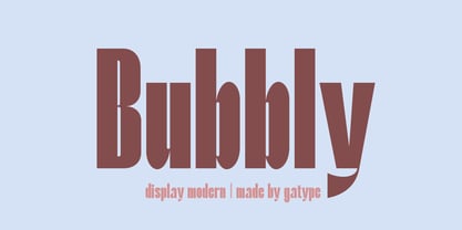 Stylish Bubbly Display with bold looking letters and Harmonious Impact to form a unique & elegant typography design. Perfect for branding projects, logos, wedding designs, social media posts, advertising, product packaging, product design, labels, photography, watermarks, invitations, stationery and any project. . uppercase and lowercase . multilingual symbol . number . punctuation . What will you get? Hope you enjoy our fonts and if you have any questions feel free to message & I'm happy to help
 - Blora by Liartgraphic,
$25.00 Hello guys! How are you guys? I bet it's great! Introducing our newest product, we call this product the Blora font. The Blora font is a serif font that has unique and interesting ligatures and alternatives With a unique and firm touch The Blora font is great for: fashion magazines, logos, photography, landing pages, flyers, What's included - multilingual support - alternative - fastener Thank you, best regards Ali Sifak Muftari
 - Univerza Sans by Type Salon,
$44.90 Univerza Sans was developed to mark the hundredth anniversery of University of Ljubljana. The style is influenced by the combination of Slovenian avantgarde with some recognizable forms that are known for Slovenian typography. Multifunctional use for identity system, formal communication, wayfinding, academic and scientific articles in order to share the institution’s spirit of knowledge, creativity, diversity and belonging. It speaks Central European languages, feels official but looks attractive and recognizable.
 - Lastari by Mantra Naga Studio,
$20.00 Lastari – a Bold Slab Serif Display Typeface. This typeface has many alternatives with swashes that can make your lettering/logotype more attractive. This font is suitable for logos and various other formal forms, such as invitations, labels, logos, magazines, books, greeting/wedding cards, packaging, fashion, makeup, stationery, novels, labels, or advertising. This font is PUA encoded, which means you can access all of the glyphs and swashes with ease!
 - Greemicaly by Zamjump,
$17.00 Greemicly is a handwritten font with signature style containing opentype features like alternative styles, swashes & ligatures. Perfect for logos, printed quotes, packaging, titles, posters, t-shirts / clothing, greeting cards, wedding badges and invitations, & more. To use swash, you need a program that supports OpenType features such as Adobe Illustrator CS, Adobe Photoshop CC, Adobe Indesign, and Corel Draw. No special software is required to use fonts in their basic form.
 - Helado by B2302,
$39.00 Helado is an elegant, modern sans-serif font, based on the idea to work as close as possible on the geometric forms of the circle and the square. Following swiss design classics Helado comes in these weights: LIGHT, REGULAR, BOLD and EXTRABOLD. Helado might be used as a headline font, for any kind of layout, it might also be transformed into that fashion label logotype you are working on. Have fun!