10,000 search results
(0.015 seconds)
- Project Sans by TypeUnion,
$40.00 Project Sans is a structured and versatile geometric sans serif which includes 10 weights and matching, playful italics that offer a unique feel for multiple applications. The fonts versatility creates a plethora of uses from branding and advertising to digital applications such as websites and apps. Project Sans has support for Central and Eastern European languages as well as Cyrillic. The font has a slight retro poster feel mixed with a uniform structure that, mixed with its substantial weight options and warm italics, creates a suite of fonts that can be used for anything your Project requires. Have fun with it and bring life to your Project.
 - Kamenica by Tour De Force,
$25.00 “Kamenica” - named after a beautiful small mountain river in Serbia - is a font family containing 3 weights: Light, Regular and Bold. The Kamenica river is only a few meters wide. Mostly shallow and cold, clear and green, it was the direct inspiration source for the creation of this condensed typeface. As our other typefaces, “Kamenica” also combines traditional shapes with modern forms, tall x-height and a collection of more than 300 glyphs. Comparing the river with the font, we could say that letters are the fishes that lives in the Kamenica river and that the font weights are the seasons in which this river shows most of its own character.
 - Comfy Cozies by Letterhend,
$14.00 Looking for a font that feels both cozy and stylish? Look no further than Comfy Cozies. This organic sans serif font has a skinny form that gives it a light and airy feel, while the regular and slanted styles offer versatility and creative potential. Whether you're designing for a playful brand or a casual event, this font will add a touch of warmth and charm to your work. Features : Uppercase & lowercase Numbers and punctuation Alternates & Ligatures Multilingual PUA encoded We highly recommend using a program that supports OpenType features and Glyphs panels like many of Adobe apps and Corel Draw, so you can see and access all Glyph variations.
 - Binter Script by Romie Creative,
$10.00 Introducing Binter. A bold retro script that will take you back to the 60s. This typeface has an extrude version so you can create a retro effect font easily. This font is very suitable for application, especially on logos, and various other formal forms such as invitations, labels, logos, magazines, books, greeting/wedding cards, packaging, fashion, make up, stationery, novels, labels or all kinds of things. advertising purposes. Feature : uppercase & lowercase numbers and alternating PUA coded swash multilingual ligature punctuation We strongly recommend using programs that support OpenType features and Glyphs panels such as many Adobe and Corel Draw applications, so that you can view and access all variations of Glyphs.
 - AN Swish by Anonymous Typedesigners,
$10.00 An Swish is a unique handwritten font. Crafted in ink to become digital. Initially it was created as a kind of textural filling of spaces - walls, posters, clothes. In the process of creation, it became clear that it can solve different problems. It can become a logo or a great solution for identity. With the apparent density of the set and the negligence of the forms, it remains quite readable. It can work with different spacing options. There is a feature in the font that changes the second character when two identical letters meet. Also added icons (lightning, heart, eye) that can decorate your projects.
 - Melancholia by Barnbrook Fonts,
$75.00 Melancholia is a subtle and beautiful sans-serif inspired by calligraphic letterforms. The name describes a feeling of deep sadness, an intense sensitivity to the world. The design of Melancholia is an attempt to introduce some of that wistfulness into the sans-serif form, a typographic classification that is often characterised by an austere functionality. Melancholia includes a set of true italics influenced by old-style serif italics, such as those found in Claude Garamond’s eponymous typeface, as well as a set of stylistic alternates and calligraphic-style swash characters.
 - Space Mode by Justin Penner,
$20.00 Space Mode is a multi-weighted typeface, sent back in time from the distant future. Forward-looking typeface designers often predict a reductive future where Latin letterforms have become increasingly modularized and simplified, or random bits have mysteriously gone missing. Thankfully, this is not the case, and typography has instead flourished and evolved. New forms have appeared, and some revived from historical references. A more complex drawing model has arisen that seems to add new curves in a effort to tame the strange diagonals that appear in the final quarter of the alphabet.
 - Foundry Old Style by The Foundry,
$90.00 Foundry Old Style was the first typeface to be released by The Foundry. Inspired by the incunabula typefaces of Nicolas Jensen, the letterforms were first created as calligraphy, with the aim of retaining the structure and free form of the pen stroke in the final drawing development. The resulting face is a contemporary translation that retains the classical tradition of the transitional roman style. Originally conceived as a text face, with a small weight range for good book work, Foundry Old Style is a versatile design that contrasts and compliments Foundry Sans.
 - Carolissa by Motokiwo,
$15.00 Carolissa is a script brush font with handwriting style. It's a simple and classy font that is suitable for various design project. With dynamic and spontaneous flow gestures, Carolissa will add more drama to your project. This font includes uppercase, lowercase, numeral, punctuation, ligature, and the multilingual support is also already PUA encoded. I believe in Leonardo da Vinci, that "Simplicity is the ultimate form of sophistication." If you have any issue or question, don't hesitate to drop me a message or email at motokiwodesign@gmail.com. I hope you enjoy the font!
 - Yummo by Dharma Type,
$24.99 Yummo is a geometric and somewhat condensed sans serif type family that can be used in a wide range of applications. The minimal glyphs that have been shaped superbly will give modern and contemporary impressions. At the same time, the rounded shape makes your typography softer and cuter. Yummo is not only a ‘geometric rounded font’ but also conveys humanness and loveliness as though the forms were handwritten. To accommodate a wide range of usage, This family consists of 5 weights and includes diacritics for most European languages in each weight.
 - Gravitational Pull by Hanoded,
$15.00 My 9-year old son Sam asks a lot (a LOT!) of questions. Like: ‘what killed the dinosaurs?’ (probably an asteroid), ‘what is the distance to Pluto’ (about 7.5 billion km), ‘how big is space’ (93 billion lightyears - give or take). I am pretty sure he asked me about gravity as well. Gravitational Pull is a messy pencil script font. It comes with a whole bunch of double-letter ligatures and some really wonky glyphs. And no, in its virtual form, this font is not subject to the Earth’s gravitational pull.
 - Hortense by Artisan Studio,
$15.00 Hortense is a modern calligraphic font that was designed by handwriting. It has modern and unique forms and the writing style is very natural. The Features of this fonts are: Standart ligatures Discretionary ligatures Stylistic Alternates Stylistic sets Hortense has PUA Unicode (Private Use Areas) Hortense can be used for various purposes such as headings, logos, wedding invitation, t-shirt, letterhead, signage, labels, news, posters, badges etc. To enable the OpenType Stylistic alternates, you need a program that supports OpenType features such as Adobe Illustrator CS, Adobe Indesign & CorelDraw X6-X7.
 - Compagnon by Hanoded,
$15.00 Compagnon is a friend, a partner. This handmade display font will come in super handy when you are working on that book cover, or the packaging of a product. It will shine on posters and websites and it will keep you warm at night. I guess that last bit is an exaggeration… Compagnon comes in three distinct styles: a ‘regular’ version, which is a bit rough around the edges, a ‘dirty’ version, with a juicy eroded look and a polka dot version. All three have their accompanying italics.
 - TwentyFourNinetyOne by steve mehallo,
$19.91 TwentyFourNinetyOne [2491] is a reinterpretation of the alphabet of 1919 by Theo van Doesburg; the original a true rendering of the thinking of the Dutch-based art movement “de Stijl.” Jump forward to 1980 and prop lettering used on the Buck Rogers in the 25th Century television series; a vernacular typeface that was a utilitarian mix of geometry and pixel-based forms, used to symbolize the futuristic universe of 2491. At times it would appear on spaceships, laser guns, signage at space ports or in one episode, a Spandex tapestry. It only seemed logical to combine and rethink the letterforms, add ligatures + other extras, and see what the results would be. Futuristic, fun and bold to read! 2491: In the future, all type will look like this.
 - Credit Extension by Comicraft,
$19.00At Comicraft we're always looking for new ways to help our loyal customers get more bang for their buck. There are times when when the big financial institutions turn their backs on the average working Joe, but that’s why we want to help you restructure your finances, renegotiate your commitment to font purchases... We're here to help you stretch your dollars a little further. With that in mind, our latest release is twice as wide as our usual fare and will help you make it to the end of the month in ways other fonts won't! It’s not so much a bailout or a refi... It’s more of a credit extension. I wonder what we should call it? See the families related to Credit Extension: Credit Crunch. - Appleton by Decade Typefoundry,
$35.00 Back to 1880-1900 when a number of events were coming together, the country was evolving from a local market economy to mass merchandising, rail systems were being built and color lithography was becoming more affordable. The first rail cars full of oranges were being shipped from Southern California to the East - what a treat during a cold winter’s day. Labels were pasted on every fruit crate and these labels had large images of oranges and orange groves. With technological advances in soldered cans, canneries popped up all over the country. In order to market their products many California Canneries pooled their resources to form the California Fruit Canners Assn. in 1899. This font was inspired from that era. Loaded with alternates, swashes, stylistic and multilingual support.
 - Lovely Melissa by Fontdroe,
$25.00 Lovely Melissa is a new variation of handmade script typeface. Complete your collections of script fonts. This typeface has been enriched with additional alternates characters for a total of 1,372 glyphs. Great for wedding invitations, product designs, and more. Go succeed and enjoy it! Main Features: Titling Alternate Stylistic Alternate Stylistic Set 01-09 Contextual Alternate Ligatures Discretionary ligature Contextual ligature Swash Variant Initial Form Medial Form Terminal Form Capital Space Numerator Proportional Lining Tabulator Oldstyle Superscript Subscript
 - Artely Inks by Mans Greback,
$59.00 Calligraphic high-quality font, with a fast and firm style.
 - Narrative BF by Bomparte's Fonts,
$39.00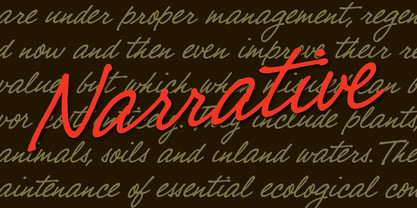 A cool handwritten script with a warm and friendly voice.
 - Honcho by Jonahfonts,
$29.95 A bold-face font with interesting lower case letter forms.
 - Banknote 1948 by Ingo,
$39.00 A very expanded sans serif font in capital letters inspired by the inscription on a bank note Old bank notes tend to have a very typical typography. Usually they carry decorative and elaborately designed markings. For one thing, they must be practically impossible to forge and for another, they should make a respectable and legitimate impression. And in the days of copper and steel engravings, that meant nothing less than creating ornate, shaded or otherwise complicated scripts. Designing the appropriate script was literally in the hands of the engraver. That’s why I noticed this bank note from 1948. It is the first 20 mark bill in the then newly created currency ”Deutsche Mark.“ All other bank notes of the 1948 series show daintier forms of typography with an obvious tendency toward modern face. The 1949 series which followed shortly thereafter reveals the more complicated script as well. For whatever reason, only this 20 mark bill displays this extremely expanded sans serif variation of the otherwise Roman form applied. This peculiarity led me in the year 2010 to create a complete font from the single word ”Banknote.“ Back to those days in the 40’s, the initial edition of DM bank notes was carried out by a special US-American printer who was under pressure of completing on time and whose engravers not only engraved but also designed. So that’s why the bank notes resemble dollars and don’t even look like European currency. That also explains some of the uniquely designed characters when looked at in detail. Especially the almost serif type form on the letters C, G, S and Z, but also L and T owe their look to the ”American touch.“ The ingoFont Banknote 1948 comprises all characters of the Latin typeface according to ISO 8859 for all European languages including Turkish and Baltic languages. In order to maintain the character of the original, the ”creation“ of lower case letters was waived. This factor doesn’t contribute to legibility, but this kind of type is not intended for long texts anyway; rather, it unfolds its entire attraction when used as a display font, for example on posters. Banknote 1948 is also very suitable for distortion and other alien techniques, without too much harm being done to the characteristic forms. With Banknote 1948 ingoFonts discloses a font like scripts which were used in advertising of the 1940’s and 50’s and were popular around the world. But even today the use of this kind of font can be expedient, especially considering how Banknote 1948, for its time of origin, impresses with amazingly modern detail.
 - Fungia by Ivan Petrov,
$30.00 Fungia is the result of an experiment to remelt loose natural forms to a coherent structure of a typeface. The idea appeared as a kind of joke: what letters look like if based on the shape of mushrooms. In a sense the structure of�mushroom has some affinity to the structure of�a letter: a cap and a stalk remind�a serif and a stem respectively. So it was pretty easy to design such straight letters like I, E, L, F. The captivating challenge was to apply the idea on round letters (O, C, D, G), letters with diagonal (N, M, Z) and signs without serifs (digits, @, &). The result exceeded expectations. The typeface turned sophisticated and vibrant but absolutely consistent. It became capital-only font in one weight. Because of its opulent forms Fungia performs best in large size and short inscriptions. However it provides readability in small size as well. Fungia is more likely thing-in-itself. Initially it wasn't intended to solve specific design challenges. But the alleged scope could include book covers, posters and billboards, street signs, magazin spreads and all situations that demand�expressive typography. Fungia supports extended latin and russian cyrillic script systems.
 - Colosseum by Alan Meeks,
$45.00 Although a sans serif, Colosseum owes its style to the original Trajan Roman form. Borrowing some characteristics from Friz Quadrata, in its san serif form it is more adaptable to text usage whilst still having a modern and original look which works well in headlines.
 - Digi Antiqua by Linotype,
$39.00DigiAntiqua was designed by the Hell Design Studio in 1968. Its basic forms were influenced by the slab serif fonts produced at the beginning of the industrial era in England around 1820. Its clear and timeless forms are extremely legible even in small point sizes. - JBP Pro by PizzaDude.dk,
$25.00 Wicked, cheeky and geeky! That's what went through my mind when updating this font. Originally made around year 2000, and now it comes in a restored and updated version. I cleaned up all curves and lines, added multilingual support and kerning. Based upon classic typefaces like Bodoni and Baskerville, but far more unpredictable and wild.
 - Romance Roman JNL by Jeff Levine,
$29.00 The antique sheet music for the 1915 song "A Girl in Your Arms is Worth Two in Your Dreams" had its title hand lettered in a Roman typeface that reflected ever so slightly the Art Nouveau influences of the time. This design is now available as Romance Roman JNL, in both regular and oblique versions.
 - Atomic Wedgie by Comicraft,
$19.00 Tighten up your capes, pull those cowls over your eyes and hoist your underpants over your trousers as far as they will go! Silver Age super heroes know that Men of Action can never look foolish fighting crime in their pyjamas and neither will you with the help of our latest crack-kerning offering.
 - Shows Gracious by Jafar07,
$17.00 Shows Gracious is taken from the word luxury that underlies this font, a classic theme with a subtle touch in every node of the alphabet, although classic, this font is highly recommended for designers, because of the classic design trend but not too far from ancient when used today. has several ligatures and alternatives that can add to the uniqueness of your design, very suitable for use as logos, branding, headlines, magazines, wedding cards, and others.
 - Oddee by Informal Type,
$25.00 Construction period of Anafor deeply inspired by the pioneer of geometric abstract art and the creator of the avant-garde suprematist movement Kazimir Severinovic, Malevich’s suprematist compositions. Anafor typeface is separated from the basic Latin letters in terms of character and letter structure. Furthermore, The forms and main structure are designed together with alternatives by taking into account the relationships between the defined angles.Anafor contains certain aspects of a display typeface, due to the structure of the letter forms that are open to abstract connotations. Typeface family includes 2 styles; Anafor Basic and Anafor Crash. Each individual style has 235 glyphs and it has OpenType encoding. Due to the diversity of three styles, Anafor is providing a wide range of possibilities for the user.
 - Trauville by Eurotypo,
$22.00 Inspired by Beauville Script, Trauville is a handmade, modern, joyful and elegant pen font with a vintage touch. Its informal appearance, the bouncy baseline, the round forms and bumpy stems, the good connection between the letters and the large number of ligatures that create more authentic and varied connections between the letters, refer to the fluent handwriting. With its 830 glyphs, the Trauville font is equipped with contextual and stylistic alternatives, many stylistic alternatives, swashes, initial forms and ligatures. This font contain a Central European language support to adapt to your design. Trauville works perfectly on greeting cards, invitations, weddings, posters, magazines, fashion world, brands and logos, packaging, etc. He is friendly and kind, fresh and fun to work with.
 - Fargo Tuscan by Greater Albion Typefounders,
$20.00 Fargo Tuscan is the first of seven typefaces exploring the decorative possibilities of the Tuscan letter form, all of which are releasing in 2017. It’s the most European of the seven- it’s a Mid-Victorian inspired display face which would have been (and is) at home on either side of the Atlantic, unlike some of the others in this batch of Tuscan faces which are distinctly ‘trans-Atlantic’ (we know, that depends on your point of view but we are Greater ALBION Typefounders after all) in flavour. Fargo Tuscan is replete with decorative features, including Swash Capitals, alternate numeric forms and stylistic alternates ideal for the beginning and ending of words. Have some mid-Victorian mid-Atlantic fun with your next design project!
 - VLNL Tp Martini by VetteLetters,
$35.00 Our chef Martin Lorenz likes to mix cool and fresh cocktails - shaken, not stirred! You have to taste his awesome Martini or mix it yourself! To make matters more easy, cocktail master Martin reveals his special recipe: “The TpMartini refers esthetically to typefaces drawn with a pointed nib as the Bodoni or Didot, but with the clear distinction that it is obviously constructed by modules. The visual system for the TpMartin is based on a square 5x9-unit grid and three different basic forms with which the font and other elements are designed. The basic forms consist of a straight line and circles of two different sizes. The line can be extended, but the circles retain their related proportions.” One piece of advice: Don’t drink and type!
 - Anafor by Informal Type,
$25.00 Construction period of Anafor deeply inspired by the pioneer of geometric abstract art and the creator of the avant-garde suprematist movement Kazimir Severinovic, Malevich’s suprematist compositions. Anafor typeface is separated from the basic Latin letters in terms of character and letter structure. Furthermore, The forms and main structure are designed together with alternatives by taking into account the relationships between the defined angles.Anafor contains certain aspects of a display typeface, due to the structure of the letter forms that are open to abstract connotations. Typeface family includes 2 styles; Anafor Basic and Anafor Crash. Each individual style has 235 glyphs and it has OpenType encoding. Due to the diversity of three styles, Anafor is providing a wide range of possibilities for the user.
 - Allotrope by Kostic,
$40.00 Allotropes are different structural forms of the same element and can exhibit quite different physical properties and chemical behaviors. The change between allotropic forms is triggered by the same forces that affect other structures – pressure, light, and temperature. From Wikipedia the Free Encyclopedia With ten weights in five widths plus Italics, this family comes to a total of 100 fonts. The large number of styles was made with the intent to cover most cases UI designers have to tackle, with one type family. Stylistic alternates were made to follow the same logic, so there is an optional single-story g, serifed capital I, and dotted zero – all available through the OpenType feature. The character set supports Western and Central European languages, as well as Turkish.
 - Kalix by Linotype,
$29.99I have a notation that the summer of 1994, when I worked with Kalix, was a warm one. I had no special typeface in mind when drawing the characters of Kalix, but many typefaces contributed to it, e.g. my own Omnibus from which I borrowed the looks of the smal case g. I think it is a lovely typeface whose use is mainly for books and magazines. Kalix is the name of a northern Swedish town situated along a river called Kalixälven. Its name is of sami origin, *káles, meaning cold. There comes the connection to the warm summer of 1994! But even the Latin word for chalice, calix, has something to do with my choice of name. Kalix was released in 1994. - Reinfolk by IKIIKOWRK,
$17.00 Introducing Reinfolk - Decorative Sans, created by ikiiko. Reinfolk is a sans serif typeface with a unique decorative shape. The form is a combination of the sans typeface with the tail character on the slab letter, so that it forms a unique formation and has a distinctive character. Reinfolk is a simple font, with a elegant and calm impression. This typeface is perfect for an elegant logo, branding, layout magazine, home & decor layout, beauty product, packaging product, quotes, or simply as a stylish text overlay to any background image. What's included? Uppercase & Lowercase Number & Punctuation Alternates & Stylistic Multilingual Support Get also a good offer & FREEBIE at our site : www.ikiiko.com Enjoy our font and if you have any questions, you can contact us by email : ikiikowrk@gmail.com
 - Auteur by Up Up Creative,
$29.00 Introducing Auteur, a graceful, full-featured script font with tons of alternate characters and OpenType features. Hand-lettered with a heavy right slant and realistic disconnected letters (connected versions also included), Auteur’s casual elegance is particularly well-suited to invitations, branding, and editorial design. Auteur comes with more than 1200 glyphs! Specific OpenType features include contextual alternates, stylistic alternates, optional initial and final forms, multiple alternate glyphs for many letters (accessed through the glyphs panel), multilingual support (including multiple currency symbols), ligatures, multiple numeral forms (standard, tabular, proportional oldstyle), and ten ampersand styles. Perhaps the most fun thing about Auteur is that it includes multiple versions of all ascending and descending letters, making it lots of fun to play with layouts and compositions.
 - RF Rufo by Russian Fonts,
$29.00 Rufo — condensed geometric sans serif with the closed forms. Contains 12 fonts. 6 regular and 6 italic. From thin to black. A rich palette gives full freedom for creativity and bright decisions. Extensive area of use. The versatility of the sans serif typeface covers various aspects of graphic design. Web, printed materials, clothing, logos, posters, labels and much more. Rufo is pragmatic typeface. Can save space and will accommodate a large amount of information in a limited space. The font was designed so that condensed letters remains readable even in small sizes. Opentype: alternate numbers, oldstyle numbers, arrows, fractions and automatic fractions, case sensitive forms, superscript and subscript, numerators and denominators. Support: cyrillic, cyrillic extended, latin, latin extended (Western European, Central European, South-East).
 - Kilshon MF by Masterfont,
$59.00 A 3 weights family, round geometric forms - ideal for headlines, signage.
 - Tali MF by Masterfont,
$59.00 Finesse and style in this condensed hand drawn elegant type forms.