10,000 search results
(0.033 seconds)
- TXT Long Hand by Illustration Ink,
$3.00 - TXT Menu Item by Illustration Ink,
$3.00 - TXT Sloppy Script by Illustration Ink,
$3.00 - TXT Brush Script by Illustration Ink,
$3.00 - TXT Modern Mom by Illustration Ink,
$3.00 - TXT Soda Shoppe by Illustration Ink,
$3.00 - TXT Groovy Smooth by Illustration Ink,
$3.00 - TXT Antique Italic by Illustration Ink,
$3.00 - My 70s Ding - Unknown license
- Digs My Hart - Personal use only
- STOP SHARK FINNING - Personal use only
- GA Dings 1 - Unknown license
- I Did This! - Unknown license
- Anderson Space1999 Dings - Unknown license
- Line Dings BRK - 100% free
- KR Coffee Dings - Unknown license
- KR Passover Dings - Unknown license
- Destinys Border Dings - Unknown license
- KR Hockey Dings - Unknown license
- KR Weather Dings - Unknown license
- Anderson Dings 2 - Unknown license
- KR Easter Dings - Unknown license
- dmf studio deins - Unknown license
- C Dans L'air - Unknown license
- KR Zodiac Dings - Unknown license
- Sloe Gin Rickey - Unknown license
- KR Sun Dings - Unknown license
- KR Sports Dings - Unknown license
- KR Teatime Dings - Unknown license
- KR Harvest Dings - Unknown license
- KR Space Dings - Unknown license
- Anderson Dings 3 - Unknown license
- PT Chocolate Dip - Unknown license
- KR Animal Dings - Unknown license
- KR Valentine Dings - Unknown license
- KR Kitchen Dings - Unknown license
- Dining Room JNL by Jeff Levine,
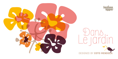
$29.00 - Dans Le Jardin by Latinotype,
$29.00 - SP Don Mills by Remote Inc,
$39.00 - Dias de Follaje by Bonez Designz,
$30.00


