10,000 search results
(0.033 seconds)
- SociaLAnimaL - Personal use only

- Romantiques - Personal use only

- Droeming - Personal use only

- 5 cent - Unknown license

- Hall Fetica Upper - Unknown license

- Motherboard JNL by Jeff Levine,
$29.00 Motherboard JNL is a retro throwback to the technology boom of the 1980s and simulates an LED readout display panel. Available in regular and oblique styles.
 - Glaciana by Intellecta Design,
$13.90Note: Only the regular style in font family is currently available due the complexity and the resulting memory and performance issues associated with the other styles. - Aberforth by Brittney Murphy Design,
$9.00 Aberforth is clean, mixed-case font family. It's mono-height, so it pairs well with other fonts. Family includes regular, rough, outline, tiles, and italic versions.
 - Windstone by Variatype,
$14.00 Windstone is a Black Ultra Condensed display sans font published by Variatype, available in regular and italic. FONT FEATURES Additional Accents 66 Languages Kerning Alternates Ligatures
 - Display Engraved JNL by Jeff Levine,
$29.00 Display Engraved JNL was inspired by the bold, engraved Sphinx Blanc from the Deberney & Peignot circa 1925, and is available in both regular and oblique versions.
 - Pipo by bb-bureau,
$65.00 Pipo is a minimalist rounded tubular and stencil font in 5 weights (Thin, Light, Regular, Medium & Bold) — many symbols and cleverly ligatured! language: all latin glyphs
 - Fordham JNL by Jeff Levine,
$29.00 Fordham JNL is a slab serif typeface in regular and oblique versions that has a casual, informal look reminiscent of 50s and 60s-era ad headlines.
 - Ugaritica by Mouhannad Alkousa,
$14.00 Ugaritica is an uppercase typeface. Blocky, sharp, and aggressive. Nice for headlines to catch the attention. Ugaritica is available in two styles - regular and bold. Enjoy!
 - Dry Goods Stencil JNL by Jeff Levine,
$29.00 An antique Bradley stencil cutting machine’s letters and numbers were the basis for Dry Goods Stencil JNL, which is available in both regular and oblique versions.
 - Handmade Stencil JNL by Jeff Levine,
$29.00 Handmade Stencil JNL was inspired by the hand lettered opening credits of the 1954 film “Human Desire” and is available in both regular and oblique versions.
 - Tamarac JNL by Jeff Levine,
$29.00Tamarac JNL offers the look of wood type with added serifs. Use Tamarac JNL when you need a change of pace from the "regular" serif fonts. - Mick by Oleg Stepanov,
$12.00 Mick is a hand-drawn typeface inspired by graffiti works of old style. The family contains Regular and Light styles. Cyrillic and extented latin character sets.
 - Cheltenham by Wooden Type Fonts,
$15.00 A revival of one of the popular text fonts of the 19th century, suitable for text or display, short descenders, tall ascenders, the regular text version.
 - Stonegert by Oleg Gert,
$15.00 Stonegert – playful, friendly, Light, pleasant, handwritten typeface - has two weights, regular and boldWell suited for the design of children's products, magazines, instagram posts and design layouts
 - BB book A by bb-bureau,
$65.00 bb-book A — breaking rules typeface Expressive book serif (triangular and curved) kicking up weight, width and contrast — in 4 styles: light, regular, medium and bold.
 - Merendina by Resistenza,
$29.00 Merendina has a geometric construction with an handwritten touch. This family contains regular and slanted and 6 weights. Do not miss all the alternates and swashes.
 - Retail Monoline JNL by Jeff Levine,
$29.00 Retail Monoline JNL is a light weight sans serif extracted from the inline of Retail Price JNL and is available in both regular and oblique versions.
 - Darbee Legend by OGJ Type Design,
$35.00A characteristic feature of the Darbee Legend is its boxy forms and the angled (unpainted) terminals. Regular to bold plus italic and a variable font (upright). - Sabrina Script by Straight.Co,
$12.00 The Sabrina is a modern script font with an elegant style. You can alternate between the regular and swashed letters to get a handwritten, professional look.
 - Castelforte - Personal use only

- Martin Luther by Harald Geisler,
$59.00 ❧ Useful links: Luther’s Manuscripts at the UNESCO Memory of the World at Google Arts and Culture Martin Luther font on Kickstarter (with Film about the creation) Each letter of the Martin Luther font is strictly based on original samples found in Martin Luther’s 500 year old handwritten manuscripts. Letters that occur more often for example vowels have two or more different versions stored in the font. (➶ Figure 4) These alternative forms are exchanged automatically by the font as you type, and create a vivid look that comes close to actual handwriting. The font avoids that two identical letters are placed next to each other like, for example the two “o” in the word “look”. ➸ What Historic Sources is the Font based on? Two historic documents were used to base the font on. The notes Luther took before giving his speech in Worms in 1521 and a 6 page letter he wrote immediately after to Emperor Charles V., summarising his speech (➶ Figure 2). Both documents have been added to the UNESCO “Memory of the World” and can be seen at the Google Arts and Culture website. ➸ The Creation of a Handwriting Font The creation of a handwriting font is very different from the creation of a regular font. Harald Geisler has specialised in recreating handwriting in preceding projects with Albert Einstein’s, Sigmund Freud’s and his own handwriting. His experience working with Archives and Museums has gone into this project. First Geisler analyses the movement in the writing to understand how each letter is drawn. This involves partially learning how to write like a person. In this process not the outlines of the sample are reproduced but the original movement path of the handwriting (➶ Figure 3). In a second step width and contrast is added to reproduce Martin Luther’s characteristic impetus and the writing tools used at the time. (Link: Youtube Playlist showcasing the creation of individual letters) How about signs that can’t be found in archives? Some Glyphs can not be found in 500 year old manuscripts, for example the @-sign. Towards the end of the creation one collects a profund amount of details about how a writer moves on paper and addresses certain tasks moving the pen. Keeping this knowledge in mind an improvisation can be based on similar letter forms. For example the @ sign is based on of the movement of a lowercase a and parenthesis. ➸ Features of the Martin Luther font ❶ Extensive Documentation of the creation of the font, including high quality reproduction of the used manuscripts. ❷ Additional texts from Historian Dr. Henning Jürgens and Palaeographer (and Luther handwriting expert) Prof. Ulrich Bubenheimer ❸ Alternating Letters - in handwriting every word looks a bit different. To avoid that two identical letterforms are placed next to each other (for example in the word look) the font actively changes between different versions of letters as you type. ❹ Ligatures - characteristic writing forms when two letters are combined (for example “ct”) (➶ Figure 5) ❺ Terminal Letterforms - renders a special letterform when letter is at the end of a word. (➶ Figure 8) ❻ ‘’’Initial and Medial Letterforms''' - some letterforms are different when placed in the beginning or middle of a word, for example the lowercase s. ❼ Luther Rose - is a seal Luther used to authorise his correspondence. Today it is a widely recognized symbol for Luther. When you enter the numbers of Luthers year of birth and death 14831546 using the Martin Luther PRO font, it will render a stylised version of the Luther Rose. (➶ Figure 7) ❽ Historic letter-forms - letter-forms that are specific to medieval writing around 1500. For example the long-s or h with a loop at the bottom. (➶ Figure 6) ⚑ Multi language support - see the technical information tab for a full list of supported languages. (➶ Figure 11) ➸ The different Styles explained ❋ Martin Luther PRO - this includes all features listed above and is geared towards writing texts that are more readable today. It features alternating letters to create a natural handwriting look as well as two stylistic sets accessible through the OpenType menu. Historic forms are available through the glyph picker. ❋ Martin Luther Historic - this font creates a historically correct reproduction (i.e. with long-s) of Luther’s medieval latin handwriting. It features alternating letters to create a natural handwriting look as well as two stylistic sets accessible through the OpenType menu. ❋ Martin Luther Expert-1 - Dedicated access to the first set of letters only. ❋ Martin Luther Expert-2 - Dedicated access to the second set of letters only. ❈❈❈ Family Pack - recieve all fonts at a discounted price. ❈❈❈ ➸ Kickstarter The creation and development of the Martin Luther font was financed by 500 supporters on ➸Kickstarter.
 - Linotype Graphena by Linotype,
$29.99Linotype Graphena is part of the Take Type Library, selected from the contestants of Linotype’s International Digital Type Design Contests of 1994 and 1997. It is a handwriting font designed by the Italian artist Giancarlo Barison. Consciously irregular and erratic, the letters dance across a page, large and small, tilted and erect. Linotype Graphena could be described as angular, restless, even mischievous. It should be set in point sizes no smaller than 12 and is best used for headlines and displays. - Bosphorus by Bülent Yüksel,
$19.00 Ideally suited for advertising and packaging, editorial and publishing, logo, branding and creative industries, poster and billboards, small text, wayfinding and signage as well as web and screen design. Optimized for web, tablet and smartphone applications. Also “Bosphorus” is a perfect screen display font. Technical information: “Bosphorus” provides advanced typographical support for Latin-based languages. An extended character set, supporting Central, Western and Eastern European languages, rounds up the family. The designation “Bosphorus 50 Normal 53 Regular” forms the central point. The first figure of the number describes the stroke thickness: 51 Thin to 56 Black. 5 Width / 6 Weights and italics also “Bosphorus” total 60 types. The family contains a set of 530 characters. Case-Sensitive Forms, Classes and Features, Fractions, Superior, Inferior, Denominator, Numerator, Old Style Figures just one touch easy In all graphic programs. You can contact me at buyuksel@hotmail.com, pre-purchase and post-purchase with questions and for technical support. UPDATE: 1- Some glyph unicode error correction / 04-06-2018 - Euro Unicode - Idottacent Unicode - Oganec Unicode - Middot Unicode 2- New Version 2.0 / 25-06-2021 You can enjoy using it.
 - Bosphorus Variable by Bülent Yüksel,
$149.00 Ideally suited for advertising and packaging, editorial and publishing, logo, branding and creative industries, poster and billboards, small text, wayfinding and signage as well as web and screen design. Optimized for web, tablet and smartphone applications. Also “Bosphorus” is a perfect screen display font. Technical information: “Bosphorus” provides advanced typographical support for Latin-based languages. An extended character set, supporting Central, Western and Eastern European languages, rounds up the family. The designation “Bosphorus 50 Normal 53 Regular” forms the central point. The first figure of the number describes the stroke thickness: 51 Thin to 56 Black. 5 Width / 6 Weights and italics also “Bosphorus” total 60 types. The family contains a set of 530 characters. Case-Sensitive Forms, Classes and Features, Fractions, Superior, Inferior, Denominator, Numerator, Old Style Figures just one touch easy In all graphic programs. You can contact me at buyuksel@hotmail.com, pre-purchase and post-purchase with questions and for technical support. UPDATE: 1- Some glyph unicode error correction / 04-06-2018 - Euro Unicode - Idottacent Unicode - Oganec Unicode - Middot Unicode 2- New Version 2.0 / 25-06-2021 3- Variable / 18-02-2022 You can enjoy using it.
 - Mousse Script by Sudtipos,
$79.00 Mousse Script is based on Glenmoy, a 1932 Stephenson Blake typeface. Glenmoy a prime example of what display typography was in pre-WWII American ad art. It graced the pages of magazines, sold numerous products and services, then simply died out when the typographic trends shifted towards the more personalized, stylized and handwritten types of calligraphy. The current trend in typography is a revivalism that brings all of the distinctive display typography of the 20th century, without chronological discrimination, back in the name of ‘retro’. Who are we to deny the masses what they want? Mousse Script doesn’t just bring Glenmoy back from the ashes of the 20th century. It expands upon the limited metal character set nearly twice over and takes advantage of the latest type technologies. This makes Mousse Script a striking typeface, both functionally and visually. A simple, attractive display font on the surface, Mousse Script is unique in its bold upright calligraphy, something rarely found these days. The OpenType version of Mousse Script combines both the regular and alternate character sets into a single, cross-platform package that takes advantage of the extended typographic features of the OpenType format.
 - Marquee by DP Fonts,
$25.00 Marquee is a hand drawn lowercase font with a vintage marquee sign feel.
 - Lemon Twist by Art Grootfontein,
$20.00 Modern and bold, LemonTwist gives your designs a little zest of fresh feeling...
 - Ringa by Melvastype,
$25.00 Ringa is extra bold slab serif typeface with a fun and sympathetic feel.
 - Ikewund by Intellecta Design,
$22.90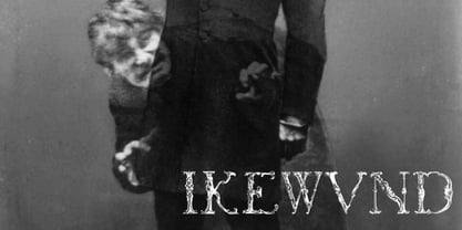 Ikewund is a font with a peculiar creepy feeling. Great for header designs.
 - Delamere by AVP,
$29.00Delamere uses conventional sans-serif letterforms but delivered with a strong calligraphic feel. - Fraggle by BA Graphics,
$45.00Designed with a happy loose feeling. Great for childrens books and fun occasions. - Blue Goblet Drawn by insigne,
$5.00 This best selling series has now been extended to include a new member, Blue Goblet Drawn. Blue Goblet is hand-drawn by the artist, Cory Godbey, and is organic, charming and exuberant. Characters bounce and dance above and below the baseline and x-height, making this a whimsical and fun script. Not only is Blue Goblet Drawn a excellent choice, it also is also a versatile member of a wide family of different fonts. You can use it side by side with the original Blue Goblet fonts, and there are a wide range of ornaments available in the supplemental ornament sets--over 370 illustrations! These illustrations include doodley frames, lovely florals and other text ornaments that can be inserted into your text and resized at will. This makes the Blue Goblet series a great pick when you want a type system for a very unique and consistent look. The Blue Goblet series also continues to expand, making any of these family members a valuable investment for the future. Blue Goblet Drawn comes in three weights and three widths in each weight, with complementary italics for maximum impact for a total of eighteen pro fonts. The compact thin weights are delicate and tall, while the Regular has just enough heft for those situations where subtlety doesn't work. If you don't need the professional features, there are three stripped down fonts that include only the basic character set! Blue Goblet Drawn also includes auto-replacing ligatures that make it appear that the script was drawn by the artistís own hand--just for you! Blue Goblet Drawn also includes a wide variety of alternates that can be accessed in any OpenType enabled application. Blue Goblet includes over 190 additional glyphs and is loaded with features including an even more unique alternate alphabet. Included are swash alternates, style sets, old style figures and small caps. Please see the informative PDF brochure to see these features in action. OpenType enabled applications such as the Adobe suite or Quark can take full advantage of the automatic replacing ligatures and alternates. This family also includes the glyphs to support a wide range of languages. Blue Goblet Drawn is a great choice for friendly display type in children's books, packaging, organic packaging or other unique applications. Use Blue Goblet whenever you want to inject a handmade sense of fun and whimsy to your designs. Give the Blue Goblet series a whirl today!
 - VLNL Gindicate by VetteLetters,
$30.00 The alcoholic beverage Gin is drunk around the world, as far back as the 13th century. Originally distilled as a medicine, it draws its main flavour from juniper berries. Gin is colourless itself but – due to its smooth taste – a major ingredient in a long list of famous colourful cocktails. Gimlet, Singapore Sling, Negroni, Charlie Chaplin, French 75, Vesper, Tom Collins, White Lady, Aviation, Monkey Gland, Southside, Gin Gin Mule and New Orleans Fizz are but a few of them. That made us decide it simply cannot be missing from the Vette Letters font collection. Vette Letters designer Henning Brehm originally designed VLNL Gindicate for the 2015 action movie Hitman: Agent 47. It was specifically used for the logo and signage of the maverick ‘Syndicate International’ organisation in the film. It lay dormant in a folder for a while, when it was reworked into this flashy 5 weight family. VLNL Gindicate is a rounded modern sans serif family, suitable for a multitide of applications, corporate or otherwise. It has somewhat of a warm sci-fy feel, without being overtly techno-ish. In the family are 3 regular weights (Light - Regular - Bold), but also an Inline and Multiline weight for extra design possibilities. Company logos, brand identities, music flyers or posters, you name it. VLNL Gindicate will spice up any design. Bottom’s up!
 - Scrapyard Script by Mans Greback,
$69.00 Scrapyard Script is a bold, heavy font with a cool and funky vibe that captures the essence of street style and urban culture. Ideal for streetwear branding, concert posters, funky album covers, and other projects that require a cool, contemporary vibe, Scrapyard Script is a display font that adds an energetic, dynamic touch to your designs. Its unique style makes it a great choice for projects that need to stand out and make an impact. Use multiple _ ¤ # to make swashes of different lengths. Example: Rockstar____ (Download required.) The Scrapyard Script font family includes four high-quality styles to suit various design needs: Regular: A bold, paintbrush-inspired style with a youthful edge Italic: Adds a touch of movement and expressiveness to the regular style Bold: An even bolder and heavier presence for more impactful designs Bold Italic: Combines the assertiveness of bold with the energy of italic Built with advanced OpenType functionality, Scrapyard Script ensures top-notch quality and provides you with full control and customizability. It includes stylistic alternates, ligatures, and other features to make your designs truly unique. It has extensive lingual support, covering all Latin-based languages, from Northern Europe to South Africa, from America to South-East Asia. It contains all characters and symbols you'll ever need, including all punctuation and numbers.
 - Totally Terrific by Set Sail Studios,
$12.00 I love Tea. Do you love Tea? Good. Because there's a whole load of T's in the Totally Terrific Typeface! Bursting with fun and bouncy brush-strokes, this typeface will undoubtedly add a dash of cheeky playfulness to your text - ideal for greeting cards, branding, merchandise, invitations & hand-made quotes. The awesome thing about this typeface is that it's so easy to mix up the various font styles and create totally unique, hand-made looking words each time. The lowercase characters can be connected (Totally Terrific Regular) or un-connected (Totally Terrific Two), and will work in any combination of these two versions. Not only does it also look great in all-caps, but the uppercase letters will fit in with the lowercase at any location - I'm serious! Just throw one in the middle of a word, I dare you ;). Your download will contain 2 font files: Totally Terrific Regular • Contains a full set of connected lowercase letters, uppercase letters, a large range of punctuation, numerals, and multilingual support. Totally Terrific Two • A second version of the Totally Terrific Typeface, with a completely new set of un-connected lowercase characters. These are designed to work in perfect harmony with the connected set from the other font file. Just keep switching between the two fonts to create unique word layouts!


