10,000 search results
(0.031 seconds)
- Cataloger by The Arborie,
$11.00 A truly organized storage section is only complete with properly and neatly organized labels. This font is perfect for that. It is legible and professional enough to use in an office setting. It is also perfect for use in the home for example organizing a home or a pantry.
 - Ballpoint Catalog by Double Z Studio,
$19.00 Ballpoint Catalog is a handwriting typeface, based on my dad's real handwriting, he was a teacher. I'm amaze by its smoothness and elegant, not fully follow the rules of penmanship handwriting but he has his own style of script which make it more human, natural handwriting rather that 'generic' handwriting typeface style. This typeface contain several ligatures to make it more natural in the writing. Suitable for any uses from branding, book cover, menu, quotes, invitation, wedding cards, advertising, blog, etc. Features Latin A-Z and a-z Numbers Symbols Ligature To enable the OpenType Stylistic alternates, you need a program that supports OpenType features such as Adobe Illustrator CS, Adobe Indesign & CorelDraw X6-X7. There are additional ways to access alternates/swashes, using Character Map (Windows), Nexus Font (Windows), Font Book (Mac) or a software program such as PopChar (for Windows and Mac).
 - Catalog JNL by Jeff Levine,
$29.00 Catalog JNL is based on a set of vintage wood type. Its uniform, block-style appearance is perfect for projects where bold, readable titling will apply. Available in regular and oblique styles.
 - Catalpa by TypeTogether,
$35.00 The Catalpa font family is José Scaglione and Veronika Burian’s wood type inspired design for an overwhelming headline presence. It has no regular weights, only four slender and four hulking weights. Catalpa wasn’t made to be normal; it was made to overwhelm, to stand out, to bellow. Catalpa is the first font family within a trilogy that will be released through 2020. Each of the three have a distinct purpose and their own look, but they serve a common goal: to act as a complete family covering an editorial’s wide array of needs. As the first of the three, Catalpa is the bookend font family with a headlining purpose. What requirements are there for a great headline typeface? Distinction, weight, and cohesiveness are a good start. Its distinctiveness must catch attention, it must have a range of weights applicable to its purpose, and its internal consistency and external look must create a cohesive family. Catalpa is a distinct and unified family whose weights are attuned to its single-minded purpose — headlines and large text. Catalpa has only eight styles that are divided into two ranges of weights — four very light weights (Hairline, Thin, Extralight, and Light ) and four very bold ones (Extrabold, Heavy, Black, and Extrablack). The thin and heavy ends of the spectrum also have their own variable fonts, each with one axis of weight so designers can fine-tune their work. The geometric influence of the design is more obvious in the light range, with their line thickness increasing in the classical manner. The bold weights increase more in width and substance to serve well in websites, mobile apps, posters, advertisements, and magazines that aim for impact more than spreading information. As a family, Catalpa gels in big headlines, short sentences, and isolated words. The family has many recognizable features, in the bolder weights especially, like the reversed contrast ‘S, s’ or the angular design of ‘Q, M, W, w, a, f, 2, 3’. Catalpa’s headlining mixture of geometry and quirkiness leaves an impression that is so characteristic of wood type, but designed for substrates and screens.
 - Goudy Catalogue by URW Type Foundry,
$35.99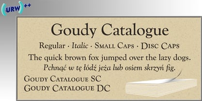
- TPG Katalog by Tolstrup Pryds Graphics,
$15.00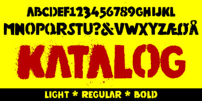
- Goudy Catalogue by Bitstream,
$29.99Goudy Catalogue was designed by Morris F. Benton in 1919. A medium weight adaptation of the of the original Goudy design, it is about 15 percent heavier than the Oldstyle. - analog - Unknown license

- Analogy by Jafar07,
$10.00 Analogy is a bold typeface that is strong, geometric, and confident. Manifolds will give your design alternatives a modern look and make your creative work stand out with lots of unique ligatures. highly recommended and those who are planning a poster design, logo, headline, t-shirt, etc.
 - Catalog Serif JNL by Jeff Levine,
$29.00 Based on text used as sub-headings within a reproduction of a sales catalog for stencil punch dies manufactured by S.M. Spencer & Co. (originally of Brattleboro, VT), circa 1868. Catalog Serif JNL is available in regular, oblique, condensed, condensed oblique, extra condensed, extra condensed oblique, ultra condensed, ultra condensed oblique, compressed and compressed oblique versions.
 - Type Catalog JNL by Jeff Levine,
$29.00 Type Catalog JNL was originally a design drawn by Jeff Levine around 2006. Type Catalog JNL has a distinctively retro look for many applications.
 - Catalog Sheet JNL by Jeff Levine,
$29.00 Catalog Sheet JNL is the digital version of an extra condensed serif typeface from the 1892 MacKellar, Smiths & Jordan type foundry specimen book. The font is available in both regular and oblique versions.
 - Regulaire by PizzaDude.dk,
$16.00 Regulaire is my laid back comic font, inspired by graffiti and my everyday regular handwriting. Works quite nice for kids products, comics, party posters - or anything that needs a casual comic look!
 - PF Signskript by Parachute,
$75.00 Sitting inside our offline vault and print catalogs for several years but still available for purchase, PF Signskript is part of a valuable triad of typographic gems which are finally re-released, fully updated and upgraded. Designed by Vladimir Radibratović, a foremost calligrapher, type designer and illustrator, this trilogy of script typefaces was recently revamped by our design team with full support for Latin, Greek and Cyrillic. Initially released between 2000 and 2003 these typefaces manifest a human, hand-crafted feel. Designed to excel particularly within casual and natural contexts, their names reveal their exact identity. The nostalgic charm of PF Signskript, the unique vintage and rough appeal of PF Rafskript or the organic Mediterranean essence of PF Mediterra have all attracted attention to these popular typefaces for brands on the supermarket shelves, wine labels, packaging, quotes, stationery and vintage lettering.
 - PF Occula by Parachute,
$33.00 Occula on Behance. Occula: Specimen Manual PDF. Occula is an exploration into high-legibility type although it’s not an effort to design the ultimate typeface in terms of economy and legibility. Instead, the goal has been to strike a balance between modern curves and lively old-style rhythm – using a rational design approach without becoming monotone. Or from another point of view: being humanistic and lively without looking old-fashioned and quirky.
 - PF Eef by Parachute,
$35.00 First conceived as the upper-and lowercase “e” for the logotype of independent publishers Elemental Editions, the letterforms were so well received that they were extended to an entire typeface and formed the basis for a bespoke font – Eef. The type design draws inspiration from the basic elements, the periodic table, functionalist vintage lettering and influences from other classic geometric typefaces with condensed cuts such as Futura and Trade Gothic. The extended set is now developed into a family consisting of three weights – Regular, Medium and Bold. While developing Eef it has been crucial to maintain the integrity of the geometrical shape in each glyph as much as possible, but also add subtle optical adjustments to make the forms more balanced and harmonic. Due to its detailed balance of simplicity, aesthetics and playfulness Eef works perfectly well in a corporate context as it does in editorial use or poster design. Eef feels most comfortable with text ranging from display to medium size.
 - PF Mellon by Parachute,
$35.00 PF Mellon is a modernist variable grotesque with mixed roots. Its unconventional aesthetic is the product of an exploration into the art of emphasizing titles, headlines and text in captivating and unpredictable ways. Contrary to conventional practices of highlighting text with heavier weights, PF Mellon proposes an intriguing new scheme based on striking and attention-grabbing compositions of narrow and extended letterforms- even when set in lowercase. Part geometric and part grotesque, PF Mellon’s expressionist alphabet and extravagant style challenge conventions of visual culture in an Art Deco-like manner. PF Mellon’s rebellious idiosyncrasy takes its cues from the eccentric personality of our popular PF Venue, an earlier geometric sans serif characterized by its daring combinations of non-uniform structures. PF Mellon’s basic design skeleton was influenced by nineteenth and early twentieth century condensed sans serif typefaces such as Stephenson Blake's Grotesque No.77 and ATF’s Alternate Gothic, adding an extra contrast to the thickness of strokes. PF Mellon is also available as a variable font format which you may request it free of charge from Parachute® once you purchase the whole type family.
 - PF Rafskript by Parachute,
$75.00 Sitting inside our offline vault and print catalogs for several years but still available for purchase, PF Rafskript is part of a valuable triad of typographic gems which are finally re-released, fully updated and upgraded. Designed by Vladimir Radibratović, a foremost calligrapher, type designer and illustrator, this trilogy of script typefaces was recently revamped by our design team with full support for Latin, Greek and Cyrillic. Initially released between 2000 and 2003 these typefaces manifest a human, hand-crafted feel. Designed to excel particularly within casual and natural contexts, their names reveal their exact identity. The nostalgic charm of PF Signskript, the unique vintage and rough appeal of PF Rafskript or the organic Mediterranean essence of PF Mediterra have all attracted attention to these popular typefaces for brands on the supermarket shelves, wine labels, packaging, quotes, stationery and vintage lettering.
 - PF Press by Parachute,
$45.00 Press combines aesthetic and functional attributes which make written text highly readable. It was originally designed for a newspaper with medium contrast to withstand harsh printing conditions. Its structure is quite narrow which makes this typeface ideal for body text and headlines where space is at premium. Supports Latin and Greek. This is a modern serif typeface which may be the right choice for newspapers, magazines and corporate communications.
 - PF Mediterra by Parachute,
$75.00 Sitting inside our offline vault and print catalogs for several years but still available for purchase, PF Mediterra is part of a valuable triad of typographic gems which are finally re-released, fully updated and upgraded. Designed by Vladimir Radibratović, a foremost calligrapher, type designer and illustrator, this trilogy of script typefaces was recently revamped by our design team with full support for Latin, Greek and Cyrillic. Initially released between 2000 and 2003 these typefaces manifest a human, hand-crafted feel. Designed to excel particularly within casual and natural contexts, their names reveal their exact identity. The nostalgic charm of PF Signskript, the unique vintage and rough appeal of PF Rafskript or the organic Mediterranean essence of PF Mediterra have all attracted attention to these popular typefaces for brands on the supermarket shelves, wine labels, packaging, quotes, stationery and vintage lettering.
 - Varsity Regular - Unknown license

- Ingleby Regular - Personal use only

- MADFONT Regular - Unknown license

- CalliPsoGrafia Regular - 100% free

- Azertype-Regular - Personal use only

- Aracne Regular - Personal use only

- junction regular - 100% free

- Belta Regular - Personal use only

- Lacuna Regular - Unknown license

- Share-Regular - Unknown license

- Capital regular - Personal use only

- Conman Regular - Unknown license

- Savia Regular - Personal use only

- Older Regular - Unknown license

- 7inch Regular - Unknown license

- Salmiak Regular - Unknown license

- Myosotis Regular by La Boîte Graphique,
$30.00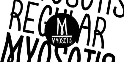 handwriting font
 - OBO Regular by Wilton Foundry,
$29.00 OBO is a modern interpretation of the classical Italian letterforms with the readability of contemporary sans typefaces. OBO is ideally suited for creating identities for branding, posters, book covers, headlines, logotypes, restaurant menus, beer labels.
 - Context Regular by Wilton Foundry,
$19.00 Context Regular is a condensed inline font with a stencil inline glyph - this makes for a smoother visual join of the stems. Context is also mono-case with the most interesting case selected for a pleasing end result. Applications are numerous: Display, Branding, Advertising, Logos, Publications, etc.
 - Mergian Regular by Tebaltipis Studio,
$15.00 Mergian - Modern Ligature Font by Tebaltipisstudio introducing our new "Mergian" Modern Ligature with Elegant Style this is perfect for branding, logos, invitation, masterheads and more. Mergian Features : -Multilanguange -Alternates -PUA Encoded -Ligatures Files Includes : -Mergian Regular.otf -Mergian Regular.ttf -Mergian Slant.otf -Mergian Slantttf If you have any questions, before or after purchase, please feel free to get in touch. Thank you


Page 1 of 250Next page