10,000 search results
(0.021 seconds)
- Brimtown by Authentype,
$12.00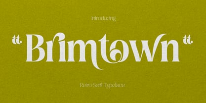 Brimtown - Retro serif font is a beauty font with a full set of uppercase and lowercase letters, multilingual symbols, numbers, punctuation, and ligatures. Brimtown Retro serif font style for poster, magazine, beauty brand design with swash glyph suitable for your beautiful elegant design concept.
 - Mousony by Sakha Design,
$12.00 Mousony is a bold, vintage styled and thick lettered slab serif font. It will elevate a wide range of crafting ideas, from cards, to branding, labels and much more. Add it confidently to your favorite creations and let yourself be amazed by the outcome generated.
 - Newlook by QUADRAAT,
$25.00 Newlook is a display font drawn with geometric shapes and high contrast. The stylistic set 01 shows capital letters using heights from descenders to ascenders and x height which gives a crazy dancing look. Perfect for display, poster, magazine etc… Support all latin languages.
 - Bodoniez by Huy!Fonts,
$19.00 Nice typographic experiment consisting of the progressive "bodonization" I have summarized in two steps, by a letter drawn with the same concentration and intensity with which Paris Hilton reading a book, to get something like the sketches that Mr. Gianbattista used to Wrap the sandwich.
 - Picz JNL by Jeff Levine,
$29.00Picz JNL is a rockin' font made up of guitar picks and is perfect for any projects representing good times. Use it moderately in short phrases or as initial caps, or combine it with Sock Hop JNL for a matching look. Limited character set. - Loo Snoo Roman NF by Nick's Fonts,
$10.00Here's a fresh version of an old favorite, Loose New Roman, from the Schaedler Studio of New York. Easy, breezy and carefree, it's a natural for happy headlines. Both versions of the font contain the complete Unicode Latin 1252 and Central European 1250 character sets. - Retrorocket NF by Nick's Fonts,
$10.00 A French lettering chapbook from the 1920s, entitled "Art du Tracé Rationnel de la Lettre," provided the inspiration for this decidedly Deco exercise in alternative letterforms. Both flavors of this font feature the 1252 Latin, 1250 Central European, 1254 Turkish and 1257 Baltic character sets.
 - Plumage by Wilton Foundry,
$29.00Plumage is somewhat unusual in that it has elements of calligraphy as well as script in a semi-loose form that gives it a pleasing appearance for both large and small sizes, and interesting flare finish strokes add to its unique character. As I read a dictionary description of "plumage", I realized that in many ways there is a parallel between a bird's plumage and how it is utilized in the context of writing: Plumage varies in pattern and arrangement for different purposes; what it expresses can of course be even more interesting. Plumage is disposable after a season, as new ones become available... imagine, a self-sustaining quill! - I guess that's equivalent to a refill or disposable pen. Historically, quill pens were made from feathers of a variety of birds, each chosen for its special characteristics. The sturdiest and most reliable feathers, however, come from turkeys, swans and geese. Feathers used to make pens are the stiff-spined flight feathers on the leading edge of the bird's wing. Pens for right-handed writers come from the left wing, and pens for left-handers, from the right! Each bird yields 10-12 good quills, and sometimes only 2 or 3 - so small a yield that the geese reared in England could not furnish nearly enough for local demand, and quills were imported from the Continent in large quantities. At one point St Petersburg in Russia was sending 27 million quills a year to the UK. It is said that geese were specially bred by US President Thomas Jefferson (1743-1826) to supply his own vast need for quills - in his lifetime he wrote almost 20,000 letters. The name "Plumage" was selected to pay homage to the noble birds that supplied countless quills for centuries of literary works. Plumage is recommended for any formal or informal invitation, decorations, awards, poetry, plaques, etc. We hope you will have the pleasure of using Plumage. - Palamecia by Typodermic,
$11.95 Palamecia is a typeface that embodies the very essence of organic design. It is a testament to the power of the creative process, one that is imbued with the spirit of experimentation and the thirst for innovation. Its unique appearance, at first glance reminiscent of a cartoon typeface, is just the beginning of what sets it apart from the competition. Palamecia was designed with a specific purpose in mind—to withstand the rigors of scaling and blurring on a variety of user interface devices. The creators of Palamecia recognized that the legibility of typefaces can be compromised by the impact of pixel scaling, and they set out to design a typeface that would not only overcome this challenge but also thrive in its wake. What makes Palamecia truly exceptional is its design process. Unlike many other typefaces, Palamecia’s designs were not born from pen strokes, but rather from cut-out silhouettes that were meticulously chiseled and chipped away. This unique approach allowed the designers to create a typeface that is both rugged and refined, with a natural aesthetic that seamlessly blends into any interface. The end result is a typeface that is both durable and versatile. Palamecia’s unique design allows it to pierce through any type of display, regardless of resolution, making it an ideal choice for designers and developers who are looking for a typeface that can deliver the goods under any circumstances. In conclusion, Palamecia is a triumph of organic design, a typeface that is as beautiful as it is functional. Its rugged yet refined aesthetic and its ability to withstand the rigors of scaling and blurring make it a must-have for any designer or developer who values both form and function. So why wait? Try Palamecia today and experience the power of organic design for yourself. Most Latin-based European writing systems are supported, including the following languages. Afaan Oromo, Afar, Afrikaans, Albanian, Alsatian, Aromanian, Aymara, Bashkir (Latin), Basque, Belarusian (Latin), Bemba, Bikol, Bosnian, Breton, Cape Verdean, Creole, Catalan, Cebuano, Chamorro, Chavacano, Chichewa, Crimean Tatar (Latin), Croatian, Czech, Danish, Dawan, Dholuo, Dutch, English, Estonian, Faroese, Fijian, Filipino, Finnish, French, Frisian, Friulian, Gagauz (Latin), Galician, Ganda, Genoese, German, Greenlandic, Guadeloupean Creole, Haitian Creole, Hawaiian, Hiligaynon, Hungarian, Icelandic, Ilocano, Indonesian, Irish, Italian, Jamaican, Kaqchikel, Karakalpak (Latin), Kashubian, Kikongo, Kinyarwanda, Kirundi, Kurdish (Latin), Latvian, Lithuanian, Lombard, Low Saxon, Luxembourgish, Maasai, Makhuwa, Malay, Maltese, Māori, Moldovan, Montenegrin, Ndebele, Neapolitan, Norwegian, Novial, Occitan, Ossetian (Latin), Papiamento, Piedmontese, Polish, Portuguese, Quechua, Rarotongan, Romanian, Romansh, Sami, Sango, Saramaccan, Sardinian, Scottish Gaelic, Serbian (Latin), Shona, Sicilian, Silesian, Slovak, Slovenian, Somali, Sorbian, Sotho, Spanish, Swahili, Swazi, Swedish, Tagalog, Tahitian, Tetum, Tongan, Tshiluba, Tsonga, Tswana, Tumbuka, Turkish, Turkmen (Latin), Tuvaluan, Uzbek (Latin), Venetian, Vepsian, Võro, Walloon, Waray-Waray, Wayuu, Welsh, Wolof, Xhosa, Yapese, Zapotec Zulu and Zuni.
 - Patched by Mans Greback,
$39.00 Patches is a multi-faceted, victorian-era serif typeface for when you need something more than plain text. Get that extra attention while adding a genuine, original appearance to your message. Patches was designed from scratch to give a sense quality and depth. Its designer Mans Greback has created a typeface with a complex structure, yet one that will be easy to master. This work will suit every style, taste and skill level. It is a decorative and completely hand-drawn design in vintage lettering, with the perks and flexibility of present-day technology, which is exactly what you'd expect from a modern typeface. Whether you are making a decorative floral headline, drawing a cowboy logo, or creating a unique design based on this ornamental font, the hopes are that Patches can give you a set of tools and inspiration to bring out the best of your artistry. Standing on the shoulders of giants, it was inspired by a wide range of works, and will hopefully be able to continue to teach and inspire future artists. Or at least help you become a better designer when you're designing an elegant and classic headline. Set the coloring of Patches to light gold and cream tones to apply a luxurious look, or in dark tones for a more rugged impression. Bold, bright colors will make it appear In the mid-1800s, decorative design flourished in the Western major cities. Victorian style thrived and encouraged techniques such as enamelling, embroidery and calligraphy. From the 1880s onwards, there were a series of reactions to higher Victorian tastes, with Art Deco reaching the heights of the 20th century. However, the Victorian art persisted popularity, as it changed to more sophisticated designs which made it more attractive to specific professions and groups. The evolution of the Victorian style in the mid-20th century was a key factor in the succession of the movement. Classic shops and salons, sport designs and traditional festivals, and later Rock'n'Roll and Harley Davidson-themed graphics inspired the continued development of the art. Aspiring to carry on this tradition, this typeface family consists twelve different high-quality variations. The main ones are Patched and Patched In – an outlined variation – and each one provided in five weights: Thin, Light, Medium, Bold and Black. Additionally, the two rough fonts Hangaround and Prospects, that tries to grasp the rough, earthy atmosphere of a shady motorcycle club. The font is built with advanced OpenType functionality and has a guaranteed top-notch quality, containing stylistic and contextual alternates, ligatures and more features; all to give you full control and customizability. It has extensive lingual support, covering all Latin-based languages, from North Europa to South Africa, from America to South-East Asia. It contains all characters and symbols you'll ever need, including all punctuation and numbers.
 - Burgues Script by Sudtipos,
$99.00 Burgues Script is an ode to the late 19th century American calligrapher Louis Madarasz, whose legendary pen has inspired schools of penmanship for over 100 years. His talent has caused some people to call him “the most skillful penman the world has ever known.” I use the word ‘ode’ in a colloquially ambitious manner. If I was an actual poet, my words would be about things I desire but cannot attain, objects of utter beauty that make me wallow in humility, or people of enormous talent who look down at me from the clouds of genius. But I don’t write poems. My work consists of letters drawn to fit together, that become an element of someone’s visual poetry. I am the poet’s assistant, so to speak. Once in a while, the assistant persists on what the subject of the poem will be. And occasionally, the poet gives in to the persistence. I hope you, visual poet, find my persistence justified in this case. The two main sources for Burgues were the calligraphy examples shown in Zaner Bloser’s The Secret of the Skill of Madarasz: His Philosophy and Penmanship Masterpieces, and C. W. Jones’s Lessons in Advanced Engraver’s Script Penmanship by L. Madarasz. These two references were the cornerstone for the concept I was trying to work with. I did have to change many of the letters in order to be able to produce digital calligraphy that can flow flexibly and offered the user a variety of options, while maintaining its attractive appearance. To this end, many ligatures and swashes were made, as well as full flourished sets of letters for use at the beginnings or endings of words and sentences. All of this has been tied together with OpenType and tested thoroughly within today’s standard design and desktop publishing software. After working with digital scripts for so long, at one point I thought that Burgues Script would become a bit of a chore to complete. I also thought that, like with most other scripts, the process would regularize itself after a while and be reduced to a mechanical habit. Surprisingly, and fortunately for me, this did not happen. The past holds as many surprises as the future. Madarasz’s method of penmanship was fascinating and challenging to translate into the strict, mathematically oriented language of the computer. It seems that the extremely high contrast of the forms, coupled with the required flow and connectivity of such lettering, will always be hard work for any visual artist to produce, even with the aide of a powerful machine. I can only imagine what steady nerves and discipline Madarasz must have had to be able to produce fully flourished and sublimely connected words and sentences on a whim. When I think of Madarasz producing a flourished calligraphic logotype in a few seconds, and try to reconcile that with the timelines of my or my colleagues’ work in identity and packaging design, the mind reels. Such blinding talent from over a hundred years ago. Burgues is the Spanish word for Bourgeois. In the end, I hope Burgues Script will serve you well when a flourished word or sentence is required for a design project. One of the wonders of the computer age is the ability to visually conjure up the past, serving both the present and the future. With Burgues, you have a piece of “the most skillful penman the world has ever known,” at your service. Burgues received important awards such as a Certificate of Excellence TDC2 2008 and a Certificate of Excellence at the Bienal Tipos Latinos 2008.
 - gAbAcHiTA FFP - Personal use only

- Play Day - Personal Use - Personal use only

- Sukothai by Linotype,
$155.99Sukothai is a traditional Thai design based on early metal type. The classic and distinct forms make it excellent for setting text at small sizes or in large passages. Originally released by Linotype for digital photocomposition, now both the Light and Bold weights are available in OpenType format. This makes it possible to dynamically and precisely position the various levels of superscript and subscript vowel signs and tonal marks. In addition to this, the complete Unicode page range for Thai is covered to ensure flawless conversion between other OpenType fonts using Unicode. The accompanying Latin design matches well in scale and texture and supports most Western European languages making it ideal for setting bilingual texts. - Andron 2 ABC by SIAS,
$44.90 Andron 2 ABC is a product developed especially for children’s literature. It is an ideal choice for primers and other books for the age when children are learning to read. The typeface has the same peak typographic quality as any other font of the praised Andron series—the very best is just good enough for our kids, is it not? As a difference from the normal glyph set (as in Andron 1 Latin or Andron Mega), the letters a, g and y have those simpler single-story shapes that resemble the forms usually taught in writing, which are sometimes called infant letterforms. Now, Andron 2 ABC is available in a full four-font family set.
 - Lovely Buttering Script by Lucky Type,
$14.00 Allow me to introduce the Lovely Buttering script, which combines elements of informal, romantic, sweet, beautiful design, and hand-drawn typography design elements. Lovely Buttering script has 1000+ glyphs and 500+ alternative characters, including various language support. You can use this font for your work very easily because there are many features in it. Contains a complete set of upper and lower case letters, punctuation, numbers, and multilingual support. This font also includes several ligatures, alternative stylistic sets for those of you who have software that can work OpenType (Corel Draw / Photoshop / Illustrator / InDesign). Need help? If you need help or advice, please contact me through e-mail. Thank you for your purchase!
 - Garrigos by Underground,
$- Set of ornaments based on the decorative motifs used by the first typographic workshop in Buenos Aires: “Imprenta de Niños Expósitos”, between 1780 and 1824. This set is the product of an extensive historical research that aims to identify the type that came from Europe to the City during colonial times, and during the first years of Argentina’s independence. This group has a lot of diversity, which fluctuates between organic baroque forms and geometric neoclassical. Its characters can be used in editorial design along with Roman typefaces, they work individually or grouped to form different figures, guards or frames. It was baptized in honor to the first printer who worked in the workshop: the Spanish Agustín Garrigós.
 - Proba Pro by Mint Type,
$- Proba Pro is a geometric sans with lowered x-height, prominent ascenders and descenders and a subtle humanist touch. It comes in 7 weights + matching italics each supporting numerous Latin-based languages as well as major Cyrillic languages. It is packed with OpenType features like ligatures, small caps, 4 sets of digits, 2 stylistic sets, superiors and inferiors, fractions, ordinals, and respective punctuation varieties including all-cap punctuation. There are also language-specific alternates for Romanian Ș/ș, Catalan punt volat, and correct small-cap versions for i/ı in Turk languages. Some of the styles of Proba Pro can be found in Mint Type Editorial Bundle together with other fonts which make some great pairs. Check it out!
 - Applbitz by Joey Maul,
$10.00 Applbitz is a set of three pixel style fonts which include a matching set of food related pix fonts. The regular style is a text font, which is optimal at 14 points when used in flash. Applbitz Pix Base and Pix Top are corresponding food related glyphs, with the top providing a bit of detail. These "friendly" pix characters can also be used in flash using some TLC (and snap to pixel grid). They are fun to add your own color combinations, and are great for a variety of food icons. View the PDF file in the gallery for color suggestions. Special note: to dress the hamburger use "{" and "½" (left brace and one-half) from Pix Top.
 - Cooper Goodtime by Breauhare,
$35.00 Cooper Goodtime is a font based on the lettering used on the CBS-TV variety series The Glen Campbell Goodtime Hour (1969-1972). The name pays tribute to its two origins, the other being Cooper Black. It was never an actual complete font set on the TV show, only a limited number of handmade letters, all upper case. It has lain dormant since the show went off the air in 1972. With this incarnation, a set of lower case letters has been created to complement the upper case letters. These lower case letters never existed before now. Cooper Goodtime is a funky, nostalgic, cool way to create a display, and it works surprisingly well in text sizes, too.
 - Ultra Condensed by Outside the Line,
$19.00 Ultra Condensed is a three-font family with a full character set. Ultra Condensed is a remastering of Tall Skinny Condensed from 1999 which continues to be a favorite. While similar, the fonts are not interchangeable. Shapes of some letters have changed, kerning and spacing are different. Tall Skinny Condensed does not have a full character set. Ultra Condensed Lettered is a hand lettered version of the hard edged Ultra Condensed. Ultra Condensed Line also hand lettered, is a thinner version of Ultra Condensed Lettered. These three fonts work well together or with a non condensed font, great for headlines at a large size. Works well for lots of copy in a small space.
 - YLab Variable by Par Défaut,
$40.00 yLab is geometric typeface compose of 10 fonts (5 weights and oblique declination) Perfect for titles and text, yLab supports many languages (Latin pro..). 11 OpenType Features (Alternative; Fraction; Numerator; Denominator; Superior; Inferior; Tabular figure; Ordinals; Discretionary Ligature; Stylistic Set; Case Sensitive Forms). • Ordinal feature includes the Latin alphabet (Uppercase & Lowercase). • Five Stylistic set for “a”, “g”, "i" and "l", includes accents. • Discretionary Ligature includes “AE”, “IJ”, “OE”, available in lowercase. • Contextual Alternate includes ligatures for arrows : <- -> ^| v| <-> v^| Add parentheses around period, numbers or arrows, add n or d for numerator, denominator. Add n, d or +, for numerator, denominator or case arrows. All Case sensitive characters become after the uppercase and number.
 - Campinas by Jehoo Creative,
$18.00 Has a serif foundation shape with minimal contrast. Campinas is designed to carry an expressive and engaging character making this font very suitable for casual and fun themed designs. With a complete set of discretionary ligatures and a complete set of alternates on the uppercase further confirms that Campinas is indeed made to attract people's attention, equipped with various weights ranging from regular to bold and decorative black. This font is very well used for design needs including Posters, Logos, Branding, Magazines, Album Covers, Web UI, Clothing, Social Media Posts, and various other applied designs. Campinas has supported multilingual support for most of Europe, each containing more than 700 glyphs in it.
 - Albertus Nova by Monotype,
$50.99 Albertus® Nova is a faithful digital revival of Berthold Wolpe’s earlier design of Albertus and is one of the five designs in The Wolpe Collection of typefaces. This new design enlarges the typeface set from its previous two weights into a robust set of five ranging from thin to black, all with extended language support including Cyrillic and Greek. Berthold Wolpe began working on Albertus in 1932, at the encouragement of Stanley Morison. Morison saw an example of Wolpe’s engraved lettering and liked it so much that he commissioned a typeface based on the design. Since then, the original Albertus typeface has been used on book covers, in branding, on signs and in video games.
 - Anago by Positype,
$16.00 Anago shares the same DNA as its sibling Macha, but is a completely different species than the former or any of my other sans serifs (Aaux Next, Air, Akagi Pro or Wasabi). Soft, ample letterforms are casually constructed and the end result produces a typeface that changes color as it varies in size — allowing the type family to work well in both text and display settings as long as attention is given to size. Anago takes a little but gives a lot. The 10-style typeface features a fully-loaded character set that includes: Small Caps, Proportional Lining and Oldstyle Numerals, Tabular Lining and Oldstyle Numerals, Fractions, Ordinals, Inferiors, Superiors, Stylistic Alternates, Ligatures, Case-sensitive, and more.
 - Regional by Sudtipos,
$39.00 Sudtipos is really proud to announce the release of Regional, a solid workhorse type family of 27 styles inspired by the Old Style Bold models from the late XIX century by different type foundries. The unique diagonal in the "R" has been the key that inspired us to create many of the several alternates included in the set. From a delicate and expressive thin condensed to an exaggerated expanded black, Regional merges the past with the present, making it useful for a wide range of designs. We have imagined Regional to be used in magazines, packaging labels and posters. The addition of a complementary one-file variable format is included when you license the complete set.
 - Swirly Display by Tebaltipis Studio,
$12.00 Swirly feels playfully nostalgic and delivers an incredible vintage retro aesthetic. Use this display font to add that special retro touch to any design idea you can think of!. Masterfully designed to become a true favorite, this font has the potential to bring each of your creative ideas to the highest level! WHAT'S YOU GET ? Unique Letterforms Works on PC & Mac Simple Installations Accessible in the Adobe Illustrator, Adobe Photoshop, Microsoft Word Fully accessible without additional design software. I really hope you'll get pleasure using Groovy Orange and it will be perfect addition to your font collection! Contact me with an inbox message If you have any question. Thank you! Happy Creating.
 - Biotic by TypeUnion,
$25.00 Biotic is a dual-personality 18 style typeface which features two distinct design approaches that can be initiated with the flick of a switch. The natural design approach uses conventional forms for a geometric sans but when you switch to the engineered approach some key glyphs become squared to create an edgy approach in an instant. The characters that change are f, i, j, k, l, t and y, along with all punctuation and accents which switch to the square approach. Biotic covers extended latin and basic Cyrillic languages and includes many opentype features such as stylistic sets & alternates, two sets of arrows, circled & old-style numbers, along with case sensitive punctuation and much more.
 - Bellflower by Celebrity Fontz,
$24.99 Bellflower is a collection of highly ornamented letters contoured with flourishes and tiny bellflowers. Romantic and classic, this stylized collection looks like something straight out of a fairy tale typography garden and comes with a full set of extended accented characters. Accented characters are also included. This digital format allows colorizing of type and is a perfect font for publications that want to capture the feel of the Victorian and Art Deco eras. Article abstract: Bellflower is a collection of highly ornamented letters contoured with flourishes and tiny bellflowers. Romantic and classic, this stylized collection looks like something straight out of a fairy tale typography garden and comes with a full set of extended accented characters.
 - Marsh Scroll by ArtyType,
$29.00 The concept for ‘Scroll’ came to me fully formed when setting out to design a bold display typeface. The premise for this was to base the letter-forms on a rolled strip of paper. A simple enough idea in principle but one I hadn't seen before. After working out the basic characters I set about completing the full effect I was after. This was achieved by applying a suitably incised line following the curve at each turning point to convey the important three-dimensional aspects of a scroll. Although the phonetic name personifying the font was there as a working title from the outset, I didn't commit to it fully until everything was completely resolved.
 - Butter Pineapple by EKNOJI,
$15.00 Butter Pineapple a display font. This font will looks awesome and amazing in many way to your latest project. Butter Pineapple is perfect for many different project such as logos & branding, invitation, stationery, wedding designs, social media posts, advertisements, product packaging, product designs, label, photography, watermark, special events or anything. What's Included : - Character set A-Z - Character set a-z - Bonus vector EPS format - Support multi-language glyphs - Works on PC & Mac - Simple installations - Accessible in the Adobe Illustrator, Adobe Photoshop, Adobe InDesign, even work on Microsoft Word. Thanks for looking, and I hope you enjoy it! Please don't hesitate to drop me a message if you have any issues or queries. EKNOJI
 - Nightales by Trim Studio,
$15.00 Introducing Nightales a simple, bold and light font style perfect for kids' books! With a playful and rounded design, this font is both whimsical and fun, making it perfect for capturing the imagination of young readers. The brush pressure adds a touch of creativity and charm, while still being easy to read and understand. The bold and light variations provide versatility for different design elements, and the rounded edges make it safe and friendly for kids. Let Nightales bring joy and excitement to your next kids' book project! even so contains All Standard glyphs and punctuations Thank you for let us be your design partner, If you have any questions please don't hesitate to drop me a message
 - Shojumaru Pro by Stiggy & Sands,
$29.00 Shojumaru draws inspiration from a movie poster for a 1957 film titled Sayonara, starring Marlon Brando. It breaks the formula of a chop suey style by mixing chop suey and traditional letterforms to create a powerful and unique letterforms all its own. The "Split" style adds further dynamics to the visual language. An already SmallCaps style font, it includes additional SmallCaps features when SmallCaps is enabled in applications for a wider range of use. Opentype features include: - SmallCaps (standard) - Full set of Inferiors and Superiors for limitless fractions - Standard & SmallCaps figure sets - A Smallcaps feature (Stylistic Alternates) that converts all characters to a small caps format, including punctuation, numerals, and other figures.
 - Caslon Bold by ParaType,
$30.00 The Bitstream version of Caslon Bold of the American Type Founders, 1905. Based on William Caslon I’s first English Old Style typefaces of 1725. Caslon modeled his designs based on late 17th century Dutch types, but his artistic skills enabled him to improve those models, bringing a variety of forms and subtlety of details. Strokes in Caslon fonts are somewhat heavier than in earlier Old Style fonts, serifs are thicker and a bit stubby. Italic letters have uneven slope. A text set in Caslon looks legible and aesthetically appealing. Caslon is a favorite font of English printers for setting of classical literature. Cyrillic version was developed for ParaType in 2002 by Isay Slutsker and Manvel Shmavonyan.
 - Diplomatic by Ivan Rosenberg,
$16.00 Diplomatic Font is formal script font with multilingual support. Is ideal for wedding invitations, magazines, social media, restaurant menus, greeting cards, birthday invitations, headers and many more. This brush font comes with a complete set of lowercase and uppercase characters, a large range of punctuation ligatures, numerals and and multilingual support. Download folder includes Diplomatic Font is a set of 636 glyphs, Upper and Lowercase characters with ligatures, numerals, lot of punctuation glyphs and up to 14 alternates for each character. 8-14 alternates for lowercase characters and 1-3 alternates for uppercase characters. For access to Stylistic Alternates and Ligatures is required software with glyphs panel like Photoshop, llustrator, Inkscape etc.
 - Alana by Laura Worthington,
$49.00 Alana is a connected script that glows with casual elegance. Its inviting letterforms work well in settings such as letter-writing and menu details; even at small sizes. Set at display sizes, Alana’s strokes reveal rough edges evocative of ink on textured paper. Alana includes over 300 alternates, including swash capitals and ornamented forms to customize titles, headlines, packaging, and wordmarks. Alana includes 62 matching ornaments: botanical fleurons, birds, and cute lil’ bugs. See what’s included! http://bit.ly/2bXTLvP *NOTE* Basic versions DO NOT include swashes, alternates or ornaments These fonts have been specially coded for access of all the swashes, alternates and ornaments without the need for professional design software! Info and instructions here: http://lauraworthingtontype.com/faqs/
 - Dvarlin Staves by Sins,
$37.48 Dvarlin Staves is a collection of 512 rune glyph's divided into six font family's. The three main font's are Root, Caber and Bole, while Remnant, Branch and Blossom are taller versions of the main set. They all come in four weights: Light, Regular, Semibold and Bold. As well as a Italic and a Slant style for the purpose of adjusting letters on a curved line. It also features codex:437 glyph set and an extended array of letters and corner alternatives, including the default runic glyph's. The collection stands at 72 styles that contains a total of 36 864 glyph's. For extra supporters consider gifting some Staves away to a crafty friend.
 - Great Copper by Pixesia Studio,
$19.00 Introducing Great Copper - An Old Handcraft Display Font With a perfect combination of its unique yet classic shapes, Great Copper greatly portrays the familiar feeling that you are looking for. This typeface suits the nostalgic feeling you want to evoke through words. It comes as if Great Copper is written personally as letters to deliver good news. As splendid it curves in delivering the sweet vibe, Great Copper comes also with its firm shape to emphasize how valuable the messages and stories that it brings. Enchanting yet emphatic, Great Copper typeface will be perfect to depict the great story about the past you'd be delighted to tell and share. Hope you Like it. Thanks.
 - Dave Gibbons Lower by Comicraft,
$49.00 Other guys may imitate him, but the original is still the greatest! Get in with the In Crowd and check out the font created by Mister Fontastic for Dave Gibbons Original Graphic Novel, The, ah, The Originals. Yes, Dave Gibbons now comes in lower case, it's not just what he does when he gets back from the off license. Be sure and pick up The Originals from Amazon -- now available in paperback, and probably still available as a hard case, much like Dave. After the crack about the case of beer above, I'm guessing you'll find me with a broken spine in the remainder pile. See the family related to Dave Gibbons Lower: Dave Gibbons Journal & Dave Gibbons .
 - Train Of Thought by Pesic,
$29.00 Train of thought is a decorative font based on vintage and retro posters of the 19th and 20th centuries. Contains all Latin and Cyrillic glyphs. It is very modern, and it is intended for the use of creating logos and T-shirt designs as well as highlighting the essential elements on billboards, magazines, etc. Today's digital designers can use these stencil patterns to embellish text set in other alphabet stencils or by themselves to evoke the feeling of rustic Americana. Train of the thought is extremely detailed, and looks good in both small and large dimensions. It also contains a set of symbols, which you can use to further emphasize the essential elements.

