10,000 search results
(0.108 seconds)
- Short Films by Dharma Type,
$19.99 Short Films is an all-new-styled family, which kind of looks like Art Deco Style. Wide opened counters and softly rounded bowls create a new feeling – Retro but futuristic, geometric but humanistic. Exquisite contrast between thin and bold parts of glyphs make mixed feeling – Pop and feminine, formal and casual, strong and soft. The most distinctive feature is a coexistence of decorativeness and Readability. This coexistence expands the range of font usage. You can use this font for not only titling but also body-text. Short Films consists of 6 weights and their matching Italics for a wide range of usages. Further, Short Films supports international Latin languages and basic Cyrillic languages including Basic Latin, Western Europe, Central and South-Eastern Europe. Also, Short Films covers Mac Roman, Windows1252, Adobe1 to 3. This wide range of international characters expands the capability of your works.
 - Galena Pro by Typorium,
$45.00 Galena Pro is an extended version of Galena, a typeface published for Bayer Corporation in 1996. Galena Pro is based on the open and organic forms imagined by the writers of humanist Italy, who designed the first so-called Roman characters. Humanist style fonts have moderate stroke contrast, uneven widths, and a classic, but soft and easy-to-read appearance. Galena Pro gives a new birth to the 15th century incunabula, a typographic drawing where the gestures of this standardized handwriting are not mechanical, but more fluid. The Galena Pro series can provide professional typography with OpenType features such as alternative sets of numbers, fractions and an extended character set to support Central and Eastern European as well as Western European Languages. The different styles of the Galena Pro are enriched with a condensed variant to meet the need for space savings in titles and texts.
 - Rialto Script by Zuzanna Rogatty,
$39.00 Rialto Script is inspired by old polish neon signs and their very imaginative and expressive lettering. Neon signs were designed by great Polish artists and architects during communistic times in Poland. A large number of alternates and swashes make every word unique, just like the neon signs were in this period. The typeface is designed to evolve as your type. It contains contextual alternates, basic and discretionary ligatures, initials and swashes. There are swashes for capitals, beginning and ending swashes in lowercase, plus dash swashes in lowercase. Lower and upper case contain a set of block letters which you can find by turning on Small Caps. Rialto Script is a monolinear display swashed script and came from dynamic and rhythmical handwriting. All of the glyphs sit slightly above the baseline with a slanted axis. Rialto is perfect for titles, logos, signs and of course, neon signs.
 - Sakrale by Invasi Studio,
$19.00 Sakrale is a modern take on the traditional black letter font. Its unique glyph shape adds a touch of rigidity to its contemporary look, making it a perfect choice for your project who want to add a touch of sophistication to their work. The Sakrale font is designed to be user-friendly, with easy-to-read characters that are perfect for headlines, logos, and branding. This font is ideal for those who want to create a modern, edgy design that stands out. Whether you're a professional designer or just starting out, Sakrale is the perfect font. Sakrale is the perfect font for any design project that requires a touch of elegance and class. Whether you're creating a logo, title, or poster, this font is guaranteed to make your work stand out from the rest. With its clean lines and modern feel, Sakrale is sure to impress.
 - Halogen Flare by Positype,
$29.00 When I released Halogen, I asked ‘Who doesn't want or need an expansive contemporary extended sans that has a sense of style and swagger… what if it had a lowercase, small caps and various numeral options… how could you say no?’ Go, click on the Halogen link and read on, if you're interested. Halogen was well-received, so I decided to take it further with Halogen Flare (the name kinda tips you off as to what kind of typeface it is, don't ya think?). As always, I prefer not to take short cuts and provide an anemic offering of glyphs — a modern typeface offered today must provide more than just the basics and this one does — lowercase, smallcaps, old style numerals, tabular forms, stylistic and titling alternates, fractions, case-sensitive features, and even an alternate uppercase ordinal set is included. Now, go make cool print and digital things with it.
 - Charm Man by Putracetol,
$18.00 Charm Man - Retro Serif Font. Charm Man is a bold retro style serif font with strong character and soft features. Charm Man is a stylish font that is both bold and retro font. Charm Man is equipped with Swash, Stylistic and Titling alternates as well as with Standard and Discretionary Ligatures. Charm Man's thick curves give a 70s groovy vibe with the serif bringing it slightly back to traditional. Comes with alternatives and ligatures, helps to create stunning logos, quotes, posts, blog posts. branding projects, magazine imagery, wedding invitations, and much more. The alternative characters were divided into several Open Type features such as Swash, Stylistic Sets, Stylistic Alternates, Contextual Alternates, and Ligature. The Open Type features can be accessed by using Open Type savvy programs such as Adobe Illustrator, Adobe InDesign, Adobe Photoshop Corel Draw X version, And Microsoft Word. This font is also support multi language.
 - Metalista by Suitcase Type Foundry,
$39.00 The Metalista font was created as a sign of undying admiration for the persistence of heavy metal culture. The angled font of almost fixed width proportions combines capitals with small letters for more variety and better definition of individual letters. Stressing the horizontal strokes subdued the historical Gothic character and emphasized a more modern signature, which is far different from the majority of current attempts at a modern adaptation of Fraktur fonts. We offer Metalista in three styles, or rather widths to be exact: Speed is inspired by the whiplash pace of 70s and 80s speed metal, and can tell and perform a lot even in a very small space; uncompromising Death balances on the fine line between expression and readability; and Metalista Black is the universal go-to, whether as megalomaniacal titles sprawled across the entire LP cover or as tiny texts for glam rock CD booklets.
 - Chemre by Dora Typefoundry,
$16.00 Chemre is a serif font filled with a modern and classy atmosphere. This font is complementedwith a mix of all caps. which is the same height and allows for unlimited combinations to give a unique style to your typography. The high contrast between thick and thin strokes gives Chemre a luxurious look. This font comes in two styles, Regular and Italic Version. Chemre is suitable for posters, packaging, branding, logotypes, headlines, titles and editorial designs. Features: 48 Ligatures - Standard Multi-Language Support Alternative Characters A, C, S, T, V, W, Y Unicode PUA Encoded This type of family has become a work of true love, making it as easy and enjoyable as possible. I really hope you enjoy it! I can't wait to see what you do with CHEMRE! Feel free to use the #Dora Typefoundry tag and the # Logo CHEMRE font to show what you've been up to!
 - Beardman by Jafar07,
$10.00 Beardman is a condensed sans-serif font designed specifically for bold and powerful headlines and titles. With four variants available: regular, italic, regular outline, and italic outline, this font allows you to express yourself with a style that suits your design project. The name "Beardman" is inspired by the meaning of a man who is masculine but has a soft heart, and it is reflected in the font's design. With strong and sturdy letterforms, the font also has a gentle and smooth touch that gives an elegant and modern impression. With its strong and expressive appearance, "Beardman" is suitable for use in graphic design projects such as posters, brochures, magazines, websites, and much more. Add a touch of masculine yet gentle to your design with the "Beardman" font. What did you get? Regular, Italic, Regular Outline & Italic Outline Alternates & Ligatures Numbers & Punctuation Multilingual Support Works on PC & Mac Simple Installations
 - Expressway Free - 100% free

- Aromo by TipoType,
$19.00 Aromo was initially conceived for editorial purposes. This typeface mixes the versatility of a simple and modern sans-serif, with the sensibility of the humanist feeling: thus making it useful in a wide range of purposes when a balanced and friendly font, with elegant proportions and high readability is required. The functional nature of its design is complemented by a family of 14 variants (7 weights, plus their matching true italics) interpolated optically for application as a hierarchical resource, where the middle weights (Light, Regular) have been optimized for use in small bodies, while the extremes (Ultra Light, Black) where designed for display environments._ Aromo also offers a wide range of historical and discretionary ligatures, small caps, eleven different types of numerals and a set of more than 700 characters covering about two hundred languages of Latin script._
 - Tilden Sans by Delve Fonts,
$29.00 Thoroughly contemporary, clean, and ready for work, Tilden Sans was designed by Delve Withrington to be no-nonsense but still stylish and friendly. Tilden Sans is square-ish with low contrast and a generous x-height. Curvilinear strokes like those in the capitals C or S, and many lowercase letters feature incised terminals offering a measure of distinction from other sans serifs, without sacrificing legibility. All of those features work in unison to make this typeface a pleasure to use and read. The Tilden Sans family has seven useful weights ranging from Light to Black and features a glyph repertoire of over 900 glyphs with language support for 225 languages. This versatile typeface performs brilliantly in a host of sizes. The Regular and Medium weights can be used at text sizes, while the Light and Black weights are great for display size settings.
 - Somatype by ArtyType,
$29.00 As with any attempt at a new typeface, you want to create something different. A difficult task as most legible fonts are based on something previous. Somatype isn't actually based on any particular font but it has unavoidable similarities to others. The important difference here being the distinctive quirk of the connection points going opposite to the norm; exemplified best by the lower case d & e. Once devised, the unique characteristic was applied wherever possible, keeping the rest of the characters in a sympathetic, rounded style. I first designed this in the light weight version, seeing it working best as a large open display font for magazines etc. but realized it would be too light for body copy at small scale, so, medium and bold weights were created to resolve that issue. Incidentally, the word ‘somatype’ literally means body-type.
 - Neonstar by Mokatype Studio,
$24.00 Introducing the Neon Sci-fi Futuristic Font called Neonstat a unique font with a futuristic style that can make your futuristic logotype more interesting. Inspired by real-world neon light signs, this font is perfect for adding your own glowing light effects or can be used to actually design real-world neon signs. Neonstar font is suitable for your design and allows you to create beautiful designs, headlines, posters, logos, badges, and much more. It is also best used for posts, logos, posters, labels, and more. Works on PC & Mac, simple installations, accessible in Adobe Illustrator, Adobe Photoshop, Adobe InDesign, and even works on Microsoft Word. PUA Encoded Characters - Fully accessible without additional design software. Fonts include multilingual support Image used: All photographs/pictures/vectors used in the preview are not included, they are intended for illustration only. Thank You
 - Why Square by Linotype,
$29.99The different fonts in the Why Square family are an extension of the designs begun in Zoran Kostic's Just Square family. Why Square's lowercase letters are all more condensed versions of Just Square's letters, and in some of the fonts, the uppercase letters are wider. The first five fonts are the different weights of Why Square (UltraThin, UltraLight, Thin, Light, and Regular). Here, all of the characters--both upper and lowercase--are more condensed versions of the geometric letters from the Just Square family. The next five fonts (UltraThin, UltraLight, Thin, Light, and Regular weights) include identical lowercase letters to those from the first five fonts in the family, but their capitals are considerably wider. These may be used as initials, either with the other fonts in the Why Square family, or with the Just Square family. - Supra Demiserif by Wiescher Design,
$29.00 »Supra Demiserif« is the demi serif addition to the Supra family. I am no fan of slab serif fonts, so I designed this one with half serifs, that makes the serifs less important. Then I found, that the italic does not look nice with slab serifs, so I did only one italic cut for the normal weight. The light and normal weights and the dominant x-height with its high ascenders make for easy reading of long copy. The heavy and x-light weights are great for elegant headlines. Supra is an OpenType family for professional typography with an extended character set of over 700 glyphs. It supports more than 40 Central- and Eastern-European as well as many Western languages. Ligatures, different figures, fractions, currency symbols and smallcaps can be found in all cuts. with each other.
 - Aromo by Underground,
$19.00 Aromo was initially conceived for editorial purposes. This typeface mixes the versatility of a simple and modern sans-serif, with the sensibility of the humanist feeling: thus making it useful in a wide range of purposes when a balanced and friendly font, with elegant proportions and high readability is required. The functional nature of its design is complemented by a family of 14 variants (7 weights, plus their matching true italics) interpolated optically for application as a hierarchical resource, where the middle weights (Light, Regular) have been optimized for use in small bodies, while the extremes (Ultra Light, Black) where designed for display environments. Aromo also offers a wide range of historical and discretionary ligatures, small caps, eleven different types of numerals and a set of more than 700 characters covering about two hundred languages of Latin script.
 - Stevia by Andinistas,
$47.00 Stevia is a font family designed by Carlos Fabian Camargo Guerrero. Stevia is a sweet font family created to design logos, cards, posters, book covers, blogs, packaging, walls, etc. Stevia is useful to differentiate your designs and stimulate your imagination through 5 fonts drawn with an apparent handmade lettering look. Stevia dingbats has more than 250 special monolineal icons to accompany Stevia Script Black (600 glyphs), Stevia Script Light (470 glyphs), Stevia Subtitles Bold (300 glyphs) and Stevia Subtitles Light (300 glyphs) in quotes, legends and short writings. That’s why you'll get a lot of alternative letters in uppercase, lowercase and opentype numbers as well as ligatures and flourishes ideal for beginning, middle and end of word. In summary Stevia is great for communicating naturalness and freshness in designs that need to be outside conventional typographic norms.
 - Arabella by profonts,
$51.99 Ralph M. Unger, (Arno Drescher), 2006, (1936) Originally, Arabella Pro was designed by Arnold Drescher around 1936/1939. Drescher created this wonderful script for former Germany type foundry Joh. Wagner. The typeface has been redesigned, digitized, completed and expanded as OpenType Pro in the profonts studio.Arabella Pro comes in two versions, light and medium, each with a large selection of manually designed ligatures and alternates, i.e. swashed upper case to make this naturally flowing script design a perfect font for OTF-savvy applications like e.g. InDesign or Quark Xpress 7.Arabella Pro light and medium are perfect partners for any sans serif, especially for Futura. It is perfectly suited for anything in the area of headlines, posters, invitations etc. However, since it is very well legible, it can also be used individually for small text blocks.
 - Wiesbaden Swing by Linotype,
$29.99 German designer Rosemarie Kloos-Rau created Wiesbaden Swing in 1992 for Linotype. This light, informal typeface is based on her own handwriting, and the strokes have a feeling of spontaneity and energetic flair. Characters like the D, O, W, g, n and y really do swing with unbridled confidence and joy. Kloos-Rau says about her typeface: “From the experience with my design company I recognized the need for fonts with personality. Wiesbaden Swing is my contemporary contribution to the field of calligraphy, a headline font which offers a fresh and unconventional approach to typography.” This family has both regular and bold weights, and a set of Dingbats. The Dingbats are light-hearted and zippy symbols for holidays, children’s products, menus, and more. Wiesbaden Swing will add zest to packaging, catalogs, menus, websites, greeting cards, and magazine layouts.
 - Obla by LetterPalette,
$20.00 The Obla font family is a modern serif typeface accompanied by appropriate italic in seven weights. Sketches of letters were drawn manually, using thick marker for creating shape and pencil for finishing details. Calligraphic origin of shapes is revealed beneath strained curves drawn on computer. All of the weights were carefully adjusted to each other. Obla is equipped with some basic OpenType features and supports Cyrillic and Latin script. Using Obla in small sizes is very convenient, because of its large x-height, and Obla is a very readable typeface. It seduces the reader with its vivacious character. The typeface is also suitable for usage in large sizes. The best choice for headlines is using the heaviest (Black) and the lightest (Thin) weight. There are two smaller family packages in offer: Obla Basic Set contains Regular, Italic, Bold and Bold Italic, while Obla Light Set contains Light, Light Italic, SemiBold and SemiBold Italic. These two sets are the most appropriate for working with small text. Other weights can be bought separately, or within the whole family. Obla is an awarded typeface. It got Special Mention in Cyrillic Typefaces category in Granshan 2016 competition and it was chosen as a Merit Winner in Print’s Typography and Lettering Awards competition. At that time, before publishing, the typeface was named Petra.
 - Cyan by Wilton Foundry,
$29.00The design of Cyan was inspired by features found in classic Roman and styles like Trajan and Bodebeck. It shows the designer's personal preference for geometric Roman proportions while incorporating open centers (B,P,R) and compact serifs. Unlike Trajan, Cyan has lowercase characters in the regular version. The characters stay true to the same features as the capitals, resulting in an unusually distinctive style. The Regular Capitals version contains Roman numerals. Cyan's weight is similar to Trajan's but the horizontal strokes are slightly bolder resulting in better legibility for small sizes, especially for lowercase characters. There are many subtle details in Cyan that become more interesting in larger sizes, for instance the subtle curves in the serifs and the overall smoothness as a result of the mostly rounded angles. Cyan is a robust font that will exceed expectations in areas never explored before. The name is inspired by the Greek word cyan, meaning "blue". The color cyan can have many different variations. One definition is a color made by mixing equal amounts of green and blue light (it also is a pure spectral color). As such, cyan is the complement of red: cyan pigments absorb red light. Cyan is sometimes called blue-green or turquoise and often goes undistinguished from light blue. Obviously the Cyan family is a perfect companion to the Cyan Sans family. - Net Hunt by Putracetol,
$28.00 NetHunt - Spider Display Sans Font Introducing NetHunt, a spider display sans font that is perfect for any design that requires a horror or scary look. The font is inspired by an old embossed nameplate with cobwebs in it, and the designer made it into a display font. NetHunt features both uppercase and lowercase versions, with the lowercase version not having the cobweb design. The font also includes a sans ligature feature that makes the cobwebs of each word even cooler. If you are looking for a font that will give your designs a spooky and eerie vibe, NetHunt is the perfect choice. Use it for logos, titles, logotypes, covers, headlines, apparel, comics, cover books, cards, posters, or anything else that requires a horror or scary look. NetHunt comes with a variety of features that make it a versatile font. The font includes uppercase and lowercase letters, opentype alternates and ligatures, and multilingual support for a wide range of languages. The font also includes number, punctuation, and symbol glyphs. The font can be used on both Windows and Mac operating systems and is compatible with most design software, including Adobe Photoshop, Illustrator, InDesign, and more. If you want to add a spooky and horror touch to your designs, NetHunt is the font for you. It is perfect for Halloween designs, horror movie posters, or any design project that requires a unique and scary font. Use it for your next project and see the difference it makes! In summary, NetHunt is a spider display sans font that is perfect for horror and scary designs. It is inspired by an old embossed nameplate with cobwebs and features both uppercase and lowercase versions. The font includes opentype alternates and ligatures, multilingual support, and number, punctuation, and symbol glyphs. Use NetHunt for your next design project and add a spooky and eerie vibe to your designs. Tags: spider, display, sans, horror, scary, Halloween, movie poster, logo, title, logotype, cover, headline, apparel, comic, books, cards, posters, opentype, ligatures, multilingual, glyphs.
 - Sweet Kulfi by Putracetol,
$28.00 Sweet Kulfi - Quirky Display Font Introducing "Sweet Kulfi", a quirky display font that adds a playful touch to your designs. Inspired by hand-lettered bold typefaces, this font is perfect for those looking to inject some fun into their projects. With both uppercase and lowercase versions available, you can mix and match to create unique designs that stand out. Sweet Kulfi also comes with a ligature feature that adds an extra cute touch to your work. For those looking to add a playful yet stylish touch to their designs, Sweet Kulfi is the perfect choice. This font works well for a variety of projects such as logos, titles, cover designs, headlines, apparel, comics, book covers, cards, posters, and anything that requires a childlike feel. It's great for those who want to bring a sense of fun and playfulness to their designs. Sweet Kulfi comes with a range of features including uppercase and lowercase letters, OpenType alternates and ligatures, numbers, punctuation and symbols. This font also supports multiple languages, making it easy to use for international projects. Inside the zip package, you'll find the Sweet Kulfi font available in OTF, TTF, and WOFF formats. With these formats, you can easily use Sweet Kulfi in a variety of design applications such as Adobe Photoshop, Illustrator, InDesign, or any other software that supports these formats. If you're looking for a font that is both playful and stylish, then Sweet Kulfi is the perfect choice. With its unique hand-lettered style, this font is perfect for a variety of design projects that require a fun and creative touch. In summary, Sweet Kulfi is a quirky display font with both uppercase and lowercase versions, OpenType alternates and ligatures, numbers, punctuation and symbols, and multilingual support. This font is perfect for a range of design projects that require a playful touch, such as logos, titles, cover designs, apparel, comics, book covers, cards, posters, and more.
 - Bananas by Canada Type,
$30.00 In the history of 20th century graphic arts, the evolution of the informal sans serif has been a uniquely American phenomenon. The ongoing saga of this (still as popular as ever) sub-genre dates back to the maturity of the Industrial Age and early Hollywood film titling, runs through the prosperous times of interwar print publications, sees mass flourishing during the various media propagations of the film type era, and solidifies itself as arguably the most common design element in the latter years of the century. Fun, bouncy, playful, and highly exciting, the casual sans serif is now all over game packaging, film and animation titles, book covers, food boxes, concert posters, and pretty much everywhere design aims to induce excitement about a product or an event. The casual sans is the natural high pill of typesetting. We figured it was high time for the casual sans to adapt to 21st century technology, gain more versatility, and become as much fun to use as the emotions it triggers. So we’re quite excited to issue Bananas, a fun sans serif family in 6 weights and 3 widths that can be used anywhere your designer’s imagination can take you. Rather than being based on a single design, Bananas was sourced from multiple American film era faces, all from 1950s and 1960s, when the casual sans genre was at its popular peak. Headliners’ Catalina and its very similar cousin, Letter Graphics’ Carmel, served as initial study points. Then a few Dave West designs informed the design development and weighting process, before narrow and wide takes were sketched out and included in the family. The entire development process happened in a highly precise interpolative environment. All Bananas fonts come with a full glyph complement supporting the majority of Latin languages, as well as five sets of figures, automatic fractions, quite a few ligatures, biform/unicase shapes and other stylistic alternates.
 - Caslon Graphique by ITC,
$29.99 The Englishman William Caslon punchcut many roman, italic, and non-Latin typefaces from 1720 until his death in 1766. At that time most types were being imported to England from Dutch sources, so Caslon was influenced by the characteristics of Dutch types. He did, however, achieve a level of craft that enabled his recognition as the first great English punchcutter. Caslon's roman became so popular that it was known as the script of kings, although on the other side of the political spectrum (and the ocean), the Americans used it for their Declaration of Independence in 1776. The original Caslon specimen sheets and punches have long provided a fertile source for the range of types bearing his name. Identifying characteristics of most Caslons include a cap A with a scooped-out apex; a cap C with two full serifs; and in the italic, a swashed lowercase v and w. Caslon's types have achieved legendary status among printers and typographers, and are considered safe, solid, and dependable. Caslon Antique was designed by Berne Nadall and brought out by the American type foundry Barnhart Bros & Spindler in 1896 to 1898. It doesn't bear any resemblance to Caslon, but has the quaint crudeness of what people imagine type looked like in the eighteenth century. Use Caslon Antique for that old-timey" effect in graphic designs. It looks best in large sizes for titles or initials. Caslon Black was designed by David Farey in the 1990s, and consists of one relatively narrow and very black weight. It is intended exclusively for titles or headlines. Caslon Black has a hint of the original Caslon lurking in the shadows of its shapes, but has taken on its own robust expression. Caslon Graphique was designed by Leslie Usherwood in the 1980s. The basic forms are close to the original Caslon, but this version has wide heavy forms with very high contrast between the hairline thin strokes and the fat main strokes. This precisely drawn and stylized Caslon has verve; it's ideal for headlines or initials in large sizes."
 - Aphrodite Slim by Typesenses,
$57.00 Aphrodite Slim Pro is not just a lighter version of its sister Aphrodite Pro. Aphrodite Slim Pro has duplicated the quantity of characters of its partner, and that means more than 500 new glyphs, reaching a total of more than 1000. More delicate and meticulous, Aphrodite Slim Pro is once more a new typography with deep calligraphic ideals: We immersed ourselves into the world of each calligraphy ductus and each calligraphy masters by studying from decoration to lettering books. This was the key for the logic of Aphrodite Slim’s behavior. The new concept of Aphrodite Slim Pro was to join diverse styles of calligraphy in one in order to achieve an autonomous expressiveness, in fact, this is what calligraphy aims to, and we agreed to bring those ideals to the world of typography: It is justifiable to be inspired in hundred-year-old calligraphies, but it is even better if the results you obtain have a plus. A personal plus. During the creation process we were wondering whether it was possible to mix certain strokes of such rigid styles as uncial, (Li·n’s favourite style), with strokes of the copperplate, (Sav’s favourite style), and also to take and mix cualities of cancelleresca cursiva, formata and moderna; finally giving our creation a roman-transition italic look. So Aphrodite Slim takes ideals and aspects from those formal styles, following its own logic though, and emphasizing the fact of being a decorative typography. Calligraphy masters of our past are who we are in debt with. They are the cause we have lovely letters now. They have been spontaneous at the moment of creation, what differs from the type-designers of nowadays, whose spontaneity is more limited. Digital faces that we are used to see these days are a result of long hours of optical adjustments, grids, macros and inspirations of other existing typography, but without personal contributions. Aphrodite Slim wants to refute this. Its mission is to rescue de spontaneity of the artesanal lettering in order to obtain unique words; those which only calligraphy masters of our past or lettering artists of our present could give us. We have worked hard to achieve this, making Aphrodite the most universal font we could: It was necessary to study the most common words, focalizing more in the ones referring to “sensitivity”, of four of the most spoken languages in the world. Aphrodite Slim has an enormous quantity of decorative characters and special ligatures for phrases and words in English, French, Spanish and German. (See English, Français, Español, Deutsch PDF in the gallery section). We promise there is no existing type that decorates/ligates glyphs and words like Aphrodite Slim does: It is the first time a font like this really considers its purpose. -The way glyphs are ligated is insane- : Aphrodite Slim rescues some ideals of persons like Jan van den Velde (Italian cancilleresca writing of XVI Century) who understands ascenders and descenders as possibilities to beautify the lines of writing with curved strokes that seem to be dancing above and below of the words. This master also creates ascenders and descenders even where they are not necessary, on letters that do not actually need them: Aphrodite Slim takes this ideal. The font counts with a wide range of glyphs that seem not to be satisfied with its more primitive form and prefer to extreme their parts to be decorative. It also existed masters of calligraphy like José de Casanova of XVII Century, who, with a magnificant skill and a really personal mark, had the particularity of ligating words that were actually separated with spaces. This is another innovative feature in Aphrodite Slim. An investigation of the most common beginnings and endings words of the English language was done. Having that feature activated (discretionary ligatures), common words will start to ligate or to be decorated even when they are separated by spaces. Impossible to forget Francesco Periccioli of XVII Century and our experience us designers to face with works of him: His letters, that today are included in the group of cancellerescas modernas, have been a direct inspiration to the oldstyle figures and historical forms variables in Aphrodite Slim. Giovanni Antonio Tagliente (XVI Century) and his particular way of making tails and diagonals longer than usual, qualities that our creation reflects too. Finally, our adventures in Biblioteca Nacional and Barrio San Telmo, Buenos Aires, were essential for us to make Aphrodite Slim more complete and interesting: Sav did an excellent work when studying how the decorative miscellanea and swirls of early XX century were. She also investigated what particularities made those roman titling characters look antique so she could rescue some ideals for the oldstyle figures and historical forms variables. This also leaded her to create the ornaments variable in Aphrodite Slim. We are really proud of presenting Aphrodite Slim Pro, a typography that was the result of days and nights of working hard, because we do love what we do; and we are glad we are living in a present that gives us the possibility to spread this kind of art, because that is the way we consider our job: Aphrodite Slim Pro is Art. Hope you can appreciate the enormous work this type has. Features. Aphrodite Slim Pro is the most complete variable. It includes more than 1000 glyphs. Thanks to the Open-Type programming, it counts with a easy way to change/alternate glyphs if the application in which the font is used supports this. The variables contained in Aphrodite Slim Pro are also offered separately. Aphrodite Slim Text: It is the variable for lines and paragraphs. Thus it is the least ornamental and the most accurate to achieve a satisfying legibility. It has the Standard Ligatures feature in order to improve the possible conflicts some glyphs could have by others. Aphrodite Slim Contextual: It is the one that makes emphasis in decorating. It has the particularity of ligating/decorating words of common use in English, French, Spanish and German. It also has the quality of ligating common beginnings and endings of the common words in English. Aphrodite Slim Stylistic: With similar features of Slim Contextual. It includes a set of decorative numbers for a display use. Aphrodite Slim Swash: This one has special beginnings and endings to decorate words. Aphrodite Slim Endings: It makes words look as a signature. Aphrodite Slim Historical: It adds an antique look to the written word. It also has the special historical ligature function. Aphrodite Slim Titling: This one is the most decorative. Its copperplate inspired ornaments give words a special color, in order to handle the quantity of decoration, it comes with the standard ligature feature, which has the most common ligatures plus others that make decorative swirls not to be conflictive. Aphrodite Slim Ornaments: A set of 52 ornaments. Aphrodite Slim Pro includes all this features plus the Stylistic Set 1; Stylistic Set 2 and the possibility of Slashed Zero. We recommend you to check out the gallery in order to see all these features in action.
 - Mykilove by Allouse Studio,
$16.00 Mykilove a Fun Lovely Font. Mykilove is perfect for any tittles, logo, product packaging, branding project, megazine, social media, wedding, or just used to express words above the background. Mykilove come with lovely stylistic alternates, ending swash, and Multi-Lingual Support. We highly recommend using a program that supports OpenType features and Glyphs panels like many of Adobe apps and Corel Draw, so you can see and access all Glyph variations. Enjoy the font, feel free to comment or feedback, send me PM or email. Thank You!
 - Super Drift by Mevstory Studio,
$15.00 Super Drift consists of a racing style with sharp lines with a verified tilt angle that will emphasize a modern and sporty style. Super Drift very suitable for automotive magazine covers, racing game covers, logos & branding, product design, labels and so on. What’s Included Super Drift 3D Super Drift Ragular Super Drift Line Standard glyphs Works on PC / Mac Simple installations Accessible in the Adobe Illustrator, Adobe Photoshop, Adobe InDesign, even work on Microsoft Word. Thank you for your purchase! Hope you enjoy with our font!
 - Quesited by Allouse Studio,
$16.00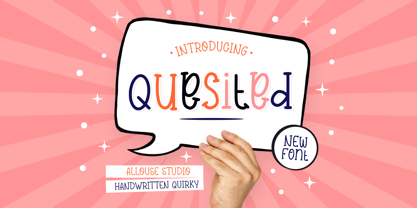 Proudly Preseningt, Quesited is a Handwritten Quirky Font. Quesited is perfect for any tittles, logo, product packaging, branding project, megazine, social media, wedding, or just used to express words above the background. Quesited come with Multi-Lingual Support. We highly recommend using a program that supports OpenType features and Glyphs panels like many of Adobe apps and Corel Draw, so you can see and access all Glyph variations. Enjoy the font, feel free to comment or feedback, send me PM or email. Thank You!
 - Hecate by Océane Moutot,
$32.90 Hécate is a contemporary serif typeface designed with sharp serifs, smooth and dynamic lines and high contrast. Inspired by the Garalde style with its tilted axis, Hécate brings uniqueness and modernity to this more traditional style. Its large variety of glyphs, including accents, old-style numbers and ligatures will give you freedom for all of your projects. It offers a large choice of uses such as magazine, branding, edition and so on. Hécate is available in 16 styles from thin to black, in roman and italic.
 - Realitta by Allouse Studio,
$16.00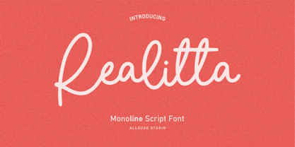 Proudly Presenting, Ralitta a Monoline Script Font. Ralitta is perfect for any tittles, logo, product packaging, branding project, megazine, social media, wedding, or just used to express words above the background. Ralitta also come with Multi-Lingual Support. We highly recommend using a program that supports OpenType features and Glyphs panels like many of Adobe apps and Corel Draw, so you can see and access all Glyph variations. Enjoy the font, feel free to comment or feedback, send me PM or email. Thank You!
 - Asher Punk by Allouse Studio,
$16.00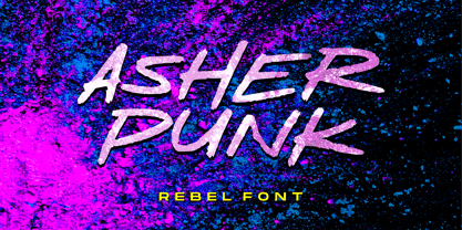 Proudly Presenting, Asher Punk a Rebel Handwritten Font. Asher Punk is perfect for any tittles, logo, product packaging, branding project, megazine, social media, wedding, or just used to express words above the background. Asher Punk also come with Multi-Lingual support. We highly recommend using a program that supports OpenType features and Glyphs panels like many of Adobe apps and Corel Draw, so you can see and access all Glyph variations. Enjoy the font, feel free to comment or feedback, send me PM or email. Thank You!
 - Naofumi by Allouse Studio,
$16.00 Proudly Present, Naoufumi a Rough Brush Font. Naofumi come along with Multi-Lingual Support to fulfill your need. We highly recommend using a program that supports OpenType features and Glyphs panels like many of Adobe apps and Corel Draw, so you can see and access all Glyph variations. Naoufumi is perfect for any tittle, product packaging, branding project, megazine, social media, wedding, or just used to express words above the background. Enjoy the font, feel free to comment or feedback, send me PM or email. Thank You!
 - Modern Royale by Bluestype Studio,
$15.00 Modern Royale is a chic and quirky lettered serif font. Trendy and stylish, this font will elevate each of your creations. Modern Royale is PUA encoded which means you can access all of the glyphs and swashes with ease! Very suitable for logo, headline, tittle, and the other various formal forms such as invitations, labels, logos, magazines, books, greeting / wedding cards, packaging, fashion, make up, stationery, novels, labels or any type of advertising purpose. Features : - Stylistic Alternates & Ligature - Number & Punctuation - Support Multilingual Languange Thank You.
 - Silent Dreams by RagamKata,
$14.00 Present to you for New Modern Unique Serif, Silent Dreams! Silent Dreams is a sophisticated ligature serif from us. This typeface has been made carefully to make sure its premium quality and luxury feel. The ligatures makes this typeface unique and stands out rather than the regular serif font. This font is very suitable for logo, headline, tittle, and the other various formal forms such as invitations, labels, logos, magazines, books, greeting / wedding cards, packaging, fashion, make up, stationery, novels, labels or any type of advertising purpose.
 - Sacred Bridge by Bombastype,
$35.00 Sacred Bridge is an old fashioned display typeface, inspired by vintage signage combined with ornaments that were inspired by certain Indonesian tribe ornament feels, because our little type foundry is focused on vintage display fonts. Till now at least. Sacred Bridges offers a layered system, with regular, rough and slant versions from each style. And don't forget about the Extras (ornaments) we offer. You'll get separate ornaments and objects that you can mix and match. We also give you most of our ornaments seen in our display.
 - Bad Coma - Personal use only

- groutpix - Personal use only

- Eutemia Ornaments - 100% free


