10,000 search results
(0.04 seconds)
- Goryfitts by Maulana Creative,
$11.00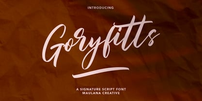 Goryfitts is a signature script font, With a high contrast stroke clean and fun characters. It has Opentype features of ligatures, makes it a perfect choice for branding and digital designs. Use this font for logos, social media, websites, blogs, instagram, social media, business cards, branding, and more! Goryfitts font support multilingual more than 100+ language. and good pair for your secondary text font with sans or serif. Make a stunning work with Goryfitts signature script font. Cheers, MaulanaCreative
 - Bilany by Letterhend,
$14.00 The Bilany is a font duo package contain a classic script and slab serif which looks great to be paired especially for vintage and adventure theme! This font duo is purposely made for headline, display or logotype, and the other various formal forms such as invitations, labels, logos, magazines, books, greeting / wedding cards, packaging, fashion, make up, stationery, novels, labels or any type of advertising purpose. Features : Uppercase & lowercase Numbers and punctuation Alternates & Ligatures Multilingual PUA encoded
 - Primaria by PeGGO Fonts,
$18.00 Primaria is a display font, inspired on the very first basic handwrite style teaching at primary school, designed in cursive and print styles in three weights each one: light, Regular and Bold, considering stylistic and typographic needs, it also contain OpenType initial lowercase alternative forms in order to get better links in those case where pairs of letters could be look better. Recommended playful and friendly design, teaching and learning stuff, children toys projects, food & drink and soft stuff.
 - Venio by Craft Supply Co,
$20.00 Venio – Double Line Font: Display Typography with Art Deco Flair Deco-inspired Elegance Infused with Art Deco sophistication, Venio, a double-line sans-serif font, brings timeless elegance to your designs. Distinctive Display Presence Venio ensures a bold yet refined aesthetic for logos and headlines, making your display stand out with its distinctive double-line design. Artful Symmetry Paying homage to Art Deco’s geometric precision, Venio’s symmetrical lines provide a visually pleasing experience, adding a touch of artistic flair.
 - LTC Forum Title by Lanston Type Co.,
$24.95 Forum Title was originally designed by Frederic Goudy in 1911. It was intended to be the heading font used for a book set in Kennerley. Based on inscriptional Roman stone cut capitals, this face is true to the early Roman forms which did not have a lower case. Forum exemplifies the classic Roman letterform at its finest. If a lower case were desired, Forum Title can be paired with Goudy Oldstyle for a harmonious hybrid font.
 - Jilliankrots by Maulana Creative,
$12.00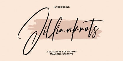 Jilliankrots is a signature script font, With fancy slanted and fun characters. It has Opentype features of ligatures, makes it a perfect choice for branding and digital designs. Use this font for logos, social media, websites, blogs, instagram, social media, business cards, branding, and more! Jilliankrots font support multilingual more than 100+ language. and good pair for your secondary text font with sans or serif. Make a stunning work with Jilliankrots signature script font. Cheers, MaulanaCreative
 - Miramar by Linotype,
$29.99Miramar font has elegance in every detail, which means that it isn't very easy to use. I like it very much, but would use it myself on rare occurencies, for very special tasks and even then in small portions. The name refers to the castle of Miramar just north of Trieste on the Adriatic coast, once the weekend resort of the Austrian imperial family. Now it is a museum with a marvellous park. Miramar was released in 1993. - Linotype Animalia by Linotype,
$29.00Linotype Animalia is part of the Take Type Library, chosen from the contestants of Linotype’s International Digital Type Design Contests of 1994 and 1997. The font was designed by German artist Johannes Plass and is full of surprises. It is like a walk through the zoo, where the j is a shark chasing a small fish and the K is a moose gazing at the sky. Linotype Animalia is intended exclusively for use in headlines with large point sizes. - Old Times American by Baseline Fonts,
$29.00The Old Times American Family is derived from several letterpress books from the 1880s in the midwest. The fonts were painstakingly compiled from over 100 pages of text and optically balanced for optimum results. Old Times American is part of the Grit History Series A font set. The set encompasses serif and sans-serif fonts in varying weights to meet the needs of designers. The less-than-perfect letterforms evoke a sense of the non-digital. - Amorflavor by Maulana Creative,
$12.00 Amorflavor is a modern script font, With a clean stroke and fun character. It has Opentype features of ligatures, makes it a perfect choice for branding and digital designs. Use this font for logos, social media, websites, blogs, instagram, social media, business cards, branding, and more! Amorflavor script font support multilingual more than 100+ language. and good pair for your secondary text font with sans or serif. Make a stunning work with Amorflavor script font. Cheers, MaulanaCreative
 - Cowboy Lament JNL by Jeff Levine,
$29.00 A lament is a sad song, and the music of the cowboys of the Old West had their fair share of them. However, a vintage piece of sheet music from the early part of the 20th century with the title "The Dying Cowboy" brought at least one positive trait to its mournful song. The title lettering was drawn in a fashion that emulated lettering made with quick strokes of a paintbrush, and became the inspiration for Cowboy Lament JNL.
 - Ovane Regular by Tebaltipis Studio,
$13.00 Ovane a new fresh & modern Sans serif with a strong style, a dancing baseline! So beautiful on invitation like greeting cards, branding materials, business cards, quotes, posters, and more! Ovane Clean Display Typeface is the part of a strong and modern Bold display. This typeface both impressive at display sizes and easily readable in text size, while the sharp shapes of the triangular serif and the distinctive letter shapes show their strength in logo design and impressive editorial use.
 - Screwball Comedy JNL by Jeff Levine,
$29.00 Cary Grant was one of Hollywood’s most versatile actors, playing romantic leads, dramatic parts and showing off his impeccable timing in screwball comedies. A perfect example of this is Frank Capra’s “Arsenic and Old Lace” from 1942. The movie trailer for the film had the title hand lettered in a playful and casual slab serif style, with varying character shapes and weights. This is now available as Screwball Comedy JNL in both regular and oblique versions.
 - De Bambeet by Zamjump,
$17.00 De Bambeet is a serif font that has a little style compared to other serifs, with multiple languages, alternate and also ligature is quite cool and suitable to be paired in various media like a posters, wedding invitations, craft products, book covers, photography, t-shirts , product packaging and other media. By using De Bambeet, I am sure that your products will look elegant, classic and luxurious. Font Featured : Uppercase Lowercase Numbers Symbols Punctuations Sylistic alternates Discretionary Ligatures
 - Schnitz by Linotype,
$29.99Linotype Schnitz is part of the Take Type Library, selected from the contestants of Linotype’s International Digital Type Design Contests of 1994 and 1997. Designed by the Finnish artist Osmo Niemi, the characters seem to contain no round forms at all. Linotype Schnitz looks as though it were chiseled and has an angular, almost brittle feel. The restless and lively appearance makes Linotype Schnitz particular well-suited to headlines and shorter texts with point sizes of 12 and larger. - Alexandria Eschate by Factory738,
$15.00 Alexandria Eschate Font Duo is a contemporary pair of script and serif fonts. Its offers beautiful typographic harmony for a diversity of design projects, name card, headlines, branding visual identity, poster, logo, magazines and etc. 2 fonts (Script and Serif) Basic Latin A-Z and a-z Numerals & Punctuation Stylistic Alternates Multilingual Support for ä ö ü Ä Ö Ü ... OTF file format Free updates and feature additions Thanks for looking, and I hope you enjoy it.
 - Sofimaria by Qaratype,
$18.00 Sofimaria is a super unique ligature font that you wont forget! It’s a high contrast serif that has loads of style. A modern take on a Caslon style typeface, this font is ideal for those bold headings or wedding invitations. It’s got hundreds of characters and ligatures plus all those European letters! Sofimaria pairs perfectly with a light scripts font or minimal sans serif. Main Features: Uppercase & Lowercase letters Punctuation and special characters Multilingual support Ligatures & Alternate glyphs
 - ReadMyHand by Linotype,
$29.99Linotype Read My Hand is part of the Take Type Library, selected from contestants in Linotype’s International Digital Type Design Contests of 1994 and 1997. It is the digitalized handwriting of its Dutch designer, Leon Hulst. As is common of handwriting fonts, the forms of the letters seem spontaneous and individual. Read My Hand is a dynamic font suitable for texts with point sizes larger than 12 and particularly good for documents which should have a personal touch. - Linotype Gneisenauette by Linotype,
$29.99 Linotype Gneisenauette is part of the Take Type Library, selected from the contestants of Linotype’s International Digital Type Design Contests of 1994 and 1997. The handwriting font was designed by Latvian artist Gustavs A. Grinbergs and is available in eight weights. Linotype Gneisenauette is a dynamic font which also reflects a bit of the optimistic spirit of the 1950s. The font is best used for headlines or middle length texts with a point size 12 or larger.
 - Novaletra Sans CF by Connary Fagen,
$25.00 Smooth brushstrokes inform the construction of Novaletra Sans. As Novaletra Serif's sister typeface, Novaletra Sans shares its easy readability and excellent performance in a humanist design. Subtle flares and low stroke contrast provide warmth uncommon in sans-serif font families. Novaletra Sans CF pairs well with simple sans-serifs like Articulat® CF, or with detailed and airy display type like Quiverleaf® CF. All typefaces from Connary Fagen include free updates, including new features, and free technical support.
 - Abdo Misr by Abdo Fonts,
$29.50 Abdo Misr is a geometrical style. This is an OpenType Font supporting Arabic, Persian, Urdu, abd English to and compatible with the various operation systems and modern software. The combination of modern Kufi and Geometrical styles and varying between straight and curved parts made it a beautiful typeface appropriate to the titles and slogans, and able to meet the desire of the user in the design of ads and modern designs of various types of audio and visual.
 - Ah, the jovial and whimsical world of fonts, where each typeface has its own distinct personality and charm. Nestled within this realm of typographic delights, you'll find a gem named joeHand 3, craf...
- Ah, KG Seven Sixteen, a font that confidently saunters into the world of typography, tipping its hat with a cheeky grin. Crafted by the whimsical wand of Kimberly Geswein, it's as if this font was sp...
- Sánchez Niu by Latinotype,
$- Sánchez Niu is a redesign of Sánchez—one of the first font families by Latinotype designed in 2011. In the typedesign industry the terms ‘nova’, ‘neue’, ‘next’, ‘new’ are often used to refer to a typeface that has been modified in different ways: redesign, technical readjustments, greater number of characters, etc. At Latinotype we are now starting to use the word ‘niu’ to refer to these kinds of typefaces. Niu is an adaptation of the original word ‘new’, i.e., we have adapted this English word to the phonology and spelling of our own language but keeping the original meaning. Race mixing, diversity, change and adaptation are part of the essence of Latin American culture and, at Latinotype, we are all constantly expressing these elements in everything we do. Latin Power! This new version includes improvements that make it work well with longer text. Such improvements have not had a major effect on the look of the font, though. We have adjusted the original proportions and added a number of new characters as well as OpenType features such as small caps, oldstyle figures, tabular numbers and stylistic alternates. Sánchez Niu contains a set of 720 characters that support 219 languages. The font is well-suited for long text, headlines and logotypes, and it has been optimised for web usage. Sánchez Niu comes with two free fonts—Regular and Regular Italic! Corrections, digital editing and review by César Araya, Rodrigo Fuenzalida and Alfonso García.
 - EDB Indians - Unknown license

- BD Megalona by Balibilly Design,
$25.00 The fundamental in creating this typeface is the implementation of our interest in typography over the past year. Inspired by the elegance, consistency, and hard work of Times New Roman pull up our minds to a daunting blank canvas and began to think about what we had to do to take this idea even further. Whatever comes to our mind and when it is poured out, it will certainly remain within the rules of the letterforms. This typeface is created by a careful approach, consisting of 28 fonts 13 weights with matching true italics forms. Feature an extended charset of over 1800 glyphs, covering 219 languages using Latin, Cyrillic (basic to extended), and Greek alphabets. Included advanced open type features like stylistic alternates, terminal form, swash, discretionary ligatures, ordinals, small caps, positional numbers, fractions, and case-sensitive forms. BD Megalona provides a range of choices that will give luxury vibes in symmetrical layouts with selective deviations, and work well in a stylish look for your typographic project. This is a complete package of problem solvers perfectly suited for body text and high-impact headlines. Advance open-type features definitely stunning on logos, branding, magazines, website, etc. BD Megalona is our ego in expression that aims to supply the necessity of design nowadays while still in the corridors of the glory of past traditions as a source of our inspiration. We would like to show you a SHORT FILM about the process of designing BD Megalona Font Family, Click Here!!!
 - f3 Secuencia round ffp - Personal use only

- ITC Bodoni Seventytwo by ITC,
$29.99Giambattista Bodoni (1740-1813) was called the King of Printers; he was a prolific type designer, a masterful engraver of punches and the most widely admired printer of his time. His books and typefaces were created during the 45 years he was the director of the fine press and publishing house of the Duke of Parma in Italy. He produced the best of what are known as modern" style types, basing them on the finest writing of his time. Modern types represented the ultimate typographic development of the late eighteenth and early nineteenth centuries. They have characteristics quite different from the types that preceded them; such as extreme vertical stress, fine hairlines contrasted by bold main strokes, and very subtle, almost non-existent bracketing of sharply defined hairline serifs. Bodoni saw this style as beautiful and harmonious-the natural result of writing done with a well-cut pen, and the look was fashionable and admired. Other punchcutters, such as the Didot family (1689-1853) in France, and J. E. Walbaum (1768-1839) in Germany made their own versions of the modern faces. Even though some nineteenth century critics turned up their noses and called such types shattering and chilly, today the Bodoni moderns are seen in much the same light as they were in his own time. When used with care, the Bodoni types are both romantic and elegant, with a presence that adds tasteful sparkle to headlines and advertising. ITC Bodoni™ was designed by a team of four Americans, after studying Bodoni's steel punches at the Museo Bodoniana in Parma, Italy. They also referred to specimens from the "Manuale Tipografico," a monumental collection of Bodoni's work published by his widow in 1818. The designers sought to do a revival that reflected the subtleties of Bodoni's actual work. They produced three size-specific versions; ITC Bodoni Six for captions and footnotes, ITC Bodoni Twelve for text settings, and ITC Bodoni Seventytwo - a display design modeled on Bodoni's 72-point Papale design. ITC Bodoni includes regular, bold, italics, Old style Figures, small caps, and italic swash fonts. Sumner Stone created the ornaments based on those found in the "Manuale Tipografico." These lovely dingbats can be used as Bodoni did, to separate sections of text or simply accent a page layout or graphic design." - ITC Bodoni Twelve by ITC,
$29.99Giambattista Bodoni (1740-1813) was called the King of Printers; he was a prolific type designer, a masterful engraver of punches and the most widely admired printer of his time. His books and typefaces were created during the 45 years he was the director of the fine press and publishing house of the Duke of Parma in Italy. He produced the best of what are known as modern" style types, basing them on the finest writing of his time. Modern types represented the ultimate typographic development of the late eighteenth and early nineteenth centuries. They have characteristics quite different from the types that preceded them; such as extreme vertical stress, fine hairlines contrasted by bold main strokes, and very subtle, almost non-existent bracketing of sharply defined hairline serifs. Bodoni saw this style as beautiful and harmonious-the natural result of writing done with a well-cut pen, and the look was fashionable and admired. Other punchcutters, such as the Didot family (1689-1853) in France, and J. E. Walbaum (1768-1839) in Germany made their own versions of the modern faces. Even though some nineteenth century critics turned up their noses and called such types shattering and chilly, today the Bodoni moderns are seen in much the same light as they were in his own time. When used with care, the Bodoni types are both romantic and elegant, with a presence that adds tasteful sparkle to headlines and advertising. ITC Bodoni™ was designed by a team of four Americans, after studying Bodoni's steel punches at the Museo Bodoniana in Parma, Italy. They also referred to specimens from the "Manuale Tipografico," a monumental collection of Bodoni's work published by his widow in 1818. The designers sought to do a revival that reflected the subtleties of Bodoni's actual work. They produced three size-specific versions; ITC Bodoni Six for captions and footnotes, ITC Bodoni Twelve for text settings, and ITC Bodoni Seventytwo - a display design modeled on Bodoni's 72-point Papale design. ITC Bodoni includes regular, bold, italics, Old style Figures, small caps, and italic swash fonts. Sumner Stone created the ornaments based on those found in the "Manuale Tipografico." These lovely dingbats can be used as Bodoni did, to separate sections of text or simply accent a page layout or graphic design." - ITC Bodoni Ornaments by ITC,
$29.99Giambattista Bodoni (1740-1813) was called the King of Printers; he was a prolific type designer, a masterful engraver of punches and the most widely admired printer of his time. His books and typefaces were created during the 45 years he was the director of the fine press and publishing house of the Duke of Parma in Italy. He produced the best of what are known as modern" style types, basing them on the finest writing of his time. Modern types represented the ultimate typographic development of the late eighteenth and early nineteenth centuries. They have characteristics quite different from the types that preceded them; such as extreme vertical stress, fine hairlines contrasted by bold main strokes, and very subtle, almost non-existent bracketing of sharply defined hairline serifs. Bodoni saw this style as beautiful and harmonious-the natural result of writing done with a well-cut pen, and the look was fashionable and admired. Other punchcutters, such as the Didot family (1689-1853) in France, and J. E. Walbaum (1768-1839) in Germany made their own versions of the modern faces. Even though some nineteenth century critics turned up their noses and called such types shattering and chilly, today the Bodoni moderns are seen in much the same light as they were in his own time. When used with care, the Bodoni types are both romantic and elegant, with a presence that adds tasteful sparkle to headlines and advertising. ITC Bodoni™ was designed by a team of four Americans, after studying Bodoni's steel punches at the Museo Bodoniana in Parma, Italy. They also referred to specimens from the "Manuale Tipografico," a monumental collection of Bodoni's work published by his widow in 1818. The designers sought to do a revival that reflected the subtleties of Bodoni's actual work. They produced three size-specific versions; ITC Bodoni Six for captions and footnotes, ITC Bodoni Twelve for text settings, and ITC Bodoni Seventytwo - a display design modeled on Bodoni's 72-point Papale design. ITC Bodoni includes regular, bold, italics, Old style Figures, small caps, and italic swash fonts. Sumner Stone created the ornaments based on those found in the "Manuale Tipografico." These lovely dingbats can be used as Bodoni did, to separate sections of text or simply accent a page layout or graphic design." - ITC Bodoni Brush by ITC,
$29.99Giambattista Bodoni (1740-1813) was called the King of Printers; he was a prolific type designer, a masterful engraver of punches and the most widely admired printer of his time. His books and typefaces were created during the 45 years he was the director of the fine press and publishing house of the Duke of Parma in Italy. He produced the best of what are known as modern" style types, basing them on the finest writing of his time. Modern types represented the ultimate typographic development of the late eighteenth and early nineteenth centuries. They have characteristics quite different from the types that preceded them; such as extreme vertical stress, fine hairlines contrasted by bold main strokes, and very subtle, almost non-existent bracketing of sharply defined hairline serifs. Bodoni saw this style as beautiful and harmonious-the natural result of writing done with a well-cut pen, and the look was fashionable and admired. Other punchcutters, such as the Didot family (1689-1853) in France, and J. E. Walbaum (1768-1839) in Germany made their own versions of the modern faces. Even though some nineteenth century critics turned up their noses and called such types shattering and chilly, today the Bodoni moderns are seen in much the same light as they were in his own time. When used with care, the Bodoni types are both romantic and elegant, with a presence that adds tasteful sparkle to headlines and advertising. ITC Bodoni™ was designed by a team of four Americans, after studying Bodoni's steel punches at the Museo Bodoniana in Parma, Italy. They also referred to specimens from the "Manuale Tipografico," a monumental collection of Bodoni's work published by his widow in 1818. The designers sought to do a revival that reflected the subtleties of Bodoni's actual work. They produced three size-specific versions; ITC Bodoni Six for captions and footnotes, ITC Bodoni Twelve for text settings, and ITC Bodoni Seventytwo - a display design modeled on Bodoni's 72-point Papale design. ITC Bodoni includes regular, bold, italics, Old style Figures, small caps, and italic swash fonts. Sumner Stone created the ornaments based on those found in the "Manuale Tipografico." These lovely dingbats can be used as Bodoni did, to separate sections of text or simply accent a page layout or graphic design." - ITC Bodoni Six by ITC,
$40.99Giambattista Bodoni (1740-1813) was called the King of Printers; he was a prolific type designer, a masterful engraver of punches and the most widely admired printer of his time. His books and typefaces were created during the 45 years he was the director of the fine press and publishing house of the Duke of Parma in Italy. He produced the best of what are known as modern" style types, basing them on the finest writing of his time. Modern types represented the ultimate typographic development of the late eighteenth and early nineteenth centuries. They have characteristics quite different from the types that preceded them; such as extreme vertical stress, fine hairlines contrasted by bold main strokes, and very subtle, almost non-existent bracketing of sharply defined hairline serifs. Bodoni saw this style as beautiful and harmonious-the natural result of writing done with a well-cut pen, and the look was fashionable and admired. Other punchcutters, such as the Didot family (1689-1853) in France, and J. E. Walbaum (1768-1839) in Germany made their own versions of the modern faces. Even though some nineteenth century critics turned up their noses and called such types shattering and chilly, today the Bodoni moderns are seen in much the same light as they were in his own time. When used with care, the Bodoni types are both romantic and elegant, with a presence that adds tasteful sparkle to headlines and advertising. ITC Bodoni™ was designed by a team of four Americans, after studying Bodoni's steel punches at the Museo Bodoniana in Parma, Italy. They also referred to specimens from the "Manuale Tipografico," a monumental collection of Bodoni's work published by his widow in 1818. The designers sought to do a revival that reflected the subtleties of Bodoni's actual work. They produced three size-specific versions; ITC Bodoni Six for captions and footnotes, ITC Bodoni Twelve for text settings, and ITC Bodoni Seventytwo - a display design modeled on Bodoni's 72-point Papale design. ITC Bodoni includes regular, bold, italics, Old style Figures, small caps, and italic swash fonts. Sumner Stone created the ornaments based on those found in the "Manuale Tipografico." These lovely dingbats can be used as Bodoni did, to separate sections of text or simply accent a page layout or graphic design." - Gegor by Balibilly Design,
$17.00 Say Hello to Gegor, an experimental serif display font. Gegor is freedom of our hand when creating the letterform without many references. We try to let the pen tool flow and dancing according to our imagination. The characters of this typeface are adopted from the letter "r". She was born and influence each other. The simple shape on the shoulder are slightly pointy at a thick weight and curves at a thin weight have a big influence on other letters. The unique form of letter "r" takes us to further development to get achieve a distinct harmony as a display typefaces. If you look at the teaser images and get an idea, we are in line. Gegor consists of 14 families from thin to black, and 1 outline style in black weight equipped with discretionary ligatures, case-sensitive forms, ordinals, small capital, and fractions. Consists of multilingual support including Western European, Central European, and Southeastern European. Gegor is perfect for posters, logos, branding, magazines, websites, and more. Gegor will give a unique vibe to your works. Supports languages: Afrikaans, Albanian, Asu, Basque, Bemba, Bena, Bosnian, Catalan, Cebuano, Chiga, Colognian, Cornish, Corsican, Croatian, Czech, Danish, Dutch, English, Estonian, Faroese, Filipino, Finnish, French, Friulian, Galician, Ganda, German, Gusii, Hungarian, Icelandic, Ido, Inari Sami, Indonesian, Interlingua, Irish, Italian, Javanese, Jju, Jola-Fonyi, Kabuverdianu, Kalaallisut, Kalenjin, Kinyarwanda, Kurdish, Latvian, Lithuanian, Lojban, Low German, Lower Sorbian, Luo, Luxembourgish, Luyia, Machame, Makhuwa-Meetto, Makonde, Malagasy, Malay, Maltese, Manx, Maori, Morisyen, North Ndebele, Northern Sami, Northern Sotho, Norwegian Bokmål, Norwegian Nynorsk, Nyanja, Nyankole, Occitan, Oromo, Polish, Portuguese, Romanian, Romansh, Rombo, Rundi, Rwa, Samburu, Sango, Sangu, Sardinian, Scottish Gaelic, Sena, Shambala, Shona, Slovak, Slovenian, Soga, Somali, South Ndebele, Southern Sotho, Spanish, Swahili, Swati, Swedish, Swiss German, Taita, Taroko, Teso, Tsonga, Tswana, Turkish, Turkmen, Upper Sorbian, Vunjo, Walloon, Welsh, Western Frisian, Wolof, Xhosa, Zulu
 - Rezak by TypeTogether,
$36.00 Nothing is hidden in the simplistic forms and overt aesthetic of Anya Danilova’s Rezak font family. Rezak is not a type family directly from the digital world, but was inspired by the stout presence of cutting letters out of tangible material: paper, stone, and wood. With only a few cuts, the shapes remain dark and simple. With more cuts, the shapes become lighter and more defined, resulting in a dynamic type family not stuck within one specific category. The Black and medium weights began as one approach before separating into display and text categories. The four text weights were created through pendulum swings in design direction that experimented with contrast, angles, tangent redirections, and the amount of anomalies allowed. The text weights are vocal when set larger than ten points and subtle at smaller sizes. The tech-heavy Incised display style came last, employing a surprising range of trigonometric functions to make it behave exactly as desired. Its look can result in something distinctive and emotional or completely over-the-top. Most normal typefaces change only in thickness; Rezak changes in intention, highlighting the relationship between dark and light, presence and absence, what’s removed and what remains. Rezak’s Black and Incised display styles are like a shaft of light in reverse and are perfect in situations of impact: websites, headlines and large text, gaming, call-outs, posters, and packaging. The tone works for something from youthful or craft-oriented to organic and natural products. Try these two in logotypes, complex print layering, branding, and words-as-pattern for greater experimentation. The text styles are bold, energetic, well informed, and round out the family with four weights (Regular, Semibold, Bold, Extrabold) and matching italics for a family grand total of ten. These jaunty styles work well in children’s books, call-outs, movie titles, and subheads for myriad subjects such as architecture, coffee, nature, cooking, and other rough-and-tumble purposes. Rezak’s crunchy letters are meant to expose rough, daring, or dramatic text. A further benefit is that this family is not sequestered within one specific genre or script, so it can be easily interpreted for other scripts, such as its current Latin and extended Cyrillic which supports such neglected languages as Abkhaz, Itelmen, and Koryak. Rezak’s push toward creativity and innovation, with an eye on typography’s rich history, reinforces our foundry’s mission to publish invigorating forms at the highest function and widest applicability.
 - Aure Westra by Aure Font Design,
$23.00 Aure Westra embodies the liquid look of a broad-nibbed ink pen. These bold forms engage the reader with a subtext of exotic wisdom. Westra’s entrancing flow brings a dramatic intrigue to text and titles and an esoteric savor to astrological expressions and chartwheels. Westra is an original design developed by Aurora Isaac, first released in the LP glyphset in 2011. After more than a decade in development, 2018 marks the release of the CJ and KB glyphsets. The CJ glyphset is a full text font with an extended set of lowercase and uppercase glyphs supporting a variety of European languages. Additional glyphs include standard ligatures, four variations of the ampersand, and check-mark and happy-face with their companions x-mark and grumpy-face. Numbers are available in lining and oldstyle versions, with numerators and denominators for forming fractions. Companion glyphs include Roman numerals, specialized glyphs for indicating ordinals, and a variety of mathematical symbols and operators. The CJ glyphset also includes an extended set of glyphs for typesetting Western Astrology. These glyphs are also available separately in the KB glyphset: a symbol font re-coded to allow easy keyboard access for the most commonly used glyphs. The unique look of Aure Westra stands on its own as a text font. Where needed, use the clean lines of Aure Jane to provide contrasting text that will showcase Westra’s exotic nature. Give Aure Westra a trial run! You may discover a permanent place for this font family in your typographic palette. AureFontDesign.com
 - Wet Pet, designed by the prolific Canadian typographer Ray Larabie, is a whimsical and expressive font that bursts with creative energy. Known for his wide range of typefaces, Larabie has a knack for...
- Alien League - Unknown license

- Marvelan by Mega Type,
$15.00 Marvelan is a display font with a touch of style that's cheerful, elegant and strong. So it is suitable for use in product design and appearance, both in modern or vintage designs. OpenType feature with several alternative characters that allow you to mix and match letter pairs to suit your design. Marvelan also includes 3 different styles, namely Regular, Outline and Extrude which are made with different styles but still have the same characters. Marvelan is included in a display font so it is very suitable for use in titles, poster products, logos, book menus, websites, books, t-shirts, posters, book covers, labels, business cards, branding, print templates and many other designs according to your needs. Marvelan includes a complete set of upper and lowercase letters, as well as multi-language support, punctuation, ligatures and alternatives. Thank you very much for looking and Enjoying it!
 - Corner C by CarnokyType,
$20.00 Corner C is a part of Corner type family. This subfamily is designed with rounded shapes in the corners. The concept of the typeface Corner is based on variation of corner shapes in font characters, from what is also its name derived. The basis is a bitmap modular principle, to which by simple addition of “the missing pixels” in corners of the characters ( Corner A ) to the shape of diagonal ( Corner B ), curvature (Corner C), or inversion curvature ( Corner D ), three more font variations are created. The basic monolinear bitmap weight is supplemented by two more extreme thicknesses – hairline and fat weight. The character set supports the complete Latin, while the x-height of lowercase is drawn at the same height as in the uppercase characters. Corner is a strong display typeface, which allows you to easily experiment and to combine it with its mutual font variations.
 - Raluxe by Prestigetype Studio,
$18.00 Need a font for a brand and personal visual identity? Introducing, our outstanding premium font duo, Raluxe; consisting of a ligature-rich Serif and elegant Script. These fonts are designed to pair harmoniously, specifically use for brand visual identities and personal identities such as logos, headlines, titles, labels, stationery, magazine, fashion industry, social media banner, business cards, or any advertising purposes. This typeface has been made carefully to make sure it's premium quality. Features : Numbers and Punctuation Multilingual Ligatures Alternates OpenType features *You can only access the ligatures and alternates feature in uppercase We highly recommend using a program that supports OpenType features and Glyphs panels like many of Adobe apps and Corel Draw, so you can see and access all Glyph variations. We hope you enjoy our font – please do let us know by emailing us at info@prestigetype.com or prestigetypestudio@gmail.com if you need something!


