2,672 search results
(0.012 seconds)
- Fenggasta by Gatype,
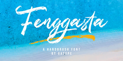
$9.00Fenggasta is a font that is scratched with a brush pen, to get a natural texture, so this font will display the characteristics of the hand. This font is very suitable for a variety of places such as clothing, poster, tittle books, stationery designs, quotes, branding, logos, invitations, greeting cards, t-shirts, packaging designs and more. - Afternoon Tea by Open Window,
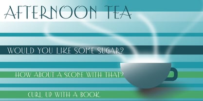
$19.95Afternoon Tea is inspired by a lettering specimen featured in Letters and Lettering by Paul Carlyle and Guy Oring published in 1938. The striking features are the elegant balance between thick and thin strokes (demonstrating its obvious ink pen influence) while maintaining a sturdy presence which is ideal for titles and headings. Afternoon Tea is caps only. - Rothek Stencil by Groteskly Yours,
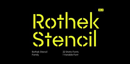
$25.00Rothek Stencil is a stencil type family based on our bestselling Rothek family. Rothek Stencil is highly legible, versatile and multilingual. • Ideal for graphic design, packaging, branding and signage • Unique stencilled letterforms • 23 Styles (11 Uprights, 11 Italics, 1 Variable Font) • 1000+ Characters per font • Extended Latin, Extended Cyrillic, and Vietnamese support • Versatile OpenType Features • Legible, versatile, and multifunctional - Good Friday by Letterara,
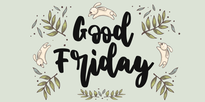
$14.00Good Friday is a Natural handwritten font. It was inspired by a brush pen, and is perfect for logos, t-shirts, branding, prints, Easter theme, Good Friday, Spring sale, and much more! This font is PUA encoded which means you can access all of the natural glyphs with ease! It also features a wealth of special features including ligatures. - Monotype Lydian by Monotype,
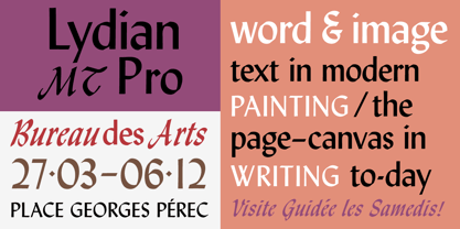
$40.99Lydian is an unusual sans serif face with strongly calligraphic letter shapes, originally cut by American Type Founders. The eye-catching nature of the Lydian font family has made it popular for use in magazines and advertising as well as in newspapers for headlines and introductions. The cursive has an even more marked pen-drawn structure. - Delivery Note by Hanoded,
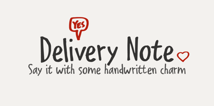
$15.00 - Abracadabra PW by Patty Whack Fonts,
$29.00This font is made of many unrestrained strokes of the pen and it is perfect for a freestyle look. It would be great to use for projects that you would want to look handwritten, lively and even calligraphic. It's very playful and mysterious. It's so much fun to use and can be used in a variety of ways! - Hanalei Pro by Stiggy & Sands,
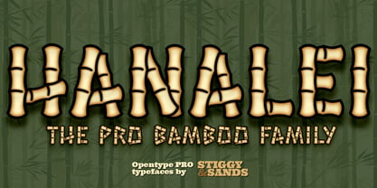
$29.00For the Polynesian Fan Inspired by the bamboo lettering of the iconic Mai Kai restaurant logo, Hanalei Pro has all the flavor of the genre without compromise. Great for titling and larger typesetting, and the added true SmallCaps & Lining/Tabular figures and limitless fractions give more range of use. The Hanalei Pro family contains 628 characters per font. - Bassun by Twinletter,
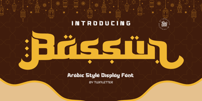
$15.00The new classic Arabic typeface “Bassun” is brought to you by our expert designers. The letters have a beautiful aspect thanks to using a digital flat pen and a gothic font approach. This typeface can be used in a wide range of Middle Eastern-themed projects, including advertising, packaging, posters, invitations, and any other graphic design. - Splinterhand by Hanoded,
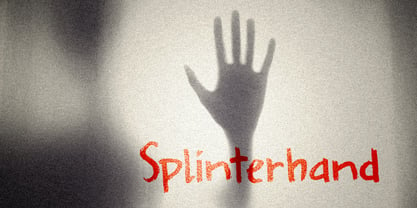
$12.00 - Buro by Corentin Noyer,
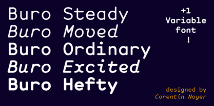
$34.00The Buro is a text font, monospace, sans-serif with rounded endings. It is characterized by its monolinear outline (slight optical corrections) and its discontinuous Roman structure. He tries to reproduce the outline of a letter drawn with a pen. The design of the Buro is inspired by the cursive letters used in Olympia typewriters of the 1950s. - Eat More Fruit JNL by Jeff Levine,
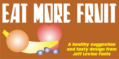
$29.00Eat More Fruit JNL is an odd name for a typeface, but then again the lettering style of the font is just as unusual. Named for a 1940s-era poster espousing "Put more pep in your step... eat more fruit", the lettering (although Art Deco in nature) also evokes images of 1960s and 1970s hippie-era concert posters. - Notes by Resistenza,
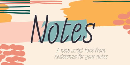
$39.00Notes Is a handwritten-Italic font style, casual and fresh. Our recipe for this project is a perfect blend of typography and handwriting. Works well in small sizes and has several ligatures. Notes Family has many cuts, Pen, Pencil, Marker and Felt Tip. This font family can be used for many purposes like publishing, quick notes, adding captions, signage. - Madsen by Monotype,
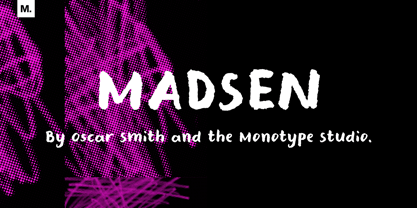
$15.99With chunky, confident letters, Madsen is rough and ready, but with an element of pizzazz. This script was drawn with a wet brush pen and rough paper to create coarse edges and an uneven baseline that showcase its handwritten, charismatic aesthetic. Madsen is a bold script, that has some contrast and a lot of natural charm. - WOODTYPE Collection by Borutta Group,
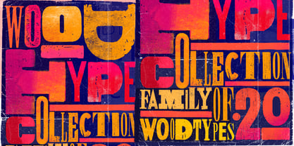
$19.00WOOD TYPE COLLECTION from Mateusz Machalski is a set of wonderful, warm, and weathered hand made typefaces designed by Mateusz Machalski. The Inspiration for this collection comes from a wooden letter blocks and other old technologies used for printing. WTC supports 40 different languages and contains over 300 glyphs per style. The Family consists of 20 typefaces. ENJOY! - Sunny Weather by Hanoded,
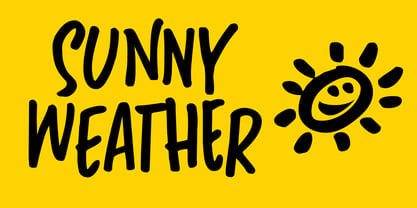
$15.00 - Freak by Cool Fonts,
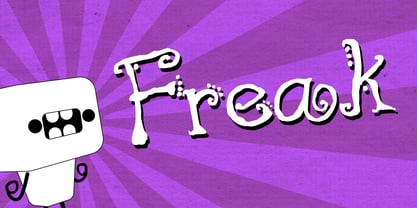
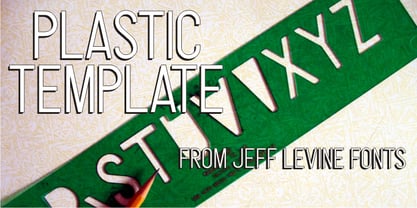
$24.00 - Plastic Template JNL by Jeff Levine,
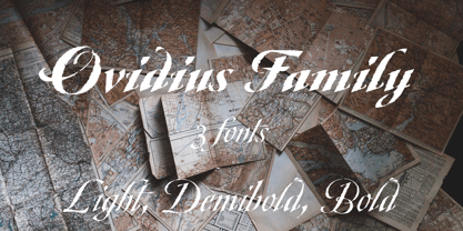
$29.00Prior to the advent of digital type, many architectural layouts, amateur print projects and a myriad of other lettering jobs were created by the use of routed plastic templates and ink pens. Plastic Template JNL was designed from just one strip of a multi-part template set and replicates the clean lines of the original design. - Ovidius Script by GroupType,
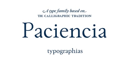
$21.00Ovidius is a formal script with solid structure. Characters present a look and feel of an ancient pen to very rough paper. The Ovidius family designed by Thaddeus Szumilas is now part of GroupType, a foundry specializing in period and revival typeface designs. These designs have not only important historical design roots, they possess great contemporary appeal. - Paciencia by Typographias,
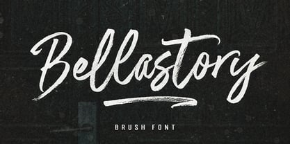
$16.00This family started as a graduation project back in 2009, coming from calligraphic studies and sketches with a broad nib pen, based on humanist proportions and inclination. From its ink and paper origins it has come a long way until the current form, being digitalized and made into fonts through the course of the last 8 years. - Bellastory by HafisHidayat,
$20.00Bellastory is a font that is intentionally made with hand strokes using a brush pen, so that it gets a natural texture, and produces beautiful fonts for your various designs, this font is suitable for cover books, magazines, logos, invitations, business cards, screen printing, product packaging, posters, invitations, greeting cards, news, blogs, everything including personal charm. - Censorship JNL by Jeff Levine,
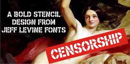
$29.00Censorship JNL joins the wide array of stencil-themed fonts from Jeff Levine. An advantage to this particular design is the larger amount of stencil sections per letter or number. When used with a plotter/cutter, stencils in excess of 12 inches high can be cut into masking material without the cut-out characters becoming floppy or unstable. - Spaghetti And Cheese by Hanoded,
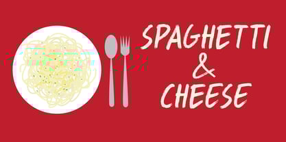
$15.00Who doesn’t like Spaghetti & Cheese? Well, my son doesn’t like it, because he hates cheese, but he seems to be one of the few. Spaghetti & Cheese is also a handmade font: slightly slanted, slightly eroded, yet very legible and clear. It was made with a Japanese ‘Shake & Write’ marker pen. Comes with a generous topping of diacritics. - Boxy Code by Just My Type,
$15.00In the late 60’s, one of the best art publications in the country was Motive magazine, published (amazingly) by the United Methodist Church. Filled to the brim with poetry, essays, line drawing and woodcuts, it also featured some cutting-edge typography. Boxy/Code is based upon my memories of woodcut typography from that great magazine. Since Boxy/Code ’s lowercase consists of the uppercase’s negative spaces, it’s easy to combine the two with Layer Styles in Photoshop in order to achieve the effect I used in one poster above. It also works great if you use a well-known text as a background. This new version is totally redrawn and features all the Latin-accented letters. Uppercase consists of black capitals in boxes; lowercase features the negative spaces of those boxed capitals. Uppercase and lowercase line up exactly for 2-color effects. - Contribute by Fontscafe,
$39.00The Contribute font is one that takes you back to the days of the fountain pen. To those who are old enough to remember, fountain pens were tiresome to fill and use – but also a pleasure to own, something to cherish that became so much a part of your daily life, a symbol of etiquette and sometimes even a style statement! Our Contribute fonts will definitely remind you of that, and everything else to do with a touch of vintage class. This 30s-like font is sure to become one of your favorite cursive fonts, be it for use on a poster or a web page. This font is ideal for those situations where you need your viewer to connect on a more personal level than formal. Think ‘writing a letter rather than typing it out’, and you will know what we mean! - Sidestroke by Ramen,
$9.00The typeface is inspired by our love of old hand-painted signs in butchers, and based on some very quick sketches using a brush pen to find what shapes worked. There is quite a quirky element to the type, as we tried to create the original sketches by rotating the brush pen to reflect the strokes of a paint brush. This lead to a horizontal stressing, which is most noticeable in letters like C, G, S and J. Sidestroke comes in 2 styles, both a standard solid version, and a pre-shadowed outline version. This can be outlined and divided in Illustrator to quickly create an alternate coloured fill for your letters. The lowercase letters have been designed to automatically horizontally align with any uppercase letters, which is a great shortcut when creating logos or other unique type layouts. - Six Hands by ParaType,
$10.00Six Hands is a set of handwritten fonts based on various writing tools, such as pencil, felt-tip pen, ball-point pen, and brush. The character set of each of these fonts supports the Cyrillic alphabet, as well as the extended Latin script for all European languages. Most of the styles also contain additional alternatives that have the capability of automatically interchanging in the setting, which significantly variegates and humanizes the text. Six Hands is quite a rare combination of diverse display fonts that work well together. It is made for talented designers who can use it creatively in packaging, advertising, displays, posters, menus, invitations and so on. The design of Six Hands was a result of collaboration between Alexandra Korolkova, Alexander Lubovenko and all those who assist them in this work. This set of fonts was released by Paratype in 2018. - Toy Decals JNL by Jeff Levine,
$29.00For decades, cereal companies have included premiums [promotional gifts] inside their packages, printed on the cartons or to send for with a special coupon and redemption instructions. During the 1940s, Pep cereal [a long-discontinued Kellogg's brand] offered a series of water-applied decals within its boxes. Most likely made by the Meyercord Company (one of America's largest transfer decal manufacturers at the time), one decal in particular had an alphabet in gold letters with black outlines. (One can only presume the marketing strategy was to have kids bug their parents to buy more Pep cereal if the child needed more than one letter of the alphabet for his or her initials!) Those decal letters have inspired a digital version as the outline character font Toy Decals JNL, which is available in regular oblique, solid and solid oblique styles. - The "Hello Pirates - Personal Use" font by Typhoon Type is a distinctive and playful typeface that captures the adventurous spirit of pirate lore and sea voyages. It presents a mix of whimsy and bold...
- Seddon Penmans Paradise Capitals by Intellecta Design,
$29.50John Seddon (1644-1700), was a famous English writing master, the leading calligrapher of his time, and master of Sir John Johnson’s Free Writing School in Priest’s Court, Foster Lane. His portrait was drawn by William Faithorne and was engraved by John Sturt as the frontispiece for his copy-books, such as ‘The Ingenious youth’s companion’ of c.1690 and 'The pen-man’s paradise' of c.1695. These were engraved after his work by others. Your extra-rare book - "The Pen-mans Paradise Both pleasent & Profitable OR Examples of all ye usuall hands of this Kingdome. Adorn'd with variety of ffigures an Flourishes done by Command of hand. Each ffigure being one continued & entire Track of the pen most where of may be struck as well Reverse (or to answer bothwayes) as Forward", London (1965). - (YES, that is the title of the book!) was the starting point to these new extra accurated works of Iza W, a series of revivals of the penmanship Seddon’s artworks, like this highly ornamented animal kingdom inspired capitals and alphabets: the Seddon Penmans Paradise Capitals typeface. And, on the other hand, you can get the animal and human kingdon inspired penmanship forms in the Bestiario font. The “SeddonsFleurons” will complete the collection. Fantastic choice to elaborated barocque/renaissance inspired and historical accurated layouts. - ITC Cali by ITC,
$29.99There are a few professions in which being left-handed confers an advantage-think of the great southpaw pitchers in major league baseball, like Sandy Koufax. Now, think of all the great left-handed calligraphers. Not so easy, right? Here's a hint: Luis Siquot. Far from being an advantage, Siquot's lefty orientation proved a hurdle to overcome. When I was young, I had serious problems writing," he recalls. "If there was a lot of text, I almost always soiled the paper with wet ink as my hand followed the pen." Then, a friend told Siquot about a special store in London that catered to left-handed people. It was there that he found an Osmiroid pen specially designed for left-handed calligraphers. ITC Cali is based on Siquot's use of this pen. "Electronic scans of my calligraphy were the foundation of the design," he says. "I was careful to leave in some imperfections to avoid an excessively mechanical look, and added the little notches in the strokes to imitate the texture of writing on a rough cotton paper." ITC Cali works equally well in text and display sizes, but it is a calligraphic script, Siquot warns, "and shouldn't be set in all capitals." That said, ITC Cali is a remarkably versatile design, well-suited to a variety of communication projects." - The Pea Johanna Script font, designed by Fonts For Peas — a unique collection of fonts inspired by handwriting — envelops the essence of personal touch blended with whimsical charm in the realm of ty...
- Pea Jane In A Hurry is a font that truly captures the essence of spontaneity and movement. Created by Fonts For Peas, this typeface stands out for its hand-drawn, casual style that appears to have be...
- KG Skinny Latte - Personal use only
- Parte Handwritten by Papermode Co,
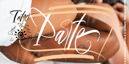
$18.00Parte is a organic handwritted font inspired by natural brush typography. Written in rapid motion using a slightly dry brush pen. This will give you a fresh and elegant design. Parte comes with uppercase and lowercase sets, numbers, alternative styles for some lowercase characters are also available which make your text and designs more attractive. Included multilingual support and special ligatures - Harajuku Script by Hanoded,
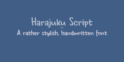
$15.00Harajuku Script is an ‘easy-on-the-eye’ script font. I made it with a Japanese brush pen. The font is quite stylish, so I named it after Tokyo’s Harajuku area, which is known internationally as a center of Japanese youth culture and fashion. Harajuku Script would look good anywhere, but product packaging, websites and magazines could profit from this handwritten gem. - Sonopa by Kenneth Woodruff,
$20.00Sonopa is a classically unclassifiable face, with an array of standard and extended ligatures and alternates, tabular and lining oldstyle figures. In essence, it is a playful, hand-penned script, with elements of rigidity taken from more structured styles. Sonopa contains enough detail to fare well at poster sizes, with an evenness of color that is also suitable for text runs. - ITC Humana Sans by ITC,
$29.99ITC Humana Sans font is the work of British designer Timothy Donaldson, an extended and versatile font family with a large array of variations. Donaldson first created ITC Humana Script with a broad-tipped pen and then went on to design the corresponding roman. ITC Humana Sans is the perfect font for anything requiring both clarity and a touch of personality. - Milford by SparkyType,
$19.00Milford is a font with its feet planted in several styles of design. It has aspects of Art Deco shapes and proportions, but has modern additions and tweaks that make it a handsome substitute for your tired heading fonts. Because of its tight spacing and filled, super-black forms, it responds nicely to treatments such as negative letter spacing and outlining. - ITC Kallos by ITC,
$29.99ITC Kallos is the work of British designer Phill Grimshaw, a text typeface family with traditional calligraphic flair. It is the result of Grimshaw's first experiments with text typeface design. The long ascenders and descenders of the lowercase alphabet lend them a look of sophisticated elegance. The capitals display the unmistakable influence of the pen and the proportions of classic inscriptional forms.
