10,000 search results
(0.045 seconds)
- Friday by Fatchair,
$6.95A variation on the 'futuristic' type genre - available in pre- and post-apocalyptic versions! - Wet Pet, designed by the prolific Canadian typographer Ray Larabie, is a whimsical and expressive font that bursts with creative energy. Known for his wide range of typefaces, Larabie has a knack for...
- Eva Antiqua SG by Spiece Graphics,
$39.00 Based on the 1922 Klingspor model by German designer Rudolf Koch, this hand-drawn quill roman has an informal and curiously delicate appearance. The typeface was known in Germany as Koch Antiqua and in the rest of Europe as Locarno. Eve, as it was called in the United States, continues to enjoy great popularity in advertising and book publishing circles. This deluxe version includes display light, display heavy, and display black as well as the hard-to-find display light and heavy (Koch Kursiv) italics. Eva-Paramount, which is based on Morris Benton's 1928 ATF Paramount, has also been included. It contains a set of alternates characters that are in keeping with the light and heavy display letter styles. Eva-Antiqua is also available in the OpenType Std format. Alternates are now merged together into each style as stylistic alternates or as swashes. These advanced features currently work in Adobe Creative Suite InDesign, Creative Suite Illustrator, and Quark XPress 7. Check for OpenType advanced feature support in other applications as it gradually becomes available with upgrades.
 - Century Old Style by URW Type Foundry,
$35.99 The Century Old Style font family was modeled on Century Expanded which had been cut in 1900. Similar weights and proportions were maintained but the letter shapes were made more elegant by the introduction of a number of old style characteristics. The Century Old Style font family is a useful text design that offers good legibility and economy.
 - Fresh Spring by Putracetol,
$24.00 Fresh Spring - 8 Quirky Spring Font. Fresh Spring is a unique plant font with 7 different versions of the font, the difference between each version is in the shape of the plant decoration. This font is basically soft and fun, coupled with plant embellishments, various shapes and options, will make this font suitable for any project you are working on, especially those with the theme of love, plants, children, babies, weddings, etc. In addition, this font is also suitable for invitation cards, greeting cards, logos, branding, posters, crafting, stickers, social media, packaging, headers, merchandise and others. The alternative characters were divided into several Open Type features such as Swash, Stylistic Sets, Stylistic Alternates, Contextual Alternates, and Ligature. The Open Type features can be accessed by using Open Type savvy programs such as Adobe Illustrator, Adobe InDesign, Adobe Photoshop Corel Draw X version, And Microsoft Word. This font also supports multiple languages.
 - Hello Bride Script by 50Fox,
$19.00 Redefine elegance with Hello Bride! This lovely font "Hello Bride" comes with classy style of calligraphy. This fonts is one of the most elegant fonts for wedding or engagement ceremony. Especially if it's an luxury ceremony. Hello Bride Font has huge ligatures & alternative characters. This Font is great for logo, printed quotes, badge, insignia, packaging, headline, poster, t-shirt/apparel, greeting card, and wedding invitation, & etc. Thanks for looking and have a wonderful day
 - Brutal Honesty by Olivetype,
$18.00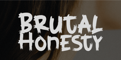 Brutal Honesty is a simple handwritten brush typeface. Carefully handcrafted to grab the attention of the viewers, this font is ideal for logos, posters, headlines, branding, apparel and so much more. This brush typeface is supporting Multi-Languages, which include: Afrikaans Albanian Catalan Danish Dutch English Estonian Finnish French German Italian Norwegian Portuguese Spanish Swedish Zulu. So what's included: Basic Latin A-Z & a-z. Numbers, symbols, and punctuations. Multilingual Support. Accented Characters : ÀÁÂÃÄÅÆÇÈÉÊËÌÍÎÏÑÒÓÔÕÖØŒŠÙÚÛÜŸÝŽàáâãäåæçèéêëìíîïñòóôõöøœšùúûüýÿžß Thank You.
 - Devil Tail by Attype Studio,
$14.00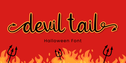 Devil Tail is a delicate and incredibly distinct handwritten font. Fall in love with its incredibly versatile style and use it to create spectacular designs! Devil Tail is perfect for branding, logo, invitation, stationery, social media post, product packaging, merchandise, blog design, game titles, cute style design, Book/Cover Title and more. What's Included : - Devil Tail.otf - Beginning & Ending Swash - Multilingual Support (Afrikaans, Albanian, Catalan, Danish, Dutch, English, Estonian, Finnish, French, German, Icelandic, Italian, Norwegian, Portugese, Spanisch, Swedish, Zulu)
 - Treppenwitz by Hanoded,
$15.00 Treppenwitz (literally: ‘Staircase Wit’) is a German word describing a conversational remark that only occurs to someone after the opportunity to make it has passed. I love words like this: they can sum up a whole sentence or a complex train of thought. Treppenwitz font is hand brushed. It’s a little uneven, a little shaky, but will look good on product packaging and book covers. Comes with loads of diacritics and double letter ligatures as well.
 - Linotype Animalia by Linotype,
$29.00Linotype Animalia is part of the Take Type Library, chosen from the contestants of Linotype’s International Digital Type Design Contests of 1994 and 1997. The font was designed by German artist Johannes Plass and is full of surprises. It is like a walk through the zoo, where the j is a shark chasing a small fish and the K is a moose gazing at the sky. Linotype Animalia is intended exclusively for use in headlines with large point sizes. - Sovana by SG Type,
$19.00 Sovana is a modern, friendly display font with sharply angled serifs. It is fun, elegant, and contemporary. Sovana works great for headlines, logos, branding, posters, packaging, and much more. FEATURES Uppercase alphabet Lowercase alphabet 41 ligatures Big range of numbers, symbols & punctuation Comprehensive language support including: Albanian, Basque, Catalan, Croatian, Danish, Dutch, English, Finnish, French, German, Hawaiian, Icelandic, Indonesian, Irish, Italian, Latvian, Lithuanian, Norwegian, Polish, Portuguese, Romanian, Slovenian, Spanish, Swedish, Turkish, Welsh & more Individual kerning & extensive range of characters
 - Sazone by Product Type,
$15.00 Welcome to Sazone, a font that represents the essence of the future with a stunning modern and futuristic twist. Are you looking for the perfect solution for modern, futuristic, sci-fi, and future-themed projects? Sazone is the answer. Sazone is a font specially designed to bring an extraordinary and stunning visual experience. Each letter is unique and conveys a sense of the future, showing astonishing sophistication and innovation. The main benefit of Sazone is its ability to deliver unrivaled style. With a unique and exclusive character, this font will give a modern, classy, and futuristic look to every text you use. Every detail is carefully thought out to create a standout and stunning impression. Also, multilingual support, allows you to display text in multiple languages without restrictions. This gives you the flexibility to reach a global audience and convey messages effectively in the most relevant contexts. Take your projects to the next level with Sazone. Let this font be the catalyst for your visual success in creating eye-catching future looks. It doesn’t matter whether you are designing logos, posters, or websites, Sazone will give off a distinctive feel, exude sophistication, and deliver an unforgettable experience. Explore endless possibilities and make your vision come true with Sazone. It’s time to enter a spectacular and amazing future. Choose Sazone and let this font become an indispensable part of your vibrant, modern, futuristic, sci-fi, and future projects. What’s Included : - File font - All glyphs Iso Latin 1 - We highly recommend using a program that supports OpenType features and Glyphs panels like many Adobe apps and Corel Draw, so you can see and access all Glyph variations. - PUA Encoded Characters – Fully accessible without additional design software. - Fonts include Multilingual support
 - Lobster 1.0 - 100% free

- Valley - 100% free

- Bruno Ace Pro Rounded by Stiggy & Sands,
$29.00 Auto-Techno-Motive Stance in a softer package. Bruno Ace Rounded Pro is a fresh derivative of our Bruno Ace Pro typeface. It draws its inspiration from modern automotive logotypes. This geometric sans-serif has a wide stance with a tall x-height for a strong look and appeal, as well as ease of legibility. The SmallCaps and extensive figure sets offer a more extensive range of use as well as a more intense vibe. Bruno Ace Rounded Pro has an obviously softer feel to it compared to the original. See the 5th graphic for a comprehensive character map preview. Opentype features include: - SmallCaps. - Full set of Inferiors and Superiors for limitless fractions. - Tabular, Proportional, and Oldstyle figure sets (along with SmallCaps versions of the figures). - Stylistic Alternates for Caps to SmallCaps conversion.
 - Sixties Stencil JNL by Jeff Levine,
$29.00 Probably one of the most unusual applications of a stencil took place in 1964 when Union Carbide [then-owner of the still-new line of "Glad" brand plastic wrap and storage bags] sponsored a $100,000 contest to match up a stencil of their logo in order to win a prize. The magazine ad told of how one thousand lucky participants would win $100 by simply taking a die-cut stencil of the brand name to the store and overlaying it on the logo printed on the food wrap box to see if it aligned perfectly. The hand-lettered title proclaiming "match the stencil and win" was done in a casual sans design and reflected the cheerfulness of many typestyles found in ads during the late 50s and early 60s.
 - Sixties Pin Buttons JNL by Jeff Levine,
$29.00 During the turbulent era of the 1960s, the youth of America found various ways to protest against "The Establishment". Whether it was campus unrest, protest songs, sit-ins or other methods, the message was the counter-culture movement. Arising from this disenchantment with traditional social standards, a small but effective means of protest arose that made no sound, yet spoke volumes - the pin button. Statements against the war in Vietnam, free love, drug use and other messages popped up on little metal discs pinned to tee shirts, suspenders, head band and hats. Sixties Pin Buttons JNL recreates twenty-six of these messages in both white on black (upper case keys) and black on white (lower case keys). Blank buttons in both white and black are found on the parenthesis keys.
 - Devin by Linotype,
$29.99Devin is designed mainly for the benefit of the advertising industry, and it surely is a nice typeface for headings, isn't it? And you should see what a nice body type it makes! I had no other typeface in mind when working with it, but I can now find several typefaces it is related to. It reminds of the egyptienne group, but I did't really plan that. The name Devin is taken from my birth region. There is a castle with that name on the northern Adriatic coast (known even from Rilke's Duino elegies - Duino is another name of the same castle). A castle ruin called Devin, too, can be found on a height above the Danube in Slovakia, not far away from its capital Bratislava. Devin was released in 1994. - Omnibus by Linotype,
$29.99Omnibus is one of my absolute favourites. My intention was to design a typeface as easy to read as Baskerville, without being a copy of it. It is easy to see that I was influenced by Baskerville, e.g. in the open lowercase g. I had in mind to design a Baskerville with the looks of the Baskervilles used in earlier typesetting. I put aside those plans for a while (but fulfilled them later on) and dedicated myself to Omnibus. In both cases my aim was to achieve a typeface with darker looks than the most used Baskerville. The name has nothing to do with buses, it is Latin with the meaning of for all". It is also in the name of Omnibus Typografi. Omnibus was released in 1993. - Ciutadella by Emtype Foundry,
$69.00 Ciutadella was originally commissioned by Mario Eskenazi’s studio. It is a versatile geometric sans serif, a simple, clean and direct family. Its power resides in an overhaul simplicity that reflects an “open” personality, easily suitable to be used across a wide range of applications, from identity systems to publications. Although it has been conceived to be used as a display typeface, it performs well in intermediate length texts mostly because of some specific characteristics such as the alternate two-story ‘a’. It is available in Open Type format and includes Alternate Characters, Ligatures, Tabular Figures, Fractions, Numerators, Denominators, Superiors and Inferiors. It supports Central and Eastern European languages. The type family consists of 10 styles, 5 weights (Light, Regular, Medium, SemiBold and Bold) plus italics. See also Ciutadella Rounded and Ciutadella Slab. Ciutadella PDF.
 - Latitude Sans by Stiggy & Sands,
$24.00 An Uber-Black Sans Serif with a Warm Personality Latitude Sans began as a digitization of a film typeface from LetterGraphics known simply as "Free". The original specimen included standard Capitals and Lowercase, Numerals and minimal Punctuation, a bare bones character set. We've fleshed out the Latitude Sans typeface to include a full standard character set, an extended international set, and more so it can be a strong heavyweight sans typestyle. See the last graphic for a comprehensive character map preview. Opentype features include: - Full set of Inferiors and Superiors for limitless fractions. - Tabular, Proportional and Oldstyle figure sets. - Ligatures for a collection of "f" paired sets: fi, fl, ft, ffi, ffl, etc. Approx. 652 Character Glyph Set: Latitude Sans comes with a glyphset that includes standard & punctuation, international language support, and additional features.
 - Serofina by insigne,
$24.99 Serofina is an adaptable and fluid connected script with plenty of alternate flourish options. From clean and flowing to cute and frilly, Serofina can do it. The Serofina family comes with four weights, including a unique hairline, which makes it a versatile investment for a wide range of design possibilities. All weights include the OpenType programming to automatically and seamlessly swap out the default characters for 45 alternate forms and 18 auto-replacing ligatures. These alternates can make the face appear to be more simplified, restrained or frilly. Serofina also includes seven ornaments and old-style numbers. Check out the sample images to see these features in action. Serofina is a highly versatile script family and its range of weights make it perfect for whenever you need an expressive and original typeface.
 - AW Conqueror Std Carved by Typofonderie,
$59.00 Engraving inspired typeface The AW Conqueror Carved encapsulates perfectly the lettering styles in fashion during the 19th century quite often in the frontispieces of books. It wasn’t rare to see these kinds of typefaces, with their variations in depth and relief effects, adorning boxes and other forms of packaging of the time. AW Conqueror superfamily AW Conqueror Didot is part of a larger family, who include 4 others subfamilies with great potential: They’re but based on same structure, with some connection between them (width for example), to offer a great & easy titling toolbox to any designers, from skilful to beginner. Each of the members try their best to be different from the others because of their features. They should work harmoniously in contrast. Club des directeurs artistiques Prix 2010 European Design Awards 2011
 - Henderson Sans by Sudtipos,
$39.00 The first thought that crosses a type designer’s mind upon seeing a slab serif is: I wonder what it would look if it was serifless. And so, after building Henderson Slab , I followed my instincts and gave it a sans serif companion. Henderson Sans comes in seven weights plus italics, each of which casting an eye on the crafty lettering origins of what is now the ubiquitous mode of corporate communication. This sans serif is a glyph-for-glyph match for Henderson Slab , inheriting pretty much all of its features and quirks, like the wealth of alternates and swashed variants — simple, endearing or otherwise. Henderson Sans is a family of seven weights plus italics, all full of open features and extended Latin language support. (Basic version do not include alternates, swashes, etc).
 - Monotype Bernard by Monotype,
$40.99In the early years of the twentieth century a number of romans with a soft and slightly script like quality were evolved. Although they did not represent the future in terms of the major design influences that were to appear after the First World War, they were a break with the past, and were developed further in the nineteen twenties and thirties. Monotype Bernard Condensed is closely associated with this period, a condensed roman evoking an easy charm. The Monotype Bernard Condensed font offers many display applications where warmth and friendliness is required. - Baluno by Luxfont,
$22.00 Introducing is a fun and playful pouty Baluno font. Font has embodied the graphic trend of cartoon flat illustrations and will successfully complement modern designs. The font has 2 types of faces, which can be used both independently and together by alternating letters in one word to avoid repeating letters, creating a unique heading. Family is ideal for children's themes, because the font resembles inflated balloons. Creates a relaxed mood and has fun. Set comes in many different carefully selected colors and gradient color options. Check the quality before purchasing and try the FREE DEMO version of the font to make sure your software supports color fonts. P.s. Have suggestions for color combinations? Write me an email with the subject "Baluno Color" on: ld.luxfont@gmail.com Features: Free Demo font to check it works. 2 types of faces. Lots of ready-made matched colors. Gradient color variants. Kerning. IMPORTANT: - Multicolor OTF version of this font will show up only in apps that are compatible with color fonts, like Adobe Photoshop CC 2017.0.1 and above, Illustrator CC 2018. Learn more about color fonts & their support in third-party apps on www.colorfonts.wtf -Don't worry about what you can't see the preview of the font in the tab "Individual Styles" - all fonts are working and have passed technical inspection, but not displayed, they just because the website MyFonts is not yet able to show a preview of colored fonts. Then if you have software with support colored fonts - you can be sure that after installing fonts into the system you will be able to use them like every other classic font. Question/answer: How to install a font? The procedure for installing the font in the system has not changed. Install the font as you would install the other fonts. How can I change the font color to my color? · Adobe Illustrator: Convert text to outline and easily change color to your taste as if you were repainting a simple vector shape. · Adobe Photoshop: You can easily repaint text layer with Layer effects and color overlay. ld.luxfont@gmail.com
 - Gradl Initialen ML by HiH,
$12.00 Max Joseph Gradl designed Art Nouveau jewelry in Germany. At least some of his designs were produced by Theodor Fahrner of Pforzheim, Germany -- one of the leading manufacturers of fine art jewelry on the Continent from 1855 to 1979. I don't know if he designed for Fahrner exclusively, but every example I found was produced by that firm. I assume it was also the same M.J, who edited a book, Authentic Art Nouveau Stained Glass which was reissued by Dover and is still available. For an artist as accomplished as Gradl was, he is very tough to research. There just does not seem to have been much written about him. The jeweler is visible in most of his typeface designs. They exhibit a sculptural quality as if they were modeled in clay (or gold) rather than drawn on paper. His monograms, especially, reflect that quality. Those shown in plates 112 through 116 in Petzendorfer actually appear to have been designed specifically for fabricating in the form of gold or silver pendents. Of the initial letters that came out of Germany during this period, these by Gradl seem unusually open and lyrical. They seem to be dancing on the page, rather than sitting. Please note that Gradl designed only the decorated initials. All other characters supplied were extrapolated by HiH, including the accented initials. Orn.1 (unicode E004) is based on a jeweled gold clasp designed by Gradl (please check out Gallery Image on Myfonts.com). Also included are an art nouveau girl’s face, a swan and the face from Munch’s “Scream”, from scans of old printer’s ornaments. Gradl Initialen M represents a major extension of the original release, with the following changes: 1. Added glyphs for the 1250 Central Europe, the 1252 Turkish and the 1257 Baltic Code Pages. Added glyphs to complete standard 1252 Western Europe Code Page. Special glyphs relocated and assigned Unicode codepoints, some in Private Use area. Total of 341 glyphs. Both upper & lower case provided with appropriate accents. 2. 558 Kerning Pairs. 3. Added OpenType GSUB layout features: salt, dlig, ornm and kern. 4. Revised vertical metrics for improved cross-platform line spacing. 5. Refined various glyph outlines. 6. Alternative characters: 16 upper case letters (with gaps in surrounding decorations for accents above letter). 8. Four Ornaments: face1, face2, swan and orn1 (silhouette of Gradl clasp) The zip package includes two versions of the font at no extra charge. There is an OTF version which is in Open PS (Post Script Type 1) format and a TTF version which is in Open TT (True Type)format. Use whichever works best for your applications.
 - Glober by Fontfabric,
$39.00 The Glober font family includes 18 weights - nine uprights with nine italics. It is characterized by excellent legibility in both - web & print design areas, well-finished geometric designs, optimized kerning, excellent web-font performance and legibility etc. Inspired by the classic grotesque typefaces - Glober has his own unique style in expressed perfect softened geometric forms. The font family is most suitable for headlines of all sizes, as well as for text blocks that come in both maximum and minimum variations. Glober font styles are applicable for any type of graphic design in web, print, motion graphics etc and perfect for t-shirts and other items like posters, logos.
 - Balearic Thread by Image Daddy Collection,
$31.00 Please note: the wispy effect in the illustrations were applied to characters from the font but is not part of the font itself.
 - Brohillo by Alit Design,
$12.00 Brohillo font is created from the frequent use of typeface for wedding needs. This font has an elegant and bold concept. It is perfect for designs with romantic themes such as wedding properties, Valentine cards, romantic quotes and others. This Dio font when combined is really good with a bold and bold serif combined with an elegant and spontaneous script to create an awesome design.
 - Elysia by Factory738,
$15.00 We present Elysia, a fresh two-faced serif with both MODERN and CLASSIC curves. Elysia is a split personality font that can be used for a variety of projects, including bold magazine imagery, wedding invitations, branding, poster design, and much more. 2 Weights (Light & Bold) 2 Styles (Modern & Classic) Basic Latin A-Z and a-z Numerals & Punctuation Stylistic Ligatures glyps Multilingual Support for ä ö ü Ä Ö Ü ... Free updates and feature additions Thanks for looking, and I hope you enjoy it.
 - Brownie Fox by IKIIKOWRK,
$17.00 Introducing Brownie Fox - Fairytale Typeface, created by ikiiko. A vintage & classy decorative type that reminds us of fairy tale books when we were kids. This typeface is perfect for an books cover, illustration for kids, vintage poster, vintage product, packaging design, magazine header, poster, quotes, and so much more.. What's included? Uppercase & Lowercase Number & Punctuation Alternates & Swashes Multilingual Support Get also a good offer & FREEBIE at our site : www.ikiiko.com Enjoy our font and if you have any questions, you can contact us by email : ikiikowrk@gmail.com
 - Lubok by Linotype,
$29.99Moscow-based designer Julia Borisovna Balasheva created her Lubok face as a pictogram-based font. The term "lubok" refers to a popular style of Russian folk art printing, which dates back to the 18th Century. In Lubok, Bakasheva has digitised several whimsical characters and animals, which were common in these prints. She suggests that you use Lubok's symbols to illustrate fairy tales; we suggest that you use Lubok to decorate everything: from your next office party invitation to comic books of your own design! - Bananas by Canada Type,
$30.00 In the history of 20th century graphic arts, the evolution of the informal sans serif has been a uniquely American phenomenon. The ongoing saga of this (still as popular as ever) sub-genre dates back to the maturity of the Industrial Age and early Hollywood film titling, runs through the prosperous times of interwar print publications, sees mass flourishing during the various media propagations of the film type era, and solidifies itself as arguably the most common design element in the latter years of the century. Fun, bouncy, playful, and highly exciting, the casual sans serif is now all over game packaging, film and animation titles, book covers, food boxes, concert posters, and pretty much everywhere design aims to induce excitement about a product or an event. The casual sans is the natural high pill of typesetting. We figured it was high time for the casual sans to adapt to 21st century technology, gain more versatility, and become as much fun to use as the emotions it triggers. So we’re quite excited to issue Bananas, a fun sans serif family in 6 weights and 3 widths that can be used anywhere your designer’s imagination can take you. Rather than being based on a single design, Bananas was sourced from multiple American film era faces, all from 1950s and 1960s, when the casual sans genre was at its popular peak. Headliners’ Catalina and its very similar cousin, Letter Graphics’ Carmel, served as initial study points. Then a few Dave West designs informed the design development and weighting process, before narrow and wide takes were sketched out and included in the family. The entire development process happened in a highly precise interpolative environment. All Bananas fonts come with a full glyph complement supporting the majority of Latin languages, as well as five sets of figures, automatic fractions, quite a few ligatures, biform/unicase shapes and other stylistic alternates.
 - Immi 505 by Adobe,
$29.00Immi 505 is another of Tim Donaldson�s prolific works. Inventive and fun-loving as always, Tim used a pen nib called a ?Brause 505? to create the letterforms for this design. The Brause 505 was an invention of Karlgeorg Hoefer. Hoefer created his typefaces Salto" and Saltino" with this nib. The other part of the name, Immi, is the nickname of Donaldson�s five-year-old daughter Imogen. The resulting unusual curves and open character of Immi 505 create a distinctive rhythm and color appropriate for short blocks of ad copy, titles, music CD covers, and Web page headlines where a bit of extra width is needed." - Saugatuck by Alex Jacque,
$20.00 Saugatuck is a cap-height only display typeface inspired by nature. With it’s roots based on a few hand-drawn characters from nearly a century ago by the pen artist W.E. Dennis, Saugatuck now exists as a two-variant typeface. It contains all of the usual characters and accents, most of the math, plus some of the more esoteric characters. Each letter A-Z has a alternate in it’s associated lowercase character to allow you to have even more varied, natural-looking text. Works great for display purposes, seasonal designs, and times when you need to invoke a little bit of a less-structured, environmental feeling.
 - FF Meta by FontFont,
$108.99 German type designer Erik Spiekermann, created this sans FontFont between 1991 and 2010. The family has 28 weights, ranging from Hairline to Black in Condensed and Normal (including italics) and is ideally suited for advertising and packaging, book text, editorial and publishing, logo, branding and creative industries, small text as well as web and screen design. FF Meta provides advanced typographical support with features such as ligatures, small capitals, alternate characters, case-sensitive forms, fractions, and super- and subscript characters. It comes with a complete range of figure set options—oldstyle and lining figures, each in tabular and proportional widths. As well as Latin-based languages, the typeface family also supports the Cyrillic, Greek, and Hebrew writing systems. FF Meta Variable are font files which are featuring two axis and have a preset instance from Hairline to Black and Condensed to Roman In 2011, FF Meta was added to the MoMA Architecture and Design Collection in New York. This FontFont is a member of the FF Meta super family, which also includes FF Meta Correspondence , FF Meta Headline , and FF Meta Serif . FF Meta® font field guide including best practices, font pairings and alternatives. Featured in: Best Fonts for Resumes
 - Omoshiroi by TEKNIKE,
$55.00 Omoshiroi is a display monospace handwriting font. The typeface is a distinct hand drawn font using a marker pen. The Omoshiroi name is derived from the Japanese word omoshiroi (おもしろい) meaning "interesting" or "amusing". Omoshiroi is great for display work, invitations, writing, architecture, posters, labels and headings.
 - Adam Kubert by Comicraft,
$49.00 Joe Kubert's son Adam has a story or two to tell as well; the AdamKubert font, based on Adam's own pen lettering in BATMAN/PREDATOR, was created by Comicraft for Marvel's ULTIMATE X-MEN series. Comicraft fonts are created BY comic book letterers FOR lettering comic books. Accept no substitutes!
 - RNS Susana by RNS Fonts,
$18.00 RNS Susana is a hand lettered brush font, with a great groovy touch. The font has a set of alternates used on contextual substitution to give it a more organic look. The design was set with a marker brush pen, making emphasis on showing the imperfections to reach its expressive personality.

