10,000 search results
(0.032 seconds)
- Santy Ehisa by Stringlabs Creative Studio,
$25.00 Santy Ehisa is a Stylish Script Font with Handwritten Style. The Santy Ehisa font made with digital brush pen strokes that making this font look authentic. This font is perfect for fashion brand, wedding invitation, business card, logo brand, signature, and then calligraphy.
 - Marlyna by Yumna Type,
$16.00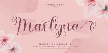 Marlyna is a beautiful and modern script. It brings a beautiful and modern typeface that best used for weddings, branding, logotype, and quotes. Featured : Beautiful Ligatures Beautiful Alternates + Swashes PUA Encoded Multilingual Support Numerals and Punctuation Beginning Swash and Ending Swashes (a-z)
 - Sunkiss by Garisman Studio,
$20.00 Sunkiss font starts from a brush stroke with a script style and also follows the times. Sunkiss is very suitable for use in various media such as: packaging, logo, label, poster, shirt design, quotes of wisdom, hand-lettering, typography and many other media.
 - Bluettelli by Letterara,
$12.00 Bluettelli is a fantastic font trio that combines three beautiful script calligraphy. It has a feminine and elegant look which is great for logos, invitations, and blogs, but can also be used to make a striking headline. Get inspired by this extraordinary set!
 - Belgian Chocolate by Double Z Studio,
$16.00 Belgian Chocolate Font. Carefully crafted. It is a sweet chic, beautiful, modern, and elegant script. Smoothly flowing, perfect for designing blog logo, website logo, print ads, book covers, film covers, apparel, cards, logos, posters, etc. Opentype features give you more alternatives in designing.
 - Sevoya Pro by Jonahfonts,
$45.00 Sevoya Pro a captivating robust script font designed with fat strokes for those strong brands and logos. Featuring short ascenders and descenders making it a bit more legible. Sevoya Pro is perfect to create outstanding headings, logos, menus, graphics, and many more applications.
 - Whitbury by Rachel White Art,
$16.00 Whitbury is a modern calligraphy script font with thin upstrokes and super heavy downstrokes. It has lots of fun ligatures! It's fun to use for quotes and headlines, and logos and branding projects. It's casual, playful, and full of eye grabbing attitude.
 - Berliman by ahweproject,
$11.00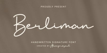 Berliman is a signature script typeface specially made with a natural handwritten style. It is perfect for branding projects, logos, wedding designs, social media posts, advertisements, product packaging, product designs, labels, photography, watermarks, invitations, stationery and any projects that need handwriting taste.
 - Ink Line by Atom,
$13.00 Ink Line is a modern font script that gives a unique impression. With ligature, titling, swash, and multi language features, Ink Line is very easy to use in the application of posters, flyers, titles, bloggers, Instagram stories, web banners, etc. Happy Design :)
 - Delgona by TM Type,
$12.00 Delgona is a delicate and fashionable script font. It is perfect for any branding project such as logos, t-shirt printing, creative products, and more. This font is PUA encoded which means you can access all of the glyphs and swashes with ease.
 - La Fausto by The Ocean Studio,
$15.00 La fausto is a beautiful font script, font will make your design more beautiful and classy. This font is suitable for any design like Logo, branding, quotes, and etc. very single letters have been carefully crafted to make your text looks beautiful
 - White Secret by Just Lett,
$17.00 Whitesecret is modern script with swashes, lowercase and Uppercase alternate. So this font is beautiful on invitation cards, wedding cards, quotes, greeting cards, business cards, and more design concept. Features: Uppercase lowercase puncuation and numeral 2 alternates lowercase and Uppercase And Multilingual language
 - Flanela Monicha by Essentials Studio,
$16.00 Flanela Monicha Is a Modern Script Font Flanela Monicha is perfect for product packaging, branding project, megazine, social media, wedding, or just used to express words above the background. Enjoy the font, feel free to comment or feedback, send me PM or email
 - Catthy Wellingten by Stringlabs Creative Studio,
$29.00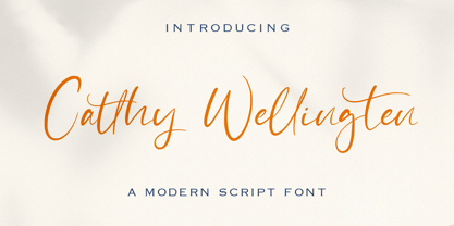 The Catthy Wellingten is a modern script font. It has a playful and feminine look, which is great for wedding invitations and anniversaries, blogs and logos. Catthy Wellingten is a handwritten font, described by an elegant touch, perfect for your favorite projects.
 - Cerellia by Illushvara,
$12.00 Cerellia is a bold script font, carefully handcrafted to become a true favorite. Its casual charm makes it appear wonderfully down-to-earth, readable and, ultimately, incredibly versatile. Fall in love with its incredibly versatile style and use it to create spectacular designs!
 - Halistine Signature by Typebae,
$15.00 Halistine Signature is a monoline script font with a signature style and a handwritten appearance. Inspired by handwritings, this font exudes elegance, smoothness, and a personal touch. This font is suitable for designs that require a personal touch and a casual feel.
 - Phaley by Typebae,
$15.00 Phaley is a soft and charming handwritten signature script font that effortlessly exudes elegance and grace. With its delicate curves and timeless beauty, it adds a touch of allure and personality to any design or document, transforming words into works of art.
 - Pejuang Cinta by Stringlabs Creative Studio,
$25.00 Pejuang Cinta is a Script Font with Handwritten Style. The Pejuang Cinta font made with digital brush pen strokes that making this font look authentic. This font is perfect for fashion brand, wedding invitation, business card, logo brand, signature, and then calligraphy.
 - MVB Embarcadero by MVB,
$79.00 MVB Embarcadero lies in a space between grotesque sans serifs and the vernacular signage lettering drawn by engineers. It’s a style that happens to convey credibility and forthrightness without pretense—it’s anti-style, actually. All of this makes for the most versatile of typefaces, capable of delivering any kind of message while staying out of the way. As is often the case with a type design that develops over several years, Embarcadero isn’t the realization of a specific concept. In the ’90s Mark van Bronkhorst began digitizing a blocky slab serif from the Victorian era, which was then set aside for many years. He later revisited the design, paring it down to its bare essentials, and as more time passed, it evolved from a grid-based outline to curves that echoed the rigid skeleton of the original. Eventually it became a complete family with all the readability requirements of a text sans serif, yet maintaining the subtle eccentricities of its inspiration. Functionally, the Embarcadero family is as adaptable as its design. The OpenType Pro set of 20 fonts contains two widths and five weights, each with italics, small caps, a full set of figures, bullets and arrows, and support for most Latin-based languages. In all, Embarcadero is suitable for headlines or text. And—thanks to its simple, square form—it’s ideal for type on screen too.
 - Maison Luxe by FontMesa,
$25.00 Maison Luxe is a revival of a very old font designed in France in or around the year 1820. You may have seen this font in the past under the names of Circus, Roma, Madame and Gillé Classic. As of November 2016 we have changed the name of this font from Gillé Classic to Maison Luxe which means Luxury House in French. For many years Joseph Gillé was credited as the original designer of this font however we've recently been contacted by a type historian in France reporting that he could not find any evidence supporting Joseph Gillé as the designer and to the best of his knowledge an artist by the name of Sylvestre may be the true designer. If you love this classic font then you're sure to enjoy the alternate version also with a matching lowercase available from FontMesa under the name of Home Style. This version of the classic with its squared off shadow is true to the original design where Home Style has diagonal lines creating a cast shadow. New in 2016 for Maison Luxe is a new matching lowercase, an uppercase German Double S (versal eszett), Greek character set, opentype features including case sensitive forms and old style numerals. We know you'll enjoy the new additions to this timeless classic design.
 - Halfroy by Heypentype,
$20.00 Halfroy is our answer to generic geometric sans trends exploding nowadays who creates sameness. Halfroy brings new sans perspectives by combining rounded and sharp edges to create delicate sans fonts. See the difference by looking at counter-shapes compared to outline, insides counter shapes you will sees a sharp edges while round but not geometrical on outlines. Halfroy gives your project unique visual impact whatever your design project is, but we recommend using thin, semibold to Fat as display then light and regular. Halfroy taken inspirations not from looking at other sans typeface, but its design inspirations comes from observing a land contour and geographical statistics in our city, Kota Batu. We found that our city geographic consist of steep slope like waves with sharp peaks and surrounded by small and third highest mountains peak on our country. From then on we begin visualize and applied on few letters. Take a look on our 'O', 'f', 's' letters, its like a stone carved letters. Its hard edges and soft edges outline clearly draws from our inspiration source. Even Halfroy looks stony, hard as individual letters, we treat this type with humanist approach in mind. Therefore you can sense a friendly yet casuals of typical sans serif fonts when it grouped together to form a words or sentences. We hope Halfroy will gives your design project a unique on its own.
 - Tichy by NoCommenType,
$20.00 The "Tichy" typeface is intended for use in titles, headlines and in short text blocks, like citates. However, the typeface is legible even in larger text blocks. It's strong appeal allows the typeface's usage mixed with other graphic elements of the layout without compromising it's readability and it's presence. The typeface's simple initial module (double braked at 135 degrees straight line), the strict rules of forming the letters lead to an unique typeface - masculine, strong and still legible. The Cyrillic glyphs are influenced by the work of the great Bulgarian typographers Boris Angelushev, Vassil Yonchev and Alexander Poplilov, who developed Cyrillic further in 60-s and 70-s of the XX century. Western, East European, Cyrillic, Baltic and Turkish codepages are supported. The font file contains all the basic ligatures, alternate glyphs and kern pairs. It can be used both on Windows and MacOS based computers. The history of "Tichy" typeface began many years ago with a project for logotype design for a small company. It was a kind of designer's game to try making some letters just using one single module. Development of the other glyphs of the latin alphabet was for many years a mandatory exercise for the young colleagues in our studio. Suddenly we realized that this project matured and creation of a new typeface started.
 - Scary Notes by Ditatype,
$29.00 Scary Notes is a spine-chilling display font designed to evoke fear and horror. With its big letters and bold weight, this font demands attention and is sure to send shivers down your spine. The details of the letters are meticulously crafted to resemble brush strokes, adding an unsettling and handcrafted touch to the font. Each letter in Scary Notes is bold and commanding, creating an impactful presence that cannot be ignored. The big size of the letters adds to the font's intensity. The brush details in this font give the font an organic and chaotic appearance, reminiscent of chilling hand-painted writings. These details add a sense of unpredictability and terror, immersing the viewer into the world of horror and fear. For the best legibility you can use this font in the bigger text sizes. Enjoy the available features here. Features: Multilingual Supports PUA Encoded Numerals and Punctuations Scary Notes fits in headlines, logos, movie posters, flyers, invitations, branding materials, print media, editorial layouts, headers, and any project that requires a terrifying touch. Find out more ways to use this font by taking a look at the font preview. Thanks for purchasing our fonts. Hopefully, you have a great time using our font. Feel free to contact us anytime for further information or when you have trouble with the font. Thanks a lot and happy designing.
 - Irrlicht by Aarhaus,
$30.00 Irrlicht is based on C. H. Kleukens’ 1923 typeface Judith Type . Whilst Dunkle Irrlicht is a fairly faithful rendition and extension of Kleukens’ typeface, the Licht style was initially added as a stand-alone stencil version; yet, the two styles work perfectly together – for different nuances, for emphasis or simply stacked/layered. Irrlicht is equipped with upper- and lowercase ligatures, contextual and stylistic alternates, fractions, superior and inferior figures, extended language support and a few extra goodies. Additional information – How Irrlicht came to life Christian Heinrich Kleukens cut his Judith Type in 1923, at the peak of German expressionism, exclusively for publications with the Ernst-Ludwig-Press, such as a limited series of biblical prints – the first being the Book of Judith , hence the original’s name. I stumbled upon this typeface a couple of years ago in a nice little 1930 booklet of the Gutenberg-Gesellschaft and was struck by its forceful darkness on paper and its seemingly simple, crude letterforms. The lack of a long-ſ in the final version of Judith Type – quite unusual for a German typeface of that time – adds to this feel of crudeness and spontaneity*. Judith Type seemed to me like a semi-blackletter cousin of Rudolf Koch’s typeface Neuland (cast in the same year). Besides its apparent affinity with expressionism, it reflects a lot of that deeply spiritual craftsmanship of the era – much like Neuland. A few months later, when I was working on a stencil project and looking for a typeface that could be cut into thin wooden plates easily, I remembered those dark, sharp letters that seemed to be lacking any curves at all. After enlarging a few letters and tracing them by hand, the whole set was redrawn digitally, using only straight lines. As for spacing, the goal was to keep the letters tight but to avoid touching characters – without ironing out all the original’s tension and rhythm. Deliberate kerning, subtle contextual alternates and ligatures help to deal with critical glyph combinations. Two additional versions were developed: a stencil version with open counters and, in reference to a popular style of the 1920s and inspired by dry, cracked wood, an inline version. These two additional styles were later merged into one font – Lichte** Irrlicht was born. — AARHAUS * Consequently, the original typeface’s German eszett is simply a ligature of the “round s” and standard z . In some of his publications, Kleukens dispenses with using eszett altogether and sets double s instead. Irrlicht , however, does feature a more common eszett (ß); the original, among other more faithful letter forms, can be accessed via the stylistic sets feature ** licht – literally bright – being the German term for inline typefaces – not to be confused with leicht ( light )
 - Wakefield by Galapagos,
$39.00A gentle breeze caressed his face as his body took on the easy posture of a dancer on break. Flickering sparklets of light sprinkled the glass-smooth surface of the aqua liquid on which he floated. His mind wandered; he was only days away from his scheduled departure date. This day was no different from a hundred other days he had spent melded to his windsurfer, skittering along the breadth of the modest lake, soaking up the sun's rays and forgetting about the entire rest of the world. Lake Quannapowitt, and the town of Wakefield, Massachusetts, were familiar to Steve, a long-time resident of the picturesque New England town. This is where he grew up; this is where he married and lived for many years; and this is the place he was preparing to leave, not one week hence. Not generally prone to nostalgia, it was in just such a state he nonetheless found himself once Zephyrus retreated, as was his custom, periodically, while patrolling the resplendent lake. Steve was going to miss the lake, and he was going to miss the town. How many hours of how many days had he spent exactly like this, standing on his motionless board, waiting for his sail to fill, and staring at the lake's shores, its tiny beach, the town Common with its carefully maintained greenery, and equally well-tended gazebo, the Center church - its spire shadow piercing the water's edge, like a scissor-cut the better to begin a full-fabric tear? Yes, he was going to miss this place - this town which all of a sudden had become a place out of time, just as he was about to become a person out of place. Once this idea struck him, he couldn't shake it. He was transported back in time four score years, now watching his ancestors walk along the shore. Nothing in view belied this belief - not the church's century old architecture, not the gazebo frozen in time, nor the timeless sands of the beach, nor the unchanging Common. Everything belonged exactly where it was, and where it always would be. This, he decided, was how he would remember his hometown. And this is when it occurred to Steve to design a typeface that would evoke these images and musings - a typeface with an old-fashioned look, reflected in high crossbars, an x-height small in size relative to its uppercase, and an intangible quality reminiscent of small-town quaintness. Wakefield, the typeface, was born on Lake Quannapowitt in the town for which it was named, shortly before Steve moved away. It is at once a tribute to his birthplace and a keepsake. - Shelldon - Personal use only

- Yugoslavia - Personal use only

- a Theme for murder - Personal use only

- Monogram kk sc - Personal use only

- Briaroak Shire - Unknown license

- Rotulona Hand - Personal use only

- Bohemia - Personal use only

- VTCSundayKomixTall - Unknown license

- Moret by The Northern Block,
$49.50 Moret is a serif display type family inspired by 20th century European sign painting. It blends several calligraphic concepts to create a unique, dynamic and emphatic typeface. Available in 5 weights and 2 styles (upright and oblique), Moret is well equipped to provide clear solutions for a variety of situations and settings such as editorials and headlines. With 466 glyphs per font, Moret supports 94 different languages. Opentype features include inferiors, superiors, fractions, tabular figures, and ligatures.
 - Dexa Pro by Artegra,
$29.00 Dexa Pro was designed by Ceyhun Birinci in 2020 with an inspiration to create a contemporary super family with inspiration from classic sans serif families. It's a workhorse family consisting of 72 fonts in condensed, narrow, normal and expanded widths. Each width has 18 fonts in thin to black weights, along with their true italic counterparts. With more than 770 glyphs per font, It offers a ton of language support from all the Latin languages to Cyrillic.
 - Aseel by MAKYN,
$40.00 Aseel is a contemporary and legible typeface. It is intended to work well in the context of information and signage design. It also works well as a body text typeface as it is characterized by open counter forms and a large x-height. It is based on the Naskh calligraphic structure and has a medium stroke contrast. The letters are condensed to fit more information per line and it exists in three weights, regular, medium and bold.
 - Falena by Typoforge Studio,
$19.00 Falena is a type family designed by Gianluca Boffito. This simple, easy-to-read, geometric-style sans serif family is published by Typoforge Studio and consists of 18 weights (together with italics). It has more than 300 glyphs per style (including special characters). Falena works equally well in long form type settings and for titles, headings, posters. It comes with two sets of original dingbats (set 1 contains 52 ornaments, set 2 contains 52 truly distinctive and stylish icons).
 - Villain by Clint English,
$25.00 Villain is a new handwritten, multi-alternate glyph font. This font was created with a natural flow in mind. Since it's meant to look handwritten, Villain comes with 3 different glyphs per letter and number and even a few alternate symbols, as well. Pro Tip: Play with the baseline shift of each character to get an even more realistic, organic result. *Note: Grunge overlay texture is for previews only. Villain Font is completely clean and free of texture.
 - Adelle Sans by TypeTogether,
$45.00 The Adelle Sans font family by José Scaglione and Veronika Burian provides a more clean and spirited take on the traditional grotesque sans. As is typical with TypeTogether typefaces, the most demanding editorial design problems were taken into consideration during its creation. The combination of lively character and unobtrusive appearance inherent to grotesque sans serifs make it an utterly versatile tool for every imaginable situation. Whether for global branding, screens, signage and advertising, or UI, the keyword behind Adelle Sans’s use is flexibility. To save space and keep legibility high, Adelle Sans is available in eight weights with matching italics and includes a condensed width of seven weights with their matching italics. Each of these 30 styles hits the perfect tone as a headline punch or subdued background hum, and the condensed widths are adept at setting short texts while retaining the expected personality. Rooted in the belief that broad language support is crucial to modern global type design, the Latin-matching variants are yet another push in TypeTogether’s ongoing multilingual efforts. The Latin script may have been first, but Adelle Sans has thus far been expanded into an exhaustive nine script family with extensive language support. Careful research and close collaboration with type experts yielded typographic consistency, legibility, and cultural awareness among all scripts, as well as filling the need for quality editorial typefaces in Arabic, Armenian, Chinese, Cyrillic, Devanagari, Latin Extended, Greek, and Thai, with more planned for the future. In addition to the 30 Latin styles, all other scripts have between seven and fourteen styles, each of which has been engineered to optically match the proportions of its counterparts. And each script comes bundled with the Latin script to ensure an harmonious fit amongst any two or more Adelle Sans families in the same block of text. The full Adelle Sans family delivers consistent, flexible, and personable results in multilingual documents, in apps, and multicultural branding worldwide. Its wide character set includes typographic niceties, small caps, several sets of figures, icons, and support for over 245 Latin-based languages. Be sure to check out the companions for Adelle Sans: Adelle, for a versatile and authoritative slab serif with no shortage of personality; and Adelle Mono, a two-width family flexible enough for developers and graphic designers alike.
 - The font "Ex Kata Damaged" is a distinctive typeface designed by the talented font designer, Vic Fieger. As the name suggests, this font carries a damaged, distressed aesthetic that conveys a sense o...


