10,000 search results
(0.026 seconds)
- Printers Drawer JNL by Jeff Levine,
$29.00 Printers Drawer JNL continues building on a library of letterpress illustrations, cartoons, ad builders, Art Deco ad panels, ornaments, embellishments, and general miscellany. The images are re-drawn from vintage source material, and this font is jam-packed with 89 images spread throughout most all of the standard keyboard positions. This is officially the 1000th release from Jeff Levine Fonts since its inception in January of 2006. Jeff Levine Fonts aims to preserve the almost-lost artwork and lettering styles of the past within a digital type format, and often recreates the designs complete with their evident flaws, idiosyncrasies and eccentricities; allowing for a “real world” and nostalgic look to the computer generated art projects of today.
 - Wilke by Linotype,
$29.99This font is a late work of the famous Berlin font artist Martin Wilke. Presented by Linotype AG in 1988, Wilke is a lively font with eccentric, playful forms. Wilke was influenced in part by the letters of the Irish handwriting in the Book of Kells, written in the late 8th century, while the pronounced contrast in strokes goes back to the styles of the 18th century. the font’s uniqueness is particularly emphasized when used in larger point sizes. - Cowboy Lament JNL by Jeff Levine,
$29.00 A lament is a sad song, and the music of the cowboys of the Old West had their fair share of them. However, a vintage piece of sheet music from the early part of the 20th century with the title "The Dying Cowboy" brought at least one positive trait to its mournful song. The title lettering was drawn in a fashion that emulated lettering made with quick strokes of a paintbrush, and became the inspiration for Cowboy Lament JNL.
 - NoweAteny by Linotype,
$29.99Linotype Nowe Ateny is part of the Take Type Library, which features the winners of Linotype’s International Digital Type Design Contest from 1994 to 1997. Designed by Dariusz Nowak-Nova, Nowe Ateny is a frantic handwriting font whose capital letters include technical-looking grid lines and end points. These seem to anchor the letters without reducing their volatility. The font consciously lacks elements which increase legibility, sacrificing them for the sake of more design oriented ideals. Nowe Ateny is thus good for headlines in larger point sizes, especially when the look of the text is as important as its content. - Linotype Cerny by Linotype,
$29.99Linotype Cerny is part of the Take Type Library, selected from the contestants of Linotype’s International Digital Type Design Contests of 1994 and 1997. Dutch artist Mark van Wageningen designed an alphabet consisting exclusively of capital letters. The font’s most distinguishing characteristic is its irregular outer contour, almost as though they were ripped out of paper. Linotype Cerny is intended exclusively for headlines in larger point sizes. - Linotype Supatropic by Linotype,
$29.99Linotype Supatropic is part of the Take Type Library, chosen from the entries of the Linotype-sponsored International Digital Type Design Contests of 1994 and 1997. This fun font from German designer Isabell Laxa is generously decorated with delicate flower silhouettes which are reminiscent of Asian flower chains and subtropical flora. Linotype Supatropic is meant exclusively for headlines in point sizes of 18 or larger. - Jorge Jenks by Colllab Studio,
$14.00 "Hi there, thank you for passing by. Colllab Studio is here. We crafted best collection of typefaces in a variety of styles to keep you covered for any project that comes your way! If you are looking for a font that is perfect to make your designs look hip and fresh, go no further. Jorge Jenks has got it all. It’s simple, organic, versatile, and super modern – but not too futuristic. It will set you above the rest of the market. Jorge Jenks is an urban brush font reflecting the urban freedom and organic flow of city life. it has strokes that are made of multiple connected nodes and his forms are unique and imperfect. This makes him a great match for both display and text typography, as well as logo design. A Million Thanks www.colllabstudio.com
 - Vintage Wedding by Edyta Demurat,
$40.00 Vintage Wedding is a collection of 432 icons, divided into 4 categories. These symbols were selected and created in order to bring to mind the past times, yet at the same time, to retain the modern design. You can find here such rare and beautiful objects as phonograph or cult eyeglasses. The font includes many diverse elements, which will help you create compositions out of flowers, to choose commemorative vases, and even to dress the bride and groom!
 - Oilvare by Adam Ladd,
$25.00 Oilvare is a hand-drawn, layered typeface inspired by vintage painted signs and oil cans. While sturdy, it also has a softer side—wide proportions, oval-inspired forms, curled angle strokes, and a medium contrast all help give it a little bit of distinction from the typical sans serif. Mix, match, and layer the styles to your liking. Carefully drawn, when you enlarge the typefaces, the subtle irregularities become more apparent and harken to hand lettering of the past.
 - Evening Event JNL by Jeff Levine,
$29.00 Hand lettering from the title credits for the 1950 film “All about Eve” were the inspiration for Evening Event JNL, which is available in both regular and oblique versions. The font’s name is an (unintended) double-homage to the film’s title, for the first part of both words include “Eve”.
 - Welth Catritz by Typetemp Studio,
$16.00 Welth Catritz Serif Typeface is a stylish font It has both Classic Modern look. Comes with alternatives and ligatures, helps to create stunning logos, quotes, posts, blog posts. branding projects, magazine imagery, wedding invitations, and much more. WHAT YOU GET: Unique Letterforms Works on PC & Mac Simple Installations Accessible in the Adobe Illustrator, Adobe Photoshop, Microsoft Word Fully accessible without additional design software. To generate all ligatures, please open Adobe Ilustrator/Photoshop - Type - Glyphs.
 - LD Absurd by Illustration Ink,
$3.00This downloadable font has silly written all over it. Its versatile style makes it useful for all sorts of absurd or comical themes. - Happy Friday by Mix Fonts,
$9.00 HAPPY FRIDAY is a font that looks ahead to the long weekend. This typeface is cute and clean, but with an undercurrent of sickening sweetness. The font turns up the volume on your social media posts, making them stand out from the crowd. Along with HAPPY FRIDAY MIX, an adorable set of dingbats made up of doodles and swashes, this font pair is perfect for your marketing collaterals and your at-home DIY projects. MIX HAPPY FRIDAY comes with the following glyphs: ABCDEFGHIJKLMNOPQRSTUVWXYZ abcdefghijklmnopqrstuvwxyz 0123456789 !@#$%^&*()`~♥✿•· ÷×+−±≈=≠≥≤[]<>:;’”,.\|/?{}“”‘’-–—_ …‚„©®™‹›«»°¹²³ªº¡¿₱¢€£¥½¼¾¶§№† ÁÀÂÄÃÅĂĀĄÆĆĈČÇÐĐÉÈÊËĖĒĘĜĤIÍÌÎÏĪĮĴŁŃÑŇ ÓÒÔÖÕŌŐØŒŔŘŚŜŠŞȘŤȚÚÙÛÜŮŬŪŰŲẂẀŴÝŶŸŹẐŽŻÞẞ áàâäãåăāąæćĉčçðđéèêëėēęĝĥıíìîïīįĵłńñň óòôöõōőøœŕřśŝšşșťțúùûüůŭūűųẃẁŵýŷÿźẑžżþß MIX HAPPY FRIDAY MIX (Dingbats) comes with the following glyphs: ABCDEFGHIJKLMNOPQRSTUVWXYZ abcdefghijklmnopqrstuvwxyz 0123456789 !@#$%^&*()
 - Hiruko by Thinkdust,
$10.00 With 15 different styles and support for all sorts of languages, Hiruko is the open and easy sort of font that can be used in almost any situation, as long as you want your message to be readable. Smooth, simple and clear, Hiruko takes inspiration from both Swiss and Japanese styles, focusing on minimalism and function within its form, the idea that less is more and the careful, exquisite craftsmanship that makes such minor changes have a big impact. From extra-light to thick, black weights, in italics or in outlines, Hiruko can be used to convey messages in such a variety of styles that you’ll never be disappointed. Alternatively if you're looking for something a little more comprehensive, why not check out the follow up to this family Hiruko Pro.
 - Museum Tertia Cursive by T4 Foundry,
$21.00Museum Tertia Cursive is inspired by a beautiful set of 126 matrices in the Swedish Norstedts type collection. These types were probably manufactured in Germany before 1750. The matrices are part of a set imported to Sweden by J.P. Lindh from Breitkopf & Härtel 1818. Now this exquisite design is available again, thanks to type designer Torbjörn Olsson. Please note modern additions like the ?-mark, @-sign and €-sign. Museum Tertia Cursive is an OpenType creation, for both PC and Mac. Swedish type foundry T4 premiere new fonts every month. Museum Tertia Cursive is our eighth introduction. Museum Tertia Cursive is part of the growing Museum type family. Museum also includes three different border fonts, an ornament font with some of Granjon's arabesques and a flowery Fournier font with Rococo capitals. - Bylander by Mans Greback,
$59.00 Bylander is a stateful serif typeface. With robust, heavy letterforms reminiscent of a foundry's hammer hitting molten metal, and an unpaired weight, Bylander's characters seem forged from the core of the Earth. Its rounded corners whisper tales of smoothened river stones, and its gentle curves combined with its industrial mass makes Bylander a paradox; both intimidating in its boldness and welcoming in its approach.
 - Fd Massive by Fortunes Co,
$19.00 Massive moon is headline font with a retro feel transports readers to a bygone era, invoking nostalgia and charm. Its bold strokes and quirky serifs harken back to the golden age of design, reminiscent of vintage posters and classic advertisements. The typeface exudes a timeless appeal, seamlessly merging the flair of yesteryear with modern readability. Each character carries a sense of character, mirroring the craftsmanship of mid-century typography. The warm color palette and slightly distressed texture further amplify the retro vibe, adding a touch of authenticity. This font doesn't just convey information; it tells a story, bridging the gap between the past and present.
 - Blunted - Unknown license

- Mango Flavor by PizzaDude.dk,
$13.00 Mango Flavor is my super cool comic-ish font with a taste of ... you may have guessed it...Mango! :) It's playful and jumpy and wants to be a part of the action!
 - Western Adventure JNL by Jeff Levine,
$29.00Western Adventure JNL is based on a classic lettering stencil of the 1950s. Part of a growing series of such stencil fonts by Jeff Levine, it's a perfect complement to Buckdance JNL. - F2F MadZine by Linotype,
$29.99Inspired by the Techno sound of the 1990s, Alexander Branczyk designed a series of new, wild and controversial fonts which mark a complete departure from typographic traditions. MadZine font is part of the Face2Face package, together with 7 other fonts from young and unconventional designers. - P22 Grosvenor by IHOF,
$24.95 Grosvenor is part of the Staunton Script Family of fonts designed by Ted Staunton for his historic novel centered around a family bible and the handwritten annotation through seven generations. The Grosvenor font is a loose script based on copperplate writing circa late 1800s.
 - Ultra Break by Lumiks Design,
$15.00 Ultra Break is a handwritten all-caps font with condensed proportions and dynamic feeling, with a lot of ligatures available. The uppercase has the main letters and the lowercase has alternate letters. It is great for display, branding, packaging, advertising, sports, titles, posters, and more!
 - Rheson by Twinletter,
$15.00 RHESON is the ideal font for any project that requires a small amount of gothic flair. Its various lovely and harmonious shapes let you select the perfect word for your project. The best part is that this font is of a high caliber, so you can be sure that your logo, label, badge, the newest music or movie videos, old-fashioned posters, and other items will all look their best.
 - Poynter Serif RE by Font Bureau,
$40.00 Inspired by the work of Hendrik van den Keere, Tobias Frere-Jones and David Berlow designed a family of typefaces focused on the challenges of newsprint publishing. This version of the family is part of the Reading Edge series of fonts specifically designed for small text onscreen, having been adjusted to provide more generous proportions and roomier spacing, and having been hinted in TrueType for optimal rendering in low resolution environments.
 - Colonna by Monotype,
$29.99Colonna is an inline roman typeface with some very elegant letterforms, based on artwork obtained by Stanley Morison during 1926 as part of a program to increase the range of display faces in the Monotype library. The letters of the Colonna font have an inscriptional feel about them, figures are non-ranging. Originally developed as an advertising face, Colonna is at its best when used in large sizes. - Natalya Monoline by insigne,
$21.99 Natalya Monoline is the rounded monolinear companion to Natalya. Like its predecessor, Natalya Monoline has a smooth rhythm and flows fluidly, due in no small part to its reliance on the golden spiral for its ornate swirls. This makes for an especially harmonious script with timeless appeal. The typeface family includes five weights with three alternate variations of the ascenders and descenders and includes OpenType ligatures, oldstyle figures and ending swashes.
 - Basketball by Evo Studio,
$10.00 Basketball is a bold and authentic slab serif font. It has a cool style and it will make any of your designs stand out. Use it for sports, racing design, or anything sports-related.
 - Flefixx by Sun Young Oh,
$54.00 Flefixx is a typeface designed to support a project "Flefixx", an idiosyncratic visual language and typeface system that unfolds narratives based on common combinations of letters. In this visual language, just as individual letters come together like puzzle pieces to form different meanings or words based on combinations, the typeface is also constructed from fragmentary elements, each playing a distinct role as if they are individual pieces. The intentional exposure of the intersections of these fragments emphasizes the typeface's creation through interconnected elements. Furthermore, diacritics and dots are strategically positioned as ornaments, enhancing their presence within the gaps between letters. This concept aligns with the theme of composition and connectivity among fragments, allowing strong rhythmic patterns to emerge as letters and symbols blend in a paragraph. Additionally, the prominent and bold punctuation marks serve to provide pauses and clarity within sentences that incorporate both letters and the visual language. They contribute to articulating sentence structure amidst the dynamic flow of sentences with combined characters and visuals.
 - Forenight by Flawlessandco,
$9.00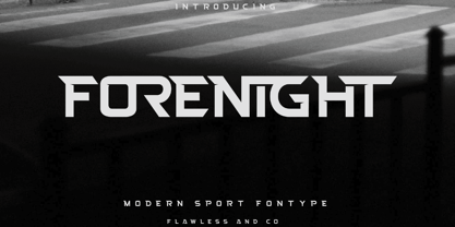 Introducing "Forenight" - a dynamic and modern sport font designed to capture the spirit of athleticism and energy. With its bold and sleek letterforms, Forenight brings a sense of power and movement to your sports-related designs. There's some connected letters and some alternates that suitable for any graphic designs such as branding materials, t-shirt, print, business cards, logo, poster, t-shirt, photography, quotes .etc This font support for some multilingual. Also contains uppercase A-Z and lowercase a-z, alternate character, numbers 0-9, and some punctuation. If you need help, just write me! Thanks so much for checking out my shop!
 - Beyond Babylon by URW Type Foundry,
$35.99 Babylon was a civilisation that stretched from Bagdad to the Persian Gulf. There is an Old and new Babylonia, the era of Babylon civilization and the biblical Babylon. The oldest scriptures to be found since the rise of civilisation are Babylonic. The Christian, the Jewish and the Arabic culture find its origin in the Middle East. And share more or less the same history, the same roots and DNA. One people, but in reality a melting pot of close related cultures whom could not be more far apart, hostile and suspicious towards each other. An eye for an eye, tooth for a tooth. One could say this disagreement is still alive today and has deeply infected all of our systems. Beyond Babylon is sculpted after Hebrew, Arabic character style elements in a European writing. It questions what happened after the great Babylonic confusion. Did the words finally come across? Did they realize the distant and gap was maybe smaller than expected. This typeface is related to my former character Eurabia. As an artist I like to play with contradictions. Use opposite elements and mould them in to one understandable piece and in addition a thought to chew on. Otherwise the experimental ore shape lovin' typeface user could be very happy with an addition feature to the existing characters. One option more to express your selves in writing. Also this typeface is really suitable for theme writing or advertising. ----------- Babylon war eine Zivilisation die sich von Bagdad bis zum Persischen Golf erstreckte. Es gibt das alte und das neue Babylon, die Ära der Babylon Zivilisation und das biblische Babylon. Die ältesten Schriften, welche seit dem Aufstieg der Zivilisation gefunden wurden, sind babylonisch. Die Christen, die Juden und die arabische Kultur finden ihren Ursprung im Mittleren Osten. Sie teilen mehr oder weniger die gleiche Geschichte, die gleichen Wurzeln und DNA: Ein Volk. Aber in Wirklichkeit waren sie ein Schmelztiegel aus eng verwandten Kulturen, welche sich nicht ferner sein könnten: feindselig und misstrauisch zueinander. Auge um Auge, Zahn um Zahn. Man könnte behaupten, diese Unstimmigkeit bestehe noch heute und hätte all unsere Systeme stark infiziert. Beyond Babylon ist eine europäische Schrift, geformt nach hebräischen und arabischen Stilelementen der Zeichen. Sie hinterfragt die Geschehnisse nach der der Babylonischen Sprachverwirrung. Kamen die Worte endlich an? Haben sie realisiert, dass die Weite des Spalts zwischen ihnen vielleicht geringer war als erwartet. Diese Schrift ist verwandt mit meinen vorigen Zeichen der Eurabia. Als Künstlerin mag ich es mit Widersprüchen zu spielen, gegensätzliche Elemente zu einem vernehmbaren Ganzen zu verschmelzen und einen kniffligen Gedanken zu erzeugen. Andererseits könnte der experimentelle oder formenverliebte Nutzer sehr glücklich über eine zusätzliche Funktion der bestehenden Zeichen sein. Eine weite Möglichkeit sich im Schreiben auszudrücken. Diese Schrift ist auch für Werbung sehr geeignet.
 - Gledek by Differentialtype,
$10.00 Gledek is a lightning display font that comes in two styles. The regular and outline styles complement each other perfectly for any purpose such as logos, sports, games, club branding, posters, labels, comic books and more. Add this font to every project you create to make it brighter and stand out.
 - Gratezon by Rvandtype,
$15.00 Gratezon is a display font. It has a cool and playful look that can be used for logos, branding, invitations, stationery, social media posts, and so much more. Featuring the perfect amount of trendiness, this font will make your designs come to life. Features : Numbers and punctuation Multilingual Support Ligature
 - Farench by Muksal Creatives,
$15.00 Farech is modern Display Vintage font, and Farech features unique and modern Display Vintage look and feel.is a fancy and Display Vintage font will elevate a wide variety of projects, from logos and stationery to magazine covers and social media posts. This typeface will take your designs to the next level!
 - Line Washington by Aqeela Studio,
$20.00 Line Washington is a thin and elegant handwritten font. Fall in love with its incredibly versatile style and use it to create gorgeous wedding invitations, beautiful stationary art, eye-catching social media posts and more! This font is PUA encoded which means you can access all the glyphs and sweeps easily!
 - Two Lines Loop by Kaer,
$21.00 Alphabet set made of two white parallel lines. They are looked like infinite looped icons. Ideal for dynamic app, minimalism design, sports identity, technology adv. What's included? Uppercase (lowercase are the same) Numbers Symbols Punctuation Multilingual support Please feel free to request any help you need: kaer.pro@gmail.com Best, Roman.
 - Bondjlo by Muksal Creatives,
$13.00 Bondjlo is font a vintange serif, and Bondjlo features unique and modern serif look and feel.is a fancy and modern serif font will elevate a wide variety of projects, from logos and stationery to magazine covers and social media posts. This typeface will take your designs to the next level!
 - WhoopAss - Personal use only

- Giza RE by Font Bureau,
$40.00 Giza brings back the colorful power and variety of the original Egyptian letterforms, a glory of the Victorian era. Designer David Berlow based the family on showings in Vincent Figgins’ specimen of 1845, the triumphant introduction of this thunderous style. This version of the family is part of the Reading Edge series of fonts specifically designed for small text onscreen, having been adjusted to provide more generous proportions and roomier spacing, and having been hinted in TrueType for optimal rendering in low resolution environments.
 - DIN Next Arabic by Monotype,
$155.99 DIN Next is a typeface family inspired by the classic industrial German engineering designs, DIN 1451 Engschrift and Mittelschrift. Akira Kobayashi began by revising these two faces-who names just mean ""condensed"" and ""regular"" before expanding them into a new family with seven weights (Light to Black). Each weight ships in three varieties: Regular, Italic, and Condensed, bringing the total number of fonts in the DIN Next family to 21. DIN Next is part of Linotype's Platinum Collection. Linotype has been supplying its customers with the two DIN 1451 fonts since 1980. Recently, they have become more popular than ever, with designers regularly asking for additional weights. The abbreviation ""DIN"" stands for ""Deutsches Institut für Normung e.V."", which is the German Institute for Industrial Standardization. In 1936 the German Standard Committee settled upon DIN 1451 as the standard font for the areas of technology, traffic, administration and business. The design was to be used on German street signs and house numbers. The committee wanted a sans serif, thinking it would be more legible, straightforward, and easy to reproduce. They did not intend for the design to be used for advertisements and other artistically oriented purposes. Nevertheless, because DIN 1451 was seen all over Germany on signs for town names and traffic directions, it became familiar enough to make its way onto the palettes of graphic designers and advertising art directors. The digital version of DIN 1451 would go on to be adopted and used by designers in other countries as well, solidifying its worldwide design reputation. There are many subtle differences in DIN Next's letters when compared with DIN 1451 original. These were added by Kobayashi to make the new family even more versatile in 21st-century media. For instance, although DIN 1451's corners are all pointed angles, DIN Next has rounded them all slightly. Even this softening is a nod to part of DIN 1451's past, however. Many of the signs that use DIN 1451 are cut with routers, which cannot make perfect corners; their rounded heads cut rounded corners best. Linotype's DIN 1451 Engschrift and Mittelschrift are certified by the German DIN Institute for use on official signage projects. Since DIN Next is a new design, these applications within Germany are not possible with it. However, DIN Next may be used for any other project, and it may be used for industrial signage in any other country! DIN Next has been tailored especially for graphic designers, but its industrial heritage makes it surprisingly functional in just about any application. The DIN Next family has been extended with seven Arabic weights and five Devanagari weights. The display of the Devanagari fonts on the website does not show all features of the font and therefore not all language features may be displayed correctly.

