10,000 search results
(0.092 seconds)
- Boyflare by Maulana Creative,
$12.00 Boyflare is a cursive handwritten script font. With bold mono-line stroke, fun character with a bit of ligatures and alternates. To give you an extra creative work. Boyflare font support multilingual more than 100+ language. This font is good for logo design, Social media, Movie Titles, Books Titles, a short text even a long text letter and good for your secondary text font with sans or serif. Make a stunning work with Boyflare font. Cheers, Maulana Creative
 - Karma Koma by Maulana Creative,
$14.00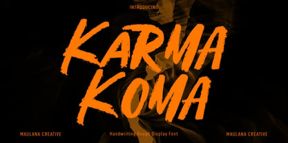 Karma Koma is a casual handwritten font. With bold brush stroke, fun character with a bit of ligatures and alternates. To give you an extra creative work. Karma Koma font support multilingual more than 100+ language. This font is good for logo design, Social media, Movie Titles, Books Titles, a short text even a long text letter and good for your secondary text font with sans or serif. Make a stunning work with Karma Koma font. Cheers, Maulana Creative
 - MC Bazelle by Maulana Creative,
$15.00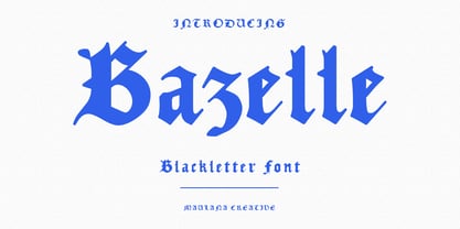 Bazelle is a modern experimental blackletter font. With medium low contrast stroke, fun character with a bit of ligatures and alternates. To give you an extra creative work. Bazelle font support multilingual more than 100+ language. This font is good for logo design, Social media, Movie Titles, Books Titles, a short text even a long text letter and good for your secondary text font with sans or serif. Make a stunning work with Bazelle font. Cheers, Maulana Creative
 - Hitshot Signature by Maulana Creative,
$12.00 Hitshot is an expressive signature brush script font. With regular brush stroke, slanted and fun character with some of ligatures and lowercase alternates. To give you an extra creative work. Hitshot font support multilingual more than 100+ language. This font is good for logo design, Social media, Movie Titles, Books Titles, a short text even a long text letter and good for your secondary text font with sans or serif. Make a stunning work with Hitshot font. Cheers, MaulanaCreative
 - MC Rasteira by Maulana Creative,
$16.00 Rasteira is an elegant classical display serif font. Regular contrast stroke, fun character with a bit of ligatures and alternates. To give you an extra creative work. Rasteira font support multilingual more than 100+ language. This font is good for logo design, Social media, Movie Titles, Books Titles, a short text even a long text letter and good for your secondary text font with script or serif. Make a stunning work with Rasteira font. Cheers, Maulana Creative
 - Sunnycyclops by Maulana Creative,
$12.00 Sunnycyclops is a Handwritten script font it's monoline and clean stroke with fun character. It has Opentype features ligature rich to give you an extra creative work. Sunnycyclops support multilingual more than 100+ language. This font is good for logo design, Social media, Movie Titles, Books Titles, a short text even a long text letter and good for your secondary text font with sans or serif. Make a stunning work with Sunnycyclops Handwritten font. Cheers, MaulanaCreative
 - MC Rib Cawmy by Maulana Creative,
$15.00 Rib Cawmy playful display font. Bold stroke, fun character with a bit of ligatures and alternates. To give you an extra creative work. Rib Cawmy playful display font support multilingual more than 100+ language. This font is good for logo design, Social media, Movie Titles, Books Titles, a short text even a long text letter and good for your secondary text font with script or serif. Make a stunning work with Rib Cawmy playful display font. Cheers, Maulana Creative
 - Franches by Maulana Creative,
$14.00 Franches is a Cute handwritten font. With high contrast bold stroke, upright and fun character with a bit of ligatures. To give you an extra creative work. Franches font support multilingual more than 100+ language. This font is good for logo design, Social media, Movie Titles, Books Titles, a short text even a long text letter and good for your secondary text font with sans or serif. Make a stunning work with Franches font. Cheers, MaulanaCreative
 - Fattalsfort by Maulana Creative,
$13.00 Fattalsfort is a Handwritten Brush font. With Bold raw brush stroke, slant and fun character with a bit of ligature and swashes. To give you an extra creative work. Fattalsfort font support multilingual more than 100+ language. This font is good for logo design, Social media, Movie Titles, Books Titles, a short text even a long text letter and good for your secondary text font with sans or serif. Make a stunning work with Fattalsfort font. Cheers, MaulanaCreative
 - Shasy Love by Maulana Creative,
$14.00 Shasy Love lovely display font. Bold stroke, fun character with a bit of ligatures and alternates. To give you an extra creative work. Shasy Love font support multilingual more than 100+ language. This font is good for logo design, Social media, Movie Titles, Books Titles, a short text even a long text letter and good for your secondary text font with script or serif. Make a stunning work with Shasy Love graffiti display font. Cheers, Maulana Creative
 - Malto by Maulana Creative,
$15.00 Malto is a condensed sans serif font. With semi bold soft edge stroke, fun character with a bit of ligatures and alternates. To give you an extra creative work. Malto font support multilingual more than 100+ language. This font is good for logo design, Social media, Movie Titles, Books Titles, a short text even a long text letter and good for your secondary text font with sans or serif. Make a stunning work with Malto font. Cheers, Maulana Creative
 - Horriblys by Maulana Creative,
$14.00 Horriblys is a decorative handwritten display font. With bold wavy stroke, fun character with a bit of ligatures and alternates. To give you an extra creative work. Horriblys font support multilingual more than 100+ language. This font is good for logo design, Social media, Movie Titles, Books Titles, a short text even a long text letter and good for your secondary text font with sans or serif. Make a stunning work with Horriblys font. Cheers, Maulana Creative
 - MC Granko by Maulana Creative,
$17.00 Granko is a a retro vibes condensed sans serif font. Bold stroke, fun character with a bit of ligatures and alternates. To give you an extra creative work. Granko font support multilingual more than 100+ language. This font is good for logo design, Social media, Movie Titles, Books Titles, a short text even a long text letter and good for your secondary text font with script or serif. Make a stunning work with Granko font. Cheers, Maulana Creative
 - Ponpewd Signature by Maulana Creative,
$11.00 Ponpewd is a Signature Script Brush Font. With bold mono-line stroke, slant and fun character with a bit of ligatures. To give you an extra creative work. Ponpewd font support multilingual more than 100+ language. This font is good for logo design, Social media, Movie Titles, Books Titles, a short text even a long text letter and good for your secondary text font with sans or serif. Make a stunning work with Ponpewd font. Cheers, MaulanaCreative
 - MC Harben by Maulana Creative,
$18.00 Harben is an wavy stem display sans font. With bold stroke, fun character with a bit of ligatures and alternates. To give you an extra creative work. Harben font support multilingual more than 100+ language. This font is good for logo design, Social media, Movie Titles, Books Titles, a short text even a long text letter and good for your secondary text font with script or serif. Make a stunning work with Harben font. Cheers, Maulana Creative
 - Bravhela by Maulana Creative,
$12.00 Bravhela is an unique western handwritten display script font. With bold consist stroke, fun character with a bit of ligatures and alternates. To give you an extra creative work. Bravhela font support multilingual more than 100+ language. This font is good for logo design, Social media, Movie Titles, Books Titles, a short text even a long text letter and good for your secondary text font with sans or serif. Make a stunning work with Bravhela font. Cheers, Maulana Creative
 - Hello Hoeask by Imoodev,
$12.00 Hello Hoeask is display fonts with visual elegance, smooth curves and beautiful ligatures clear, making your work look true and attractive. A very versatile font that works in both large and small sizes. This font is suitable for a wide variety of projects such as invitations, logo, branding, magazine, photography, card, product packaging, mugs, quotes, poster, label, signature and more. Font which is perfect for all business sectors including personal projects, studio, corporate, creative agency, industrial, company, etc.
 - Alright, picture this: a font that decided it wanted to be the cool uncle of the comic book world, showing up at family gatherings with a leather jacket and a slight lean to one side. That, my friend...
- Cloister Open Face LT by Linotype,
$29.99Cloister Open Face was designed in 1929 by Morris Fuller Benton as one weight of the Cloister Old Style family. Cloister itself appeared from 1897 with American Type Founders, and later for the typesetting machines of the Linotype, Intertype and Monotype companies. At that time, it was the truest modern industrial revival of the Jensonian Roman. Benton stayed close to the style of his model in both design and spacing. Cloister Open Face has an old-world elegance, and it works well for titling in books and magazines. In 1458, Charles VII sent the Frenchman Nicolas Jenson to learn the craft of movable type in Mainz, the city where Gutenberg was working. Jenson was supposed to return to France with his newly learned skills, but instead he traveled to Italy, as did other itinerant printers of the time. From 1468 on, he was in Venice, where he flourished as a punchcutter, printer and publisher. He was probably the first non-German printer of movable type, and he produced about 150 editions. Though his punches have vanished, his books have not, and those produced from about 1470 until his death in 1480 have served as a source of inspiration for type designers over centuries. His Roman type is often called the first true Roman." Notable in almost all Jensonian Romans is the angled crossbar on the lowercase e, which is known as the "Venetian Oldstyle e."" - Ridasbin by Twinletter,
$17.00 Say hello to Ridasbin, a loyal friend in the world of design! With this classic serif font, you can feel the luxury of classic modernism in every project you work on. Whether you are creating posters, brochures, or other designs, Ridasbin will give you an elegant and unforgettable touch. The elegant and classy serif style on Ridasbin will make your designs look professional and classy. Each letter is designed with subtle details and perfect proportions, creating a timeless look. Not only that but Ridasbin is also equipped with special features such as ligatures and alternative characters that allow you to experiment with various interesting letter combinations. You also don’t need to worry about using various languages, because Ridasbin supports multilingualism. This means you can be creative and reach audiences from all over the world easily. With Ridasbin, you can present a stunning classic modernism charm in your designs. Display unforgettable elegance and charm, and make a lasting impression on your potential customers. Don’t miss the chance to own this beautiful classic serif font. Get ready for satisfaction and great design results with Ridasbin! What’s Included : File font All glyphs Iso Latin 1 Alternate, Ligature Simple installations We highly recommend using a program that supports OpenType features and Glyphs panels like many Adobe apps and Corel Draw so that you can see and access all Glyph variations. PUA Encoded Characters – Fully accessible without additional design software. Fonts include Multilingual support
 - Tyma Garamont by T4 Foundry,
$49.00The TYMA Garamont Roman was inspired by the Berner-Egenolff type sample from the 1560s. The Italic was inspired by a sample from Robert Granjon, also from the 1560s. The name TYMA is short for AB Typmatriser, a Swedish company founded 1948, because the Second World War stopped all import of matrices for Linotype and Intertype typesetting machines. It took until 1951-52 before the import was up to speed again. Until then, Sweden had to fend for itself. TYMA produced all technical equipment needed for type production, including the pantograph to cut the matrices, a complete set for each size and version. The templates for Garamont Roman were initiated by Henry Alm 1948. Bo Berndal was hired the following year, and continued the work by drawing and cutting templates for the rest of Garamont Roman, as well as for the remaining Garamont family. Bo Berndal stayed at TYMA until it went bankrupt in 1952. At that time Bo Berndal had already kick-started his career as type designer by drawing the typeface Reporter for one of the big daily newspapers, Aftonbladet, a version of Cheltenham for another daily, Dagens Nyheter, and copied several old typefaces for other customers. Librarian Sten G. Lindberg at The Royal Library of Stockholm, Kungliga Biblioteket, procured copies of original type samples. Henry Alm started the work in 1948, and Bo Berndal completed it - finally in this OpenType version. - Mobalys by Alit Design,
$19.00 Introducing Mobalys - Where Elegance Meets Nature Embrace the beauty of nature with Mobalys, a captivating font that seamlessly blends the grace of elegant script with the modern simplicity of sans serif. Immerse your designs in the lush greenery of a go-green theme, accompanied by stunning leaf illustrations that breathe life into your creations. Elegance in Every Curve: Mobalys boasts an exquisite script style that adds a touch of sophistication to your projects. Each curve and swirl is carefully crafted to exude elegance. Modern Simplicity: The sans serif elements bring a contemporary flair, ensuring versatility in usage. Whether it's a sleek logo or a clean headline, Mobalys adapts effortlessly. Nature's Embrace: Dive into a world of greenery with Mobalys. The font is adorned with enchanting leaf illustrations, adding a touch of organic charm to your designs. Let the beauty of nature seamlessly integrate into your projects. Extensive Character Set: With 730 characters at your fingertips, Mobalys provides a diverse range of options to express your creativity. Explore a plethora of possibilities with ligatures, alternates, swashes, and more. PUA Unicode: Unleash your design freedom with Mobalys' Private Use Area (PUA) Unicode support. Access additional characters and symbols for a truly customized touch to your work. Elevate your designs with Mobalys, where the synergy of elegance and nature creates a visual masterpiece. Immerse your audience in the refreshing green world and let your creativity flourish. Mobalys is not just a font; it's an experience.
 - The Janda Hide And Seek font, crafted by the talented Kimberly Geswein, is a playful and charismatic typeface that exudes a sense of whimsy and warmth. True to its name, it seems to play a delightful...
- The font Komika Title, created by Apostrophic Labs, is a distinctive and vibrant typeface that falls within the display category due to its unique characteristics and visual appeal. This font is part...
- As of my last update in 2023, no official font directly named "Ren & Stimpy" exists as it would pertain specifically to the iconic American animated television series "The Ren & Stimpy Show" which ai...
- Picture this: "Teen Spirit" by Steven J. Lundeen is not just a font; it's the embodiment of youth rebellion, a visual shout that echoes through the halls of high school, sticking it to the man with e...
- Vulpa by Eclectotype,
$36.00 Vulpa is a charming serif family in regular, italic and bold, informed by the proportions of a personal favorite, Plantin. The quirky foxtail terminals (inspired in part by my script font, Gelato Script) can be seen across all three styles. These little details make the typeface very expressive at display sizes, but practically disappear at text sizes, making for a very versatile face. Across the three styles there are a number of useful OpenType features which make Vulpa capable of demanding typographic work, even though there are only three styles. Regular, italic and bold are all you really need anyway! The regular and bold weights both include small caps, and the italic features swash capitals for most letters. The italic also features quaint discretionary ligatures, and all styles include standard ligatures, automatic fractions, proportional and tabular, lining and oldstyle figures. If this isn't enough, the Vulpa family also includes Ornaments and Drop-Cap fonts. There is an ornament for A to B, a to b and 0 to 9. These have been carefully designed to match the feel of the text fonts, and many are influenced by ornaments and fleurons from the ATF 1912 Type Specimen book. The drop-caps have an engraved look, and two color versions can be made by overlaying upper and lower case. Despite the lack of weights compared to ‘workhorse’ faces, the charm and versatility of Vulpa make it a really useful typeface, that I hope you'll enjoy using as much as I enjoyed making.
 - TT Severs by TypeType,
$29.00 TT Severs useful links: Specimen | Graphic presentation | Customization options TT Severs is a geometric grotesque with emphasized elements of internal brackets. A distinctive feature of TT Severs is the unusual form of internal ovals, which refers us to the style of traditional Arabic writing. TT Severs has a strong character and is great for use in high tech (IT), the web, in robotics, computer games, and sports. TT Severs is a 2-in-1 font family. In a large body size, it works great as a display font, creating a distinctive character for logos and headings. At the same time, when TT Severs is used in a small body size or in large text arrays, the font’s peculiarities of bracket construction fade, and it perfectly functions as a text font, thanks to both the low contrast between vertical and horizontal strokes and the detailed logic of interaction of black and white letter elements. The font family TT Severs includes 18 fonts, each of which consists of 558 glyphs. The family has standard and discrete ligatures, which include experimental ligatures for the Cyrillic alphabet. In addition, TT Severs can be made a little more humanist—it is enough to turn on stylistic alternates, and due to them the font takes the form of a humanist grotesque, which refers us to traditional broad nib writing. As part of the font family, you will also find old-style figures and a large number of OT features such as case, ordn, sups, sinf, dnom, numr, onum, tnum, pnum, liga, dlig, salt (ss01), frac.
 - Satero Serif by Linotype,
$29.99 Satero was designed by Prof. Werner Schneider in 2007. Never before have we had so much written material to consume; this is the age of mass-communication. Unfortunately, the decision of which typeface to use is too often made lightly. The typeface is one of the most elementary means of language, and it can play a major role in a text's legibility and the amount of time the reader needs for it. The Satero Type System offers a high degree of legibility due to its dynamic and forms. The individual characters have been based on classical concepts. They are clearly made, and leave all unnecessary elements behind. The type works to create an environment of extreme legibility. Essential parts of the a, c, e, s, and r are to be found at the x-height line, which is the most important area of a line of text in determining legibility. The Satero Type System includes two members whose basic forms are the same. The Sans Serif members are more horizontally differentiated than common grotesques, which aides their legibility. The Serif design employs asymmetrical serifs, avoiding elephant feet" altogether. Their dynamic is progressive. The condensed nature of the seriffed counterparts is optimal for newspaper and magazine applications, where space is at a premium and paper must be saved. All fonts in the Satero Type System include a number of alternate glyphs, as well as ligatures and proportional lining figures; all weights except the Heavy and Heavy Italic fonts are also equipped with small caps, small cap figures, and oldstyle figures as OpenType features. "
 - Gopixel by Ditatype,
$29.00 Go Pixel is an exciting game-themed display font designed in uppercase, capturing the essence of retro pixel art. The consistent proportions of this font create a harmonious and balanced visual experience. Each uppercase letter is crafted with precision, ensuring uniformity and maintaining the overall aesthetic appeal. This design choice guarantees that every character fits seamlessly together, resulting in a cohesive and visually pleasing typographic composition. The uneven borders of Go Pixel add a touch of vintage charm and quirkiness to the font. Each letter is outlined with varying thickness, mimicking the imperfections found in retro pixel art. This unique feature gives the font a distinct personality and captures the nostalgia of classic video games. With low contrast, it embraces a softer and more subtle approach to readability. The slight variation in stroke width allows for a smooth and comfortable reading experience. While the low contrast may be unconventional, it enhances the overall retro feel of the font, immersing your audience in the world of classic gaming. Enjoy the available features here. Features: Multilingual Supports PUA Encoded Numerals and Punctuations Go Pixel fits in headlines, logos, posters, titles, branding materials, print media, editorial layouts, website headers, and any projects that aim to evoke a sense of fun and nostalgia. Find out more ways to use this font by taking a look at the font preview. Thanks for purchasing our fonts. Hopefully, you have a great time using our font. Feel free to contact us anytime for further information or when you have trouble with the font. Thanks a lot and happy designing.
 - Vala by Monotype,
$29.99 Vala™ dances across printed pages and shines on screen. This is a high-energy design that blends the grace of an English Roundhand script with the gravitas of an extra bold Bodoni. There is even a bit of romance in the design. Vala speaks with a resonant voice – and knows few bounds. The typeface enhances print headlines, subheads, cover art and packaging. The design also brings its distinctive melding of verve and poise to banners, headings, navigational links and branding in web sites, blog posts, games and apps. Oscar Guerrero found inspiration for Vala in shop window lettering near his home in Bogotá, Colombia. “The capital A, R and V caught my attention and I photographed the window for future reference,” he explains. “Later I started to draw more letters inspired by the ones in the window.” Guerrero admits that he has always admired the work of Giambattista Bodoni and allowed his classic Didone designs to infuse Vala. Striking contrast in stroke weights, lively ball-terminals and a large x-height give Vala the grace and force of a Waikiki wave. Not satisfied with just a basic character set, Guerrero also took advantage of OpenType’s capabilities and drew a complete set of swash capitals, a bevy of fancy ligatures, and a suite of lowercase alternative designs. The result is that Vala easily emulates custom lettering in posters, headlines and logotypes. The “romantic” part of Vala? Guerrero dedicated the design to his girlfriend, Valentina, and named it after her.
 - Galix Mono by Eclectotype,
$25.00 This monospaced version of Galix was commissioned in 2037 by the space exploration company Earth2, as part of a major overhaul of their branding, which had used, since 2021, a generic sans serif (much like every other company). Many specialists in both design and space exploration suggested that this very rebrand started a chain of events that concluded with the invention of time travel in 2041. Contrary to the perceived notion put forward in popular Science Fiction, time travel is only (as of now) possible in the digital realm. It was considered fitting that included among the first files sent back in time should be the Galix Mono typeface, which was remade in OTF format to ensure that it would work with the technology available in 2019. Earth2, for all their insight, did not foresee that the release of the typeface in September of 2019, would lessen the impact of their rebrand. What kind idiots would rebrand a forward looking company with a font that was, by then, almost 18 years old? The subsequent lacklustre response to the redesign didn’t inspire the tidal wave of R&D funding Earth2 had anticipated, and the company went into administration in the summer of 2039, having never invented the time travel which made the release of Galix Mono in 2019 possible. Experts believe that the files sent back in time, although their very sending made it impossible for them to be sent, remained as “time relics” of the future that might have been.
 - Dolsáb by Kent Barns,
$20.00 Dolsáb was designed from scratch with uniqueness in mind. The subtle movement from thick to thin and the variants of sharp to rounded make this cutting edge san serif a must have. The inspiration for Dolsab was a simple pairing of a rhombus and calligraphy. While neither of those two elements can be seen in their entirety in any instance, the influence of both is strong. The rhombus can be notice on most ascenders like on the lowercase t & l, for example. And the calligraphy inspiration is most easily captured on the descenders such as the lowercase y & g. The most beautiful characteristics of Dolsab is definitely the calligraphy-influenced movement. These features really stand out on the lowercase a & e. It's almost amusing to let your eye follow the contours of those two letter forms as they travel from thick to thin, sharp to rounded and back again. Users are welcomed to try all font styles of Dolsab in any applique of their choosing. However, it will be quickly noticeable that only Dolsab Air & Demi (the thiner of the styles) will be best suited for body copy. Personally I like to see these letterforms as large as they can be to really showcase the subtle movement, especially in Dolsab Heavy where these movements become much more dramatic. You'll never know what really works best unless you experiment. Dolsab surely isn't the answer to all projects, but it's certainly worth trying. No other typeface moves quite like Dolsáb.
 - Satero Sans by Linotype,
$29.99 Satero was designed by Prof. Werner Schneider in 2007. Never before have we had so much written material to consume; this is the age of mass-communication. Unfortunately, the decision of which typeface to use is too often made lightly. The typeface is one of the most elementary means of language, and it can play a major role in a text's legibility and the amount of time the reader needs for it. The Satero Type System offers a high degree of legibility due to its dynamic and forms. The individual characters have been based on classical concepts. They are clearly made, and leave all unnecessary elements behind. The type works to create an environment of extreme legibility. Essential parts of the a, c, e, s, and r are to be found at the x-height line, which is the most important area of a line of text in determining legibility. The Satero Type System includes two members whose basic forms are the same. The Sans Serif members are more horizontally differentiated than common grotesques, which aides their legibility. The Serif design employs asymmetrical serifs, avoiding elephant feet" altogether. Their dynamic is progressive. The condensed nature of the seriffed counterparts is optimal for newspaper and magazine applications, where space is at a premium and paper must be saved. All fonts in the Satero Type System include a number of alternate glyphs, as well as ligatures and proportional lining figures; all weights except the Heavy and Heavy Italic fonts are also equipped with small caps, small cap figures, and oldstyle figures as OpenType features. "
 - Ruca by URW Type Foundry,
$49.99 Since my first contact with blackletters in 1999, I became more and more fascinated by these artistic looking typefaces. It all started in the USA at the age of 16, when I took an art class. I decided to trace some blackletter typefaces because they looked very interesting. From this point on I was intrigued by blackletter fonts from all over the world. I studied their different body structures and their cultural background as well as the type designers behind it. Full of information and inspiration I started to draw my own blackletter typeface in 2006. While studying in Hamburg I got in touch with the studio of URW++, where I got skilled in type software and development. Creating a type takes an eye for detail and patience but also lots of time and so it took almost 4 years until the project was finished. And so Ruca was born. Ruca is a refined and expanded typeface. When you look at the spines, the tails or the flags you can see the detailed drawing, which makes the font also extremely good looking in very tall letters. The full character set contains over 400 characters, many ligatures, two number sets and all important currency symbols. Over 300 kerning pairs and many OTF-features make the font easy in use for professional type applications. The typeface is very well applicable for strong headlines and mastheads. Because of its unique appearance, Ruca is perfectly suitable professional graphic applications such as fashion design or branding.
 - Freebooter Script - Alts - Unknown license

- Moondog Zero - Unknown license

- Moondog Fifteen - Unknown license

- Haven Code - Unknown license

- Scriptina - Alternates - Unknown license


