10,000 search results
(0.048 seconds)
- Thefrost by Maulana Creative,
$11.00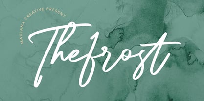 Give your designs an authentic handcrafted feel. Thefrost Modern Script Font is perfectly suited to stationery, logos and much more. Many Thanks! MaulanaCreative
 - Ongunkan Greek Athen by Runic World Tamgacı,
$45.00 It is the athenian version of the ancient Greek script. Ancient Greek numerals are included. It's not Unicode, it's a Latin based font.
 - Julio by Authentic,
$39.50 Julio is designed in the best tradition of English scripts. It comes in very handy if you want to have an elegant touch.
 - Vacation Monogram by Selvia Design,
$15.00 “Vacation Monogram” is a script font combined with a monogram. This monogram is decorated with forms of tourism and traveling around the world.
 - Jess by Epiclinez,
$18.00 Jess is an authentic stylish script font. This handwritten beauty is suitable for high-end, sophisticated branding or for simple, memorable Instagram quotes.
 - Skeleton Slab by Studio K,
$45.00 Skeleton Slab brings a new elegance to a classic form. I was thinking of calling it Ozymanidias, after Shelley’s poem, because it evokes memories of ancient runic inscriptions, but then I thought that was maybe a bit pretentious, and I decided I'd keep it simple and descriptive. Besides, I wasn't sure how to spell Ozymandias! Skeleton Slab has small caps in place of lower case.
 - Sign Letters JNL by Jeff Levine,
$29.00 A few scant examples of some condensed Roman style water-applied decals inspired Sign Letters JNL. The decals were once part of the gold and black "Signmaker" letters and numbers once manufactured by the Duro Decal Company of Chicago and were sold through hardware and variety stores across the country. The condensed letters (which were eight inches in height) did not sell as well as Duro's mainstay sizes of 1/2 inch to 3-1/2 inches and were discontinued long before the rest of the line was supplanted by self-adhesive lettering.
 - Cinema Macabre by Wing's Art Studio,
$10.00 Cinema Macabre: Horror Fonts Torn from the Pages of Giallo A Hand-drawn Display Font for Creating the Most Diabolical Horror Titles This loose and inky brush font takes its inspiration from the classic Giallo film posters of the 1960s to 1980s - a cult cinematic subgenre beloved for its stylish visuals, haunting soundtracks and exploitation led marketing. It's a devilishly drawn design that aims to capture the feeling of vintage horror, preserving analogue details of old print while remaining versatile enough to work across a variety of digital designs. The Cinema Macabre font family boasts six fonts, each containing a unique set of uppercase and lowercase characters, as well as numerals, punctuation and language support. Add to this a host of custom ligatures, underlines and graphic elements and you have an essential toolbox for creating truly hand-made looking title designs. Cinema Macabre if a font that rewards experimentation by mixing all the various upper and lowercase alternatives, with interesting combinations waiting to be found and inspire terror across your own movie posters, book covers, albums and editorials. Few other fonts offer the versatility to create such diabolical designs! A Brief Introduction to Giallo: In popular cinema, Giallo is a genre of mystery fiction and thrillers often containing slasher, psychological horror, exploitation, supernatural and erotic elements. The term giallo (meaning yellow) derives from a series of pulp novels published by Mondadori from 1929 taking the name from its trademark yellow covers. The series consisted of Italian translations of mystery novels by well-known authors such as Agatha Christie, Edgar Allan Poe and Raymond Chandler. The popularity of these cheap paperbacks eventually established the word Giallo as a synonym in Italian for a mystery novel. The cinematic Giallo subgenre developed during the 1960-80s and are noted for their vivid cinematography, memorable soundtracks and inventive gore-filled scenarios. Key examples include Dario Argento's Suspiria, Tenebrae and Deep Red - stylish films that at once influenced the American slasher (see Black Christmas and Friday 13th) up to todays horror in Censor and Last Night In Soho.
 - ITC Tyfa by ITC,
$29.99 Some words from the designer, Frantisek Storm... Designed by Josef Tyfa in 1959, digitalized by F. Storm in 1996. This Roman and Italic are well-known perhaps to all Czech graphic artists and typographers ever since their release. Although this type face in some details is under the sway of the period of its rise, its importance is timeless, in contradistinction to other famous types dating from the turn of the sixties which were found, after some time, to be trite. The italics live their own life, only their upper-case letters have the same expression as the basic design. Thin and fragile, they work excellently, emphasizing certain parts in the text by their perfect contrast of expression. When seen from a distance they are a little bit darker than the Roman face. Tyfa Roman was released in 1960 by Grafotechna in Prague for hot setting. Later on, Berthold produced letter matrices - "rulers" for Staromat devices, used for manual photosetting of display alphabets. In the eighties it was available on dry transfers of Transotype and today it is offered also by ITC. The meticulously executed designs of the individual letters in the 288 point size are arranged into a set of signs on a cardboard of about B2 in size. The yellowed paper reveals retouches by white paint on the ink. Blue lines mark the baseline, the capital line, the ascender and descender lines and the central verticals of the letters. With regard to the format of the flat scanner, the designs had to be reduced, with the use of a camera, to the format A4, i.e. to the upper-case letter height of about 30 mm. These were then scanned in 600 dpi resolution and read as a bitmap template to the FontStudio programme. The newly created bold type faces derive from Tyfa's designs of the letters "a", "n", "p", the darkness of which was increased further, approximately by 3%, to enhance their emphasizing function. The text designs have hairstrokes thickened by one third; the contrast between thin and thick strokes has been modified, in order to improve legibility, in sizes under 12 points. We have used electronic interpolation to produce the semi-bold designs. Josef Tyfa himself recommends to choose a somewhat darker design than the basic one for printing of books.
 - Club - Personal use only

- ALCATRAZ - Personal use only

- Teatral - Personal use only

- Shanghai - Unknown license

- Gothic Birthday Cake - 100% free

- KG Lego House - Personal use only

- Staubach - 100% free

- 84 Rock! - Personal use only

- Digital tech - Personal use only

- Cher Font - Unknown license

- GarbageG - Unknown license

- Espresso - Unknown license

- PlasterCaster - Unknown license

- GASMASK - Personal use only

- Drebiek - Unknown license

- VTCSuperMarketSaleTallTilt - Unknown license

- SF Piezolectric Inline - Unknown license

- Avain - Personal use only

- Vinyle by Lián Types,
$37.00 Bold, rounded and super cool. Those are the attributes of my latest font “Vinyle”, french for vinyl. In this epoque where all fields of Design are giving a lot of importance and attention to Typography and Lettering, I felt it was my duty to contribute with something that could really stand alone and ‘say something else’ that just words to be read. I've found that lately in the world, regarding a finished piece of design, the role of Typography (and of letters in general) went from being secondary, (like a minor player or a supporting actor) to the most important one. People are starting to understand the beauty of a well-done letter: they want their storefronts with unique scripts, they want to drink coffee surrounded by lettered blackboards, they want to buy books with astonishing covers with swashes ‘por doquier’. I'm more than happy to be alive in a present where even the most unimaginable friends of mine, (who couldn't spot differences between comic sans and helvetica before) are now conscious of the importance of a letter, or let’s say: Of the ‘voice’ of Typography. With Vinyle I tried to make a font with power. Following the nowadays trend of, let me say, “the vintage sans renaissance”. This time I put my brushes and nibs aside and experimented with something new. It wasn't easy, if you will pardon, for me to see swashes all over the place withouth the classic calligraphic ‘thick and thins’, but with after some weeks of work I started to love them. Like I already showed you in other creations (1) let me finish with the phrase: GEOMETRY IS SEXY! TIPS Vinyle has a lot of attitude, it shouts “here I am!” it really can ‘design an entire piece’ for you with just a word or two: It was designed with a 10 degree slant on purpose so the user may rotate it (like on the posters) that amount of degrees in order to see better results. Use Vinyle with the ‘fi’ standard ligatures activates for better kerning and ligatures! NOTES (1) See my font Selfie , the ‘little sister’ of Vinyle.
 - Chalky Letters by DimitriAna,
$22.00 Chalky Letters is a multilayered font collection, created for the chalk-lettering lovers. Letters and ornaments are carefully hand-drawn to resemble the authentic chalk effect. 4 different vintage typographic styles along with a variety of decorations and shadow effects make endless combinations. The collection gives the designer the freedom to use it in any typographic project he can imagine: greeting cards, labels, large scale prints, branding, packaging, signage, editorial design. Typographic styles: Chalky Letters Heading: All caps, old fashioned, serif, with 2 styles of decoration and shadow effects Chalky Letters Label: All caps, heavy, serif, vintage, solid and outline, with 4 styles of decoration and a shadow effect Chalky Letters Script: Simple modern calligraphic with terminal forms and 2 alternate styles of descenders. Combined with a shadow effect. Chalky Letters Note: All caps, simple, thin, old fashioned, with a shadow effect Chalky Letters Extras: 2 styles of ribbons, frames and ornaments. The font collection supports Central, Eastern, Western European, Baltic, Turkish and Greek languages.
 - San Remo Casual SG by Spiece Graphics,
$39.00 Now is a great time to dust off your old motor scooter and take a ride along the Italian Riviera. Let’s head to the flower city of San Remo, Italy - the namesake for this versatile, 1950s style script. Try San Remo on your next brochure or flyer project. You may want to consider using it to create a special logo or icon for your personal stationery. It’s perfect for any job that requires linked or connected letters. And for your convenience, this dashing design sports a variety of alternate characters plus lining and old style figures. San Remo Casual is also available as an OpenType font. It contains lining and oldstyle figures, prebuilt fractions, stylistic alternates, and a wide assortment of f-ligatures, plus more. These advanced features currently work in Adobe Creative Suite InDesign and Illustrator. Check for OpenType advanced feature support in other applications as it gradually becomes available with upgrades. Ciao!
 - Newercastle by Chank,
$49.00 Newercastle is the new incarnation of a popular Chank font formerly known as "Newcastle". A consistent fan favorite since its initial release in 2005, the distressed blackletter font is new and improved. This sinister script is now bulked up with all-new capital letters, a bit of punctuation, and smattering of new crowns, griffins and other heraldic doodads. Designer Kevin Hayes opted for an assortment of gritty old icons instead of more traditional punctuation, because he felt that's just the way this type of font could perform best for you, the font enthusiast. "At-signs and percentile glyphs just aren't believable in fraktur-style fonts," says Kevin. You benefit by getting a bit of clip art with the new font instead of boring old punctuation. Use the new bats indiscriminately to add a regal air to even the most mundane newsletter. Or use layer upon layer to add a rustic richness to a poster project. Enjoy this wicked, textural type and use it with extreme force.
 - Tavern by FontMesa,
$25.00 Tavern is a super font family based on our Algerian Mesa design, with Tavern we've greatly expanded the usability by creating light and bold weights plus all new for 2020 with the introduction of extra bold and black weights Tavern is now a five weight family. The addition of the bold weight made it possible to go further with the design by adding open faced shadowed, outline and fill versions. Please note, the fill fonts are aligned to go with the open faced versions, they may work with the outline versions, however you will have to apply them one letter at a time. The Tavern Fill fonts may also be used a stand alone font, however, the spacing is much wider than the regular solid black weights of Tavern. In the old days of printing, fill fonts rarely lined up perfect with the open or outline font, this created a misprinted look that's much in style today. To create that misprinted look using two different colors, try layering the outline fonts offset over the top of the solid black versions. Next we come to the small caps and X versions, for a font that's mostly seen used in all caps we felt a small caps would come in handy. The X in Tavern X stands for higher X-height, we've taken our standard lowercase and raised it for greater visibility in small text and for signage where you want the look of a lowercase but it needs to be readable from the street. In August of 2016 I started the project of expanding this font into more weights after seeing the font in use where someone tried creating a bold version by adding a stroke fill around the letters. The result didn't look very good, the stroke fill also caused the shadow line to merge with the serifs on some letters. This lead me to experiment to see if a new bold weight was possible for this font and I'm pleased to say that it was. After the bold weight was finished I decided to type the regular and bold weights together in a first word thin second word bold combination, however the weight difference between the two wasn't enough contrast. This lead me to wonder if a lighter weight was possible for this font, as you can see yes it was, so now for the first time in the history of this old 1908 type design you can type a first word thin second word bold combination. So why the name change from Algerian to Tavern? Since the original font was designed in England by the Stephenson Blake type foundry I decided to give this font a name that reminded you of the country it came from, however, there were other more technical reasons. During the creation of the bold weight the engraved shadow line was sticking out too far horizontally on the bottom right of the serifs dramatically throwing the whole font off balance. The original font encountered this problem on the uppercase E, L and Z, their solution was a diagonal cut corner which was now needed across any glyph in the new bold weight with a serif on the bottom right side. In order to make the light and regular weights blend well with the bold weight diagonal cut offs were needed and added as well. This changed the look of the font from the original and why I decided to change the name, additional concerns were, if you're designing a period piece where the font needs to be authentic then this font would be too new. Regular vs. Alt version? The alternate version came about after seeing the regular version used as a logo and secondary text on a major product label. I felt that some of the features of the regular version didn't look good as smaller secondary text, this gave me the idea to create an alternate version that would work well for secondary text in an advertising layout. But don't stop there, the alternate version can be used as a logo too and feel free to exchange letters between both regular and alternate versions. Where are the original alternates from Algerian? Original alternates from Algerian are built into the regular versions of Tavern plus new alternates have been created. We're excited to introduce, for the first time, all new swash capitals for this classic font, you're going to love the way they look in your ad layout, sign or logo. The best way to access alternate letters in Tavern is with the glyph map in Adobe Illustrator and Adobe InDesign products, from Adobe Illustrator you can copy and paste into Photoshop as a smart object and take advantage of all the text layer style features Photoshop has to offer. There may be third party character maps available for accessing alternate glyphs but we can't advise you in that area. I know what you're thinking, will there be a Tavern Condensed? It takes a lot of hours to produce a large font family such as this, a future condensed version will depend on how popular this standard version is. If you love Tavern we're happy to introduce the first weathered edge version of this font called Bay Tavern available in February 2020.
 - Cougher by Context,
$10.00 A big fat quirky face for big bold weird uses. Inspired by E. McKnight Kauffer and vintage travel posters, both styles have support for multiple languages.
 - KG Always A Good Time by Kimberly Geswein,
$5.00 Happily-lettered handwriting full of optimism. This handwriting was drawn with a chunky round marker and is bold enough for drawing attention yet still completely legible.
 - Safety Goggles by Ali Hamidi,
$10.00 Safety Goggles is a bold, strong, masculine display font. This font is perfect for SVG design, sticker, home decoration, quotes, headings, blogs, logos, invitations and more!
 - Antique Shadow by Wooden Type Fonts,
$15.00A modified remake of one of the popular wooden type fonts of the 19th century. This is an extra bold, shadowed, sans serif suitable for display. - French Antique by Wooden Type Fonts,
$20.00A revival of one of the popular wooden type fonts of the 19th century, extremely condensed, bold, flat thick serifs, a very useful design for display. - Display Engraved JNL by Jeff Levine,
$29.00 Display Engraved JNL was inspired by the bold, engraved Sphinx Blanc from the Deberney & Peignot circa 1925, and is available in both regular and oblique versions.
 - Pipo by bb-bureau,
$65.00 Pipo is a minimalist rounded tubular and stencil font in 5 weights (Thin, Light, Regular, Medium & Bold) — many symbols and cleverly ligatured! language: all latin glyphs
 - Ugaritica by Mouhannad Alkousa,
$14.00 Ugaritica is an uppercase typeface. Blocky, sharp, and aggressive. Nice for headlines to catch the attention. Ugaritica is available in two styles - regular and bold. Enjoy!


