10,000 search results
(0.027 seconds)
- PostIndexHand3 - Unknown license

- PostIndexHand2 - Unknown license

- Our Generation by Seemly Fonts,
$12.00 Our Generation is a brand new handwritten font. Our Generation is perfectly suited for stationery, logos, t-shirt, paper, print design, website header, photo frame, flyer, music cover, poster, image slider, and much more.
 - Hurstmonceux by Anthony Prudente,
$20.00 Hurstmonceux is a distressed, antique Victorian-esque typeface. The eroded style is based on the aged quality of printed books from the Victorian time. Capitals are ornately decorated, with lowercase set in small caps.
 - Summer Splendor by Seemly Fonts,
$14.00 Summer Splendor is a brand new handwritten font. Summer Splendor is perfectly suited for stationery, logos, t-shirt, paper, print design, website header, photo frame, flyer, music cover, poster, image slider, and much more.
 - Backstay by Ali Hamidi,
$14.00 Backstay is a casual and relaxed single line script font. It matches any branding project such as logos, t-shirt printing, creative products, and more. It will look extraordinary in a variety of contexts.
 - Fearful House by Seemly Fonts,
$14.00 Fearful House is a brand new display font. Fearful House is perfectly suited for stationery, logos, t-shirt, paper, print design, website headers, photo frames, flyers, music covers, posters, image sliders, and much more.
 - Instinct Question by Seemly Fonts,
$14.00 Instinct Question is a brand new display font. Instinct Question is perfectly suited for stationery, logos, t-shirt, paper, print design, website headers, photo frames, flyers, music covers, posters, image sliders, and much more.
 - Sketchwriter by Baseline Fonts,
$24.00 Sketchwriter™ is a terribly fun hand-drawn typeface designed with many uses in mind. At small point sizes, it's a little grungy. The larger the display, the more interesting the stroked glyphs become.
 - Cute Rabbit by Seemly Fonts,
$14.00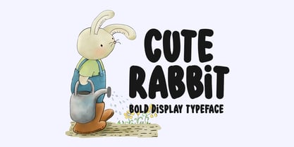 Cute Rabbit is a friendly and sweet display font. It is perfectly suited for stationery, logos, t-shirt, paper, print design, website header, photo frame, flyer, music cover, poster, image slider, and much more.
 - Striking Rainbow by Seemly Fonts,
$14.00 Striking Rainbow is a brand new display font. Striking Rainbow is perfectly suited for stationery, logos, t-shirt, paper, print design, website header, photo frame, flyer, music cover, poster, image slider, and much more.
 - Gladsome Morning by Seemly Fonts,
$14.00 Gladsome Morning is a cool, clean, and simple display font. It will look stunning on any food packaging design, poster, flyer, or print. Use this font for your designs and explore its endless possibilities.
 - Coldfield JNL by Jeff Levine,
$29.00Coldfield JNL is the revival of an old wood type font from Jeff Levine. Clean and easily readable at different point sizes, it is an excellent companion to Twelve Oaks JNL and Ingomar JNL. - Shy Darling by Seemly Fonts,
$14.00 Shy Darling is a cool and romantic display font. It is perfectly suited for stationery, logos, t-shirt, paper, print design, website header, photo frame, flyer, music cover, poster, image slider, and much more.
 - Sweet Daydream by Seemly Fonts,
$12.00 Sweet Daydream is a brand new display font. Sweet Daydream is perfectly suited for stationery, logos, t-shirt, paper, print design, website header, photo frame, flyer, music cover, poster, image slider, and much more.
 - Christmas Eve by Seemly Fonts,
$12.00 Christmas Eve is a brand new handwritten font. Christmas Eve is perfectly suited for stationery, logos, t-shirt, paper, print design, website header, photo frame, flyer, music cover, poster, image slider, and much more.
 - Slab Compact JNL by Jeff Levine,
$29.00 Slab Compact JNL was based on the printed title found on the box cover of a 1950s-era word games set called “Lex-O-Grams” and is available in both regular and oblique versions.
 - Expression Exchange by Seemly Fonts,
$14.00 Expression Exchange is a brand new handwritten font. Expression Exchange is perfectly suited for stationery, logos, t-shirt, paper, print design, website headers, photo frames, flyers, music covers, posters, image sliders, and much more.
 - Summer Fable by Seemly Fonts,
$14.00 Summer Fable is a brand new display font. Summer Fable is perfectly suited for stationery, logos, t-shirt, paper, print design, website headers, photo frames, flyers, music covers, posters, image sliders, and much more.
 - Meilesha by Selvia Design,
$13.00 "Meilesha" is a unique and beautiful handwritten font. This font is equipped with uppercase, lowercase, numerals, punctuations, and multilingual support. It is suitable for invitations, weddings, ornaments, logos, banners, posters, prints, branding, and others.
 - Austin Antique by HiH,
$10.00 “More is better” may have been the motto of Richard Austin of Austin and Son’s Imperial Letter-Foundry on Worship Street at Finsbury Square in London when he designed and cut his Antique typeface. The year it was created is uncertain, but it is known to have appeared in a specimen book produced in 1827. At first glance, the upper case letters of Austin Antique look very much like Figgins Antique. But, upon examination, one will note that the Austin face is much darker. In general, the letters designed and cut by Richard Austin have fatter strokes, larger serifs and smaller counters -- more metal and less daylight. The premise was that the darker the letter, the more attention an ad using the typeface would receive. In old pictures of London and Paris one may see walls crowded with posters and “bills” -- competing for the attention of the passerby. Morris and Updike aside, the early nineteenth century marked the beginning of a commercial as well as industrial revolution. Patterns of commerce were changing. With new methods of marketing came the need for new typefaces to support the new methods. Foundries found the display types were very profitable and competed most energetically and creatively for the trade. There was a lot of trial-and-error. Some ideas faded away. Others, like the Antiques or Egyptians, were refined and developed. From them came the Clarendons that were to prove both popular and long lasting -- because they worked. Their job was to sell goods, not please the aesthetic sensibilities of the critics. They did their job well. Austin Antique has a full Western European character set, plus the following ligatures: ct, st, fi, fl, ff, ffi and ffl. Tabular numbers. Surprisingly readable.
 - monogram kk - Personal use only

- But by Nicole Fally,
$40.00 Bold, black and square. But was first drawn as a logotype for the magazine "BUT – Bilder und Texte" (pictures and texts) which was published by an experimentally-oriented non-commercial initiative. In consideration of the unusual dimensions of the magazine (6 x 14 cm / 2,4 x 5,5 inch), I decided to fill as much space as possible with the body of type. This formal idea refers to the meaning of the title by blurring the border between legible letters and abstract shapes. Because of its origin, But is ideal for short messages in headline point size. Despite its blocky shapes, But creates a friendly atmosphere. The details are as playful as the restrictions that are given by the concept allow them to be. Punctuation marks and other special characters contrast the boldness of the design since they are matching the thin parts of upper- and lowercase letters. This also avoids gaps when longer texts are set. But is available in open type format and has an extended character set (Latin extended A). Two sets of numerals, one matching the x-height and another one matching the cap-height, are provided.
 - Meow Tails by Yumna Type,
$16.00 Meow Tails is a cute, adorable display font inspired by cat theme. All of its letters and characters are designed in flowing and round shapes to express soft and smooth nuances like a sleeping cat. Furthermore, the insertion of additional objects to the letters functions to suggest a cat’s characteristics, such as cute eyes, whiskers, and a long tail. Meow Tails, of which available features and a clipart bonus you can enjoy, will live up and charm your designs in order to attract the audience with the theme you have. In fact, it will also help you build up your brand identity to be unique and memorable, particularly brands related to cats or pets. Features: Alternates Multilingual Supports PUA Encoded Numerals and Punctuations Meow Tails fits best for various design projects, such as brandings, headings, magazine covers, quotes, printed products, merchandise, social media, etc. Find out more ways to use this font by taking a look at the font preview. Thanks for purchasing our fonts. Hopefully, you have a great time using our font. Feel free to contact us anytime for further information or when you have trouble with the font. Thanks a lot and happy designing.
 - Mah Jongg by Bogusky 2,
$10.00No, it's not the complete set but a great way to send out invitations for Mah Jongg Parties, Notices, Posters, Banners and Flyers. Here's a menu of what's contained and take a look at the Character Chart for some close-ups. It may seem complicated but not really. Shift, Alphabet keys will give you caps Mah Jongg characters, tiles beside a letter of the alphabet. The "lower case" alphabet is the same letter font used in the caps but without a tile. The regular keys "1 through 9" are the actual Crack tiles with the correct oriental glyph. Numerals to match the "lower case" are found using Shift and the Number keys. The $ sign is the Forward Slash and the "¢" sign is the Back Slash Dragons: Left & Right brackets Nice One Bam symbols: Shift, Left & Right brackets Hitting Option & the keys, "A,S,F & C" will reveal attractive flower designs. Punctuation, period, comma, quotes, etc. are in their usual locations. You may want to print this menu as a handy guide. The license agreement stipulates that you may disassemble and use elements from this font to create colorful art as in the illustration shown with the font listing. - Rubrical by Ditatype,
$29.00 Introducing Rubrical, a script font that gives personalized feel to the design with a confident presence. This typeface is characterized by its substantial weight, giving your design a bold and impactful appearance. Rubrical maintains consistent proportions across all its letters, offering a sense of stability. It also adds a sense of warmth and personality. It has flowing and connected letterforms that are embellished with graceful swings that adorn select letters. These decorative elements, which can include ornate initials or elegant swinging flourishes, add a touch of sophistication and artistic flair to your text. They create a visual journey that is engaging, unique, and memorable. In addition, enjoy the features here. Features: Ligatures Stylistic Sets Swashes Multilingual Supports PUA Encoded Numerals and Punctuations Rubrical fits in headlines, logos, posters, flyers, branding materials, print media, editorial layouts, and many more designs. Find out more ways to use this font by taking a look at the font preview. Thanks for purchasing our fonts. Hopefully, you have a great time using our font. Feel free to contact us anytime for further information or when you have trouble with the font. Thanks a lot and happy designing.
 - Neue Reman Gt by Propertype,
$49.00 Neue Reman Grotesk It has 70 font styles in total family + 1 Variable. This typeface is designed to be used very practically. Each style can be changed easily. Has a variety of alternative letters that can be selected to make typography designs more attractive. The family comes in 7 weights with matching italics + Variable Font File and includes multilingual latin pro characters. 1. Extra Light - Condensed - Expanded - Slanted Italic 2. Light - Condensed - Expanded - Slanted Italic 3. Regular - Condensed - Expanded - Slanted Italic 4. Medium - Condensed - Expanded - Slanted Italic 5. Semi Bold - Condensed - Expanded - Slanted Italic 6. Bold - Condensed - Expanded - Slanted Italic 7. Heavy - Condensed - Expanded - Slanted Italic Neue Reman Grotesk contains 750 glyphs, a Latin Pro Fonts. This is the second version of Neue Reman Family. Complete with Stylistic Alternates, Stylistic Set, Caps Swashes Letter, Standard Ligatures, Discretionary Ligatures, Tabular Figures, Proportional Figures, Superscript, Subscript, Scientific Inferiors, Fractions, Ordinals, Arrows and a variety of figures and fractions. Neue Reman typeface suitable to use in multipurpose projects such as on websites, systems, printing, embedding, servers, screens, display, digital-ads, branding, logos, titles, headlines, teks, and everything else. Need something else? Get in touch with us on propertype.foundry@gmail.com Thank you
 - Logopedia Next by Bülent Yüksel,
$19.00 What makes "Logopedia Next" unique is that it has a strong body, upper and lower case letters are the same size and work in perfect harmony. All letters in the character have "alternatives" in various numbers. This feature provides you variety in your designs. It is possible to take your designs to the next level by using "Logopedia Next". "Logopedia Next" is ideal for especially logo design, advertising and packaging, branding and creative industries, banners and billboards and signage as well as web and screen design. "Logopedia Next" provides advanced typographical support for Latin-based languages. An extended character set, supporting Central, Western and Eastern European languages, rounds up the family. The designation “Logopedia Next 500 Regular” forms the central point. Logopedia Next comes 3 weights and italics total 6 types. The family contains a set of 543 glyphs. Classes and Features, Stilistic Style, Fractions and Old Style Numerator just one touch easy In all graphic programs. Logopedia Next"" is the perfect font for web use. Be sure to check out the other siblings of "Logopedia". - Logopedia Now - Logopedia Now Soft - Logopedia Next - Logopedia Next Soft You can enjoy using it.
 - Bembo MT by Monotype,
$45.99 The origins of Bembo go back to one of the most famous printers of the Italian Renaissance, Aldus Manutius. In 1496, he used a new roman typeface to print the book de Aetna, a travelogue by the popular writer Pietro Bembo. This type was designed by Francesco Griffo, a prolific punchcutter who was one of the first to depart from the heavier pen-drawn look of humanist calligraphy to develop the more stylized look we associate with roman types today. In 1929, Stanley Morison and the design staff at the Monotype Corporation used Griffo's roman as the model for a revival type design named Bembo. They made a number of changes to the fifteenth-century letters to make the font more adaptable to machine composition. The italic is based on letters cut by the Renaissance scribe Giovanni Tagliente. Because of their quiet presence and graceful stability, the lighter weights of Bembo are popular for book typography. The heavier weights impart a look of conservative dependability to advertising and packaging projects. With 31 weights, including small caps, Old style figures, expert characters, and an alternate cap R, Bembo makes an excellent all-purpose font family.
 - Bembo Infant by Monotype,
$45.99The origins of Bembo go back to one of the most famous printers of the Italian Renaissance, Aldus Manutius. In 1496, he used a new roman typeface to print the book de Aetna, a travelogue by the popular writer Pietro Bembo. This type was designed by Francesco Griffo, a prolific punchcutter who was one of the first to depart from the heavier pen-drawn look of humanist calligraphy to develop the more stylized look we associate with roman types today. In 1929, Stanley Morison and the design staff at the Monotype Corporation used Griffo's roman as the model for a revival type design named Bembo. They made a number of changes to the fifteenth-century letters to make the font more adaptable to machine composition. The italic is based on letters cut by the Renaissance scribe Giovanni Tagliente. Because of their quiet presence and graceful stability, the lighter weights of Bembo are popular for book typography. The heavier weights impart a look of conservative dependability to advertising and packaging projects. With 31 weights, including small caps, Old style figures, expert characters, and an alternate cap R, Bembo makes an excellent all-purpose font family. - ZT Ravigsfen by Zelow Type,
$13.00 In a design landscape dominated by modern advancements, ZT Ravigsfen emerges as a stunning turning point. A work of sans-serif grotesque font that celebrates the style and audacity of classic sci-fi, this font takes users on a journey through time. With Nine Weights spanning from delicate thin to commanding black, ZT Ravigsfen offers boundless flexibility to embrace any design project. Its unique alternative style, featuring a central split, creates characters shrouded in mystery and wonder. This is more than just a font; ZT Ravigsfen is a narrative. Each letter is a blank canvas waiting to be filled with stories and adventures. Both uppercase and lowercase letters, while sharing similar forms, exude distinct auras, framing each word with a signature touch. ZT Ravigsfen Key Features: 9 Remarkable Weights 3 Styles (Grotesque, Oblique, & Alternate) Captivating Alternative Style Distinct Aura in Every Thickness Rich with 525 Glyph Free Updates Download now, discover unforgettable retro aesthetics, and embrace boundless creativity with ZT Ravigsfen. This font is the gateway to a new dimension of design waiting to be explored. I hope you have fun using ZT Ravigsfen. Thanks for using this font ~ Zelowtype
 - Plethora by Sudtipos,
$49.00 A few years ago I've discovered the work of one of the most prolific typeface designers of the Bruce type Foundry in NYC during late nineteenth century. Browsing Julius Herriet's work I found a very unique kind of ligatures in his patented "Old Style Ornamented" type design. Some letters were designed with a little top tail that allowed them to connect to each other. After that, I found that he also designed a single italic weight of the same font 7 years later. Since the beginning of the Opentype days I’ve been deeply obsessed with exploring different ways to build ligatures, so that lead me up to this point where I felt the need to create “Plethora”, this new font inspired by Herriet’s work. Extrapolating weights, adding variable technology and playing with additional interconnected letters and alternates. Definitely, Plethora means a large or excessive amount of something, and this font tries to bring back this abundance of details two centuries later. Available in 9 weights, from roman to italic, and also as variable format, “Plethora” supports plenty of latin languages and is a perfect choice for today’s design tides.
 - Plinc Goliath by House Industries,
$33.00 Vincent Pacella was a true giant of hand-lettering and typeface design. Of the dozens of styles he designed for Photo-Lettering and International Typeface Corporation, his dominant Goliath towers above the rest. The font is perhaps best known from Herb Lubalin’s American flag that the design legend created for Print magazine’s 40th anniversary cover. Pacella takes “slab” serif to heart with this colossally-proportioned font, using brawny stroke endings and minimal curves to create a powerful figure for maximum visual impact. Take advantage of Goliath’s superior stature to make viewers take notice in industrial settings, sports branding, and oversized outdoor media applications. For comparatively modest musings in accompanying running text, consider partnering it with a comparatively spartan slab serif like Municipal. Or, team up Goliath with a faceted fellow heavyweight like United Sans. Originally drawn in 1970, Goliath was digitized by Ben Kiel with Adam Cruz in 2011. GOLIATH CREDITS: Typeface Design: Vincent Pacella Typeface Digitization: Ben Kiel, Adam Cruz Typeface Production: Ben Kiel Like all good subversives, House Industries hides in plain sight while amplifying the look, feel and style of the world’s most interesting brands, products and people. Based in Delaware, visually influencing the world.
 - Strawberry Junkies by Yumna Type,
$15.00 Choosing the right display font can make your designs look more attractive and stunning, so that your designs gain more popularity. This is the Strawberry Junkies for you. It is a rather circled display font of which prone circled letters express soft, fun nuances in order that the company becomes more easily recognized by customers and audience. This font’s main characters are the consistent geometry, proportion, and line thickness on every letter to make it legible for big text sizes. In addition, Strawberry Junkies provides an extra clipart as a special bonus. Furthermore, you can enjoy the available features here. Features: Multilingual Supports PUA Encoded Numerals and Punctuations Strawberry Junkies fits best for various design projects, such as brandings, posters, banners, headings, magazine covers, quotes, printed products, merchandise, social media, etc. Find out more ways to use this font by taking a look at the font preview. Thanks for purchasing our fonts. Hopefully, you have a great time using our font. Feel free to contact us anytime for further information or when you have trouble with the font. Thanks a lot and happy designing.
 - Open Serif by Matteson Typographics,
$19.95 OPEN SERIF - answering the question “what font pairs well with Open Sans?”. Designed by Steve Matteson for extraordinary legibility and comfortable reading on screen and in print. Open Interpretation: Not quite Veronese – not quite Egyptian. A dash of panache in an otherwise sturdy serif typeface. Open Serif is an elegant text and display typeface family. Open Interiors: Visually open and legible at text sizes just like its cousin Open Sans. Open Serif reads smoothly but has an energetic texture. The chancery style italic contrasts nicely to the roman in a full bodied nod to Italian Renaissance forms. Open Type: Open Serif is full of OpenType features including Small Capitals for the Roman, Italic Swash Capitals and Old Style Figures for both. Open Translation: Supporting all the languages available in Open Sans, Open Serif completes the translation capabilities of international companies. Extended text is more pleasant to read in a serif typeface so go global with a unified typeface family! Open Face: Open Serif Titling is an elegant companion to round out the family. These ‘open-face' capital letters are ideal for initial letters, mastheads, titles and decoration.
 - Logopedia Now by Bülent Yüksel,
$19.00 What makes "Logopedia Now" unique is that it has a strong body, upper and lower case letters are the same size and work in perfect harmony. All letters in the character have "alternatives" in various numbers. This feature provides you variety in your designs. It is possible to take your designs to the next level by using "Logopedia Now". "Logopedia Now" is ideal for especially logo design, advertising and packaging, branding and creative industries, banners and billboards and signage as well as web and screen design. "Logopedia Now" provides advanced typographical support for Latin-based languages. An extended character set, supporting Central, Western and Eastern European languages, rounds up the family. The designation “Logopedia Now 500 Regular” forms the central point. "Logopedia Now" comes 3 weights and italics total 6 types. The family contains a set of 543 glyphs. Classes and Features, Stilistic Style, Fractions and Old Style Numerator just one touch easy In all graphic programs. "Logopedia Now" is the perfect font for web use. Be sure to check out the other siblings of "Logopedia". - Logopedia Now - Logopedia Now Soft - Logopedia Next - Logopedia Next Soft You can enjoy using it.
 - Wood Type DIY by TypoGraphicDesign,
$19.00 The typeface Wood Type DIY is designed from 2016–2022 for the font foundry Typo Graphic Design by Manuel Viergutz. The display font based on the original wood letter from flea market. The font started from 50 wood letters (analog) and was finally digitalize and extended to 300+ glyphs (digital). 4 font-styles (Rough, Clean, Mix, Impact) with 320 glyphs incl. decorative extras like icons, arrows, dingbats, emojis, symbols, geometric shapes (type the word #LOVE for ❤️ or #SMILE for 🙂 as OpenType-Feature dlig) and stylistic alternates (9 stylistic sets). For use in logos, magazines, posters, advertisement plus as webfont for decorative headlines. The font works best for display size. Have fun with this font & use the DEMO-FONT (with reduced glyph-set) FOR FREE! Font Specifications ■ Font Name: Wood Type DIY ■ Font Styles: 4 (Rough, Clean, Mix, Impact) + DEMO (with reduced glyph-set) ■ Font Category: Display for headline size ■ Font Format:.otf (Mac + Win, for Print) + .woff (for Web) ■ Glyph Set: 320 glyphs incl. extras like icons (decorative extras like arrows, dingbats, emojis, symbols) ■ Design Date: 2016–2022 ■ Type Designer: Manuel Viergutz
 - Logopedia Next Rounded by Bülent Yüksel,
$19.00 What makes "Logopedia Next Rounded" unique is that it has a strong body, upper and lower case letters are the same size and work in perfect harmony. All letters in the character have "alternatives" in various numbers. This feature provides you variety in your designs. It is possible to take your designs to the next level by using "Logopedia Next Rounded". "Logopedia Next Rounded" is ideal for especially logo design, advertising and packaging, branding and creative industries, banners and billboards and signage as well as web and screen design. "Logopedia Next Rounded" provides advanced typographical support for Latin-based languages. An extended character set, supporting Central, Western and Eastern European languages, rounds up the family. The designation “Logopedia Next Rounded 500 Regular” forms the central point. "Logopedia Next Rounded" comes 3 weights and italics total 6 types. The family contains a set of 543 glyphs. Classes and Features, Stilistic Style, Fractions and Old Style Numerator just one touch easy In all graphic programs. "Logopedia Next Rounded" is the perfect font for web use. Be sure to check out the other siblings of "Logopedia". - Logopedia Now - Logopedia Now Rounded - Logopedia Next - Logopedia Next Rounded You can enjoy using it.
 - Raina by Nathatype,
$29.00 Want to have a more unique design? Raina is a new way to show uniqueness and freedom in your design. Raina is one of the sans serif font combinations with the display font. Unlike the other solid, firm displays of sans serif font, Raina expresses more artistic, unique displays as a result of the display font’s character combinations. Its differing letter shapes from ordinary alphabets create uniqueness for this font because each letter has no straight lines, but indentations or cavities instead, and no tiny lines or hooks as a sans serif font character. With the unique shape of this font, use this font on bigger screens for a legibility reason. This font has included outstanding features to take your creativity and ideas to the next level. Features: Ligatures Multilingual Supports PUA Encoded Numerals and Punctuations Raina fits for various design projects, such as posters, banners, logos, book covers, quotes. , headings, printed products, merchandise, social media, etc. Find out more ways to use this font by taking a look at the font preview. Feel free to contact us if you require more information when you are experiencing a problem. Thank you. Happy designing.
 - Logopedia Now Rounded by Bülent Yüksel,
$19.00 What makes "Logopedia Now Rounded" unique is that it has a strong body, upper and lower case letters are the same size and work in perfect harmony. All letters in the character have "alternatives" in various numbers. This feature provides you variety in your designs. It is possible to take your designs to the next level by using "Logopedia Now Rounded". "Logopedia Now Rounded" is ideal for especially logo design, advertising and packaging, branding and creative industries, banners and billboards and signage as well as web and screen design. "Logopedia Now Rounded" provides advanced typographical support for Latin-based languages. An extended character set, supporting Central, Western and Eastern European languages, rounds up the family. The designation “Logopedia Now Rounded 500 Regular” forms the central point. "Logopedia Now Rounded" comes 3 weights and italics total 6 types. The family contains a set of 543 glyphs. Classes and Features, Stilistic Style, Fractions and Old Style Numerator just one touch easy In all graphic programs. "Logopedia Now Rounded" is the perfect font for web use. Be sure to check out the other siblings of "Logopedia". Logopedia Now Logopedia Now Rounded Logopedia Next Logopedia Next Rounded You can enjoy using it.


