10,000 search results
(0.021 seconds)
- Policy Gothic by E-phemera,
$20.00 Policy Gothic is derived from the boilerplate on a vintage insurance policy, and in a former life may have been Engraver's Gothic or something like it. A rough all-caps sans serif, it's great for designing forms and other "official" paperwork with a vintage feel. The font features a full international character set including various currency and other commercial symbols
 - Pony Tale Pro by Jonahfonts,
$45.00 Pony Tale Pro is a handwritten unconnected script face in eight styles: Light, Regular, Bold and Outline with Italics and Small-Caps. Very suitable for Packaging, Greeting cards, Magazines, Posters and Advertising Ads. A space after any lower-case glyph will produce the word terminal, invoking the OpenType/CONTEXTUAL ALTERNATIVE variant. (Opentype variants may only be accessible via Opentype-Aware applications.)
 - DOORLEY HAND by John Doorley & Associates Pty. Ltd.,
$25.00Doorley Hand is a unique new font based on the handwriting of Australian advertising man and creatist John Doorley. The font's character and personality sits somewhere between charming child-like handwriting and classic contemporary calligraphy. It pays homage to simpler times when more organic and personalised forms of communication reigned. A perfect counterpoint to the fast-forward, hi-tech world today. - Dreamland by Comicraft,
$19.00Ring-bearers across Middle Earth will be kissing their Sorceror's Stones, when they hear the news of the debut of this magickal collection of fonts, suitable for Incantations, Faerie talk, Books of Magic and fantastickal Arias. Coincidentally the official font of Scott Sava's DREAMLAND CHRONICLES (how didja guess?), Dreamland is also suitable for any chronicles you may have of your own. - Topographic Sans JNL by Jeff Levine,
$29.00 A 1940s-era book from the U.S. Army Corps of Engineers entitled "Topographic Drafting" features a page for "lettering construction and spacing" in the process of map making. The letters and numbers were formed on grids using that mechanical drafting process for uniformity in stroke width. This was the basis for Topographic Sans JNL, which is available in both regular and oblique versions.
 - Acceptable JNL by Jeff Levine,
$29.00 Acceptable JNL is a typeface modeled from hand lettering on a piece of 1940s sheet music, and has a distinctly casual, yet Art Deco flair. It's name can also be mischievous, for when you're asked "which font should I use for the job" you can answer "the Acceptable font". This may well start a dialogue reminiscent of Abbott and Costello's "Who's On First?"
 - Sidesakey by Aminmario Studio,
$20.00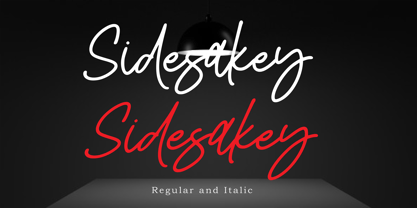 Sidesakey simplifies elegance into one truly stunning handwritten font. With its relaxed feel, Sidesakey is incredibly versatile, suitable to each of the design projects you may have in mind! Use it to create beautiful greeting cards, wedding invitations, logos, website titles and much more! Comes in Regular and Italic styles. Thank you for your purchase! Hope you enjoy with our font
 - CRM American Horror by CRMFontCo,
$35.00 The Classic Charles Rennie Mackintosh Font has been a massive seller over the years. Its use in the Hollywood motion picture "Spider Man 2", has now been emulated by the branding of the the new Fox TV series "American Horror Story". Very unusual for the horror genre, this slightly tweaked version of the classic original mirrors how the show's producers have used it.
 - Dreamland Int'l by Comicraft,
$19.00 Ring-bearers across Middle Earth will be kissing their Sorceror's Stones, when they hear the news of the debut of this magickal collection of fonts, suitable for Incantations, Faerie talk, Books of Magic and fantastickal Arias. Coincidentally the official font of Scott Sava's DREAMLAND CHRONICLES (how didja guess?), Dreamland is also suitable for any chronicles you may have of your own.
 - Fabrikat Normal by HVD Fonts,
$40.00 Fabrikat Normal is a geometric typeface which is based on 20th century German engineers’ typefaces. It is optimised for small sizes and long texts, but due to its constructed architecture it also works in headlines or display use. You can combine Fabrikat Normal with the more straight and space saving Fabrikat Kompakt or the reduced to the max Fabrikat Mono.
 - Hotdogger by Eurotypo,
$24.00 Hotdogger is a family of cursive brush fonts, presented in two weights and completed with a sans serif font and an useful pack of graphics to play with. These fonts are specially designed for meal packaging and labels, advertising posters, lettering logos or whatever you may be looking for in expressive works.. Hotdogger contain full OpenType features and support CE languages.
 - Borba by Edyta Demurat,
$20.00 Borba is light, fresh and friendly at first glace. It's simple, modern and elegant due to its monoline and minimalistic form. It is really readable which makes it perfect for long texts but it looks great in titles and short sentences as well. To sum up, borba is a universal typeface which may be used whenever you need a stylish and modern typography.
 - Curves Accent by Blackout,
$20.00Curves accent is based on the idea of accents. We add small details to increase interest. Some say small details make all the difference; the font seeks to prove this. This font is fun, open, and ready to accent any work it is placed on. It may very well be used to add the special touch most people would love to see. - WBP Ripples by Studio Jasper Nijssen,
$20.00 Stone skipping creates water ripples. This font expands by the same principle. A small, narrow base growing to the top, right, bottom and left until it reaches the shores. In this case: from the mean line to the baseline and caps height with a max. of three lines. WBP Ripples is a beautiful, friendly looking and playful display font for everyday use.
 - Is This The End by Intellecta Design,
$19.90 Is This the End has three different ornamental endpieces ready to use in end chapters, final pages in books, magazines and several artistic representations. Each endpiece may be used in different languages like German, Bulgarian, Croatian, Danish, Spanish, Finnish, French, Dutch, Italian, Norwegian, Polish, English and Portuguese. Intellecta Design researched these endpieces from the very rare Richard Gans type catalogue from 1882.
 - Funky Fat Jiggly PW by Patty Whack Fonts,
$15.00Funky Fat Jiggly PW is intended and suitable for Display use and Titles. It's not very suitable for long paragraphs of text. This font is meant for fun, fun, fun! It contains the basic characters. Uppercase, lowercase, numerals, and basic punctuation. See the character map for all of the included characters. Funky Fat Jiggly PW is available in OpenType, PostScript and TrueType format. - Ziggity by Pelavin Fonts,
$20.00 With its tall, slinky letterforms and perky switchbacks, Ziggity may not be your father's typeface, but don't let that fool you. It's ready and willing to step right up and say what's needed with a unique angle on things. Ready to use as-is or with any variety of angles, outlines or shadows, it will make your message memorable if not downright adorable.
 - Eurydome by Emboss,
$30.00 Eurydome is one of Jupiter's many moons, and was named after Eurydome, the mother of the Graces in Greek mythology. Eurydome was inspired by the Grotesque face Venus, with an additional flair added to the lowercase a, b, d and g. Eurydome was designed to complement any display face that may be used in your project. Add grace to your layout, with Eurydome.
 - MB Picture House by Ben Burford Fonts,
$30.00 Small caps art deco font inspired by the golden age of Hollywood and childhood trips to the Majestic Cinema. Two styles, each with three weights. Picture House One is sharp and crisp, Picture House Two has a slightly 'Out of Focus' look to it. Both come with extended language support and oldstyle numbers, giving a lot of scope for may uses.
 - Chevalier by URW Type Foundry,
$35.00 Chevalier is an engraved all-capital typeface with delicate shading. The Chevalier font is suitable for business letterheads and corporate stationery, headlines and packaging, where a clean, safe, established image is desired. Chevalier is a trademark of Heidelberger Druckmaschinen AG, which may be registered in certain jurisdictions, exclusively licensed through Linotype Library GmbH, a wholly owned subsidiary of Heidelberger Druckmaschinen AG.
 - Delysian NF by Nick's Fonts,
$10.00If you wanted to send out a party invitation in 1923, Barnhart Brothers & Spindler recommended this typeface, which was originally called, simply, "Greeting Card". It also appears to be suitable for greetings from Mars. Available in two weights, regular and bold. Both versions of the font include the 1252 Latin and 1250 CE character sets (with localization for Romanian and Moldovan). - Risky Biscuit by PizzaDude.dk,
$16.00 Risky Biscuit is wants to go its own ways. It is never too much or too little - just perfect in its awkwardness! You may think surfer, skater, DJ or hand craft - that’s okay, because Risky Biscuit is all that and even more! Comes with contextual alternates - meaning 5 different letters AND small caps for each vowel…and of course multilingual support!
 - Cissarz Latein NF by Nick's Fonts,
$10.00This classically elegant typeface is based on a 1912 design by Johann Vincenz Cissarz for the Ludwig & Mayer Foundry. To add a little more visual interest, alternate letterforms can be found in various positions throughout the font: consult the expanded character map. This font contains the complete Latin language character set (Unicode 1252) plus support for Central European (Unicode 1250) languages as well. - Schism One by Alias,
$55.00 Schism is a modulated sans-serif, originally developed from our Alias Didot typeface, as a serif-less version of the same design. It was expanded to three sub-families, with the thin stroke getting progressively heavier from Schism One to Schism Three. The different versions explore how this change in contrast between thick and thin strokes changes the character of the letterforms. The shape is maintained, but the emphasis shifts from rounded to angular, elegant to incised. Schism One has high contrast, and the same weight of thin stroke from Light to Black. Letter endings are at horizontal or vertical, giving a pinched, constricted shape for characters such as a, c, e and s. The h, m, n and u have a sharp connection between curve and vertical, and are high shouldered, giving a slightly square shape. The r and y have a thick stress at their horizontal endings, which makes them impactful and striking at bolder weights. Though derived from an elegant, classic form, Schism feels austere rather than flowery. It doesn’t have the flourishes of other modulated sans typefaces, its aesthetic more a kind of graphic-tinged utility. While in Schism Two and Three the thin stroke gets progressively heavier, the connections between vertical and curves — in a, b, n etc — remain cut to an incised point throughout. The effect is that Schism looks chiselled and textural across all weights. Forms maintain a clear, defined shape even in Bold and Black, and don’t have the bloated, wide and heavy appearance heavy weights can have. The change in the thickness of the thin stroke in different versions of the same weight of a typeface is called grading. This is often used when the types are to used in problematic print surfaces such as newsprint, or at small sizes — where thin strokes might bleed, and counters fill in and lose clarity, or detail might be lost or be too thin to register. The different gradings are incremental and can be quite subtle. In Schism it is extreme, and used as a design device, giving three connected but separate styles, from Sans-Didot to almost-Grotesk. The name Schism suggests the differences in shape and style in Schism One, Two and Three. Three styles with distinct differences, from the same start point.
 - Schism Three by Alias,
$55.00 Schism is a modulated sans-serif, originally developed from our Alias Didot typeface, as a serif-less version of the same design. It was expanded to three sub-families, with the thin stroke getting progressively heavier from Schism One to Schism Three. The different versions explore how this change in contrast between thick and thin strokes changes the character of the letterforms. The shape is maintained, but the emphasis shifts from rounded to angular, elegant to incised. Schism One has high contrast, and the same weight of thin stroke from Light to Black. Letter endings are at horizontal or vertical, giving a pinched, constricted shape for characters such as a, c, e and s. The h, m, n and u have a sharp connection between curve and vertical, and are high shouldered, giving a slightly square shape. The r and y have a thick stress at their horizontal endings, which makes them impactful and striking at bolder weights. Though derived from an elegant, classic form, Schism feels austere rather than flowery. It doesn’t have the flourishes of other modulated sans typefaces, its aesthetic more a kind of graphic-tinged utility. While in Schism Two and Three the thin stroke gets progressively heavier, the connections between vertical and curves — in a, b, n etc — remain cut to an incised point throughout. The effect is that Schism looks chiselled and textural across all weights. Forms maintain a clear, defined shape even in Bold and Black, and don’t have the bloated, wide and heavy appearance heavy weights can have. The change in the thickness of the thin stroke in different versions of the same weight of a typeface is called grading. This is often used when the types are to used in problematic print surfaces such as newsprint, or at small sizes — where thin strokes might bleed, and counters fill in and lose clarity, or detail might be lost or be too thin to register. The different gradings are incremental and can be quite subtle. In Schism it is extreme, and used as a design device, giving three connected but separate styles, from Sans-Didot to almost-Grotesk. The name Schism suggests the differences in shape and style in Schism One, Two and Three. Three styles with distinct differences, from the same start point.
 - Schism Two by Alias,
$55.00 Schism is a modulated sans-serif, originally developed from our Alias Didot typeface, as a serif-less version of the same design. It was expanded to three sub-families, with the thin stroke getting progressively heavier from Schism One to Schism Three. The different versions explore how this change in contrast between thick and thin strokes changes the character of the letterforms. The shape is maintained, but the emphasis shifts from rounded to angular, elegant to incised. Schism One has high contrast, and the same weight of thin stroke from Light to Black. Letter endings are at horizontal or vertical, giving a pinched, constricted shape for characters such as a, c, e and s. The h, m, n and u have a sharp connection between curve and vertical, and are high shouldered, giving a slightly square shape. The r and y have a thick stress at their horizontal endings, which makes them impactful and striking at bolder weights. Though derived from an elegant, classic form, Schism feels austere rather than flowery. It doesn’t have the flourishes of other modulated sans typefaces, its aesthetic more a kind of graphic-tinged utility. While in Schism Two and Three the thin stroke gets progressively heavier, the connections between vertical and curves — in a, b, n etc — remain cut to an incised point throughout. The effect is that Schism looks chiselled and textural across all weights. Forms maintain a clear, defined shape even in Bold and Black, and don’t have the bloated, wide and heavy appearance heavy weights can have. The change in the thickness of the thin stroke in different versions of the same weight of a typeface is called grading. This is often used when the types are to used in problematic print surfaces such as newsprint, or at small sizes — where thin strokes might bleed, and counters fill in and lose clarity, or detail might be lost or be too thin to register. The different gradings are incremental and can be quite subtle. In Schism it is extreme, and used as a design device, giving three connected but separate styles, from Sans-Didot to almost-Grotesk. The name Schism suggests the differences in shape and style in Schism One, Two and Three. Three styles with distinct differences, from the same start point.
 - Rhapsody Script by Rotterlab Studio,
$10.00 Rhapsody is a handwritten script font with varying baseline, which is designed to convey elegance and style. It is smoothline, clean and feminine. Works perfectly for logos, magazines, menus, books, invitations, wedding / greeting cards, packaging, labels, t-shirt etc. All designs you will have a wonderful homemade touch with Rhapsody. Rhapsody features 400+ glyphs and 181 alternate characters. including initial and terminal letters, alternates, ligatures and multiple language support. To enable the OpenType Stylistic alternates, you need a program that supports OpenType features such as Adobe Illustrator CS, Adobe Indesign & CorelDraw X6-X7, Microsoft Word 2010 or later versions. and there are additional ways to access alternates / swashes, using Character Map (Windows). How to access all alternative characters using Adobe Illustrator: https://www.youtube.com/watch?v=XzwjMkbB-wQ How to access all alternative characters, using Windows Character Map with Photoshop: https://www.youtube.com/watch?v=Go9vacoYmBw Thank you!
 - Onomatopedia by Comicraft,
$29.00 Fans of Comicraft have made a lot of noise (HELP!) about the availability of ready-to-wear, factory surplus sound effects, not unlike those made available over a decade ago in our extremely popular and raucous ZAP PACK. It may sound impossible (WHA--?!), but Comicraft's Sonic Specialist, John JG Roshell, locked himself away (CLIK) in our top-secret SFX lab forming Onomatopoeia at high speeds (FWOOSH) and extreme temperatures (BBRRR), and sounded out over One Hundred (GASP) of the loudest (BTOOM), most intense (UNNGHH), squawkiest (KRAKK), discordant (SPLANGG), dissonant (SQUTCH) -- as well as dulcet and restrained (THWIPP) -- sound effects ever conceived (WOO HOO!) Helpfully arranged in alphabetical order (YIPPEE!), this Library of Onomatopeia -- the ONOMATOPEDIA, if you will (DING) -- is now available for use by the general public. WARNING: Comicraft Sound Effects may explode on contact with skin (AAAH!); please use protective clothing and eyewear when handling the Onomatopedia.
 - PROG.BOT - 100% free

- This Boring Party - Unknown license

- Body Goat by Typodermic,
$11.95 Welcome to the bizarre world of typography where the surreal meets the extraordinary! Introducing Body Goat, a hand-painted display typeface that will leave you spellbound. Its compact design may seem unassuming at first, but the inky quality of its letters draws you in with a hypnotic effect. But that’s just the beginning. When Body Goat is colored, it transforms into a fantastical creature that is both playful and powerful. Its casual appearance is deceptive, as it is perfect for creating headlines that command attention and make a bold statement. With Body Goat, you can create a world that defies the norms of typography, where the rules are rewritten, and the possibilities are endless. Whether you’re a designer, artist, or just a curious outsider, let Body Goat take you on a journey of surreal proportions. Most Latin-based European writing systems are supported, including the following languages. Afaan Oromo, Afar, Afrikaans, Albanian, Alsatian, Aromanian, Aymara, Bashkir (Latin), Basque, Belarusian (Latin), Bemba, Bikol, Bosnian, Breton, Cape Verdean, Creole, Catalan, Cebuano, Chamorro, Chavacano, Chichewa, Crimean Tatar (Latin), Croatian, Czech, Danish, Dawan, Dholuo, Dutch, English, Estonian, Faroese, Fijian, Filipino, Finnish, French, Frisian, Friulian, Gagauz (Latin), Galician, Ganda, Genoese, German, Greenlandic, Guadeloupean Creole, Haitian Creole, Hawaiian, Hiligaynon, Hungarian, Icelandic, Ilocano, Indonesian, Irish, Italian, Jamaican, Kaqchikel, Karakalpak (Latin), Kashubian, Kikongo, Kinyarwanda, Kirundi, Kurdish (Latin), Latvian, Lithuanian, Lombard, Low Saxon, Luxembourgish, Maasai, Makhuwa, Malay, Maltese, Māori, Moldovan, Montenegrin, Ndebele, Neapolitan, Norwegian, Novial, Occitan, Ossetian (Latin), Papiamento, Piedmontese, Polish, Portuguese, Quechua, Rarotongan, Romanian, Romansh, Sami, Sango, Saramaccan, Sardinian, Scottish Gaelic, Serbian (Latin), Shona, Sicilian, Silesian, Slovak, Slovenian, Somali, Sorbian, Sotho, Spanish, Swahili, Swazi, Swedish, Tagalog, Tahitian, Tetum, Tongan, Tshiluba, Tsonga, Tswana, Tumbuka, Turkish, Turkmen (Latin), Tuvaluan, Uzbek (Latin), Venetian, Vepsian, Võro, Walloon, Waray-Waray, Wayuu, Welsh, Wolof, Xhosa, Yapese, Zapotec Zulu and Zuni.
 - Edge Of Madness, crafted by the whimsically named designer Darrell Flood, is a font that refuses to take itself too seriously. Picture this: the letters are holding a wild party, and sanity was defin...
- Klang MT by Monotype,
$29.99Will Carter, well known in connection with his private press in Cambridge, has combined the skills of a calligrapher with a practical knowledge of printing. His mastery of pen-drawn letterforms was put to practical use in the design of Klang. Klang is a slightly inclined and calligraphically shaped sans serif with short ascenders and descenders. The Klang font is useful for informal applications, such as invitations, greetings cards and posters, but can also be used in advertising. - Scansky by Satori TF,
$20.80 Scansky is a carefully crafted contemporary modern sans serif typeface. It comes with 28 fonts, regular and condensed sub-families, and matching italics. Scansky was designed to give a distinct, corporative look to your artwork, suited for signage, web, and corporate print material. It is equipped with an extended character set to support Central, Eastern and Western European languages. And the good news is that the SemiBold weights are free of charge so you can try it. :)
 - Hantlay by DYSA Studio,
$18.00 Hantlay is a handwritten brush font. This another collection of script is perfect for your next personal branding project, excellent for your business. Hantlay have a smooth edges, so this font gives an authentic handcrafted feel style. Hantlay is perfect choice for people looking for clean, modern, minimalist, elegant, beauty design styles. Suitable for almost any graphic designs such as logo, branding materials, business cards, gift cards, t-shirt, cover, thumbnail, print, poster, photography, quotes .etc
 - Grafinc by PosterType,
$18.00 Grafinc is fat, black and robust. It is a geometric-based display typeface that comes in two cuts: ExtraBlack and Rounded. Grafinc can be used for all types of media – print, web, broadcasting or games. Despite its robust appearance and display character, Grafinc is very friendly typeface. It appears to be very legible in smaller sizes, too. The cuts include some very fine ligatures, making its appearance very rhythmic and smooth. Available in OpenType and western languages.
 - Stone Dense by Putracetol,
$20.00 Stone Dense is a playful display font. Stone Dense has a large number of ligatures, 160 ligatures. So that makes this display font more playful and unique. And Stone Dense has a bold body, with unequal widths for the characters. Stone Dense can suitable for your projects that require fonts with bold and strong characteristics. Such as branding, logos, titles, headlines, printing, magazines, quotes, posters, fashion, t-shirts, apparel and others. Stone Dense is also support multi language.
 - Bullterrier by Beewest Studio,
$10.00 Bullterrier is a bold type of font that has a unique character than other bold fonts, Bullterrier has a strong but soft character, with an elegant and fresh theme, Bullterrier is provide your something different unique bold font . Its weight excels in logos, posters, social media, magazine titles, clothing, large print formats – and anywhere you want to see it. Inspired by the design styles that are currently popular, let’s make your imagination come true with Bullterrier.
 - Montana by Resistenza,
$39.00 Montana is an elegantly playful handwritten font family with separate fonts for icons and illustrations included. This font is based on tight, condensed Grotesk typefaces, combining geometry and legibility with the originality of handwritten strokes. The result is a fresh font family perfect for headlines, typographic posters, t-shirts, food packaging and other print works. Its optimized legibility, simple structure and low contrast was made to perform excellently with e-books and mobile apps in mind.
 - Pantai Bali by DYSA Studio,
$19.00 Pantai Bali is a new organic siganture font. This another collection of script is perfect for your next branding project, excellent for your business. Pantai Bali have a natural edges, so this font gives an authentic handcrafted feel style. Pantai Bali is perfect choice for people looking for clean, modern, minimalist, elegant, beauty design styles. Suitable for almost any graphic designs such as logo, branding materials, business cards, gift cards, t-shirt, cover, thumbnail, print, poster, photography, quotes .etc

