10,000 search results
(0.02 seconds)
- Pompeian Cursive by Wordshape,
$30.00 Pompeian Cursive is a calligraphically-inspired display typeface featuring a limited number of alternate characters and a handful of graceful ligatures. A lively set of non-lining numerals accompanies, as well as a few calligraphically-inspired flourishes for ornament. The history of this typeface: Oswald Cooper’s relationship with the Barnhart Brothers & Spindler foundry was one instigated under the auspices of creating new styles of type in lieu of following stylistic trends. In 1927, BB&S requested that Cooper create a script-like cursive typeface design in step with Lucien Bernhard’s Schoenschrift and ATF’s similarly-styled Liberty typeface. In response to BB&S’s desire to emulate instead of innovate, Cooper wrote to Mcarthur, “I am desolated to see Barnhart’s hoist the black flag. Your own efforts through the years to boost the foundry into a place in the sun as an originator seem wasted.” Still, Cooper took up the task at hand, creating a delicate, sophisticated type design which he named Pompeian Cursive. The typeface featured a limited number of alternate characters and a handful of graceful ligatures. A lively set of non-lining numerals accompanied, as well as a few calligraphically-inspired flourishes for ornamenting the end of lines of type accompanied the typeface, as well. By reviewing the few remaining original drawings for the type, as well as copious samples of Pompeian Cursive from both Cooper & BB&S' proofing process and period-specific type specimens, Wordshape presents the first digital version of this classic hybrid script/sans typeface, complete with all original alternate characters and ornaments. Pompeian Cursive has been intensively spaced and kerned for the finest setting for weddings, announcements, and general display work. - What was the inspiration for designing the font? While researching a biographic essay for Japan’s IDEA Magazine, I came across the original proofs and drawings for Pompeian Cursive. While a number of foundries have released interpretations of Cooper’s assorted typefaces, they stray from the original rather dramatically in parts. Cooper is without a doubt my favorite type and lettering designer, and to bring a refined return to his original intentions is an immense gift. - What are its main characteristics and features? Pompeian Cursive is a typeface which functions as both a display face and a limited text face. It features classy, thoughtful, and delicate swash capitals and rugged lowercase characters with a low x-height and gracefully long ascenders and descenders. - Usage recommendations: Display type or text-setting. Perfect for newspaper work, editorial design, materials intended to invoke an "old-timey" flavor, or just about anything in need of personality.
 - Minspire by Mehras Types,
$25.00 Minspire, inspired by my own handwriting. Originally started as part of my "Inspire" project during the pandemic. what was originally a personal challenge to keep my creativity level in difficult times, became a passion to learn making Typefaces professionally. (I don't think there is any school in the world that teaches you that properly). The name is a combination of my initials Mehras Irani, combined with the word inspire. Unicodes included in this family: Basic Latin Latin-1 Supplement Latin Extended-A *This is my first font/typeface design. If there are any mistakes you notice. please contact me and I will make an update to the family.
 - Kamenica by Tour De Force,
$25.00 “Kamenica” - named after a beautiful small mountain river in Serbia - is a font family containing 3 weights: Light, Regular and Bold. The Kamenica river is only a few meters wide. Mostly shallow and cold, clear and green, it was the direct inspiration source for the creation of this condensed typeface. As our other typefaces, “Kamenica” also combines traditional shapes with modern forms, tall x-height and a collection of more than 300 glyphs. Comparing the river with the font, we could say that letters are the fishes that lives in the Kamenica river and that the font weights are the seasons in which this river shows most of its own character.
 - Novelty Script by HiH,
$10.00 Novelty Script is a bold dynamic script, sharply delineated, yet fluid. Most of the lower case letters and many of the upper case letters have joins. The typeface was designed by Nicholas J. Werner and Gustave F. Schroeder and patented in March 1893. The original release was by the Central Type Foundry of St. Louis, Missouri. Although a part of ATF from 1892, the Central Type Foundry continued to operate under its own name until 1895. Novelty Script uses our new encoding, as noted in the All_customer_readme.txt. The Euro symbol has been moved to position 128 and the Zcaron/zcaron have been added at positions 142/158 respectively. Otherwise, Novelty Script has our usual idiosyncratic glyph selection, with the German ch/ck instead of braces, Western European accented letters, lower case “o” and “u” with Hungarian umlaut and our usual Hand-in-Hand symbol. But that is not all. With the takeover of the Central Type Foundry by ATF, a group of special characters appeared. All are included in this font, except the “&Co” and the "'s", for a total of nine in all. The “Ch” and “nd” ligatures are especially interesting because of the impact they have on the color and overall appearance of the page. Download the PDF Type Specimen for locations. This is a fun font to use. Its strength is print, where it gives a page a refreshing look. The joins sometimes have difficulty on the screen, in spite of extensive hinting. Playing around with small changes on the point size can pay dividends. Not for the faint-of-heart. Are you up to the challenge?
 - Noctis by Italiantype,
$39.00 Noctis was originally born as a single weight display typeface, designed by Luca Terzo who took inspiration by the unusual wedge serifs of Aldo Novarese's 1972 typeface for H. Berthold A.G., Primate. The design was developed by the Italian Type team into a full family of five weights from thin, each with its own true italic, and with a complementary set of decorative patterns. The strong Didonesque contrasts make this typeface both impressive at display sizes and easily readable in text size, while the sharp shapes of the triangular serifs and the distinctive letter shapes show their strength in logo design and impressive editorial use. Inspired by the elegant, self conscious and over-the-top aesthetics of Italian fashion scene of the eighties and nineties, Noctis finds its strength in its strong textural nature, that is explored in the Noctis Texturae subfamily, where each letter is used as a tile to produce seamless patterns that can be used to extend the branding capabilities of Noctis. Noctis features an extended latin character set of 481 glyphs covering over 190 languages, and includes advanced open type features like standard and discretionary ligatures, positional numerals, stylistic alternates and case sensitive brackets. Mixing versatility and personality, Noctis is ready to be like a top model on the design catwalk, making your projects looking classic but contemporary, finely tuned but assertive, and elegant as the best Italian luxury fashion.
 - Shaking by La Boîte Graphique,
$17.00 Designed by Ewen Prigent, Shaking is a set of four expressive hand-crafted titling typefaces ideal for packaging, posters, children's books… and many other media! Shaking one, two, three and four!
 - Bandmaster JNL by Jeff Levine,
$29.00 The opening movie titles from the 1940 musical comedy “Strike up the Band” (starring Judy Garland and Mickey Rooney) inspired Bandmaster JNL, which is available in both regular and oblique versions.
 - Creata by Ivan Petrov,
$25.00 Creata is a sans serif typeface with a wide range of application. The font family contains 14 weights (7 straight with match italics). The overall design is neutral but some letters has pretty unusual appearance (for example @, &). Creata has its own personality, its own integrity and a unique voice. Recommended for corporate branding and editorial exercises.
 - ALS Schlange Slab by Art. Lebedev Studio,
$63.00 Schlange is a rich typeface with rounded terminals. The family includes five sans serifs and five slab serifs in weights from ultra light to bold. Schlange’s personality is determined by an open aperture and quite large lower case characters in comparison with the upper case set. Schlange’s personality is open and friendly, giving a text it’s used for a soft, warm appeal. Schlange will work well as a display type (think titles, short magazine call-outs, ad banners, and such), but it’s not a good choice for extensive bodies of academic text. Available in numerous weights, the typeface provides rich opportunities for mixing and matching and is great for typographic compositions. These qualities make Schlange a dream type for a packaging designer. It will feel at home in design for cosmetics or sweets, postcards, children’s books and menus.
 - ALS Schlange Sans by Art. Lebedev Studio,
$63.00 Schlange is a rich typeface with rounded terminals. The family includes five sans serifs and five slab serifs in weights from ultra liight to bold. Schlange’s personality is determined by an open aperture and quite large lower case characters in comparison with the upper case set. Schlange’s personality is open and friendly, giving a text it’s used for a soft, warm appeal. Schlange will work well as a display type (think titles, short magazine call-outs, ad banners, and such), but it’s not a good choice for extensive bodies of academic text. Available in numerous weights, the typeface provides rich opportunities for mixing and matching and is great for typographic compositions. These qualities make Schlange a dream type for a packaging designer. It will feel at home in design for cosmetics or sweets, postcards, children’s books and menus.
 - Rodia by Monotype,
$25.00 Rodia is an Oddball Geometric Sans Typeface consisting of nine weights in both roman and oblique. It’s a geometric sans with a twist that’s perfect for branding and identity projects – it will also give your body text a unique voice. Inspiration came from the iconic “RADIO” signage that was once in place at 5041, Pico Boulevard, Los Angeles in 1985 (documented at https://tinyurl.com/y2krt2ox). With its distinctive leg, the /R/ provides a personality trait to define the style of the character set. You can clearly see how this characteristic separates Rodia from other geometric sans families – the /k/v/w/x/y/K/R/V/W/X/Y/ glyphs all display the distinctive ‘feet’ and ‘hands’ as terminals to legs and arms. Then there is the /A/ with its triangular crossbar – this triangular motif has been used to embellish alternates in Stylistic Set 1 for /A/E/F/G/H/Q/S/ glyphs. These will add another layer of versatility for your typographic projects. Rodia features an extensive character set covering all Latin European languages. Key features: 9 weights in Roman and Oblique Full European character set (Latin only) 400+ glyphs per font.
 - Ever West by Andrew Tomson,
$10.00 Meet the new font family! This font came to my mind while I was sitting in line at the dentist. There are often different magazines at the front desk to read and pass the time while waiting. One of those magazines turned out to be about fashion. When I opened it on a random page, I saw beautiful pictures. But you know what the first thing that catches my eye? The font! The font in which the headline or quote is written. After you read it, you look at everything else. And I wondered what my font would be in this case. I present to you my version of a font for fashion lettering. Good luck and love to you, friends!
 - 1925 My Toy Print Deluxe Pro by GLC,
$42.00 This family was created inspired from two French (one so common and a very rare large one) "toy print" boxes, named Le petit imprimeur, with rubber stamp characters from the 1920's. The big difference from our 1920 My Toy print is that this font is complete, with upper and lower cases, accented, complete punctuation and some symbols. The doubly of each usual character in each style (A-Z/a-z and numerals) allow to give a rich and variously uneven appearance, looking like the results of the real use of those old rubber stamps, with bad kernings and alignement. The font is containing West (including Celtic), Central, East European, Turkish and Cyrillic characters. The bold style may be used as a reinforcement, mixed with normal style without disadvantage, allowing finally four choices for each usual letter... The original size is 6mm (about 17 pts).
 - Medieval Leaves by Kaer,
$19.00 Once I found a pretty H letter initial on an ancient book. The letter was illuminated by beautiful engraved leaves. Based on it, I designed A-Z and 0-9 sets and assembled Medieval Leaves font. Medieval Leaves font family has Regular and Colored styles. It's all you need to precisely imitate medieval style text. Use this font as a decorative element at the beginning of a paragraph or section, other part of the paragraph should be in regular black letter font. You’ll get Drop Caps & Numbers set. --- *You can use color fonts in PS CC 2017+, AI CC 2018+, ID CC 2019+, macOS 10.14 Mojave+ * *Please note that the Canva & Corel doesn't support color fonts!* *Please download this test file with only A letter ( https://www.dropbox.com/s/03e7i78j4bz4mnm/MedievalLeaves-Test.otf?dl=0 ) to check your app & system.* --- Please feel free to request any help you need: kaer.pro@gmail.com Best, Roman.
 - DT Paper Type by Dragon Tongue Foundry,
$9.00 DT PaperType has evolved and morphed over time from quite distant origins. I previously created DT Paperside. It was neither Papyrus nor SSI Countryside, but was inspired in some ways by the Papyrus form, although untextured and smoother, and had the more open dimensions and proportions, similar to that of Countryside SSi, with its larger easily readable lowercase body, and more consistent, shorter stems. DT Paperside had an open scripted feel which was pleasing to the eye and easy to read. DT PaperType has since been crafted from of the original Paperside font. The Organic flow and comfortable form of Paperside has been retained, but it has been shifted very much from the feel of a script font, into a quality, extremely readable, organic and friendly, serif font, retaining its clarity, while adding a great deal of pose and class. This font is primarily suited to body text, and as such is extremely readable. It does however also make an excellent Display font, and comes with a full set of over sized Caps that drop below the line to stand out on a headline when required. Paperside can also automatically enhance the first letter of most sentences, and changes other letters to suit their position within words, and the letters they appear beside. Now comes with an italic that curves and softens various letters. For best results, use this ‘smart font’ with Contextual Ligatures turned on. Mulitiple Stylistic Alternatives are included. Inspiration for this fonts predecessor (Paperside) came from two other fonts. Papyrus: designed by Chris Costello and created in 1982, it is a hand-drawn textured typeface, emulating texts written in biblical times. One of the most used (and misused) fonts of all times. Owned by Letraset, and currently published by the Internation Typeface Corporating (ITC). Countryside SSi: The serif font of an unknown designer, currently licensed by Southern Software Inc. Feel free to preview some other Dragon Tongue fonts that are yet to be released, at https://www.dragon-tongue.com/fonts
 - Winsel by insigne,
$29.00 You stand, poised at the brink. If you do not choose the right, the best typeface, this may be one of the greatest disasters in your history. The whole root and core and brain on which and around which your project is built seems about to perish into an ignominious end. But I do not for a moment fail to believe that Winsel shall prevail for you. This bold new face, founded from the tested mind of insigne design, will in the moment of need wield for you the full might of its ancestors. The entire strength of the British Empire’s vernacular poster lettering spanning the 1920’s to the 1950’s drives the very heart of every feature and weight this font has to offer. Winsel’s expanded design is sharp and angular, based on pointed brush strokes. Its thick, sturdy appearance will draw and direct your reader’s mind to the weight and importance of your messages and titling. Within the font’s full forces work a range of styles to achieve victory in the contest ahead: thick weights that are compact and muscular for carrying a heavier load and lighter, finer weights to lead you through your more sensitive operations. It stands equipped with OpenType features, ready to support most European Latin-based languages and providing features such as Small Caps and Titling Caps in all nine of its weights. Well-honed for the task ahead, Winsel has been crafted to ride out the storm of mediocrity and to outlive the merits of inconsequence, if necessary for years, if necessary alone. There has never been in all the world such an opportunity for you. With Winsel, you shall go on till the end. You shall write on the beaches. You shall write on the landing grounds. You shall write with growing confidence and growing strength in print or on the air. Every morn has brought forth a noble chance. Your chance this day is Winsel.
 - Bentwood by Paragraph,
$22.00 This font takes its name and the overall shape from modern bentwood furniture, namely Scandinavian designs since the 1940s. The curved corners of the letterforms are practically hyperbolic, to convey the tension and strength of the bent plywood. These curves are meant to appear more dynamic than circular or elliptical segments of traditional sans serif fonts. The letterforms are simplified, without extra corners, stems, connections or hooks, yet remain legible at any size. Now at version 2, Bentwood contains Central/Eastern European, Baltic and Turkish character sets and more ligatures with Open Type functionality. Some minor corrections were made to letter shapes and positions, as well as to kerning and spacing.
 - Kingdom by Funk King,
$15.00 Kingdom is a castle font. You can use the characters for display and build your own castle.
 - Monotone - Unknown license

- Bergsland Display by Hackberry Font Foundry,
$24.95 This is a display version of a stylized sans serif font family that is very high-waisted and sleek called Bergsland Fashion. This four-font set has a Regular and a Black plus the italics. The stroke is only slightly modulated. The letterforms are higher, with a more open aperture, and sprinkled with breaks to add light and sparkle. This an attempt at a readable sans serif for text. It has many OpenType features and 465 characters per font: Caps, lower case, small caps, old style figures, numerators, denominators, accents characters and so on.
 - Paradise June by Putracetol,
$28.00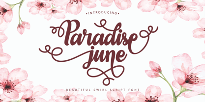 Paradise June is a beautiful swirl script font. This font is feminime, elegant, messy and modern. This font has a very beautiful swirl, perfect for use in wedding and invitation projects. Also very suitable for crafting or lettering. Paradise June perfect for wedding event, anniversary, birthday,greeting cards, logotype, branding, wedding invite and card, elegant logo, poster, packaging, stationery, website, and any other projects. Come with open type feature with a lot of alternates, its help you to make great lettering. This font is also support multi language.
 - Racesky by ZetDesign,
$20.00 Racesky is a racing-themed font but is still suitable for other purposes. This font is created in two bevel styles to give different choices to each user. This font is also accompanied by open type features in the form of kerning, ligature, and stylistic alternate to make it easier to choose styles and shapes. Consistent lettering is also an advantage that makes it easier for you to produce a perfect and stylish work. don't hesitate to choose this font as part of your collection ... happy working and enjoy your font ...!
 - Military Scribe by Three Islands Press,
$39.00 The 10th Regiment of Foot is a British military unit raised more than three centuries ago—and perhaps most famous in the U.S. for seeing action on American soil during the Revolutionary War in the Battle of Lexington and Concord and the Battle of Bunker Hill. Military Scribe is modeled after the compact, utilitarian script on the mid- to late-1770s muster rolls of the Tenth of Foot. I incorporated the work of at least three separate scribes, merging their neat old penmanship into a legible disconnected cursive. Perhaps the most versatile of all our vintage handwriting fonts, Military Scribe might faithfully reproduce antique letters, labels, lists, or just about any document of the period. OpenType features include multiple stylistic sets, scores of historical, contextual, and discretionary ligatures (including nine terminal “d”s) lining and old-style figures, ink blots, cross-outs, and full support for Central and Eastern European alphabets—more than 1,000 glyphs in all.
 - Dearest Friend lite - Unknown license

- Nebulen by Zeenesia Studio,
$16.00 Nebulen is a beautiful and feminine serif font created by a romantic and lovely look. Nebulen was built with Open Type features, stylistic Alternate and Ligature makes your project will be awesome.
 - Coming Soon Pro by Open Window,
$19.95 Coming Soon by Open Window is based on the handwriting from mom when she was in 6th grade. Solid balance, masterful strokes, and just a touch of lemonade stand for good measure!
 - Movie Screen JNL by Jeff Levine,
$29.00 The hand lettered opening titles from the 1944 Laurel and Hardy comedy “The Big Noise” served as the inspiration for Movie Screen JNL, which is available in both regular and oblique versions.
 - QueueBrick by The Northern Block,
$16.70 QueueBrick is an 8 font family consisting of 4 weights Open & 4 weights Closed. A block-work typeface inspired by East European movie posters. Example includes Stanley Kubricks 2001: A Space Odyssey.
 - Selaris by Zeenesia Studio,
$16.00 Selaris is a beautiful and feminine serif font created by a romantic and lovely look. Selaris was built with Open Type features, stylistic Alternate and Ligature makes your project will be awesome.
 - Adesso by Présence Typo,
$36.00 Adesso is a humanistic sans serif very generous & comfortable. It has been created for very young readers. With its wide opened & rounded shapes it is particularly peaceful & legible especially in small sizes.
 - S6 Sans by S6 Foundry,
$29.00 S6 sans is a contemporary neo-grotesque sans serif typeface with strong stylistic geometric contrasts. Its distinctive wide-open stance was designed to give the right visual consistency for branding and communications.
 - Glorando by Letterena Studios,
$10.00 Proudly present Glorando Typeface, created by Story type, A serif modern and classic typeface that has its own unique style & modern look. This typeface is perfect for an elegant & luxury logo, book or movie title design, fashion brand, magazine, clothes, lettering, quotes, and so much more. This font is PUA encoded which means you can access all of the glyphs and swashes with ease!
 - Gerald by Letterena Studios,
$10.00 Proudly present Gerald Typeface, created by Story type, A serif modern and classic typeface that has its own unique style & modern look. This typeface is perfect for an elegant & luxury logo, book or movie title design, fashion brand, magazine, clothes, lettering, quotes, and so much more. This font is PUA encoded which means you can access all of the glyphs and swashes with ease!
 - Grisha by Grontype,
$14.00 Grisha is a futuristic and modern retro look. Each uppercase and lowercase letter has its own characteristics, plus some alternates and ligatures. This font is bold and tight kerning, very suitable for your design projects such logo tagline, logotype, name card, flyers invitation, magazine header etc. Features: Uppercase glyphs Lowercase glyphs Numeral and Punctuations Standard Ligatures Stylistic Alternates Thankyou for choosing this font Regard, Grontype
 - Alpen Jack by HandletterYean,
$14.00 Alpen Jack is a handwritten display font with its own style to distinguish your design from others. Alpen Jack is suited for any work, especially if it is unique. Also great for craft and any kind of custom design. This font is compatible with any design software like Photoshop, Illustrator, Silhouette design studio, and so on. Maximize your inspiration and creativity with this font.
 - Lobster 1.3 - 100% free

- Gabardina - Personal use only

- Quebrada - 100% free

- Shecarea by Putracetol,
$24.00 Shecarea is a beautiful script font with 2 style, fill style and line style. This font has a modern and unique font feel, there is more feminine style too. Shecarea is perfect for is perfect for logotype creation, lettering compositions, wedding invitations, fashion projects, book design cover, magazines typography, cards, packagings, posters, branding and more. Come with open type feature like a lot of alternates and also ligatures. Its help you to make beautiful lettering. This font is also support multi language
 - Menina Graciosa Ornaments by Intellecta Design,
$17.90 Meninas are the new comprehensive collection of innovative craft alphabets and ornaments researched in rare cross-stitch booklets from 1850 to 1930. This alphabet and ornaments series was entirely designed by hand, without use of auto-tracing, by Iza W, from Intellecta Design. Keep your eyes wide-open, because we will launch more amazing alphabets in this collection. “Menina” means “Girl” in Portuguese. Menina Graciosa is a Graceful Girl. See too her sister fonts: Menina Formosa , Menina Carinhosa , Menina Poderosa Ornaments , Menina Espinhosa .


