2,349 search results
(0.017 seconds)
- Sans Anger by Olivetype,
$18.00 Sans Anger is a stunning and authentic brush font with a natural feel. Get inspired by its whimsical style and turn any design project into a true stand-out. So what’s included: Sans Anger (OTF, TTF, and WOFF) Basic Latin A-Z, a-z, numbers, symbols, and punctuations Sans Anger is supporting Multi Languages: from Afrikaans Albanian Catalan Danish to Dutch English Spanish Swedish Zulu. Accented Characters : ÀÁÂÃÄÅÆÇÈÉÊËÌÍÎÏÑÒÓÔÕÖØŒŠÙÚÛÜŸÝŽàáâãäåæçèéêëìíîïñòóôõöøœšùúûüýÿžß Thank you
 - MCF bad manners - 100% free

- walker free style - Unknown license

- Wiener Gentil Toutou - Unknown license

- TF Wander Cloud by Teenage Foundry,
$19.00 TF Wander Cloud display typeface fonts – unique and innovative designs that are sure to make your project stand out! Each letter in this font is square, with elegant cuts that give the letters shape. This font is perfect for anyone looking to add a touch of modern elegance to their designs. Our typeface display fonts are designed with precision and attention to detail, ensuring that each letter is perfectly balanced and easy to read. The square shape of each letter gives the font a modern and minimalist feel, while the cuts add an extra layer of sophistication and elegance Features: Uppercase, Lowercase, Numeral, Punctuation & Multilingual. For any questions please contact me 🙂 Thanks!
 - Banner Year NF by Nick's Fonts,
$10.00An unnamed scroll typeface featured in the 1869 MacKellar Smiths and Jordan specimen book provided the pattern for this font. You may begin and end the scrolls with parentheses, braces or brackets, and employ the space bar as you normally would to construct headlines "in full-flowing draperies". Both versions of this font contain the complete Unicode 1252 (Latin) and Unicode 1250 (Central European) character sets, with localization for Romanian and Moldovan. - Neue Werner Paperclip by Funk King,
$5.00 Neue Werner Paperclip is inspired by the 70s classic.
 - History Walker GT by Gartype Studio,
$10.00 Inspired by bold and slanted handwriting style, we present to you History Walker, a handwritten font with bold and slanted characters that was comes with alternates and multilingual glyphs to help people around world with that unique accent with this font. History Walker is very suitable like as text, cover book, poem, handwritten style, and more.That way easily change the glyphs to make more unique glyphs.
 - Deco Banner JNL by Jeff Levine,
$29.00 Deco Banner JNL is composed of reverse lettering on a black background with Art Deco end caps. To create a banner, first type the plus sign for the left end cap, then your text. To add a space between words, use the bar on the shift position of the backslash key then continue on. To add the right end cap, type the equal sign.
 - Type Warmers JNL by Jeff Levine,
$29.00 The name Type Warmers JNL traces its lineage to small catalog booklets issued by Indianapolis' Cobb Shinn for his line of letterpress cuts; of which a few can be found included within this typeface. Presumably type could "warm up to" these stock illustrations and work hand-in-hand to deliver the message, hence the "Type Warmers" sobriquet. Originally known for illustrating many attractive and comical postcards of the early 1900s, Shinn moved into the field of purchasing stock art and redistributing them as electrotypes or "cuts", the predecessor to today's digital clip art. A number of the cartoons he sold can be found in the Shinn Kickers JNL font.
 - Frames And Banners by Outside the Line,
$19.00 32 illustrations of 15 Frames and 17 Banners. Most are line drawings with a reverse version. Lots of dots and grids, scallops and stripes to mix and match. Quick way to add some punch to your layouts. Great for mailing labels, labeling for jars, borders for this and that. Nice scrapbook additions too. Take a look at Rae's other frame fonts... Frames & Borders and Frames & Borders Too.
 - Drone Ranger Pro by Vintage Type Company,
$9.00 The original, highly acclaimed, Drone Ranger Display Font has been completely re-drawn, re-vamped, and upgraded with a ton of extra features. Drone Ranger PRO is a bold, chiseled display family inspired by dystopian, retro propaganda. The font is very industrial in its aesthetic, and is built on strict, rigid geometry. Features include a full uppercase alphabet with alternate glyphs, varying stroke weights for better legibility, improved glyphs & numerals, fractions, and a full set of Adobe Latin 4 diacritics + basic cyrillic.
 - Tulk's Victorian Banner by Greater Albion Typefounders,
$14.50 Tulk's Victorian Banner revives the tradion of 'Banner' typefaces-lettering within their own lozenge or cartouche, that made such an appealing feature in many old type foundries catalogues. Tulk's Victorian Banner makes a wonderful feature of lettering in any piece of period inspired design. It compleiments our recent Fitzgerald space especially well, but can be used alongside any typeface of your choice where you want to bring a touch of period flamboyance.
 - Appointment With Danger by Device,
$29.00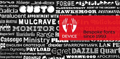
- Danger Girl Hex by Comicraft,
$19.00 A dangerous charm. A death hex. A summoning. An Invocation. An enchantment. An incantation to raise the dead. A supernatural chant. Be careful what you spell out with this font, you might get what you wish for...
 - Magic Twanger NF by Nick's Fonts,
$10.00Hiya, kids! Hiya, hiya, hiya! was the customary greeting of Froggy (a rather cheap rubber toy), who played second banana to otherwise-perennial sidekick Andy Devine on the 1950s TV show, Andy's Gang. The Magic Twanger was the thing which, when plunked, brought on the cartoons and other kid-friendly fare. The Opentype version of this font supports Unicode 1250 (Central European) languages, as well as Unicode 1252 (Latin) languages. - MCF bad manners ww - 100% free

- Ranger Rays Rocketeers SRF by Stella Roberts Fonts,
$25.00 Ranger Rays Rocketeers SRF was originally a freeware font on Jeff Levine's old site, but needed a lot of reworking and cleanup to be user-friendly. Jeff did all of the fixes and provided this charming retro-style font of space-age dingbats to the Stella Roberts Fonts project. The net profits from my font sales help defer medical expenses for my siblings, who both suffer with Cystic Fibrosis and diabetes. Thank you.
 - Anger is a gift - Unknown license

- Corps-Script-Shadow - Unknown license

- Brda by Linotype,
$29.99Brda originally designed by the Polish designer Franciszek Otto for the Powiat weekly newspaper. Powiat needed a new, dynamically drawn sans serif for its headlines, and Otto's Brda fit the bill. Combining traditional Grotesk letterforms with witty subtleties, like the notched-joint seen in the capital G, Brda displays a novel design that works best when set large. The typeface is named after the Brda river, which runs through Bydgoszcz, Poland, the city where Powiat is published. The Brda family includes three weights, each with a companion italic: Regular, Bold, and Extra Bold. The Brda family's Extra Bold weight was one of the winners selected in the 2003 International Type Design Contest, sponsored by Linotype GmbH. Franciszek Otto also teaches graphic design at the Secondary Art School in Bydgoszcz, where his typefaces rank among the students' favorites. - CMC7 - Unknown license

- TIES - Personal use only

- Anabel - Personal use only

- Liturgisch - Personal use only

- PM Eckmannschrift by Paper Moon Type & Graphic Supply,
$15.00 Eckmannschrift is a redrawing based on original sketches and type specimens of the original 1900 Otto Eckmann typeface Eckmannschrift. It includes the original characters designed by Otto Eckmann not included in most modern releases of the font. Though it is a vintage typeface, it has found several popular resurgences of use over its 100 years in existence, including today's retro styles and psychedelic posters from the 1960s.
 - Tribal Tattoos III by Otto Maurer,
$18.00 Tribal Tattoos comes from the German tattoo artist Otto Maurer. This clean vector Tribal art is best for making good plott or printed art.
 - Tombola by RMU,
$30.00 Inspired by painted letters of Otto Heim, "Tombola" reflects in a charming way the feelings of the Roaring Twenties, especially in advertisement and in the creation of posters.
 - Rudelsberg-Initialen - Personal use only

- Kress Titling by RMU,
$30.00 In 1923, the Schriftguss AG, Dresden, released this all-caps Art Deco font designed by Otto von Kress. From the existing basics, the now available font was completely redrawn and redesigned for modern use.
 - Isoglyphics by Michael Browers,
$25.00Isoglyphics was initially concepted as a rip on Otto Neurath and the resulting movement towards icons as visual language. However, the final design resulted in visual satire of contemporary culture through the resulting icons. - PM Eckmann Initials by Paper Moon Type & Graphic Supply,
$15.00 PM Eckmann Initials is our chromatic (layered) version of Otto Eckmann's Eckmannschrift Initial Cap typeface designed to work with his typeface Eckmannschrift. Our version can be used for general Art Nouveau initial caps or combined with our PM Eckmannschrift typeface.
 - Snow Cap by Bitstream,
$29.99Snow Cap from Bitstream is a wintry display face with snow effects dropped onto Jennifer Maestre’s Mister Earl. Released in 1995, the snow was artfully placed onto each character by Bitstream designer Richard Stetler. - Lorelei by insigne,
$21.99 Lorelei is an exuberant and bouncy script. The ink seems to be slathered onto the surface in a casual and spontaneous manner, making for a flowing and feminine script that is perfect for invitations or greeting cards. The script also contains a large number of OpenType alternates and ligatures to extend the impulsive nature of the lettering. Lorelei is named for a young German maiden that supposedly threw herself into the Rhine.
 - Wola by Monotype,
$50.99 Wola™, by Franciszek Otto, is not for the typographically timid. It creates vibrant digital headings, banners and navigational links, in addition to commanding print headlines and subheads – but it is not shy, reserved or demure. The design blends the stroke weight stress of Bodoni with the urgency of handwritten letterforms, conveying the energy and immediacy of a design that’s bigger than life – and outside the fence. OpenType® Pro fonts of Wola provide for the automatic insertion of ligatures and alternate characters. These are in addition to a character set supporting most Central European and many Eastern European languages, including Cyrillic and Greek. All this makes Wola a comfortable – if boisterous – world traveler.
 - Taiko by astype,
$20.00 Taiko is a strong headline typeface based on a design by Otto Arpke from 1928. Taiko Std is the basic version with 235 glyphs. The full version with over 650 glyphs includes the following OpenType features: - central European glyphs - small caps - tabular & mediaeval numerals - dynamic fractions
 - Rilke by Pelavin Fonts,
$20.00 Rilke, is the lettering used by Gustav Klimt on the 1st Vienna Secession poster in 1898 and is named for Klimt’s contemporary the poet Rainer Maria Rilke. The Vienna Secession was a group of artists whose motto was "to every age its art and to art its freedom." Their goal was to create a new style not based upon any historical influence. Its subtle curving strokes and the idiosyncratic set of the various characters create an elegant lightness which lends itself well to poetry, inscription
 - Chub by Chank,
$39.95Chub was inspired by and dedicated to: Jimmy Dean Pork Sausage, J Otto, Ben & Jerry, Spunk, Chuck Jones, Run DMC, those teenage kids with their big baggy pants, French Market coffee, George Clinton, Bill Clinton, Chistina Ricci, Sesame Street and the letter C. God bless all those big, fat, fun things that make life grand. - Rail Route Stencil JNL by Jeff Levine,
$29.00 Rail Route Stencil JNL is based on a hand-cut paper stencil depicting a logo for the Baltimore and Ohio (B&O) Railroad. The lettering is from the motto encircling an image of the Capitol dome: "Linking 13 Great States with the Nation". This motto was not present on some other versions of the B&O logo.
 - ZiGzAgEo - Personal use only


