10,000 search results
(0.167 seconds)
- Prelom by Tour De Force,
$25.00 Prelom is modern serif family inspired by retro designed typefaces. Comes in 5 Normal weights, 5 true Italics and 5 Condensed weights. With tall x-height, sharp serifs like fishing hooks, original Italics and distinctive character overall design, Prelom is ideal family for editorial use or branding. Beside extended Latin character set, Prelom contains Cyrillic characters as well. It is equipped with Initials, Ligatures, Fractions and Tabular Numbers as OpenType features.
 - Gavotte by Linotype,
$29.99Linotype Gavotte was designed by Rudo Spemann in 1940. His style was unmistakable, marked by original ideas and completely new forms. His tendency toward the unusual and adventurous resulted in unique, decorative characters. When he wrote, the tip of his pen flew across the page, leaving behind rows of letters which displayed an almost unbelievable regularity of form and flow. Gavotte is a perfect example of the best of Spemann’s calligraphy. - Locarno by ITC,
$29.99Locarno is the work of British designer Alan Meeks and is his adaptation of Rudolf Koch's original design for the Klingspor type foundry. The unique design of the roman weight features geneous capitals and a reserved lowercase. The italic capitals have an open, engraved decoration that combines perfectly with the lowercase with its tall, elegant ascenders. Locarno is a typeface with the sophisticated look of the 1920s and 30s. - Fitzronald by Cercurius,
$29.90 Fitzronald is a body text typeface with a strong personality combined with a good legibility in small sizes. It is an excellent book typeface, but it can be used in e.g. advertising and packaging as well. Due to its good legibility at low resolution, it is a superb website and e-book typeface. Fitzronald is based on Ronaldson, an American typeface originally cut by MacKellar, Smiths & Jordan in 1884.
 - Gronau by Zetafonts,
$35.00 Andrea Tartarelli discovered the letterforms that would inspire his Gronau family in a 1912 specimen that showcased the typeface Fette Reichs-Deutsch, designed by Wilhelm Gronau in 1902. Fette Reichs Deutsch has been digitised by Tartarelli as Gronau Fette. With Gronau Neue, Tartarelli tried to find a contemporary, gestural interpretation of blackletter shapes, adding a slightly calligraphic look and feel to the original hasty lines and energetic construction.
 - Cirulis Display by Asketic Design Studio,
$40.00 Cirulis is a display sans family of two weights. Inspired by the lettering of Ansis Cīrulus (1883-1942) one of the first Eastern European designers. The artist’s heritage is characterized by letters with asymmetric widths, sliced cuts and various intrinsic features. By carefully studying forms and origins of the letters Asketic designed a new typeface that in a contemporary fashion relives early 20th century national romanticism of Eastern Europe.
 - White Rose by The Good Type,
$10.00 White Rose is an original hand-drawn typeface that was made for the White Rose Catholic Worker house in Chicago. White Rose (the Catholic Worker house) follows a long tradition of providing hospitality, being active and involved in the community and living a sustainable lifestyle. In the same way, White Rose (the typeface) follows a long tradition of typefaces, mimicking Old Style and Transitional forms while retaining an element of style.
 - Giza by Font Bureau,
$40.00 The sixteen styles of Giza bring back the colorful power and variety of the original Egyptian letterforms, a glory of the Victorian era. Designer David Berlow based the family on showings in Vincent Figgins’ specimen of 1845, the triumphant introduction of this thunderous style. The truly unforgettable “Nine” weights were designed for ultimate emphasis in posters, and do their most effective work in the very largest of sizes.
 - Tuff by Stone Type Foundry,
$49.00 Tuff began with Magma. Set as text, they appear to be similar and are quite comfortable as typographic companions. The child-safe softness of Tuff owes something to the letterforms of the earliest extant Greek Manuscript, The Persae by Timotheos in the 4th Century BC. It is beholden to Morris Fuller Benton's original Souvenir, and its revival by Ed Benguiat. My own Stone Informal was also an influence.
 - Eden CT by CastleType,
$39.00 Eden Light, originally designed by the American type designer Robert H. Middleton in 1934, was commissioned by Publish magazine for a redesign in 1990. When I found a specimen of Eden Bold a couple years later, I decided to digitize it also. Subsequently, I created a Medium weight. Very squared and compact with thin slab serifs, Eden includes support of all European languages that use the Latin alphabet.
 - MFC Carnivale Monogram by Monogram Fonts Co.,
$69.00 The inspiration source for Carnivale Monogram is an elegantly sexy antique of typographic history. Known as Romantiques No. 3 or Ornate No. 2, this fantastic typefaces has been digitally revived and expanded for monogram designs. While this typestyle was never originally intended for monograms, its ornate nature lends itself so wonderfully to the craft. Download and view the MFC Carnivale Monogram Guidebook if you would like to learn a little more.
 - Whistleberry by 10four,
$25.00 Originally given life as a wordmark for the Alt-Country band Woodshed Supply Company, the Whistleberry typeface evolved from a few simple letterforms inspired by early 20th Century signage, into a surprisingly functional typeface. With plenty of rustic charm, a robust glyph set, and a variety of alternate characters, Whistleberry will add flare and appeal to your work. Whistleberry comes in two weights; a modest Regular and a beefy Bold
 - ZionTrain Cyrillic by AndrijType,
$27.00 Originally ZionTrain was built as a (probably first in Cyrillic!) navigation typeface for the Kharkiv identity project and Kharkiv subway and airport navigation systems. We wanted comprehensible, distinctive letterforms, that can help everybody on the way from Babylon to Zion. The project was used in Kharkiv promotion at homeland and abroad, but was rejected by the new government. As a corporate typeface it was used for a few cultural projects.
 - Gloriana by Scriptorium,
$12.00Gloriana is based on hand lettered titles from an old fairy tale book. The illustrator isn't credited, and we had to create and modify a lot of characters, but we preserved the interesting personality of the original lettering. In creating Gloriana the popularity of Folkard was kept very much in mind, so it has some of the same features, including special flourished characters accessed with the option/alt key. - Guadalajara JNL by Jeff Levine,
$29.00 Hand lettered, the title on the sheet music for a 1940s hit song "Ti-Pi-Tin" inspired Guadalajara JNL. The melody and original Spanish lyrics were written by Maria Grever, one of Mexico's first successful female composers, with English lyrics supplied by Raymond Leveen. This decorative and fun type face brings to mind fiestas South of the border, and emanates the charm of Mexico's music, dance and colorful costumes.
 - Chapeau by Milieu Grotesque,
$99.00 Chapeau is loosely inspired by a Johnny Cash letter written on an old IBM typewriter. The original typeface called “Doric” was a rare example of a proportionally aligned typewriter face, supplied by IBM in the late 1960s. Based on simple geometric shapes, Chapeau is a low contrast sans-serif with rounded endings. The letterforms have been carefully aligned to avoid exceeding width and to achieve an efficient, contemporary appearance.
 - PiS Koernig by PiS,
$38.00 PiS Koernig is inspired by handwritten alphabets from Max Körner's book „Das Neue Schriftenbuch“ from 1949 featuring bold and decorative display type for use in sign painting and advertising. It features clean and readable glyphs as well as quirky deco alternate letters in Max Körner's original style to add some 1950ies flavour to your projects. Be sure to use E and F caps + alternates for some labyrinth-esque patterns!
 - Funkadelity by PizzaDude.dk,
$18.00 Funkadelity is a funky breed between 60ies poster typography and 80ies grafitti. Maybe even inspired a bit by comic book lettering! Funkadelity wants to burn off the dance floor and show off the fancy dance moves - at the same time, it want to show off the smooth and clean lines of the letters. Originally handdrawn, but I digitally remastered every single letter, leaving the curves smooth and clean!
 - PF Press by Parachute,
$45.00 Press combines aesthetic and functional attributes which make written text highly readable. It was originally designed for a newspaper with medium contrast to withstand harsh printing conditions. Its structure is quite narrow which makes this typeface ideal for body text and headlines where space is at premium. Supports Latin and Greek. This is a modern serif typeface which may be the right choice for newspapers, magazines and corporate communications.
 - Altogether by PintassilgoPrints,
$29.00 Oodles of doodles! Altogether brings not two or three, but eight - yep! - flavours for each letter. Original, creative, authentic flavours. Sometimes sweet, sometimes fun, sometimes weird. A bit eccentric, let's say. So we can say it different. Let the autopilot cycle all these glyphs by simply turning on the contextual alternates feature inside your application. If you prefer, handpick your choices from a glyphs palette. And, mainly, have fun!
 - Firelli by Typejockeys,
$60.00 Firelli is an original family of 14 styles including 7 weights and Italics. Delighting from thin to black, Italic swash caps, ligatures, and neat alternate characters. Big headlines will love Firelli’s incorruptible details. Longer texts will benefit from a wide-ranging family with its solid posture. Go, use everything Firelli has to offer, to design your contentful magazines, powerful annual reports, or even bedtime stories and fairy tales.
 - Cruz Cantera BT by Bitstream,
$50.99 Cruz Cantera is a crisp and stylish yet informal sans serif typeface created by NYC type designer Ray Cruz. It is a slightly condensed design. The vertical strokes have rounded terminals, and there are some characters with serifs. Notable characters include the upper and lowercase E. There are three weights and each works equally well alone, or together for both display and text. Original design by Ramon Cruz completed in 2002.
 - Bankster by Pelavin Fonts,
$15.00 With it’s origins in a hand-lettered headline about money managers, Bankster is an alphabet meant to evoke the feelings of currency or financial documents. Multiple styles facilitate the perfectly registered layering of components in a variety of color combinations to enhance impact and provide an enriched dimensional experience. It not be for everyone but, it's a perfect solution for the designer who has no patience for boring type treatments.
 - Deco Drop Caps JNL by Jeff Levine,
$29.00 From the pages of the 1939 French lettering book “Modèles de lettres modernes par Georges Léculier” (“Models of Modern Lettering”) comes an attractive and unusual set of initial drop caps made from square letters adorned with multiple vertical lines. Originally designed as white letters on black backgrounds, an additional set with black letters on white backgrounds comprise Deco Drop Caps JNL; available in both regular and oblique versions.
 - 1512 Initials by GLC,
$20.00 This set of initial decorated letters is an entirely original creation, drawn inspired by Italian renaissance patterns. It contains two roman alphabets : one drawn in white on black background and the other in black on white. We have included a few fleurons and decorative elements. It can be used as variously as web-site titles, posters and flyers design, publishing texts looking like ancient ones, or greeting cards, all various sorts of presentations, as a very decorative, elegant and luxurious additional font... This font supports strong enlargements remaining very smart and fine. It's prefered height is about one inch equivalent to about four lines of characters. This font may be used with all blackletter fonts, but works especially well with 1543 Humane Jenson, 1557 Italique and 1742 Civilite, without any anachronism.
 - Ongunkan Radloff Viking by Runic World Tamgacı,
$100.00 Vasili Vasilyevich Radlof or Wilhelm Radloff (Russian: Василий Васильевич Радлов; German: Wilhelm Radloff; 17 January 1837 - 12 May 1918) was a German-born Russian orientalist and founder of Turcology. Radloff is a Russian Turkologist of German origin, who researches the Turkish world from different aspects, opens a new era in the history of Turkology by bringing them to light, and has devoted 60 years of his 81-year long life to these studies. In his work known as Radloff Atlas, it was published with a runic font that he developed specifically for the Old Turkish Runic Alphabet. I made the Turkish Runic Font using Radloff's Atlas. I developed this viking font based on this font and adapted it to Viking writing. I will adapt other runic versions when I have the opportunity.
 - Bogdan by ParaType,
$30.00 An original script font designed by Victor Kharyk and licensed by ParaType in 2006. Based on Ukrainian Skoropis (fast handwriting) of 16-17th centuries. The font was named after Ukrainian Getman Bogdan Khmelnitsky, because the main sources and inspirations for the project were taken from collection of handwriting Universals (decrees) of that time -- the middle of 17th century. The shape of letters imitates flat nib quill handwriting with stress, bringing them informal liveliness. The Bogdan font character set contains Cyrillic, Old Slavonic , Glagolitic, Latin and Greek alphabets in two variants: Rejestrowy (Regular) and Siczowy (Alternate). The font is for use in display typography, but can work quite well for short text setting. Bogdan type is well suited for historical and cultural texts associated with Europe of 15-17th centuries
 - Jinkay Faux by Twinletter,
$15.00 We’ve created Jinkay, a display typeface with a Japanese style that’s similar to original. Don’t be afraid to use this font in all of your special projects right now; imagine how beautiful and appealing your design will be; your project will instantly captivate all of your audience at first glance; they will easily remember the appearance of your project if you use this font, because it will be unique, different, and stand out from the crowd. Logotypes, food banners, branding, brochure, posters, movie titles, book titles, quotes, and more may all benefit from this font. Of course, using this font in your various design projects will make them excellent and outstanding; many viewers are drawn to the striking and unusual graphic display. Start utilizing this typeface in your projects to make them stand out.
 - Kloetzchen by TypoGraphicDesign,
$9.00 The typeface Klötzchen (german word for blocks) is designed from 2020 for the font foundry Typo Graphic Design by Manuel Viergutz | Typo Graphic Design × Peter Eckartz | kleinholzTYPO as a political statement #climatejustice The display font based on the original wood letter from Peter Eckartz (kleinholzTYPO). The technic is called Reifendreherei from the Erzgebirge. Craft Tools like Hobel and Fräsmaschine. The idea based from Gert Schaaf (Spielzeugproduzent in Wittlich, 1970s). The font started from 41 wood letters (analog) and was finally digitalize and extended to 374 glyphs (digital). Thanks to Alex Branczyk for the Klötzchen. 3 font-styles (Wood, Clean, Impact) + 1 icon-style with 374 glyphs (Adobe Latin 1) incl. 100+ decorative extras like icons, arrows, dingbats, emojis, symbols, geometric shapes (type the word #LOVE for ❤️or #SMILE for
 - MFC Peony Monogram by Monogram Fonts Co.,
$19.95 The inspiration source for Peony Monogram was a unique stackable monogram design with floral accents from a vintage embroidery publication. Originally intended to adorn handkerchiefs, this simple pattern has so many design possibilities, from colorizing to formatting options. You can really play around with this monogram font! Peony Monogram can create one, two, or three letter monograms, even basic titling due to its unique design. Because of Peony's unique stackable monogram formatting, make certain that the point size of the font is the same as the leading being applied to the font in order to minimize gapping between stacked forms. While we've adjusted this within the font, your program may override these settings. Download and view the MFC Peony Monogram Guidebook if you would like to learn a little more.
 - Grippo by Canada Type,
$24.95 The first Grippo sketches were done in the 1980s, but only now does it see the light of day as a complete series of interchangeable, layerable fonts. The original single-font concept was simple enough: Double the stems so they become sturdy handles. But then we elected to add more playfulness and versatility to the idea. By separating the main idea’s layers and producing them as individual fonts, layerability is achieved, and endless possibilities of play and variation arise. In 2D or 3D, colourful or demure, in titling or as initials, Grippo is a great eye-catcher that emphasizes the big fun aspect of your design. Each font of the Grippo suite comes with a few built-in alternates, a glyphset of over 385 characters, and support for the majority of Latin-based languages.
 - Buddy by Hackberry Font Foundry,
$24.95 Buddy is the new companion sans for Contenu, the book font family designed for my book on font design design. Originally, I called it Compagnon, but that seemed to pompous. Then I called it Aide, but that was too formal and dry. It's a loose, free, easy to read sans, so when my wife suggested Buddy, it clicked. This is the 4-font Buddy family of Regular, Italic, Bold, & Bold Italic. I made a new, more limited feature set for these fonts due to their designed usage, but there are still small caps, small cap figures, oldstyle figures, numerators, and denominators. The bold is closer to a black, and the italics are only slightly slanted obliques. If you need a strong black in caps, use the small caps of the bold.
 - Lagos by Scholtz Fonts,
$19.00 Lagos was created because of the lack of African-inspired fonts that are truly modern without being partly art-deco in origin. I wanted to make a vigorous, sharp-edged font that reflects the energy and dynamism of modern Africa. The lines of the font combine the sharp angularity of African rocks and mountains with the smooth fluidity of Africa's snake-black rivers. The font is supplied in two styles, Lagos Regular and Lagos Light. Lagos Light is not a simple, mechanical modification of Lagos Regular. The outlines and proportions have been subtly modified to accommodate the lighter weight. Lagos contains a full 256 character set (upper and lower case, punctuation, diacritical characters, special symbols and numerals), in which all characters have been fully kerned and letter-spaced.
 - Rhythm by Positype,
$42.00 I hate the idea of revivals. I have publicly said I choose not to do revivals because they make me uncomfortable. This is as close as I have been to crossing my own line. To be direct, Rhythm is based on the ATF typeface, Ratio (I just recently learned the foundry of origin). I came across this typeface from a printed specimen years ago when I was in school and held onto it. It was unique and I loved how well integrated the inline worked within both the flourish and serif of the glyphs—it was old, but not, reminiscent, but fresh. My specimen was limited in the glyph offering (it was c. 1930ish) and I realized a lot would need to be done to ‘finish’ it and bring it to contemporary expectations. I didn't want to do ‘retro’ and tried to avoid the visual trappings associated with it. What I did want to do is interpret what I had in the specimen and reinterpret it digitally, refining its construction and extending its typographic equity along the way. The ‘One’ and ‘Two’ (and their matching ‘Solids’) styles diverge providing various elaborations that coordinate well between rigid bracketed serifs and compact tails. I further expanded the glyph offering to include a full diacritic set, old style numerals, fractions, stylistic alternates, swashes, titling alternates and controlled flourishes that adhere to the efficient framework of the script. And yes, I refer to it as a ‘script’ because calling it a ‘cutesy serif’ seems wrong :) I hope this is seen less as a slavish revival and more as a championing of a really unique typeface. The Original Typeface was Adastra, designed by Herbert Thannhaeuser for the Foundry D. Stempel AG in Frankfurt, Germany.
 - Paletone by Bale Type,
$15.00 Paletone is hand lettered sans in two style, Regular & Bold. With the organic and handmade feels, you can use this font for any project. This minimalist font also suitable for the project with earth tone color. Also good for quotes.
 - Nature Product by Serebryakov,
$25.00 Nature Product it's single weight display font with ideology defines of healthy lifestyle and nutrition. Pure curves based on calligraphy method. Font perfect for use in organic foods, cosmetics, medication package design & identity projects, food editorial prints and web blogs. Enjoy!
 - Just Write by The Ocean Studio,
$13.00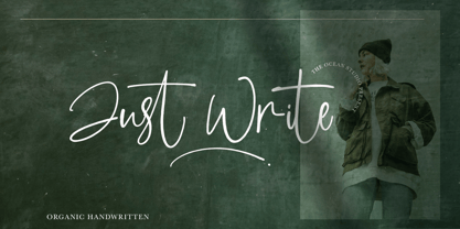 Just Write is an organic handwritten font that is suitable for branding, signature, wedding invitation, promotion, product packaging, and other needs. This font is modern, simple. You will get full set of lowercase and uppercase letters, numerals and punctuation, multilingual symbols.
 - Italiano Fushion New by RM&WD,
$35.00 Italiano Fushion is part of an expanding project on which we have been working for several years and which we are committed to in the future. Like the first two, this one too starts from the study of the great Futurist adventure of the early 1900s by great artists such as DEPERO and MARINETTI, who twisted the world of typography with shapes and colors. Italian Fushion is made up of almost 2,000 glyphs for each weight and in addition to hundreds of alternatives mainly, such as initials and endings of each word but also different alternatives for the letters I, J, Y. Thanks to the characteristics of Open Type, you can change them in automatic many of the alternatives, use it as a simple text font by changing only the I's and J's that have the typical capital dot, and giving the text a more fun breath to the composition. Italiano Fushion is suitable for large texts and to get the most out of it it is compulsory to transform the text into UPPERCASE text using the tabs of graphic applications such as Illustrator, or activate the Alternavive tabs and the various options of SS. Ideal for creating Logos, Head Lines, Web Titles, Posters, Epub Covers, Tatoo Projects, T-Shirts, Drink Labels ... Thanks
 - Weaver - Unknown license

- Parasight - Unknown license


