10,000 search results
(0.051 seconds)
- Hatmaker by ITC,
$29.99Jean Evans' interest in type design dates back to her third-grade fascination with fancy script writing. Years later, work at a sign-painting school she found in the Yellow Pages® cemented her relationship with letterforms. Evans went on to study with master calligraphers and type designers, including the likes of Donald Jackson, Hermann Zapf and Matthew Carter. Evans' designs have been exhibited and collected around the globe, and her distinctive calligraphic style has been lauded by leading trade organizations, annuals and publications. Hatmaker, one of Evans' more popular typefaces, was originally developed for the Boston-based broadcast design firm of the same name. Inspiration for the design came from Ben Shahn's famous hand-constructed alphabet. Shahn's alphabet, however, was limited to capital letters. Daunted by the idea of designing a lowercase that would measure up to Shahn's capitals, I developed a second set of caps-simple, quirky, yet almost classic-to work as 'lowercase' with the Shahn-like caps," explains Evans. Mixing the two in Hatmaker, creates a lively interplay of light and dark." - Glade by Dear Alison,
$24.00 My latest typeface is a formal, copperplate script named Glade. Beginning as a project for a client who wanted several widths of a formal script style, the project never saw fruition. However, it did get me excited about the idea of a width family of steel nib scripts, ranging from extra narrow to extra wide, and the result is the Glade family. To give Glade a minor modern makeover from the original intent, the lowercase has been scaled up, and the Capitals scaled down for a more friendly personality. The character set has been expanded, and OpenType support has been added for unlimited fractions, ordinals, superiors and inferiors. So if you have the need for a formal connecting script, but are short on space, try Glade Narrow or Glade Extra Narrow. If space is not an issue, then the Regular, Wide or the generously gracious Extra Wide should do nicely. And if you get the whole family, well then you are set for anything that comes your way.
 - Rolling Brush by Ditatype,
$29.00 Rolling Brush is a script font that gives handwriting appearance with original and personal brush details. This font is made beautifully so that the letters are connected to each other, creating a continuous and flowing look. Each letter is attached to the previous letter and continues to the next letter, creating beauty in writing unity. This font shows brush details on each letter. Brush strokes displays a rough, organic texture to the edges of the letters, adding dimension and visual life. These details give a unique impression to this script font. On the other hand, even though it has a rough border, this script still maintains a natural and elegant aesthetic touch. Some letters may have dramatic twists, while others are simpler. This flexible shape creates an expressive and creative look to the lettering. Because it is designed with a rough border, it would be better if you use this font at a large text size so it is more easy to read. Enjoy the various features available in this font as well. Features: Alternates Ligatures Multilingual Supports PUA Encoded Numerals and Punctuations Rolling Brush is suitable for any designs that want to convey a warm, personal and alluring impression. You can use this font in the design of greeting cards, invitations, logos, labels, and many other design projects that want to create uniqueness through a natural, handwritten touch. Find out more ways to use this font by taking a look at the font preview. Thanks for purchasing our fonts. Hopefully, you have a great time using our font. Feel free to contact us anytime for further information or when you have trouble with the font. Thanks a lot and happy designing.
 - Aure Nox by Aure Font Design,
$23.00 Aure Nox inspires the chill whimsy of a haunted forest. The roughhewn forms of this decorative, sans-serif font engage the reader with a subtext of rakish charm. Surprisingly legible, Nox adds a bit of rebelious sass to text and titles, and a daring stance to astrological expressions and chartwheels. Nox is an original design developed by Aurora Isaac. After more than a decade in development, 2018 marks the first release of the CJ and KB glyphsets in regular, italic, bold, and bold-italic. The CJ glyphset is a full text font supporting a variety of European languages. A matching set of small-caps complements the extended lowercase and uppercase glyphsets. Supporting glyphs include standard ligatures, four variations of the ampersand, and check-mark and happy-face with their companions x-mark and grumpy-face. Numbers are available in lining, oldstyle, and small versions with numerators and denominators for forming fractions. Companion glyphs include Roman numerals, specialized glyphs for indicating ordinals, and a variety of mathematical symbols and operators. The CJ glyphset also includes an extended set of glyphs for typesetting Western Astrology. These glyphs are also available separately in the KB glyphset: a symbol font re-coded to allow easy keyboard access for the most commonly used glyphs. Though Nox stands well on its own as a text font, the more traditional sans-serif forms of Aure Jane pair well as an innocuous foil to Nox's brazen presence. Give Aure Nox a trial run! You may discover a permanent place for this font family in your typographic palette. AureFontDesign.com
 - Feeling Blessed by HansCo,
$15.00 Feeling Blessed is a beautiful and modern script font. It features an incredibly classic style, while still keeping a friendly feel. Feeling Blessed is the perfect font for making original and outstanding designs. Its casual charm makes it appear wonderfully down-to-earth, readable and, ultimately, incredibly versatile. Feeling Blessed will look outstanding in any context, whether it’s being used on busy backgrounds or as a standalone headline! Comes with a full uppercase, lowercase, numbers and punctuation + standard multilingual support. It’s great for branding, logo designs, lettering, logotype, craft, posters, packaging and much more. We recommend using Adobe Illustrator or Photoshop. Tutorial how to Install & use Alternate / Special Character : https://hanscostudio.com/tutorial/ Enjoy!
 - Goodwater by Fenotype,
$19.00 Goodwater is an original collection of a Brush, three weights of a monoline Script and four weights of condensed Sans typeface. Goodwater also has a “Print” version with rugged outline and worn-out texture of each font. Goodwater is a great pack for any display use from online to logo and from headline to packaging. All the styles are designed using the same proportions and soft corners so that they’ll place nice together. All Print versions have the same texture style and size too so that they’ll fit smooth together. Goodwater Script and Brush fonts are equipped with automatic Standard Ligatures and Contextual Alternates to keep the flow smooth and it’s best to keep those features on.
 - Ranelte Deco by insigne,
$5.00 With the original Ranelte, Insigne Design pays tribute to the strong, simple forms of the long-lasting DIN series. Now, Ranelte Deco, a new variant on the classic-inspired font, makes a more specific statement with some unique styles that are clearly contemporary. It’s the type of face that you’ll find adds great value to your high-tech and bleeding edge design uses. Ranelte Deco is designed for title use and posters. Since it’s an experimental display font, there are no OpenType features, but the typeface fully covers Latin-based languages. Remember, even a timeless classic can be reshaped to something beautiful. See how the new style of Ranelte Deco can make your next masterpiece.
 - Cooper Goodtime by Breauhare,
$35.00 Cooper Goodtime is a font based on the lettering used on the CBS-TV variety series The Glen Campbell Goodtime Hour (1969-1972). The name pays tribute to its two origins, the other being Cooper Black. It was never an actual complete font set on the TV show, only a limited number of handmade letters, all upper case. It has lain dormant since the show went off the air in 1972. With this incarnation, a set of lower case letters has been created to complement the upper case letters. These lower case letters never existed before now. Cooper Goodtime is a funky, nostalgic, cool way to create a display, and it works surprisingly well in text sizes, too.
 - Starsigns by Tarallo Design,
$9.99 Starsigns is a unique set of zodiac symbols with a handmade feel. This font includes twelve astrology symbols: Aquarius, Pisces, Aries, Taurus, Gemini, Cancer, Leo, Virgo, Libra, Scorpio, Sagittarius, and Capricorn. Additionally, it features a moon and a sun symbol. The symbols were created from watercolor originals, giving them a warm and fluid quality. To utilize Starsigns, simply install it as a regular font. As you type, instead of letters, you will see the corresponding zodiac symbols. For accessing the symbols, type any lowercase letter on your keyboard between 'a' and 'm'. Most design software, such as Illustrator, InDesign, and Photoshop, provide a glyphs palette where you can select the desired symbol precisely.
 - Grand Paradiso by Ardian Nuvianto,
$49.00 Grand Paradiso is a luxurious and elegant display font that will add a touch of sophistication to any design. With its bold and dramatic curves, this font is perfect for headlines, titles, and branding projects that require a touch of elegance and class. Inspired by the grandeur of nature and the beauty of mountains, Grand Paradiso is designed to capture the essence of nature and the majesty of the great outdoors. Its unique and artistic letterforms make it ideal for creating logos, posters, and other design projects that require a touch of originality and creativity. Whether you're designing for a luxury brand or creating a beautiful piece of typography, Grand Paradiso is the perfect choice for your next project.
 - Toothpaste Two by Eclectotype,
$20.00 Toothpaste Two is a reworking of Toothpaste . The new font has all the features of the original Toothpaste, but is now even crazier, with the line twisting and turning over and under itself, making a tangled string of text bordering on the edge of legibility. As in Toothpaste, every letter and number connects and there are numerous contextual alternates and ligatures to keep it all running smoothly. This is a fun, decorative font. It would look good on kids' websites, scrapbooks, party invitations and the like. It works best in brighter colors on darker backgrounds, which give the characters a neon light quality. Also, try it with a stroke for a cool cartoony effect.
 - P22 CoDependent by IHOF,
$24.95 P22 CoDependent is a revival of the Independant typeface from 1930 created by Dutch designer Johannes Nicolaas Coenraad Collette along with Jos Dufour from Belgium. Independant was released in metal by the Belgian division of the Amsterdam Type Foundry in commemoration of the 100th anniversary of the independence of Belgium from the Netherlands. Despite the name, the two fonts contained in the set, Regular and Shadow, are not codependent upon each other. They can be used alone, but together they can create a dynamic two-color option. There have been other fonts inspired by and revived directly from Independant, but this version adheres the original design with the added consideration of how the shadow version will overlap.
 - Recton by Ws Studio,
$15.00 Recton is a sophisticated and charming serif with a fashionable touch. Specially designed for luxury, elegant, feminine projects, Recton is perfect for creating modern and chic designs such as logos, packaging, editorials and more. A trendy, classy & modern style serif font for your fancy projects. Elegant, fashion and classic style in the Recton font will be great for any branding project. Many alternatives and binders will help you create a unique and original logo or website header design. Follow My Store For Upcoming Updates Including Additional Glyphs And Language Support. And Please Message Me If You Want Your Language Included or If Any Features or Glyph Requests Feel Free To Message Me. Have a nice day !
 - American Uncial by Linotype,
$40.99American Uncial™ was designed by Victor Hammer in 1943. Uncial typefaces consist of letter forms of the Capitalis Monumentalis and the majescule cursive. The origins of Uncial faces date back to the 5th century. In 1953, American Uncial was expanded to include some new figures, also designed by Hammer, and was rereleased by Klingspor with the name Neue Hammer Unziale. The forms are based on old scripts in books of antiquity and the early Middle Ages and the font is a new variation of a classic. Neue Hammer Unziale font has been a favorite for certificates and diplomas and is recommended for headlines and shorter texts in a point size of 12 or larger. - Bikini by Volcano Type,
$19.00 Bikini is a display-font that offers designers a variety of opportunities to create a lively and sophisticated typography. The font contains swash-capitals and roman capitals as well as two different forms of lowercase letters for endless combinations. Furthermore, a set of more than 60 ligatures is included. Bikini gets its charm by mixing up constructivist and handmade origination concepts. Although the letters show partially very expressive and overhanging details, the creation is strictly based on a matrix of circles and arcs (see drawing). In spite of its static and geometric basic elements Bikini seems to come to life and to break the rules of the grid, thus it looks somewhat psychedelic.
 - Twentieth Century by Monotype,
$29.99 Twentieth Century was designed and drawn by Sol Hess in the Lanston Monotype drawing office between 1936 and 1947. The first weights were added to the Monotype typeface library in 1959. Twentieth Century is based on geometric shapes which originated in Germany in the early 1920's and became an integral part of the Bauhaus movement of that time. Form and function became the key words, unnecessary decoration was scorned. This clean cut, sans serif with geometric shapes was most appropriate. The lighter weights of the Twentieth Century font family can be used for text setting; the Twentieth Century bold and condensed fonts are suitable for display in headlines and advertising. Commonly spelled 20th Century.
 - Jatheedo by Twinletter,
$14.00 Jatheedo is a typeface created with original handwriting that may anesthetize your eyes and give a wonderful and beautiful impression. This font is highly versatile in its use. Because of its strong character, this font is attractive when used alone, but it is also stunning when paired with sans or sans serif letters. So, what are you waiting for? Enjoy and give your project a unique appearance. This typeface was created with a natural touch of handwriting that has been developed to generate parts and compositions that meet your requirements. As a result, this typeface is ideal for crafts, children’s writing, adventure posters, food banner titles, wedding invitations, and logos for product packaging.
 - 1871 Dreamer Script by GLC,
$38.00 This script font was inspired from a lot of manuscripts, notes and drafts, written by the famous American poet Walt Whitman. It is a very elegant type, in spite of a few curious ligatures, often concerning the r or z small letters. Notice the very characteristic “th”. It is used as variously as web-site titles, posters and fliers design or greeting cards, all various sorts of presentations, menus, certificates, letters. This font, in spite of its small size, supports very strong enlargements as well as small sizes ( the original size was about 36 to 48 pts ). When printed, it remains perfectly legible and elegant from 9/11 pts even if using an ordinary inkjet printer.
 - Momentum by Baseline Fonts,
$29.00The Momentum family of typefaces is not for the faint of heart. Although difficult to spot at small point sizes, the glyphs are nothing but dot-to-dot letterforms raggedly, haphazardly placed for a chunky appearance. Brazen and bold in its appearance, Momentum may be EXACTLY WHAT YOU ARE NOT LOOKING FOR in a font family, unless you desire a chiseled, flat, cut-out look. Originally developed for package design requiring a grunge appearance, the Momentum family of fonts creates controversy and speculation wherever it is utilized. Momentum is a modern, chiseled typeface designed with a sense of humor. Perfect for large and small display alike, the extended character set allows flexibility on the fly. - Estefania Bold Script by Shaltype Co,
$12.00 Estefania is based on Retro Bold Script Typeface that could fit any Graphic Project. Using bold and contrast strokes to get eye-catchy and smooth looking, this project is just born and will come with other styles and more glyphs in the future. Drawn manually by hands, and reform into a clean Typeface. Natural stroke from original lettering. It can be used for Titles or even for writing. In this font, you will get : - TTF & OTF files - WOFF & WOFF2 - Over 299 Glyphs - 11 OpenType features - Support Multilingual languages Get Estefania now! It will be best used for any design requirement, many fonts will come with a unique concept. Thank you! Best Regards, FM-STCO.
 - Bastian by Akifatype,
$14.00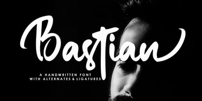 Bastian is a modern handwritten font, organic, dynamic and energetic sytle.Can used for various purposes. such as the title, signature, logo, correspondence, wedding invitations, letterhead, signage, labels, newsletters, posters, badges, etc.
 - Belly Swing by Bogstav,
$16.00 Belly Swing is natural, organic and kind of cute. It's my handmade sans font with contextual alternates - meaning that you have 3 different versions of each lowercase letter to choose from!
 - DF Etalage Script by Dutchfonts,
$33.00 Etalage Script was drawn for the first time in the year 2000, based on a early 20th century lettering stencil with what farmer Boelema at Lalleweer stenciled his grainsacks. Eventually the script letter was developed as a typeface with a wink to the ‘lost’ display types for the ‘display window’ of graphic designer Ariënne Boelens, who in exchange made the website www.lalleweer.nl. What originated the Ariënne should be evident now.
 - Paperly by Rachel Kick,
$4.00 Paperly is the perfect way to add a friendly, hand-written touch to any project! It's simple and minimalist design conveys a calm and friendly feel. It was designed by Rachel Kick based on original hand-drawn letters. Each character was initially drawn on paper before being transformed into a simple typeface. It has 4 styles that can be combined or used individually to fit the needs of any project.
 - Do It Yourself JNL by Jeff Levine,
$29.00 Do It Yourself JNL was modeled after self-adhesive vinyl letters and numbers manufactured by Duro Art Industries of Chicago - formerly the Duro Decal Company. The hand-drawn look of the original lettering was retained by Jeff Levine to stay true to the design, and the rectangles that border each glyph represent the pieces of self-adhesive vinyl onto which the characters were silk screened. Limited character set.
 - Stenographer JNL by Jeff Levine,
$29.00 Sheet music for the song “The Little Thing You Used to Do” (from the 1935 motion picture “Go into your Dance” starring Al Jolson and Ruby Keeler) had its title set in what closely resembled Bank Gothic Condensed. [Bank Gothic was originally designed by Morris Fuller Benton for American Type Founders circa 1930.] This reinterpreted version is now known as Stenographer JNL, and is available in both regular and oblique versions.
 - Yefimov Sans by ParaType,
$30.00 Yefimov Sans is a sans companion for Yefimov Serif . It is one of the last original faces by Vladimir Yefimov. It has contemporary design, squarish shapes of the round letters and legible proportions. Thanks to open aperture, it works well in small point sizes, and its distinctive letterforms make it good also for display purposes. The typeface was completed by Maria Selezeneva and Alexandra Korolkova. Released by ParaType in 2015.
 - Doric by Linotype,
$29.99Originally released by the Stephenson Blake foundry in England, Doric is modeled on one of the sans serifs of William Caslon IV, who was the first to interpret sans serif letterforms into a typeface (1816). Doric Bold has large, heavy capitals with uniform letter widths. It is often used for classified advertising in newspapers because these qualities coupled with a large x-height allow greater legibility at small point sizes. - Buntisland by Greater Albion Typefounders,
$20.00 Buntisland (we wonder where we came up with that name from... another subconscious whim), is Greater Albion Typefounders blackletter release for Christmas 2016. The family consists of four typefaces- regular, weathered, shaded and shadowed, and has it's origin in a design challenge which came up in conversation, as all the best ones do. In this case it was 'design a legible all capitals black letter...' Challenge accepted and completed!
 - Sensational Sans by Type Innovations,
$39.00 Sensational Sans is an original design by Alex Kaczun. The inspiration started with the shape of a paper clip. Simple and elegant. A condensed sans serif that's, well... just sensational! It's a delight to use and view. Great for advertising, large headlines, web applications, and well... just about anything. Works equally well in a broad range of text point sizes. Comes in 4 delightful flavors—Light, Regular, Medium and Bold.
 - Hancock Pro by Red Rooster Collection,
$60.00 Hancock Bold Condensed is slab serif typeface. The original Hancock design was produced by the Keystone Type Foundry, circa 1903; a condensed version was added circa 1917 by Lanston Monotype. Steve Jackaman (ITF) designed and produced a digital version of Hancock in 1994, and completely redrew the typeface for its 2017 release. The new version has a 40% larger glyph set, and supports Latin 1 plus Central/Eastern European languages.
 - Nadia by Type Innovations,
$39.00 Nadia is an original design by Alex Kaczun. It is a modern stencil interpretation of Granjon Oldstyle, highlighted by large elongated serifs, generous proportions and a large x-height. It is an elegant display for headlines as well as text. Named after his daughter, Nadia has a distinctively vibrant and baroque quality which some would even call sensuous. It’s a truly unique stencil treatment characterized by crisp, clean, rounded shapes.
 - Thorowgood Wide by Wooden Type Fonts,
$20.00 One of the original Clarendon types, an English design, here derived from a specimen taken from an American foundry, no identifying marks. With a tall x-height, wide version, unlike more traditional Clarendons, not a square serif but bracketed. Unique to this Clarendon are the rounded openings at the points where the horizontal and vertical stems meet in the capital B, D, P and R, not common in other Clarendons.
 - Bindlestiff NF by Nick's Fonts,
$10.00Schmallfette Binder-Style, designed by Joseph Binder and released by D. Stempel AG in 1959 provided the template for this upright, set-tight display face. Its rather unconventional placement of the crossbars on the f and t is a subtle attention-grabber, and true to Binder's original design. Both versions include the complete Latin 1252, Central European 1250 and Turkish 1254 character sets, as well as localization for Moldovan and Romanian. - Barnum by Victory Type,
$9.00 Victory Type is proud to present the release of another classic American typeface. Originally a wood-type, Barnum evokes circus wagons and wanted posters from the wild west. Rugged, rustic, old-fashioned and full of character, Barnum is a charming blast from the past and great for headlines and signage. This chunky slab-serif alphabet was digitized and expanded to include full punctuation and European characters by Noah Rothschild.
 - Marcinelle by Fando Fonts,
$4.00 The origin of this family is the classic French-Belgian comics. The screams and onomatopoeia of these comics have so much personality that I needed to create a typeface family that would allow the designer to really replicate them. But this family has many more applications: packaging, logos, posters, signage, packaging, branding, etc. With its wide variety of glyphs you can make your sound effects, logos, etc. in most Latin languages.
 - Bebedot by Holland Fonts,
$30.00Bebedot originated from doodles and scrabbles in notebooks; irregular forms very well might contain a style for an alphabet. Once used for an intro spread in Wired magazine (#6.04, April 1998): "To keep up you need the right answers. To get ahead you need the right questions". The name was inspired by a women clothing poster at the San Francisco bus stands. The dot is for the com that never came. - DF Ariënne by Dutchfonts,
$33.00 The Etalage-script has been drawn for the first time in the year 2000, based on a early 20th century lettering stencil with what farmer Boelema at Lalleweer stenciled his grainsacks. Eventually the script letter was developed as a typeface with a wink to the ‘lost’ displaytypes for the ‘display window’ of graphic designer Ariënne Boelens, who in exchange made the website www.lalleweer.nl. What originated the Ariënne should be evident now.
 - Cheddar Gothic Sans Two by Adam Ladd,
$25.00Cheddar Gothic Sans Two is a hand-drawn, multi-weight display family. An all-caps, sans serif typeface with condensed proportions that works great for a variety of display uses. The uppercase characters add distinction with extended crossbars and chiseled terminals, while the lowercase provides a more classic sans serif appearance. This family is an expanded version of the original Cheddar Gothic Sans, with more weights and even broader language support. - Monotype Goudy Catalogue by Monotype,
$29.99Originally designed for American Type Founders, Goudy drew inspiration from the classical old style faces for Goudy Old Style. Round characters have a strong diagonal stress, ascenders are fairly long but descenders are very short. Goudy bold was introduced in 1920; this was designed by Morris Fuller Benton. This typeface has been particularly popular in America where it is extensively used in advertising, book jackets, for labels and packaging.