4,646 search results
(0.038 seconds)
- As of my last update in early 2023, the font PharmaCare might not be widely recognized like Helvetica or Times New Roman, but it carves its unique aesthetic, potentially specialized for the healthcar...
- Bohemian Initials by Kaer,
$24.00 I’m happy to present you the Bohemian initials font family. Regular and Colored styles (Uppercase & Numbers) based on Codex Gigas originated in medieval Bohemia. The manuscript has been dated 1230. The elaborate initials are at the beginning of the main texts and their principal divisions. The painter was aiming to achieve a plastic depiction of the trailing vines of the initials, and he painted with solid colours. He used only four of the primary colours cinnabar red, blue, green and yellow, brightly toned, as well as white accents and contours. The trailing vines of the initial letters are painted in a decorative, advanced Romanesque style, already bordering on naturalism. The plant taken as the starting point is the acanthus, a thistle-like plant which grows wild in the Mediterranean countries. The decoration of the Devil’s Bible is not the work of an amateur. Scholars have concurred: it is book illuminations created in Northeast France and Southern England in the so-called Channel style which provided the starting point for the coiled trailing-vine shapes in the initials of the Devil’s Bible. --- You can use color fonts in PS CC 2017+, AI CC 2018+, ID CC 2019+, macOS 10.14 Mojave+ Please note that the Canva & Corel & Affinity doesn't support color fonts! --- Please feel free to request any help you need: kaer.pro@gmail.com Thank you!
 - Neo Sans Cyrillic by Monotype,
$103.99The branding agency's client wanted an ultra modern"" typeface that was ""futuristic without being gimmicky or ephemeral,"" according to the design brief. Designer Sebastian Lester took on this intriguing custom font assignment, but soon, a bureaucratic decision cancelled the project. ""I was left with a sketchbook full of ideas and thought it would be a shame not to see what came of them,"" says Lester. He decided to finish the design on his own. Lester's research confirmed that the principal ingredient of an ""ultra modern"" typeface was simplicity of character structure: a carefully drawn, monoline form, open letter shapes and smooth, strong curves. To conceive a typeface that crossed the line from modern to futuristic, Lester decided to amplify these qualities. About a year after Lester's initial conceptual work, two highly functional and versatile typefaces emerged. These are Neo Sans and Neo Tech, designs Lester describes as ""legible without being neutral, nuanced without being fussy, and expressive without being distracting."" Both the Neo Sans and the more-minimalist Neo Tech families are available in six weights, ranging from Light to Ultra. Each has a companion italic, and Neo Tech offers a suite of alternate characters. While engineered to look modern as tomorrow, Neo Sans and Neo Tech display the functional and aesthetic excellence that earns them a place in the list of classic designs from the Monotype typeface library. - Neo Sans Paneuropean by Monotype,
$114.99The branding agency's client wanted an ultra modern"" typeface that was ""futuristic without being gimmicky or ephemeral,"" according to the design brief. Designer Sebastian Lester took on this intriguing custom font assignment, but soon, a bureaucratic decision cancelled the project. ""I was left with a sketchbook full of ideas and thought it would be a shame not to see what came of them,"" says Lester. He decided to finish the design on his own. Lester's research confirmed that the principal ingredient of an ""ultra modern"" typeface was simplicity of character structure: a carefully drawn, monoline form, open letter shapes and smooth, strong curves. To conceive a typeface that crossed the line from modern to futuristic, Lester decided to amplify these qualities. About a year after Lester's initial conceptual work, two highly functional and versatile typefaces emerged. These are Neo Sans and Neo Tech, designs Lester describes as ""legible without being neutral, nuanced without being fussy, and expressive without being distracting."" Both the Neo Sans and the more-minimalist Neo Tech families are available in six weights, ranging from Light to Ultra. Each has a companion italic, and Neo Tech offers a suite of alternate characters. While engineered to look modern as tomorrow, Neo Sans and Neo Tech display the functional and aesthetic excellence that earns them a place in the list of classic designs from the Monotype typeface library. - AT Move Nath! by André Toet Design,
$75.00 NATH !* Is a peculiar typeface. It’s design came by the fascination of Optical Illusions and 3D on a flat surface, like with Holborn and Powerplay. The typeface is named after a girlfriend of André Toet. *Made in the UK, 1974, London (Central School of Art & Design). (Redesigned 2013 by André Toet / Jasper Terra). Concept/Art Direction/Design: André Toet © 2017
 - Grumpy by Suomi,
$40.00 An extreme headline font with six optical variants. Black 24 is loosely based on ITC Grouch (1970) by Tom Carnase. It has some 2000 hand-adjusted kerning pairs for TNT (that’s Tight, Not Touching), a very popular type treatment from the seventies and eighties. Take your pick, or get them all, so you don’t have to buy another one later on.
 - Santral by Taner Ardali,
$39.00 Santral typeface has been designed with the idea of achieving the ideal balance of geometrical perfection and optical impression. The sharp and precise design of Santral leads to a clear and reliable communuciation with the reader. 12 weights and italic versions, including kerning values and Opentype layout features provide all typographic equipments to get the best result for the typographic layouts.
 - Antonia by Typejockeys,
$60.00 Antonia is an original type family of 46 font, 7 weights and 4 optical sizes. Born in the middle of the Alps, Antonia is as modern as it is down to earth. The multi-variant package includes text, display, and italic styles, looking crisp and perfect in all sizes and applications. Antonia is our first release available in Variable font format.
 - Fram by Juraj Chrastina,
$29.00 Fram is an uppercase stencil typeface. It comes with a fine-tuned kerning, its extensive character set ensures multiple languages coverage and the design is adapted to different ranges of size through size-specific optical compensation. Fram L is intended for use at large sizes and Fram S with larger gaps guarantees good performance even when the size is reduced.
 - Parity Sans by Shinntype,
$19.00 The Parity concept takes the minimalist unicase alphabet and expands it in another dimension, that of the megafamily encompassing a variety of weights, optical sizes and styles (roman/italic, serif/sans, proportional/monowidth)—of benefit whether fine tuning a single, quite specific font for the task at hand, or harmoniously combining several in the hierarchy of a multi-formatted page layout.
 - Lush Script by Positype,
$59.00 Lush was a formal script until it had a few too many drinks and, as a result, loosened up a little bit. Harkening back to the handlettering of the 40s and 50s, Lush has evolved into a casual, but well-dressed script that maintains a rather aggressive rhythm. Transitions often whip back quickly, forcing the letters to reel from the movement and resolve efficiently. It is not as warm as some scripts, intentionally so, so as to distinguish it from its predecessors. Type and lettering fans will revel in the options afforded to each character—in some cases there are up to 15 different variations with multiple glyph recipes available to produce the most unique and fluid lettering combinations possible. An often overlooked segment of contemporary script fonts, the uppercase letters have at least 3 options to work with that mesh well with the 36 ornamental flourishes to add even further embellishment. In total, there are over 1,650 glyphs in the typeface that includes these OpenType options: Stylistic Alternates, Contextual Alternates, Swashes, Titling, Historical Forms, Initial Forms, Oldstyle Numerals and 3 additional Stylistic Sets. With this release, I have tried to provide as much flexibility and 'forgiveness' within the typeface so the lettering enthusiast can have fun and explore thousands of iterations… and it's pretty easy math to figure this out: with over 970 alternates and 270 ligatures, I intended this typeface to be one that keeps on giving. One important fact to note… this marks the first release of a smooth, non-brushed, non-textured script from me—but it won't be the last. That said, I will have to admit that the brush has influenced many of the characters and their construction. Enjoy :)
 - Duende by Aerotype,
$49.00 Created with headline, logo and other short display work in mind, Duende comes in two weights with alternates for the upper and lowercase, consecutive characters are controlled with the OpenType Ligature feature. Display bigger lowercase crossbars as the surrounding characters allow with OpenType Contextual Alternates on, or create your own custom lowercase f or t with a non-crossbar character and one of the included crossbar options Other features include case-sensitive quotes and smart apostrophes. Duende has an alternate for every capital letter and multiple alternate options for the lowercase including swashy terminal characters and non-connecting alternates. Also included are a few clip-on swash elements that can be used to create initial and terminal forms. Duende uses smart crossbars for common situations, unifying Af, Aft, At, Att, Aff, tt and ff with a single crossbar when the OpenType Ligature feature in on. The Ligature feature also ensures subtle baseline variation when two lowercase characters are keyed twice in a row. Enable Contextual Alternates in your OpenType menu and Duende uses bigger f and t crossbars as the surrounding characters allow. Enable Discretionary Ligatures for lowercase o connections. You can also make your own lowercase f and t to fit any situation combining one of the included crossbars and non-crossbar f or t characters (available as ‘Alternates for Current Selection’ when f or t is selected). Just select the crossbar you want from the glyph table as a separate text element and move it anywhere. Also included are ten tt ligatures with crossbars and one without. Duende also has a few other swashy things that can be used to cross the lowercase f and t. Customize alternate capitals U, V, W, X and Y with any one of the swash options available in the glyph table for those characters.
 - Choret Fudyng by Alit Design,
$19.00 Introducing Choret Fudyng, a font with a captivating Bubble style that will elevate your designs to new heights. This font family offers a range of options to suit your creative needs, including the enchanting 3D, classic Regular, and elegant Light variants. Whether you're designing logos, posters, or social media graphics, Choret Fudyng has the perfect style to make your text pop. Each letter is meticulously crafted with attention to detail, ensuring a visually pleasing and harmonious look. With Choret Fudyng, you can effortlessly add depth and dimension to your typography, creating stunning visuals that leave a lasting impression. Choret Fudyng is not just a font; it's a complete typographic solution. With full support for PUA Unicode, this font allows you to access a wide range of additional characters and symbols, expanding your creative possibilities. It's also designed to be multilingual, enabling you to effortlessly communicate in different languages and alphabets. But that's not all - Choret Fudyng takes ligatures to the next level. With an extensive collection of ligature options, this font lets you create fluid and seamless connections between characters, enhancing the overall aesthetic appeal of your designs. Whether you're designing logos, branding materials, or invitations, Choret Fudyng's ligatures will add a touch of elegance and sophistication. Experience the power of Choret Fudyng and unlock a world of typographic versatility. With its PUA Unicode support, multilingual capabilities, and abundant ligature options, this font is a must-have for any designer or creative enthusiast. Language Support : Latin, Basic, Western European, Central European, South European,Vietnamese. In order to use the beautiful swashes, you need a program that supports OpenType features such as Adobe Illustrator CS, Adobe Photoshop CC, Adobe Indesign and Corel Draw. but if your software doesn’t have Glyphs panel, you can install additional swashes font files.
 - Morris by HiH,
$10.00 Morris is a four-font family produced by HiH Retrofonts and based on the work of the very English William Morris. William Morris wanted a gothic type drawn from the 14th century blackletter tradition that he admired both stylistically and philosophically. He drew from several sources. His principal inspiration for his lower case was the 1462 Bible by Peter Schoeffer of Mainz; particularly notable for the first appearance of the ‘ear’ on the g. The upper case was Morris’s amalgam of the Italian cursive closed caps popular throughout the 12th through 15th centuries, a modern example of which is Goudy’s Lombardic Capitals. The gothic that Morris designed was first used by his Kelmscott Press for the publication of the Historyes Of Troye in 1892. It was called “Troy Type” and was cut at 18 points by Edward Prince. It was also used for The Tale of Beowulf. The typeface was re-cut in at 12 points and called “Chaucer Type” for use in The Order of Chivalry and The Works of Geoffrey Chaucer. Morris' objective is designing his gothic was not only to preserve the color and presence of his sources, but to create letters that were more readable to the English eye. ATF copied Troy and called it Satanick. Not only was the ATF version popular in the United States; but, interestingly, sold very well in Germany. There was great interest in that country in finding a middle ground between blackletter and roman styles -- one that was comfortable for a wider readership. The Morris design was considered one of the more successful solutions. Our interpretation, which we call Morris Gothic, substantially follows the Petzendorfer model used by other versions we have seen, with the following exceptions: 1) a larger fillet radius on the upper arm of the H, 2) a more typically broadpen stroke in place of the foxtail on the Q, which I do not like, 3) inclusion of the aforementioned ear on the g and 4) a slightly shorter descender on the y. We have included five ornaments, at positions 0135, 0137, 0167, 0172 and 0177. The German ligatures ‘ch’ & ‘ck’ can be accessed using the left and right brace keys (0123 & 0125). Morris Initials One and Morris Initials Two are two of several different styles of decorative initial letters that Morris designed for use with his type. He drew from a variety of 15th century sources, among which were Peter Schoeffer’s 1462 Mainz Bible and the lily-of-the-valley alphabet by Gunther Zainer of Augsburg. Each of the two initial fonts is paired with the Morris Gothic lower case. Morris Ornaments is a collection of both text ornaments and forms from the surrounding page-border decorations.
 - Antique by Storm Type Foundry,
$26.00The concept of the Baroque Roman type face is something which is remote from us. Ungrateful theorists gave Baroque type faces the ill-sounding attribute "Transitional", as if the Baroque Roman type face wilfully diverted from the tradition and at the same time did not manage to mature. This "transition" was originally meant as an intermediate stage between the Aldine/Garamond Roman face of the Renaissance, and its modern counterpart, as represented by Bodoni or Didot. Otherwise there was also a "transition" from a slanted axis of the shadow to a perpendicular one. What a petty detail led to the pejorative designation of Baroque type faces! If a bookseller were to tell his customers that they are about to choose a book which is set in some sort of transitional type face, he would probably go bust. After all, a reader, for his money, would not put up with some typographical experimentation. He wants to read a book without losing his eyesight while doing so. Nevertheless, it was Baroque typography which gave the world the most legible type faces. In those days the craft of punch-cutting was gradually separating itself from that of book-printing, but also from publishing and bookselling. Previously all these activities could be performed by a single person. The punch-cutter, who at that time was already fully occupied with the production of letters, achieved better results than he would have achieved if his creative talents were to be diffused in a printing office or a bookseller's shop. Thus it was possible that for example the printer John Baskerville did not cut a single letter in his entire lifetime, for he used the services of the accomplished punch-cutter John Handy. It became the custom that one type founder supplied type to multiple printing offices, so that the same type faces appeared in various parts of the world. The type face was losing its national character. In the Renaissance period it is still quite easy to distinguish for example a French Roman type face from a Venetian one; in the Baroque period this could be achieved only with great difficulties. Imagination and variety of shapes, which so far have been reserved only to the fine arts, now come into play. Thanks to technological progress, book printers are now able to reproduce hairstrokes and imitate calligraphic type faces. Scripts and elaborate ornaments are no longer the privilege of copper-engravers. Also the appearance of the basic, body design is slowly undergoing a change. The Renaissance canonical stiffness is now replaced with colour and contrast. The page of the book is suddenly darker, its lay-out more varied and its lines more compact. For Baroque type designers made a simple, yet ingenious discovery - they enlarged the x-height and reduced the ascenders to the cap-height. The type face thus became seemingly larger, and hence more legible, but at the same time more economical in composition; the type area was increasing to the detriment of the margins. Paper was expensive, and the aim of all the publishers was, therefore, to sell as many ideas in as small a book block as possible. A narrowed, bold majuscule, designed for use on the title page, appeared for the first time in the Late Baroque period. Also the title page was laid out with the highest possible economy. It comprised as a rule the brief contents of the book and the address of the bookseller, i.e. roughly that which is now placed on the flaps and in the imprint lines. Bold upper-case letters in the first line dramatically give way to the more subtle italics, the third line is highlighted with vermilion; a few words set in lower-case letters are scattered in-between, and then vermilion appears again. Somewhere in the middle there is an ornament, a monogram or an engraving as a kind of climax of the drama, while at the foot of the title-page all this din is quietened by a line with the name of the printer and the year expressed in Roman numerals, set in 8-point body size. Every Baroque title-page could well pass muster as a striking poster. The pride of every book printer was the publication of a type specimen book - a typographical manual. Among these manuals the one published by Fournier stands out - also as regards the selection of the texts for the specimen type matter. It reveals the scope of knowledge and education of the master typographers of that period. The same Fournier established a system of typographical measurement which, revised by Didot, is still used today. Baskerville introduced the smoothing of paper by a hot steel roller, in order that he could print astonishingly sharp letters, etc. ... In other words - Baroque typography deserves anything else but the attribute "transitional". In the first half of the 18th century, besides persons whose names are prominent and well-known up to the present, as was Caslon, there were many type founders who did not manage to publish their manuals or forgot to become famous in some other way. They often imitated the type faces of their more experienced contemporaries, but many of them arrived at a quite strange, even weird originality, which ran completely outside the mainstream of typographical art. The prints from which we have drawn inspiration for these six digital designs come from Paris, Vienna and Prague, from the period around 1750. The transcription of letters in their intact form is our firm principle. Does it mean, therefore, that the task of the digital restorer is to copy meticulously the outline of the letter with all inadequacies of the particular imprint? No. The type face should not to evoke the rustic atmosphere of letterpress after printing, but to analyze the appearance of the punches before they are imprinted. It is also necessary to take account of the size of the type face and to avoid excessive enlargement or reduction. Let us keep in mind that every size requires its own design. The longer we work on the computer where a change in size is child's play, the more we are convinced that the appearance of a letter is tied to its proportions, and therefore, to a fixed size. We are also aware of the fact that the computer is a straightjacket of the type face and that the dictate of mathematical vectors effectively kills any hint of naturalness. That is why we strive to preserve in these six alphabets the numerous anomalies to which later no type designer ever returned due to their obvious eccentricity. Please accept this PostScript study as an attempt (possibly futile, possibly inspirational) to brush up the warm magic of Baroque prints. Hopefully it will give pleasure in today's modern type designer's nihilism. - FF Holmen by FontFont,
$41.99 Danish type designer Per Jørgensen created this serif FontFont in 2007. The family has 5 weights, ranging from Regular to Bold (including italics) and is ideally suited for book text, festive occasions as well as editorial and publishing. FF Holmen provides advanced typographical support with features such as ligatures, small capitals, case-sensitive forms, fractions, and super- and subscript characters. It comes with a complete range of figure set options – oldstyle and lining figures, each in tabular and proportional widths.
 - Varstate by Alphabet Agency,
$15.00 The Varstate font family is a versatile collection of fonts inspired by the varsity team name lettering often seen on apparel such as Letterman jackets, t-shirts and hoodies. The fonts can be used in combination to provide a variety of design options and different looks in genres such as sports, leisure and industry. The family contains fonts in 4 weights; Normal, Semi Light, Light and Extra Light. Each font includes Latin basic characters which includes uppercase, lowercase, numbers, punctuation and much more.
 - Pincoya Black Pro by Latinotype,
$49.00 Pincoya Black Pro is a font based on lettering found on a poster from the Spanish Civil War, complemented with graphics developed in “La Unidad Popular” (Chilean political coalition) during the seventies. Pincoya has many alternate characters in Opentype format that provide multiple options when composing a text. It is an ideal font for high impact sentences, logotypes, magazine layouts, poster designs, etc. Languages include: Basic Latin, Western European, Euro, Catalan, Baltic, Turkish, Central European, Romanian and Pan Africa Latin.
 - Oddlini by sugargliderz,
$44.00 I have a lot of options to choose from, and it's hard to decide. For example, if I use "Thin" for the body text, I might make the title slightly larger and use "ExLight," and for the headings, I could use "Regular" or something similar. I could also stick to one font weight, like "Light," and differentiate the text using various sizes. This font is designed for enjoying the process of "indecisiveness," so please feel free to wander and deliberate extensively.
 - Maritime Champion Stencil by Kyle Wayne Benson,
$6.00 Make no mistake, Maritime Champion is not simply seaworthy. This peacoat grubbing, all hands on decking, accordion serenading font is not for the faint of heart. He’s all caps all the time. Even the lightest of his six weights is enough to anchor a Man-o-War in any Caribbean maelstrom. This stencil set includes four weights to accompany the existing four shoreline styles and six regular weights. It’s an all caps family that includes lots of language options and opentype fractions.
 - Misguided by Set Sail Studios,
$14.00 Misguided; "to go astray". This brush font throws out the typography rulebook and breaks away from the mundane letterforms. Thick lines, thin lines, small letters, big letters - it has it all, and thrown into THREE hand-painted character sets which can be mixed up, lowercase or uppercase, giving you a massive amount of customisable layout options for each word. Misguided is guaranteed to add an eye-catching appeal to your logo designs, handwritten quotes, product packaging, merchandise & social media posts.
 - Hexi by Sign Studio,
$9.00 Hexi is a modern style serif font. It has 9 thicknesses (Thin to Black) to provide more support when designing and also Oblique version to give your texts more different or contrast. Have bold serifs to reduce the pixel effect on digital devices. Minimized the nodes in each design to keep the glyphs bodies clean. Give the extrema point on each curve, it will make Hexi look smooth and neat. There are several subpackage options for you to save even more.
 - Morl by Typesketchbook,
$55.00 Developed from condensed san serif families of the 90’s to 00’s, Morl brings together the distinctive features of the time but presented in a simpler design. Its potential is increased with Original, Sans, and Rounded options which offer varied moods. Suitable for publications, web and product designs, Morl can fit either headlines or body. It’s also effectively supported in various devices. The family comes in 10 weights, making it available to use for your required tasks in 60 styles.
 - Aira by Jafar07,
$19.00 Aira is a serif font with a modern style that is designed very neatly and boldly, especially for designers and clients who want to have a classic yet trendy design concept, with 35 alternative lowercase letters and 9 ligatures, as an option for those of you who want to add a unique touch to your design. This font is perfect for a sturdy and discreet company logo and is also perfect for magazine layout designs, articles, quotes, and even posters.
 - Natasha Walker by Hadiftype,
$16.00 Natasha Walker is Thin sans serif that gives it a high class appeal. Comes in 2 weights, Regular and Bold. The inspiration for this typeface comes from the Art Deco era, feels modern and contemporary. Thick and thin branches are done daintily. Giving this entire font a highly polished look. Perfectly in luxury designs. Also contains 150 discretionary ligatures uppercase characters, giving you a variety of layout options. It’s perfect for fashion and lifestyle themes and even for branding purposes.
 - Codeplay by Gie Studio,
$11.00 Are you looking for handwritten originals with fun characters? Yes, you will find it right here. Codeplay is a original handwritten font. It is suitable for svg designs, pottery, shirts, hats, tote bags, wall art, interior prints, and get creative with its childlike playfulness. Codeplay includes Multilingual Options to make your branding globally acceptable. Features: Funny Ligatures Swash collection Multilingual Support 83 country PUA Encoded Numerals and Punctuation Thank you for your visit and downloading premium fonts from Gie Studio Designers: Gie Studio
 - Pluck by Grontype,
$14.00 Pluck is an attractive Display typeface that created elegant and modern look. To pick this font is a solution for your awesome graphic projects such a magazine Header, movie poster or flyer design that require a unique touch. This font is a great option in designing logo tagline, and also can be used in invitational cards and another printable stuffs. Pluck Features: Pluck standard glyphs Numeral and Punctuations Multilingual support Discretionary Ligatures Thankyou for picking this font for your awesome projects Regard, Grontype
 - HWT Bernice by Hamilton Wood Type Collection,
$24.95 HWT Bernice is an ornament font system designed by Marian Bantjes. The basic shapes were designed by Bantjes for the Hamilton Wood Type Museum's border stamping machine as a contemporary application for this 150 year old machine, which punches shapes into end grain wood to form continuous border patterns. The digital version expands a bit beyond the punch machine and allows designers to assemble a multitude of options using flipped and rotated variations of these 6 basic shape sets using simple keystrokes.
 - FF Super Grotesk by FontFont,
$68.99 German type designer Svend Smital created this sans FontFont in 1999. The family has 6 weights, ranging from Regular to Bold in Condensed and Normal and is ideally suited for film and tv and editorial and publishing. FF Super Grotesk provides advanced typographical support with features such as ligatures, alternate characters, case-sensitive forms, fractions, super- and subscript characters, and stylistic alternates. It comes with a complete range of figure set options – oldstyle and lining figures, each in tabular and proportional widths.
 - Maritime Champion by Kyle Wayne Benson,
$8.00 Make no mistake, Maritime Champion is not simply seaworthy. This peacoat-grubbing, all-hands-on-decking, accordion-serenading font is not for the faint of heart. He’s all caps all the time. Even the lightest of his six weights is enough to anchor a man-o-war in any Caribbean maelstrom. This 10-font family includes six weights and a Shoreline style that comes in four weights. It’s an all-caps family that includes lots of language options and OpenType fractions.
 - Zamoka by Eraky,
$9.00 ZAMOKA font is a display font of 2 weights Regular and Rounded, ideally suited for advertising and packaging, festive occasions, editorial and publishing, logo, branding and creative industries, poster and billboards as well as web and screen design. ............................................................................ ZAMOKA font provides advanced typographical support with features such as ligatures, case-sensitive forms, fractions, super and subscript characters, and stylistic alternates. It comes with a complete range of figure set options – oldstyle and lining figures, each in tabular and proportional widths.
 - P22 Tulda by IHOF,
$24.95 Tulda is a very lively lettering font originally drawn for a German calendar. The optional symbols feature over 72 festive renderings for just about any occasion. This font is also available as an OpenType font with over 500 characters. For the OpenType version: standard Opentype features such as ligatures & oldstyle figures are available through the features menu in programs such as InDesign or other applications that support OpenType. Additional ornaments and alternate characters can be inserted through the glyph pallet.
 - Crayonize by PintassilgoPrints,
$19.00 Crayonize is a casual handwritten font with a fresh crayon look, available in two weights. Both styles are all-caps with two options for each letter and numeral, for a natural, organic hand-lettered feel. Contextual alternates feature is included, making it easy to cycle the alternates. Crayonize is excellent for display purposes and small chunks of text: packaging, books, apparel, editorial, greetings cards, opening titles, screens, the list has no end. Give it a try, have fun, and keep on creating!
 - Kayino by Twinletter,
$15.00 Let’s not be frightened of the asymmetrical Kayino font. The character of this Groovy Retro font is intriguing and enjoyable. If your project calls for enjoyment, proceed with care. The foundation of Kayino was classical but modern music. A psychedelic-inspired look called Kayino was created using vintage objects and brash pop art typography from the 1960s. The fun and captivating character of the Groovy Retro font makes it the ideal option for designs like posters, banners, music, branding, logos, and more.
 - Rawkner by Trustha,
$18.00 Rawkner is a sans serif font. Inspired by ink trap. The first concept is the letter "W" and "K", then the other letters refer to both. Come with four styles, regular, oblique, round, and round oblique. Rawkner is perfect for the headline, and subheadline. There are alternative glyphs that you can choose according to your project. Also, the ligature of the uppercase and lowercase will make it more perfect. Rawkner is an option that you should try for your creative project.
 - Template Moderne JNL by Jeff Levine,
$29.00 The A.B. Dick Company was a manufacturer of mimeograph duplicating machines which produced copies by the process of transferring ink through an etched wax stencil onto paper. Customers had the option of purchasing various size and style lettering guides in order to create eye-catching headlines or announcements on their print projects. One such guide called ‘Modern Display’ featured a lettering style resembling Futura Black with added serifs. This is now available as Template Moderne JNL, in both regular and oblique versions.
 - Neulis by Adam Ladd,
$25.00 Neulis is a geometric sans and modern script hybrid offering a unique blend of characters inspired by script letterforms (like the l, k, r, s) along with script-style exit strokes (like the a, n, u) that blend into the geometric skeleton. Neulis Alt adds more of a restrained option by keeping with more classic sans letterforms. With a monoline appearance, the type looks clean and modern. Neulis provides a distinct, creative, and expressive message for branding, advertising, packaging, and more.
 - Athlone by Fontdation,
$15.00 Athlone, a display font that inspired by the vintage/classic letterforms. Mouse-crafted with high attention to details; clean lines, sharp edges and tempting curves. Available in slanted version too, gives you more options too play with. Suits best for title/headline, logo/logotype, packaging/label designs, etc.Packed with 300+ glyphs, Athlone gives you standard upper/lower case characters, numerals, punctuations, some multilingual letters, alternate characters, stylistic sets, ligatures, etc. This font is a must have item for your designing arsenal.
 - Kwikspeed by Alphabet Agency,
$17.50 Kwikspeed is a italic display font that was developed from typography used in e sport themed design work. The font is designed so that the capital letters link together in a cool way. The font includes lots of alternative capital letters to provide many different options allowing you more versatility. The same goes for the ligatures - they also present cool ways of displaying letter combinations. The font includes uppercase, lowercase, numbers, alternative capitals, discretionary ligatures, basic Latin international and punctuation characters.
 - Ecaliptycus by Maulana Creative,
$12.00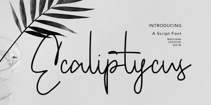 Ecaliptycus is casual script font, with clean mono-line stroke, upright and fun character. It has Opentype features ligatures of character and alternate lowercase option, To give you an extra creative work. Ecaliptycus script font support multilingual more than 100+ language. This font is good for logo design, Social media, Movie Titles, Books Titles, a short text even a long text letter and good for your secondary text font with sans or serif. Make a stunning work with Ecaliptycus font. Cheers, MaulanaCreative