10,000 search results (0.031 seconds)
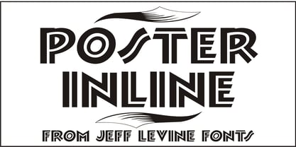
  1. Poster Inline JNL by Jeff Levine, $29.00
    The word "Signs" hand-lettered on the cover of a 1930s instructional book on sign and poster lettering was the basis for Poster Inline JNL.
  2. Mono Condensed by ParaType, $30.00
    The typeface was designed at ParaType (ParaGraph) in 1990 by Alexander Tarbeev based on Pragmatica typeface, 1989 by Vladimir Yefimov. A monospaced condensed sans serif.
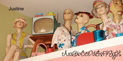
  3. Justine by Outside the Line, $29.00
    Justine, while a playful, swirly, girly font is a complete font with the full character set. It was inspired by the handwriting of Justine Childs.
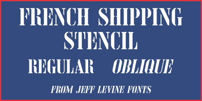
  4. French Shipping Stencil JNL by Jeff Levine, $29.00
    The hand punched lettering of an antique French shipping stencil was the inspiration for French Shipping Stencil JNL; available in both regular and oblique versions.
  5. Adventure by ParaType, $30.00
    PT Adventure™ was designed by Natalia Vasilyeva and licensed by ParaType in 2001. An original calligraphic script. For use in advertising and display typography.
  6. Cathedral by Solotype, $19.95
    This font was designed as an experiment in simplfying the Blackletter. We never showed it in the Solotype catalog, so it didn't get much use.
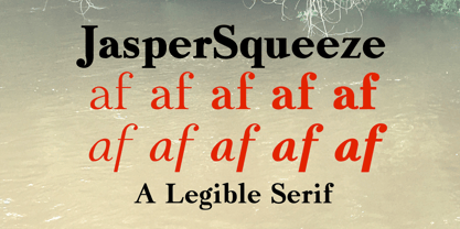
  7. Jasper Squeeze by Ingrimayne Type, $6.00
    JasperSqueeze was an attempt to do a decent text face. Blending it with XAabced resulted in JabcedHy, which seems to be superior to both parents.
  8. Edwardian by Linotype, $40.99
    Edwardian font was designed by Colin Brignall, a free-flowing roman face with hints of the early Edwardian period. Edwardian exudes warmth, individuality and charm.
  9. Notepad by The Arborie, $11.00
    This font was made to be clean and legible. It's versatile nature makes it perfect for note taking, posters, or even for long form copy.
  10. Fencing by Monotype, $29.99
    Andale Mono was designed by Steve Matteson. It is a highly legible monospaced font designed with the needs of terminal emulation and software development environments.
  11. CG Adroit by Monotype, $29.99
    Adroit was designed by Phil Martin in 1981. Adroit’s letters have a strong contrast between thick and thin strokes and a distinct diagonal stress.
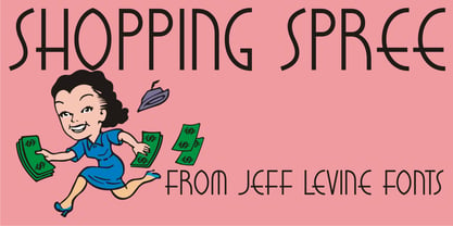
  12. Shopping Spree JNL by Jeff Levine, $29.00
    Shopping Spree JNL was inspired by the hand lettering on the title card for the 1938 film "Fast Company" starring Melvyn Douglas and Florence Rice.
  13. Stampede by FontMesa, $25.00
    Stampede was created from a small sample of letters found on an old document dating back to 1902 from the Chicago, Indiana & Eastern Railway Co.
  14. Secret Agent NF by Nick's Fonts, $10.00
    This typeface was suggested by a 1930s ad for a product called Plantol, designer unknown. It can be either graceful or playful, depending on context.
  15. Claridge by Monotype, $29.99
    Claridge was designed by Adrian Williams and released in 1979. The lowercase g of the Claridge font has a distinctive central join to the loop.
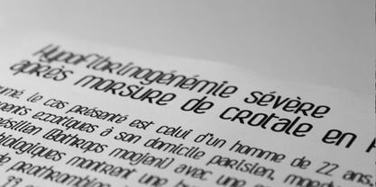
  16. Boa by Alien, $30.00
    Boa bold is a basic display font made for print. It was created for an Artbook about reptiles. It needed to be round and clear.
  17. Hundo - Personal use only
  18. Phinney Jenson by HiH, $12.00
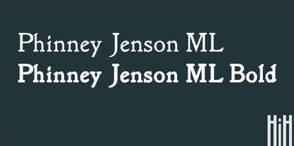
    Phinney Jenson ML is a font with deep historical roots firmly planted in the fertile soil of the Italian Renaissance. Twenty years after Lorenzo Ghiberti finished his famous East Doors, the Gates of Paradise, of Santa Maria del Fiore in Florence and about fifteen years before Sandro Botticelli painted his “Birth of Venus,” a French printer by the name of Nicolas Jenson set up a small print shop in the powerful city-state of Venice. The fifteenth century marked the end of the plague and the rise of Venetian power, as the merchants of Venice controlled the lucrative trade of the eastern Mediterranean and sent their ships as far as London and even the Baltic. In 1470, Jenson introduced his Roman type with the printing of De Praeparatio Evangelica by Eusebuis. He continued to use his type for over 150 editions until he died in 1480. In 1890 a leader of the Arts & Crafts movement in England named William Morris founded Kelmscott Press. He was an admirer of Jenson’s Roman and drew his own somewhat darker version called GOLDEN, which he used for the hand-printing of limited editions on homemade paper, initiating the revival of fine printing in England. Morris' efforts came to the attention of Joseph Warren Phinney, manager of the Dickinson Type Foundry of Boston. Phinney requested permission to issue a commercial version, but Morris was philosophically opposed and flatly refused. So Phinney designed a commercial variation of Golden type and released it in 1893 as Jenson Oldstyle. Phinney Jenson is our version of Phinney’s version of Morris' version of Nicolas Jenson’s Roman. We selected a view of the Piazza San Marco in Venice for our gallery illustration of Phinney Jenson ML because most of the principal buildings on the Piazza were already standing when Jenson arrived in Vienna in 1470. The original Campanile was completed in 1173 (the 1912 replacement is partially visible on the left). The Basilica di San Marco was substantially complete by 1300. The Doge’s Palace (not in the photo, but next to the Basilica) was substantially complete by 1450. Even the Torre dell'Orologio (Clock Tower) may have been completed by 1470—certainly by 1500. Phinney Jenson ML has a "rough-and-ready" strength, suitable for headlines and short blocks of text. We have sought to preserve some of the crudeness of the nineteenth-century original. For comparison, see the more refined Centaur, Bruce Rogers's interpretation of Jenson Roman. Phinney Jenson ML has a strong presence that will help your documents stand out from the Times New Roman blizzard that threatens to cover us all. Phinney Jenson ML Features: 1. Glyphs for the 1252 Western Europe, 1250 Central Europe, the 1252 Turkish and the 1257 Baltic Code Pages. Accented glyphs for Cornish and Old Gaelic. Total of 393 glyphs. 400 kerning pairs. 2. OpenType GSUB layout features: onum, pnum, salt, liga, dlig, hisy and ornm. 3. Tabular (std), proportional (opt) & old-style numbers (opt). 5. CcNnOoSsZz-kreska available (salt).
  19. Action Jackson - Unknown license
  20. Two Turtle Doves - 100% free
  21. Hydrogen - Unknown license
  22. Zinc Boomerang - Unknown license
  23. I suck at golf - Unknown license
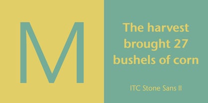
  24. ITC Stone Sans II by ITC, $45.99
    The ITC Stone Sans II typeface family is new from the drawing board up. Sumner Stone, who designed the original faces in 1988, recently collaborated with Delve Withrington and Jim Wasco of Monotype Imaging to update the family of faces that bears his name. Sumner was the lead designer and project director for the full-blown reworking – and his own greatest critic. The collaborative design effort began as a relatively simple upgrade to the ITC Stone Sans family. As so often happens, however, the upgrade proved to be not so simple, and grew into a major design undertaking. “My initial intent,” recalls Sumner, “was to provide ITC Stone Sans with even greater versatility. I planned to add an additional weight, maybe two, and to give the family some condensed designs.” As Sumner began to look more closely at his twenty-year-old typeface, he decided that it would benefit from more extensive design improvements. “I found myself making numerous refinements to character shapes and proportions,” says Sumner. “The project scope expanded dramatically, and I’m pleased with the final result. The redesign has improved both the legibility and the overall appearance of the face.” The original ITC Stone Sans is part of the ITC Stone super family, along with ITC Stone Serif and ITC Stone Informal. In 2005 ITC Stone Humanist joined the family. All of these designs have always offered the same three weights: Medium, Semibold, and Bold – each with an italic counterpart. Over time, Stone Sans has emerged as the godfather of the family, a powerful design used for everything from fine books, annual reports and corporate identity programs, to restaurant menus, movie credits and advertising campaigns. ITC Stone Sans, however, lacked one attribute of many sans serif families: a large range of widths and weights. “These fonts had enjoyed great popularity for many years – during which graphic designers repeatedly asked for more weights and condensed designs in the family,” says Sumner. “Their comments were the impetus.” ITC Stone Sans II includes six weights ranging from an elegant Light to a commanding Extra Bold. An italic counterpart and suite of condensed designs complements every weight. In all, the new family encompasses 24 typefaces. The ITC Stone Sans II family is also available as a suite of OpenType Pro fonts, allowing graphic communicators to pair its versatile design with the capabilities of OpenType. These fonts offer automatic insertion of ligatures, small caps and use-sensitive figure designs; their extended character set also supports most Central European and many Eastern European languages. ITC Stone® Sans II font field guide including best practices, font pairings and alternatives.
  25. tobminx - Personal use only
  26. groutpix - Personal use only
  27. a Theme for murder - Personal use only
  28. NeoTrash - Personal use only
  29. Digs My Hart - Personal use only
  30. Selectric - Unknown license
  31. Fashion Passion - Unknown license
  32. Spike - Unknown license
  33. Giddehand - Personal use only
  34. Sfilth - Unknown license
  35. a Theme for murder - Unknown license
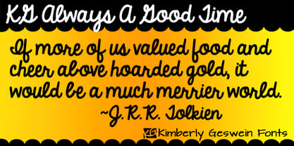
  36. KG Always A Good Time by Kimberly Geswein, $5.00
    Happily-lettered handwriting full of optimism. This handwriting was drawn with a chunky round marker and is bold enough for drawing attention yet still completely legible.
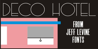
  37. Deco Hotel JNL by Jeff Levine, $29.00
    Hand lettering on the Art Deco-era sheet music for a song entitled "Rosemary" was the model for this delicate monoline design called Deco Hotel JNL.
  38. Paine by James J. Connell, $19.00
    Paine was designed to be a humanistic sans serif with an overall contemporary feel while at the same time evoking the feeling of earlier transitional faces.
  39. Black Spoon by Alien, $30.00
    Black spoon is a basic display font made for print. It was created for an Artbook about reptiles. It needed to be round, clear and modern.
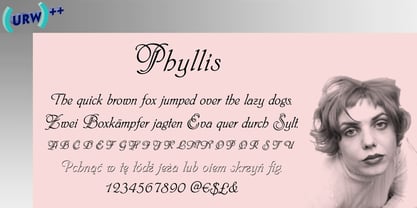
  40. Phyllis by URW Type Foundry, $35.00
    Phyllis was designed by Heinrich Wieynck in 1904. The Phyllis font has a suite of alternative initials that provide a flourish to an otherwise modest script.
Looking for more fonts? Check out our New, Sans, Script, Handwriting fonts or Categories
abstract fontscontact usprivacy policyweb font generator
Processing