10,000 search results
(0.029 seconds)
- Croz by Cititype,
$17.00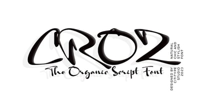 Croz Script is a raw and organic script typeface. Its cool appereance is carefully handcrafted to straight away grab the attention of the viewers. the shapes give this font a modern, chic, fun, funky vibe. Suitable if use for logos, posters, craft project, portfolio, headlines, brandings, apparel, etc.
 - Neues Bauen by Hanoded,
$10.00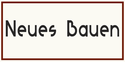 Neues Bauen is a Bauhaus inspired font with some interesting glyphs. It is slightly rounded in places, but sharp in others and it will most certainly make your designs stand out. Neues Bauen in other words, like the style that emerged in pre-war Germany, is a statement.
 - Komica Brought by Figuree Studio,
$18.00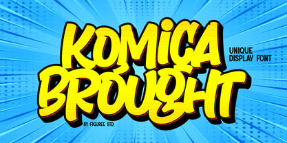 Say hello to Komica Brought font. Made with love and joy. Comic look, so it will make your design more beautiful, cute, fun, and colorful. Features: Uppercase and Lowercase Numerals and Punctuation (OpenType Standard) Accents (Multilingual characters) PUA Encode I hope you can enjoy the font :) Regards Figuree Studio
 - BabyDoll by Burghal Design,
$29.00Delicately swirled BabyDoll includes eight assorted dingbats, and like all Burghal Design fonts, includes upper and lower case letters, as well as numbers, symbols, punctuation, and accented foreign characters. BabyDoll is so cute and sweet, you just may get a cavity. Please remember to brush and floss regularly. - As of my last update in early 2023, there is no widely recognized or standard font specifically named "CODE3X" within the global design community or within major font repositories such as Google Font...
- Rising Sun by Proportional Lime,
$25.95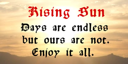 This typeface was inspired by Gering and Remboldt's work during the late 1490s. Their printing concern, the Soleil d'or in Paris, was one of the printing business to engage in the use of blackletter printing, when the rest of the Parisian printers where using humanist influenced roman typefaces. This peculiar backwards trend was really one of the original examples of "retro", taking advantage of the desires of the more conservative northern Europe that had not yet embraced the newer roman types.
 - LTC Goudy Modern by Lanston Type Co.,
$39.95Goudy Modern/Open was designed by Frederic Goudy, who was inspired by the caption of a French engraving. It is Goudy's first attempt at a "modern" face, but with less contrast and rigidity normally found in Bodoni style Modern faces. Goudy Modern was designed later in 1918 after viewing a proof of Goudy Open with the line filled in. Not a true modern face, but still a Goudy classic. The Pro versions include ligatures, varieties of numerals and Central European character sets. - Artful Dodger by Hanoded,
$15.00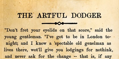 The Artful Dodger is a character in Charles Dickens' Oliver Twist. Dickens wrote his books in the Victorian Era, which also gave birth to a beautiful and extensively used typeface called Clarendon. The typeface was developed by Robert Besley and first published in 1845. Artful Dodger was modeled on the glyphs found in a 1865 book, which was typeset in Clarendon. Artful Dodger has not been 'cleaned', so the glyphs look rough and worn, just like the book I found them in.
 - LTC Goudy Open by Lanston Type Co.,
$39.95Goudy Modern/Open was designed by Frederic Goudy, who was inspired by the caption of a French engraving. It is Goudy's first attempt at a "modern" face, but with less contrast and rigidity normally found in Bodoni style Modern faces. Goudy Modern was designed later in 1918 after viewing a proof of Goudy Open with the line filled in. Not a true modern face, but still a Goudy classic. The Pro versions include ligatures, varieties of numerals and Central European character sets. - Die Bruecke by Hanoded,
$15.00 Die Brücke was a group of German expressionists which formed in Dresden in 1905. Members of the group include Erich Heckel, Fritz Bleyl, Ernst Ludwig Kirchner and Karl Schmidt-Rottluff. Much of the group's work was influenced by primitivism and medieval woodblock printing. Die Bruecke font was based on a printed invitation for an art exhibition from 1906. Although the font is all caps, upper and lower case glyphs differ and can be interchanged. Of course Die Bruecke comes with extensive language support.
 - Foundry Sans by The Foundry,
$90.00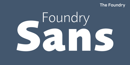 This humanistic sans serif design was inspired by a conversation that David Quay had with renowned type designer Hans Meyer, during ATypI in Paris, 1989. Meyer revealed that Sabon, designed by Jan Tschichold, was the inspiration behind his Syntax font. This approach formed the basis for the design development of The Foundry's very first sans serif typeface family; the inspiration for Foundry Sans comes from Stempel Garamond. Foundry Sans was the second typeface to be released for The Foundry typeface library in 1990.
 - Zagolovochnaya by ParaType,
$30.00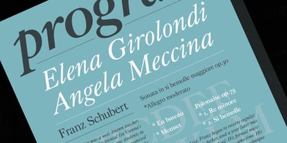 Zagolovochnaya was based on the letterforms of Zagolovochnaya gazetnaya (Newspaper Display) type family of Polygraphmash in 1962 by Iraida Chepil et al. The face was a revival of Cyrillic version of Caslon designed in the late 1930s. The artworks of Zagolovochnaya gazetnaya were redrawn by Isay Slutsker (1924-2002) in the late 1990s. In spite of its name the font is useful both for display and text matter. The digital version was developed for ParaType in 2002 by Manvel Shmavonyan.
 - Bernhard Modern by URW Type Foundry,
$35.99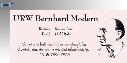 Bernhard Modern was designed by Lucian Bernhard and was first cut by American Type Founders. Bernhard Modern is an unusual face with small lowercase but very tall ascenders and short descenders. Bernhard Modern was intended to hold its color and contrast without depending on the spread of ink of the letterpress method. It has an attractive pen drawn quality which has made it a popular choice for invitations and greetings cards. The Bernhard Modern font is useful for advertising and display work.
 - Spiraling Down by Hanoded,
$15.00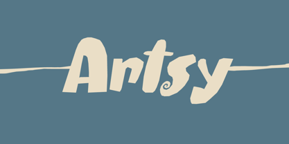 I was listening to an Opeth album called Blackwater Park. By the time I had decided that this font needed some swirls, the band was playing a song called The Drapery Falls - which has the word ‘spiraling’ in it (see poster 2) - and the name was born. Spiraling down is a surprisingly elegant font (given its roughness). I probably wouldn’t set a whole text in it, but it will really stand out as a titling font for packaging or book covers.
 - Refinery by Kimmy Design,
$10.00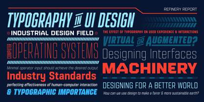 Refinery is the newest font in the Evanston Collection of square typefaces. With a similar capital structure to Tavern and Alehouse, Refinery includes both lowercase and small caps, making it an ideal typeface for paragraph text settings. It also comes in a wide array of weights and widths, with 85 font files in total. DESIGN Refinery has it’s roots in early 20th century signage and saloon typography, but has been modernized - even future-ized - to fit the 21st century digital landscape. The design was aimed at providing a type family that could work in many modern design fields, from sports, tech and military to gaming, HUD, virtual reality and augmented reality. ENGINEERING Essentially. Refinery is a simple mono-linear square design has been expertly refined into an easy-reading sans serif typeface. It was designed to be used in both display and text settings. From hairline to black in ultra-narrow or extended, the wide array of weight and width options makes it easy to find the right font for each text need. SPECS Refinery not only includes 85 font files, but each one include a wide array of Opentype Extras that allow even further customization. • Stylistic Alternatives: Letters A W Y have a styling variation that rounds the pointed apex into a square curve. The S and 2 variation straightens the spine, making all curves in the alphabet read as 90º angles. • Small Capitals: A shortened version of the capitals for alternate header settings. • Titling Alternatives: In this typeface, this feature turns on lifted small caps. Take the small capitals, raise them to level with capitals and underline at the baseline. When multiple lowercase or small capital letters are typed in a row, the underlines connect, creating unique ligatures. • Figures: There are different figure styles for different text needs. Options include, proportional lining, tabular lining (for math), old style and small capitals. • Discretionary Ligatures: A little funk to this otherwise serious typeface. Letters with a long baseline or cap height stem - F, L, T - get elongated to hug a small capital vowel. Other ligatures include Co. and No. • Catchwords: These are common words that bring emphasis to a design. In English these words include ‘and’ ‘as’ ‘by’ ‘in’ ‘of’ ‘the’ ‘to’ ‘when’, among others. Refinery also includes multilingual catchwords of ‘el’ ‘la’ ‘oder’ ‘go’ ‘para’ ‘pour’ ‘und’ ‘y’, among others. For the full list, please check out the specimen images. EXTRAS To round the typeface off, a set of over 150 ornaments, icons, arrows, patterns and line breaks is included to provide complimentary graphics. These can be found in the Ornaments labelled font, it is recommended to use the Glyphs panel to select which text glyph is needed.
 - Edge Of Madness, crafted by the whimsically named designer Darrell Flood, is a font that refuses to take itself too seriously. Picture this: the letters are holding a wild party, and sanity was defin...
- Once upon a time, in the mystical land of AEnigma, there was a font that decided it didn't want to play by the rules. Its name? Bandwidth Bandless BRK. This font was the digital equivalent of that qu...
- Ah, diving into the world of fonts, are we? Necros isn't just another name in the vast sea of typography; it holds its ground with a distinctive aura and personality. Picture this: The essence of got...
- HONKUS - Personal use only

- Sayso Chic - Unknown license

- Power Breakfast by Hanoded,
$15.00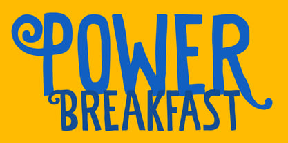 I am a firm believer in the fact that breakfast is the most important meal of the day. So, for the last 10 years (ever since I became a father), I have been serving my family a healthy breakfast. I live in The Netherlands, so the main portion of breakfast is bread, but I try to serve something ‘nice’ every day. Like strawberries, yoghurt with banana and brown sugar (not too much sugar!), oatmeal porridge or granola. I myself like Indonesian fried rice (nasi goreng) for breakfast, but I am afraid my kids won’t eat that in the morning… Power Breakfast is a handmade display font. Yes, it is wobbly, yes, it is uneven, but that’s what’s so darn good about it!
 - New Millennium by Three Islands Press,
$24.00New Millennium is one of three font families that share a common name, a common design philosophy, a common x-height, and basic character shapes. (The others are New Millennium Sans and New Millennium Linear; all three work well together.) New Millennium is a serif face of what some might describe as a "modern style." But although it has flat serifs, it differs markedly from, say, Bodoni or Didot -- especially in the italic, which is a radical departure from tradition. (The bold styles are in fact sans-serif, identical to those of New Millennium Sans.) There's also a nice, dark Headline style for display text. New Millennium is a distinctive, legible, accessible text face that might be well suited to, say, scientific documentation. - Palm Sunday by Putracetol,
$22.00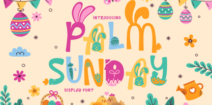 Palm Sunday - Quirky Easter Day Theme Font is a unique typeface designed to capture the playful spirit of Easter and Palm Sunday. This font is characterized by its quirky, chaotic, and variable thick-thin letterforms, which add an element of fun and intrigue to your designs. It can be used effectively either on its own or in combination with its ten charming variations. With ten distinctive variations inspired by Easter day, including eggs, bunnies, carrots, bunny ears, and flowers, Palm Sunday is the ideal choice for projects related to Easter, Pascha, and the joyous celebrations associated with the holiday. It perfectly suits children's themes, crafting projects, and any design that seeks to evoke a sense of fun, playfulness, and a vibrant, colorful aesthetic.
 - Koerier by Hanoded,
$15.00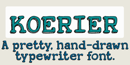 Koerier means 'Courier' in Dutch and is a reference to the classic font it was modeled on. Each glyph was hand drawn, giving the font a unique look and feel, making it an ideal typeface for ads, posters and packaging. Comes with a full range of diacritics.
 - Flo Barnum by Solotype,
$19.95No telling how old this font is, because it came from Hamilton, a firm that was late in the wood type business, but was the repository of many older patterns from earlier wood type makers. Great circus look to it. Some missing characters drawn at Solotype. - KG Payphone by Kimberly Geswein,
$5.00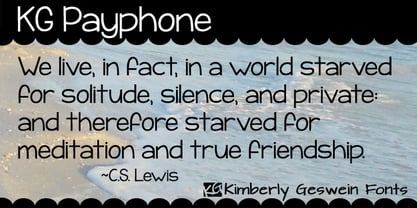 This font was specifically created for my husband. He teaches 5th grade and wanted a font that was legible enough for students to read but still playful enough to add a touch of whimsy to his classroom. Legible enough for body text but fun enough for titles.
 - Toronto Gothic by E-phemera,
$12.00Toronto Gothic was developed from a headline in a 1920s issue of the Toronto Star. In a previous life, it was probably Condensed Titling Gothic #11, but in this form its rounded corners and irregular lines are meant to make it look worn from years of use. - Gladiate by Solotype,
$19.95This was a favorite of job printers in late Victorian times. They used it on cards and stationery, as well as small handbills. It was made in a range of sizes from 10 point to 36 point. Good for places where you really don't want to shout. - PeterPierre by Ingrimayne Type,
$6.95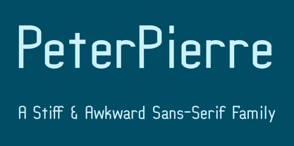 PeterPierre is a stiff, awkward sans serif face. It has little variation in stroke width and the vertical and horizontal elements are connected with short, sharp curves. The condensed style was developed first and then, in a quest for legibility, it was widened into the regular style.
 - Clearface Gothic by URW Type Foundry,
$35.99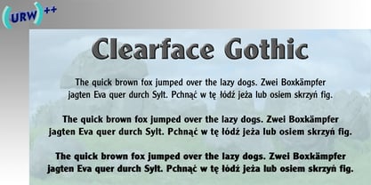 Clearface Gothic was designed by Morris Fuller Benton for American Typefounders. The design was released between 1907 and 1910 for text and display use. Since then, many variations have been released. An interesting typeface, Clearface Gothic is useful in advertising for display and small quantities of text.
 - Visual Fantasy by Kitchen Table Type Foundry,
$15.00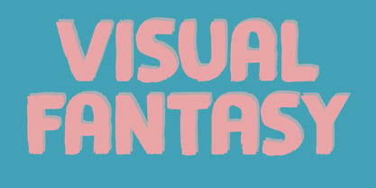 Visual Fantasy is a great, all caps display font. It was based on an old font of mine called Plakkaat, which was made using a flat brush and acrylic paint. Visual Fantasy is great for poster work, book covers and product packaging. Comes with extensive language support.
 - Spiral by ARTypes,
$35.00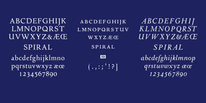 Spiral is a digital transcription of a design by Joseph Blumenthal (1897-1990) which was hand-cut by Louis Hoell and cast by the Bauer foundry in 1930. The design with an italic added was later cut for Monotype and issued in 1936 as Emerson 320.
 - Stencil Sheet JNL by Jeff Levine,
$29.00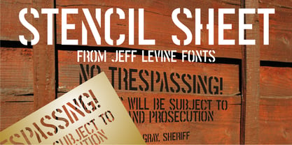 Stencil Sheet JNL was modeled from an antique brass stencil sign that was custom hand punched for the customer. Sets of punch dies were available for years that allowed rubber stamp shops and similar trades to make custom stencils out of sheets of zinc or brass.
 - Yayazout JNL by Jeff Levine,
$29.00Yayazout JNL is the Rock and Roll equivalent of Jeff Levine's other "Love Generation" font, Positive Vibe JNL. This typeface emulates the innovative and outrageous styles of the late 60s-early 70s design period where the message was the music and the music was the message... - Home Movies JNL by Jeff Levine,
$29.00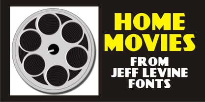 A set of cling vinyl letters and numbers for titling home movies or slides is the basis for Home Movies JNL. The set was made by the Clingtite Letters Company of Chicago and retailed for $2.95. It was advertised in many photographic publications of the 1950s.
 - MPI Antique by mpressInteractive,
$5.00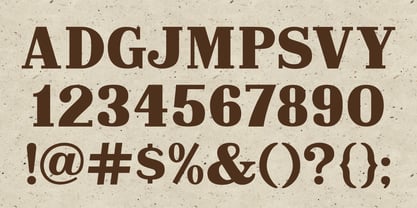 Antique is a bold, classic font with high stroke contrast and no bracketing on the serifs. This letter style was hugely popular during the early 19th century and was the basis for a myriad of other designs. This version is based on wood type of unknown origin.
 - Fela by Picador,
$24.00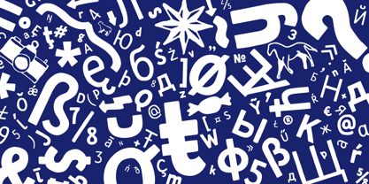 Fela family was designed for books and posters for young children to gain high readability and nice feeling. Every glyph was hand drawn and shaped for better result. This typeface consists of different alternate glyphs with special automatic script, many special characters for different languages and pictograms.
 - Solid Deco JNL by Jeff Levine,
$29.00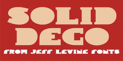 Solid Deco JNL was modeled after a small sign with the word "restaurant" in an unusual Art Deco solid lettering style. It was spotted within the same image of the Lenox Lounge in New York which gave forth the neon letters that became Sign Sans JNL.
 - Diphthong by Diphthong Type Foundry,
$10.00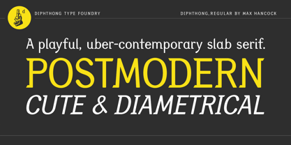 The challenge was to create a single typeface weight that was versatile enough without a large font family, and could be put to use with a variety of media formats, from book text to advertising spreads, all while remaining legible and delightful to read. Originally designed between the years 2002 and 2004, the inspiration for the design originated from the concepts of Stefano Giovannoni's uber-contemporary industrial designs and architecture. Where to start with such a font design was obvious to Diphthong Regular's designer, Max Hancock; to create a transitional, slab serif form that was corky and serious, interchangeably. The characteristics of the font followed a postmodern playfulness, popular in many sub-cultures looking for an alternative to the harsher, cut-shape, deconstructivist styles. And, the unique objective behind the design was to make it so that the usual difficult combination of the t and h (hth) in language was legible as well as pleasant to look at, thus the reason for the name. The soft, subtle roundings add a flair of utilitarianism while the cut edge ascenders help to blur the line between cute and diametrical mannerisms.
 - AlienAutopsy - Unknown license


