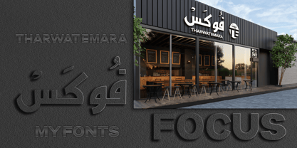
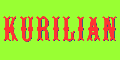
This font may be conservative and classic, but also may be more playful and modern. It is good for theater or art posters and for modern music, web-pictures or vinyl covers. Of course it also will be good for coffee shops, cafe's, restaurants, magazine's headers, signs or gift/post cards and weddings. Try to use it in your beauty or travel blogs, you will see how many options you will have with stylish FOCUS
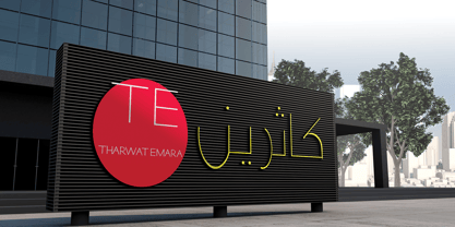
This font may be conservative and classic, but also may be more playful and modern. It is good for theater or art posters and for modern music, web-pictures or vinyl covers. Of course it also will be good for coffee shops, cafe's, restaurants, magazine's headers, signs or gift/post cards and weddings. Try to use it in your beauty or travel blogs, you will see how many options you will have with stylish CATHRINE
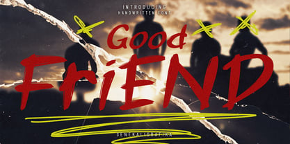
“Good Friend” has hard strokes and signature style that speak to instant unique sensation. Take your creative projects to the highest level with this font. “Good Friend” will help you to create special and touching typographical design for your projects, for every day or the happiest day in life, greeting card, headings, flyer, product packaging, book cover, printed quotes, logos, and many more. It is really universal and modern font. The owner of endless possibilities!
Ah, the Pea Little-Ducky font by Fonts For Peas is the kind of typeface that makes you feel all warm and fuzzy inside, like a hug from a particularly friendly duck. Imagine a font that has sipped a b...
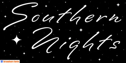
Based on the hit album by Glen Campbell, Southern Nights is the font with a style that’s “free as a breeze,” as the song says. It’s fun and casual, yet it has a flair for fashion and elegance. It also has an art nouveau look which lends itself to greeting cards as well as the branding of perfume, clothing, retailing, dining, and other luxury/high-end uses. This font includes alternate characters for the upper R, S, and T, the lower g and z, plus ligatures that include a double lower t and double lower l (L). As the song might say, I apologize to anyone who can truly say that they have found a better font! Digitized by John Bomparte.
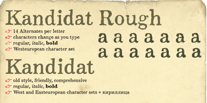
Imagine being printer in the early nineteenth century, your stock isn’t the finest, your lead characters are worn out: Voilá Kandidat Rough. But wait, Kandidat isn’t the usual scan-an-old-book,-put-the-glyphs-in-a-font-and-you’re-done-font. Kandidat Rough has a variety of whopping 14 alternates for most characters. Our algorithm changes the letters automatically. All you have to do is turn on Contextual Alternates in your layout app. The algorithm is the best we’ve seen so far, and it’s so good that even same words appear in different forms. And should by coincidence words have the same glyphs, just assign a different Style Set to the first letter, and all other letters in the word will change as well (well, it depends a bit on your software). The mechanism isn’t perfect and maybe we stretched OpenType capabilities a bit over the top, but we yet haven’t seen any better routine for switching letters on the fly. Is it worth to mention that Kandidat Rough not only speaks English, but also German, French, Spanish, Dutch, Danish, Norwegian, Swedish, Croatian, Turkish and most likely some other languages? Maybe. To be sure whether your language is supported, this is the typeset of all letters: ABCDEFGHIJKLMNOPQRSTUVWXYZÀÁÂÃÄÅÆÇÈÉÊËÌÍÎÏÑÒÓÔÕÖØÙÚÛÜÝĆČĐĞ݌ފŸŽ abcdefghijklmnopqrstuvwxyzàáâãäåæçèéêëìíîïñòóôõöøùúûüýÿćčđğıœşšž Apart from that we also included the following punctuation and currency symbols: !"#$%&'()*+,-./:;?@[\]_{|}¡©«®°±¶·»¿×–—‘’‚“”„†•…‹›⁄≠☞ €¢$£¥ This sums up to nearly 3000 glyphs per font, and we have three of them: Regular, Italic and Bold. All neatly kerned. All in all a great repertoire for even the most demanding book or advert jobs with a look of old times. And now imagine you are sick of the rugged print experience Kandidat Rough delivers: go for Kandidat. This is our Scotch-ish ancestor the Rough version was made from. A sturdy, friendly, round, warm friend from the beginning of the nineteenth century. A bit dark, maybe. You will like it. Kandidat has the aforementioned type set plus complete Baltics, Eastern Europe and Cyrillic. Plus a couple of gimmicks like fleurons, stars, circled numbers, arrows, and, and, and… Kandidat Regular additionally has small caps for Latin based scripts (not Cyrillic). The spick and span Kandidat font set also consists of Regular, Italic and Bold cuts. The bold cut is on the very bold side and can nicely be used for headings, whereas Italic is a great companion for Regular. It took us some time and trouble to finish this project, but after all we are very proud of our little feat and hope you will enjoy Kandidat as much as we do. Enjoy!
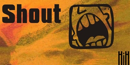
Shout is a “Hey, Look at ME” font. It is an attention-getting font for posters, flyers and ads. Its lineage includes the Haas Type Foundry’s 19th century advertising font, Kompakte Grotesk, which Jan Tschichold (1902-1974) dryly described as “extended sans serif” and which graphic designer Roland Holst (1868-1938) would have disapprovingly referred to as a “shout,” as opposed to the quiet presentation of information that he believed was the proper function of advertising. In 1963 Letraset released what appears to be an updated variation in multiple weights designed by Frederick Lambert called Compacta. Shout draws heavily on Compacta, as well as other similar fonts of the 50s and 60s like Eurostile Bold Condensed and Permanent Headline. In weight, it falls about halfway between Compacta Bold and Compacta Black, but with a relatively heavier lower case that is not so easily pushed around by the upper case. After all, one can shout while sitting down. Shout is the first font released with our new encoding, as noted in the All_customer_readme.txt. The Euro symbol has been moved to position 128 and the Zcaron/zcaron have been added at positions 142/158 respectively. Otherwise, Shout has our usual idiosyncratic glyph selection, with the German ch/ck instead of braces, a long s instead of the Greek mu and our usual Hand-in-Hand symbol. There are also left and right glyphs of a big mouth ]ing (135/137) and left and right glyphs of an angry man shouting (172/177). Please use Shout with discretion. Folks get tired of being yelled out. After awhile, they stop listening. Shout ML represents a major extension of the original release, with the following changes: 1. Added glyphs for the 1250 Central Europe, the 1252 Turkish and the 1257 Baltic Code Pages. Add glyphs to complete standard 1252 Western Europe Code Page. Special glyphs relocated and assigned Unicode codepoints, some in Private Use area. Total of 355 glyphs. 2. Added OpenType GSUB layout features: pnum, ornm, liga, hist & salt. 3. Added 266 kerning pairs. 4. Revised vertical metrics for improved cross-platform line spacing. 5. Revised hyphen, dashes & math operators. 6. Minor refinements to various glyph outlines. 7. Inclusion of both tabular & proportional numbers. Please note that some older applications may only be able to access the Western Europe character set (approximately 221 glyphs). The zip package includes two versions of the font at no extra charge. There is an OTF version which is in Open PS (Post Script Type 1) format and a TTF version which is in Open TT (True Type)format. Use whichever works best for your applications.
Sure, let me tell you about a whimsical and delightful font named "Cup Font." Imagine a font that is as playful and comforting as a warm cup of your favorite beverage on a chilly morning. That's Cup ...
The font Skellingtonbats by Chris Pirillo is a fascinating and unique creation that captures the whimsy and slight spookiness of Halloween and gothic aesthetics, making it stand out in the realm of t...
The font "KR Trees" by Kat Rakos is a charming and inventive typeface that ventures beyond the conventional realm of typographic design. Rather than focusing on letters and numbers, this font embrace...
Instant Soup Mix by Utopiafonts is a font that captures the essence of casual creativity and quirky charm. Envisioned and designed to bring a playful and somewhat whimsical touch to various types of ...
Tattoo Sailor, crafted by the talented font designer Juan Casco, is a font that seamlessly embodies the spirit and aesthetic of traditional sailor tattoos, which have captivated people's imaginations...
"Elegancia Romantica" is a captivating font designed by Octotype, a designer known for crafting fonts that encapsulate a myriad of emotions and themes. As suggested by its name, Elegancia Romantica i...
The font "Pea Stacy's Doodles," created by Fonts for Peas, is an enchanting collection of doodle-inspired characters that brings a unique and whimsical touch to any project. This font stands out for ...
Mister Loopy is a playful and whimsical font that feels like it has been directly lifted from the pages of a captivating children’s storybook or a whimsical piece of modern art. With its distinctive ...
Sure! Qurve Hollow Wide, crafted by the talented Dan Redding, is a distinctive font that immediately catches the eye due to its unique design and broad appeal. This typeface belongs to the larger fam...
The font named TRUEblood, created by the designer known as SpideRaY, carries with it a level of artistry and inventiveness that makes it stand out in the world of typography. This font draws inspirat...
AnjaliOldLipi is a font that gracefully bridges the gap between tradition and digital expression, particularly in the context of Malayalam script. It is a typeface that has been carefully designed to...
Ah, the LED Counter 7 by Style-7, a font that hails from the digital age, winking at us from the not-so-distant past. Imagine, if you will, stepping into a time machine, only to find that instead of ...
The "MAWNS Rock" font, created by the talented Swedish typeface designer Måns Grebäck, is a striking example of versatility and artistic expression within typography. This particular font is a part o...
Ah, Monster Paparazzi! Imagine for a moment, deep in the wild underbrush of creativity, lurks a font so captivating that it could only be dubbed Monster Paparazzi. Crafted by the illustrious duo, Kev...
The Iphegenia™ font, masterfully created by the talented designer David F. Nalle, embodies a unique blend of artistic inventiveness and refined classicism, making it a remarkable typeface in the font...
Ernest is a handmade typeface with an unique yet strong personality. Say it bold with this font. Punk & Wave styles. Ideal for type based designs.
Strong, hard lines inspired the name of this font, based on the "nuclear standard" set by the U.S. and the Soviets during the cold war.
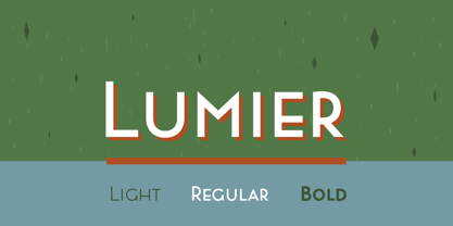
Lumier by Tour De Force, $25.00 Inspired by art deco posters from the period between WWI and WWII, Lumier comes in 3 weights with the proportions of a modern sans families.
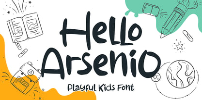
Say hello to Hello Arsenio font. Made with love and joy. Kids look, so it will make your design more beautiful, cute, fun, and colorful.
Designed by Les Usherwood. Digitally engineered by Steve Jackaman. This beautiful version of Century Old Style by Les may be superior to any existing versions.
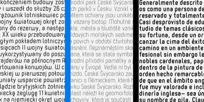
Borba Sans is based on Borba . It is really readable sans serif typeface which may be used whenever you need a stylish and modern typography.
A very unusual type based on wooden type designs of the 19th century, lacking lower case which may not have been designed for this font.
Pakenham is a distinctive and versatile font designed by Ray Larabie, a Canadian type designer known for his wide range of typography contributions to both commercial and non-commercial projects. Thi...