10,000 search results
(0.125 seconds)
- Mundbind NL by Hanoded,
$15.00 I just visited my good friend Jakob Fischer from Pizzadude.dk in Denmark. As always we talked fonts, drank coffee and walked endlessly through Copenhagen, the city where he lives. We thought it would be a fun idea to each create a font from a handmade sign we saw in the city. We only had like 7 glyphs to work with, so the rest was up to our imagination. We also thought it would be nice to give the fonts a similar name. Mundbind means mask in Danish. When you Google translate it, it will give you the wrong translation (it will say 'mouth piece'), so trust me on this one! My font is called Mundbind NL - where the NL stands for Netherlands. Jakob will hopefully call his finished font Mundbind DK - where the DK stands for Denmark. Mundbind NL comes with a monster load of diacritics (including Vietnamese) and two alternate glyphs for the lower case letters that will cycle as you type.
 - Roller Poster by HiH,
$12.00 Roller Poster is named after Alfred Roller. In 1902, Roller created a poster to advertise the 16th exhibit of Austrian Artists and Sculptures Association, representing the Vienna Secession movement. The exhibit was to take place in Vienna during January & February 1903. The location is not mentioned because everyone in Vienna knew it would be held at the exhibit hall in the Secession Building at Friedrichstraþe 12, a few blocks south of the Opernring, near the Naschmarkt. Designed by Joseph Maria Olbrich in 1897, the buiilding has been restored and stands today as one finest of the many fine examples of Art Nouveau architecture in Vienna (see vienna_secession_bldg.jpg). Because of its dome, it is called “the golden cabbage.” The poster itself is unique. The word “secession” is in one type style and takes up two-thirds of the elongated poster. At the bottom of the poster are the details in a different lettering style. It is this second style at the bottom that is the basis for the font Roller Poster. In keeping with our regular naming conventions, we were going to call it Roller Gezeichnete (hand-drawn), but the wonderful play on both words and the shape of the three S’s in secession was too compelling. In November 1965 there was an exhibit of Jugendstil and Expressionist art at the University of California. Alfred Roller’s Secession Poster was part of that exhibit. Wes Wilson was designing promotional material at Contact Printing in San Francisco. Among their clients was a rock promoter named Bill Graham, staging dance-concerts at Fillmore Auditorium. Wilson saw the catalog from the UC exhibit and Roller’s lettering. Wilson adapted Roller’s letter forms to his own fluid style. The result was the poster for the August 12-13, 1966 Jefferson Airplane/Grateful Dead concert at Fillmore put on by Graham (BG23-1). Wilson continued to use Roller’s letter forms on most of the posters he did for Graham through May 1967, when he stopped working for Graham. The posters were extremely successful and the lettering style along with Roller’s letter forms were picked up by other artists, including Bonnie MacLean, Clifford Charles Seeley, James Gardner, and others. The Secession poster and the Fillmore posters have inspired a number of fonts in addition to ours. Among them are JONAH BLACK (& WHITE) by Rececca Alaccari, LOVE SOLID by Leslie Carbarga and MOJO by Jim Parkinson. Each is different and yet each clearly shows its bloodlines. Our font differs in two ways: 1) the general differences in the interpretation of the letter forms and 2) the modification of the basic letter form to incorporate the diacriticals within the implied frame of the letter, after the manner of the original design by Roller. We borrowed Carbarga’s solution to the slashed O and used it, in a modified form, for other characters as well to accomplish the same purpose. We recommend that you buy ours and at least one of the other three. According to Alaccari, a version called URBAN was released by Franklin Lettering in the 70’s (and is shown on page 51 of The Solotype Catalog). For comparison of our font to original design, see image files roller_poster_2s.jpg of original poster and roller_poster_2sx.jpg showing reconstruction using our font for the lower portion (recontructed area indicated by blue bar). Please note the consistency of character width. In the lower case, 23 of the basic 26 letters are 1/2 EM Square wide. The ‘i’ is an eighth narrower, while the ‘m’& ‘w’ are one quarter wider. All the Upper Case letters are 1/8 EM wider than the lower case. This is to make it easier to fill a geometrical shape like a rectangle, allowing you to capture a little of the flavor of Wes Wilson’s Fillmore West poster using only a word processor. We have also included a number of shapes for use as spacers and endcaps. If you have a drawing program that allows you to edit an ‘envelope’ around the letters to distort their shape, you can really get creative. I used Corel Draw for the gallary images, but there are other programs that can accomplish the same thing. The image file “roller_poster_keys.jpg” shows the complete character set with the keystrokes required for each character (see “HiH_Font_readme.txt” for instruction on inserting the non-keyboard characters). The file “roller_poster_widths.jpg” shows the exact width of each character in EM units (based on 1000 units per EM square). You will notice that the font is set wide for readability. However, most programs will allow you to tighten up on the character spacing after the manner of Roller & Wilson. In MS Word, for example, go to the FORMAT menu > FONT > CHARACTER SPACING. Go to the second Drop-Down Menu, labeled ‘Spacing’ and select "condensed' and then set the amount that you want to condense ‘by’ (key on the little arrows); two points (2.0) is a godd place to start. Let your motto be EXPLORE & EXPERIMENT. Art Nouveau has always been one of my favorite movements in art -- I grew up in a home with a couple of Mucha prints hanging on the living room wall. Perhaps because of that and because I lived through the sixties, I have enjoyed researching and designing this font more than any other I have worked on. Let’s face it (pardon the pun), Roller Poster is a FUN font. You owe it to yourself to have fun using it.
 - Religan by Dora Typefoundry,
$17.00 The new Religan serif font is luxurious and elegant which will bring a unique style and trendy look to your designs. This modern serif relogan has several on-trend ligature binders and special characters to make it look more unique in all design projects and work perfectly to pair with other fonts. It's perfect for logotypes, branding, wedding monograms and invitations, blog headlines and more. Here we prepare some fasteners: ab ar an am ah ara ap ti tr st tu tt ct et ff ty ffi fu ft fj fy th tm tn in im ir it ta ri er eh em en ch cr ra ng li eb cb fr ck fb fh fk jj gi and more.. Religan also includes the full set: Uppercase and lowercase Multilingual symbol Number Punctuation This type of family has become a work of true love, making it as easy and enjoyable as possible. I really hope you enjoy it! I can't wait to see what you do with Religan! Feel free to use the #Dora Typefoundry tag and # Religan Modern Serif Font to show what you've done. If you have any questions, you can contact us by email: doratypefoundry@gmail.com Thank You!
 - Voguish by Redy Studio,
$19.00 Voguish – Sophisticated Calligraphy Are you looking for an outstanding and unique font? Do you want to add some fun and playfulness to your creations? Then this is the font that you need! Say hello to Voguish – the new, exclusive, and elegant font! Voguish is a sophisticated font ideally crafted to easily create amazing results with a minimum of fuss. Voguish is a perfectly balanced font with unique, stylish letter shapes that have been combined with a sophisticated contemporary touch. Being a perfectly multifunctional font, it is the ideal fit for new season designs. It’s perfect for all those luxurious projects or designs that you want to stand out from the crowd! Download it now and make all your dreams come true! It’s so unique and elegant in look, that it will be the talk of your town! Voguish features: A full set of upper & lowercase characters Numbers & punctuation Gorgeous ligatures A full set of alternate upper & lowercase characters Uppercase beginning swashes Lowercase ending swashes Lowercase alternates characters Multilingual symbols PUA Encoded Characters – Fully accessible without additional design software. Feel free to give me a message if you have a problem or question. Thank you so much for taking the time to look at one of our products.
 - TB StarsAndStripes by TrueBlue,
$18.00This font is dedicated to the glorious flag of the U.S.A., "Old Glory". The family consists of two versions: a base and one called "composable" composed from a set of glyph (characters) that they can be inserted to pairs. One of blue color and one red for to obtain one glyph to two colors. As an example inserting "Aa" with a red 'A' and the a blue 'a' will produce a single letter 'A' colored to white stars in a blue field and white stipes in a red field, thus producing the most impact. - Crop by Thinkdust,
$10.00 Crop is the guy who works till 3am, striving for greatness. Crop is the one in the gym at six in the morning, pushing harder every time. Taking no for an answer, just isn't part of the deal. Crop is the one with fire in his heart and eye intense enough to achieve the unthinkable. If you've never stopped pushing boundaries, if you think second place isn't worth getting out of bed for, if you can stand on the top of the world and ask, 'What's next?' - Crop might just be the one for you!
 - Gristwood JNL by Jeff Levine,
$29.00 The rustic lettering which also served as the model for Grist Mill JNL is the basis for Gristwood JNL. Another set of vintage wood type has the letters reversed out of blocks, making for a specialty titling font. Decorative end caps are located on the greater and less than keys and also on the plus and equal keys. A blank block for regular word spacing is on the underscore key, along with a wider blank box on the backslash key. This typeface has a somewhat limited character set.
 - Zebrawood by Adobe,
$29.00Zebrawood font is a joint work of the typeface designers K.B. Chansler, C. Crossgrove and C. Twombly, who also designed Rosewood, Ponderose and Pepperwood together. Like its relatives, Zebrawood also displays a kind of Wild West character. Its style can be traced back to the Toscanienne typefaces which appeared in advertisements and on signs at the end of the 19th century. Typical of this capital alphabet are the split serifs and robust base forms, which emphasize the typeface's decorative character. Zebrawood is, like Rosewood and Schwennel, meant as a bicolor font, meaning that the weight Zebrawood fill complements the inner spaces of Zebrawood regular. When used carefully in headlines, Zebrawood font will be sure to attract attention. - FeggoliteKeyed by Ingrimayne Type,
$9.00 FeggoliteKeyed has letters on rounded rectangles with shadows. The letter shapes are from a decorative, monospaced font called FeggoliteMono. The typeface contains characters that will add color to letters. There are two ways to do this. One uses layers and the other a combination of characters, some with zero-width. A file in the gallery explains the ways that this can be done.
 - Toddler JNL by Jeff Levine,
$29.00The fun, lighthearted appeal of Toddler JNL will bring out the inner child in you. Perfect for any layout or project that has to do with newborns, toddlers, preschool, playtime or anything related to little ones. There's a fairly complete character set - and two different width blank boxes on the brace keys - which can be used as spaces between words. - Ballard Avenue by Turtle Arts,
$20.00Ballard Ave is inspired by old vintage signage found in Ballard, Washington, an old neighborhood of Seattle. Ballard Avenue is a protected historical district filled with turn of the century brick buildings that have been converted into quaint shops and independent businesses. This alphabet is based on the antique signage that still exists on the sides of many of these buildings. - Store Tags JNL by Jeff Levine,
$29.00 Store Tags JNL is a collection of vintage-style store price tags that are great for a multitude of purposes. Print them with a color fill and overlay them on product photos in ad fliers. Enlarge them and print them out on card stock to create pre-printed tags, or print them out poster-size and use them for point-of-sale displays.
 - Latos Vocos by James White,
$12.00 This font style is commonly seen in traditional tattoo artist portfolios all over the world. Inspired by graffiti seen in bathroom stalls, taco stand tables, public transportation windows, and brick walls in the suburbs of East LA. This font will go great on a banner for a tattoo design, and even on a t-shirt design for all your urban clothing lines.
 - Karasha by Nurf Designs,
$25.00 Karasha is a display font with Japanese style. You will get an Japanese feel to every text that uses this font. It’s the perfect font for any design projects that require a Asian aesthetic. Works on PC & Mac Simple installations Accessible in the Adobe Illustrator, Adobe Photoshop, Adobe InDesign, even work on Microsoft Word. PUA Encoded Characters – Fully accessible without additional design software.
 - Militarist by Vozzy,
$10.00 Introducing military label font named Militarist. This font has a cyrillic and multilungual characters support (check out all available characters on previews). The font family has eight styles: Regular, Stencil, Lines, Texture, Texture FX, Rough, Stencil Rough and Lines Rough. This font will look good on any military or serious styled designs like a poster, T-shirt, label, logo, etc.
 - Lodgepole by Tall Trees Design Co,
$20.00 Lodgepole is a hand illustrated font family created by Zach Minard of Tall Trees Design Co. Inspired by timeless legibility and worn National Park signage. Lodgepole Regular and Book are designed to pair perfectly together, while both of these styles are available as Solid (With no internal texture) or Grit. Lodgepole Grit uses the strokes from the original pen-to-paper illustration for all texture, creating an authentic one-of-a-kind texture.
 - ASTYPE Ornaments Christmas A2 by astype,
$28.00 Christmas A2 uses the following OpenType features to set up to four different color layers. - Superscript/Superior (Trees) - Subscript/Inferior (Stars) - Numerator (Candles) - Denominator (Light, Bells) Note: Due to the complexity of some parts of the font, some printers may have problems of rendering it smoothly. To avoid this problem you should always outline the font data for the final documents. On lower systems turn font antialiasing off for faster screen redrawings.
 - ASTYPE Ornaments Christmas A by astype,
$28.00 Christmas A uses the following OpenType features to set up to four different color layers. - Superscript/Superior (Trees) - Subscript/Inferior (Stars) - Numerator (Candles) - Denominator (Light, Bells) Note: Due to the complexity of some parts of the font, some printers may have problems of rendering it smoothly. To avoid this problem you should always outline the font data for the final documents. On lower systems turn font antialiasing off for faster screen redrawings.
 - Lausanne - Personal use only

- Vassallo - Unknown license

- Indian Feather by Balpirick,
$15.00 Indian Feather is a Beautiful Handdrawn Font. Indian Feather is a romantic and sweet calligraphy typeface with characters that dance along the baseline. It will add a luxury spark to any design project that you wish to create! Indian Feather also multilingual support. Enjoy the font, feel free to comment or feedback, send me PM or email. Thank you!
 - Villena by Carpiola Studio,
$12.00 Villena is a magical script font carefully created with a touch of elegance. Whether you’re looking for fonts for Instagram or calligraphy scripts for DIY projects, this font will turn any creative idea into a true piece of art! Villena is PUA encoded which means you can access all of the glyphs and swashes with ease!
 - Simpleoak by Balpirick,
$15.00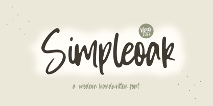 Simpleoak is a Modern Handwritten Font. Simpleoak is a cute and vintage styled handwritten font. Whatever the topic, this font will be a wonderful asset to your font library, as it has the potential to enhance any creation. - also multilingual support Enjoy the font, feel free to comment or feedback, send me PM or email. Thank you!
 - Obelisk Stone by Balpirick,
$15.00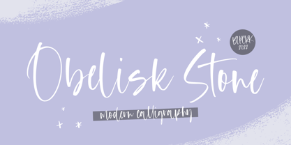 Obelisk Stone is a Modern Calligraphy Font. Obelisk Stone is a dazzling script font. Whatever the topic, this font will be a wonderful asset to your font library, as it has the potential to enhance any creation. - also multilingual support - Ligatures Enjoy the font, feel free to comment or feedback, send me PM or email. Thank you!
 - Fun Line by FunFont,
$19.00 FunLine is a modern script font, crafted with monoline strokes characterized by curved lines and seamless connections, presenting a classic font with a modern touch. The font family comprises three weights; Light, Regular, and Bold. Suitable for your design needs. The Arabic version will be released, accompanied by the addition of Arabic, Urdu, Pegon, Persian, and Kurdish languages.
 - Fabulous Rabbit by Balpirick,
$15.00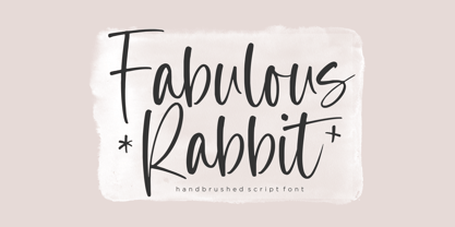 Fabulous Rabbit is a Handbrushed Script Font. Fabulous Rabbit is a cute and slim handwritten font. Whatever the topic, this font will be a wonderful asset to your font library, as it has the potential to enhance any creation. - also multilingual support Enjoy the font, feel free to comment or feedback, send me PM or email. Thank you!
 - Arfindes Orthem by madeDeduk,
$12.00 Introducing Arfindes Orthem is a brush handwritten font and will be perfect for all your project design book, title branding, product packaging, invitation, quotes, label, poster, logo etc. Feature Uppercase & Lowercase Number & Symbol International Glyphs Multilingual support Alternative Ligature Feel free to drop us a message any time and follow my shop for upcoming updates Hope you enjoy it.
 - Auguste Boutique by Balpirick,
$15.00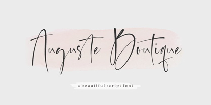 Auguste Boutique is a Modern Calligraphy Font. Auguste Boutique is a dazzling script font. Whatever the topic, this font will be a wonderful asset to your font library, as it has the potential to enhance any creation. - also multilingual support - Ligatures Enjoy the font, feel free to comment or feedback, send me PM or email. Thank you!
 - Fun Line Arabic by FunFont,
$29.00 FunLine is a modern script font, crafted with monoline strokes characterized by curved lines and seamless connections, presenting a classic font with a modern touch. The font family comprises three weights; Light, Regular, and Bold. Suitable for your design needs. The Arabic version will be released, accompanied by the addition of Arabic, Urdu, Pegon, Persian, and Kurdish languages.
 - Dolphin Dolls by Balpirick,
$15.00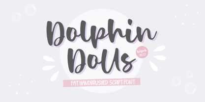 Dolphin Dolls is a Handbrushed Script Font. Dolphin Dolls is a cute and vintage styled handwritten font. Whatever the topic, this font will be a wonderful asset to your font library, as it has the potential to enhance any creation. - also multilingual support Enjoy the font, feel free to comment or feedback, send me PM or email. Thank you!
 - Riotous by Letterhend,
$19.00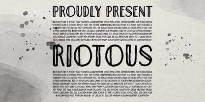 Introducing, Riotous Brush Font! Riotous is a font that features a handwritten style with a free and expressive feel. the rough brush strokes leave a strong effect to make your design looks more natural and unique! What will you get: Including number and symbol. Support Multi Language This font also support PUA Encoded! So, grab your own. Thank You!
 - Simple Summer by Sakha Design,
$12.00 Simple Summer is a cute and quirky handwritten font with an incredibly friendly feel. Whether you’re looking for fonts for Instagram or handwritten scripts for DIY projects, Simple Summer will turn any creative idea into a true piece of art! This font is PUA encoded which means you can access all of the amazing glyphs and ligatures with ease!
 - Donkey Monster by Balpirick,
$15.00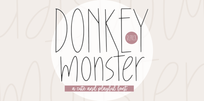 Donkey Monster is a Cute & Playful Font. Donkey Monster is a cute and slim handwritten font. Whatever the topic, this font will be a wonderful asset to your font library, as it has the potential to enhance any creation. - also multilingual support Enjoy the font, feel free to comment or feedback, send me PM or email. Thank you!
 - Midnight Rookie by Hatftype,
$15.00 Midnight Rookie - A Graffiti Display Font is a free style font that has the characteristics of street art that shows freedom and is filled with unique characters. Features : • Character Set A-Z • Numerals & Punctuations (OpenType Standard) • Accents (Multilingual characters) • Ligature • Alternate. There it is. I really hope you enjoy it. Comments & likes are always welcome and accepted.
 - Grovelane by Balpirick,
$15.00 GROVELANE is a Condensed Handbrushed Font. Grovelane is a simple and clean display font. It is the ideal choice for a variety of designs, so add it confidently and you will love the relaxed and neat final result.. GROVELANE also multilingual support. Enjoy the font, feel free to comment or feedback, send me PM or email. Thank you!
 - Brefid by Gian Studio,
$16.00 Brefid is a luxurious yet elegant display font. characters that suit today's styles will be very interesting for you to create any design work with a classy model while still maintaining a calm and impressive style to look at. You're sure to have inspiration to match your creativity! Free updates for more versions in the future. Thank You
 - Yourladies by Balpirick,
$15.00 Yourladies is a Modern Handwritten Font. Yourladies is a sweet and delicate handwritten font. Dainty and joyful, this font will be ideal for writing wedding invitations, cards or any other design that may need a romantic, personalized touch! Yourladies also multilingual support. Enjoy the font, feel free to comment or feedback, send me PM or email. Thank you!
 - Heavy by madeDeduk,
$14.00 Introducing Heavy is a fun bold font and will be perfect for book, title branding, product packaging, invitation, quotes, t-shirt, label, poster, logo etc. Feature Uppercase & Lowercase Number & Symbol Alternates Ligatures International Glyphs Multilingual support Feel free to drop us a message any time and follow my shop for upcoming updates Hope you enjoy it.
 - Arts Glory by Hatftype,
$15.00 Arts Glory - Graffiti Font is a free style font that has the characteristics of street art that shows freedom and is filled with unique characters. Product Include : Arts Glory (OTF,TTF Format) Arts Gloryt Webfont (WOFFFormat) Features : • Character Set A-Z • Numerals & Punctuations (OpenType Standard) • Accents (Multilingual characters) • Ligature • Alternate There it is. I really hope you enjoy it.
 - Gravura by ITC,
$29.99 Noted British designer Phill Grimshaw designed Gravura in 1995. Gravura is a classic copperplate script with perfect strokes and proportions. The intricacy of its initial capitals blend beautifully with the simple elegance of its lowercase, whose letters have been designed to link together in the style of true handwriting. Text set in Gravura feels very personalized.

