10,000 search results
(0.351 seconds)
- SK Kalender by Salih Kizilkaya,
$9.99
- Indy Italic by ITC,
$29.00 - P22 Rakugaki by IHOF,
$24.95
- Walden by Fenotype,
$35.00
- Brilliant by FaceType,
$35.00
- Chamy by Rosario Nocera,
$12.00
- Mysthiqa by Essentials Studio,
$16.00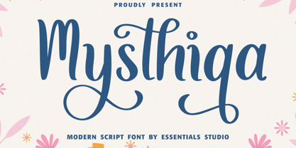
- Karine by Mightyfire,
$10.00
- Moodystone by Adante Creative,
$23.00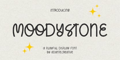
- Horas by Yukita Creative,
$14.00
- Tripoca by Panatype Studio,
$9.00
- Batistar by Allouse Studio,
$16.00
- Signaday by Allouse Studio,
$16.00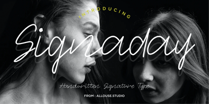
- Aniara by Gustav & Brun,
$18.00
- Alinea Sans by Présence Typo,
$36.00 - Mensa by AVP,
$19.00
- Sallyna Cattalya by Essentials Studio,
$16.00
- Shredded - Unknown license

- Scream - Unknown license

- DelitschAntiqua - Unknown license

- Greex - Unknown license

- Roman Acid - Unknown license

- Snail n Ink - Unknown license

- Malaga Pro by SoftMaker,
$9.99
- Soledad Pro by SoftMaker,
$9.99
- Balloon Pro by SoftMaker,
$14.99
- Casual Pro by SoftMaker,
$9.99
- Powers Of Marduk by Deniart Systems,
$15.00 - Erasmus by Red Rooster Collection,
$45.00 - Masterman by Wooden Type Fonts,
$15.00
- Aquarius by Red Rooster Collection,
$45.00 - Pavane by Scriptorium,
$18.00 - Rudolfo by Scriptorium,
$12.00 - Giulio Pro by SoftMaker,
$9.99
- Elmore Pro by SoftMaker,
$9.99
- Pedro Pro by SoftMaker,
$9.99
- Somerset Pro by SoftMaker,
$9.99
- Altemus Flowers by Altemus Creative,
$11.00
- Fratturato Digitale by Funk King,
$10.00
- Bellini by Red Rooster Collection,
$45.00


