10,000 search results
(0.025 seconds)
- Belphebe by Scriptorium,
$18.00Someone recently pointed out that May and June are the wedding season months, and that while we have some excellent fonts for non-traditional weddings (celtic and renaissance styles work well), we don't have a straightforward, elegant engraver style font. That's the kind of shortcoming we can remedy, hence our Belphebe font, which is in the tradition of popular wedding invitation fonts like Rook, but has some antique characteristics which are in the Scriptorium tradition. The kerning on this font was a real challenge, because we wanted all the characters to fit together for a flowing, hand-lettered look, but the results are worth it. - Lansbury - 100% free

- Monto Screen by Lucas Tillian,
$28.00 Introducing Monto Screen – the latest addition to the Monto superfamily, distinguished by its rational and meticulously constructed aesthetic. This new sub-family complements the success of Grotesk and Grotesk Display while offering a fresh take on Monto's design principles. Monto Screen is purposefully crafted for the digital era, ensuring unparalleled legibility and visual clarity on screens of all sizes. Its stroke endings align precisely at 90 and 0-degree angles, and its rounded shapes feature carefully designed verticals, creating a clean and harmonious structure. Through its rational construction, Monto Screen exudes a very trustworthy feel and established aesthetic, embodying a sense of reliability and timeless elegance. Its cap height aligned to the ascenders presents a unique choice that sets it apart, making it a compelling and distinct addition to the Monto superfamily. Embrace the future of typography with Monto Screen – a modern and rationally designed typeface that sets new standards for clarity and readability on digital platforms.
 - Absentia Slab by DR Fonts,
$19.00 Conceived as a slab serif companion to the Absentia Sans family, this typeface complements its sibling with charisma and style. Built on the same geometric framework, they combine and harmonize gracefully. Yet Absentia Slab stands on its own as a novel alternative to conventional options. Anchored by blocky serifs, it presents an appearance of stability and steadiness. Its audacious design integrates unique features such as vertical terminals in glyphs ‘a’, ‘e’ and ‘6’. To make optimal use of available space, one-sided serifs (and in some cases, simple strokes without any serifs) help maintain an airy, uncluttered footprint as seen in letters ‘m’, ‘E’ and ‘N’. This forward-looking typeface is well suited for a variety of projects: understated yet spirited, technical yet welcoming. It has a modernist appeal, while reminiscent of XIXth Century woodblock lettering. Designed by Daniel Robichaud, Absentia Slab is available in ten weights with matching italics and two variable fonts.
 - HWT Unit Gothic by Hamilton Wood Type Collection,
$39.95 The Unit Gothic series was released by Hamilton Manufacturing Co. in 1907. This sans serif family features one of the first multi width/weight type 'systems' anticipating the Univers font system by 50 years. This set of 7 fonts was designed to aid in press room efficiency and with its incremental variation in widths gave poster printers unprecedented flexibility in fitting copy while using consistently harmonious fonts. This HWT release is the first ever digital version of these fonts. Each font contains 600 glyphs including Greek and Cyrillic character sets as well as alternate characters which are based on the actual special character production patterns from the Hamilton Wood Type Museum collection. HWT Unit Gothic system features: •HWT Unit Gothic 716 - 50% wider •HWT Unit Gothic 717 - 25% wider •HWT Unit Gothic 718 - (Standard width which others are based on) •HWT Unit Gothic 719 - 25% narrower •HWT Unit Gothic 720 - 50% narrower •HWT Unit Gothic 721 - 62.5% narrower •HWT Unit Gothic 722 - 75% narrower
 - Roijer by PeGGO Fonts,
$39.00 “Röijer” was born from a branding exercise done with “high care”, graphically developed thanks to the valuable help of designers Marcela Aguilera & Pedro Gonzalez, each letterform and every type design process was worked as a typographic jewel, as a strong bond between classical and fresh concepts (with a Lombardic and Art Nouveau touch). Röijer puts a dual capital model in your hands; a classic Roman and a fresh contemporary alternative, on each letter: the first located in a lowercase box looks formal and sober, while the uppercase box shows a glamorous and more daring look, ideal to being use at specific moments only. Röijer combine elegance and audacity in a very magistral way. It has 2 variants with 541 glyphs each one; a normal and a volumetric one, all with an ornaments set and a decorative objects set. Ideas that be useful not only for branding design but also for titling, headline composition, label design, fashion and luxury stuff.
 - Teenage Dreams by Indieground Design,
$10.00 This handwritten font is ideal for bringing back 90s nostalgic atmospheres. With its indie nature, this grungy font will add a touch of spontaneity and style to any creative project. This font recreates the atmospheres of our teenage years in the 90s, when we listened to Smashing Pumpkins, wore Chucks, and went to indie gigs. We love thinking about that time of wonder, discovery and imagination, and Teenage Dreams is perfect for bringing them back into our creative projects. Achieve a realistic handwritten effect by mixing the 4 different versions in titles and covers, instantly creating typographic artwork with an alternative, intimate attitude. On top of that, we also added a 5th bonus version of this dreamy font, with scribbles and drawings you can add to your compositions. This way, you will get a grungy scrapbook effect while adding intensity and style to any project. It is awesome when used on dark, noisy backgrounds, or used on top of images and photographs!
 - Worthington Arcade by Device,
$39.00 Worthington Arcade is a classically-proportioned capitals-only type incorporating a selection of ligatures and alternates. It loosely resembles the hand-painted architectural lettering of the 30s to the 50s, exemplified by the likes of Percy Smith’s interior signage for the BBC or George Mansell’s lettering for the University of London and the signs found on London’s bridges. However, rather than a slavish copy of any historical model, it is more an examination and evocation of certain idiosyncratic quirks of civic lettering of the period, and an attempt to create a peculiarly English titling typeface. The round letters, for example the O, Q and C, are wider than the perfect circle usually found in such designs, while the straight-sided characters, usually drawn on a square, are narrower. This lends the whole a subtle elegance that is also emphasized by the raised crossbars on the H, E and F and extended lower leg of the E. Includes old-style numerals.
 - Hello Monday by Fenotype,
$25.00 Hello Monday is a bold and wide vintage style serif font with a friendly charm and a reminiscence of a warm nostalgic feeling. Hello Monday is a great typeface for contemporary graphic design with that certain feeling of familiarity. It works well on logos, packaging, restaurant graphics, or any display use, as well as in headlines or shorter texts. Try Hello Monday with reduced tracking for tighter word images, or if you want to use it in really small sizes add some tracking. Hello Monday is equipped with Contextual, Swash, Stylistic and Titling alternates as well as Discretionary Ligatures and even more extra alternates. All these features can be accessed by OpenType controls or straight from Character or Glyphs window. Swash Alternates are the most exaggerating ones while Stylistic Alternates do smaller changes. In addition Hello Monday has 15 ornaments that can be accessed from 0-9 and punctuation by clicking on Titling Alternates.
 - Brecksville by OzType.,
$15.00 Brecksville is a condensed grotesk typeface that takes inspiration from early German designs of the mid-19th century. It was designed as part of my current research into grotesk typefaces and different letterforms, as part of my dissertation research, “Perfected Letters: German Grotesk in the Nineteenth Century”, which focuses on the role of German design in typography. The Brecksville font family provides a wide range of weights, ranging from light to bold for both its rounded display style and more rugged sharp style. Both its styles feature the same horizontal proportions and metrics so they can freely be combined with no spacing issues. Brecksville's visually punchy condensed style and sharp edges, allows it to stand out on the screen – at almost any size. Its black composition also brings out the details needed in magazine and tabloid headlines, while maintaining readability throughout. The rounded display version is ideal for posters and other uses where you want something eye catching but not too hard on the eyes.
 - BrushType Longhand by Brush Art Design Office,
$52.00My name is Teruyoshi Matsui. I live in Japan. I am a Brush Artist. I artistically write the letters of the alphabet with a Japanese brush. I have created the font “ BrushType Longhand”. It was originally named "BrushType Alternative". But I changed my mind before it was completed. At first I aimed at an alternative font. But while I was trying to make it alternative, I realized that it was not. Of course there are many alternative letters that you have never seen before among them, so you have to be careful using the font. If you are a progressive and defiant designer trying to discriminate against others' designs, you should own my font "BrushType Longhand". Be ambitious! This is the word I will give you. I am ambitious ,too. No one in the world creates brush fonts like me. I am the only one as a Brush Artist though no one knows. I will be a world artist some day. So you should buy the font that is one of my favorite works. Thank you. - ITC Merss by ITC,
$29.99ITC Merss proves that sometimes accidents work out just fine. Late one evening Eduardo Manso, an Argentinean graphic and type designer, spilled coffee on his desk. When he began to wipe up the mess, he noticed that one of the splashes looked like a roman letter 'l' - complete with serifs. This triggered his imagination. “What if a complete alphabet was created with this same irregular flow to the character designs?” ITC Merss was the result of Manso's experiments with “fluid” letter shapes. The oddly handsome design looks aged and spontaneous at the same time. Its irregular texture is striking-the result of careful modeling of character shapes. While Manso wanted to maintain the free-form character of spilled liquid, he also knew the individual letters had to work together with an underlying harmony. When not experimenting with typefaces - or spilled coffee - Manso creates award-winning graphic and publication designs. A contributor to the design magazine el Huevo (the Egg), he also writes articles on type and typography and is part of the publication's design team. - Wolfhagen Blackletter by Mofr24,
$13.00 Introducing Wolfhagen Blackletter, an extraordinary font that embodies the perfect blend of medieval-modern elegance. With its strikingly bold and stylish appearance, this typeface effortlessly merges timeless aesthetics with contemporary flair. What sets Wolfhagen Blackletter apart is its ability to seamlessly transcend borders, thanks to its extensive multilingual support, empowering your creative endeavors on a global scale. This font is a true embodiment of sophistication, making it ideal for headlines, art crafts, logotypes, and beyond. Its unique charm and exquisite design concept bring an unparalleled allure to any project it graces. The intricate details and intricate strokes of Wolfhagen Blackletter capture the essence of medieval craftsmanship while infusing it with a modern twist, resulting in a truly captivating and versatile typeface. We created Wolfhagen Blackletter with a vision to offer designers a font that would stand out from the crowd and leave a lasting impression. The marriage of medieval inspiration with contemporary design was a deliberate choice, as we sought to evoke a sense of timeless elegance while meeting the demands of the modern creative landscape. Unleash the power of Wolfhagen Blackletter, and witness the transformation of your projects into works of art. This font embodies the harmonious convergence of past and present, enabling you to communicate your ideas with a touch of history and a dash of contemporary sophistication. Discover the uniqueness of Wolfhagen Blackletter and embark on a creative journey that is both captivating and unforgettable.
 - Senar by Larin Type Co,
$14.00 Senar is a great font family that includes 20 fonts ( Slab serif - 5 weights upright and 5 weights oblique, Sans serif - 5 weights upright and 5 weights oblique ). It is a modern, versatile and easy-to-read font that is perfect for a wide range of design solutions, such as logos, branding, label, packaging, web titles, text descriptions, as a primary or secondary, and much more.
 - Qanelas by Radomir Tinkov,
$29.00 Qanelas is a modern sans serif with a geometric touch. It comes in 20 weights, 10 uprights and its matching italics. Designed with powerful opentype features in mind. Each weight includes alternate characters, fractions, extended language support (+ Cyrillic), arrows, ligatures and more. Perfectly suited for graphic design and any display use. It could easily work for web, signage, corporate as well as for editorial design.
 - Chesna Grotesk by Horizon Type,
$- Chesna grotesk is a geometric form-based sans serif typeface. It has 20 weights 10 uprights and 10 italics. Bringing a new approach to the classic grotesque design, Chesna was inspired by typefaces such as Avenir, Futura and Circular. Each weight includes extended language support, fractions, tabular numbers, arrows, alternative characters and ligatures. (Please see the pdf specimen for more information.) PDF Specimen, Horizontype.com
 - Meroche by MlkWsn,
$15.00 Introducing - Meroche Sweet and Classsy Sans Display Family Meroche Sans Family consists of 4 weight : Thin, regular, medium and bold equipped with 20+ ligatures and alternative letters that look sweet and classy and are very good for your work such as logos, branding, packaging, posters, invitations, insta stories and your advertising needs. If there is anything you need to ask, you can contact me at mlkwsn999@gmail.com
 - Pittsburgh by Greater Albion Typefounders,
$18.00 Pittsburgh is the latest (as at August 2011) in a range of inter-war American inspired commercial faces, and takes its place alongside the popular Bettendorff and the Spargo family. These shaded stab-serif capitals speak of the heyday of heavy manufacture and engineering and bring a gritty feel of the 20s and 30s to any project. Why not indulge in a little heavy engineering today?
 - Danah by Eyad Al-Samman,
$35.00 Danah” is the first name of a very close and cherished classmate, friend, and peer. Danah is a Palestinian woman who used to study with me in the same university where I was honorably introduced to her several years ago. In fact, I decided to dedicate this typeface wholly to her in return for all the years of friendship that we had spent together as classmates during the late 1990s. She was—and absolutely still—a source of support and inspiration for me in life due to her brilliant, big-hearted, and philanthropic personality. Danah likes different things in life and among them the sea, horses, reading, and also travelling. She lives and works now in Palestine, and yearns for being granted a new life—like many other free Palestinians—full of freedom, peace, and happyness. Danah® is a handwriting and scribbly Arabic display typeface. The main trait of this typeface is the realistic handwriting design of its letters and ligatures. This feature renders it as one of the stylish typefaces used for headlines and also texts. Among the distinguished letters of Danah® typeface are the “Qaaf”, “Kaaf”, “Meem”, “Noon”, and others. Moreover, Danah® typeface has a character set which supports Arabic, Persian, Urdu, and Latin letters/numerals with a limited range of specific Arabic and Latin ligatures. This font comes in a single weight (i.e., regular) with exactly 639 distinctive glyphs. Due to its free and streamlined design, Danah® typeface is appropriate for heading and text in Arabic, Persian, and Urdu. It can be graphically and visually exploited in magazines, posters, and interfaces of different things such as clothes and equipment. Moreover, it can be pleasingly used in writing personal, friendly, and unofficial letters, messages, documents, invoices, notes, dispatches and menus which require a smoothed handwritten touch and trend. It is also elegantly suitable for signs, books’ covers, advertisement light boards, and titles of flyers, pamphlets, novels, and books of children and adults. In brief, Danah® typeface is one of the new hand-drawn typefaces which can be brought into play efficiently in diverse graphic, typographic, calligraphic, and artistic works in different languages and cultures. 2018-09-13 00:00:00.000 10.0000 F25946-S114426 10913 Timeless URW Type Foundry https://www.myfonts.com/collections/timeless-duplicate-font-urw NULL NULL 2016-01-08 00:00:00.000 89.9900 F10913-S42560 54569 Jellofries Maulana Creative https://www.myfonts.com/collections/jellofries-font-maulana-creative https://cdn.myfonts.net/cdn-cgi/image/width=417,height=208,fit=contain,format=auto/images/pim/10000/JtHgrbkPi7YU282OWix69Tqb_97b690350e4b3ed453d7c27fe0eb6664.png Jellofries is a fancy brush script font. With brush bold contrast stroke, fun character with a bit of ligatures and alternates. To give you an extra creative work. Jellofries font support multilingual more than 100+ language. This font is good for logo design, Social media, Movie Titles, Books Titles, a short text even a long text letter and good for your secondary text font with sans or serif. Make a stunning work with Jellofries font. Cheers, Maulana Creative 2022-05-06 00:00:00.000 12.0000 F54569-S252887 38361 Alt Moav ALT https://www.myfonts.com/collections/alt-moav-font-andreas-leonidou https://cdn.myfonts.net/cdn-cgi/image/width=417,height=208,fit=contain,format=auto/images/pim/10000/70046_aa489c02cd589f8f924b405c901a8014.png Moav is a geometric experimental display typeface for use on logos,posters etc. 2011-12-13 00:00:00.000 15.0000 F38361-S179452 42255 M Elle HK Monotype HK https://www.myfonts.com/collections/m-elle-hk-font-monotype-hk NULL HK series fonts are in Unicode encoding and consists of BIG 5 character set and HKSCS characters. The character glyphs are based on the regular Traditional Chinese writing form and style. It is generally used in Taiwan ROC, Hong Kong and Macau. 2011-05-11 00:00:00.000 523.9900 F42255-S193845 71839 Kaerobi Kulokale https://www.myfonts.com/collections/kaerobi-font-kulokale https://cdn.myfonts.net/cdn-cgi/image/width=417,height=208,fit=contain,format=auto/images/pim/10004/ieVtB18gl4EgKrVVDIPLtX8b_33d93ffd2cd339b2544feb3d7a0a3121.png Kaerobi is an condensed display font, and with a style that is very different from the others. This font comes in four styles, Regular, Oblique, Rough, and Outline Version. Kaerobi is well-suited for posters, social media, headlines, magazine titles, clothing, large print formats - and wherever you want to be seen. Inspired by the style of design that is currently popular, and this is the answer to all the needs of every idea that you will pour in this modern era. We highly recommend using a program that supports OpenType features and Glyphs panels such as Adobe Illustrator, Adobe Photoshop CC, Adobe InDesign, or CorelDraw, so you can see and access all Glyph variations. This font is encoded with Unicode PUA, which allows full access to all additional characters without having special design software. Mac users can use Font Book, and Windows users can use Character Map to view and copy one of the extra characters to paste into your favorite text editor / application. Thank You. 2022-08-16 00:00:00.000 17.0000 F71839-S298671 52588 The Heather Romie Creative https://www.myfonts.com/collections/the-heather-font-romie-creative https://cdn.myfonts.net/cdn-cgi/image/width=417,height=208,fit=contain,format=auto/images/pim/10000/Lc4estBSB0wCiDunz9GNDUcb_097035319875b31f0a18a4bb2e8e675b.png The Heather Script is a formal calligraphy design, including Regular. This font is casual and pretty with a stroke. Can be used for various purposes. such as logos, product packaging, wedding invitations, branding, headlines, signage, labels, signatures, book covers, posters, quotes and much more. Heather Script featuring OpenType style alternatives, ligatures and International support for most Western Languages is included. To enable the OpenType Stylistic alternative, you need a program that supports OpenType features such as Adobe Illustrator CS, Adobe Indesign & CorelDraw X6-X7, Microsoft Word 2010 or a later version. How to access all alternative characters using Adobe Illustrator: *https://www.youtube.com/watch?v=XzwjMkbB-wQ Heather Script is coded with PUA Unicode, which allows full access to all additional characters without having to design special software. Mac users can use Font Book , and Windows users can use Character Map to view and copy any additional characters to paste into your favorite text editor/application. How to access all alternative characters, using the Windows Character Map with Photoshop: *https://www.youtube.com/watch?v=Go9vacoYmBw 2022-02-23 00:00:00.000 19.0000 F52588-S242949 16709 Pastina Lebbad Design https://www.myfonts.com/collections/pastina-font-lebbad-design https://cdn.myfonts.net/cdn-cgi/image/width=417,height=208,fit=contain,format=auto/images/pim/10000/220264_a574aa9e49d2f9f1da3950f1fef09123.png Pastina is an elegant serif font consisting of caps, lower case, and alternate characters. Soft serifs and the graceful flow of each character add to the classic feel of this font. 2008-07-31 00:00:00.000 24.9500 F16709-S66588 2367 Munira Script Picatype https://www.myfonts.com/collections/munira-script-font-picatype https://cdn.myfonts.net/cdn-cgi/image/width=417,height=208,fit=contain,format=auto/images/pim/10000/309621_5c93006e7517281c082dc7c75bfd1c2b.png Munira Script is a modern calligraphy design. This font is casual and pretty with swashes. It can be used for various purposes. such as logos, product packaging, wedding invitations, branding, headlines, signage, labels, signature, book covers, posters, quotes and more. Munira Script features OpenType stylistic alternates, ligatures and International support for most Western Languages. To enable the OpenType Stylistic alternates, you need a program that supports OpenType features such as Adobe Illustrator CS, Adobe Indesign & CorelDraw X6-X7, Microsoft Word 2010 or later versions. How to access all alternative characters using Adobe Illustrator: https://www.youtube.com/watch?v=XzwjMkbB-wQ How to access all alternative characters, using Windows Character Map with Photoshop: https://www.youtube.com/watch?v=Go9vacoYmBw Munira Script is coded with PUA Unicode, which allows full access to all the extra characters without having special designing software. Mac users can use Font Book , and Windows users can use Character Map to view and copy any of the extra characters to paste into your favourite text editor/app. If you need help or have any questions, please let me know. I'm happy to help :) Thanks & Happy Designing! 2019-07-05 00:00:00.000 10.0000 F2367-S10062 27004 Ketimun Hanoded https://www.myfonts.com/collections/ketimun-font-hanoded https://cdn.myfonts.net/cdn-cgi/image/width=417,height=208,fit=contain,format=auto/images/pim/10000/306179_8517cd9a57ccc15cff68737e17de4e85.png Ketimun means ‘cucumber’ in Bahasa Indonesia. At home we eat a lot (A LOT) of Indonesian food, which often includes Acar Ketimun (Sweet/sour cucumber salad). I usually make the simple version, but sometimes I go for the more elaborate cucumber salad (the recipe of which you’ll find on poster 2). Ketimun font is a rather delicious script font; uneven, organic and full of life. Comes with a fresh taste and lots of diacritics. 2019-06-06 00:00:00.000 15.0000 F27004-S120951 38675 Psalterium Alter Littera https://www.myfonts.com/collections/psalterium-font-alter-littera https://cdn.myfonts.net/cdn-cgi/image/width=417,height=208,fit=contain,format=auto/images/pim/10000/204202_94b78204200645ccd1daa5d5f1a63916.png A clean, smooth adaptation of the magnificent gothic types used by Johann Fust and Peter Schöffer in their famous Mainz Psalter (Psalterium Moguntinum) of 1457, also used in their Canon of the Mass (Canon Missae) of 1458, and in their Benedictine Psalter (Psalterium Benedictinum) of 1459. [Although these works were published after Gutenberg’s break with Fust, it is generally agreed that Gutenberg was working along with Fust and Schöffer on the Mainz Psalter while the 42-line Bible was still being printed.] In addition to the usual standard characters for typesetting modern texts, the font includes a comprehensive set of special characters, uncial initials (adapted from both the Mainz Psalter and early sixteenth-century Dutch types by Henric Pieterszoon), alternates and ligatures, plus Opentype features, that can be used for typesetting (almost) exactly as in the Mainz Psalter and later incunabula. The main historical sources used during the font design process were high-resolution scans from the copy of the Mainz Psalter preserved at the Österreichische Nationalbibliothek, Vienna (the only copy whose colophon includes the famous printer’s mark of Fust and Schöffer). Other sources were as follows: Masson, I. (1954), The Mainz Psalters and Canon Missae, 1457-59, London: Printed for the Bibliographical Society; Kapr, A. (1996), Johann Gutenberg - The Man and his Invention, Aldershot: Scolar Press (ch. 8); Füssel, S. (2005), Gutenberg and the impact of printing, Burlington: Ashgate (ch. 1); and Man, J. (2009), The Gutenberg Revolution, London: Bantam (ch. 8). Specimen, detailed character map, OpenType features, and font samples available at Alter Littera’s The Oldtype “Psalterium” Font Page. Note: Several uncial initials in The Oldtype “Psalterium” Font have been derived from corresponding characters in The Initials “Gothic C” Font, adjusting them to cope with the special (large) x-height and letter spacing of the Psalterium font (so the two sets of initials are not directly interchangeable). 2012-07-06 00:00:00.000 25.0000 F38675-S178340 23791 VLNL Donuts VetteLetters https://www.myfonts.com/collections/vlnl-donuts-font-vetteletters https://cdn.myfonts.net/cdn-cgi/image/width=417,height=208,fit=contain,format=auto/images/pim/10001/190114_ca5047d6d6754375933067862f9328a8.png VLNL Donuts’ first incarnation was designed already in 2005 by DBXL as a logo for Dutch funky house music outfit Hardsoul, and since then has been used for lots of music related projects. Donuts is heavily infused by hip 1970s geometric fonts like Blippo, Pump and ITC Bauhaus, but nonetheless has both feet in this modern day and age. Meticulously designed and tightly spaced, VLNL Donuts is very suitable for logos, headlines and music artwork. We especially recommend using it on big 12 album covers. Oh, and it got its name for obvious reasons (“the O looks like one...’) VLNL Donuts is deep fried, glazed and can be covered in a variety of sweetness: sprinkles, cinnamon, coconut, chopped peanuts, powdered sugar or maple syrup. They also can be filled with cream, custard or jam. As a very sweet and saturated snack should, VLNL Donuts is fitted with a full set of alternate swoosh caps that can be deployed to liven up your already ‘out there’ designs.
 - Jeles by Tour De Force,
$25.00 Inheriting the beauty and style of old type classics from this genre, Jeles is blended with very elegant modern approach featuring soft corners, round slab serifs and tasty ball terminals. Jeles is designed mostly for display use and it is highly recommended to get the whole family if you want to get the best result. It is designed in two styles Condensed and Normal. The Condensed version is developed in two weights each coming with corresponding italics. While the Normal styles are three ranging from Regular, Bold and Black. The total of 7 separate fonts inside the family are quite enough if you look for diversity and flexibility at one place. You could use the uprights for more serious and strong headlines while the Italics work perfectly for more fresh and live subheads. Of course editorial design is only one of the many directions where Jeles family could be used successfully as we all know typefaces with so visible contrast between thin and thick and combined with classic elegance, could be easily used in every design of cosmetic industry, fashion, food, jewelry, etc. Try to design a stylish boutique shop signboard and you will surely discover its beauty and potential. Easy-to-read, it is good for print design, revealing its authentic letterpress-like character as well as perfect for screen use note that the thin strokes and serifs are not that thin to vanish on a low resolution monitor. Professionally designed, they are solid enough yet very elegant and even gentle making Jeles a desired family design of attractive web banners, web sites, apps and e-books.
 - Porte by Groteskly Yours,
$18.00 - Unique Modernist Look - 590+ characters per font - Standard & Discretionary Ligatures - Multiple Stylistic Sets - Old Style Figures - Case-Sensitive Punctuation - Multilingual - Cyrillic Included - Uppercase + Lowercase Porte is an elegant sans serif font inspired by stone carving and modernist typefaces of early 20th century. While at its core Porte is a display font, it can also be used for larger bodies of text and in a variety of projects. Thanks to its unique proportions and feel Porte is reminiscent of early 20th century type, wherein aesthetic qualities often overweighed matters of practicality and applicability. Porte is at once delicate and sturdy, subtle and unyielding. Porte is very OpenType friendly, boasting an awesome selection of useful OpenType features, precise and exhaustive kerning (around 1000 pairs) and lots of discretionary ligatures to make your designs look amazing. A selection of wider and narrower alternate glyphs allow the designer to modify the rhythm of the typeface, extending its application and impact. With 590+ characters on board, Porte supports all major Latin based languages as well as a number of Cyrillic languages. Porte received its first major update in fall 2022. Not only was the character set expanded considerably, but also some glyphs were re-drawn to fix visual inconsistencies, and a large number of stylistic alternates was added. The kerning, too, was re-done to accommodate new letterforms. Trials available upon request.
 - Octin Prison by Typodermic,
$11.95 The Octin Prison font family is a veritable powerhouse of design, boasting seven different weights to choose from, each one exuding an air of rugged toughness that is sure to make a statement. Whether you’re looking to create designs for sports teams, schools, police departments, construction sites, or military units, Octin Prison is the perfect choice for projects that require a no-nonsense, utilitarian aesthetic. What sets Octin Prison apart is its ability to capture the essence of its namesake—the prison system—while also offering a versatility that makes it a great option for a wide range of design themes. The font’s thick, bold strokes and sharp, angular edges create a sense of solidity and permanence, while its sleek, modern lines give it a contemporary edge that is sure to grab attention. With weights ranging from light to black, Octin Prison is a font that can be used for a variety of design purposes. The lighter weights work well for smaller text, providing a clean, legible look, while the heavier weights make for an imposing headline font that demands attention. In conclusion, if you’re looking for a typeface that can capture the essence of ruggedness and durability, while also offering versatility and style, look no further than Octin Prison. It’s a font that is sure to make a statement and leave a lasting impression on anyone who sees it. Check out the rest of the Octin families: Octin Sports, Octin College, Octin Stencil, Octin Vintage & Octin Spraypaint. Most Latin-based European writing systems are supported, including the following languages. Afaan Oromo, Afar, Afrikaans, Albanian, Alsatian, Aromanian, Aymara, Bashkir (Latin), Basque, Belarusian (Latin), Bemba, Bikol, Bosnian, Breton, Cape Verdean, Creole, Catalan, Cebuano, Chamorro, Chavacano, Chichewa, Crimean Tatar (Latin), Croatian, Czech, Danish, Dawan, Dholuo, Dutch, English, Estonian, Faroese, Fijian, Filipino, Finnish, French, Frisian, Friulian, Gagauz (Latin), Galician, Ganda, Genoese, German, Greenlandic, Guadeloupean Creole, Haitian Creole, Hawaiian, Hiligaynon, Hungarian, Icelandic, Ilocano, Indonesian, Irish, Italian, Jamaican, Kaqchikel, Karakalpak (Latin), Kashubian, Kikongo, Kinyarwanda, Kirundi, Kurdish (Latin), Latvian, Lithuanian, Lombard, Low Saxon, Luxembourgish, Maasai, Makhuwa, Malay, Maltese, Māori, Moldovan, Montenegrin, Ndebele, Neapolitan, Norwegian, Novial, Occitan, Ossetian (Latin), Papiamento, Piedmontese, Polish, Portuguese, Quechua, Rarotongan, Romanian, Romansh, Sami, Sango, Saramaccan, Sardinian, Scottish Gaelic, Serbian (Latin), Shona, Sicilian, Silesian, Slovak, Slovenian, Somali, Sorbian, Sotho, Spanish, Swahili, Swazi, Swedish, Tagalog, Tahitian, Tetum, Tongan, Tshiluba, Tsonga, Tswana, Tumbuka, Turkish, Turkmen (Latin), Tuvaluan, Uzbek (Latin), Venetian, Vepsian, Võro, Walloon, Waray-Waray, Wayuu, Welsh, Wolof, Xhosa, Yapese, Zapotec Zulu and Zuni.
 - Burgues Script by Sudtipos,
$99.00 Burgues Script is an ode to the late 19th century American calligrapher Louis Madarasz, whose legendary pen has inspired schools of penmanship for over 100 years. His talent has caused some people to call him “the most skillful penman the world has ever known.” I use the word ‘ode’ in a colloquially ambitious manner. If I was an actual poet, my words would be about things I desire but cannot attain, objects of utter beauty that make me wallow in humility, or people of enormous talent who look down at me from the clouds of genius. But I don’t write poems. My work consists of letters drawn to fit together, that become an element of someone’s visual poetry. I am the poet’s assistant, so to speak. Once in a while, the assistant persists on what the subject of the poem will be. And occasionally, the poet gives in to the persistence. I hope you, visual poet, find my persistence justified in this case. The two main sources for Burgues were the calligraphy examples shown in Zaner Bloser’s The Secret of the Skill of Madarasz: His Philosophy and Penmanship Masterpieces, and C. W. Jones’s Lessons in Advanced Engraver’s Script Penmanship by L. Madarasz. These two references were the cornerstone for the concept I was trying to work with. I did have to change many of the letters in order to be able to produce digital calligraphy that can flow flexibly and offered the user a variety of options, while maintaining its attractive appearance. To this end, many ligatures and swashes were made, as well as full flourished sets of letters for use at the beginnings or endings of words and sentences. All of this has been tied together with OpenType and tested thoroughly within today’s standard design and desktop publishing software. After working with digital scripts for so long, at one point I thought that Burgues Script would become a bit of a chore to complete. I also thought that, like with most other scripts, the process would regularize itself after a while and be reduced to a mechanical habit. Surprisingly, and fortunately for me, this did not happen. The past holds as many surprises as the future. Madarasz’s method of penmanship was fascinating and challenging to translate into the strict, mathematically oriented language of the computer. It seems that the extremely high contrast of the forms, coupled with the required flow and connectivity of such lettering, will always be hard work for any visual artist to produce, even with the aide of a powerful machine. I can only imagine what steady nerves and discipline Madarasz must have had to be able to produce fully flourished and sublimely connected words and sentences on a whim. When I think of Madarasz producing a flourished calligraphic logotype in a few seconds, and try to reconcile that with the timelines of my or my colleagues’ work in identity and packaging design, the mind reels. Such blinding talent from over a hundred years ago. Burgues is the Spanish word for Bourgeois. In the end, I hope Burgues Script will serve you well when a flourished word or sentence is required for a design project. One of the wonders of the computer age is the ability to visually conjure up the past, serving both the present and the future. With Burgues, you have a piece of “the most skillful penman the world has ever known,” at your service. Burgues received important awards such as a Certificate of Excellence TDC2 2008 and a Certificate of Excellence at the Bienal Tipos Latinos 2008.
 - Noma by Spinturnix,
$15.00 Noma is a new wide-set display font with a minimal geometric style. I designed Noma because I wanted a tech-inspired font that has plenty of character while remaining legible. Noma is a great choice for high-impact headings and logotypes. I hope you enjoy, thanks for checking it out!
 - Niguella by Portograph Studio,
$20.00 Niguella is a serif while elegance still maintained. It will boost your design stand out! Niguella is the perfect typeface for any kind of your project, such as advertisements, branding, graphic design, quotes, wedding design, logo for online or offline business, photography, and others. Make your business more elegant beautiful!
 - Autopilot by Juncreative,
$19.00 Autopilot is an elegant and flowing handwritten font. It is PUA encoded which means you can access all of the glyphs and swashes with ease! It maintains its classy calligraphic influences while feeling contemporary and fresh. Fall in love with this font and bring your projects to the highest levels!
 - Stringlabs by Stringlabs Creative Studio,
$25.00 StringLabs is a cute and modern script font. It maintains its classy calligraphic influences while feeling contemporary and fresh. This font is PUA encoded which means you can access all of the amazing glyphs and swashes with ease! It also features a wealth of special features including alternate glyphs and ligatures.
 - Schwenk by Kostic,
$40.00 Schwenk is a wide reversed-contrast typeface made to be used in display settings – headlines, logotypes, store windows. The Regular style is adjusted for smaller point size while the Thin is made in a higher contrast for large headlines. An alternative (wide) capital letter I is available via the Stylistic Set.
 - MBF Avturo by Moonbandit,
$42.00 Introducing MBF Avturo, a square, condensed, modern, minimalist typeface that redefines versatility. Clean lines and a sleek design make it an eye-catcher, while its three weights – light, regular, and bold – offer a spectrum of possibilities for your creative endeavors. Elevate your projects with MBF Avturo’s contemporary charm and minimalist sophistication.
 - AntartidaEssential by Los Andes,
$18.00 AntartidaEssential is a minimal sans serif typeface. While its simple monolinear structure gives it a kind of neutral feeling, it is functional and clean. It is a essential family of 4 fonts, 2 weights and italics. This typeface no contains alternate glyphs and add only Windows 1252 Character set (219 Glyphs).
 - Paella by Wilton Foundry,
$29.00I finally designed this simplified brush style script after years of frustration trying to find a font that can fit a need for short descriptors especially for packaging design. While this script does not replace custom script, it comes close - it even includes the underscore as in the sample type. - Camsia by BonjourType,
$12.00 Camsia is a distinct and flowing handwritten font. It is PUA encoded which means you can access all of the glyphs and swashes with ease! It maintains its classy calligraphic influences while feeling contemporary and fresh. Fall in love with this font and bring your projects to the highest levels!
 - Anhattan by Stringlabs Creative Studio,
$25.00 Anhattan is a nostlagic retro script with a fun feel. Get inspired by its vintage aesthetic! This is a beautiful combination of timeless elegance and authentic calligraphy. It features an incredibly classic style, while still keeping a friendly feel. Anhattan is the perfect font for making original and outstanding designs.
 - Lonestar Western by FontMesa,
$25.00Lonestar Western is a revival of the old classic slab serif font named Hellenic which was very popular in the middle to late 1800s. While watching an old western movie the opening credits caught my attention, it was the Hellenic font with spurs added which gave it a more western look. - Bridgera by Akrtype Studio,
$15.00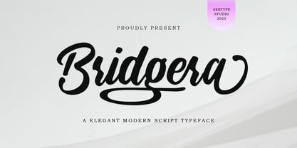 Bridgera script font is a magical script font carefully created with a touch of elegance. This is a beautiful combination of timeless elegance and authentic calligraphy. It features an incredibly classic style, while still keeping a friendly feel. Bridgera script font is the perfect font for making original and outstanding designs.
 - Brvsheed by Mofr24,
$10.00 Introducing Brvsheed, a modern handwritten font that exudes uniqueness with its brushed texture. With both Regular and Italic styles, it's a versatile choice for posters, marketing, T-shirt design, and more. Its multilingual support enhances its usability, while its distinctive look adds flair to titles, YouTube thumbnails, and gaming graphics.
 - Shaheen pro Arabic by Zaza type,
$99.00 Shaheen pro is a version of Shaheen typeface, Shaheen pro is an Arabic and Latin typeface that embodies power and a tendency towards uniformity. While preserving the neat, minimalist look which is associated with it. The name, too, hints at the strong character of the typeface. Shaheen comes in 5 wights
 - Modern Appliances JNL by Jeff Levine,
$29.00 If there s a back-story about the design inspiration for Modern Appliances JNL, it's lost to time. An unfinished design for quite a while, this clean sans with an Art Deco flair was recently completed, and the design quality should speak more for its appeal than any promotional blurb.
 - American Wonders by Sarid Ezra,
$17.00 Introducing, American Wonders - Font Duo! American Wonders is a package of two fonts containing signature script and bold serif. This versatile fonts that you can use for any project. This bold serif is strong and powerful while the signature script is soft and authentic hand writing. This font also support language!
 - Le Major by Calamar,
$18.00 Le Major is my new elegant serif font that will bring in your projects a touch of luxury and style. It's perfect match for logotypes, branding, wedding monograms and invitations, blog headlines and much more. Flip through all the previews and get inspired like I was while creating this font.
