10,000 search results
(0.014 seconds)
- PMN Caecilia eText by Monotype,
$29.99PMN Caecilia™ is the premiere work of the Dutch designer Peter Matthias Noordzij. He made the first sketches for this slab serif design in 1983 during his third year of study in The Hague, and the full font family was released by Linotype in 1990. The PMN prefix represents the designer's initials, and Caecilia is his wife's name. This font has subtle variations of stroke thickness, a tall x-height, open counters, and vivacious true italics. Noordzij combined classical ductus with his own contemporary expression to create a friendly and versatile slab serif family. With numerous weights from light to heavy, and styles including small caps, Old style figures, and Central European characters, PMN Caecilia has all the elements necessary for rich typographic expression. eText fonts - the optimum of on-screen text quality With our new eText fonts that have been optimised for on-screen use, you can ensure that your texts remain readily legible when displayed on smartphones, tablets or e-readers. The poor resolution of many digital display systems represents a major challenge when it comes to presenting text. It is necessary to make considerable compromises, particularly in the case of text in smaller point sizes, in order to adapt characters designed in detail using vector graphics to the relatively crude pixel grid. So-called 'font hinting' can help with this process. This, for example, provides the system with information on which lines are to be displayed in a particular thickness, i.e. using a specific number of pixels. As font hinting is a largely manual and thus very complex technique, many typefaces come with only the most necessary information. What is unimportant for a text printed in high resolution can result in a poor quality image when the same text is displayed on a screen, so that reading it rapidly becomes a demanding activity. Specially optimised eText fonts can help overcome this problem. An extremely refined and elaborate font hinting system makes sure that these fonts are optimally displayed on screens. Monotype has not only adopted font hinting for this purpose but has also thoroughly reworked the fonts to hone them for display in low resolution environments. For example, the open counters present in the letters C, c, e, S, s, g etc. have been slightly expanded so that these retain their character even in small point sizes. Also with a view to enhancing appearance in smaller point sizes, line thickness has been discreetly increased and x-height carefully adjusted. Kerning has also been modified. Don't leave the on-screen appearance of your creations to chance. Play it safe and use eText fonts to achieve perfect results on modern display devices. Many typefaces, including many popular classics, are already available as eText fonts and new ones are continually being published. The eText font you can purchase here are available for use as Desktop Fonts or Web Fonts. Should they be used in Mobile Devices such as smartphones, tablets or eReaders, please contact our OEM specialists at sales-eu@monotype.com. - PMN Caecilia Sans by Monotype,
$50.99 Few projects are outside the range of PMN Caecilia® Sans. Drawn specifically for on-screen imaging, the family benefits from a large suite of weights, each with several stylistic variations. This is a design ideally suited to building digital interfaces, complex websites, apps, games, kiosks, HTML ads and large-scale brand identities. “My goal was to create a, friendly, versatile, ageless, yet discerning typeface family that will serve the needs of many users,” says Peter Matthias Noordzij. the typeface’s designer. “It is not intended to be eye-catching, but generous: enabling numerous visual and typographical expressions.” The use of Noordzij’s earlier design, PMN Caecilia, in Amazon’s Kindle® wireless reading devices, gave him the opportunity to study the behavior of the slab serif typeface in an on-screen environment. Although based on his earlier design, Noordzij incorporated fundamental changes to optimize PMN Caecilia® Sans’ digital performance. While PMN Caecilia has proven to be a steadfast serif typeface in print and on screen, the addition of a sans serif counterpart gives designers more flexibility when creating complex hierarchies. The combination of serif and sans serif makes the PMN Caecilia family a good choice for everything from print editorial projects to complicated web sites. A broad range of typefaces pair well with PMN Caecilia Sans. Humanist serif typefaces, such as Agmena™, Dante®, and Frutiger® Serif, set up dynamic typographic harmony, while designs like ITC New Veljovic™ Masqualero™ and Perpetua®, will create a striking counterpoint. And, of course, PMN Caecilia is a natural design partner – as are other slab serif typefaces, like the Aptifer™ Slab, Joanna® Nova and Soho® families.
 - Mon de Tresor by Reyrey Blue Std,
$14.00 Mon De Tresor is an elegant and thin lettered sans serif font. Perfect for editorial projects, Logo design, Clothing Branding, product packaging, magazine headers, or simply as a stylish text overlay to any background image. It will add a luxury spark to any design project that you wish to create! Includes: Uppercase and Lowercase Ligatures Stylistic Alternate
 - Mon Petit Cahier by Hanoded,
$15.00 My family and I are stuck in quarantine for a week; my eldest son tested positive for Covid19 (but everyone else tested negative), so we can’t go out. That means that the kids follow classes online. I noticed their notebooks and suddenly realised that a notebook used to be called a ‘cahier’, which is a French word meaning the exact same thing. I guess it sounded sophisticated at the time. Mon Petit Cahier (meaning: My Little Notebook) is a handmade script font. It is not meant to be awe-inspiring, nor do you want to use it for headlines or posters. It is a nice little font that feels at home wherever an unobtrusive script is needed. Comes with all the diacritics you want and a set of cool double letter ligatures.
 - Adieu Mon Ami by Hanoded,
$15.00 No, I am not leaving and none of my friends or relatives have packed up and left. I needed a more ‘letter-like’ name for this font and I found Adieu Mon Ami (farewell, my friend in French). Adieu Mon Ami is a handmade pencil font that will add that extra ‘je ne sais quoi’ to your designs. It comes with joie de vivre, un petit peu de vilain, but can be doux comme de la soie as well. Bonne chance!
 - Cyrillic Old Face - Unknown license

- Old Standard TT - 100% free

- Old Rubber Stamp - 100% free

- Ye Old Shire - Unknown license

- SF Old Republic - Unknown license

- SF Old Republic - Unknown license

- BN-Old Fashion - Unknown license

- Olde European ES - Unknown license

- old time radio - Unknown license

- OMEGA Old Face - Unknown license

- SF Old Republic - Unknown license

- SF Old Republic - Unknown license

- Old School Tattoo by m u r,
$15.00 Old school sailor tattoo lettering.
 - Old French School by JBFoundry,
$20.00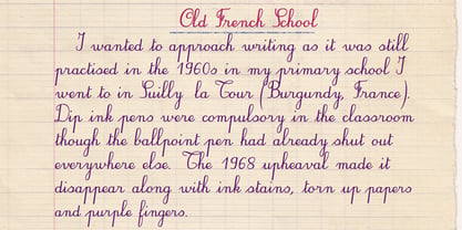
- LD Old Country by Illustration Ink,
$3.00This old fashion font looks like it belongs on a saloon sign. If you've got old west style photos, finish up your scrapbook page with title and journaling done in this cool font. It's perfect for lettering on western themed invitations, newsletters, sign, flyers, even menus. - WL Rasteroids Old by Writ Large,
$5.00 Rasteroids Old is a typographic flashback to computing of the early 1980s, when 7-pin dot-matrix printers were the state of the art, and most home computer displays were TVs hooked up to RF modulators. Rasteroids Old not only captures the dot-matrix printer look, but recreates the rasterized appearance of text on those lower-resolution monitors. Rasteroids Old is a fixed width font lacking any descenders. Furthermore, the character set is limited to the subset of US-ASCII that would be available on a typical machine of 1980. As such, it is not intended for large areas of copy.
 - MPI Old Style by mpressInteractive,
$5.00 Old Style is an example of classic roman type design. It has little contrast in stroke weight, small rounded serifs, open characters, and is very easy to read. It is based on wood type of unknown origin.
 - Goudy Old Style by URW Type Foundry,
$35.99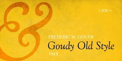
- Bookman Old Style by Monotype,
$40.99 The origins of Bookman Old Style lie in the typeface called Oldstyle Antique, designed by A C Phemister circa 1858 for the Miller and Richard foundry in Edinburgh, Scotland. Many American foundries made versions of this type which eventually became known as Bookman. Monotype Bookman Old Style roman is based on earlier Lanston Monotype and ATF models. The italic has been re drawn following the style of the Oldstyle Antique italics of Miller and Richard. Although called Old Style, the near vertical stress of the face puts it into the transitional category. The Bookman Old Style font family is a legible and robust text face.
 - Abbott Old Style by SoftMaker,
$7.99 SoftMaker’s Abbott Old Style is a revival of Joseph W. Phinney’s typeface of the same name, a modified serif typeface. It is charmingly antique and exotic.
 - Caslon Old Face by Bitstream,
$29.99William Caslon established the first major English typefoundry, re-creating earlier Dutch designs with excellent craftsmanship, color and rhythm. Caslon Old Face is one of many faithful revivals; the original matrices (from many hands; the lowercase of the 48 point is Moxon’s 1669 Great Canon) survive at Stephenson Blake. George Ostrochulski adapted this design for photocomposition at Mergenthaler with skill and understanding. - Old Paris Nouveau by Baseline Fonts,
$24.00Old Paris Nouveau is based on letterpress stylings of modern roman alphabets from the 1920s. Adapting the nouveau sensibility to the digital age required several conventions, including several alternate glyphs for specific individual letterforms as well as creating consistent stem weights and x-heights for more effective body copy. The inherent charm of Old Paris lies in its variation in form and style -- and yet the uniformity. Organic simplicity and elegance underscore the strength and utility inherent in the family of fonts. - Old Persian Cuneiform by Deniart Systems,
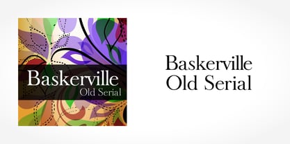
$10.00Based of the ancient Persian writing system. NOTE: this font comes with a comprehensive interpretation guide in pdf format. - Baskerville Old Serial by SoftMaker,
$-
- Century Old Style by URW Type Foundry,
$35.99 The Century Old Style font family was modeled on Century Expanded which had been cut in 1900. Similar weights and proportions were maintained but the letter shapes were made more elegant by the introduction of a number of old style characteristics. The Century Old Style font family is a useful text design that offers good legibility and economy.
 - Poynter Old Style by Font Bureau,
$40.00 In the 1670s, Christopher Plantin was the largest publisher of his day. Hendrik van den Keere cut for him an astounding series of romans. As Stanley Morison once observed, such types adopted features of Flemish blackletter to strengthen elegant French romans. Large on the body, strong in color, economical in fit, widely (if anonymously) distributed, they established effective standards for all that followed; FB 1997–2000
 - Horley Old Style by Monotype,
$40.99 Twenties nostalgic oldstyle revival supervised by F.H. Pierpont at Monotype with echoes of Jenson, Caslon, and Goudy.
 - Old Favorites JNL by Jeff Levine,
$29.00Old Favorites JNL is a collection of over 35 dingbats based on designs from the early days of printing. These timeless images will fill a variety of needs. - Old Softy NF by Nick's Fonts,
$10.00The pattern for this friendly face was found within the Keystone Type Foundry's 1884 specimen book, under the rather prosaic name of Round Gothic. This version retains all of the original's warmth and charm, while updating it to twenty-first century standards. Both versions of this font include the complete Latin 1252, Central European 1250 and Turkish 1254 character sets, along with localization for Lithuanian, Moldovan, Romanian and Turkish. - Old Claude LP by LetterPerfect,
$39.00 Old Claude was drawn by Paul Shaw to simulate an old cut of the classic (Claude) Garamond type designs of the 16th & 17th centuries. The pronounced rough edges and coarse letter shapes create the effect of letterpress printing with old foundry type onto handmade paper. The companion Old Claude Expert includes small caps and old-style figures. This "antiqued" design works equally well for both text and display.
 - Same Old Joke by Bogstav,
$15.00 Same Old Joke is a happy and handmade font. Use it for anything that needs a hand lettered expression. Works well with prints, cards, packaging or perhaps even a poster of your favourite chocolate! Each version of the font is full of personality, and was carefully handdrawn to keep both the legibility and the handmade feeling. I put in ligatures to substitute the most common letter repeating - to make it look even more handmade!
 - Old Style 7 by Linotype,
$29.00The name Old Style No. 7 comes from a time when foundries released a variety of typefaces under one name. Linotype produced Old Style No. 7, which was based on an early 1870s typeface from the Bruce Typefoundry, which had based its design on a type from the Scottish foundry Miller and Richards. Old Style No. 7 is a reliable text type that is serviceable for both books and shorter copy demands, such as magazines. - Diaconia Old Style by Hackberry Font Foundry,
$24.95Diaconia Old Style is a new rendition of my workhorse body copy font that I originally designed to use for the body copy of "Printing in a Digital World." I became increasingly upset with the lack of lowercase numbers and true small caps. Diaconia started life as a modification of one of the Dutch Bible fonts I traced. It has changed a lot since then (although I have a hard time telling how much because I have lost the original). The plain and italic work especially well when used in very large sizes as display faces. The other four variants (small caps, heavy, heavy italic, and black) are designed for use in book production. Because I format all my own books, I was able to design fonts that met my needs exactly: lowercase numbers, SMALL CAPS font, Mac Command, Option, and Control symbols, ballot box in the section slot, and several other special characters. DiaconiaPro is the OpenType family of my body copy workhorse. This is the first font family I ever created: classic, elegant, easy to read. 583 characters: small caps, oldstyle figures, numerators, denominators, lining figures, accents and a lot more. - Chong Old Style by Monotype,
$29.99In the tradition of Goudy Old Style and Goudy Modern, Chong Wah drew Chong Old Style™ and Chong Modern™ as visually different – but complementary – designs. According to Chong Wah, “The extended family of typefaces started as a concept rather than a preconceived design. The concept is different sans serif type styles with a common underlying structure and a clear lineage to traditional serif designs. While there are similarities between the designs, each typeface was drawn as a separate entity.” Chong Old Style has the flavor of traditional old style designs without slavishly replicating the earlier design traits. It has the heft and color of an old style design but lacks the serifs and inclined stroke axis customarily seen in these typefaces. The result is a versatile suite of typefaces that deliver a straightforward message in large or small sizes. Chong Modern is a sans serif interpretation of the classic modern, or neoclassical, designs of Bodoni and Didot. More than a Bodoni without serifs, Chong Modern also has an elegant, Art Deco demeanor. This is a design that walks the line between traditional and contemporary with grace and aplomb. Chong Wah drew his Old Style and Modern designs in Light, Regular and Bold weights, adding an Extra Bold to the Old Style. All designs benefit from harmonizing italic counterparts. Both branches of the Chong family are also available as OpenType Pro fonts, allowing graphic communicators to take advantage of OpenType’s diverse capabilities. These fonts, in addition to providing for the automatic insertion of old style figures, ligatures and small caps, also offer an extended character set supporting most Central European and many Eastern European languages - Old Labels JNL by Jeff Levine,
$29.00 Old Labels JNL was inspired by the red and white gummed labels that were used for shipping parcels long before self-adhesive materials and desktop publishing rendered the older labels obsolete. The fifty-two glyphs include a generous supply of phrases such as ‘Air Mail’, ‘Do Not Bend’, ‘Rush’, etc. along with a number of blank label backgrounds and decorative frames. NOTE: Commercial replication of the images within this font for any resale purposes (including, but not limited to labels, t-shirts, stock designs, et al) requires a separate license which may be obtained by contacting the designer via the email address found within the End User License Agreement.


