10,000 search results
(0.036 seconds)
- Coochie Nando NF by Nick's Fonts,
$10.00Among the many display faces Milton Glaser designed during the heyday of Push Pins Studios was the pattern for this dramatically shadowed face, whose original name—for reasons unexplained—was "Kitchen." Well, whatever the reason, it's definitely "what's cooking," so the Italian word for the latter half of that phrase gives this typeface its name. Equally at home being kookie or spookie. Both versions include the complete Unicode Latin 1252, Central European 1250 and Turkish 1254 character sets, with localization for Moldovan and Romanian. - Streamers NF by Nick's Fonts,
$10.00This curly, swirly antique offering is based on a Victorian-era typeface called "Fillet". Opening and closing flourishes can be found at the brace and bracket positions, and the ribbon effect can be carried between words by using the underscore character in place of a space. Due to the highly ornate nature of this font, it does not contain math operators, fractions or superior numbers. Both versions of the font include 1252 Latin and 1250 CE (with localization for Romanian and Moldovan) character sets. - P22 FLW Terracotta by P22 Type Foundry,
$29.95The lettering and 100 extras for this font set, the third in P22’s Frank Lloyd Wright series, are derived from letterforms and decorative embellishments found in Wright’s early work (1893–1910) and in his book, The House Beautiful (1896–97). Wright based his delicate graphic designs on stylized natural plant forms. Users go this font can adorn their graphics with these beautiful motifs. Terracotta Regular and Terracotta Alt have been remastered and now contain almost 400 characters including support for Western and Central European languages. - Bowdon by K-Type,
$20.00 Bowdon is a warm, Bodoni-inspired English Modern, influenced by the 1930s lettering of designer Barnett Freedman. Slightly rounded corners give characters a printed-look softness, and hairlines are thickened a little to increase legibility at smaller sizes, reducing the harshness and dazzle that can afflict Didone typefaces. Bowdon is supplied in three widths – Regular, Wide and Narrow – and each width is accompanied by a utilitarian oblique rather than a fancy italic. Each font includes a full Latin Extended-A character set and additional oldstyle numerals.
 - Bing by Pelavin Fonts,
$20.00 The sinuous, organic forms of Bing first came into being on a poster for a Smithsonian Institution exhibit on Siegfried Bing, a German art dealer in Paris who figured prominently in the development of Art Nouveau towards the end of the nineteenth century. Inspired by the natural forms of Antonio Gaudi, and the Paris Metro stations of Hector Guimard, Bing can be used effectively in the modernist style of Art Nouveau and is equally at home in the 1960s psychedelic rejuvenation of that genre.
 - P22 Tuscan Expanded by IHOF,
$24.95 P22 Tuscan Expanded is a digitization of the mid-19th Century Woodtype font "Antique Tuscan Expanded - Wells & Webb 1854". Specimens of this font are rarely, if ever, seen with a lower case. It is noted in the book American Wood Type 1828-1900 by Rob Roy Kelly that the lower case is "missing". This version was digitized from a recently discovered full set including all lower case plus ff ligatures. One unique feature of this design is the heart shape formed in the V, X & Y.
 - Neology by Shinntype,
$49.00 To see the “auto-mix” effect, go to the Webfont page. This typeface has been designed to demonstrate a hypothesis: consistency in letter form and style is not essential to fluent reading. The Neology fonts also include both plain constituents, Neology Deco (1920s-style minimalist geometric) and Neology Grotesque (similar to Helvetica etc., but with a small x-height). All fonts have both three-quarter and full cap-height lining figures. The plain fonts have stylistic alternates (“a” for Deco and “g” and “l” for Grotesque).
 - Van Dijk by ITC,
$40.99Van Dijk was designed by Peter O'Donnell in 1986 and is a zigzag typeface with a printed handwritten character. Angular forms and an emphasized slant to the right make it seem energetic and forward-reaching. The s forms with their rounded and softer forms contrast all the better with the rest of the alphabet. The strong figures of Van Dijk are reminiscent of advertisements of the 1940s. Van Dijk is best used for headlines or short texts in point sizes of 12 or larger. - Miramonte by Ascender,
$29.99 Miramonte Pro was designed by Steve Matteson in 2006 as a friendly sans serif design suitable for user-interface design, corporate branding and publishing. The name means 'behold the mountains' in Spanish, suggesting the rustic, unrefined type design. Miramonte is based on Stanislav Marso's humanist sans serif released by Grafotechna in 1960. This revival includes a cursive style italic rather than a sloped roman. Miramonte Pro includes an extensive character set for publishing Central and Eastern European languages. Its OpenType features include proportional figures, and tabular figures.
 - PGF Caprina Pro by PeGGO Fonts,
$24.00 "PGF Caprina Pro" is an audacious and rough geometric sans-serif font inspired by the wild and untamed personality of mountain goats (the word "caprina"‘ in Spanish is related to or resembling ‘goats’)—amazing animals which can skilfully climb up slopes and withstand very cold temperatures. Was originally developed under the Latinotype team supervision and is now upgraded to this Pro version that comes in 20 font styles, with 739 glyphs each, supports now more than 200 Latin-based languages and includes a wider OpenType features range like: Stylistic Alternates ‘set 01’ for b, d, g, p, q, i, j, t, y, &, I, G, M Stylistic Alternates ‘set 02’ for d, g, j 4 Stylistic Alternate from ‘set 01’ to ‘set 04’ for Enclosed Numbers (circles and squares) Stylistic Alternate ‘set 05’ for curved 3 and ‘Zero with dot inside’ Contextual alternates automatically turns ‘zero’ into a ‘slashed zero’ in alphanumeric contexts Contextual alternates automatically turns “Il” into a serif for improve its legibility Case Sensitive when "All Caps" is activated for ß, ¡, ¿, () [] {}, ‹› «», •(bullet), *(asterisk), -(hyphen) Standard Ligatures for fi, fj, fl Discretionary Ligatures for tt, tr, www, LL, TT Lining Numbers Old Style Numbers Tabular Lining Tabular Old Style Numbers Slashed zero on every number figures Numerators and Denominators from 0 to 9 for any Fraction expression Superiors and Inferiors from 0 to 9 for any scientific notation Ordinal forms for ‘a’ and ‘o’ Localized language customization for German, Dutch, Polish, Catalan, Romanian, Moldavian, Turkish, etc. Every OpenType option is also accessible via Character Map allowing users and designers to choose an alternate design for a particular character. “PGF Caprina Pro” is well-suited for high-impact action publishing and advertising as well related with adrenalynic and extreme sport design stuff.
 - Philadelphian by FontMesa,
$29.00 Philadelphian is a revival of a MacKellar, Smiths & Jordan font from 1867 by the same name. The regular version with shadow outline was the only style that was offered in 1867. We've taken the original design further by creating two additional weights of medium and bold plus plain black versions. The medium and bold weights are unique because only the horizontal strokes increase in thickness while the vertical strokes remain the same in each weight. Philadelphian Nite is the plain black version of this font family, Nite is the casual spelling of the word Night meaning dark or black. In the late 1800's Philadelphian was a very popular typeface which can be seen on many billheads and letterheads through the early 1900's. If you're looking for a western style font that doesn't look like any other then Philadelphian is the right choice. While the name doesn't remind you of the cowboy genre we've kept the original name for historical reasons because this font was so popular in its day. We plan on going forward with a weathered version of Philadelphian which will be released under a southwestern style name. With Philadelphian we've decided to set the complete family price to an amount that may be considered on sale all of the time.
 - Mrs Grey by Hipopotam Studio,
$20.00 Stylish and elegant typeface written with a wide, broad-edge nib. Over 40 standard ligatures and over 150 alternate and swash characters. Use OpenType features (Swash and Stylistic sets) to change the endings of lowercase letters or select most suitable characters from glyphs panel or character map. As an extra we added a free set of over 30 ornaments for even more design possibilities.
 - Al Lonely Bridges by Aluyeah Studio,
$125.00 Hello Aluyeaholics! Lonely Bridges a stunning display font inspired by the soul of solitude. Lonely Bridges carries an italic style giving the impression of an unstable, rebellious, and indecisive soul. Make your design project more emotional to convey. Coming with 150+ stunning and super easy to use alternates and ligatures. To get results like the preview just type L.4onel.4y B.3r.idges.2
 - Hamerslag by Paweł Burgiel,
$38.00 Hamerslag is an ultra-condensed serif type family with uncomplicated, regular appearance, large x-height, relatively high contrast and modern glyphs shapes. Available in four styles, contain fraction- and scientific numerals, standard ligatures, currency symbols, proportional and tabular lining figures. Its wide character set support 200 Latin-script languages, 50 Cyrillic-script languages and 190+ romanizations/transliterations, e.g. The United Nations romanizations, Chinese official romanization (Hanyu Pinyin), BGN/PCGN (United States Board on Geographic Names and the Permanent Committee on Geographical Names for British Official Use), American Library Association / Library of Congress romanizations and others. The OpenType PostScript CFF (.otf) and OpenType TrueType TTF (.ttf) support encodings: Windows 1250 Latin 2 (Eastern European), Windows 1251 Cyrillic, Windows 1252 Latin 1 (ANSI), Windows 1254 Turkish, Windows 1257 Baltic, ISO 8859-1 Latin 1 (Western), ISO 8859-2 Latin 2 (Central Europe), ISO 8859-3 Latin 3 (Turkish, Maltese, Esperanto), ISO 8859-4 Latin 4 (Baltic), ISO 8859-5 Cyrillic, ISO 8859-9 Latin 5 (Turkish), ISO 8859-10 Latin 6 (Scandinavian), ISO 8859-13 Latin 7 (Baltic 2), ISO 8859-14 Latin 8 (Celtic), ISO 8859-15 Latin 9, ISO 8859-16 Latin 10, Macintosh Character Set (US Roman). Supported OpenType features: Acces All Alternates, Capital Spacing, Case-Sensitive Forms, Denominators, Fractions, Glyph Composition/Decomposition, Historical Forms, Kerning, Localized Forms, Numerators, Ordinals, Proportional Figures, Scientific Inferiors, Slashed Zero, Standard Ligatures, Stylistic Alternates, Subscript, Superscript, Tabular Figures. Kerning is prepared as single ('flat') table for maximum possible compatibility with older software.
 - GR Altosa by Garisman Studio,
$35.00 GR Altosa is a very cool typeface for headline designs with a bold and bold theme. With a strong display and clean nodes make text in the design become more character and great. Inspired by headline trends in a poster or magazine today. So that with a firm and a very modern style makes your design better! This font is formed from the headline display font of a very careful title. Suitable for all graphic design projects, prints, logos, posters, t-shirts, packaging, website, ticket and applies to several types of graphic design. Especially for the use of a title! Very suitable! GR Read is compatible with any software without pain, especially in headlines with GR Altosa pairing
 - XXII Totenkult by Doubletwo Studios,
$21.99 The “XXII Totenkult” is inspired by the classical letterforms of old roman/renaissance typefaces and an ode to the decay. This is an allCapitals-font and the lowercase glyphs contain a variation of the uppercase. With activated “calt”-feature every second lowercase will be replaced by an alternate, this will give the font a more natural look. Detailed information here: XXII Totenkult on Behance.
 - AZ Hello by Artist of Design,
$25.00 AZ Hello font was inspired from old auto repair signs. This font utilizes an "old look" to the line work which is designed to have a "worn feel" to it. Ideal for use as headline or sub-head text in you design.
 - Geoparody by Typodermic,
$11.95 Introducing Geoparody, the typeface that channels the free-spirited energy of the 1960s with its bold, groovy style. This typeface is inspired by the iconic Anonymous font, which rose to fame as the font of choice for the hit TV quiz show, Jeopardy. Geoparody takes the original Anonymous typeface to new heights with a range of six weights and italics. Plus, you can unleash your creative side with OpenType stylistic alternates, featuring an alternate “X” and “Y” that add an extra touch of playfulness to your designs. Whether you’re designing a retro poster, a funky album cover, or a psychedelic website, Geoparody will help you stand out with its distinctive style. So, let your creativity run wild with Geoparody, the typeface that captures the rebellious, futuristic spirit of the late 1960s. Most Latin-based European writing systems are supported, including the following languages. Afaan Oromo, Afar, Afrikaans, Albanian, Alsatian, Aromanian, Aymara, Bashkir (Latin), Basque, Belarusian (Latin), Bemba, Bikol, Bosnian, Breton, Cape Verdean, Creole, Catalan, Cebuano, Chamorro, Chavacano, Chichewa, Crimean Tatar (Latin), Croatian, Czech, Danish, Dawan, Dholuo, Dutch, English, Estonian, Faroese, Fijian, Filipino, Finnish, French, Frisian, Friulian, Gagauz (Latin), Galician, Ganda, Genoese, German, Greenlandic, Guadeloupean Creole, Haitian Creole, Hawaiian, Hiligaynon, Hungarian, Icelandic, Ilocano, Indonesian, Irish, Italian, Jamaican, Kaqchikel, Karakalpak (Latin), Kashubian, Kikongo, Kinyarwanda, Kirundi, Kurdish (Latin), Latvian, Lithuanian, Lombard, Low Saxon, Luxembourgish, Maasai, Makhuwa, Malay, Maltese, Māori, Moldovan, Montenegrin, Ndebele, Neapolitan, Norwegian, Novial, Occitan, Ossetian (Latin), Papiamento, Piedmontese, Polish, Portuguese, Quechua, Rarotongan, Romanian, Romansh, Sami, Sango, Saramaccan, Sardinian, Scottish Gaelic, Serbian (Latin), Shona, Sicilian, Silesian, Slovak, Slovenian, Somali, Sorbian, Sotho, Spanish, Swahili, Swazi, Swedish, Tagalog, Tahitian, Tetum, Tongan, Tshiluba, Tsonga, Tswana, Tumbuka, Turkish, Turkmen (Latin), Tuvaluan, Uzbek (Latin), Venetian, Vepsian, Võro, Walloon, Waray-Waray, Wayuu, Welsh, Wolof, Xhosa, Yapese, Zapotec Zulu and Zuni.
 - Comic Sans by Microsoft Corporation,
$49.00The Comic Sans® typeface, one of Microsoft's most popular designs, has received a makeover courtesy of Monotype Imaging. The company has introduced the four-font Comic Sans Pro family of typefaces. Featuring elements such as speech bubbles and cartoon dingbats, Comic Sans Pro extends the versatility of the original Comic Sans, designed by Vincent Connare for Microsoft in 1994. Hats off to Monotype Imaging for enlivening Comic Sans and getting it back to its roots as a comic book lettering face. Now everyone can write with more panache - and look even more like a pro using swashes, small caps and other typographic embellishments," said Connare. "Every day, millions of people rely on Comic Sans for countless applications ranging from scrapbooking to school projects," said Allan Haley, director of words and letters at Monotype Imaging. "Comic Sans is also a favorite in professional environments, used in medical information, instructions, ambulance signage, college exams, corporate mission statements and executive reprimands - even public letters from sports team owners to their fans. Breaking up with your spouse? Why not write a letter in Comic Sans Pro, embellished with a typographic whack!, pow! or bam! Comic Sans is everywhere, and now it's even better." The Comic Sans Pro family includes regular and bold fonts, in addition to two new italic and bold italic fonts drawn by Monotype Imaging's Terrance Weinzierl. "Our aim is to put the 'fun' back in 'functional.' We can't wait to see Comic Sans Pro used in everything from second wedding announcements to warning labels," said Weinzierl. "Long live Comic Sans!" Comic Sans Pro contains a versatile range of typographic features including swashes, small caps, ornaments, old style figures and stylistic alternates - all supported by the OpenType® font format. OpenType-savvy applications, such as Adobe® Creative Suite®, QuarkXPress® or Mellel™ software are required to access these features. Comic Sans Pro can also be used in new versions of Microsoft® Office including Microsoft Word 2010 and Microsoft Publisher 2010. In addition, Comic Sans Pro includes a set of ornaments and symbols, including speech bubbles, onomatopoeia and dingbats, pre-sized to work well as bullets." - Sun Type by VP Creative Shop,
$29.00 Introducing Sun Type, a delightful and versatile serif logo font that exudes creativity and charm. With over 150 ligature glyphs and alternate characters, this font offers a wide range of design possibilities, allowing you to craft unique and visually stunning logos and brand identities. Sun Type goes above and beyond with its extensive collection of 52 swashes, offering you the opportunity to add elegant and decorative elements to your text. These swashes effortlessly elevate your designs, giving them a touch of sophistication and individuality. Not only does Sun Type excel in its aesthetic appeal, but it also showcases its practicality by supporting a staggering 87 languages. No matter where your audience is located or what language they speak, you can confidently communicate your message with this font. Language Support : Afrikaans, Albanian, Asu, Basque, Bemba, Bena, Breton, Chiga, Colognian, Cornish, Czech, Danish, Dutch, Embu, English, Estonian, Faroese, Filipino, Finnish, French, Friulian, Galician, Ganda, German, Gusi,i Hungarian, Indonesian, Irish, Italian, Jola-Fonyi, Kabuverdianu, Kalenjin, Kamba, Kikuyu, Kinyarwanda, Latvian, Lithuanian, Lower Sorbian, Luo, Luxembourgish, Luyia, Machame, Makhuwa-Meetto, Makonde, Malagasy, Maltese, Manx, Meru, Morisyen, North Ndebele, Norwegian, Bokmål, Norwegian, Nynorsk, Nyankole, Oromo, Polish, Portuguese, Quechua, Romanian, Romansh, Rombo, Rundi, Rwa, Samburu, Sango, Sangu, Scottish, Gaelic, Sena, Shambala, Shona, Slovak, Soga, Somali, Spanish, Swahili, Swedish, Swiss, German, Taita, Teso, Turkish, Upper, Sorbian, Uzbek (Latin), Volapük, Vunjo, Walser, Welsh, Western Frisian, Zulu LigaturesAB,AC,AD,AF,AG,AI,AK,AL,AM,AN,AP,AR,AT,AU,AV,AW,AY,BA,BE,BI,BL,BO,BU,CA,CC,CE,CH,CI,CK,CL,CO, CR,CT,CU,DA,DD,DE,DI,DO,DS,DY,EA,EC,ED,EE,EF,EG,EI,EL,EM,EN,EP,ER,ES,ET,EV,EW,EX,EY,FA,FE,FF,FI, FO,FR,GA,GE,GH,GO,GS,HA,HE,HI,HO,HT,IK,IL,IM,IN,IT,IH,KE,KI,KN,KO,LA,LE,LF,LI,LK,LL,LO,LT,LY,MA,ME, MM,MO,MP,MS,MU,NC,ND,NE,NG,NK,NL,NN,NO,NS,NT,OA,OB,OC,OD,OF,OG,OI,OK,OL,OM,ON,OO,OP, OR,OS,OT,OU,OV,OW,PE,RA,RE,RF,RK,RM,RN,RO,RR,RS,SA,SC,SE,SH,SK,SS,ST,TC,TE,TH,TI,TL,TO,ST,TT,TU, TW,TY,UC,UE,UL,UM,UN,UR,US,UT,VA,VE,VO,WA,WE,WH,WN,WO,YE,YO,YS,MEN,FRO,RON,ROM,THE, AND,ING,HER,HAT,HIS,THA,ERE,FOR,ENT,TER,WAS,YOU,ITH,VER,ALL,THI,OUL,GHT,AVE,HAV,HIN,ATI, EVE,HING,WERE,FROM,THAT,THER,HAVE,THIS,MENT How to access alternate glyphs? To access alternate glyphs in Adobe InDesign or Illustrator, choose Window Type & Tables Glyphs In Photoshop, choose Window Glyphs. In the panel that opens, click the Show menu and choose Alternates for Selection. Double-click an alternate's thumbnail to swap them out. Mock ups and backgrounds used are not included. Thank you! Enjoy!
 - Steam by Type Forward,
$- Steam combines the spirit of the old-fashioned wood type with modern flavours. Its distinctive reversed high contrast and extremely bold serifs make it impossible to stay unnoticed. It’s a fun and bold unconventional typeface that we’ve designed with great passion and curiosity! The type family consists of 13 weights that are divided into several packs. Each font in the pack can be layered on top of each other to make a funkier look. Steam is multilingual! It speaks more than 130 languages and supports extended Latin, Cyrillic, punctuation, default and small numbers, symbols and signs. It is also familiar with the OpenType features like standard and discretionary ligatures, stylistic sets, localized forms, small numbers and fractions and more. Steam looks best on logos, posters, headlines, and T-shirts and is perfect anytime you need some bold letters with specific flavour and touch. Have fun creating!
 - Pirulen by Typodermic,
$11.95 In a future world where technology reigns supreme, communication must adapt to convey the cold and calculated efficiency of machines. Pirulen is the answer to this need. This hi-tech headliner is a futuristic marvel that transcends the limitations of traditional typography. Pirulen takes inspiration from the bold and daring style of 1930s Bank Gothic, but with a unique and revolutionary twist. It strips away any hint of warmth or humanity and replaces it with a cold and calculated design that perfectly captures the feeling of machines and technology. The result is a typeface that is both imposing and captivating. One of the most striking features of Pirulen is the lambda-style “Λ”, which adds to its already bold and robust appearance. This iconic symbol is a clear indicator of Pirulen’s futuristic design and sets it apart from other typefaces. And if you’re looking for even more variation, Pirulen offers barred “A” and accented variants that can be easily accessed through your application’s stylistic alternates function. With six different weights and italics, Pirulen is a versatile typeface that can adapt to any situation. Whether you’re creating sleek and modern designs or gritty and industrial ones, Pirulen can help you convey the cold and calculated efficiency of the future. So don’t be left behind—embrace the future with Pirulen. Most Latin-based European writing systems are supported, including the following languages. Afaan Oromo, Afar, Afrikaans, Albanian, Alsatian, Aromanian, Aymara, Bashkir (Latin), Basque, Belarusian (Latin), Bemba, Bikol, Bosnian, Breton, Cape Verdean, Creole, Catalan, Cebuano, Chamorro, Chavacano, Chichewa, Crimean Tatar (Latin), Croatian, Czech, Danish, Dawan, Dholuo, Dutch, English, Estonian, Faroese, Fijian, Filipino, Finnish, French, Frisian, Friulian, Gagauz (Latin), Galician, Ganda, Genoese, German, Greenlandic, Guadeloupean Creole, Haitian Creole, Hawaiian, Hiligaynon, Hungarian, Icelandic, Ilocano, Indonesian, Irish, Italian, Jamaican, Kaqchikel, Karakalpak (Latin), Kashubian, Kikongo, Kinyarwanda, Kirundi, Kurdish (Latin), Latvian, Lithuanian, Lombard, Low Saxon, Luxembourgish, Maasai, Makhuwa, Malay, Maltese, Māori, Moldovan, Montenegrin, Ndebele, Neapolitan, Norwegian, Novial, Occitan, Ossetian (Latin), Papiamento, Piedmontese, Polish, Portuguese, Quechua, Rarotongan, Romanian, Romansh, Sami, Sango, Saramaccan, Sardinian, Scottish Gaelic, Serbian (Latin), Shona, Sicilian, Silesian, Slovak, Slovenian, Somali, Sorbian, Sotho, Spanish, Swahili, Swazi, Swedish, Tagalog, Tahitian, Tetum, Tongan, Tshiluba, Tsonga, Tswana, Tumbuka, Turkish, Turkmen (Latin), Tuvaluan, Uzbek (Latin), Venetian, Vepsian, Võro, Walloon, Waray-Waray, Wayuu, Welsh, Wolof, Xhosa, Yapese, Zapotec Zulu and Zuni.
 - Sgraffio by Eurotypo,
$48.00 Sgraffio is a classic script font with an elegant contemporary style. Inspired by the CopperPlate script, it is an updated viewpoint. The special characteristics of this typeface is that its strokes are agile and dynamic, with slight and smooth variations in thickness, giving to the final art a sophisticated atmosphere. It is attractive and readable. It can be used in decorative titles, as well as in large readable text. Contain a useful set of OpenType features that can help you in many typographic fine adjustments, you can choose from different alternates, swashes, discretionary and standard ligatures. This fonts is completed with Old Style figures and Central European languages. It is ideal for fashion magazines, advertising, business web, logotypes, lettering - logotypes, e-commerce brands, books, greeting / wedding cards, packaging, labels or any type of effective visual communication purpose.
 - Nicolas Jenson SG by Spiece Graphics,
$39.00 It was the original work of fifteenth century designer Nicolas Jenson that formed the basis for this roman serif style developed by Ernst Detterer in 1923. Similar in spirit to other early twentieth century revivals such as Centaur, Cloister Old Style, and Italian Old Style, Nicolas Jenson is distinguished by its pristine and delicate nature. A gifted young apprentice to Detterer, Robert Hunter Middleton, greatly expanded the family. And by 1929, bold, italic, and open were part of the Ludlow Foundry’s beautiful Nicolas Jenson Series. It was reintroduced under a new name, Eusebius, in 1941. This digital version includes a new medium and extrabold weight with intermediate small caps and swash alternates throughout the family. There is also a regular expert version with a variety of currency symbols plus a regular petite caps (regular x-height small caps) and old style figures version. Nicolas Jenson is now available in the OpenType Std format. Small caps, old style figures, and swash alternates have all been combined into one style for ease of use. You will also find an additional regular petite caps version included with the regular style. Some new characters have been added as stylistic alternates and historical forms. These advanced features work in current versions of Adobe Creative Suite InDesign, Creative Suite Illustrator, and Quark XPress. Check for OpenType advanced feature support in other applications as it gradually becomes available with upgrades.
 - Mustang by Robert Arnow,
$21.99 Mustang is a powerfully expressive brush font that combines an edgy urban aesthetic with a smooth feminine flow. Some have suggested that Mustang is romantic. Some say it has something to do with speed or freedom. While precisely what Mustang expresses is up to debate, there’s no doubt that it’s expressing it with intensity. The style was born in my high school years, when I would wreck my notebooks with multiple layers of graffiti tags which would start in the margins and then creep in to cover the entire page. I developed a sensibility towards a very fast, expressive use of my hand, which later easily and naturally translated into brush. I used this style typographically on several projects throughout the years, and even turned it into a signature illustration style. Mustang is the second font, after Streetbrush, to use this brushwork as its inspiration. Mustang will be especially evocative at large sizes, where the details and sharpness of the shapes really come to life. It also holds together well for use as body copy, but may lose some of its aesthetic integrity at really small sizes.
 - Neo Latina by deFharo,
$12.00 Neo Latina is a classic sans serif typography in small caps of square proportions and rectilinear character with the ends of the rounded horns and a semi-stencil design that gives a futuristic aspect and of science fiction. Neo Latina is the right heiress of geometric fonts from the early 20th century inspired by the Bauhaus school and is specially designed for use in any size for both screen and print. Neo Latina is a very versatile typography for graphic design, you can use it in advertising posters, video games, film titles, logos, editorial design, etc. The Commercial version includes: - Two fonts: Regular & Bold - 460 glyphs. Latin Extended-A • OTF & TTF - Neo Latina fonts can be used unlimited for both Commercial and Personal projects. - The download file includes a PDF with the specimen sheet of typography. - OpenType features compatible with: Photoshop, Illustrator, QuarkXpress, Indesign. - OpenType Features: Subscript, Additional languages, Alternate Annotation Forms, Capital Spacing, Denominators, All Alternates, Oldstyle Figures, Superscript, Superiors, Superior letters, Standard Ligatures, Kerning, Extended Fractions, Small Capitals, Historical Forms, Inferiors, Fractions, Localized Forms, Numerators, Ordinals, Discretionary Ligatures, Scientific Inferiors, Slashed Zero. - Bitcoin & Chaos symbol: b# - a#(ligatures)
 - The font named "Hendrix Demo" by The Scriptorium is a vivid encapsulation of both creativity and tribute, designed with an essence that echoes the legendary flair of Jimi Hendrix, to whom it ostensib...
- Slavica by Green Type,
$28.00 Slavica is a modern pixel version of old Slavonic fonts.
 - Kustom Culture by Scratch Design,
$10.00 Kustom Culture font was born from an inspiring vintage old paint display. This font gives a vintage, classic, and old feel, inspired by authentic old paint effects. Kustom Culture font is perfect for you looking for a vintage and logotype. Suitable for any graphic designs such as branding materials, t-shirts, badges, print, packaging, label, business cards, logos, posters, t-shirts, quotes .etc Features: Stylistic Alternates, Numerals & Punctuation Accented characters, Format File: TTF, OTF, Multiple Languages Supported
 - Albiol by Mr. Typeman,
$14.00 Create your own design by choosing this wonderful handwritten font. Albiol has an effortless yet refined quality, making it an excellent fit for projects of all types.
 - Zoomba by Lebbad Design,
$24.95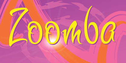 Zoomba is a cool edgy script.
 - Neue Frutiger Paneuropean by Linotype,
$79.00During planning for the new Roissy Charles de Gaulle airport in Paris at the beginning of the 1970s, it was determined that the airport's signage system had to include the clearest and most legible lettering possible. The development of all signage was put into the hands of Adrian Frutiger and his studio. The team carried out their task so effectively that a huge demand for their typeface soon arose from customers who wanted to employ it in other signage systems, and in printed materials as well. The Frutiger® typeface not only established new standards for signage, but also for a range of other areas in which a clear and legible design would be required, especially for small point sizes and bread-and-butter type. The typeface family that which emerged as a result of this demand was added into the Linotype library as "Frutiger" in 1977. Frutiger Next, created in 1999, is a further development of Frutiger, not necessarily a rethinking of the design itself. It was based on a new concept, the most obvious visual characteristics of which is the larger x-height, as well as a more pronounced ascender height and descender depth for lower case letters in relation to capitals. This new design created a balanced image and included considerably narrower letterspacing. Frutiger Next meets the demand for a space-saving, modern humanist sans. 2009's Neue Frutiger is a rethink of the 1977 Frutiger family, now revised and improved by Akira Kobayashi in close collaboration with Adrian Frutiger. Despite the various changes, this "New Frutiger" still fits perfectly with the original Frutiger family, and serves to harmoniously enhance the weights and styles already in existence. The perfect mix, guaranteed Neue Frutiger has the same character height as Frutiger. As a result of this, already existing Frutiger styles can be mixed with Neue Frutiger where necessary. Likewise, Neue Frutiger is perfect for use alongside Frutiger Serif. Newly added are the "Neue Frutiger 1450" weights. Especially for the requirements of the newly released German DIN 1450 norm we have built together with Adrian Frutiger specific weights of the Neue Frutiger. The lowercase l" is curved at the baseline to better differentiate between the cap "I", additionally the number "0" has a dot inside to better differentiate between the cap "O", and the number "1" is now a serifed 1. The font contains additionally the origin letterforms from the regular Neue Frutiger font which can be accessed through an Opentype feature." - Neue Frutiger Cyrillic by Linotype,
$89.00During planning for the new Roissy Charles de Gaulle airport in Paris at the beginning of the 1970s, it was determined that the airport's signage system had to include the clearest and most legible lettering possible. The development of all signage was put into the hands of Adrian Frutiger and his studio. The team carried out their task so effectively that a huge demand for their typeface soon arose from customers who wanted to employ it in other signage systems, and in printed materials as well. The Frutiger® typeface not only established new standards for signage, but also for a range of other areas in which a clear and legible design would be required, especially for small point sizes and bread-and-butter type. The typeface family that which emerged as a result of this demand was added into the Linotype library as "Frutiger" in 1977. Frutiger Next, created in 1999, is a further development of Frutiger, not necessarily a rethinking of the design itself. It was based on a new concept, the most obvious visual characteristics of which is the larger x-height, as well as a more pronounced ascender height and descender depth for lower case letters in relation to capitals. This new design created a balanced image and included considerably narrower letterspacing. Frutiger Next meets the demand for a space-saving, modern humanist sans. 2009's Neue Frutiger is a rethink of the 1977 Frutiger family, now revised and improved by Akira Kobayashi in close collaboration with Adrian Frutiger. Despite the various changes, this "New Frutiger" still fits perfectly with the original Frutiger family, and serves to harmoniously enhance the weights and styles already in existence. The perfect mix, guaranteed Neue Frutiger has the same character height as Frutiger. As a result of this, already existing Frutiger styles can be mixed with Neue Frutiger where necessary. Likewise, Neue Frutiger is perfect for use alongside Frutiger Serif. Newly added are the "Neue Frutiger 1450" weights. Especially for the requirements of the newly released German DIN 1450 norm we have built together with Adrian Frutiger specific weights of the Neue Frutiger. The lowercase l" is curved at the baseline to better differentiate between the cap "I", additionally the number "0" has a dot inside to better differentiate between the cap "O", and the number "1" is now a serifed 1. The font contains additionally the origin letterforms from the regular Neue Frutiger font which can be accessed through an Opentype feature." - Wolverton by Greater Albion Typefounders,
$10.00 The extensive Wolverton family was inspired by a turn of the 20th century luggage label designed by the London and North Western railway. The Wolverton family combines period flair and charm with respect for the modern need for legibility and purposefulness. The family has at its heart four Body text faces (regular, italic, bold and bold italic). These are complimented by three display text faces, offering upper and lower case letter forms, all offered in regular, oblique, bold and bold oblique forms. Four all-capital based display design are also included if offered in the same four style, making an extensive and flexible family suitable for a wide range of uses; everything from setting large amounts of text to large scale signage and poster work. Wolverton offers a unique blend of charm an modern flexibility, why not give it a try today? All faces include lining and old style numerals and are extensively kerned. Individual faces are all economically priced and substantial discounts offered for the purchase of larger sets of typefaces.
 - Bad Coma - Personal use only

- tekken 6 2 - Unknown license

- Mogata - 100% free

- Rolloglide - Personal use only

- Rockabye - Personal use only

- Debitant - 100% free


