10,000 search results
(0.046 seconds)
- Miedinger by Canada Type,
$24.95 Helvetica’s 50-year anniversary celebrations in 2007 were overwhelming and contagious. We saw the movie. Twice. We bought the shirts and the buttons. We dug out the homage books and re-read the hate articles. We mourned the fading non-color of an old black shirt proudly exclaiming that “HELVETICA IS NOT AN ADOBE FONT”. We took part in long conversations discussing the merits of the Swiss classic, that most sacred of typographic dreamboats, outlasting its builder and tenants to go on alone and saturate the world with the fundamental truth of its perfect logarithm. We swooned again over its subtleties (“Ah, that mermaid of an R!”). We rehashed decades-old debates about “Hakzidenz,” “improvement in mind” and “less is more.” We dutifully cursed every single one of Helvetica’s knockoffs. We breathed deeply and closed our eyes on perfect Shakti Gawain-style visualizations of David Carson hack'n'slashing Arial — using a Swiss Army knife, no less — with all the infernal post-brutality of his creative disturbance and disturbed creativity. We then sailed without hesitation into the absurdities of analyzing Helvetica’s role in globalization and upcoming world blandness (China beware! Helvetica will invade you as silently and transparently as a sheet of rice paper!). And at the end of a perfect celebratory day, we positively affirmed à la Shakti, and solemnly whispered the energy of our affirmation unto the universal mind: “We appreciate Helvetica for getting us this far. We are now ready for release and await the arrival of the next head snatcher.” The great hype of Swisspalooza '07 prompted a look at Max Miedinger, the designer of Neue Haas Grotesk (later renamed to Helvetica). Surprisingly, what little biographical information available about Miedinger indicates that he was a typography consultant and type sales rep for the Haas foundry until 1956, after which time he was a freelance graphic designer — rather than the full-time type designer most Helvetica enthusiasts presume him to have been. It was under that freelance capacity that he was commissioned to design the regular and bold weights of Neue Haas Grotesk typeface. His role in designing Helvetica was never really trumpeted until long after the typeface attained global popularity. And, again surprisingly, Miedinger designed two more typefaces that seem to have been lost to the dust of film type history. One is called Pro Arte (1954), a very condensed Playbill-like slab serif that is similar to many of its genre. The other, made in 1964, is much more interesting. Its original name was Horizontal. Here it is, lest it becomes a Haas-been, presented to you in digital form by Canada Type under the name of its original designer, Miedinger, the Helvetica King. The original film face was a simple set of bold, panoramically wide caps and figures that give off a first impression of being an ultra wide Gothic incarnation of Microgramma. Upon a second look, they are clearly more than that. This face is a quirky, very non-Akzidental take on the vernacular, mostly an exercise in geometric modularity, but also includes some unconventional solutions to typical problems (like thinning the midline strokes across the board to minimize clogging in three-storey forms). This digital version introduces four new weights, ranging from Thin to Medium, alongside the bold original. The Miedinger package comes in all popular font formats, and supports Western, Central and Eastern European languages, as well as Esperanto, Maltese, Turkish and Celtic/Welsh. A few counter-less alternates are included in the fonts.
 - Quarter Braille by Echopraxium,
$20.00 Presentation QuarterBraille (Abbreviated as "QB" thereafter) is a decorative, steganographic and lattice font. Its core design concept is that Braille dots are represented as "quarters of a square"[1]. This is illustrated by posters 1 and 2 (NB: these glyph parts will be called "QB dots" thereafter). The other glyph parts (see poster 3) are purely decorative and meaningless in terms of Braille dots encoding[2]. All glyph parts are meant to generate a wide variety of patterns from horizontal and vertical combinations of glyphs. There is also a graphic convention to differentiate uppercase from lowercase letters with the presence or absence of shape subparts (in the "endings", "quarter of a circle with a ring" and "quarter of a diamond with a small square in the middle") like shown by poster 4. This font is suitable for very short texts (e.g. logos, acronyms, quotes, ambigrams, pangrams, palindromes, etc...) but on the other hand it may be used for steganographic purpose like geocaching as well as fictive alphabets (e.g. Alien/SciFi/Fantasy/Antique civilizations). Posters 1. Font Logo: the displayed text is " Quarter " followed by " Braille". There's a rainbow layer above the text to highlight the "QB dots", this is achieved by A..Z glyphs with "only QB dots" (codes 230..255) 2. Anatomy of a Glyph (L) and "QB Dots" (quarters of a square) 3. Glyphs Parts: Square and Cross (Inverted square), Circle and Inverted Circle (with or without the small circle in the middle), Diamond (with or without the small square in the middle), Inverted Square and Circle, Shape combos, Ending 4. Uppercase vs Lowercase (tiny shape subparts are shown in red) 5. Sample 1: Bathroom sink with QB tiles on the credence 6. Sample 2: Hands knuckle tatoos: "LOVE/HATE"[4] 7. Sample 3: Poker Hand: pocket Aces. It's an Ace of Hearts (Ah) on the left and an Ace of Spades (As) on the right. Like in regular cards, the card value (e.g. Ah) is displayed twice: at the top and rotated by 180 degrees at the bottom. This poster also illustrates that QB could be used to print embossed playing cards with tactile and visual display of card values. 8. Sample 4: Pangram: "Adept quick jog over frozen blue whisky mix" 9. Sample 5: Latin Magic Square: "SATOR AREPO TENET OPERA ROTAS" (NB: for compensation of the 2/3 glyph ratio, letters on each line are separated by a space: "S A T O R", ...). 10. Sample 6: Quote of Mahatma Gandhi: "Learn as if you will live forever, live like you will die tomorrow.". This is also a demonstration of border glyphs combinations. 11. Sample 7: Steganography use case: the text is a sequence of 64 aminoacids (1 Letter notation), this protein was described in a research paper "The complete Aminoacid sequence of an amyloid fibril protein AA of unusual size (64 residues) 1975". 12. Sample 8: Border Glyphs with the provided styles and mixed styles. The words are the same than in poster 9 ("SATOR AREPO TENET OPERA ROTAS"). Despite the 2/3 glyph ratio, the "TENET cross" was achieved by both inserting spaces in horizontally ("T ENE T") and by using the "thin borders glyphs". Notes a. Border glyphs[3] are meant to enhance the esthetics of text samples displayed with QB b. Special characters (e.g. *$()[].,;:&@# ...) are provided and follow the NABCC (North American Braille Computer Code) convention. c. A..Z Glyphs with only the "QB dots" are provided as demonstrated by posters 1 and 2 (A/N: this was very useful to create them). d. Glyph Map: 32..64: Special characters - 161..187: "Thin variant" of Border glyphs, 192..229: Border glyphs, 230..255: A..Z with only the "QB dots" - Codes 176 an 181 are "regular SPACE" (empty glyph). Footnotes 1. There is indeed two shapes which represent the braille dot: the "quarter of a square" and the "quarter of a cross". It's because a cross may be considered as an "inverted square" because the square corners are merged in the center. 2. That's why the SPACE glyph is only made of decorative/meaningless glyph parts (i.e. no "QB dots"). 3. For other fonts with border glyphs, please take a look at my other "decorative Braille fonts" (GoBraille, HexBraille, KernigBraille, StackBraille, MaBraille, DiamondBraille, LorraineBraille). 4. LOVE/HATE knuckle tatoos are inspired by the anthology scene from "The Night of the Hunter" movie (Charles Laughton 1955), it also appearead in "Do The Right Thing" movie (Spike Lee 1989). Disclaimer This font is not appropriate and not meant to print text documents in Braille for the blind readers audience.
 - Advokat Modern - 100% free

- Melonday Demo - Personal use only

- MC Twinkle Star - Unknown license

- Metro - Personal use only

- Leftist Mono Serif - Unknown license

- Eclipse - Unknown license

- HVD Poster - Unknown license

- Schmalfette Fraktur - Personal use only

- Dwarves - Unknown license

- F25 Bank Printer - 100% free

- SwissCheese - Unknown license

- Dispute - Unknown license

- Meridiana - Unknown license

- Castro - Unknown license

- Matricula Espanola - Unknown license

- Kingthings Knobson - 100% free

- 486 - Unknown license

- Frequency Mod - Unknown license

- PixL - Unknown license

- Nafise by Sulthan Studio,
$10.00 A modern font with a Typeface display style, very attractive, coupled with several lowercase ligatures. This font is available in 3 thickness styles such as regular, Bold, and Out line . This font has uppercase, lowercase, numbers, punctuation, and language support.
 - Pen Nib Western JNL by Jeff Levine,
$29.00 Inspired by the hand lettered phrase “the pen is mightier than the sword” in a 1923 promotional blurb for Speedball lettering pens, Pen Nib Western JNL recreates the decorative style of this vintage artistic gem in both regular and oblique versions.
 - Bohemian Hunter by Hustle Supply Co,
$14.00 Bohemian Hunter Bohemian Hunter is an All-Caps contemporary display / spur serif typeface. It comes packed with 9 different font files including 3 weights. What's included? 9 Font Files Light, Regular, Bold Clean, Rough, Stamp Versions Western European Characters Included
 - Unholy by Natural Ink,
$12.00 Unholy Script is a modern calligraphy design, including Regular. This font is casual and beautiful with swash. Can be used for various purposes. such as logos, product packaging, wedding invitations, branding, headlines, signage, labels, signatures, book covers, posters, quotes, and more.
 - Magnivera by Eko Bimantara,
$24.00 Magnivera is a display serif font family. inspired from oldstyle serif with a high contrast letterforms, the characteristic of the typeface is flamboyant and fit for fashion theme. Magnivera consist of 4 styles from regular to heavy with matching italics.
 - Paletone by Bale Type,
$15.00 Paletone is hand lettered sans in two style, Regular & Bold. With the organic and handmade feels, you can use this font for any project. This minimalist font also suitable for the project with earth tone color. Also good for quotes.
 - Ratfern by Muksal Creatives,
$10.00 Raftern is a unique and modern family of Sans serif fonts. Simply Conception has 10 families Regular font, starting from the small thin to the largest Heavy. This typeface is versatile and can be used successfully in magazines, posters, branding, websites.
 - Woebegone by Hanoded,
$10.00 Woebegone is a cute little handmade font. I started off by drawing the glyphs with a Pilot pen, then added some strokes with a Japanese brush pen. Woebegone comes in Regular and Italic and has all the accents you need.
 - Sailoria by Wacaksara co,
$10.00 Sailoria is fancy handpainted font comes with two styles Regular and Bounce is really fun and great to use for any creative project like signature, stationery, logo, typography quotes, magazine, book cover, website header, clothing, branding, packaging design and more.
 - Alonga by Tour De Force,
$25.00 Alonga is modern serif family that comes in 3 weights: Light, Regular and Bold. Characterized with high contrasted stems and sharp triangular serifs ñ all wrapped in elegant geometric letter shapes. Contains Tabular and OldStyle Numerals, Ligatures, Numerator, Denominator and Fractions.
 - Vicenza by Almarkha Type,
$29.00 Introducing Vicenza – Elegant Serif a Luxury serif font with a stylish touch inspired by the famous minimalist logo and Vicenza has 2 regular and Italic styles is perfect for the purposes of designing templates, brochures, videos, advertising branding, logos and more.
 - Pacific Northwest Letters by Cultivated Mind,
$29.00 Pacific Northwest Letters is a fun, handwritten font by Cultivated Mind. Pacific Northwest has been carefully hand painted and comes in two styles (Regular/Rough). This font includes a set of lower case letters and Pacific Northwest hand painted Labels B.
 - Churchward Ta Tiki by BluHead Studio,
$20.00Churchward Ta Tiki is a new font release by BluHead Studio, LLC from the exciting and unique typefaces of New Zealand designer Joseph Churchward. We will be releasing fonts from his extensive library in OpenType format on a regular basis. - MAISY by Cultivated Mind,
$29.00 A chic and simple geometric hand font. Maisy comes with a set of icons and is perfect for fashion, marketing, books, websites, magazines, film and television. Maisy comes in two font styles (basic/wide) and four weights (light/regular/bold/black).
 - Twilight by Natural Ink,
$12.00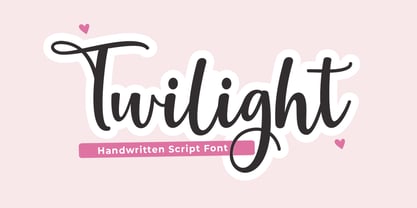 Twilight Script is a modern calligraphy design, including Regular. This font is casual and beautiful with swash. Can be used for various purposes. such as logos, product packaging, wedding invitations, branding, headlines, signage, labels, signatures, book covers, posters, quotes, and more.
 - Sachsenwald by Monotype,
$50.99 Toshi Omagari’s revived Sachsenwald design can be the perfect choice for distinctive headlines and brand identities for music, movies, video games and more. The revised design includes a regular and light weight – maintaining its distinctive design traits and adding more versatility.
 - Stencil Chamfer JNL by Jeff Levine,
$29.00 The packing information stenciled on an antique wooden crate included a slab serif type style with chamfered corners. This design has now been re-drawn as the digital typeface Stencil Chamfer JNL, which is available in both regular and oblique versions.
 - Collect Em Now BB by Blambot,
$10.00 Collect Em Now BB is the sentence-case companion typeface to the uppercase Collect Em All BB! It includes four fonts: regular, italic, bold and bold italic, double letter opentype ligatures, contextual alternate barred-I correction, manga glyphs, and more!
 - Pavilion by Cocodesign,
$12.00 Pavilion Script is a modern calligraphy design, including Regular. This font is casual and beautiful with swash. Can be used for various purposes. such as logos, product packaging, wedding invitations, branding, headlines, signage, labels, signatures, book covers, posters, quotes, and more.


